Sherwin Williams 20 Most Popular Paint Colors (2025)
BEST-SELLING SHADES: BEIGE, CREAM, GREIGE & MORE
When looking for the best paint color for your room, cabinets, or exterior, you might want to know what’s popular – which colors are people sampling the most and using in their homes in 2025 and beyond?
Don’t worry, I’ve got you covered, literally and figuratively…in paint.
Of course, when it comes to the most popular colors, white takes the top spot(s). However, it’s easy to see why white paint colors are the most popular…

- White is still pretty trendy as a wall color (with soft, warm whites replacing the brighter white trend from previous years)
- Some shade of white is used in almost every home, either on the walls, cabinets, trim, doors, or ceilings (and exteriors as well).
Once warm white walls aren’t as popular, these colors should fall in the ranks a bit.
However, we’re not talking about whites today (I’ll list them quickly for sharts n’ giggles). We’re chatting about the most popular shades of gray, greige, taupe, beige, tan, cream, blue, and green – you name it, I’ve got it. If I don’t have it…it’s not popular.

FUN FACT: My info comes from Samplize Peel & Stick, my blog, & Online Color Consulting. We’re undoubtedly the top 2 referrers and supporters of Sherwin Williams and Benjamin Moore paint in all of North America.
SHERWIN WILLIAMS MOST POPULAR PAINT COLORS
To get this ball rolling, let’s get the whites out of the way, as ‘technically’, they’re the most popular…
- Sherwin Williams Alabaster is the most popular white paint color from Sherwin Williams. It has a soft, pretty warmth that’s great for cabinets, trim, and exteriors. Just be careful, as it can be a touch warm for some of the popular white and off-white quartz countertops.

This image is great as it shows Alabaster on the walls and Pure White on the ceiling!
Sherwin Williams Alabaster: IMAGES, Info, & More
- Sherwin Williams Pure White is definitely the most popular white when it comes to my Online Paint Color Consulting. It’s flexible and versatile with a wide range of finishes.
Sherwin Williams Pure White: IMAGES, Info, & More
Now, here’s what you’ve been waiting for, the most popular NON-WHITE colors from Sherwin Williams…

1. SHERWIN WILLIAMS ACCESSIBLE BEIGE 7036
Once you spend time in a space painted Accessible Beige, it’s easy to see why it’s one of Sherwin Williams most popular paint colors, even though it has its limitations (every color does).
As its name suggests, Accessible Beige is a beige paint color. However, unlike more traditional shades of beige, Accessible Beige has a subtle gray undertone. This undertone subtly taps back AB’s warmth and takes the edge off any overly golden hues.
As for depth, Accessible Beige has an LRV of 58. Personally, I lean into colors that sit between 60-70 for the average home, as these depths tend to settle best overall. As the Great Goldilocks once said – not too dark, not too light, but juuuuuuust right. Really though, 58 isn’t that far off, I’m just being anal (one of my redeeming features, according to my hubby).
One reason Accessible Beige might be the top color is that it’s not just badass and beautiful on walls, it’s popular on cabinets, too, particularly for those wanting non-white cabinets without too much depth.

If you find Accessible Beige a touch darker than you want (a common comment in my consulting), try lightening it by 25%, which will get you above that 60 mark.
WHY IS ACCESSIBLE BEIGE THE BEST COLOR?
- It’s popular for all of the walls in a room and easily supports gorgeous accent colors.
- Kitchen cabinets look great painted in Accessible Beige. With non-white cabinets being trendy, it’s a popular choice.
- Accessible Beige is a great exterior color that complements a wide range of bricks, stones, and roofs.
- For those wanting non-white interior trims and doors, Accessible Beige is super popular when partnered with warm white walls.
If you love Accessible Beige, sample and compare it with Sherwin Williams Natural Linen (#10) and Natural Tan.
Sherwin Williams Accessible Beige: IMAGES, Info, & More!
2. SHERWIN WILLIAMS AGREEABLE GRAY 7029
Unsurprisingly, Agreeable Gray is in 2nd place. What’s interesting to a color nerd like me is that it was in 1st place last year, and has been bumped by the warmer look of Accessible Beige.

Agreeable Gray has been one of Sherwin Williams most popular paint colors for several years, thanks to its flexibility.
With minimal allegiance to greige or taupe, Agreeable Gray’s undertones are non-committal.
While this can be a problem if your finishes demand a particular undertone, it’s a great option if your finishes are easy-peasy to please.

WHY IS AGREEABLE GRAY ONE OF THE BEST NEUTRALS?
- Agreeable Gray is a top choice when painting an entire home one single color, but it’s also great for independent rooms.
- It’s a gorgeous cabinet color, even though it can be finicky with its wall color partners (which is a blog post unto itself).
- Agreeable Gray is a great exterior paint color, suiting tons of bricks, stones, and roofs.
- While Accessible Beige is the more popular choice, AG also looks pretty on interior trims and doors with white walls.

COLOR REVIEWS: SW Agreeable Gray | BM Stonington Gray | SW On the Rocks | SW Light French Gray | BM Edgecomb Gray | BM Chantilly Lace | BM White OC-151 | BM White Dove
If you love the look of Agreeable Gray, sample and compare it with Sherwin Williams Popular Gray and Modern Gray.
Sherwin Williams Agreeable Gray: IMAGES, Info, & More
3. SHERWIN WILLIAMS SHOJI WHITE
Shoji White is a beautiful shade of off-white and has risen drastically in the ranks.
- 2024: Shoji White was in 8th place*
- 2023: Shoji White was in 26th place
- In 2019, it wasn’t even in the top 50
The Best Medium to Dark Green Paint Colors
WHY IS SHOJI WHITE ONE OF THE BEST WARM NEUTRALS?
Shoji White is popular for many reasons…
- It’s gorgeous for all the walls in a room or as a simple, warm neutral for an entire home.
- It’s great for color-drenching, perfect for those who want their walls, trims, etc., to be the same color.
- Cabinets look gorgeous painted in Shoji White, especially with non-white cabinets being in style.
- It’s also become a popular paint color for exteriors.
Like me, Shoji White ain’t no one-trick pony. Giddyup.

SW Cotton | SW Sanctuary | SW Shoji White | SW Mortar | SW Egret White
If you fall in love with Shoji White, sample and compare it with Sherwin Williams White Duck (#16), Pearly White, and Benjamin Moore Ballet White.
Sherwin Williams Shoji White: IMAGES, Info, & More
4. SHERWIN WILLIAMS SEA SALT 6204
Sea Salt’s popularity goes to show it’s not just good on potato chips, but on walls, too.

Sea Salt is a green-gray…ish. While some green-grays commit to their green hue, Sea Salt is a sneaky bugger, as it can, and often does, look green-gray, but also easily swings to blue-gray or blue-green.
WHY IS SEA SALT THE BEST PAINT COLOR?
- Sea Salt’s a popular choice for those wanting a calming, soothing paint color for their room. It also pulls off a beachy vibe and fits well in a transitional or even country-style home.
- Sea Salt isn’t typically used on cabinets (I only suggest it in rare situations). It’s far more popular for all of the walls in a room.
- Sea Salt’s blend of color vs. gray makes it a popular choice as it’s definitely color-forward, but has a good gray base calming it.

SW Sea Salt | SW Rainwashed | SW Silver Strand | SW Creamy | SW Agreeable Gray | SW Alabaster
By the way, when sampling and comparing paint colors the right way, never put them on bare drywall, as it has a grayish hue. Put white poster board, paint, or paper around your samples. The top row would pop much more on white vs. the janky drywall color.
If Sea Salt satisfies your taste buds, sample and compare it with Sherwin Williams Silver Strand and Benjamin Moore Quiet Moments.
Sherwin Williams Sea Salt: IMAGES, Info, & More
5. SHERWIN WILLIAMS EVERGREEN FOG 9130
While I’m not surprised that Evergreen Fog is popular, I AM surprised it’s in 5th place.
Why?

The most popular paint colors are usually whites, off-whites, and light-depth shades. Evergreen Fog isn’t a light-depth color, nor is it a light-medium.
Evergreen Fog is a SOLID medium-depth color, which goes to show how friggin’ gorgeous it is, as even with its depth, it’s massively popular.
WHY IS EVERGREEN FOG ONE OF THE BEST COLORS?
Oh, there are a TON of reasons, including…

- While not many people would paint their entire home Evergreen Fog, it’s amazeballs in a single room or two.
- Evergreen Fog is a gorgeous green paint color for kitchen cabinets and islands. While some darker shades of green are popular, its moderate depth and green-gray blend make it a top choice.
- With green exteriors slowly gaining traction, Evergreen Fog is popping up more on siding and stucco.
- Evergreen Fog makes for a beautiful accent wall color, making a statement without saying a word. Unlike me, who ALWAYS has something to say.
If Evergreen Fog looks like the hue for you, sample and compare it with Sherwin Williams Escape Gray, Acacia Haze, and Dried Thyme.
Sherwin Williams Evergreen Fog: IMAGES, Info, & More
6. SHERWIN WILLIAMS SNOWBOUND 7004
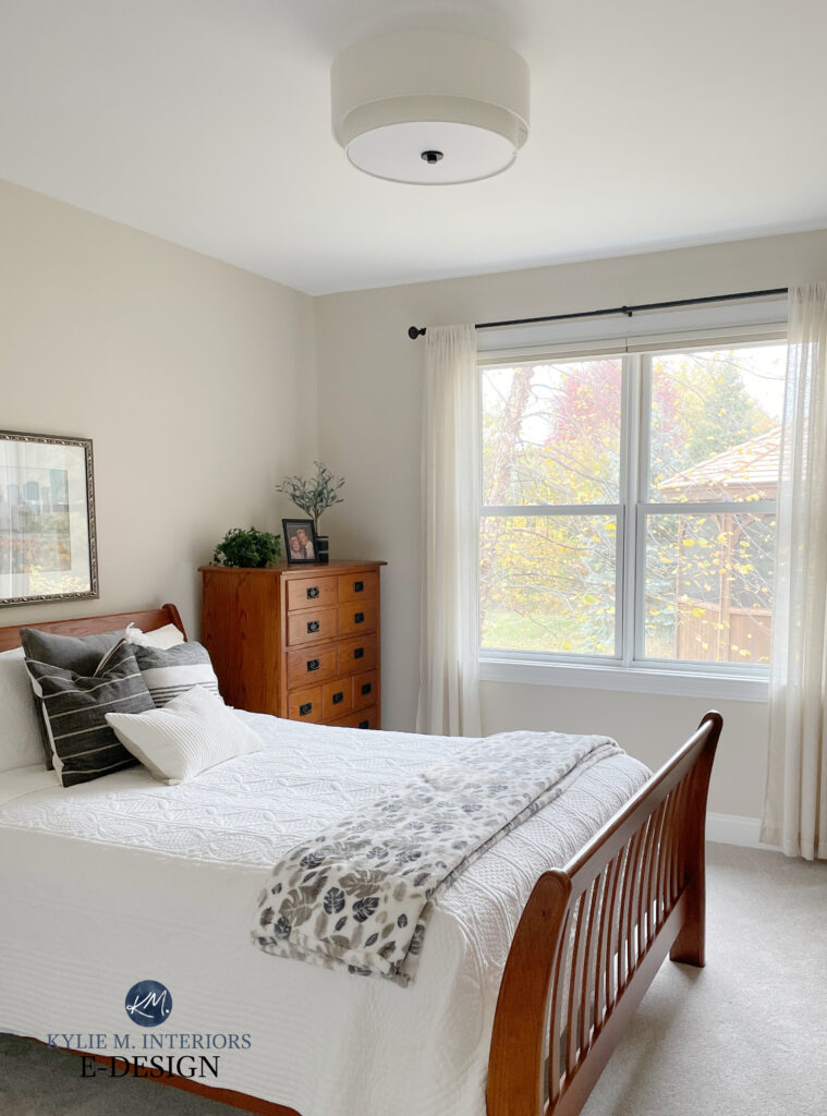
I was hesitant about listing Snowbound. While it’s rightfully in 6th place, its higher LRV of 83 puts it in the ‘white world’, and I was committed to NOT including whites in this list. Again, it’s easy for white to be a top-selling color, as unlike most shades, it’s used excessively on almost every surface in a home.
But if you ask this color cowgirl, Snowbound is a bit different from traditional shades of white.

Snowbound walls, white trim, Agreeable Gray cabinets, my favorite soft shade of black on the island
- It has an LRV of 83, so it’s definitely in the white range, but…
- It has a decent gray undertone, along with some taupe (purple-pink), making it a very atypical shade of white.
- Due to its undertones, I rarely recommend it for trims, ceilings, and doors. It’s way too limiting when it comes to coordinating wall colors and other finishes.
- When I do my Online Color Consulting, it occasionally comes up as a cabinet color, but it’s few and far between.
Here’s Snowbound on every surface…

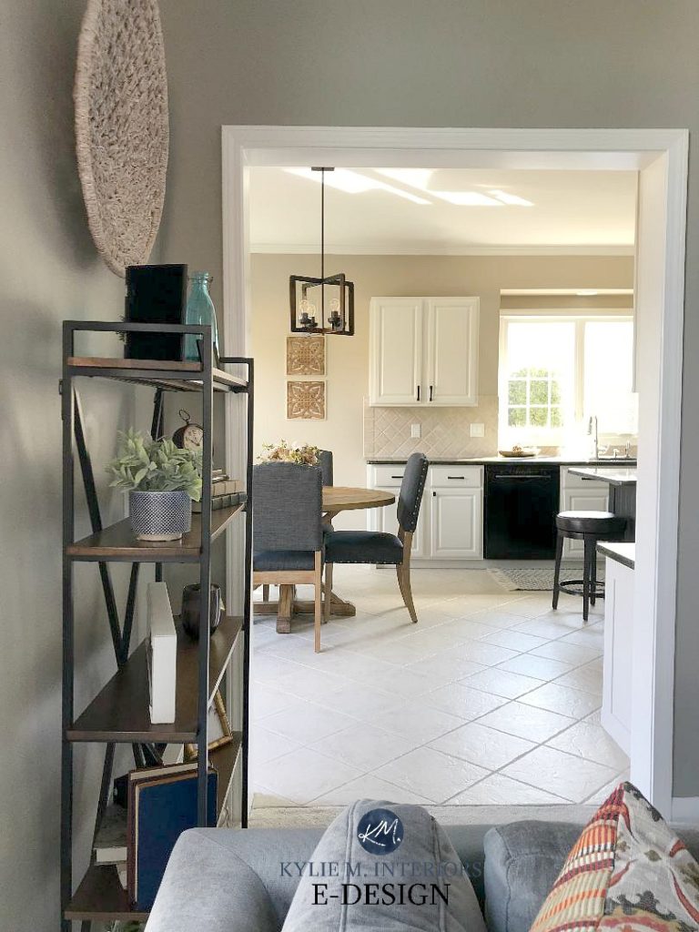
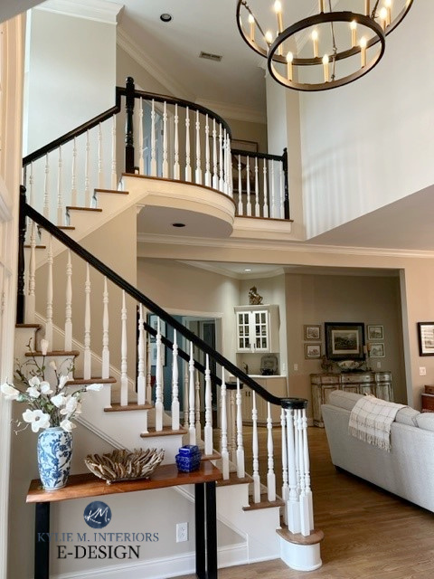
All the photos in my blog are from my Online Color Consulting clients, readers, and friends— because real homes deserve to be celebrated (dirty laundry and all!) While not magazine-perfect, they’re packed with ideas and proven color choices to help you create a home you’ll love.
There are only two ways I think Snowbound should be used…
- When it’s on the trims, doors, ceilings, and walls, and there’s no brighter or warmer white nearby for it to contrast/clash with. This approach keeps Snowbound’s undertones at their most subtle (shown above, in my girlfriend’s stunning home).
- When it’s on the walls and the trim is a brighter, simpler shade of white. You do this when you want to see Snowbound’s soft gray-taupe undertones, as you need a brighter white for it to contrast with.
Here’s what happens when you mix Snowbound with the WRONG shade of warm white…

Notice how the walls look pink-purple and the warm white cabinets look yellow. You have to be SO CAREFUL when mixing and matching whites, as only some whites go well together.
The above image supports my point that I’m unsure why Snowbound is so popular, as it’s pretty fussy. But hey, you do you, boo.
If you’re feeling tempted by Snowbound, sample and compare it with Sherwin Williams Heron Plume, Pure White, and Eider White.
Sherwin Williams Snowbound: IMAGES, Info, & More
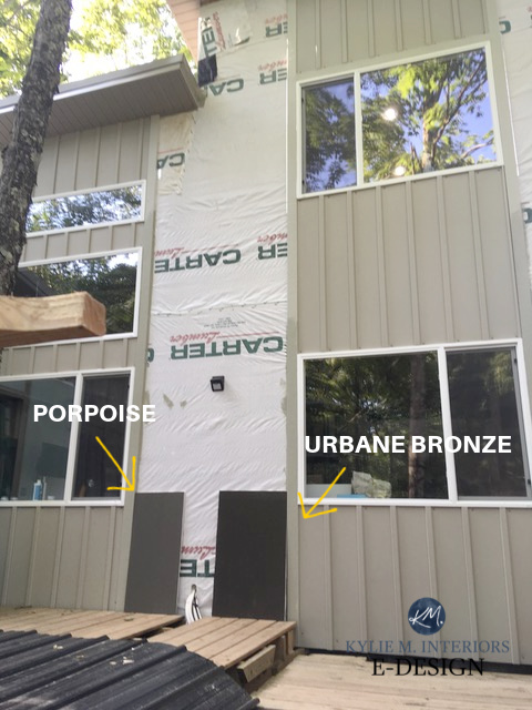
7. SHERWIN WILLIAMS URBANE BRONZE 7048
COME TO MOMMA! Hot damn, do I love this color. While it’s not everyone’s cup of tea or vat of wine, Urbane Bronze has been hot since 2021, when it was Sherwin Williams’ Color of the Year.

How to Update Outdated Granite Countertops
One thing I love about Sherwin Williams, is that while they don’t always hit the mark, their Colors of the Year often last for more than a year.
What does this mean?
While some colors – no names mentioned (ahem, Redend Point and Upward), last about as long as my patience, others are popular for years, which shows they were a great choice in the first place. This includes Sherwin Williams Evergreen Fog (#5) and Urbane Bronze.

The Best Dark Greige Paint Colors
Urbane Bronze is a dark greige, as dark as it gets before you tiptoe into the black end of things.
With its warm green undercurrent, Urbane Bronze appeals to those who want to make a statement without too much gray, black, or color.
WHY IS URBANE BRONZE ONE OF THE BEST DARK PAINT COLORS?
- While it’s rarely used as an entire room color (although people do use it), it’s gorgeous as an accent wall color and suits a wide range of warm neutrals.
- Urbane Bronze is one of the most popular colors for kitchen islands. Some paint their whole kitchens, but islands and bathroom vanities are more common.
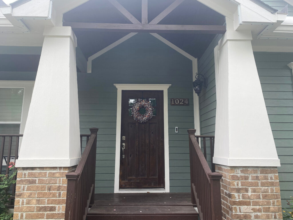
- Urbane Bronze is a gorgeous exterior color, either on siding or stucco, trim, or as an accent on the front door or garage door.
- Some use Urbane Bronze on their interior doors when they want a statement without the sharpness of black.
Don’t settle on Urbane Bronze without comparing it to similar shades like Sherwin Williams Porpoise, and others found in this blog post.
Sherwin Williams Urbane Bronze Review: IMAGES, Info, & More
8. SHERWIN WILLIAMS IRON ORE 7069
If it weren’t for Samplize’s stats, I wouldn’t have put many dark paint colors in the top 10. Sure, they’re stunners, but I would’ve thought legit wall colors (LRVs 60-75) would take the top spots.

As for Iron Ore, this baddy has become more popular as trends shift away from legit black paint colors, into softer, subtler shades.
This is because Iron Ore is a soft shade of black. With its LRV of 6, it definitely winks seductively at the black range (which is more in the 2-4 range) with a come hither glance, but won’t commit to anything deep or meaningful.
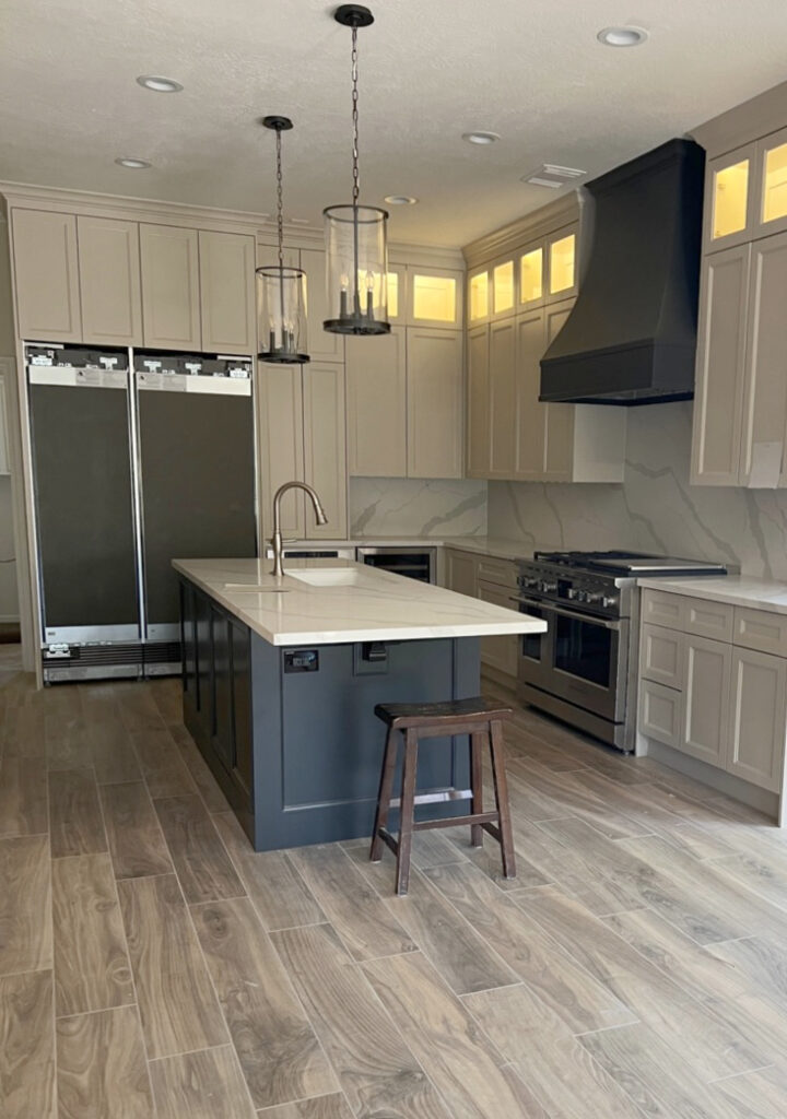
Iron Ore island & range hood with Sherwin Williams Sandbar painted cabinets
WHY IS IRON ORE THE BEST BLACK PAINT COLOR?
- Iron Ore is pretty cool as an accent wall. Its subtle green undertone tends to show up on the large scale, but isn’t remotely overwhelming.
- If you need a dark exterior trim, front door, or garage door color but don’t want black, Iron Ore offers drama without the same sharpness.
- Iron Ore is super popular on interior doors, again, for those who want a slightly softer, but still dramatic look.
- I love Iron Ore on kitchen islands. While it can be a bit harsh in many bathrooms (as not every bathroom finish can support such a dark cabinet color), it’s worth sampling if you think your room can handle it.
To see another soft black with a shift in undertones, sample and compare Iron Ore with Benjamin Moore’s Cheating Heart and Wrought Iron (Sherwin Williams doesn’t have great comparables).
Sherwin Williams Iron Ore: IMAGES, Info, & More
9. SHERWIN WILLIAMS REPOSE GRAY 7015
According to Samplize, a lot of you are sampling Repose Gray. According to my Online Color Consulting, this color is not hot…at all. That being said, just because someone orders a sample doesn’t mean they end up using it, and I bet this is the case with Repose Gray.

Why?
Repose Gray has an LRV of 58. Sure, it’s the same depth as Accessible Beige, but it has a heaviness to it that’s muddy without being warm, drab without being brown, and like rectal thermometers, isn’t used as much in the average home.
I think the familiarity of the name, and the fact that it WAS super popular is why it still makes the list.
Or maybe people are still using it and loving it. I definitely have some Online Color Consulting clients who’ve fallen in love with Repose Gray, and it looks beautiful in their homes; I’m just surprised it’s still this popular given warmer trends.
WHY IS REPOSE GRAY STILL POPULAR?
As you now know, I’m surprised it is. Here’s where you can expect to find Repose Gray in the average home…
- While it can be heavy for your entire home (especially if you have dark rooms or hallways), it’s suitable for single rooms.
- Many people ask me about using it on their kitchen cabinets, but it can be VERY FUSSY about its wall color partners. This said, it coordinates with some of the popular white and off-white quartz countertops.
- It can be a good exterior color, humoring a range of stones, bricks, mortars, and asphalt roofs.
If I’m looking for a color with a warm gray look, I might bust over to Benjamin Moore and check out Collingwood or Nimbus.
Sherwin Williams Repose Gray Review: IMAGES, Info, & More
As for this next color, I’m thrilled it made the top 10 list, as I’ve referred hundreds of my clients to it over the last few years…
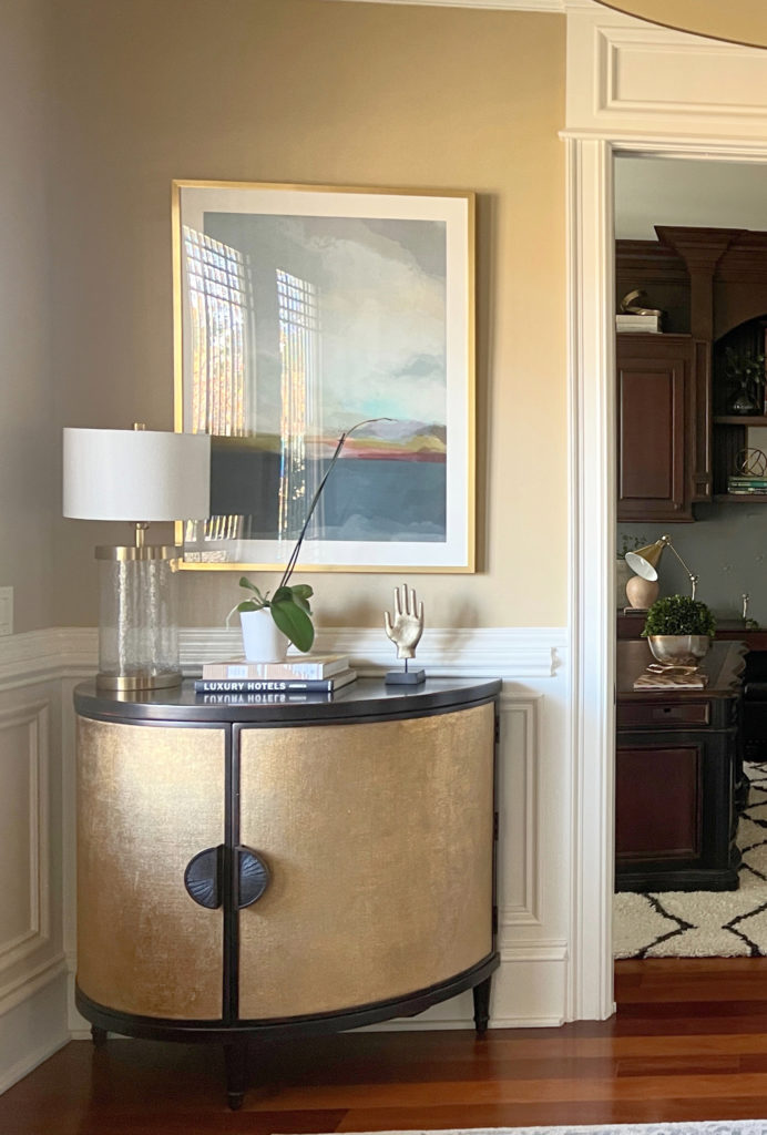
10. SHERWIN WILLIAMS NATURAL LINEN 9109
As far as beige paint colors go, Natural Linen speaks my love language – I’ve been lusting over it for about 12 months now. Warm, subtle, light, and gentle, Natural Linen is a modern, more timeless approach to beige (compared to shades from the early 2000s).

Natural Linen has an LRV of 66, parking its bountiful little booty in the middle of the light range. This makes it a great choice for the average home with a reasonable amount of light.
WHY IS NATURAL LINEN SHERWIN WILLIAMS’ BEST BEIGE?
Well, it’s not. Apparently, Accessible Beige is, but if you ask North America’s Top Paint Color Expert (ahem), Natural Linen is way better.
- Natural Linen’s LRV of 66 makes it ideal for an entire home – not too heavy for dark, poorly lit rooms (or those with no windows), but not so light that it washes out too much on well-lit walls. While many choose it, I find Accessible Beige a touch dark for some spaces.
- Some people are tossing Natural Linen on their kitchen cabinets. While I wouldn’t for a variety of reasons (ask me later), you do you, boo. Funny enough, I prefer Accessible Beige on cabinets.
- Natural Linen is an interesting option for exteriors, as it can humor many asphalt roofs, bricks, and stonework.
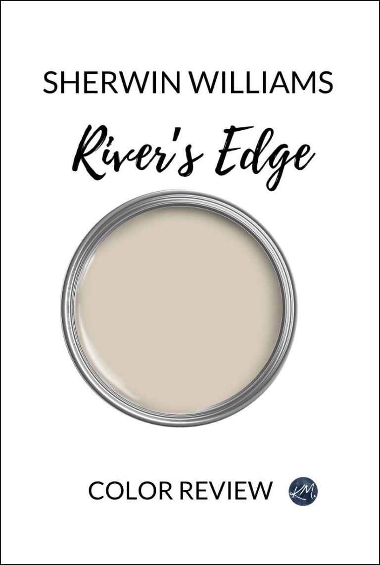
If you love Natural Linen as much as I do, sample and compare it with Sherwin Williams River’s Edge, Moderate White, Kestrel White (color review is coming soon), and Benjamin Moore Muslin – sometimes a tweak in temperature, undertone, or depth can make one color perfect over another!

Sherwin Williams Natural Linen: IMAGES, Info, & More
Now, that was a LOT of information to digest. While I could type my little heart out all day long, you might be ready for some quick facts. So, if you need a little more color inspiration, here are #11-20…
11. SHERWIN WILLIAMS CREAMY 7012
Creamy is a beautiful, subtle shade of modern cream for walls or cabinets.
Creamy trim and wainscoting with golden-hued walls similar to Sherwin Williams Harmonic Tan.
Sherwin Williams Creamy Review: IMAGES, Info, & More
12. SHERWIN WILLIAMS DRIED THYME 6186
Green paint colors are undoubtedly the top ‘colors’, with Dried Thyme coming in 12th place (there are a few Benjamin Moore greens on the list, too).
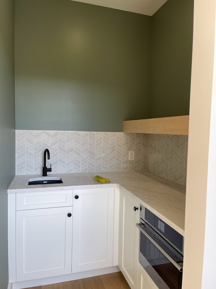
Sherwin Williams Dried Thyme: IMAGES, Info, & More
13. SHERWIN WILLIAMS RAINWASHED 6211
If you like Sea Salt, but want a bit more color on your walls, Rainwashed is a beautiful color to sample and compare.

Sherwin Williams Rainwashed Review: IMAGES, Info, & More
14. SHERWIN WILLIAMS CLARY SAGE 6178
Clary Sage is another popular shade of green for accent walls, or even entire rooms. While it might be a bit too purposefully green for the average kitchen cabinet or island, you just might fall in love anyway!
Here’s your Peel & Stick sample of Clary Sage…

The Best Medium to Dark Green Paint Colors: Sherwin Williams
15. SHERWIN WILLIAMS RETREAT 6207
Retreat has been popular for a while for entire rooms, accent walls, kitchen cabinets and islands, and even exterior color palettes.

Sherwin Williams Retreat: IMAGES, Info, & More
16. SHERWIN WILLIAMS WHITE DUCK 7010
I love White Duck, and if it weren’t for Shoji White (#3), it might’ve been in the top 10. I would definitely compare these two, along with Sherwin Williams Aesthetic White, if you’re looking for a subtle, warm, neutral paint color for your walls, cabinets, or exterior.

Sherwin Williams White Duck: IMAGES, Info, & More
17. SHERWIN WILLIAMS AESTHETIC WHITE 7035
I love Aesthetic White – it’s been one of my go-to neutrals for a few years. If this were based on my Online Color Consulting alone, it would be in my top 10 fo sho. It’s great for walls, cabinets, and exteriors and is definitely worth sampling.

Aesthetic White walls, Pure White trim, Accessible Beige cabinets
Sherwin Williams Aesthetic White: IMAGES, Info, & More
18. SHERWIN WILLIAMS DRIFT OF MIST 9166
I haven’t been bitten by the Drift of Mist bug yet, and I don’t expect to be anytime soon…or ever – maybe because it’s a bit too gray, although it has a pretty soft warmth and muted undertones. However, it’s definitely a popular shade that a lot of you have been exploring.
Sherwin Williams Drift of Mist: IMAGES, Info, & More
19. SHERWIN WILLIAMS PEWTER GREEN 6208
From the heart of my bottom, I love this color so much. Pewter Green is a badass, beautiful shade of dark green. It’s a commitment to color, but it has a bit of gray to take the edge off.

Sherwin Williams Pewter Green Review: IMAGES, Info, & More
20. SHERWIN WILLIAMS TRADEWIND 6218
If you’re looking for a popular shade of light blue, Tradewind might blow you over. Popular for bedrooms, in particular, this shade of blue is worth sampling and comparing.
Here’s your Peel & Stick sample of Tradewind…

Sherwin Williams Tradewind: IMAGES, Info, & More
Also, this list is subject to change. I’ll be revisiting and editing it every 6 months or so to see if any of the top colors get bumped!
Benjamin Moore’s 20 Most Popular Paint Colors
READ MORE
The Best Warm Neutral Paint Colors That AREN’T BEIGE
Warm Neutral Paint Colors with NO YELLOW!
The 6 ALMOST No-Fail Neutral Paint Colors
Get the Color Consultant that Designers Hire…