
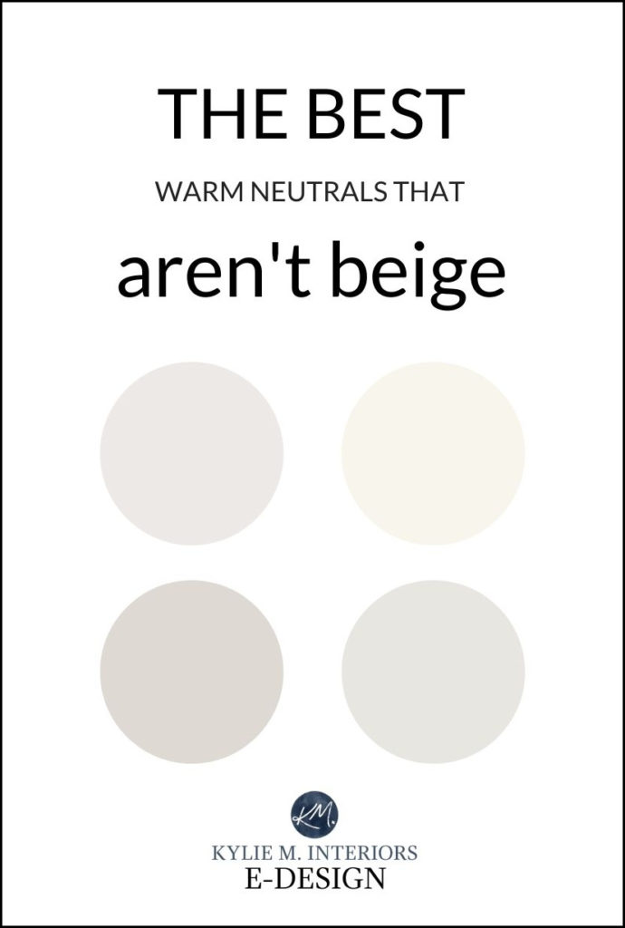
The 11 Best Warm Neutral Paint Colours (THAT AREN’T BEIGE!)
CREAM, GREIGE, TAUPE – I’VE GOT YOU COVERED
With trends leaning warmer and warmer, many of us wonder how the HECK we’re going to step out of the gray world and into the beige end of things. However, some are still traumatized by the builder beiges of the 90s and Tuscan-style beiges of the early 2000s – they aren’t going ANYWHERE near beige.
But just because a neutral color is warm doesn’t mean it has to be beige. That’s right; there’s a whole world of colors out there that can give you warmth without bringing you back to the Tuscan era.
WARM GRAY PAINT COLOURS
To start with, let’s talk about warm gray paint colors. While these are technically warm versions of gray, this doesn’t make them overly warm. And because I’ve already written blog posts on a few of my favorite warm grays, we’re taking things even warmer today.
While Colonnade Gray is a BEAUTIFUL warm grey – it didn’t make the cut as it’s NOT warm enough!
GREIGE & TAUPE PAINT COLOURS
Some of the sneakiest greige and taupe paint colors are hugging the worlds of gray and beige without 100% allegiance to either. However, the most purposeful shades offer a bit more commitment…
Greige paint colors tend to favor a green undertone. As greige leans further away from gray, it leans more into TAN, which is why greige and tan (or beige with a yellow-green undertone) often suit each other, as they can share similar undertones.
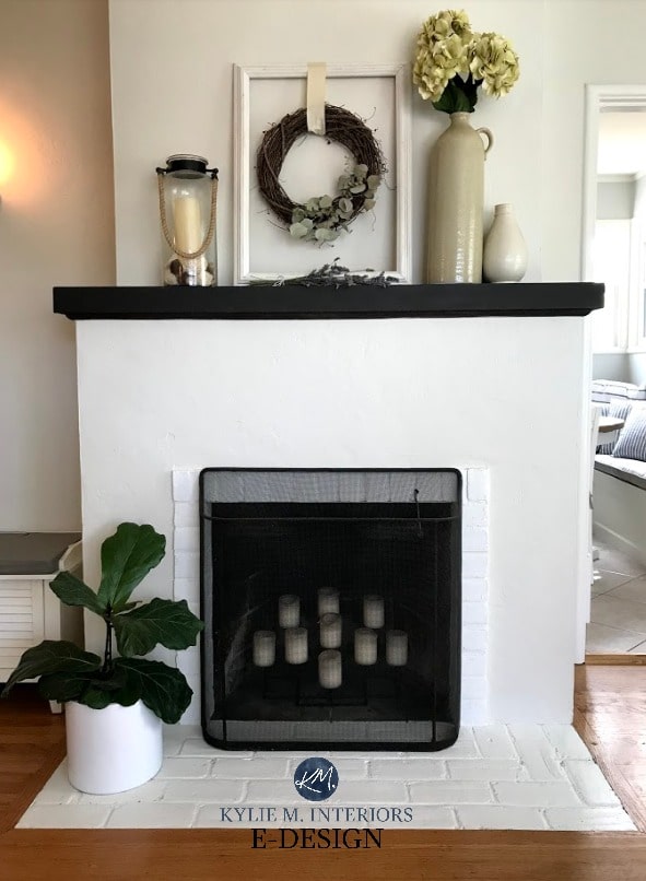
While this fireplace below was screamin’ for some beige, it’s happy and more updated with a transitional colour.
Sometimes, it’s about finding a happy place between you and your home!
Benjamin Moore Edgecomb Gray
Taupe paint colors tend to favor a violet-pink undertone. As taupe leans further away from gray, it leans more into BEIGE, which is why taupe and beige often suit each other, as they can share similar undertones (pink, in particular). While we’ll look at a few colors that politely wink at beige, it’ll be like a hot n’ quick Tinder date with beige vs a marriage.
Benjamin Moore London Fog
Sherwin Williams Accessible Beige is one of my favorite beiges, and it’s a hit amongst even NON-beige lovers!
CREAM PAINT COLOURS
It would be crazy to talk about warm paint colors without hitting cream. However, to stay modern, we’ll be looking at considerably muted shades of cream.
Why?
Because creams with more yellow aren’t trendy (yet) and are also trickier to coordinate with interior finishes. Just remember, cream is ALWAYS a yellow hue colour—you can’t make cream without it!
Benjamin Moore Ballet White
A FEW THINGS TO REMEMBER…
- For a colour to be WARM, it needs some form of orange, yellow, or red (pink) – it’s the nature of the beast. The key is to make these warm undertones more of a background feature than the main players.
- Don’t forget that a paint color’s LRV is almost as important as its colour! If you’re unfamiliar with LRV, READ THIS; it will change how you choose paint colors FOREVER!
- Pay attention to your room’s exposure. The warmer your exposure is, the more you might lean into slightly grayer versions of warm neutrals. The cooler your exposure is, the warmer you might want to lean! READ MORE.
- If you find most of these options too warm or too beige/creamy for you, then you really are looking for the warm gray end of things or the grayer side of greige and taupe.
1. SHERWIN WILLIAMS EGRET WHITE 7570
Egret White is a STUNNER. With its taupe base, Egret White makes a very slight nod towards a violet-pink undertone without slapping you upside the head with it.
FULL Paint Colour Review of Sherwin Williams Egret White
Between gray and beige, Egret White caters to gray. However, even in a north-facing room, you’ll be hard-pressed to find it even remotely cool. Rather, it will hold a very pretty, passive warmth.

SIMILAR COLORS TO COMPARE WITH EGRET WHITE
- Oh, you have to check out Benjamin Moore Classic Gray.
- And while it can show up with pink undertones, Benjamin Moore Pale Oak is stunning.
- Within Sherwin Williams, I also recommend Sherwin Williams City Loft.
- Many people love Sherwin Williams Agreeable Gray. Between the two, I prefer Egret White’s gentle softness (it’s also lighter/less heavy).
2. SHERWIN WILLIAMS VERSATILE GRAY 6072
Versatile Gray is a light-medium depth TAUPE paint colour which means it has violet-pink undertones. And let me tell you, this is one DARN flexible, warm neutral paint colour as it relates to coordinating with a wide range of interior finishes.
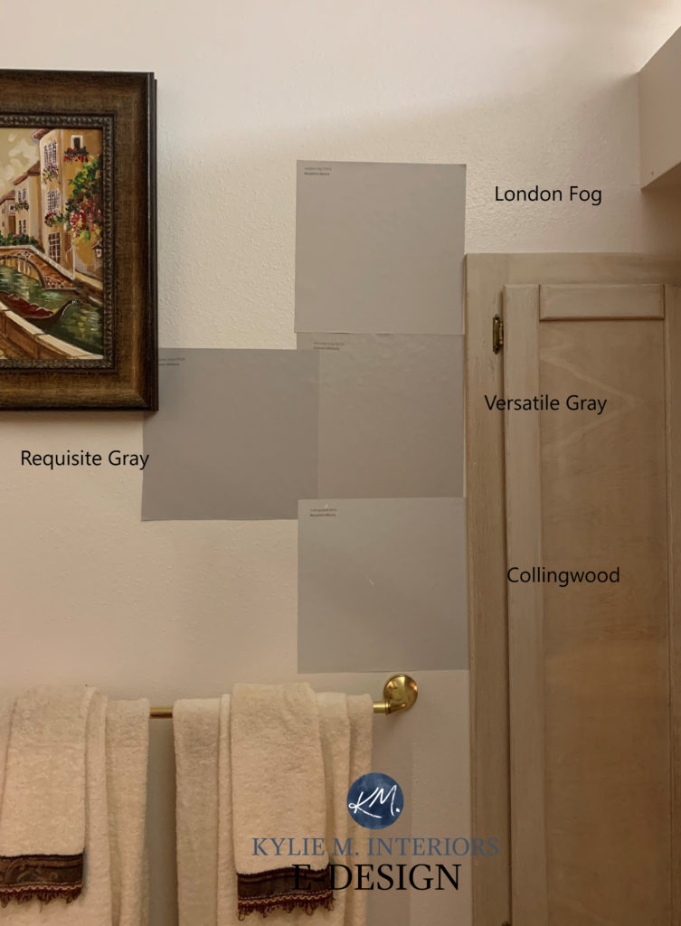
In the above photo, London Fog is another taupe-inspired beauty, whereas Requisite Gray and Collingwood are closer to being WARM GRAYS with violet undertones.
Paint Colour Review of Sherwin Williams Versatile Gray & Perfect Greige
3. BENJAMIN MOORE BALLET WHITE OC-9
Ballet White is the OG of the warm neutral world (‘Original Gangster’ for those who aren’t as hip as me – wink wink).
Why?
Ballet White is a lighter neutral and a soft one at that. So, whereas some traditional warm paint colors have more weight (including yellow and orange hues), Ballet White is soft and subtle. And while it IS a cream, it has a neutral base to calm it right the heck down.
FULL Paint Colour Review of Benjamin Moore Ballet White
COMPARE THESE COLORS TO BALLET WHITE
- Sherwin Williams White Duck is similar to Ballet White, and you’ll learn all about it next!
- Sherwin Williams Shoji White is more muted than Ballet White but equally as gorgeous.
- Want a bit more warmth without going FULL YELLOW? Check out Benjamin Moore’s White Down
4. SHERWIN WILLIAMS WHITE DUCK 7010
If Ballet White is the OG of the warm, neutral world, White Duck is its kissin’ cousin. This is awkward, as I don’t expect gangsters to be down with this type of relationship. But anyway.
White Duck is VERY SIMILAR to Ballet White. The main difference is that White Duck is a chunk lighter and a touch less warm/creamy.
White Duck with a beautiful blue-green front door!
FULL Paint Colour Review of Sherwin Williams White Duck
COMPARE THESE COLORS TO WHITE DUCK
- Sherwin Williams Shoji White is very similar to White Duck—read about it HERE to find out the difference!
- I’ve also been lovin’ on Benjamin Moore China White (also known as Sea Pearl).
- If you love White Duck, compare it to these similar shades to see which best suits your interior finishes.
5. BENJAMIN MOORE GRAY MIST OC-30
Because I rely 100% on my Online Paint Colour Consulting clients for photos, I don’t always have the shots. Some colors haven’t been used enough, or the photos that I have are too blurry or unuseable. And this IS the case with Gray Mist. It’s a beautiful shade of greige, catering to tan, but with trends previously being cooler, Gray Mist has been ignored for quite some time.
But will Gray Mist ever be the most popular warm neutral paint colour? No.
Why?
Gray Mist has a green undertone. Is it subtle? Yes. Does this undertone make it a bit finicky with many of today’s finishes? You bet your booty it does. But this doesn’t mean YOUR home doesn’t suit a warmer green undertone, so check it out if it tickles your fancy.

Get your Peel & Stick sample of Gray Mist HERE!
Paint Colour Review of Benjamin Moore Gray Mist & Fog Mist
COLOURS THAT ARE SIMILAR TO GRAY MIST TO COMPARE & SAMPLE
- Sherwin Williams Fog Mist is similar to Gray Mist but with a bit more depth (lower LRV)
- Sherwin Williams’s Natural Choice is along similar lines.
Get the best expert color advice…
6. SHERWIN WILLIAMS MODERN GRAY 7632
Modern Gray certainly IS a modern gray.
Why?
You ask a lot of questions—I like that about you—and you have a great smile, too. As trends lean warmer and warmer, we’re leaving gray behind, meaning that a more modern take on gray will have a whole lot more warmth to it. Modern Gray is a lovely shade of taupe but is very subtle in its approach, often flashing little to no undertone—unlike myself, who flashes as much as possible whenever possible.
Paint Colour Review of Sherwin Williams Modern Gray
SIMILAR SHADES TO COMPARE WITH MODERN GRAY
- Definitely check out the previously mentioned Sherwin Williams Egret White and Agreeable Gray.
- Sherwin Williams City Loft is another good comparison.
- Shift into Benjamin Moore and look at Edgecomb Gray (coming next).
Samplize Peel & Stick show up on your doorstep in 1 DAY!
Visit the SAMPLIZE website HERE
7. BENJAMIN MOORE EDGECOMB GRAY OC-173
You had to see this one coming from a mile away (or a kilometre for all of us Canadians, eh?)
I’ll be talking about Edgecomb Gray for the rest of my life. Why? Well, when trends are COLD, Edgecomb Gray seems to be the happy medium for warm lovers. As trends lean warmer, Edgecomb Gray will be a great happy medium for all you cool lovers (I know you’re reading this, Elsa).
Edgecomb Gray is the perfect balance between gray and beige with NO commitment to either. It also has minimal undertones, making it a neutral shade to be reckoned with.
FULL Paint Colour Review of Benjamin Moore Edgecomb Gray
COMPARE THESE COLORS TO EDGECOMB GRAY
Ermmmm, well…Edgecomb Gray really is a color unto itself, but you could check out Sherwin Williams Modern Gray and Benjamin Moore Winds Breath. Actually, Sherwin Williams Accessible Beige (which is, admittedly, beige – 3 slaps with a wet noodle for me) is a stunner, too.
8. SHERWIN WILLIAMS CREAMY 7012
Creamy is one dreamy cream paint colour. While many cream paint colors offer a bit too much yellow for the average homeowner (including myself), Creamy gives yellow a very polite nod without tipping the scales. It’s also the lightest and brightest shade in this blog post without hitting the warm white end.
However, with its HIGH LRV, you can expect Creamy to wash out considerably in an overly well-lit space like this foyer below…
This said, just because a color washes out doesn’t mean it looks bad! This living room below also has abundant natural light, making Creamy look more like a soft, warm white…
FULL Paint Colour Review of Sherwin Williams Creamy
The 5 Best Creamy White & Off-White Paint Colors
COMPARE THESE SIMILAR PAINT COLORS
- Benjamin Moore White Down is similar to Creamy but has a bit more body.
- Sherwin Williams Alabaster is a slightly lighter approach (it’s also a better trim color than Creamy).
- Sherwin Williams Pearly White is a stunner if you want less yellow-cream.
9. BENJAMIN MOORE PALE OAK
Pale Oak is gorgeous if you like pink. Not that the pink in Pale Oak is overwhelming, but in the wild world of undertones, it favors a soft violet-pink.
Many beige tiles, especially those from the early 2000s, love a bit of pink in their neutral, as shown in this next image…
Benjamin Moore Classic Gray on the left, Pale Oak on the right
COMPARE THESE SIMILAR PAINT COLORS
- Sherwin Williams Egret White comes across as more muted and is a great comparable
- Benjamin Moore Balboa Mist is a popular warm gray with less pink.
Paint Color Review of Benjamin Moore Pale Oak
COLOURS THAT STRADDLE THE LINE…
While the above colors should hit the spot, some of the most popular warm neutral paint colors sit on the border between taupe/greige and beige. This means that in some rooms, they might not lean into beige due to their surrounding finishes and the exposure of the room. However, in other rooms, you might see a BIT more beige than you bargained for.
Remember that these are still very subtle and often very FLEXIBLE shades that can be great options without getting remotely close to the traditional ends of the beige and tan worlds.
10. BENJAMIN MOORE WINDS BREATH OC-24
Benjamin Moore Winds Breath is one of my new faves! However, it’s been watching way too many Jackie Chan movies as it’s quite the ninja.
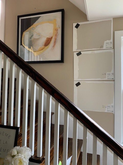
Winds Breath is the MIDDLE sample in this next photo. See how it’s not quite as beige as Accessible Beige and looks a touch more taupe than Ballet White…
Winds Breath does have a taupe-greige base, but of all of the options on this page, it’s one of the few that’s slightly more likely to nod at beige without 100% commitment. I have MAD love for this colour and expect to see more of it with the shifting trends.
FULL Paint Colour Review of Benjamin Moore Winds Breath
SIMILAR SHADES TO COMPARE WITH WINDS BREATH
- Sherwin Williams Aesthetic White is similar to Winds Breath but is a bit cooler/grayer.
- Sherwin Williams White Duck and Shoji White.
11. BENJAMIN MOORE STONE HEARTH 984
I know I’m pushing my luck with this bad boy. The thing is, if you have north-facing light, Stone Hearth is a warm neutral that could sit perfectly for you. However, if you have south-facing or warm afternoon sunshine, you might get a wee bit twitchy as it will lean more beige.
Kylie M E-Designs / Rick Pharaoh Photography
SIMILAR SHADES TO COMPARE WITH STONE HEARTH
- Benjamin Moore Cedar Key is similar to Stone Hearth, just lighter. I also love Benjamin Moore Smokey Taupe.
- Sherwin Williams Balanced Beige, which throws my theory that Stone Hearth MIGHT look neutral enough for you. Both are just such ATYPICAL BEIGES as they’re not traditionally golden warm – try them; they might surprise you!
The Ultimate Guide to Update YOur 2000s Home: 5 PART SERIES
12. SHERWIN WILLIAMS AESTHETIC WHITE 7035
I am thoroughly and completely obsessed with wine funnels and Ryan Reynolds in a Speedo Aesthetic White.
Why?
Aesthetic White is a fabulous off-white paint colour that does have a beige base, but hot damn, does it EVER LEAN INTO GRAY! Seriously – mad love.
FULL Paint Colour Review of Sherwin Williams Aesthetic White
READ MORE
The Best Warm Neutrals With NO YELLOW UNDERTONES!
The 5 Best Creamy White & Off-White Paint Colors
What Are UNDERTONES & How to Find Them
The 5 Best Off-White Neutral Paint Colours
The Ultimate Guide to White Paint Colours
The 12 Best Whole Home Gray & Greige Paint Colours
The 8 Best WHOLE HOME Warm Neutral Paint Colours
NEED HELP?
CHECK OUT MY ONLINE PAINT COLOUR CONSULTING!
Chat soon,
ORIGINALLY WRITTEN IN FEB 2022, AWESOME UPDATED JUST FOR YOU IN LATE 2023


Wow! I have been struggling the past month with my decision on paint colors somewhere between warm gray/beige and painting equipment in my main living areas waiting to be used and I really needed this post Kylie!! Thank you so much! You read my mind!
WAHOOOOO, this is JUST what I love to hear – thank YOU!
This is EXACTLY what I needed your voice of reason reminding me what my home needs and not what I want 🤯 !! Have a North facing room with nearly identical fireplace to the first pic with reclaimed brick ! Changing up sofas so not tied with them. Would edgecomb grey or creamy suit better in North facing room
I have Simply White walls and am looking for an off white that will work in my north west facing kitchen. Would it be weird to do walks and cabinets in Simply white?
Clark, it would not be weird AT ALL, in fact, the warmth of Simply White can be a great balance to northern light. HOWEVER, make sure Simply White is the RIGHT white for your countertops/backsplash/floor! https://www.kylieminteriors.ca/4-steps-pick-the-right-white-for-your-trim-cabinets-or-walls/
Thanks for responding! I will check out that link.
I’m glad to see some attention for Gray Mist – most of my house is painted this color and I love it. I think it works well with the variety of warm wood finishes in my older home, without being TOO warm
I painted my laundry room Winds Breath last year. It really calmed down the 90’s linoleum and pinkish counter top that I am living with for a while. I have a lot of ballet white in my house but it was too yellow and seemed to clash with the fixed elements of the laundry. I was really nervous choosing it because you didn’t have any reviews on it but it turned out great! It is a really soft pretty color. It changes throughout the day but always pretty.
I love to hear this~! It’s definitely one of my NEW FAVE warm neutrals 🙂
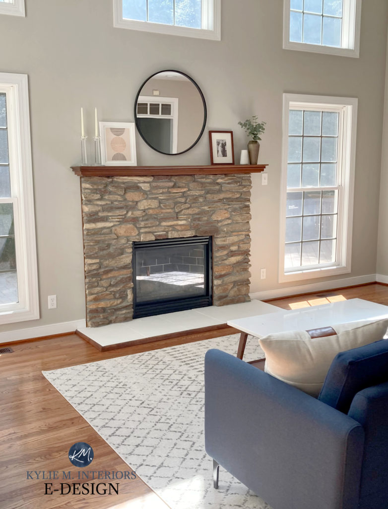
You continue to amaze me with your skill and your warmth! What is the wall colour in the first shot with the cognac sofa. love it!
Wow, what a nice compliment, thank you, Deb! That lovely colour IS…Benjamin Moore Edgecomb Gray 🙂
Would these warm neutrals you’ve listed above pair well with White Duck cabinets?
Kylie, I am a clothing designer who knows color pretty well but I tore my now white hair out trying to find the perfect “greige” that doesn’t lean too taupe or green in various lights. I have huge windows and mostly open concept where light bounces around and changes throughout the day. I fell in love with BM’s Natural Cream! It skews a tad taupe for a short time in my southeast light but I can live with it. What do you think of this color? Have you ever used it? LOVE, LOVE, LOVE your blog!!
Hi Nancy! Have you check out BM Winds Breath? It’s a STUNNER. I’m always leary with Natural Cream and don’t totally trust it, which is why I haven’t reviewed it, but Winds Breath is WICKED WICKED pretty! It’s lighter and more muted for sure.
Hello- Would SW white duck kitchen cabinets work with BM simply white walls? I keep getting mixed reviews that you should do the same white that you have on your walls. But others are doing a different white. Thank you so much.
Hi, Kylie!
I’m getting desperate to choose great paint color. it’s too difficult for me! Many colors looked capture the outside green color… omg…
So I’ve been studying painting colors from your postings for several days! 🙂
Now I’m finding out that there are too many things that affect the painting colors…
Your postings are really great!
I wanted to get your Consultations, but it looks always sold out. 🙂
I’d want to buy samples from you. Could you help me to choose several samples?
There are the East(several windows) and West(small one window) facing windows in my living room.( it’s not bright space) Travertine floor. live on a golf course. only have wood table and chairs. (almost empty now)
Existing wall color is SW Kilim Beige, but it looks too toasted afternoon and night.
I am thinking of a few colors, but before I buy, could you tell me about your thoughts and other colors of the sample you recommend to buy?
1. Aesthetic white
2. Neutral ground
3. Moderate white
Hi Kylie!
I am painting my kitchen cabinets stone hearth and I am wanting a warm white for my walls. What warm white would look good with stone hearth and what trim color would work with it? I was thinking maybe soft chamois or winds breath, but I worry soft chamois might look green with it and wind’s breath may not offer enough contrast?
Thanks for your help!
Abby
Do Edgecomb Gray and Ballet White work together? I’m thinking of using Edgecomb Gray in a bedroom with Ballet White in the hallway but I’m concerned the undertones will fight with one another. Would Manchester Tan be a better match for Ballet White?
OH YOU BET YOUR BOOTY they do! Not that Man Tan is bad, but I’ve always loved EG and BW.
I’d love to see your recommendations for a palette starting with Ballet White! I really enjoyed your updated video on Gray Owl with coordinating colors… Can you do that for Ballet White, too?
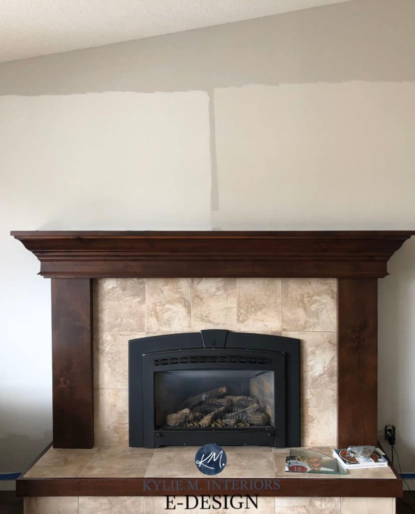
Hi ! Fun site to read. Would you please tell me the color you used on the walls in the first photo (tall fireplace) ?
Thank You !
Christine
Ahhh, that’s BM Edgecomb Gray!
Hi, love your site, it’s very informative and I’ve learned a lot!
My question is, what color paint do you suggest for rooms with the low E energy efficient glass windows? They throw off a green hue (they have green coating).
I’m considering egret white for kitchen cabinets and aesthetic white or white heron for the walls throughout the house.
What are your thoughts please?
Thanks so much
Oooo, that green hue can be tough to fight, but you’re ABSOLUTELY on the righ tlines with colors like Egret White/White Heron. Aesthetic White can pick up a wink o’ green the odd time, so that might make me nervous. BM Classic Gray/Balboa Mist are pretty too.
Hi Kylie,
Thank you for all of you insight on paint colors! I have spent the last 3 days trying to find the right colors for our condo and have watched many of your videos. I am looking for a neutral that is basically a “light taupe.” I like the color is Loggia but it too dark for my great room. I tried Accessible Beige but with north facing windows, it is too gray. Would Natural Tan work? If I was to pair that with a slightly darker color (LRV 50’s+) what would you recommend? Thank you for you help!
Kathy