
How to Choose Paint Colors for Any Room: A Step-by-Step Guide
Undertones, LRV, exposures, & more…
Have you ever painted a room and been disappointed or even devastated? Between undertones, interior finishes, exposures, and neighbors’ unwanted opinions, a lot goes into finding the best paint color for your room.
Thank God you have me (wink wink).
I can’t even count the times I’ve helped my Online Color Consulting clients fix rooms they just painted. Their beige looks pink, the cream is too yellow, and the greige that looked soooo great in their friend’s home looks flat and dull in theirs.
The funny thing is (#notreallyfunnywhenyouhavetorepaintyourroom), it’s not always about making a big change – it’s often about tweaking the details of what’s there (which is much different from twerking, which sadly, I’m yet to perfect).

Why do these color mistakes happen so often? Well, there are several reasons…
- You didn’t listen to their room’s bossiest finishes
- You chose the wrong undertones
- Your room’s exposure doesn’t suit the color you chose
- Your paint color’s LRV is too high or too low
In other words, don’t blame the colour – blame the person who applied it (it’s okay, we’ve all done it).
When paint colors go wrong, it’s usually because homeowners focus more on what they want, rather than figuring out what their room needs.
My client chose a beautiful cabinet colour, Farrow & Ball Pigeon, which is a gray with a green (green-blue) undertone.
This is why I wrote this blog post: to outline the basic steps for finding your best paint color, along with helpful links to in-depth blog posts for those who want to learn more.
So, without further ado, let’s find the perfect hue for you, baby boo.
Remember, you’re not a color expert and this stuff isn’t always easy – if you don’t get it, it’s okay (there’s a reason people hire me). However, these steps should get you on your way to atleast understanding some of your home’s needs.
STEP 1: FIND YOUR ROOM’S BOSSIEST FINISH(ES)
While there’s the odd room with no bossy finish, most rooms have one or more.
What is a bossy finish?
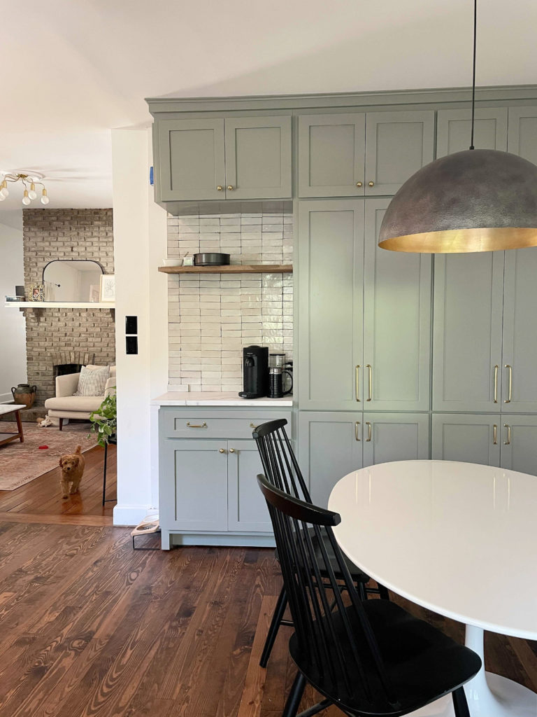
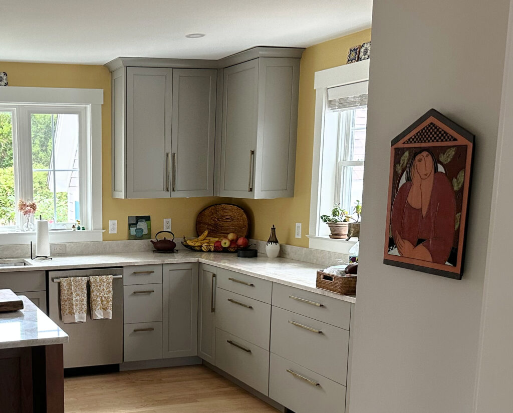
When choosing a wall color for a kitchen like this, the red-orange stain on the cabinets and teh backsplash call the biggest shots.
A bossy finish has a color, undertone, or depth that dictates what paint colors will look best in your room. These are most often permanent finishes that are costly to replace, including…
INTERIOR BOSSES
- Countertops
- Backsplashes
- Tile flooring
- Fireplace brick or stone
- Carpet
- Wood finishes with strong stains (red/yellow/orange/pink/gray)
- Large furniture pieces (but not always)
In the ideal world, your bossy finishes will coordinate with each other and agree on the type of wall color they suit. However, this isn’t always the case; in which case, you have to prioritize.

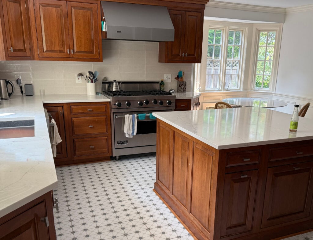
This older granite countertop doesn’t coordinate with the tile floor, but at least they both agree on an ACCENT color they love – green!
‘Usually’, but not always, vertical surfaces are a higher priority than horizontal ones. This is because they meet the walls on the same vertical sightline, so your eyes connect them quickly.
While linens, artwork, and smaller-scale furniture pieces can call the shots if you absolutely CAN’T change them, they’re super low on the list, as they’re the most replaceable.
Consider your room and what its bossy finish(es) might be. From there, keep on reading to learn about depth (LRV), undertones, and more!

The bossy finish in this room is the stone fireplace, and clearly, the previous owner didn’t listen to its needs.
Learn more about your room’s bossy finishes and how to coordinate with them: How to Choose Paint Colors: Bossy Finishes
2. FIGURE OUT THE UNDERTONES IN YOUR BOSSY FINISH
When it comes to undertones, they don’t just apply to paint colors – you’ll find them in every finish, including wood stains, countertops, tiles, and more.
This tongue-and-groove wood ceiling has pink undertones
But first, what ARE undertones?
There are two types of undertones…
- The type that hides in your so-called ‘neutral’ surface of paint color. Whether it’s a gray countertop with purple undertones or a tan paint color with green undertones, they’re sneaky lil’ buggers.
- There are also undertones in COLORS, like blues, greens, and purples. For example, blue can have a green or purple undertone, and green can have a blue or yellow undertone.
Almost every paint color and finish has undertones. When choosing paint colors, it’s about matching or contrasting with your finishes’ undertones*
*Other than pure white, pure black, and primary colors. And of course, there’s the odd color/finish with none, but let’s assume yours isn’t one of them.
COLOR GROUPS & THEIR MAIN UNDERTONES
- GRAY: blue, green, or purple (read more HERE)
- GREIGE: green
- TAUPE: purple or purple-pink
- BEIGE: orange
- TAN: yellow
- CREAM: yellow
- WHITE: usually yellow, but can pick up any color (read more HERE)
And what’s the best way to find undertones?
SAMPLE AND COMPARE.

If you don’t like blue undertones, comparing the above samples will help you avoid Stonington Gray. Also, I have reviews for all of these colors.
When it comes to finding the undertones of your interior finishes, the best way to do so is by grabbing a range of paint color samples (that you think could work) and placing them 100% vertical with your surface.
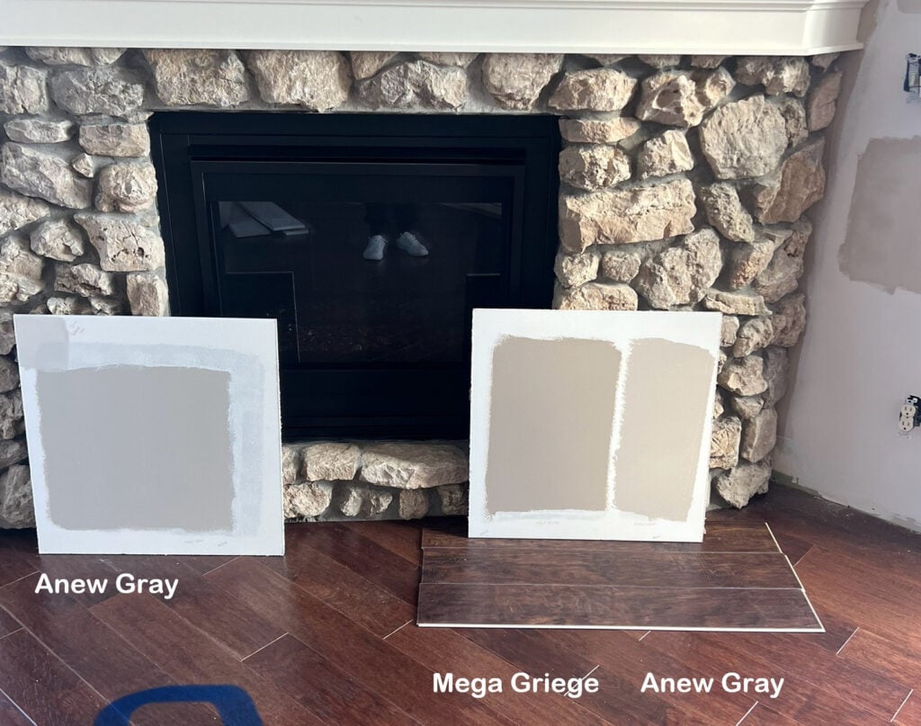
Let’s say you have a marble countertop like this one below. It LOOKS pretty darn gray and white, right?

The best paint samples are the large, peel-and-stick ones from Samplize.
However, by placing a range of grays with it, we see it actually has purple undertones.
How do we know this?
None of the samples match the gray in the countertop, and in fact, they show that the countertop has a purple undertone. The left sample leans blue, the center sample leans green, and the right one is a muddy green. All of these make the gray in the marble look purple in comparison.
In this next example, we see that all of the colors relate well to the stone fireplace. In this case, we might consider depth (LRV) and our room’s exposure to pick our best option (coming up shortly)…

REVIEWS: SW Argos | SW Colonnade Gray | BM Revere Pewter
So, grab a range of samples that look like they might go with your finish (more is better, since you’re not sure what will work). Notice which ones connect, and which ones clash.

Clients hire me because I suggest color options like this – all from photos!
Let’s do another example using white. While some whites are whiter than my lil Ginger butt cheeks (and no, if you click on that link it won’t take you to those photos – that’s a TOOOOOTALLY different website – wink wink), most whites have some undertone. In this next room, you’ll see Sherwin Williams Pure White on every painted white surface…

Now, let’s compare Pure White directly to a cleaner, brighter white…
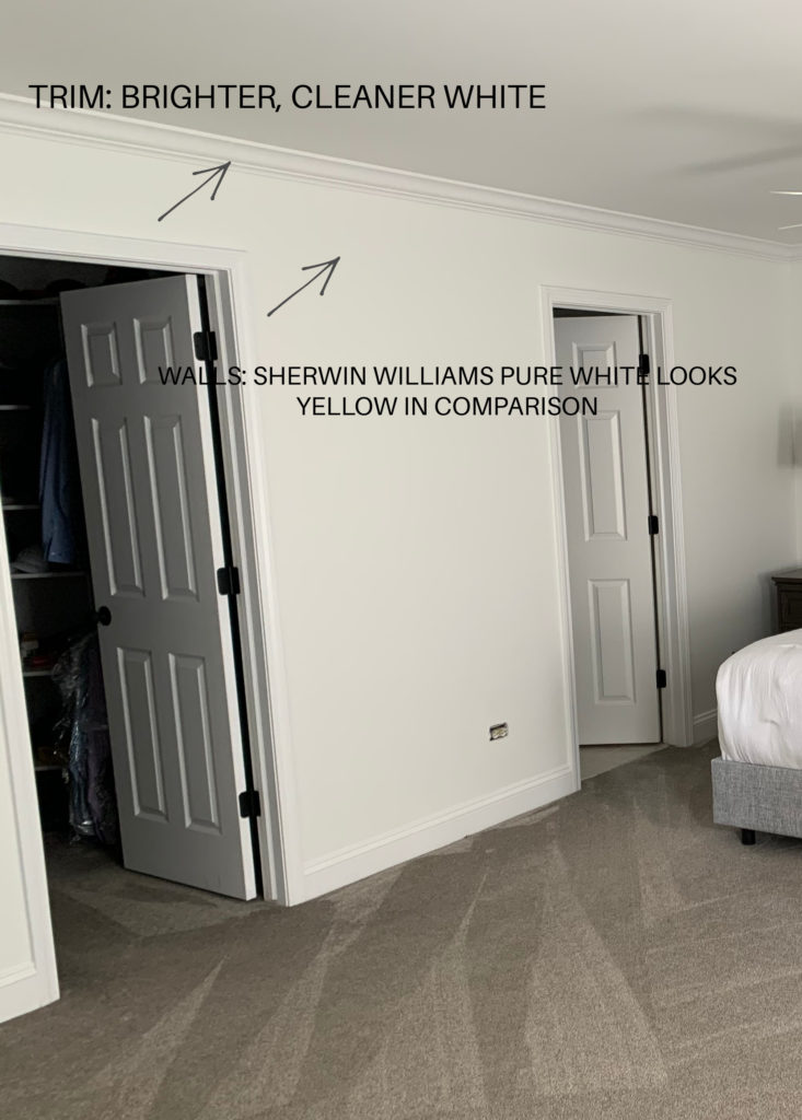
Pure White only appears bright white in the first room because it’s not being directly compared to a whiter shade of white.
COMPARE COMPARE COMPARE
Learn ALL about undertones here: Paint Colors & Undertones: A Color Expert’s Guide
STEP 3: PAY ATTENTION TO YOUR ROOM’S EXPOSURE
While it doesn’t call the biggest shots, your room’s exposure plays a role in its best color options.

The Best Beige & Tan Paint Colors
A SUMMARY OF EXPOSURES
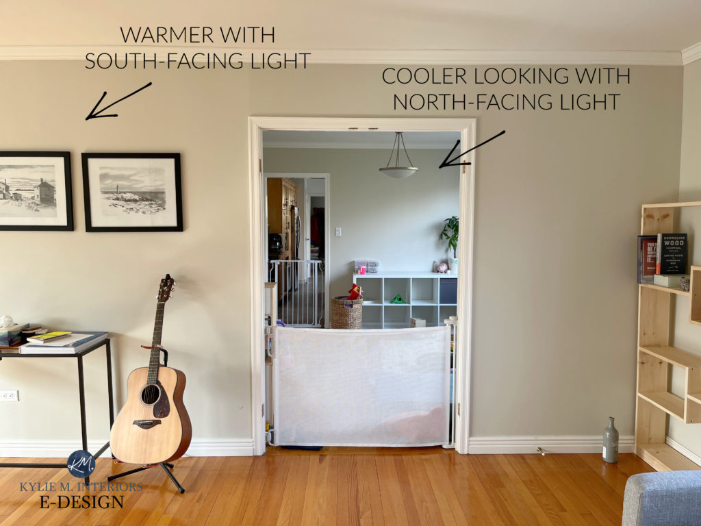
NORTH-FACING ROOMS: Rooms with a northern exposure receive consistent light throughout the day and no direct sunshine. This light is seen as a bit cool and flat.
North-facing rooms often suit warm paint colors, as the warmth helps balance the cooler light.
Benjamin Moore’s Best Warm White Paint Colors
SOUTH-FACING ROOMS: Rooms with a southern exposure get a buttload (look it up, it’s a thing) of sunshine throughout the day. This light will wash out colors at the height of the day, and get warmer throughout the afternoon (increasingly golden).
South-facing rooms can look gorgeous in cool paint colors, as the temperatures help balance those warm rays.
EAST-FACING ROOMS: Rooms with eastern exposure get a good dose of light in the morning (not overly warm or cool), but fall flat and dull in the afternoon.
WEST-FACING ROOMS: Rooms with western exposure look flat and dull in the morning, but warm up like an easy-bake oven in the afternoon.
East and west-facing rooms often look best in colors with a ‘bit more color’ or undertone, as this can help them during the ‘flat and dull’ times of day. Whereas colors that are already a bit flat and drab can look even worse.
The Best Green & Blue Paint Colors for Bedrooms
What about rooms with 2 or more exposures?
- You might let the biggest window call the shots, or the one that lets in the most light (e.g., if you have a big window but it’s covered by shrubs, your other window might be more dominant).
- If your room is north-west or south-east (or the other way around), some prefer to accommodate the dominant north or south-facing light, as it is more consistent throughout the day.
The Best Stone-Inspired Paint Colors – also, I’m madly in love with this kitchen
Here are some of the blog posts I’ve written about exposures…
- The Best Paint Colors for North-Facing Rooms
- The Best Paint Colors for South-Facing Rooms
- The Best Paint Colors for East-Facing Rooms
- The Best Paint Colors for West-Facing Rooms
- How to Choose Paint Colors for a Room With Two or More Exposures
And remember, I have over 600+ articles on this lovely little blog o’ mine. If you’re curious about a colour, use the SEARCH feature to see if I have it!
STEP 4: FIGURE OUT THE DEPTH YOU WANT
While you don’t need to know an exact number, figuring out which RANGE you want to be in is an important step in your color-pickin’ journey. And nothing tells you a paint color’s depth like its LRV.
What is LRV?
Benjamin Moore White Dove Color Review
LRV stands for Light Reflectance Value, and it is a number assigned to every paint color on a scale of 0-100. Technically, this scale is more like 2-95 (as we don’t have pure blacks or pure whites), but nonetheless, 2 is the darkest black and 95 is the whitest white accessible to the residential paint world.
PAINT COLOR DEPTHS & THEIR LRVS
- White paint colors have LRVs between 82 and 95
- Off-White paint colors have LRVs between 73 and 81
- Light paint colors have LRVs between 55 and 72
- Light-medium have LRVs between 40 and 54
- Medium paint colors have LRVs between 20 and 39
- Medium-dark colors have LRVS between 10 and 19
- Dark paint colors have LRVs between 2 and 9 (anything under 6 or so is usually black)
While there’s the odd exception to the above (e.g., some super light yellows with high LRVs, but they aren’t white), it’s a good list to follow.

ABOVE: Sherwin Williams Evergreen Fog (accent wall) has an LRV of 30, which tells you it’s a medium-depth paint color. Benjamin Moore White Dove has an LRV of 83.16, making it a white paint color, but on the lower, darker end of the range.
Now, that can seem super overwhelming, I get it – that’s why there’s wine and funnels. To make the above information useful, here’s what you might do…
HOW TO RESEARCH A PAINT COLOR
Go to Pinterest and type in ‘Benjamin Moore Palettes‘ or ‘Sherwin Williams Palettes‘. This will give you some imagery and ‘color blobs’ to check out. When you see one you like, look it up online.
For example, let’s say you land on this image…
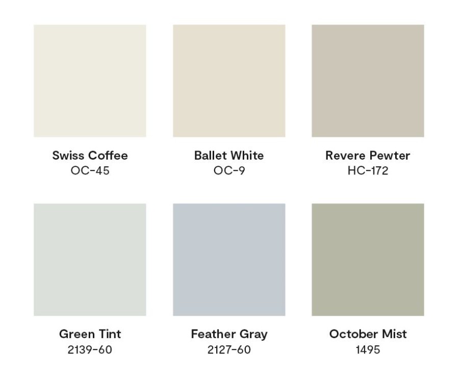
You like the look of Ballet White for your room.
- Go to my SEARCH and type in Ballet White (I have reviews on almost all of the most popular paint colors).
- Find Ballet White’s color review.
- Read about Ballet White’s LRV, as well as undertones, best coordinating whites, and much more.
Alternatively, learn how to find any paint color’s LRV in this blog post: The Ultimate Guide to LRV & Paint Colors.
And of course, there are a billion other paint tips and ideas that I could share with you, but for the sake of staying focused on not having complete verbal diarrhoea, we’ll stop right here.
READ MORE
The Ultimate Guide to White Paint Colours
LRV: The Ultimate Guide to LRV & Choosing Paint Colours
3 Steps to Choosing The Best White For Your Home
How to Create a Timeless Home – 4 Part Series
Get the best paint color advice


Updated for fresh content and images in late 2025


Love this discussion of undertones! I have learned so much from your color reviews Kylie!
I am looking to paint my kitchen /family room Moderate White to match my Giallo Napoleon and travertine kitchen finishes but looking to blend it with another living room color for my furnishings with Gossamer Veil. Would these work together? They would overlap in the foyer too.
Thanks for your wonderful blog!
Hi Jackie, I like these two together. I’m hoping that the room with Moderate White doesn’t get super intense afternoon western sunshine as it will lean it that much more orange and makes me a WINK twitchy with Gossamer, but overall, I’m diggin’ it.
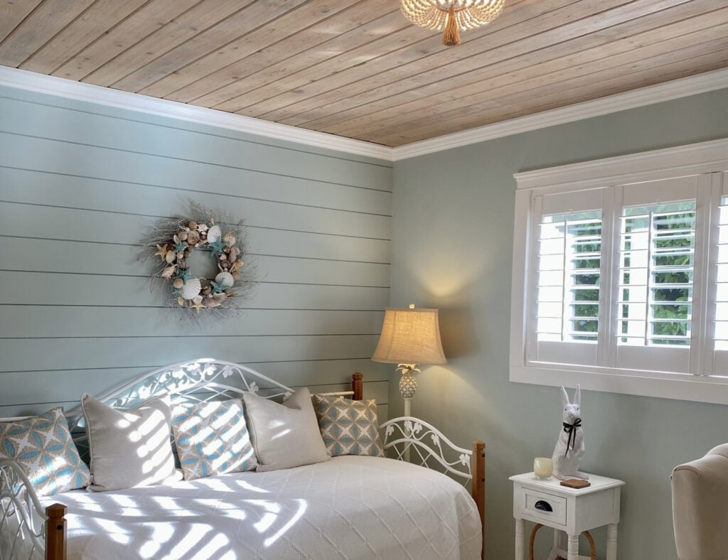
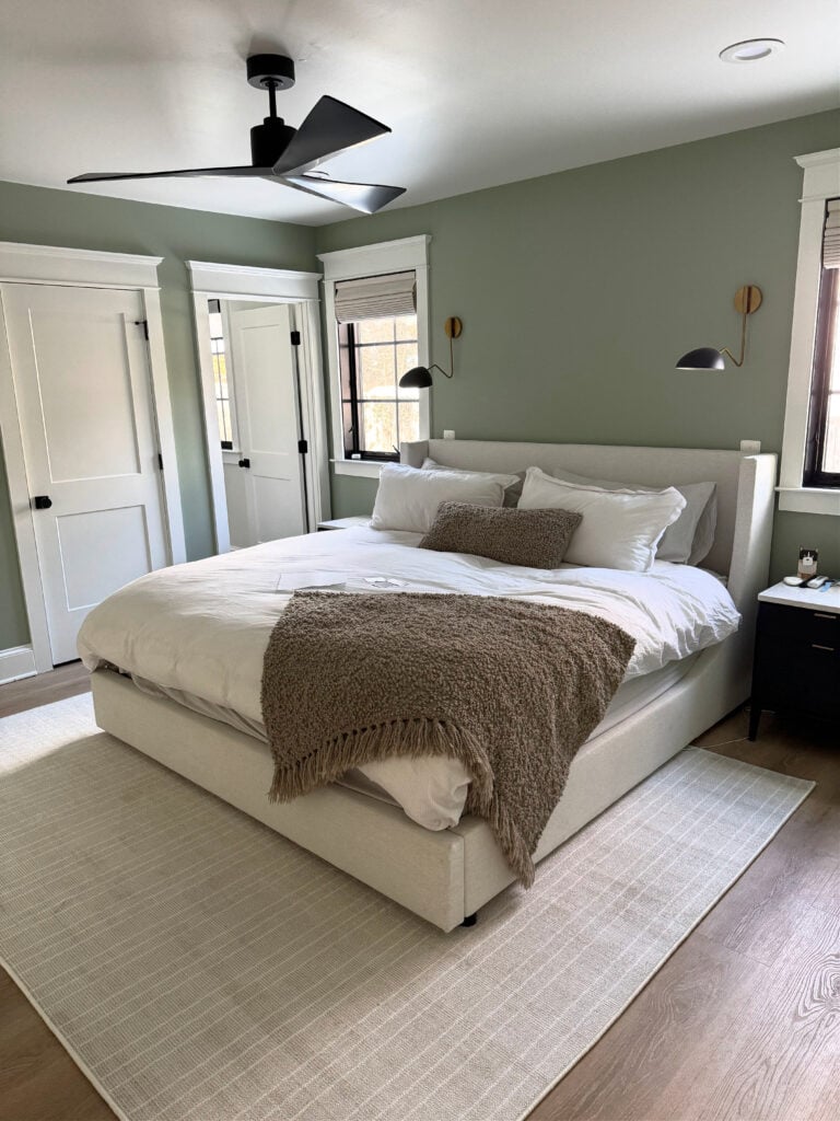
Hello…what’s the color of the pic with the bed in it and a white art piece above the bed? Love that color.
Hi Mechele, that’s BM Winds Breath 🙂
Eesh! Ok, big gulp. What if the flooring, and countertops are neutral taupes/greys with a violet undertone and playing nicely with the white walls but the white appliances are casting an alarming blue undertone? To choose a neutral cabinet colour, who do I appease…the undertone of the appliances or the flooring & countertops?
Also, at the start of your article, you said sometimes adjustments simply require some small tweeking. Any small tweeks for this type of situation? Thanks so much!
Great article – thank you so much! I do have a quick question. Is the undertone influenced by the setting – i.e., surrounding colors, lighting, etc. Or, will a color have the same undertone no matter where it is placed? Thanks!
Hi Tanya! ABSOLUTELY – great question! Undertones can become more or less obvious depending on their surroundings. For example, a violet undertone that looks a touch more passive surrounded by other violet undertones can look much STRONGER when partnered with an opposite undertone, ie. green!
Things can also shift based on exposure. For example, some blue undertones can look more blue-green in warm western sunshine or in warm light bulbs!
Kylie! I feel like you are talking about me…LOL. I had issues with the undertone in my guest bedroom that turned this cute sunny and cottagey feeling room into a dull, depressing spot. I just couldn’t figure out what went wrong. Through your package you recommended the correct revision (we went with the trim color darkened by 25%). It really was all about the undertone. NOW, this special room is like stepping into a dream. We love it! Thank you. And thanks for the education. Carolyn
WAHOOOOOO, thank you, Carolyn, this is JUST what I love to hear!!!
Another fantastic post!! There is ALWAYS more to learn…and you spell it out!!
Thank you, Maggie! (also my daughter’s name and it’s the PRETTIEST name ever :))
So, should all the main pieces in a room always have all the same (only one) undertone? When can you get away with a second undertone or can you?
I was given a tip by a color expert years ago that I use every time I pick colors. I take samples of my flooring, upholstery, countertop material, cabinet drawer front, wood furnishing, whatever will be in the rooms with the wall color and take them outside on a clear day in the early afternoon and look at everything together. The natural sunlight works like a truth serum and makes the neutrals state their undertones.
I did this last weekend in a really tough situation. The person needing help choosing a paint color is moving into a retirement community apartment. All the finishes except wall color are already decided. The cabinets were maple with an orange stain, the floors are a gray and brown mix wood look LVT (purple undertones) with a gray/brown/white multitone carpet and the countertops a light yellow Corian. Trim and doors are SW Extra White.
The display apartment had the walls painted in SW Natural Choice. I was not there, but the woman and her sister both said the walls looked green.
We picked out about a dozen wall colors and then paired the list down to 3 final choices.
Natural Linen, Moderate White and Accessible Beige. We kept a sample of the Natural Choice out as well and took everything outside. Natural Choice screamed Chartreuse in natural daylight surrounded by all the other colors. Accessible Beige also looked somewhat green and a bit dirty next to the orange and violet and yellow. Typically I find Natural Linen to be a bit too warm with most finishes, but in this situation it worked well with the warmth of the other color selections. I am still somewhat concerned that in the bedroom, where the only other color is the carpet it may be a bit warmer than I would want, but they are only allowed to choose one color for the entire space.
Just finished painting my west facing bathroom – that has tan fixtures. I chose BM White Down as you suggested in one of your blogs. I was so worried that the fixtures and tile would look pink, not at all. It is an amazing colour at any time of day. Thanks so much.
YES, I love to hear this feedback, thank you! It also helps others who are in a similar situation :).
I remember ages ago that red lipsticks were either red-blue or red-orange and that the red-blue made your teeth look whiter – I think that’s right!! Thanks so much for rewriting this – great help!
I wish I had understood more about undertones and the proper way to choose a paint color…I just finished painting my dining room London Coach by Valspar. I had painted samples of the color on my beige walls and thought it was a soft dove gray that went well with my honey oak cabinets and trim. Now that the entire room is painted, the purple and brown undertones come through quite strongly, especially at night. I had planned to paint my adjoining kitchen and livingroom the same color, but now I’m very unsure. It’s a lovely color, but not what I expected. Is there a neutral (and perhaps lighter) gray you would recommend that would flow well with London Coach, but subtly steer away from the heavy purple and brown undertones? (I don’t mind a gentle purple undertone…I read that would work best with honey oak and help tone it down….though I’m not seeing that with London Coach…)
Once you know your undertones, then what? Does everything have to be the same undertone? Specifically in question- can you do white trim with a yellow undertone and a greige with green undertone (Simply White and Edgecomb Grey)? Or how about pairing a green-blue with an adjacent room that’s green slight yellow undertone (oval room blue and herbal wash)?
Hey Jennifer, this is a great question and a LOADED one, too, as there are soooo many variables depending on the room, the goal, and the depths of the colors you’re using. As it relates to whites/trims and partnering them with the walls, there’s still so much. Generally, cool white trim colors prefer cool wall partners. However, cool walls can handle some warm trim colors as well. Really, it’s more of a ‘per color’ basis, than a general rule that can be applied.
I have a brown sofa. Paint a lot for it. Moving and want to incorporate greys. What undertone am I looking for? This is sooo hard
Ooo, brown can be tough. I would say GENERALLY, that many brown sofas love warm grays with a green undertone. However, it depends on the exact type of brown (as they have undertones) as well as the flooring and other finishes.