
THE 6 BEST, ALMOST ‘NO-FAIL’ NEUTRAL PAINT COLORS
WHAT’S THE BEST FOOL-PROOF PAINT COLOR THAT GOES WITH EVERYTHING?
You’ll see a lot on Pinterest about ‘No Fail Neutrals’, ‘Safe Paint Colors’, or ‘The Top 10 Fool-Proof Paint Colors…’ I’m here to burst your bubble and tell you, there’s no such thing as a no-fail neutral.
Why?
Oh, Lordy, where do I start?
To keep it short and curly, 4 main things can affect how a paint color looks…
- PERSONAL PERCEPTION: What I think is fabulous, you might thing is fugly
- REFLECTION: Lighter paint colors, in particular, can easily pick up reflections from their surroundings, including the green of grass or the red of your neighbor’s siding.
- EXPOSURE: The exposure of your room (i.e., the temperature of the natural light) will affect how a paint color appears.
- INTERIOR LIGHTING: You can change how a paint color looks by adjusting the KELVINS of your light bulbs

Much of the above can be explained by metamersim, which is when a paint color changes its appearance based on the surroundings and influences of each room or home.
Are there certain colors that are more likely to work well in your home than others? You bet your cute little booty there are, and I’m going to share these with you. However, no ONE color will work in every home in any room.

6 PAINT COLORS THAT ARE AS CLOSE AS POSSIBLE TO ‘NO-FAIL NEUTRALS’
These colors are shades that frequently appear in my Online Color Consulting work. These shades often work in the average home. While they might not work for EVERY surface (cabinets, walls, trims, exteriors), they’re a great place to start.
- You’ll see different types of neutrals listed below, from beige and taupe to gray and white.
- Chances are, not ALL of these colors will work in our home, but there’s a good chance that at least one of them does.
Let’s get this color party started…
1. BENJAMIN MOORE EDGECOMB GRAY HC-173
Edgecomb Gray is definitely a popular warm neutral, not just for rooms, but also for cabinets and exteriors.
Snuggled between the ample bosoms of beige and gray, Edgecomb Gray is a transitional color, bridging the warm and cool worlds, with a depth RIGHT in my LRV happy place.
Benjamin Moore Edgecomb Gray: IMAGES, Info, & More
If Edgecomb Gray is CLOSE but no cigar, check out colors like…
- Sherwin Williams Accessible Beige
- Sherwin Williams Modern Gray
2. SHERWIN WILLIAMS EGRET WHITE 7570
Egret White is on the edge of the off-white and light ranges, offering nice contrast with trim without too much visual weight.

SW Egret White | SW Modern Gray (also awesome) | SW Heron Plume | BM Classic Gray
Some call it a warm gray, while others call it taupe due to its subtle undertones. If you ask this color cowgirl, it’s a taupe, and this particular taupe is amazeballs for rooms, exteriors, and even kitchen cabinets!
Sherwin Williams Egret White: IMAGES, Info, & More
If Egret White is ALMOST your perfect no-fail neutral, but you need an alternative, you’ll find some beautiful colors to sample and compare in my CURATED TAUPE COLOR BUNDLE – have fun with Peel & Stick!
3. BENJAMIN MOORE WHITE DOVE OC-17
As far as popular, flexible shades of white go, White Dove is near the top of the list (along with Sherwin Williams Pure White).
White Dove is a soft, warm shade of white that suits a wide range of interior finishes, including tiles, countertops, brick, stone, and more. White Dove is a great place to start your color adventures, whether for your walls, cabinets, trims, or exterior.
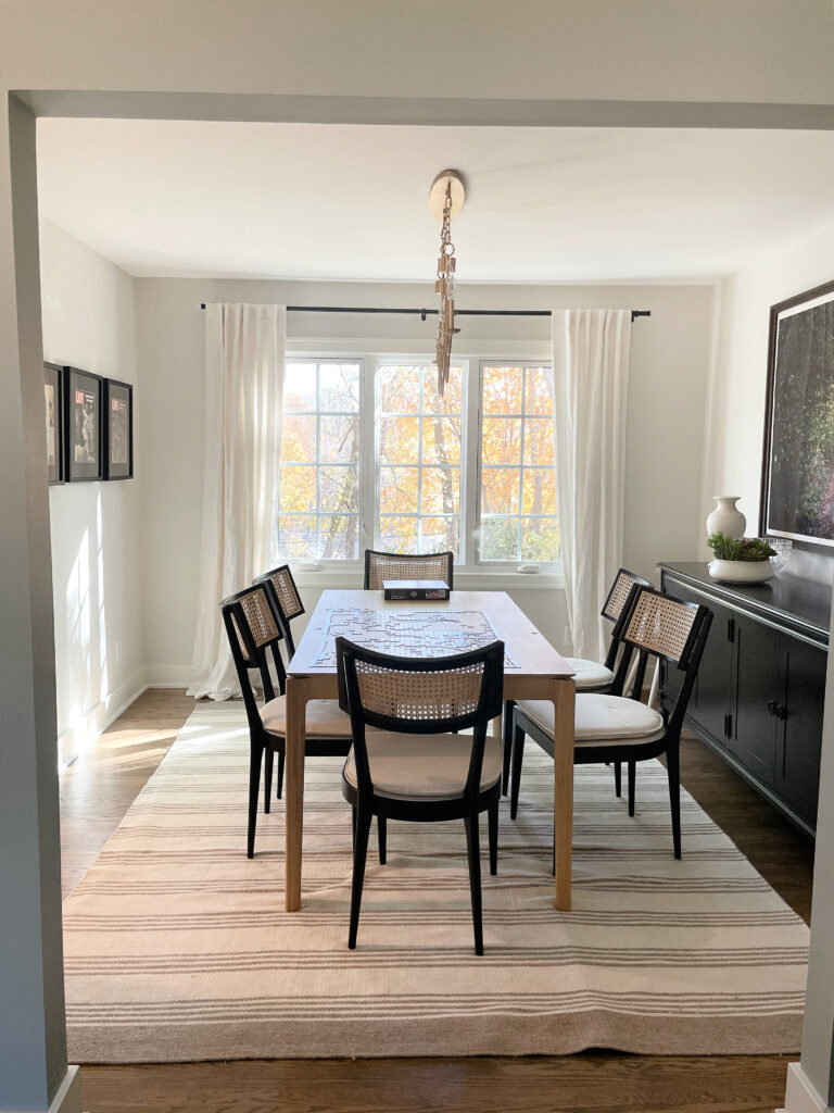
![]()
Benjamin Moore White Dove: IMAGES, Info, & More
But, White Dove isn’t the only beautiful white on the market. If you need some comparisons, check out Sherwin Williams Alabaster, Greek Villa, Benjamin Moore Cloud White, or my favorite whites in my CURATED WHITE BUNDLE.
4. SHERWIN WILLIAMS NATURAL LINEN 9109
If you’re looking for a popular, versatile shade of beige, Natural Linen is rising in the ranks.
Not as heavy as the beiges from the early 2000s, but not in the off-white world, Natural Linen suits tons of beige tiles, countertops, and finishes from the early 2000s, as well as more modern beige surfaces.
Sherwin Williams Natural Linen: IMAGES, Info, & More
If Natural Linen is close but no cigar, you need to sample and compare similar shades like Sherwin Williams River’s Edge, Benjamin Moore Muslin, or any of these shades in my CURATED BEIGE COLOR BUNDLE for some Peel & Stick fun!
5. BENJAMIN MOORE COLLINGWOOD OC-28
When it comes to gray paint colors, those with a subtle purple undertone tend to suit more interior finishes than those with blue or green undertones. For this reason, Collingwood can be a great fit for the average home, assuming your room suits gray in the first place.
Benjamin Moore Collingwood: IMAGES, Info, & More
Collingwood is a stunner, but it’s not the only one. Check out other shades like Sherwin Williams On the Rocks, Alpaca, Benjamin Moore Balboa Mist, and Classic Gray – sometimes a little tweak makes all the difference!
The Best WHOLE HOME Warm Neutral Paint Colors
6. BENJAMIN MOORE MARITIME WHITE
While Maritime White isn’t the most popular exterior paint color, it’s a super livable, somewhat timeless color that’s even reasonably safe for resale. Of course, it has to suit the finishes in your home, but compared to many other shades, it has a good shot at it.

I mean, doesn’t everyone have a baby grand piano?? 🙂
Maritime White is an off-white/light depth shade of beige. It has a flexible warmth, centering on an orange undertone, and is known to suit a wide range of finishes.
Here are a few alternatives you might want to sample at the same time…

SW River’s Edge | BM Maritime White | SW Moderate White (even though it says River’s Edge, it’s not) | SW Divine White | BM Cedar Key
It can also be an interesting off-white cabinet color, complementing some of the trickier backsplash and countertop combinations from the early 2000s.
Benjamin Moore Maritime White: IMAGES, Info, & More
PEOPLE ALSO ASK…
WHAT’S SHERWIN WILLIAMS MOST POPULAR NEUTRAL PAINT COLOR?
While it can change on a yearly basis, right now, not including whites*, Sherwin Williams Accessible Beige is Sherwin’s most popular paint color, followed closely by Shoji White and Sea Salt.
Accessible Beige is super pretty and flexible
While I’d definitely use Accessible Beige or Shoji White in an entire home, Sea Salt’s degree of color makes it best for one or just a few rooms at most.
Sherwin Williams 20 Most Popular Paint Colors
*Sherwin Williams Alabaster and Pure White are the top-selling whites, with Alabaster beating Accessible Beige in popularity (being an option for walls, trims, AND cabinets, it kind of makes sense).
The Best WHOLE HOME Warm Neutral Paint Colors
WHAT’S BENJAMIN MOORE’S MOST POPULAR NEUTRAL PAINT COLOR?
Again, white takes the lead (Benjamin Moore White Dove, Swiss Coffee, and Chantilly Lace), the next most popular neutral is Benjamin Moore Pale Oak – a gorgeous shade of taupe that’s worth comparing with Sherwin Williams Egret White, for sure.
While Pale Oak is stinkin’ gorgeous, it didn’t make my list as many find it a bit too pink.
So there you have it – a range of neutrals to explore for your home. And if all else fails, you know who to call (wink wink).
READ MORE
The 5 Best, Almost Fool-Proof WHITE Paint Colors For Your Home
The 3 Best, Most Timeless Neutral Paint Colors
The 8 Best WHOLE HOME Warm Neutral Paint Colors
6 Tips for Choosing a Paint Color When You’re an Overthinker
Check out my Online Paint Colour Consulting!

ORIGINALLY WRITTEN IN 2017, UPDATED IN 2025


I came across your blog while looking for “SW Wool Skein” and got hooked to your website. Thank you!!
Interesting article. Metamerism!! Now I can understand why my new river white counter tops and clear glass back splash look green. I have tall green trees all around family room/kitchen. it has North/East/South exposure. We redid our kitchen with white/grey cabinets. All white surface have green hue in them. Painted family room Behr Sage tint, which I think is very close to SW Sea salt and the color is lost in the room. I am thinking of going to beige route and painting it SW Wool Skein. have to get sample and see it.
Hi Kylie, one word HELP! I bought my mobile home, it has dark floors, which eventually is gonna be torn up, I will be painting the trims in the doors in my bedroom and in the bathroom connection with some kind of white. However, I’m having a problem do I want a blue wall but I don’t want it to poke out I like soft colors but I do not like pastels that makes any sense. I don’t know where to go with a yellow by Benjamin Moore or a green not sure, but I will have a white bed spread and I have a black iron frame. Any suggestions?
So, you’re thinking a bit of blue? What about something like BM Smoke for a moderate approach?? BM October Mist is lovely too, or Soft Fern for a gentler approach 🙂