
The Best Gray Paint Colors With Purple Undertones
Popular gray paint colors with one thing in common…
Are you looking for a gray paint color that’s flexible? One that suits a wide variety of exposures, tiles, countertops, and finishes? Then you’re likely looking for grays with one BIG THING in common – a purple undertone.
Why purple?
Whether you like undertones or not, every gray paint color has them.

When coordinating with most interior finishes, purple (violet) is hands-down the most versatile and common undertone found in gray.
Sure, there are gorgeous and (insanely) popular blue-grays out there, as well as beautiful green-gray paint colors, but just because they get chosen often doesn’t necessarily make them the BEST choice, if you get what I’m sayin’.
So, if you’re looking for that perfect gray paint color, it might just be one of these…

1. BENJAMIN MOORE COLLINGWOOD OC 28
If you follow my blog or Kylie M. Instagram (drink the Kool-Aid, it’s goooood), you’re no stranger to Benjamin Moore’s Collingwood – I’ve been spouting about it for YEARS.
Aside from its gorgeous purple undertone, another reason Collingwood is such a popular shade of gray is because of its LRV of 62, which sits RIGHT in my happy place.
Here’s Collingwood looking badass and beautiful with stronger, cherry-red stained kitchen cabinets…

Benjamin Moore Collingwood: Paint Color Review
Get your PEEL & STICK SAMPLE of Collingwood
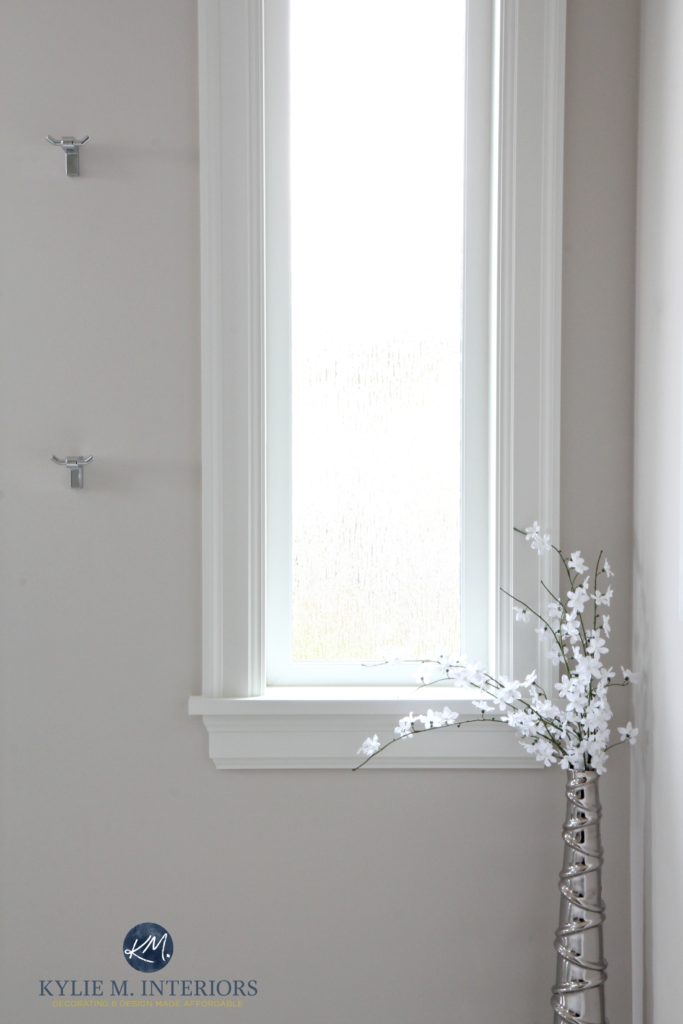
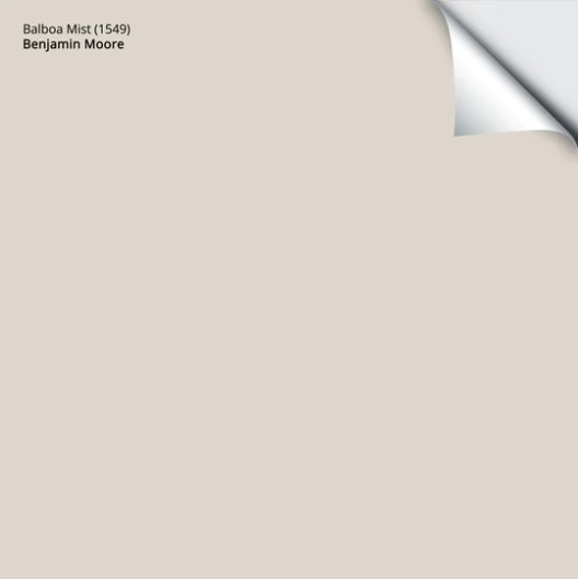
2. BENJAMIN MOORE BALBOA MIST OC 27
Balboa Mist is a super popular (top 20) warm shade of gray. If you want an approach that’s a bit lighter than Collingwood, this one could hit the spot (don’t tell your hubby, though; he’s been looking for that spot for years).

Balboa Mist doesn’t always look this subtle, but dang, is it ever gorgeous!
The Best Paint Colors to Update Golden Oak
With paint trends leaning warmer, warm grays like Balboa Mist will be more timeless (relatively speaking) than a traditional cool gray (for the average home).
Benjamin Moore Balboa Mist: IMAGES, Info, & More
Here’s your PEEL & STICK SAMPLE of Balboa Mist…
3. SHERWIN WILLIAMS ON THE ROCKS 7671
While Collingwood and Balboa Mist are more noticeably warm, Sherwin Williams On the Rocks seems to lean cooler. However, while On the Rocks may look colder than its peers, it has a slightly more STORMY look and isn’t considered an icy cold gray.
Sherwin Williams On the Rocks: IMAGES, Info, & More
As for depth, On the Rocks LRV of 62 is great for the average room.

The Best Paint Colors with Marble
Get your PEEL & STICK SAMPLE of On the Rocks
4. SHERWIN WILLIAMS CITY LOFT 7631
City Loft is one of my personal favorites when it comes to light, considerably warm grays with purple undertones. This is because City Loft also moonlights as a taupe paint color, which means it’s warmer than a standard gray.

The subtle taupe warmth of City Loft does a great job of nodding towards warmth without looking overly pink, even with these maple cabinets, which have a pink undertone…
How to Update Wood or Oak Cabinets: 4-PART Series
City Loft is a very gentle approach to gray, given its taupe tendencies. And while it certainly has undertones (all grays do), they’re well-suited to many interior finishes. City Loft’s LRV is 70, parking it in the ample bosom between the off-white and light worlds. As the Late Great Goldilocks once said…it’s juuuuust right.
The 12 Best Light Greige & Taupe Paint Colors
Sherwin Williams City Loft: IMAGES, Info, & More
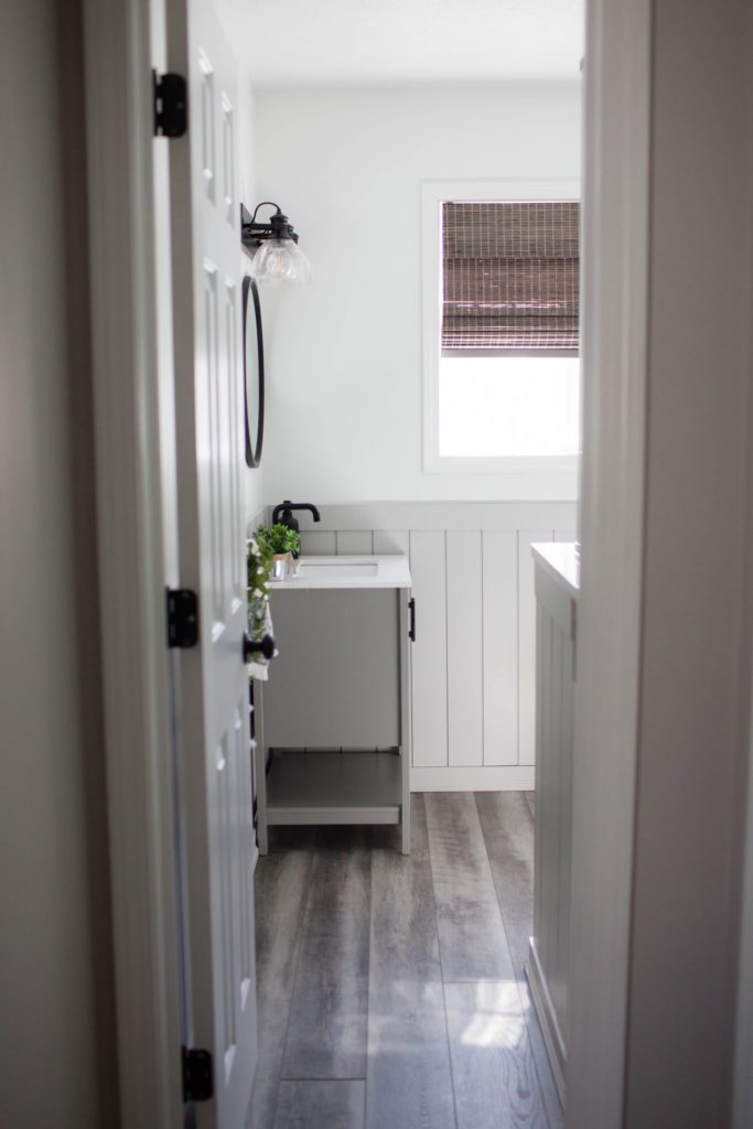
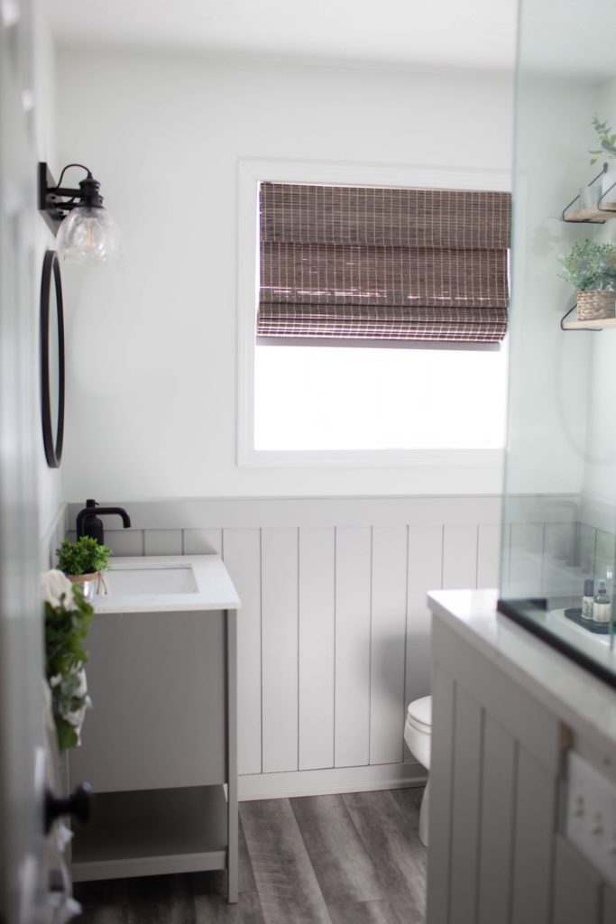
5. BENJAMIN MOORE NIMBUS 1465
Benjamin Moore Nimbus is a great gray for those who don’t know whether they want a warm or cool shade. While Nimbus IS a warm gray, it’s super passive and less noticeable than in Collingwood and Balboa Mist, making it appear a bit cooler in comparison.
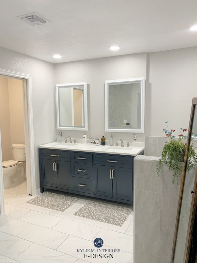
Nimbus is a gorgeous choice for the above bathroom with its marble-look flooring and navy blue vanity.

Nimbus on the left | SW On the Rocks on the right
Remember, EVERY gray paint color has undertones – find the one that BEST suits your interior finishes (I bet it’s purple).
Benjamin Moore Nimbus Paint Color Review
Here’s your PEEL & STICK SAMPLE of Nimbus…
6. SHERWIN WILLIAMS ALPACA 7022
Alpaca is a great gray-purple for those whose finishes (or personal preferences) lean into a noticeable purple undertone without going over the top.
By the way, has anyone ever even SEEN an Alpaca with gray-purple hair? I know I haven’t.
As for depth, Alpaca has an LRV of 57, making it a slightly darker, light-depth paint color.

REVIEWS: SW Popular Gray | SW Heron Plume
Alpaca and the previously mentioned Nimbus are reasonably similar, but Nimbus has a touch more warmth and a touch less undertone.
OH, WE AREN’T DONE YET! I’m just getting started.
Sherwin Williams Alpaca: IMAGES, Info, & More
Get your Peel & Stick sample of Alpaca
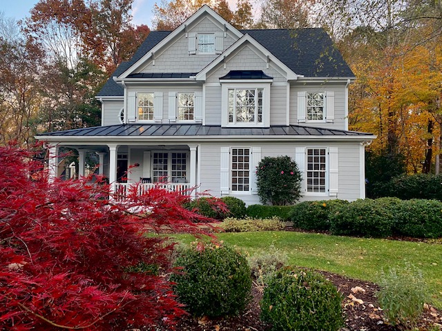
7. BENJAMIN MOORE SMOKE EMBERS 1466
Again, another Barney-inspired beauty. And thanks to that big purple dinosaur, purple has a bad rap.
HUMOR me when I say that gray with a purple undertone could be the best thing that’s ever happened to you and your home (other than me – wink wink).

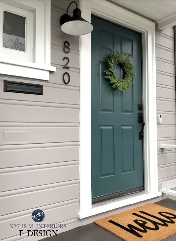
Smoke Embers siding with Benjamin Moore White Dove trim and Wythe Blue front door
Smoke Embers is stunning. Coming in darker and cooler than grays like Alpaca and Collingwood, Smoke Embers has an LRV of 51.44, meaning it has a bit more meat on its bones than the average popular gray paint color. This depth means that this slightly moodier shade of gray has more meat on its bones; great for the exterior of a home, walls, and even kitchen cabinets.
FAR LEFT – Smoke Embers
And while Smoke Embers is positioned underneath Nimbus in the fan deck, you’ll see that, along with its increased depth, Smoke Embers can look a touch cooler and more purple.
Is Gray Still Trendy on Walls, Exteriors & Kitchen Cabinets?
Get your PEEL & STICK SAMPLE of Smoke Embers
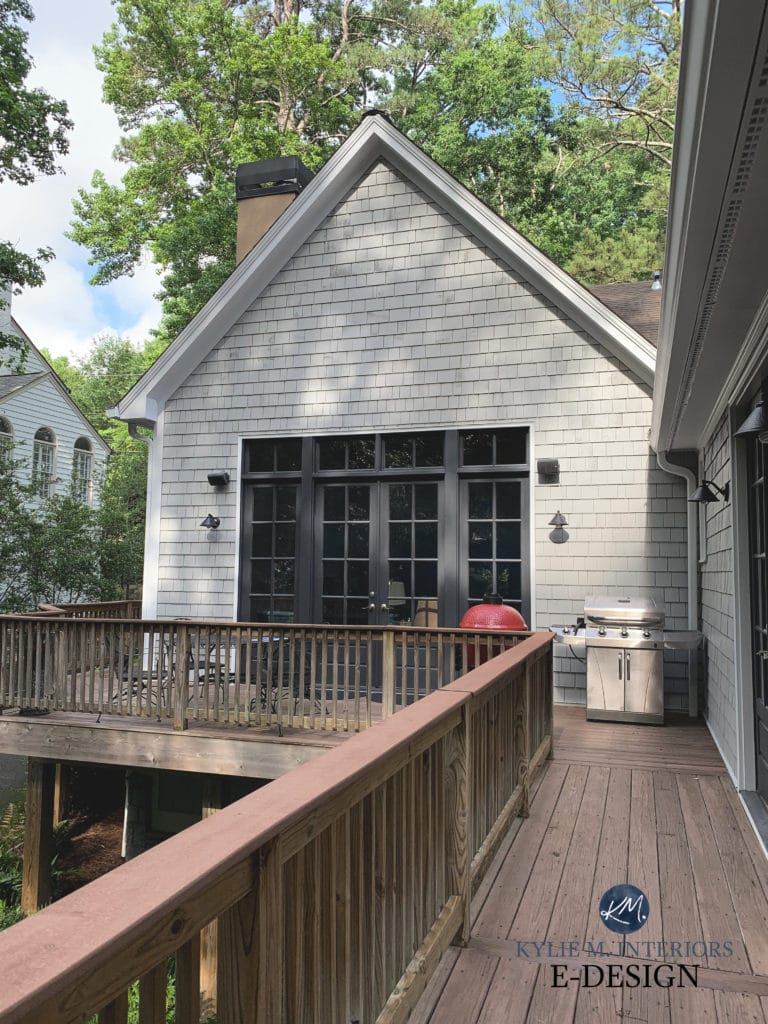
8. SHERWIN WILLIAMS KNITTING NEEDLES 7672
When it comes to gray exteriors (and some interiors), Knitting Needless can be a gorgeous choice. With its subtle purple/violet hue and ability to flex with varying exposures, Knitting Needles is one of my go-tos when doing Color Consulting.
Sure, it looks cooler than most of the other gray shades on this page, but as shown on this exterior (above and below), it can pick up a lovely softness.
Here’s your Peel & Stick sample of Knitting Needles…
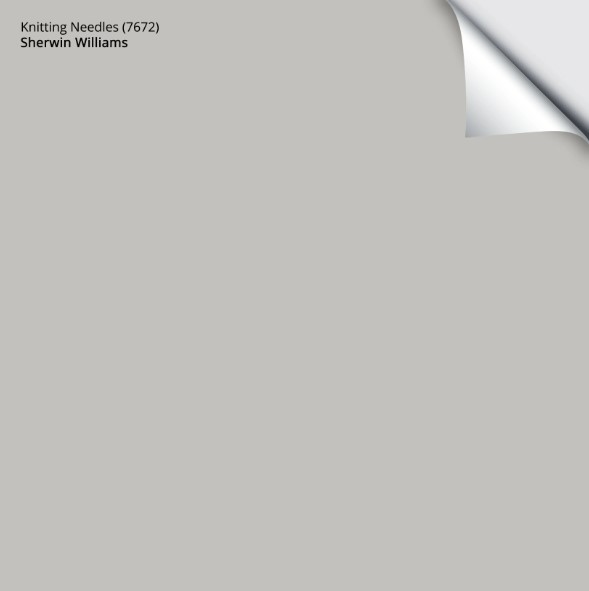
While I have yet to have a client use it on their interior walls, it’s easy to see how gorgeous it is for a home’s exterior…
9. SHERWIN WILLIAMS LIGHT FRENCH GRAY 0055
Why doesn’t Light French Gray get as much attention as the others?
If you ask me, it’s because of its placement in the fan deck. Many of the more POPULAR shades of gray are closer together, around pages 235-245. Light French Gray is jammed way in the front, near the bottom of page 205. Not that you asked, but anyway.
Light French Gray shiplap | Pure White walls
Light French Gray is friggin’ fabulous. Sure, it humors a mild purple undertone, but it’s fractional at best. However, whereas some grays like this pick up a blue or green undertone, Light French Gray stays pretty darn neutral. Its depth/LRV sits in the high end of the light-medium range, making Light French Gray great for many applications, including cabinets, walls, and exteriors.
Here’s Light French Gray with some of its competition…

REVIEWS: BM Edgecomb Gray | SW Agreeable Gray | BM Stonington Gray | SW On the Rocks
Paint Colors & LRV: The Ultimate Guide You Need to Read
Get your Peel & Stick sample of Light French Gray
10. BENJAMIN MOORE SILVER SATIN OC-26
It’s a toss-up between Silver Satin and Benjamin Moore Classic Gray. But since I tend to give Classic Gray more attention, and because it caters quite a bit to taupe, I figured it was Silver Satin’s turn (check them both out).
In this next photo, it’s tough to get a read on Silver Satin (in the dining area) due to the amount of natural light. Remember, colors with higher LRVs (like Silver Satin’s 74.9) can wash out with too much natural light.
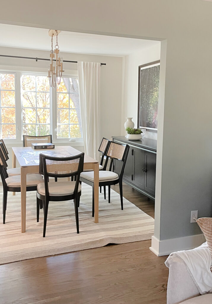
Comparing Silver Satin to the white of the table in this next photo is a great way to get a feel for its approach…
The Best Off-White Neutral Paint Colors
Silver Satin is an off-white, WARM gray paint color. While it’s not as warm as Classic Gray, they share a mild tendency towards a purple undertone.
And because I can’t even stop myself, here’s a good shot of Classic Gray in action – IT’S SO STINKIN’ PRETTY…
Benjamin Moore Silver Satin Paint Color Review
Benjamin Moore Classic Gray Paint Color Review
THE BEST DARK GRAY PAINT COLORS WITH PURPLE UNDERTONES
While the top eight colors focus on the lighter end of things, there’s a great demand for darker grays, especially on cabinets, accent walls, and exteriors.
Check out how this next home is updated with a beautiful shade of gray-purple…
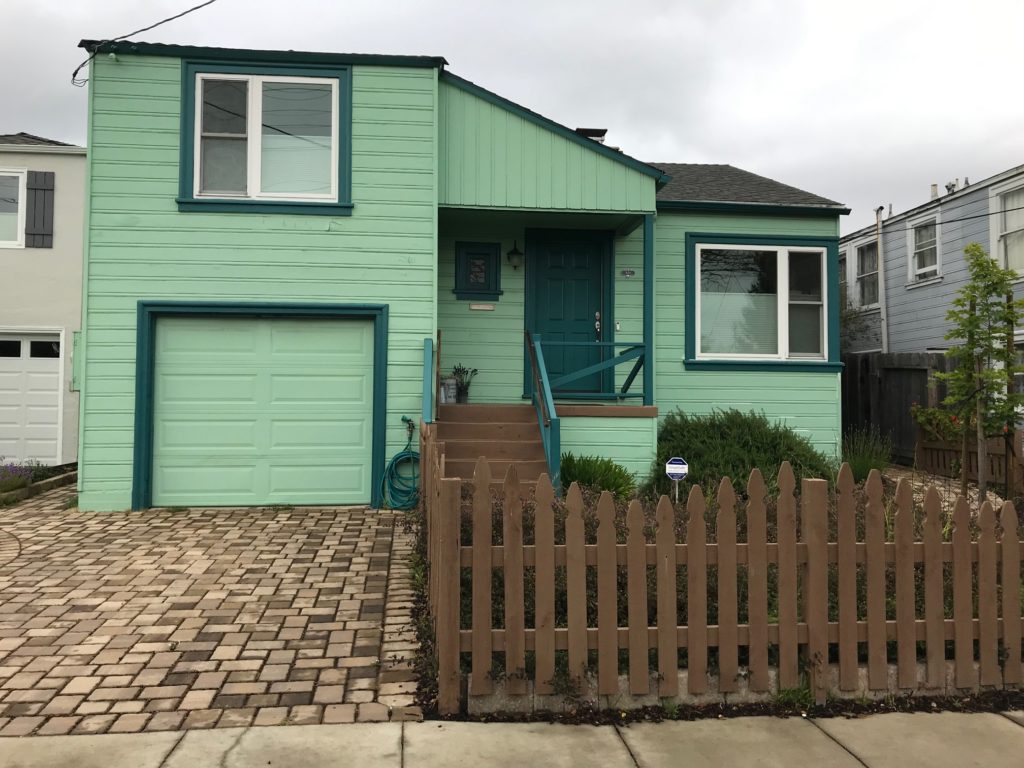
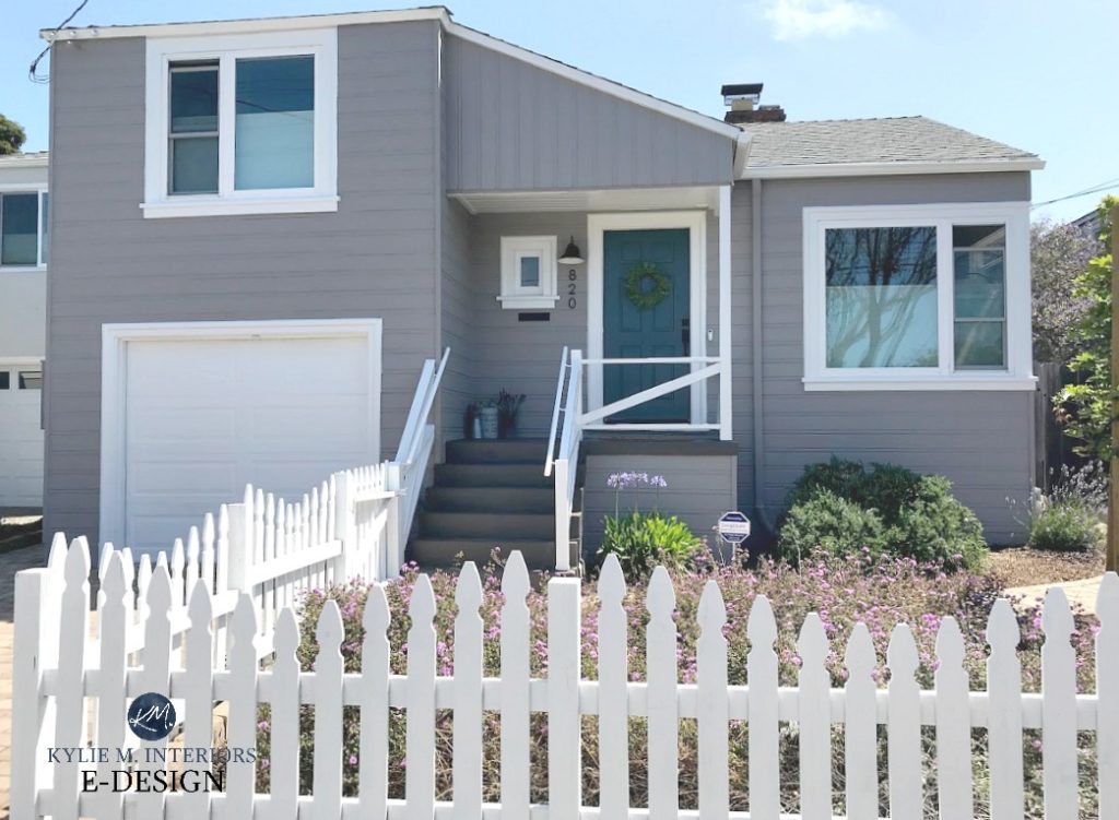
The Best Front Door Paint Colors (Even Your HOA Will Love)
Remember, every gray has undertones of blue, purple, or green (or a blend). And while in the darker end, there’s often more demand for grays with a blue-purple undertone, this doesn’t mean gray-purples don’t have a solid place.
Here’s your Peel & Stick sample of Polished Concrete
11. SHERWIN WILLIAMS DOVETAIL 7018
Like my ability to burp my friends’ full names, I bring Dovetail up with much joy.
Why?

Dovetail filled a previously unfilled spot. Benjamin Moore Chelsea Gray can go green, Metropolis (coming up next) is sometimes TOO warm, and well, as far as ‘reasonably neutral darker warm grays go’, Dovetail is the best.
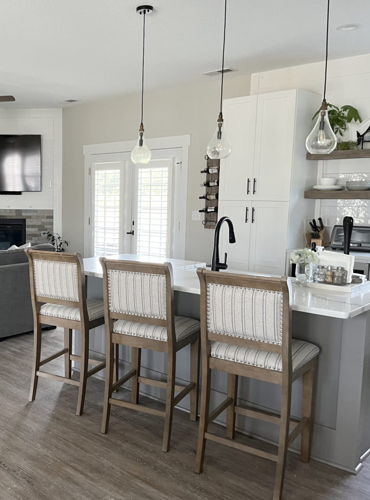
The Best Paint Colors for Kitchen Islands
However, while it certainly nods at the ‘gray-purple’ category and often does the job, I wouldn’t say it’s SUUUUUPER committed to purple. I can’t say that Dovetail is fully committed to anything, but it’s worth mentioning as I often recommend it alongside Metropolis.
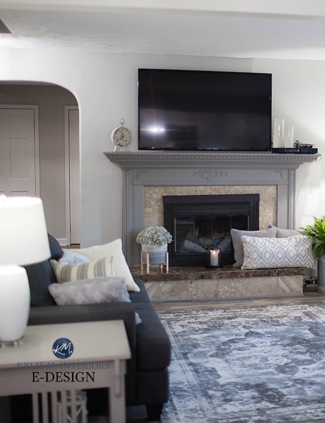
My next client did a great job updating this fireplace surround with Dovetail, updating the look of her beige tile surround and brown hearth…
How to Update Your Fireplace: 5 EASY & Affordable Ideas
Sherwin Williams Dovetail: Paint Color Review
Get your Peel & Stick sample of Dovetail
12. BENJAMIN MOORE METROPOLIS CC 546
Metropolis is one of my long-time faves. Its purple undertone suits a much wider range of countertops (compared to many other, popular dark grays), especially the granite counters from the early 2000s. And while it might not be as popular as Dovetail, it’s perfect if your space needs a bit more warmth and commitment to purple.
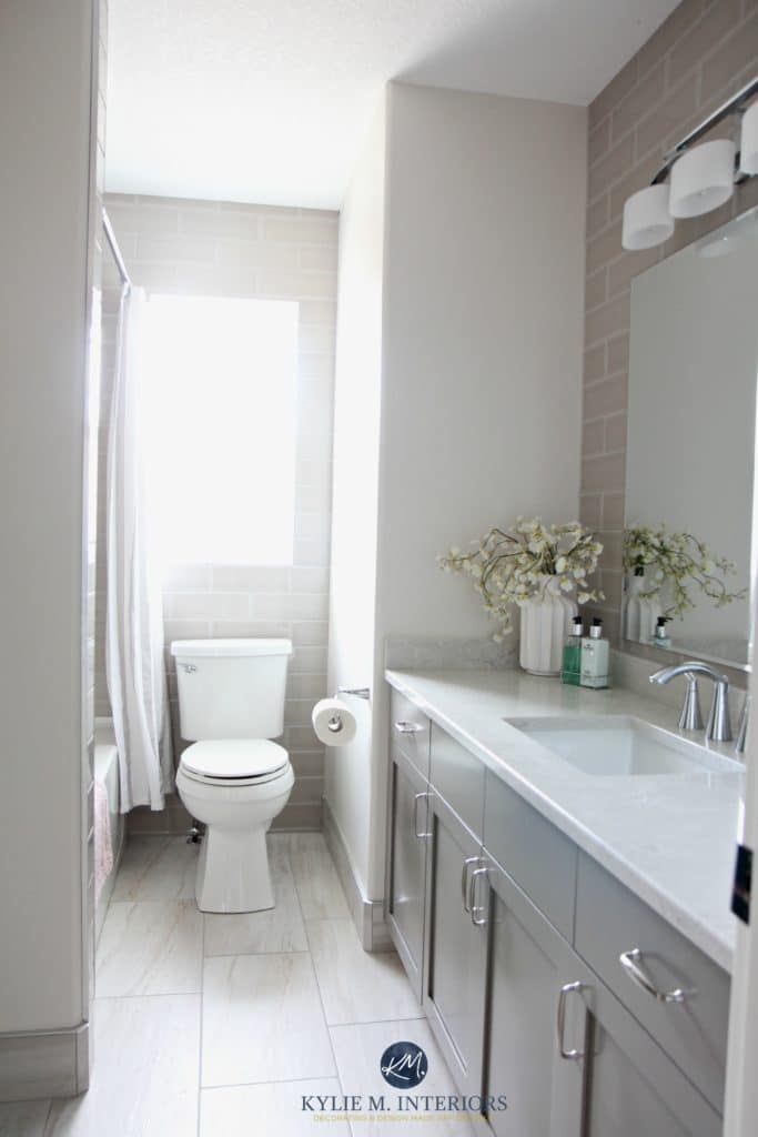
While this next bathroom doesn’t have older granite countertops, it still shows what a stunner Metropolis is…
With its moody plum-inspired hues, Metropolis is also great for exterior palettes…
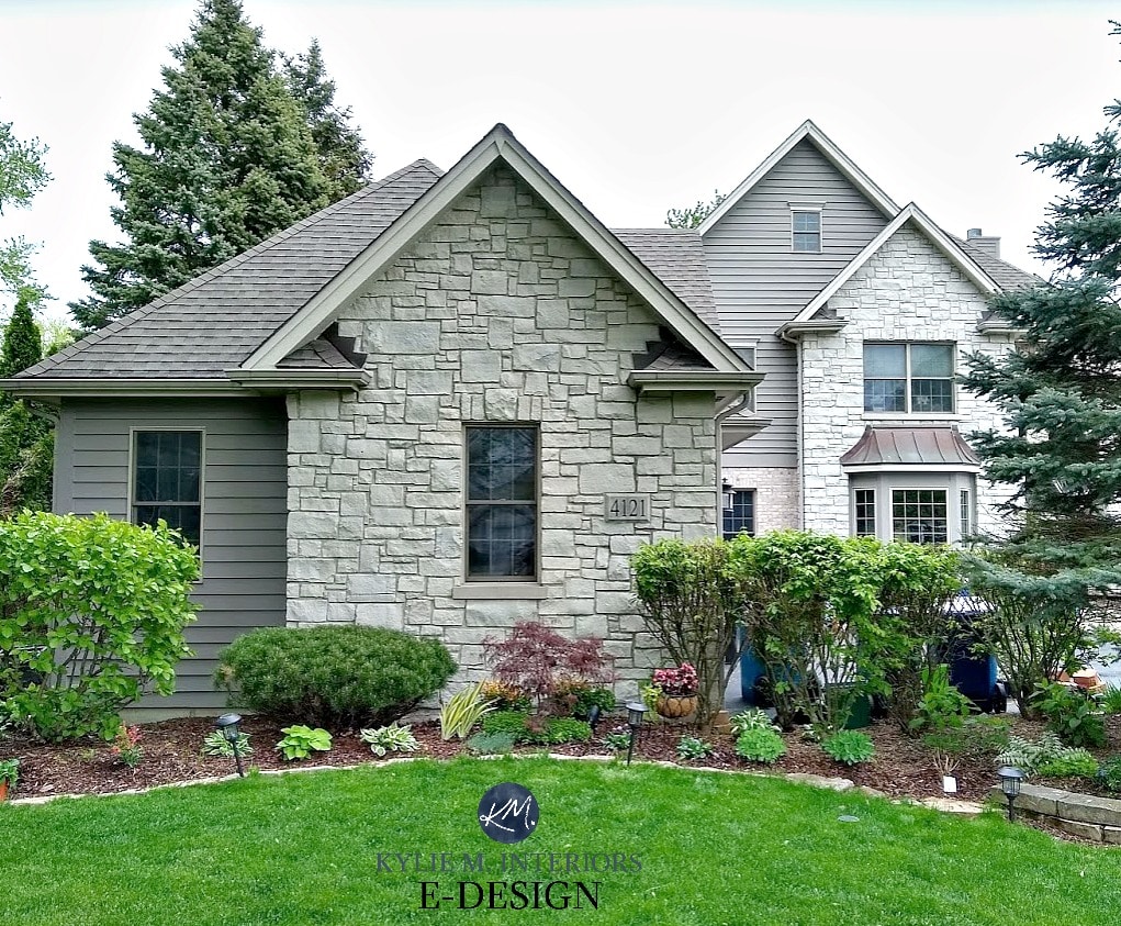
Here’s another shot in a bit more natural-looking light. It’s LOVIN’ on that beige brick and helping it look way more updated in partnership with the stonework…

Benjamin Moore Metropolis Paint Color Review
Get your Peel & Stick sample of Metropolis
13. SHERWIN WILLIAMS POLISHED CONCRETE 9167
If your home’s finishes call for a more noticeable purple undertone, Sherwin Williams Polished Concrete could hit the sweet spot.
This next photo is a close-up of the “before” and “after” shown earlier…
What Are The Best Paint Colors for Your Front Door?
Polished Concrete is a medium-depth warm gray with a purple undertone. Compared to Metropolis, Polished Concrete is lighter and flashes a little more color.
You’ll see an even more noticeable difference between Polished Concrete and Dovetail. In comparison, Polished Concrete shows how neutral Dovetail can look (along with a lower LRV).
Here’s your PEEL & STICK SAMPLE of Polished Concrete
14. BENJAMIN MOORE SILHOUETTE AF-655
While Silhouette hasn’t been talked about much in color circles, it’s making the rounds now, thanks to being the Color of the Year for 2026.

This beautiful blend of purple, brown, and gray works well on walls, cabinets, doors, and more.
Benjamin Moore Silhouette’s FULL Paint Color Review
And while there is a HECK of a lot more beautiful gray-purples out there, at some point, I have to stop talking/typing.
BUT…if you’re not sure about gray-purples, be sure to check out my favorite light to medium gray blues and gray-green paint colors out there, too!
POPULAR GRAY-PURPLE-RELATED QUESTIONS
WHY DOES MY GRAY PAINT COLOR LOOK PURPLE?
There is no TOTALLY neutral gray. And while some grays are more neutral than others, a soft purple or violet undertone is one of the most complementary colors to a wide range of interior finishes!
In fact, the grays that most people think are ‘totally neutral’ most often have a purple undertone (it’s sneaky that way).
WHAT’S THE MOST POPULAR GRAY WITH PURPLE UNDERTONES?
Benjamin Moore Balboa Mist and Classic Gray are two of the most popular gray-purples, although Classic Gray skews considerably warmer, winking seductively at taupe.

WHY DO SOME GRAYS LOOK PURPLE?
Every gray has undertones. Sure, there’s the odd fabric, tile, or paint color that seems more or less neutral, but more often than not, it actually has a purple undertone (blue and green aren’t as common as purple).
So, if you see purple undertone in your gray, that’s because it probably HAS a purple undertone.

While light bulbs with higher Kelvins can change how a color looks, no standard light bulbs cast a ‘purple light’. Cool daylight bulbs often seem cool and blue; warmer, lower Kelvin bulbs lean into yellow (and orange-red in the super low ranges). Cheap light bulbs with low CRIs can cast a green light.
How the Kelvins of Light Bulbs Affect Paint Colors
WHICH GRAY HAS THE LEAST PURPLE UNDERTONE?
If you’re looking for a gray with only a WEE wink of violet, Sherwin Williams Light French Gray could be a great option.
READ MORE
The 10 Best DARK Gray Paint Colors: Benjamin Moore
Paint Review of Benjamin Moore Cinnamon Slate – A Beautiful Shade of Purple!
Are Gray Paint Colors Still Trendy on Walls, Cabinets & Exteriors
6 Ideas to Update Your Home on a Budget
Get the best color advice and home update ideas…
Check out my Online Paint Color Consulting!

ORIGINALLY WRITTEN IN 2023, UPDATED IN 2025


Where have you been all my life? I’m surprised it took me so long to find your site, but am darned happy for it. A person who luxuriates in color, insists on calling undertones for what they are, and compares one color to similar colors across brands….! And, and, and. I get so frustrated with bloggers/designers/’grammers who stop at saying that this white or that grey is ‘beautiful’ or ‘perfect’ without saying WHY. I could go on. Long story (and it is) short: we are taking possession of a 100-year old house in upper NY state. Dark trim, ancient wiring/no artificial light except lamps, gray/overcast winter. Oof! In my own bright, California home I do color without a hitch, but this place will challenge me. Whether you know it or not, you are on my team!
WOW, what an awesome comment to get; thank YOU! And a 100-year-old home in upper NY? Lucky. The only 100-year-old homes where we live are in a tough area that isn’t always super safe – I loooooove old homes – just the smell of the old wood makes me happy :).
I’d ask you some questions, but I don’t get to my comment section NEARLY as much as I’d like to. Generally, I’m curious as to whether you’re keeping the dark trim/painting it and what the overall LOOK is that you’re going for. Off the top, from the sounds of it, grays with violet undertones probably aren’t warm/soft enough for your home. One colour I’ve fallen in love with lately is SW Egret White as it NODS at the gray world but has a gorgeous warmth and VERY few undertones (SW Alabaster often suits older homes too). Anyways, I could go on and on :). I’m glad you found me!
Why do you only show colors for interior painting?
I need exterior house color ideas!
Hi Caren, if you go to my search and type in EXTERIOR, you’ll find some blog posts! I do the best I can, as I do put out this info for free :).
this is the color way I have been looking for and didnt know how to figure it out, thank you so much. I have a master bath painted in sw light french gray, with marble looking tiles and counter, but i wanted to change it to a lighter more purple less blue tone. it works well but i dont want the blue look . I just picked up most of your reccommended colors in paint chips, now to find the best one. Thank you so much for this post.