
The 3 Best Chameleon-Like Gray Paint Colors
3 Flexible Grays – When You Can’t Choose an Undertone
If you’ve ever had to choose a gray paint color, you’ll know how mind-numbing it can be. Just when you think you’ve found the perfect gray, it flashes up some crazy undertone, and before you know it, you’re running to the wine fridge for reinforcements.
That’s why today, rather than focusing on grays with specific undertones (because you know you can’t get away from them), I’m sharing 3 of the most flexible gray paint colors! Can’t decide on an undertone? Perfect—NEITHER CAN THEY!
Now, if you’ve done your research, you’ll know all about grays 3 undertones – blue, green, and purple.
And while I always get Online Color Consulting clients asking for a ‘gray with no undertones‘ – sadly, it’s a no-go. Grays have undertones – capiche?
However, you don’t get off that easy.
1. Many of the most common, popular interior finishes NEED paint colors that commit to an undertone (mostly commonly purple). There’s a chance these colors won’t hit a spot that needs to be hit.
2. Because they aren’t committed to one undertone, they easily pick up the others, depending on the time of day, room’s exposure, etc. So, while you might not know what you’re getting, you might end up with something you dislike.
But, for those of you who are relatively easy-to-please and need a versatile shade of gray, these could be JUST what you’re looking for.
Remember, a flexible color can also be unpredictable.
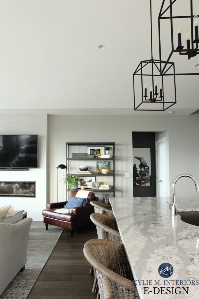
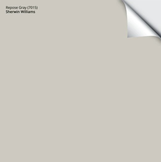
1. SHERWIN WILLIAMS REPOSE GRAY
Repose Gray is the most flexible, chameleon-like gray paint color in my experience (which is vast). I love it and curse it ALL in the same mouth full of wine sentence.
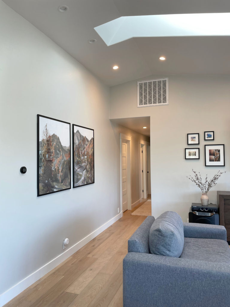
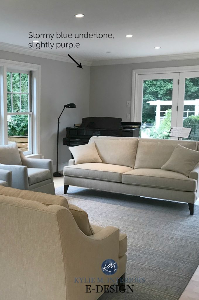
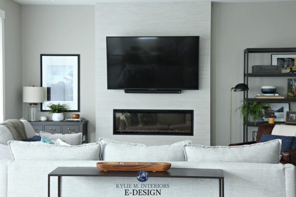
At its heart, Repose Gray is a warm shade of gray, so it’s a touch muddy compared to clean or cool grays. It can look warmer in rooms with southern or afternoon western sun but surprisingly cool in other lights. Look at the difference in these next two spaces…


With direct light, Repose Gray looks brighter and warmer, whereas it looks almost stony in the bedroom with a slight blue hue.
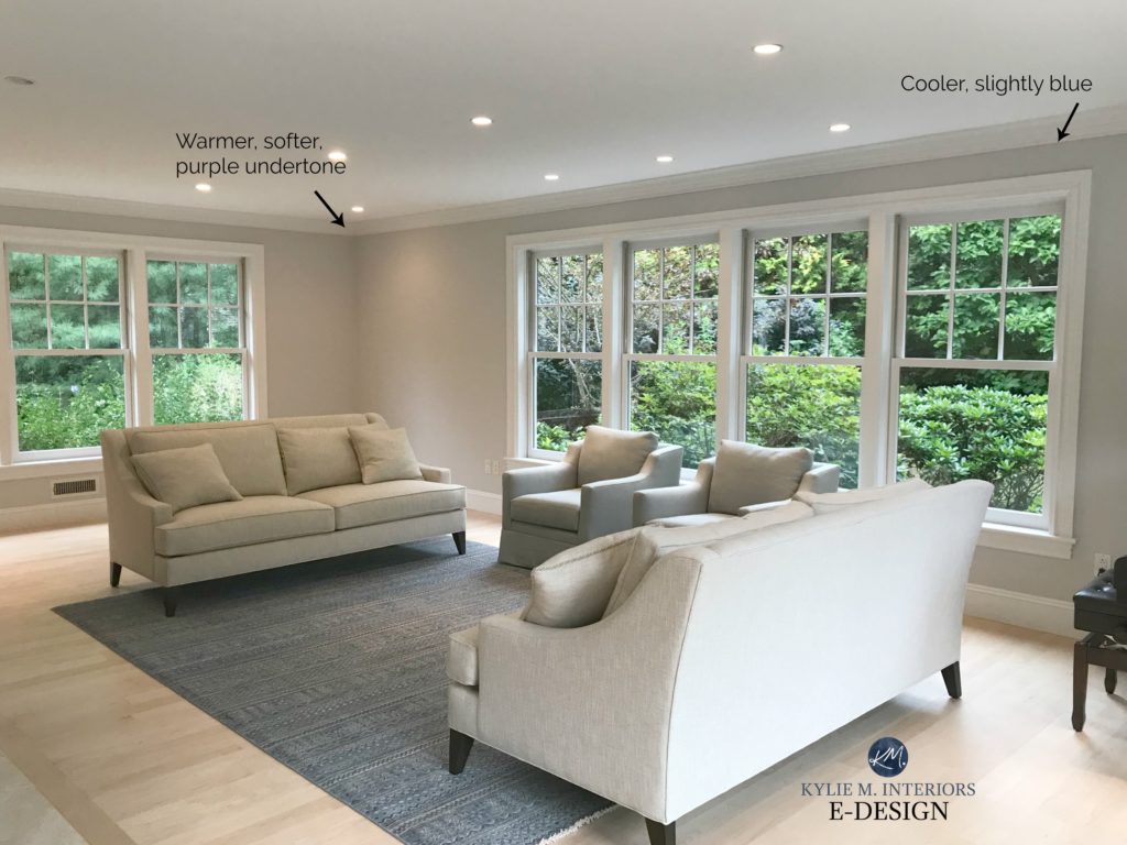
In this next living room, Repose Gray is really at its flexible best. It doesn’t pick up any obvious undertone and shifts every few feet…
The Best Paint Colors with Pink-Toned Woods
FUN FACTS ABOUT REPOSE GRAY
- Repose Gray has an LRV of 58
- When it does grab an undertone, it tends to favor a vague violet or green. Blue is less common.
- Repose Gray is the most popular of the three on this page
- If you were to lighten Repose by 25%, it would get closer to my magical LRV number for almost any room
- Need more warmth? Check out Sherwin Williams Agreeable Gray
Here’s your Peel & Stick sample of Repose Gray…
The Best Paint Colors to Update Red-Toned Woods & Red Oak
Paint Colour Review of Sherwin Williams Repose Gray
2. BENJAMIN MOORE SHORELINE 1471
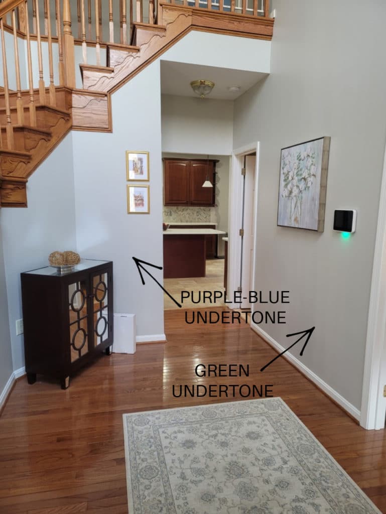
Not to be confused with Benjamin Moore Shore Line (same name but with a space) – which is most definitely NOT a flexible gray; it’s a fugly taupe; Shoreline is a light, barely warm gray that seems like it should lean into a vague green. However, more often than not, I see it grab either purple or even a wink of blue – let’s say that, like me on a Friday nite – it’s open to suggestions.

FUN FACTS ABOUT SHORELINE
- Shoreline has an LRV of almost 69
- Shoreline is the lightest and freshest of the options on this page
- It can easily grab ANY of the three cool undertones and is easily influenced by the exposure of the room, lighting, and furnishings
- As the color strip of Shoreline darkens, it goes considerably into the green undertones, but don’t let that fool you; Shoreline is more likely to flash blue-purple
- Don’t like purple? Check out BM Gray Owl
Here’s your Peel & Stick sample of Shoreline
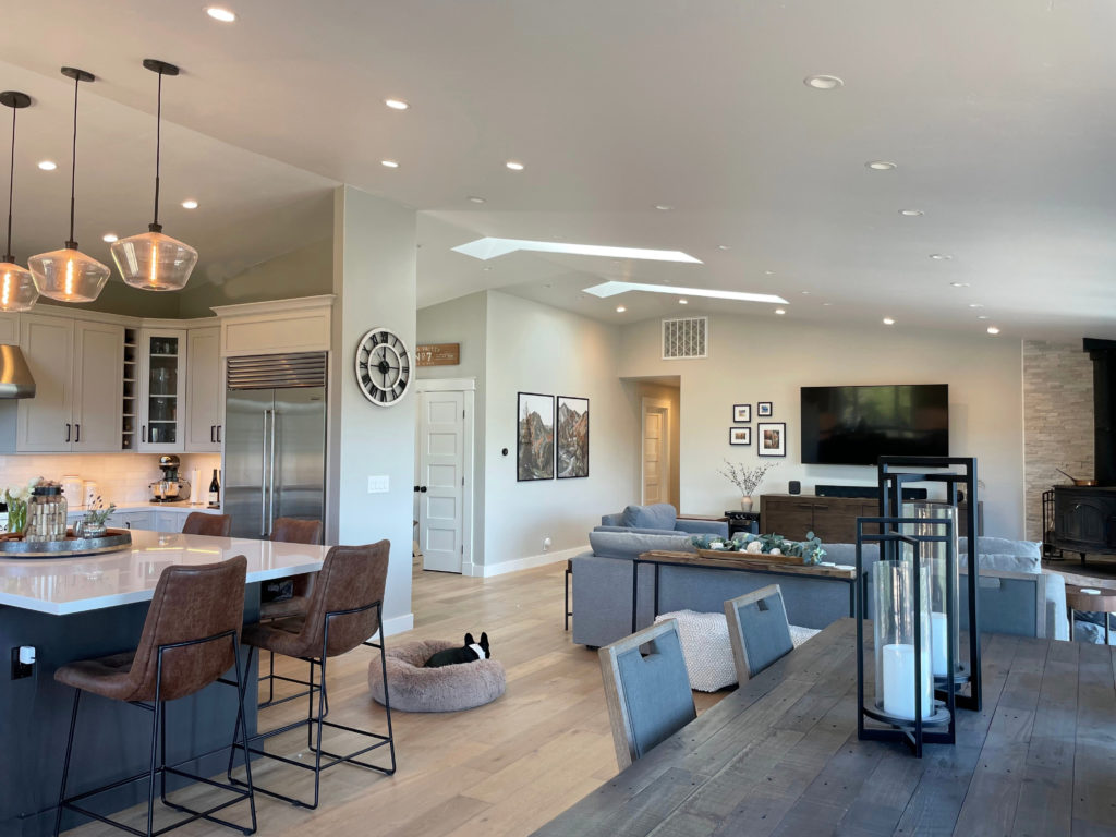
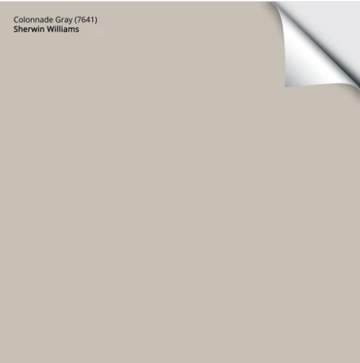
3. SHERWIN WILLIAMS COLONNADE GRAY SW 7641
Colonnade Gray is the warmest of the bunch. It’s a warm gray that’s TRYING to be greige, but it just doesn’t quite get there.
Colonnade also favors a vague green undertone. However, this can entirely disappear, replaced by a soft, vague blue and, more rarely, a cool purple—which can give it an overall ‘neutral gray’ appearance, especially in a north-facing room.
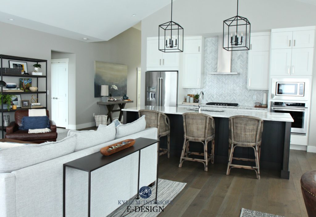
In the above photo, look at the Colonnade on the far left. It is soft, stormy, and muted and turning greenish down the hallway. Then look above the kitchen—fresh and clean!
- Colonnade Gray has an LRV of 53. Don’t know what LRV is? Read up, buttercup.
- Colonnade will FAVOR green, but don’t be surprised to see blue or purple.
- If you lighten Colonnade Gray by 25%, the green all but disappears
Paint Color Review Sherwin Williams Colonnade Gray
Here’s your Peel & Stick sample of Colonnade Gray…
So there you have it. Rather than choosing a green, blue, or purple undertone, why not have the potential to hit all three? Now, that isn’t to say that these colors will hit ALL 3 in every room/home; it’s more about their versatility to humor spaces that are maybe a bit trickier to choose from. They have a bit more flexibility, which Tim said he’d also like me to work on.
READ MORE
The Best Gray & Greige Paint Colors for Your ENTIRE HOME
The 10 Best Warm Neutrals for Your Entire Home
Sherwin Williams Agreeable Gray vs. Revere Pewter, Repose Gray, & More
Need help?
Check out my affordable and fun E-Design!

ORIGINALLY WRITTEN IN 2019, UPDATED IN 2024


I ran through a few greys in my home. Collingwood from BEN Moore looked great in my basement with dove grey carpet and LED lighting. I guess we lucked out. (Or in). But I love Wickham same brand for light grey in my craft workshop. I haven’t seen you comment on that. But I do love your insights.
Ooo yes, I love both of those! Wickham is so INTERESTING as it can flash that bit blue/green at times. And Collingwood, one of my faves and certainly more predictable than the 3 mentioned in this blog post!
These are 3 great grey color choices and it’s so helpful to see how light affects the undertone. Love your posts and your sense of humor! No one but you can explain color like this. Thanks.
Well thank you Nancy! I’m glad you enjoyed it 😉
What do you think about revere pewter ?
I have golden tone granite with gray marbling .
Right now it is compatible cream. I want to move towards gray instead of yellow. Thanks!
Hi Kylie,
Some advice for you::
Love you and your site and I have used your advice (purchased a package last year).
You may want to take a look at your wording “…get the colour consultant…that designers hire.” Being an English teacher, might I suggest that you change THAT to WHO?
“THAT” REFERS TO AN INANIMATE OBJECT; “WHO” REFERS TO A PERSON (YOU). JUST SAYIN….
Well bless your heart – a decorator I am, an English major I am not ;). I always try to catch myself with things like that and DAMN I have that all over my site – well, I’m going to change it moving forward. Thank you for taking the time to right too me! Just joking, I just put those in there for fun, I’m sure it made you twitch 😉
~Kylie
Kylie, from one smart ass to another, you kill me! You sure have a way with words. I enjoy reading your blog just for the hell of it. Keep it up girlfriend.
😉🤭
Great post! I recently painted about half our condo with SW’s On the Rocks, and have been pleasantly surprised with no annoying undertones. We’re planning to do 2 bedrooms (one with northern light, the other with northeast light) with SW’s Rock Candy color. The samples painted on the walls look great, but I am prepared for some blue undertones to come through.
Lovely shades of grey! Thanks for sharing Kylie. Carolina at Hamilton Billiards.
I completely agree! These are three of my favorite grays, as well. I used Colonnade gray in my own house, and love it!
Hi Kylie, I stumbled upon your site accidentally while searching Sherwin Williams grays. It has been so helpful! I was so pleased to hear your adamance that ALL grays have an undertone as I’ve always thought the same! I have a passion for design, but it’s only a hobby! As my husband and I have just moved into our forever home, I have so enjoyed selecting colors. I already know repose gray will be in our living room, but I struggled with choices for our den! Thanks to the help of your blog, I have selected colonnade gray with a grizzle gray accent….though I very well may change my mind again! Best of luck in your business and thank you for such helpful advice.
Any comments on SW Light French Grey? Where does it fit in?
A few months ago I “thought” I was getting SW Colonnade Grey, but ended up with BM Collingwood (I have done it before but with SW Chelsea Gray Vs BM Chelsea Gray). Collingwood is in the gray family, but in my hall it mostly looks a pretty tan. I can see the gray if the lights are off and the bathroom light is shining on it. I may have to take a second look at Colonnade Gray again though.
I am looking at all three of these paint colors for my dining room update. It’s small 12×15 furnished in mahogany with blonde colored floors. The room faces west with one window facing north. Any insights would be greatly appreciated.
Thank you!
Have you looked at something along the lines of BM Collingwood? I can be quite pretty with mahogany and blonde woods! I would be LESS inclined to use a colour that could go blue or green.