
The Best Paint NUMBERS for Your Home: 62-74 (LRV)
Game-Changing Advice for Picking YOUR Best Paint Color
Paint numbers, you say? Yes, paint numbers. And let me tell you, these magical little numbers will save your life, or at least the small thread of sanity you have left after trying to find the ever-elusive perfect paint colour.
Every paint color has an LRV number. This isn’t just a number based on science; it’s a number that tells YOU how light or dark a paint color is. These numbers run on a scale from 0 to 100.
0 is BLACK
100 is WHITE
In the USEABLE residential paint world, no colors have LRVs of 0 or 100 (our scale runs from 2 to 95). However, the 0-100 range provides a starting point for choosing a paint color.
As you may (or may not) know, depending on how much of my Kool-Aid you drink, LRV is a great way to choose a paint colour. But where do you find a color’s LRV? You can click on the previous link for some amazing info, or get the short and curly right here…
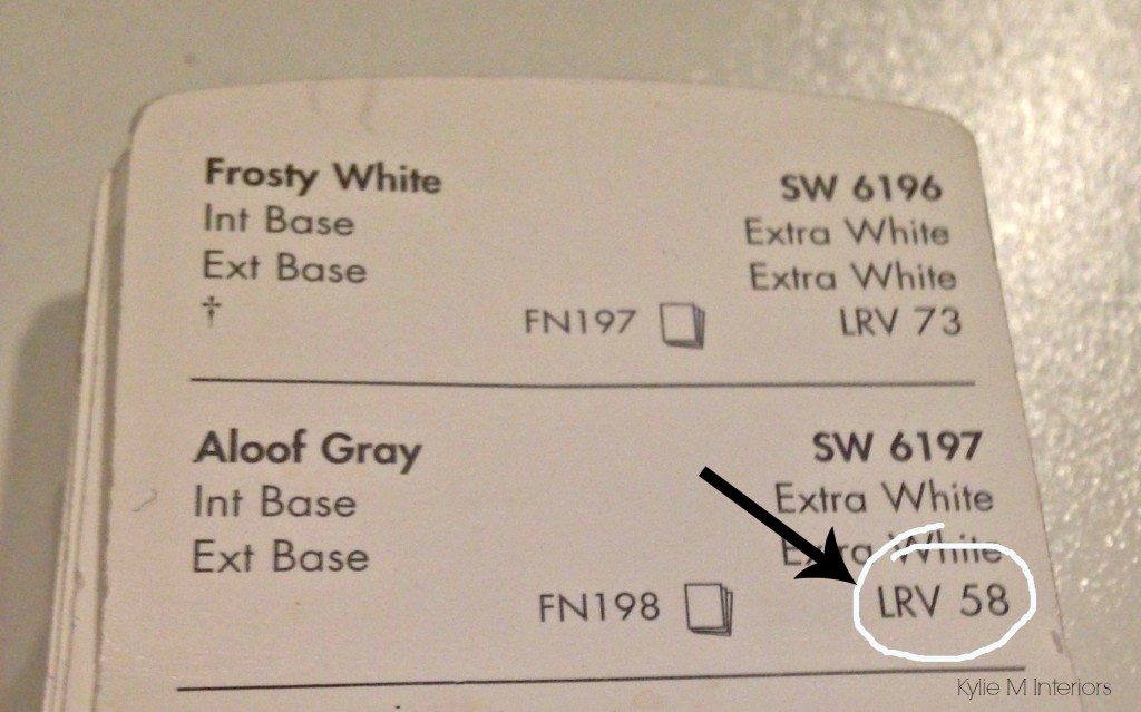
Sherwin Williams (below) shows the LRV on the back of each color in the fan deck, in the index, AND on each color’s website page.
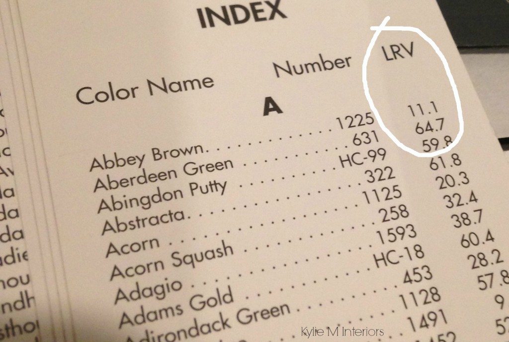
Benjamin Moore (below) shows each color’s LRV in the fan deck index OR on the color’s info page on their website.
So why 60-65?
Having done many thousands (for real) of Online & In-Home Color Consultations, I see the same things repeatedly. So, I took all the info crammed into my wee lil’ noggin’, thought about the how and the why, and came up with anhow and the why and came up with the LRV range of 60-70 based on some common averages…
- The average room size
- The average amount of natural light that comes into a room
- The personal tastes of the average homeowner as it relates to how light or dark they want a room to look
And, of course, some rooms fall outside these averages; I work with them EVERY day. The super dark rooms, the super bright rooms. The ones with tricky exposures and interior finishings in wild and wacky colors – I deal with these, too. But I’ve found some SERIOUS consistencies regarding the FINAL COLORS that my clients choose, and many of these colors fall in the LRV range of 62-74 (if you want to make your life simpler, settle for 60-75).
WHAT’S THE PERFECT LRV NUMBER?
It depends on who you talk to. I’m one of the top color experts (insert horn toot here), and 65, give or take a few points, often hits the spot, hence the 62-74 range. HOWEVER, the most popular LRV right now is closer to 70-75 (the off-whites).
Learn MORE about LRV here
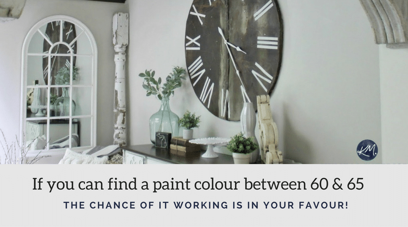
If you can find a color that you and your room agree on, between the LRV numbers 62 and 74, the chances of it being a good depth for your room (based on averages) are pretty darn good.
- Is your room a bit darker? Then bump that number up by 5 (or more).
- Is your room brighter, and you want more coziness? Then close the drapes, strap on some jam-jams, and snuggle up to your honey. Or go lower than 60 by a little or a LOT.
Now, let’s look at a few of these bad boys.
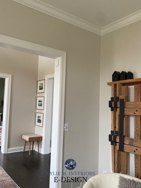
BENJAMIN MOORE GRAY OWL OC-52
With an LRV of 65, Gray Owl is a popular shade, for sure. And while gray isn’t trendy anymore, many of you don’t care and love it anyway – to which I say, GOOD ON YA!
FULL Colour Review of Benjamin Moore Gray Owl
SHERWIN WILLIAMS AGREEABLE GRAY 7029
Agreeable Gray has an LRV of 60. While it’s one of the few colors at the lower end of our magical range, it’s a great choice for the average home/room because of its temperature and undertone flexibility.
Agreeable Gray is a warm neutral that can pass as a gray or greige, depending on your room, exposure, and PERCEPTION. This makes it a great choice when you’re unsure which color suits your room and just need to start somewhere!
FULL Paint Colour Review of Sherwin Williams Agreeable Gray
BENJAMIN MOORE COLLINGWOOD OC-28
Collingwood is a popular warm gray with an LRV Of 62, which can be the sweet spot for some rooms. But ALL grays have undertones, so expect to see some purple popping up in this beautiful shade of gray! 
Read more: Paint Colour Review: Benjamin Moore Collingwood
With trends leaning warmer, grays aren’t as in demand. However, warm grays, like Collingwood, are likelier to last longer than the cool end.
BENJAMIN MOORE EDGECOMB GRAY HC-173
I love Edgecomb Gray, and so do my clients. With an LRV of ALMOST 64, it is a great choice for MANY rooms and exposures.
One reason for Edgecomb Gray’s popularity (other than its badass LRV), is that it has no real commitment to green or pink undertones, leaving you with a pretty darn easy-to-please warm neutral.
Paint Colour Review: Benjamin Moore Edgecomb Gray
SHERWIN WILLIAMS NATURAL TAN 7567
Natural Tan is a popular color for those who are tired of gray and ready to lean into the warmer, beige-tan world. With its LRV of 65, it’s in the middle of our ideal LRV range and offers a well-balanced warmth and depth.
As for undertones, beige and tan differ from each other. So, being a tan paint color, Natural Tan has a very (very) vague green undertone, although some people see a wink of pink (which I’m yet to see).
FULL Paint Color Review of Natural Tan
SAMPLIZE offers peel-and-stick paint samples that are more AFFORDABLE, EASIER, and more ENVIRONMENTALLY FRIENDLY than traditional paint pots.
- Samples arrive ON YOUR DOORSTEP in 1 BUSINESS DAY!
- they’re more affordable than the sample pots/rollers/foam boards that are needed for traditional paint sampling
Visit the SAMPLIZE website HERE
The above suggestions are colors that come up repeatedly with my Online Paint Color Consulting clients. Does this mean they’ll be right for you? Not necessarily. There are many things to consider when it comes to choosing the COLOUR for your room, such as…
YOUR ROOM’S EXPOSURE & HOW IT AFFECTS COLORS
Whether you have north, south, east, west, or a MIX of those exposures – each room has its particular colour needs (which can be unrelated to the LRV number). And yes, I’ve written blog posts on EACH of those compass directions if you click the above links.
Kylie M & V1 Real Estate Photography
THE SIZE OF YOUR ROOM (size matters…amen)
The size of your room can be GREATLY affected by the LRV of the paint colour. I mean not literally, but visually. For example, if you have a room painted a light color, and you paint the end wall a darker shade, that end wall will look CLOSER and make the room look smaller.
The 13 Best Dark Navy Blue Paint Colors
On the other hand, small rooms often benefit from paint colors with higher LRVs as they reflect more light. However, I’ve made some small rooms look PRETTY DARN AMAZING with wicked dark hues.
3 Ideas to Add Personality to a Small Bathroom
INTERIOR FINISHES (HARD & SOFT)
Do you have wood cabinets or flooring? Or maybe you have a challenging carpet, couch, or countertop colour. Whatever it is, your paint colour must work WITH it, not against it. Often, we get caught up in the colors WE love and forget to honor our home’s finishes. While you want to keep your personal tastes in mind, listen to your home FIRST and work out from there.
PERSONAL TASTES
Which always amaze and excite me.
So, as you can see, picking the right COLOUR can be challenging; however, looking at colors that are between 60-70 is a GREAT place to start your color search. And if that doesn’t work? You know how to call…and it ain’t the Ghostbusters.
Find out your 3 BEST PAINT COLORS
Kylie M E-Designs and Online Colour Consulting
Chat soon,

READ MORE
The Best Off-White Neutral Paint Colors
The Best WHOLE HOME Warm Neutral Paint Colors
The 12 Best Whole Home Paint Colours
The Best Gray and Greige Paint Colours – Sherwin Williams
Written in 2017, updated in 2023


I’m painting the exterior of my home with Accessible Beige with Swiss Coffee trim. I love it, so far. It looks so different as the day goes on.
Hooray, I’d LOVE to see how it looks all done!
That sounds really nice….too bad I went with AB on the inside of the house! Agree, I love it as the day / light changes – good choice. Great article as always, Kylie!
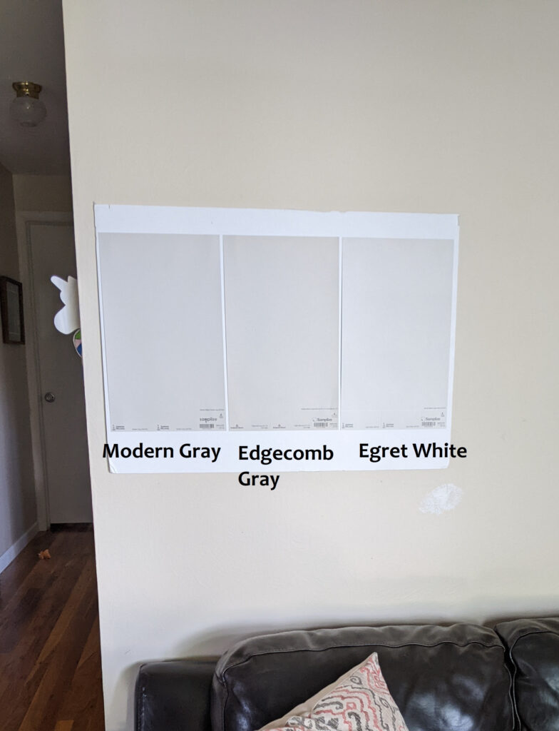
I love this, I have been trying to decide between gossamer veil sw, and modern gray sw, does modern gray pull a purple to you? Or does gossamer veil pull to green? It will be in mostly south facing rooms, with an open floor plan
Hi Jill! I’m still doing some research on Gossamer, but I would say it COULD pull a touch (wee touch) green, whereas Modern Gray can pull a touch…dare I say…pinky/purple? It’s very passive, but you might see it compared to more traditional grays and warm grays 🙂
Thank you! Paint colors are so fun, but can be so tricky!
Jill
I love Gossamer Veil! I painted my entire house with it. Looks grayish in light and more taupey in shadows. It’s beautiful! I think it’s around a 57 LRV. It does pull a teeny bit pink but not enough to be noticeable. It goes with everything. Love it!
Ooo, interesting at that it would pull pink, as more often, it pulls green! Good to know ;).
Gossamer Veil is similar on my paint color sample board to Agreeable Gray, although Gossimer Veil has less blue and more light gray/green tint to it., where AG is Blue. I see some pink in the Modern Gray.
Exactly right, Kylie. Gossamer Veil can be taupe also taupe green and sometime’s taupe-blue. Modern Gray does seem more pink on my color sample. Love my GV!
I am in process of having my open floor plan home painted. I have been thinking about a Grey or Greige tone. I have light birch hardwood floors, white trim and white kitchen cabinets. My problem being my countertops are a dark blue quarts and my fireplace tiles are dark blue. My home is very bright a south facing exposure. I use lots of blue and turquoise accents, it seems that all the greys have a green or purple undertone, which I don’t like. Thanks for any advice you could give me.
Hi Melody! When it comes to personal paint questions I do refer to my e-design, this way I can look at your flooring/countertops/etc…and come up with some ideas that work, otherwise I’m just guessing! And yes, you’ll find that grays have either blue, green or purple undertones. You might have to look at the greige range to cut that back a bit, but still it’s a risk! https://www.kylieminteriors.ca/product-category/interior-paint-palettes/
~Kylie
I am remodeling a home with natural maple casing and trim, and cabinets, and floors…….(yes- a lot-too much) maple ) burn I have to work with it for now. I painted the kitchen island iron mountain by BM, along with some built-ins nearby. I chose collingwood by BM for the majority of the main floor and to my horror-it started to look blue. I made the painters stop painting until I figure out what to do. I am guessing that the maple is making the collingwood paint look different than. And-my painter wanted to use SW paint so it was a color match but it seems to not be the match that is causing the problem but rather the maple. I now have 16 gallons of collingwood that I have to figure out what to do with (can I tint it-and if so, what direction do I go?) The iron mountain color is staying so I have to figure out how to proceed-I was thinking edgecomb gray to try to stay in the gray tones and work with the iron mountain but now that I have all this Sherwin William paint I feel compelled to have to try to find an SW paint that will work . According to your blogs that I have been reading I might be able to pull of worldly gray or modern gray but i don’t understand their undertone and fear another disaster! Any advice on tones with natural maple?
Hmmmm, sounds to me like you might have low lighting, northern exposure, or a combo of those! And 16 gallons of paint – holy moly. First, I would get a paint chip of Collingwood from BM and make sure that it’s a good colour match. Next, I would take the paint to SW and talk to them about shifting it to cut a bit of the gray out. They’ll know which colourant to add – you have nothing to lose by trying! Edgecomb Gray is a beautiful greige, that should be a bit more ‘greige’ acting than Collingwood, but not guarantees, as long as there’s gray in there it might be reacting with your exposure/interior finishings. Without seeing your home, that’s the best I can think of!
~Kylie
What LRV would you suggest if you don’t want a really dark color but are trying to minimize reflection amplifying any light leaking through drawn curtains? (For someone working nights and sleeping during the day) Something in the 50’s? The room is SE exposure if that makes a difference.
You’re right, I would try to land myself somewhere between 40-55, depending on how bright the room is. If it’s SUPER bright light coming in, that will really lift things up (particularly in the middle of the day) and you may want to stay slightly under 50. SW Anew Gray is a nice one at 47, but again, will lighten up a LOT if your room gets a lot of that southern light…
HOpe that helps!
~Kylie
Thank you, that is very helpful and narrows the choices down a lot. I had been mostly looking at Ben Moore colors but I will check out Anew Gray 🙂
Kylie, I just found you on Pintrest! This is an amazing concept!!!
I think I need to purchase the one paint room package. I want to repaint my dining room, however, I also would like help with how to accessorize? Which package should I order?
Hi Helen! I’m so glad you found me 🙂 And it sounds like the 1 room package would be perfect! Now at this time I’m not doing ‘decorating’ but it’s something I’m looking to add in the (somewhat) near future as there seems to be a demand for it!
Looking forward to your dining room! When you fill out the questionnaire, let me know it’s you, from the comment gallery! https://www.kylieminteriors.ca/product-category/interior-paint-palettes/
~Kylie
So many of your photos all show the colors on walls, along with white trim. Should we adjust our LRV if we are working with wooden (maple) trim in a west or north facing room? Does it make that much difference? Thank you!
Oooo Tammy, you are paying attention! So yes, i WISH WISH I had more photos of homes with dark trim. Unfortunately, I haven’t had many clients send me photos that will work for my blog!
So, it’s not that the LRV of the paint colour will change, but the way you SEE the colour might change. Compared to ‘white’ ANY colour looks darker. However, compared to wood trim, a colour can look lighter than it WOULD with white trim. Does that make sense? It’s the comparison and contrast that can shift things. You know what, this would make a good blog post. I’m going to scrounge my files for some dark wood trim photos…so long story short, funny enough I just MIGHT adjust the LRV if I felt like the colour might be a shift too dark…
~Kylie
I am working on our bedroom which faces north……..looking for a paint color which is neutral but coordinates with a country blue quilt accented by a mustard antique quilt. We are replacing wood work with a white shade. I have tried multiple white shades but so far am leaning towards benjamin moore muslin…..any thoughts?
Hi Sheri! When it comes to personal questions, I do try to refer to my E-design, this way I can take a look at photos and spend some quality time with your room, otherwise I’m just guessing on its other features!
If you’re interested, they are affordable and fun! https://www.kylieminteriors.ca/online-decorating-design-services/
~Kylie
I think I understand the importance of the LVR, but what about when you actually paint a color. All of your examples seem to be mostly gray colors – which is also frustrating with many of your other posts. Not your fault, I know, since those are popular, but there are the unfortunate few with orange color trim & sun coming in only on one side of the living/dining/kitchen area (east). And let’s not forget that dark walnut furniture because that darn corner piece of the sofa sectional wouldn’t fit in the basement ruining all my living room plans!. Does the 62 hold true with blue, green or or other colors. I don’t want the trim to pop too much. The colors I’m looking at are only at 50, but now I’m afraid they won’t work.
Still love your posts even though I don’t have white trim & can’t go gray 🙂
Hi Tracy! You’re right, it’s the neutrals that are getting all of the attention these days as that seems to be what people are asking for! And colours can be trickier, but LRV still applies. It all depends on how much colour you actually WANT rather than how much depth there is. With orange toned trim, your main concern WILL be how much colour there is as the less gray there is mixed in with the blue/green, the more ‘colourful’ the walls will look. These cool colours WILL accent/glorify the orange toned trim, more so than the LRV of the colours. So LONG story short 😉 I still like the 62 number for ‘colours’ and from there it’s really deciding on how much neutral I want mixed in to the colours to tone them down…
I hope that helps!
Thank you! Yes, it does help. I’m not sure if i’m leaning more toward green or blue, or maybe I’ll just brave it & attempt a “popular” color, but this gives me a good place to start. I’m thinking more neutral, less colorful. Just working toward that perfect look of glorifying that trim, without blending it in or bringing out the orange too much! What did people do when oak trim was the norm? It’s so tricky! Thanks so much for your advice!
Kylie,
Your blog is outstanding!
I wanted to share my experience with LRV so it might help someone else. I have been using this little number to help me choose colors for quite a while now.
Three years ago we painted our kitchen SW Silverplate 7649, LRV 53. Using a large foam-board painted with Silverplate, I thought, hmm, I like it but that LVR is too dark and not reflecting enough light at night. Even though we have plenty light in our kitchen during the day, 2 large windows and a sliding door, it wasn’t reflecting enough light at night! So we had it lightened by 25% and it looks great both day and night.
My guess is that the lightened version of Silverplate is now about 57 LRV. It is subtle but it does make a difference.
Now, I am looking for a gray to paint a condo living room. I found SW Big Chill 7648 with LRV 62, score! (Your blog confirmed what I thought would work, thank you!) I compared it to my kitchen lightened Silverplate which is still slightly darker than Big Chill. But both seem to be in the same color family of cool grays’.
Considering the small size of the condo and the fact that windows are only on one SW facing side, I feel confidant that Big Chill will work. I don’t think this condo will get a lot of light since there is a huge tree that is blocking a lot of the light to the only 3 windows/sliders of this condo.
The white for the crown moulding, doors and baseboards that I have chosen is SW 7757 High Reflective White. It looks clean to me and it has a LRV of 93, HOLY CATS! I have used BM Super White in the past, LRV 89, but High Reflective White has that beat being so bright and crisp, just what a PHX condo needs, cool and crisp!
I was looking at your blog to see if you have done a post on ceiling colors? I couldn’t find anything. But I wanted to ask if you have tried adding a little blue paint to white for the ceiling? I am seriously considering doing this. Again, trying to keep everything cool and crisp when it is hotter than H E double toothpicks in PHX!
I got a sample of SW 6806 Rhythmic Blue and some base white. I used 3 parts white to one part blue. Painted a poster board with it and it looks great; a very subtle blue/violet tint. Do you have an opinion about this, good/bad or is it just a trend? I have never done a ceiling in a color other than white so I am little nervous about it.
Thank you for providing such wonderful information, it is greatly appreciated.
Oooo Shelley, what a great comment, thank you! Isn’t it cool when it all starts making sense? And I do have 2 blog posts on whites – one for BM and one for SW. And they cover some of the whites you’re looking at, and I wonder if you might even like SW EXtra White as it has that subtle cool flash, as does BM Chantilly Lace!
Here’s the links to those 2 posts as well…
Sherwin Williams: https://www.google.com/url?q=https://www.kylieminteriors.ca/the-4-best-white-paint-colours-sherwin-williams/&sa=U&ved=0ahUKEwjci8Dw6rzaAhUKFnwKHTE5CloQFggFMAA&client=internal-uds-cse&cx=partner-pub-5050475103619299:2713416047&usg=AOvVaw12TLYB4RkU-JMtuO6ANA4V
Benjamin Moore: https://www.kylieminteriors.ca/the-8-best-benjamin-moore-white-paint-colours-undertones-and-more/
Chat soon!
~Kylie
Hi Kylie,
It seems we are picking the same paint colors!
Yes, I have Chantilly Lace though out my home (not condo), living room walls, kitchen cabinets, doors and trim. I like it.
Extra White seemed a little gray but I am sure it would read “white” once on trim. But I am still loving that SW High Reflective White with Rhythmic Blue and Big Chill.
You are absolutely awesome Kylie. I truly enjoy your site, your recommendations, knowledge of course and refreshing attitude. As a realtor in Toronto who truly believes in painting and staging prior to selling, you have really helped me. Today there was halt/stop at one of my clients home as the owner felt the colour would be too dark (first stroke of paint against a white backdrop can be intimidating) howner I asked for their patience and faith. And now I see that Collingwood is 62 LRV and that was a super nice surprise. Had never heard of LRV and this was an awesome blog, and I learn so much from you. THANK YOU!
Wahoo Juliana, that is JUST the type of commment I love to get! In the next few months I’ll be putting out an e-book on the ‘5 Key Rooms/Home Staging’ that you and your clients might find helpful! Did you find my Home Staging section on my blog? It’s under ‘Tips and Ideas’ 🙂
~Kylie
Hi Kylie,
I am thinking of purchasing one of your e-design packages but am uncertain which one to pick. I have a living room/dining room adjacent to a large opening to the kitchen. I am thinking of grays but the kitchen has light brown/off-white tumbled marble in a subway tile pattern. So my quandary is also how to pick grays that work well together or to pick one for both rooms. Thanks for your help.
Hi Danae, I would love to help! It sounds like you might need the ‘Open Layout’ package as well as a ‘Single Room’. If I start your design and think that all of the rooms should be the same, then I can refund you that single room…I hope that helps! https://www.kylieminteriors.ca/product-category/interior-paint-palettes/
~Kylie
hi Kylie…trying to decide between BM Edgecomb gray and SW Gossamer Veil. for a west facing TV room with 1 window Any advice? Thankyou
Hi Angela, I can’t REALLY say without seeing your room, furnishings, flooring, etc… off the top of my head if i had to BANK on one, I’d go for Edgecomb for its versatility…
Hi Kylie, your website is amazing. You explain things that I could “feel” for years, but didn’t know the science behind and how to use it in decision making. I have a question about LRV after reading many of your posts. I’d love to use Wythe Blue in my northern exposure room with large windows, but at an LRV of 48, it just looks so saturated on the wall. You reference lightening colors to brighten them up, so my question is this: if I were to lighten Wythe Blue by 25%, would the store generate an updated LRV on the label? Or would I need to guess by the feel of the sample on the wall? Thank you so very much!
Hi Joslann! I’m glad you’re finding it helpful! When you go to the paint store and ask them to mix your Wythe Blue 25% lighter, the sticker on top of the can should show the adjusted recipe, not the original, so you can have it handy if you need more down the road!
Kylie,
What are your thoughts on reversing the traditional white trim and greige walls with greige trim and white walls? I was considering Ashwood by Benjamin Moore (Kevin 67) for the trim but it looks a tinge green. What would you say about agreeable gray for the trim? Should my lrv be lighter than 60 for the trim if I want to use it like a white down the road?
Hi just a few questions. I’m getting ready to paint the interior of my home. I have choose three colors which are sea salt for my walls and my trim flour white. Cream and sugar for my hallways. My qustion is
I’m thinking Sea Salt will maybe too light where as you can’t really see the color. My furniture in my living room is more of a chocolate or dark brown and my den is more of tan brown any suggestions woukd really appreciate the feed back.
I am hoping for some help with choosing paint color for a condo that I am building in east boca. I will not be able to see the paint on the walls until I move in. I would like a pale gray with little undertones. I will have some rooms lighter and some darker. I am restricted to Sherwin Williams paint. I am considering
SW 9545 ghosted and also SW 9549 touch of grey. I have also considered SW 7661 but think it has too much blue undertone.
I am not sure if Ghosted has too much beige undertone and worried that touch of grey will be too overpowering for whole condo. The condo is approx. 5500 square feet with a lot of natural light in bedrooms and living room. Dining room and kitchen and office will get little natural light.
Any advice is appreciated
Thank you,
Jill
Hi. I’ve Learned a lot about LRV’s from you!
Question…I’m painting my bedroom with my 2 windows facing NNW . (says my compass.)
Shall I consider choosing my colors and LRVs for a “north facing room” or a “west facing room”. Tricky.
No SW or BM paint store helpers around here have a clue about picking colors for the way your room faces. Duh! Thanks
Oooo, that’s a tough one. I would base it on northern light, but know that you’re going to get a little influx of WARMTH in the afternoon to help things along 🙂
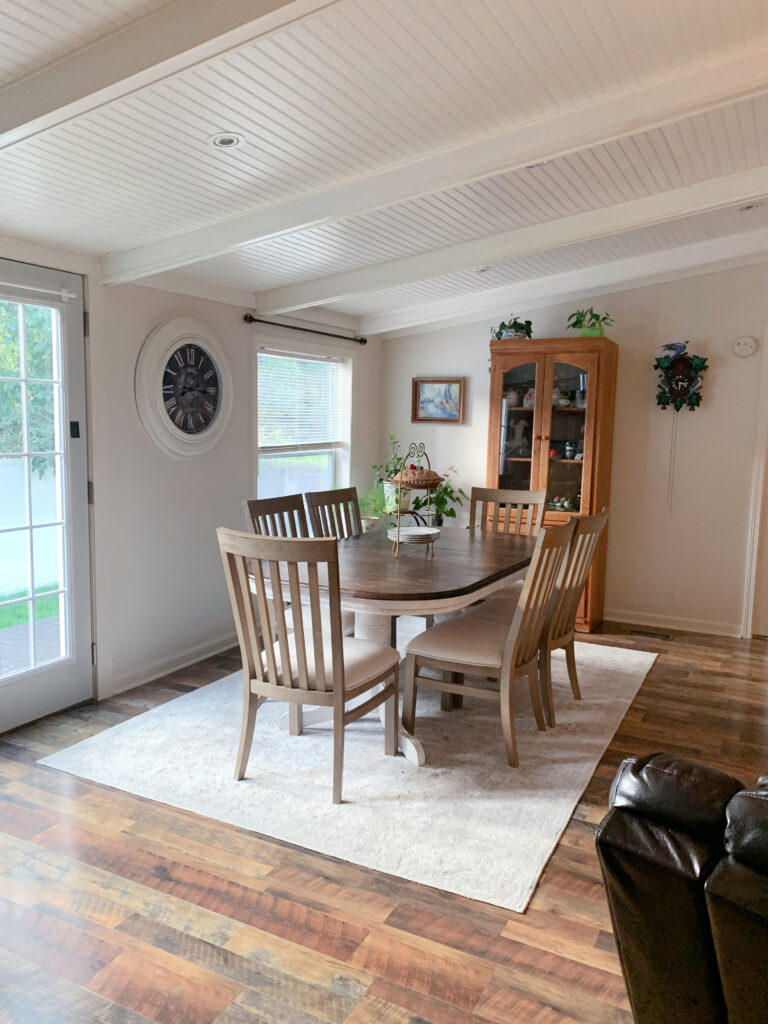
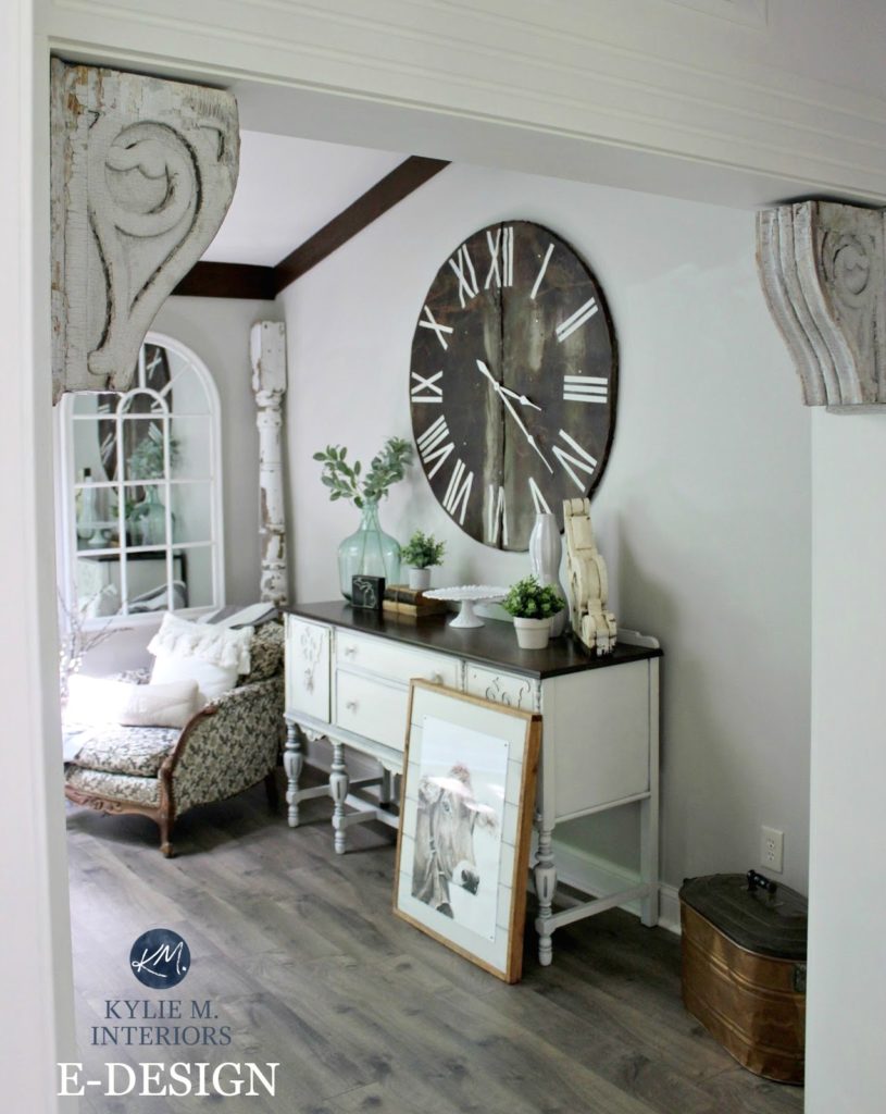
What is the wall color in the dining room image closer to the top of the article (wainscot ceiling and black wall clock)? Thanks!
Ahhh, that’s the lovely SW White Duck!