
North, East, South, West: Paint Colors for Your Room’s Exposure
Choosing the best paint colors for your natural lighting
Unless your room has no windows or you’re a vampire, you’ve likely had to consider natural light and exposure when choosing paint colors. And maybe you didn’t even know it was exposure that was messin’ with yo’ mind as your gray went purple and your beige went green, but let me tell you, exposure is a force to be reckoned with! (I ‘reckon‘ most things with wine, it helps).
This blog post gives you a simple, meat-and-potatoes summary. If you’d like to dig a little deeper, I’ve included some great links to the other, more in-depth articles.
Just remember, the BEST paint color for your room is the one that suits its interior finishes. In most cases, exposure should be your SECOND consideration, not your first.
NORTH-FACING ROOMS & PAINT COLORS
North-facing rooms offer a cool gray light that can be a bit flat if you don’t have a ton of it. While northern exposure is consistent, it can be chilly.

Sherwin Williams First Star Paint Color Review
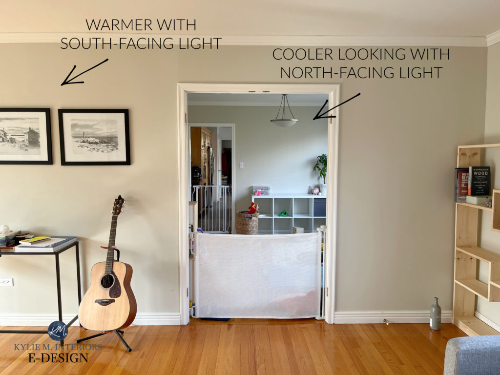
Anyone who says exposure doesn’t matter should spend some time with this photo—it’s the same color, but with different exposures (there are no interior lights on, either).
SUMMARY OF ROOMS WITH NORTH-FACING EXPOSURES
- It can be slightly easier to pick paint colors for north-facing rooms as the light is more consistent throughout the day.
- North-facing rooms can still be BRIGHT if there are enough windows, but bright doesn’t mean WARM. These rooms will also have fewer shadows compared to south/east/west.
- If you paint a north-facing room a cool gray, blue, green, or purple, you risk the room feeling DOUBLY as chilly. Painting a north-facing room a warm neutral or warm color can help balance the cool light coming in.
- If you still want a gray, north-facing room, consider a warm gray paint color.
- It might be tempting to paint a north-facing room white, especially a warm one, but some whites won’t react as well in a northern space.
Paint Color Review of Sherwin Williams Accessible Beige
Remember, this blog post is a summary. For more in-depth color details, click on the links provided!
EAST-FACING ROOMS & PAINT COLORS
East-facing rooms have a soft, bright light in the morning that is sliiiiightly warm, but NOTHING like afternoon western light.
Sherwin Williams Pure White
Benjamin Moore Collingwood
SUMMARY OF ROOMS WITH EAST-FACING EXPOSURES
- As the day progresses, eastern light gets whiter and brighter until noon. Paint colors can be washed out at the height of the day.
- In the afternoon, east-facing rooms become more gray and subdued, acting slightly like north-facing rooms.
- When choosing paint colors for your room’s exposure, east-facing rooms often benefit from slightly warmer colours. However, some colors like greige may appear a bit flat in the afternoon.
The Best Paint Colours for an East-Facing Room
SOUTH-FACING ROOMS & PAINT COLORS
South-facing rooms have a warm, yellow-toned light that becomes warmer and hotter as the evening approaches.
The Best Blue-Green Paint Colors
QUICK SUMMARY OF ROOMS WITH SOUTH-FACING EXPOSURES
- South-facing rooms can make paint colors appear washed out during the middle of the day and create more shadows.
- Painting a south-facing room with a warm color will increase the space’s visual warmth. Painting a south-facing room a gray or cool colour can help balance out the warm sunshine coming in the windows.
The Best Paint Colors for a South-Facing Room
WEST-FACING ROOMS & PAINT COLORS
West-facing rooms tend to be a bit flat and gray in the morning hours, but once noon hits, things start to lighten and brighten, and you may hear the faint sound of Kylie poppin’ a wine cork (hey, it’s 5 o’clock SOMEwhere).
The Best Blue-Green Blend Paint Colors
SUMMARY OF ROOMS WITH WEST-FACING EXPOSURES
- As the afternoon progresses, the light coming in appears warmer and warmer as the sun gets closer to setting, becoming CONSIDERABLY warmer in mid/late afternoon.
- When choosing paint colors for your room’s exposure, West-facing rooms can handle both slightly warm and cool colors, keeping in mind that in the afternoon, SUPER warm colors will only increase in intensity.

The Best Paint Colours for a West-Facing Room
ROOMS WITH TWO OR THREE EXPOSURES
If you have a room with two or three different exposures, it’s not a bad thing! When you have only one exposure, you’re 100% reliant on that particular light throughout the day. In contrast, multiple exposures can balance the more extreme ends (i.e., extreme north/south).
Ideas to Update Your 2000s Home
In rooms with multiple exposures, things get tricky to explain as it can depend a lot on which windows are larger and if there’s any shrubbery/grass/patio overhang or any other exterior influences that could block the light, so generally speaking:
- If you have TWO or more exposures and ONE of those is either north or south (meaning the others are east or west), you’ll likely want to focus on the north/south as they tend to be the more dominant lights.
- If you have an east-west, that’s tough. If they’re evenly balanced, I’d cater more to what suits the room during the flatter times of day (east afternoon/west morning). If one exposure is more dominant due to larger windows/no trees hiding the window, hit that one.
- If you have north/south, this is the best mix, as you can compare the best paint colors for north-facing rooms and the best paint colors for south-facing rooms to see which ones best suit your tastes and the interior of your home!
The Best Paint Colours for Rooms with TWO OR MORE Exposures
EXTERIOR PAINT COLORS & EXPOSURES
Just when you thought choosing interior colors was a challenge! The direction your home faces can play a huge part in which paint color looks best. READ UP, BUTTERCUP!
The Best Exterior Paint Colours: Why Your Home’s Exposure Matters
PEOPLE ALSO ASK…
WHAT PAINT COLOR BEST REFLECTS LIGHT, ESPECIALLY IN A DARK ROOM?
White is the most reflective color, given its high LRV. Add a bit of SHEEN to that white paint color, and you’ll have some great light bouncing around! And while more vibrant colors won’t necessarily reflect more light than white, they can appear more cheerful and upbeat than some neutrals in dark spaces.
The Best Paint Colors for a Dark Room
WHAT PAINT COLORS ARE BEST FOR A LOT OF NATURAL LIGHT?
For many rooms, colors with an LRV lower than 50 are a great way to calm down an OVERLY bright home. Colors with high LRVs will wash out more in natural light, whereas darker colors will hold better (while still appearing lighter than normal).
How to Calm a High-Energy Room
READ MORE
The Ultimate Guide to Choosing Paint Colours Using LRV
5 Reasons You Keep Choosing the Wrong Paint Colours
Kylie M’s Quick Guide to Paint Colors & Their Undertones
The 8 Best WHOLE HOME Warm Neutral Paint Colors
The Ultimate Guide to Choosing Paint Colour Using LRV
Need HELP?
Check out my Online Paint Color Consulting!


WRITTEN IN 2018, AWESOMELY UPDATED IN 2025


I love your informative posts, thank you! I am stuck for a paint color selection for my entry, family room, and hallway. I have multi-colored swaths in each room and each time I think I’ve made a decision – BAM! it changes. First I settled on Revere Pewter but it looks so flat and not at all like the photos of the lovely light rooms wearing it. Then I went with Sea Salt. My family room has a large window and door that face East/Northeast so I get some direct bright light in the morning. Seat Salt almost looks “minty” or even baby blue in this light (not what I hoped for). However, as the light moves on to the front of the house to my south windows it looks darn right gray with a hint of green. I have poured over plenty of “what color to paint” articles and blogs, and I just paid a professional $300 to help. Basically all things should be “neutral” for a buyer, but I am an artist who favors, rich color (as evidenced by my turquoise and white kitchen). I welcome any suggestions for this difficult situation!!
Hi Ellen! It’s hard to say without seeing your home, finishes, lighting, etc… but check out BM Edgecomb Gray which is a light greige, I’ve had a lot of success with it!
Kylie, when a room face a point in between two points on the compass ( for example north east or southwest), how does this effect paint choices?
Good question! I actually have a blog post that covers 2 or 3 exposures that should be helpful for you! https://www.kylieminteriors.ca/how-to-choose-paint-colours-for-a-room-with-2-exposures/
~Kylie
Hi! I just bought a new house and it has skylights in both the living area and the dining/kitchen area. It’s really messing with my color sense! The walls are currently a greige that looks lovely in some light but ugly and flat in others but I can’t quite find the pattern. How do skylights affect colors?
Hi Liz! I’ve found that skylights will pick up a bit on their main exposure (like if they are slightly sloped south/east/north/west), but generally act a bit like an eastern light, particularly at the height of day where they can EASILY wash out a colour as they get the midday sun that is the most lightening!
Hi Kylie, love your website and posts! Is it a faux pas to simply use a lightened version of the same color for darker rooms in the house (i.e., hallway)? Or should I be looking for a lighter, but different/complimentary color for those darker rooms? Thanks!
Hi Shani, it’s not a faux pas at all! But when you lighten your colour make sure you still like the undertones, as colours WILL shift undertones when they are lightened/darkened 🙂
Hi Kylie! I love your blog. I painted my north facing living room and hallway SW Creamy which I love thanks to your advice! I have a south facing den with an accent wall I painted BM Tyler Gray. I tried painting the walls that flank the accent wall SWCreamy also but because they are south facing it looks much too yellow when compared to the Tyler Gray. Do you have any suggestions for a white or warmer white color that could go with BM Tyler Gray without going too yellow in a south facing room?
Hmmm, maybe take a look at BM White Down, that might calm things down for you 🙂
I’m late to this party, but wanted to say thank you for this awesome website! I recently used your advice to pick colors for the walls of our condo that was going up for sale. I used SW Vanillin for the living and bedrooms which are mostly east/somewhat north facing and SW French Grey for the kitchen and bath, which have no natural light (and the kitchen has awful fluorescents). (If only we had looked at a blog for how to hire painters…that went less successfully!) Thanks!
Hi Kylie! I love Colonnade Gray! My new great room/ kitchen will face northwest. Do you think it could work? If not, is there a SW greige or white that works in that light? Thanks!
I love your articles. I’ve corrected quite a few painting mistakes from the past, but this one has me confused. I have a mud room that has an east morning window. The sun swings away and in the afternoon has a west glass door. Then goes darker. Do I go cool or warm with the paint color? The room has lots of soft white trim and the floor is a gray/blue tile. I’m drawn to BM Pebble Beach. Thank you.
I find a lot of people talking about how direction affects your paint colours but could somebody please talk about how the colour is affected by where you live? If a Brit takes a trip to Cancun and loves all the colours at the beach house, then comes home to the misty moors of Yorkshire and paints with the same colours, how will it turn out?
That’s an interesting thought, Layla! I do know that the more south you go, the warmer the light gets, whereas if you’re me, living in a gray, moody place, colours tend to get more muted and grayed out in this environment. That being said, SOME colours with blue-green cool tones can be slightly enhanced by a cooler light!
We have just painted our living room and dining room dove white and the walls look lovely. The ceiling doesn’t though as it looks too greige. We are going to use a Benjamin Moore white ceiling paint that has a white tint added to it. We were advised by the people at the paint store. We put some sample paint on the ceiling in the living room and it looks like it will probably work. This is a north facing living room with two small east windows and of course the window that faces north. The dining room has a window facing east and some south exposure from the small TV room that is right next to it. Kylie can I get your thoughts on this ceiling paint. It would be much appreciated.
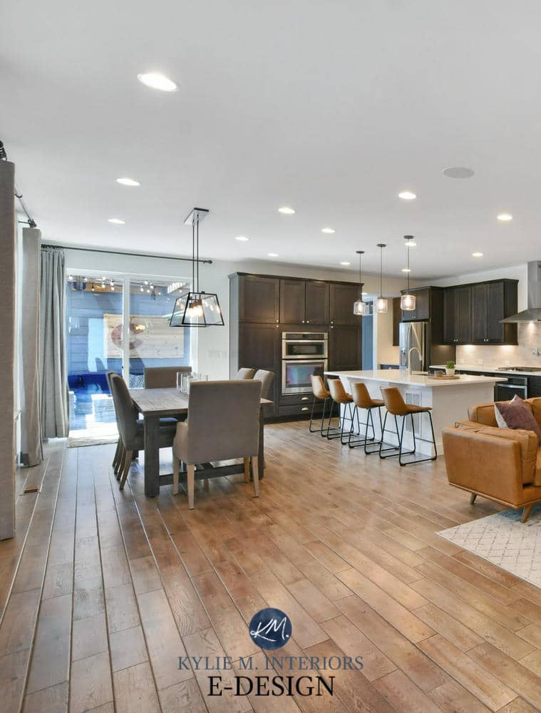
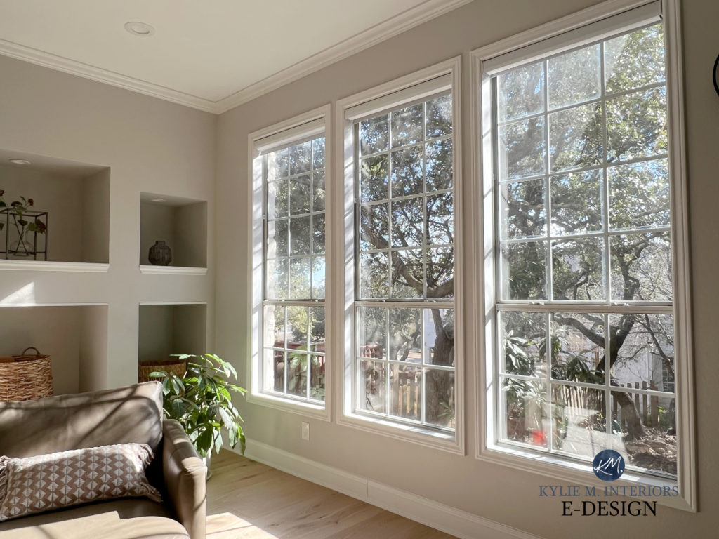
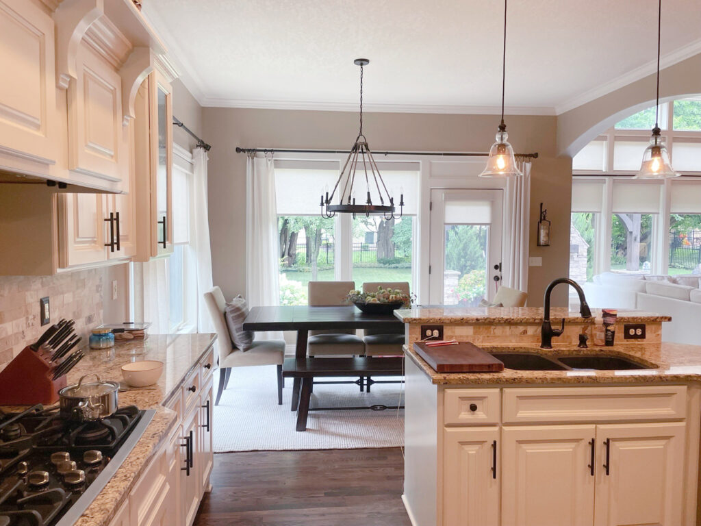
Kylie, I so appreciate your posts. Your explanations are the best I’ve found for guidance on the unique lighting challenges in my home. Would you be willing/able to say what the paint color is that appears in the picture above with the ginormous windows? My home has a similar set of windows/lighting situation and I’m wishing for a warmer feel than the very neutral white I have now.
You’re welcome! If it’s the photo where you’re in the kitchen looking out into a living area and you can see two crystal type chandeliers – THAT is the lovely Sherwin Williams Casa Blanca and it is such a warm soft feeling! I also love Sherwin Williams Aesthetic White. It’s FAR more passive, but I’m really enjoying its subtle warmth 🙂
Help. In our last two homes, we’ve used an off-white with a hint of gray something like friend Lee Gray so I wanna go a new direction. I’m looking for something creamy. Off-white with a hint of cream/tan/beige. Suggestions?
There are SO many! Check out SW Shoji White, White Duck, Aesthetic White – just a few to get you started! There’s more here, too 😉 https://www.kylieminteriors.ca/the-best-off-white-neutral-paint-colours-undertones-and-more/
Thank you for this great post!
We are looking at Origami White (technically an off-white at LRV 76) for our walls and Extra White for our kitchen cabinets…. Would you pair these two together? Thanks!
Hey Elizabeth! FIRST, make sure to get a quart of paint mixed up in Extra White in the same paint/finish you plan on using for your cabinets – it can look a bit warmer in cabinet paint vs the sample you have 🙂
Hey Kylie! Love your blog, really do appreciate your expertise and heapin’ helpin’ of humor on the side. My question is: Husband is not budging on painting 1965 wood paneling. Paneling is in south facing living room, with wood privacy shutters. Kitchen is the same, but rest of home has “standard” walls. Any suggestions for ceiling, floors, and the rest of my turf? Thank you! -KC
ugh. I have a condo with only east and west facing windows. Figures I’d get the bipolar directions.
Quick question – would you say that this advice only applies to the Northern Hemisphere? I live in Hawaii and the light is always strong, even when its cloudy. The trend here is dark colors (browns, grays etc.) to soften the light and “cool the room” but I’m not a fan and perfer color like blues, greens, etc. I’m trying to figure out what to do paint these bipolar east west rooms of mine….
Hey! YES, these mixed exposures can be tough! First off, I’m jealous. I also live on an Island, but we get sun for a bout 8 weeks a year ;). I actually think blues and greens coudl be fabulous for what you’re wanting. These can be super calming, relaxing shades and their cool tones can definitely help take the edge off a warm room. Maybe you’ll find a nice one here? https://www.kylieminteriors.ca/8-most-popular-blue-green-paint-colours-mix-sherwin-williams-and-benjamin-moore/
OH! Thank you! I’ll have a look.
I came from a place with limited sunlight in the winter originally, so I can feel you on the less than 8 hours. That’s part of my struggle now. I got used to decorating to let the light and warmth in as much as possible. But, uh, I…tried to do that here and I needed to wear shades in the house. 😎The sun is just so powerful here!