
The 8 Best White Paint Colors for North or East-Facing Rooms
Can you paint a room with northern or eastern light white?
If you’ve ever tried to pick paint colors for a north or east-facing room, you’ll know what it’s like to bang your head against a wall, chug a vat of wine like a Viking, and scream at the world, begging for mercy.
However, creating a welcoming and well-balanced room will be much easier once you understand your room’s needs.

And guess what, Buttercup?
White paint colors aren’t that hard to pick when you have a lil Ginger in your back pocket (I pinch upon request). While you might see hundreds of whites on display, most of these can burn in a pit of disappointment, because that’s how you’ll feel if you use them in your home.
Truth be told…
Only a SMALL HANDFUL of white paint colors is worth looking at.
Okay, maybe two handfuls (which is what Tim calls me).
But before we understand which whites are best, let’s have a little chat.
Remember, I’m not just here to show you what you can do via pretty pictures; I’m here to TEACH you how to make the best choices for you and your home!
WHITE PAINT COLORS & DARK ROOMS
It doesn’t matter if your exposure is north, east, south, west, or a blend, while white will brighten up any dark space, don’t expect it to save the day…
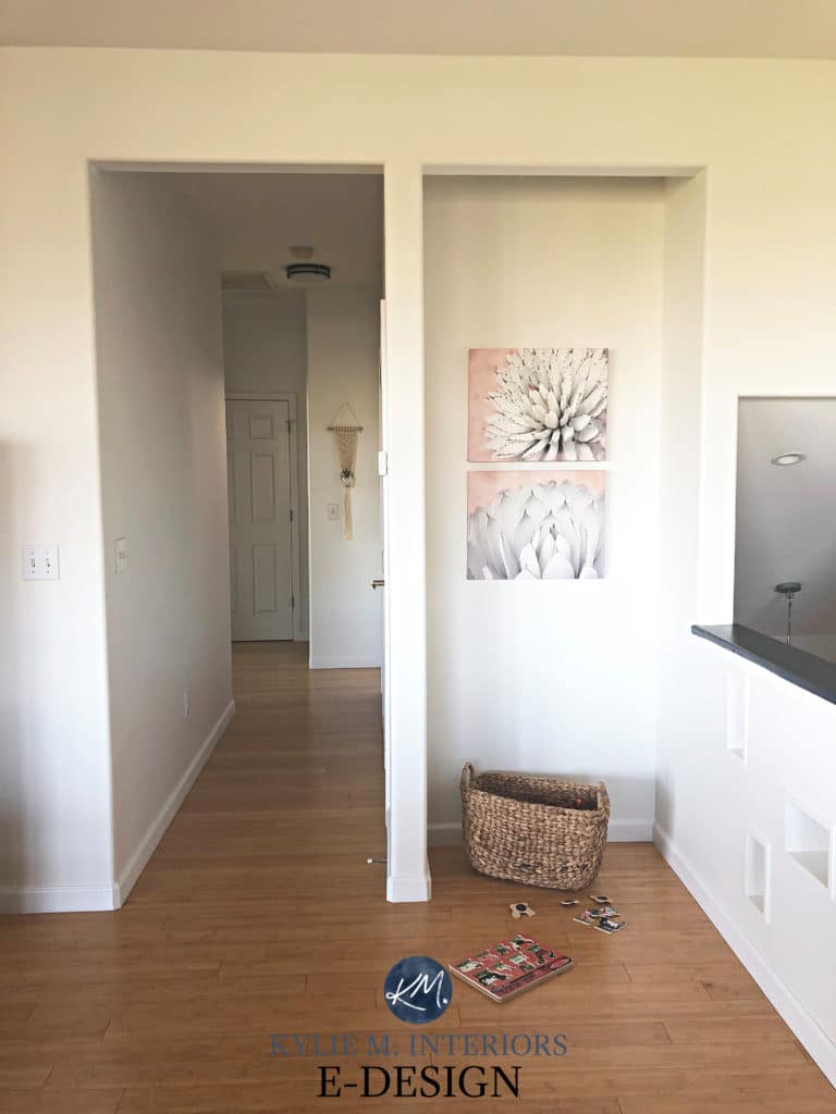
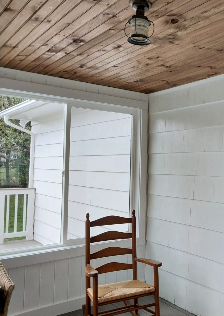
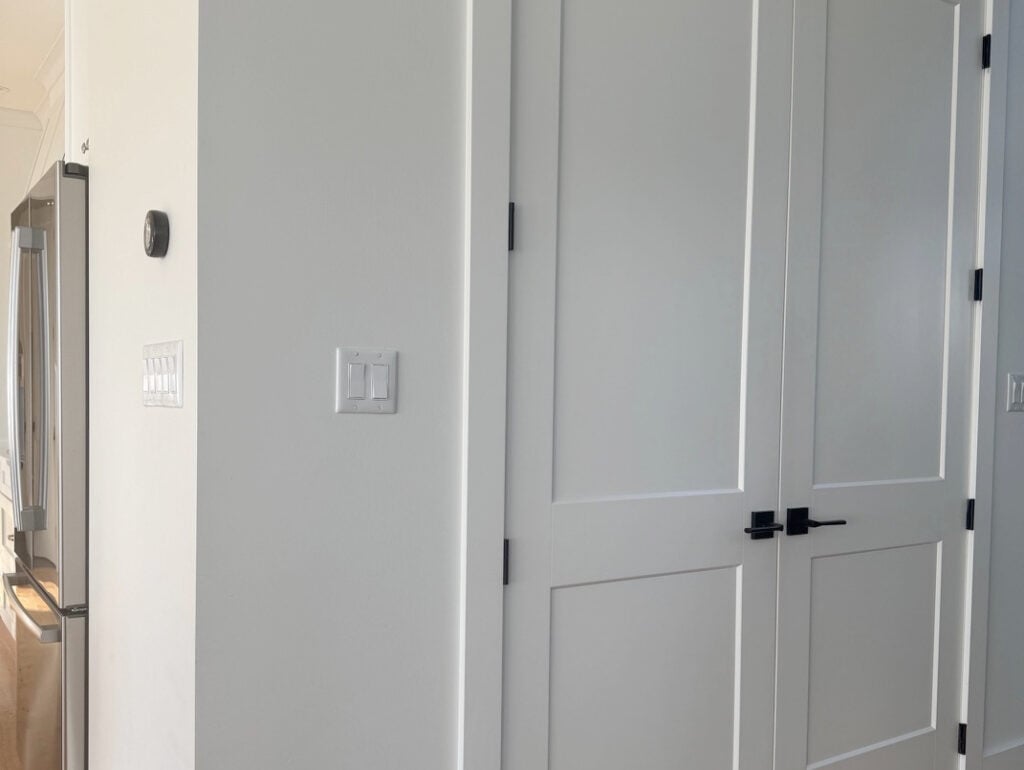
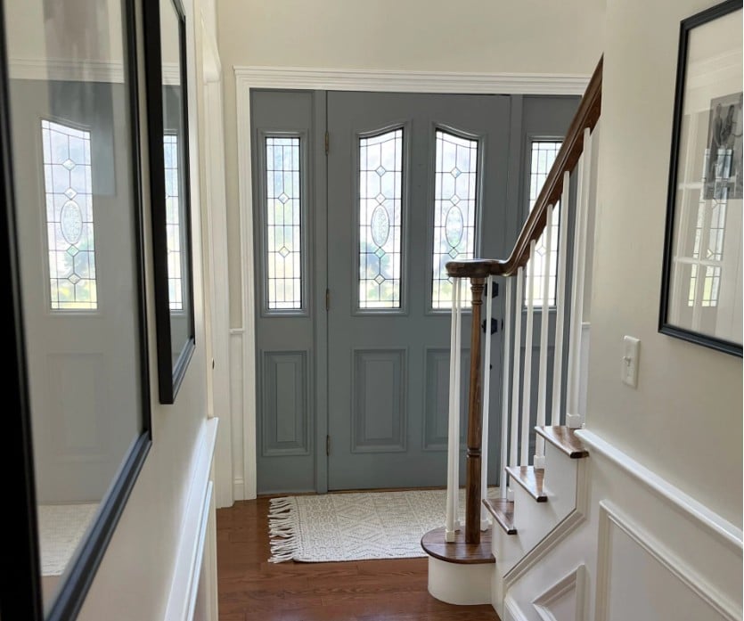
If you have a dark east or north-facing room or a dark hallway (shown above), white can be a great choice… as long as you have a decent interior lighting plan. If you don’t, you might want to look at colors with more…color (chroma).
White paint colors in a dark room, without enough interior lighting, often look like cheap primer.
Don’t expect white to be a miracle worker; help it out with interior lighting.

Next, let’s do a quick little refresher on north-facing and east-facing rooms…
NORTH-FACING ROOMS
- Rooms with northern exposures have a cool gray cast, and because every gray has undertones, we aren’t surprised to see a subtle blue here and there.
- North-facing rooms are the coolest-looking rooms in a home. And I don’t mean cool like me in Converse and skinny jeans; I’m talking COLD like Tim’s ex-girlfriend’s heart.
- These spaces don’t get any sun throughout the day. Even if a northern room receives a secondary hit from the south, east, or west, it’s the dominant northern exposure that calls the shots.
- They can look flatter and duller compared to rooms with hits of sunshine, especially if the amount of natural light is limited.
It’s kind of cool to see the shift in natural lighting using the same white paint color (Benjamin Moore Super White)…
EAST-FACING ROOMS
If your east-facing room also receives some southern light, you might consider a color that suits a south-facing room best. This is because enough south-facing sunshine helps offset the eastern light’s flatness. The same goes for western afternoon sunshine.
However, if your room has a dominant eastern exposure (or northeast), consider the following points…
- Like northern exposure, eastern light can be flat and drab, but only in the afternoon.
- While east-facing rooms can be bright in the morning, they’re not as warm
(yellow-orange-pink warmth like afternoon western sunshine).
99.5% of the photos in my blog are from my Online Color Consulting clients, readers, talented photographers, & friend’s homes – real homes, real budgets, real people. Maybe they aren’t magazine-perfect, but they’re packed with ideas & proven color choices to help you create a home you love.
THE MANY TYPES OF WHITE PAINT COLORS
- What’s the difference between a good white and a bad white? (I prefer Pinot Gris myself.)
- How do you know which white is right and which white is wrong?
- And why does it matter – isn’t WHITE WHITE? HELLLLS no.
There are 5 MAIN TYPES OF WHITE. However, this blog post focuses on 1 in particular – warm. If you’re unsure which type of white you’d like to use, continue reading. As Sir Frances Bacon says (or said, as apparently he’s dead), KNOWLEDGE IS POWER!
WHICH WHITES ARE A BAD IDEA IN NORTH & EAST-FACING ROOMS?
If you paint a room with northern or eastern exposure, a cool white paint color or a stark, bright shade of white…
- The room will look even colder than it already does; you’re giving it a double-whammy (not to be confused with Tim’s favorite Friday night move, also called ‘the double-whammy’). While east-facing rooms will brighten up with a vague warmth in the morning hours, in the afternoon, you’ll be left with chalky-looking walls.
- Cool northern light can glorify any cool undertones in your white paint color. Even a true white can skew cool.

I mean, each to their own, but DAMN THAT’S GONNA LOOK COLD!
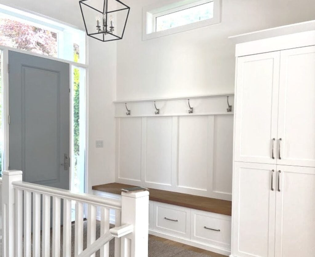
You might hope to see photos of my north-facing client’s homes painted in cool whites, but I don’t have many.
Why?
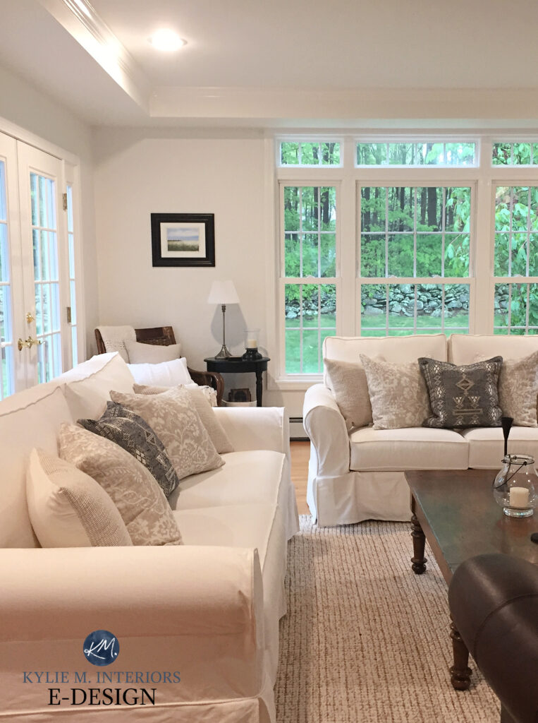
Because I rarely advise it. And if I do, it’s for a pretty specific reason. For example, I have a client who wanted a ‘whole home’ white paint color. Because her home is primarily south-facing (so it’s visually warm already) and she doesn’t like warm whites, we chose the cool white look of Benjamin Moore Super White.
Luckily, the only space in her home that receives north-facing light is the entryway, in which Super White looks a little lackluster. Sure, it’s still a stunning space, but I’d turn that light on for some passive, warm lighting.
Now, look how different Super White looks in her south-facing dining room…
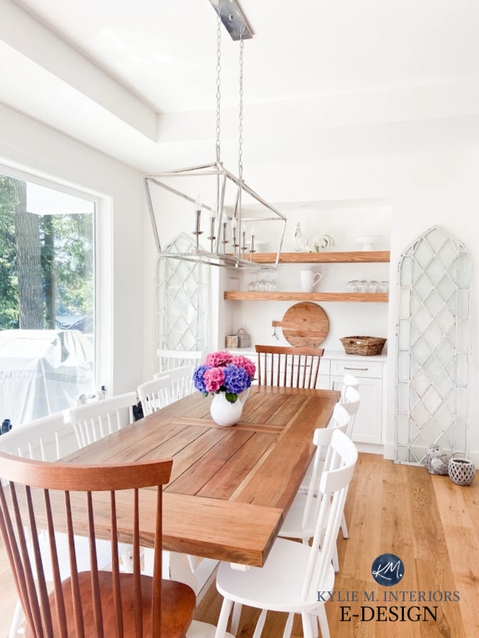
This shows how the same paint color can look drastically different under different light sources (called Metamerism), highlighting why it’s important to choose your white carefully!
Behr Ultra Pure White is the WHITEST white | The Best Green Bedroom Paint Colors
Specific to true whites, because they don’t have a strong allegiance to being warm or cool, they’ll pick up what their environment is throwing down. This means that in a north-facing room, a true white could look pretty darn cold and quite similar to a cool white.
In eastern afternoon light, your true white might look chalky.
As shown in this next room, while Sherwin Williams High Reflective White has a super high LRV and is quite a genuine white. It’s not for every room, and usually benefits from a wee bit of sunshine (don’t we all…).

The redeeming feature of true white paint colors in north-facing rooms is that once the sun goes down (which Elton John is not a fan of), you’ll be left with the original white you wanted, a simple one that will be affected by the Kelvins of your interior lighting, which can be a bit easier to control.
Still not sure what to do? Have another glass and let’s get this color party started.
THE BEST SHADES OF WHITE FOR NORTH OR EAST-FACING ROOMS
The best white paint colors for a north-facing room are WARM WHITES, as they help balance the cool light coming into the windows (we’ll check out the shortlist in a minute).
Sherwin Williams Pure White
Another important note is that cool northern light can still lean some warm whites towards the cooler side. This means your warm white might not look as warm as it would in another room with a warmer exposure.
Like Britney Spears, I’m going to hit that baby one more time…
Cool northern light can still lean a warm white towards the cooler side. This means your warm white might not look as warm as it would in a room with warmer exposure.

The Best Darker Blue-Gray (& Green) Paint Colors
However…
a) The warmth of the white can help balance the cooling effect of northern light (or flat eastern light), often creating a great happy medium that balances the scales.
b) You have flexibility based on how WARM the white is that you choose – the warmer the white, the more it will counteract the effect of cool northern or flat eastern light.
In this next room, Pure White appears considerably warmer with decent southern light…

However, notice how the warmth falls back in a room with cooler lighting…

1. If you don’t like warm whites, choose a white that’s only slightly warm, knowing that the gray of the northern light might soften some of the warmth.
2. If you love warm white paint colors, you might want to lean into a warm white with a bit more warmth than average, as northern light may try to pull it to the cool side. The warmer your white is, the better it will counteract the cool northern or flat eastern light.
Now, the above information is really the meat n’ potatoes of this blog post – are you ready for the GRAVY?
1. SHERWIN WILLIAMS PURE WHITE 7005
I LOVE PURE WHITE – wait, was that my inside voice? Trust me, there are many things I say that should be kept inside my head, right, Mom? Anyway.
Pure White is the most subtle, least warm shade of white on this page. It’s for those who are afraid of warmth, but know they can’t paint their room a cold or stark white.
If you’re having a mental battle between wanting a clean, crisp white and understanding that it could visually hold your room back, Pure White could be a perfect choice.
In a north-facing room, Pure White’s warmth can drop significantly (as shown above). However, what makes this an interesting option is that some of you don’t want an ‘overtly warm white’; you just don’t want a cold icy one. For this reason, Pure White could hit the spot.
Pure White will look gorgeous in a space with morning eastern light – not overly warm, just simple and soft. In the afternoon, it may lose much of its warmth, as with northern exposure.
Personally, I’d choose a warmer white, but it’s NOT ALL ABOUT ME (not all the time, anyway). I’m just here to show you the options and what they might do.
Pure White has an LRV of 84, so while its name might suggest a BRIGHT white, it’s considerably soft. However, if, like me, you want to add some visible warmth to your east- or north-facing room, Pure White might not be warm enough; in that case, keep reading…
Here’s your Peel & Stick sample of Pure White…

Sherwin Williams Pure White Color Review
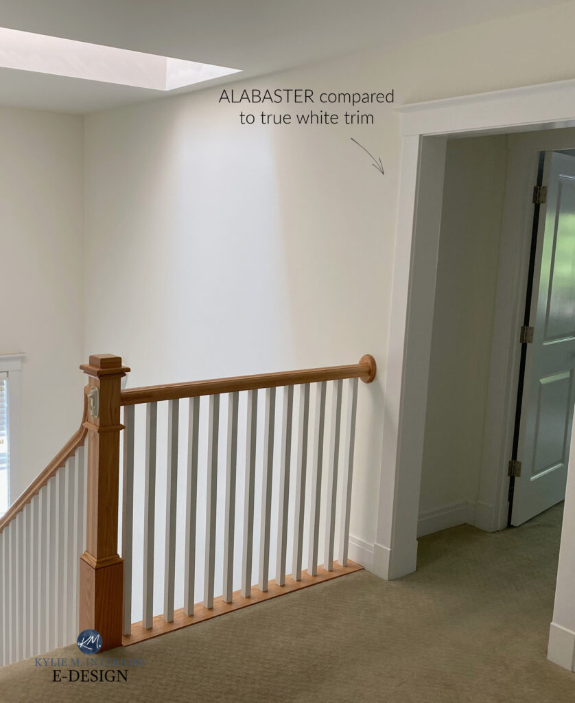
2. SHERWIN WILLIAMS ALABASTER 7008
Alabaster is a lovely, warm white paint color. However, if you’re hoping for ‘legit’ white walls, it’s a bit farther away than the others.
This is because Alabaster has an LRV of 82, so it has a bit more meat on its lovely lil’ bones. Along with this meat, there’s a soft cream base (cream is a yellow color with neutral added to calm it down).
In a north-facing room, Alabaster has the warmth to offset that cool gray light. Could your walls look a TOUCH creamy? That’s open to perception. However, if you’re looking for a softer approach to white, Alabaster may be the perfect choice.
This next photo shows Alabaster with true white trim. If you want Alabaster to look warmer and creamier, pair it with a white like Benjamin Moore Chantilly Lace. However, if you want it to look like a ‘soft, warm white,’ make sure you paint your trim the SAME as the walls, as this makes Alabaster’s undertones look more subtle.
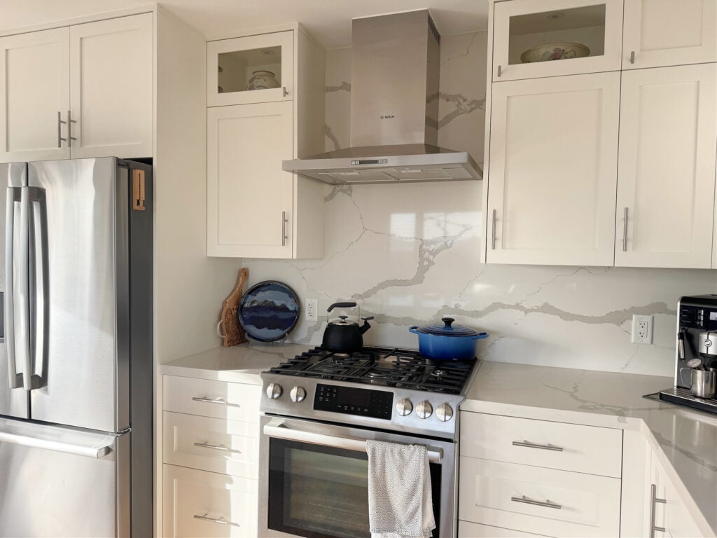
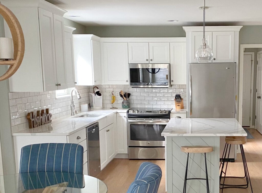
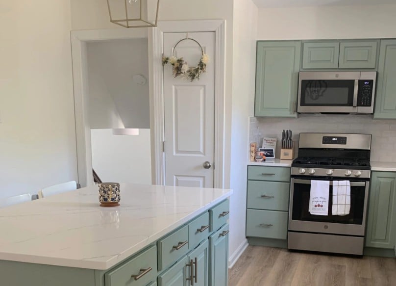
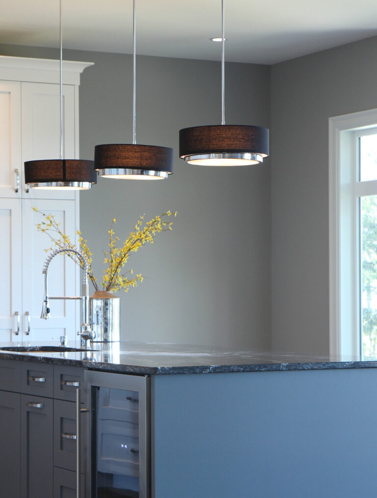
In this next kitchen, the cabinets, trims, and walls are all Alabaster, creating a simpler, seamless, and less creamy look…
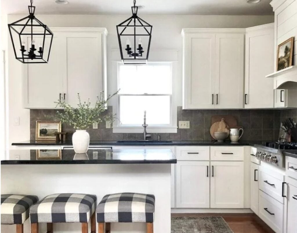
Ideas to Update a 1990s Home | The gorgeous kitchen of my Online Color Consulting client, Jenna Christian.
In an east-facing room, Alabaster will look smooth like butter (without as much yellow) in the morning light, and again, its warmth will take away some of the dullness of afternoon eastern light.
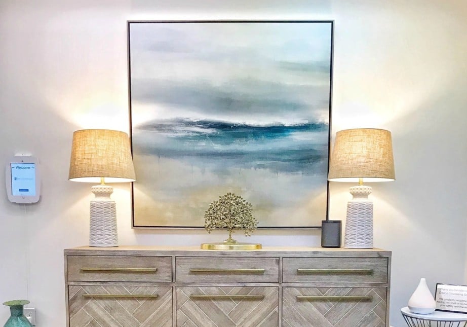
The reception of my client’s office – Eddins Counseling
Here’s your Peel & Stick sample of Alabaster…
Sherwin Williams Alabaster Color Review
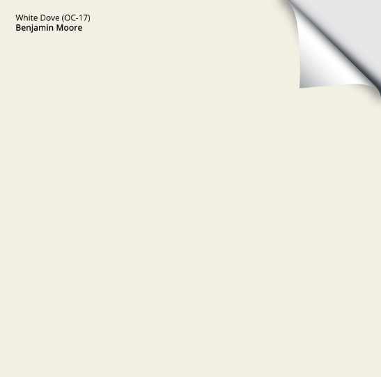
3. BENJAMIN MOORE WHITE DOVE OC-17
White Dove is a wickedly gorgeous, warm white. Like Alabaster and Pure White, it’s a soft white paint color, not a bright or true one, thanks to its LRV of 83.06.
White Dove is like the lovechild between the muted look of Pure White and the warmth of Alabaster.
White Dove’s gentle warmth does a good job of adding a bit of balance to gray northern or flat eastern light without going overly yellow, as some more dominant warm whites can.
The Best Paint Colors for the INSIDE of Your Front Door
As for White Dove in east-facing rooms, its warmth helps offset the afternoon light’s flatness. It also happens to look GORGEOUS in east-facing morning light.

White Dove has an LRV of 83.16, which places it firmly in the white range, albeit on the lower end. This means that your walls won’t be crisp and clean, but will have a gentle warmth (I have it in my own home).
Not sure what LRV is? It could SAVE YOUR PAINT-LOVIN’ LIFE – check it out here.
In this next space, I worried we’d get a lot of green reflecting onto the walls from the exterior. Instead, White Dove is holding itself quite well on the walls, trims, and ceiling…
Interior lighting can help off-set any green reflections
This next room gets an equal balance of north and south-facing light, and look at how awesome White Dove is at humoring both…
The above room is my family room (say hello to Douglas Fur). I chose White Dove for its ability to handle different exposures with a passive warmth.
Here’s your Peel & Stick sample of White Dove…
FULL Paint Color Review of Benjamin Moore White Dove
4. BENJAMIN MOORE CLOUD WHITE
It doesn’t get more classic than Cloud White. This gorgeous shade of warm white has been popular for decades, taking us through the hunter green and burgundy of the 1990s, Tuscan-inspired paint colors of the 2000s, and even through the gray trend of 2015.
And it’s still here.

Cloud White trims, railings, and board & batten with Benjamin Moore Gray Owl walls
Cloud White appears as a soft, warm, and creamy shade of white. Even though its LRV is higher than White Dove’s (85.05 to 83.06), its increased warmth gives it a pretty weight.
In this next beautiful kitchen, notice the difference between the walls and the trim/pantry door…
The walls are Cloud White, whereas the trims and door are a standard white. This shows how you can enhance the appearance of your warm white by pairing it with whiter trim.
HOWEVER…most people like a more seamless look and use the same white on walls, trims, ceilings, and cabinets.
Paint Color Review: Benjamin Moore White Dove
5. SHERWIN WILLIAMS GREEK VILLA 7551
While I haven’t spent as much quality time with Greek Villa as the others, it’s worth exploring.
Greek Villa is a soft shade of white with an LRV of 84, making it comparable to BM White Dove and SW Pure White.
This next sample is friggin’ fabulous. Notice how the east-facing dining room looks in Greek Villa compared to the south-facing living room in the backdrop…

When you compare them (which you should), notice how its yellow undertone comes off a bit clearer than White Dove’s. So, if you have a dark north-facing or east-facing room and find White Dove and Pure White a bit dingy or not warm enough, Greek Villa could be a subtle adjustment on that.
Sherwin Williams Greek Villa Color Review
Did you know you can easily compare my FAVORITE warm whites in this CURATED Peel & Stick Color Bundle?

Greek Villa isn’t there, but it’s easy to add.
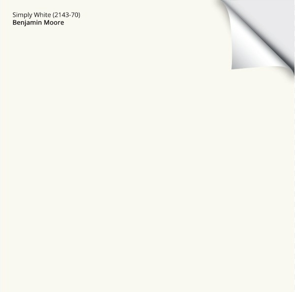
6. BENJAMIN MOORE SIMPLY WHITE OR SW CHEVIOT
These two are sharing a slot as they’re pretty darn comparable. I mean, sure, all of these warm whites are comparable, but these two are kissin’ cousins – illegal in most States, but not my blog.
Starting with BM Simply White. Simply White is a brighter shade of white, thanks to its LRV of 89.52, making it brighter than all to the previously suggested whites.
Check out this fun comparison…
L-R: BM Cloud White | BM Simply White | BM Chantilly Lace | BM Atrium White (woooof, don’t do it) | BM White Dove
Along with a jacked-up brightness, Simply White also has a slightly more noticeable yellow undertone. It’s this hue that can make up for the lack of warmth in a north-facing or dead-ass east-facing room (said with love).
Next, Sherwin Williams Cheviot. Cheviot is a newish white paint color from Sherwin Williams, offered in its Emerald Designer Collection. While it’s a wee bit pricey (understatement), Cheviot and the other newer shades of white add a few much-needed choices.

Cheviot walls, Benjamin Moore Chantilly Lace trim, and a badass black interior door
Cheviot has an LRV of 89, just like Simply White. Where you’ll see a bit of a shift is that Cheviot’s yellow is just a bit more balanced. It’s almost like there’s a wink of orange in there, but not. Compare the two and you’ll see what I mean.
Here’s your Peel & Stick sample of Simply White…
Here’s a Peel & Stick sample of Cheviot.
That’s it…
A handful (plus a thumb) of great shades of white to choose from. That’s it. If you don’t find a white you love here, chances are you need to go spelunking in the wild world of off-white paint colors.
WANT MORE WARMTH?
There’s a chance that even with the soft, warm whites mentioned above, you’re still not getting the warmth you want to see on your walls. If so, you may want to explore the following warm, creamy white and cream paint colors.
So, there you have it! Of course, there are many more awesome colors to check out, but hopefully, these whites get you pointed in the right direction. If not, you know where to find me.
READ MORE
The 5 Most Fool-Proof White Paint Colors
The Best Paint Colors for East-Facing Rooms
The ULTIMATE GUIDE to Choosing White Paint Colors
The 8 Best Benjamin Moore White Paint Colors
Get the best paint color advice with Kylie M’s Online Color Consulting packages!


Updated with fresh, new content and images 2026


Hi,
We have a small north facing bathroom. It has golden yellow with light brown tone tile! I want to paint it Alabaster. Do I paint the ceiling and trim Alabaster as well?
Thank You
I would!
I keep coming back to Ivory Lace, your thoughts would be much appreciated. The rooms I am painting face West. Cheers!
I’m often iffy in Ivory Lace. It’s in a tough spot between the white and off-white worlds, making it a bit more finicky if you’re using it as a trim and/or cabinet color. As a wall color, it’s pretty. Soft and muted.