
The 5 Types of White Paint Colors
WHAT THE BEST WHITES ARE REALLY MADE OF
While white paint colors are always a timeless choice for ceilings and trim, they’re still reasonably in style for walls and exteriors. While this trend is fading (along with Modern Farmhouse), many still choose to clad their interiors in white on white…on white.
But the popularity of a color doesn’t make it any easier to pick your home’s best shade. Warm, cool, bright, soft – where do you even BEGIN?
White here, white now.

We’re going to look at the FIVE types of white paint colors.
When looking for the best white for the job, you’ll want to figure out which type of white best suits your room, not based on your personal preferences, but on the NEEDS of your room and its finishes!
I know this can be a tough pill to swallow, but have a glass or two or ten of wine, and it’ll go down easier, wink wink. #justjokingkindofnotreally

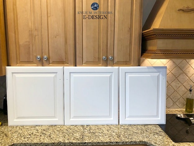
1. BRIGHT WHITE PAINT COLORS
Bright whites are just what they claim to be – bright white. If you can’t picture one in your mind, just think of my pasty white Ginger legs.
Now, being bright doesn’t mean whites have an absence of undertone; it just means they have a more genuine approach to white compared to many other softer shades.
Benjamin Moore Simply White is a bright white. It has an LRV of 89.52, along with a yellow undertone…
4 POPULAR BRIGHT WHITE SHADES
- Benjamin Moore Simply White
- Sherwin Williams Cheviot
- Sherwin Williams White Snow
- Benjamin Moore White Snow (also a quasi-true white)
THE DEPTH (VALUE) OF BRIGHT WHITES
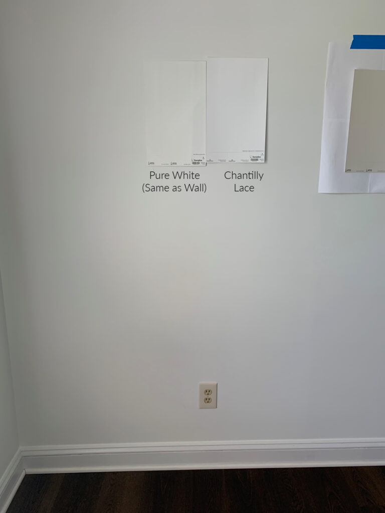
The bright white range starts at approx. 87 LRV and goes up only a short distance to approx. 90. A color like Chantilly Lace (below) sits on the border, but because of its minimal undertone, it leans more towards the TRUE WHITE range.
Benjamin Moore Chantilly Lace
Not sure what LRV is? It tells you how light or dark a color is on a scale of 0-100, 100 being the WHITEST.
WHAT UNDERTONES DO BRIGHT WHITES HAVE?
In bright whites, the undertone you’ll find the most is yellow. And while this undertone can be noticeable, given the high LRVs, it can be less obvious on a large scale. This is especially the case in bright rooms, where a lot of light bounces around.
The undertones in bright whites can also be less noticeable UNTIL you compare them to a true white or a white with an opposite undertone.
Benjamin Moore Super White is a reasonably bright white with an LRV of 87.36. While it can look DARN WHITE, especially in a well-lit room, it has a slightly cool undertone.
Not seeing a cool white in the above photo? This is a south-facing room, and the warm rays balance Super White a bit.
Super White looks SUPER gorgeous in this cute little powder room…

Benjamin Moore Super White: IMAGES, Info, & More
2. SOFT WHITE PAINT COLORS
Soft whites look just like they sound. What does this mean? Well, depending on the LRV you choose, they can either:
1. Looks like a brighter white without a TRUE white to be directly compared to, or…
2. Others appear soft and subtle, even when there isn’t a clean white to compare them to.
Benjamin Moore White Dove, shown below in Cassie’s room, is a soft white with a warm but reasonably neutralized cream (yellow) undertone, particularly suitable for southern exposure.

6 POPULAR SHADES OF SOFT WHITE
- Sherwin Williams Pure White
- Benjamin Moore White Dove
- Benjamin Moore Cloud White
- Benjamin Moore Swiss Coffee
- Sherwin Williams Alabaster
- Sherwin Williams Greek Villa
Greek Villa, shown on the walls of this next open-concept space, is a soft, warm white with an LRV of 84. Notice the degree of yellow in Greek Villa compared to the brighter white look of the Chantilly Lace trim and built-ins…
The above effect makes Greek Villa appear a bit more creamy yellow than usual, rather than a bright, warm white (which it can resemble more closely if the trim is the same color as the walls).
THE DEPTH (VALUE) OF SOFT WHITE PAINT COLORS
The SOFT WHITE range starts at approx. 82 LRV and goes up to 86 or so. If you go above 86, you’re in the bright whites. Go below 82, and you’re tiptoeing into the OFF-WHITE range, which is becoming increasingly popular for walls.
Sherwin Williams Pure White (below) is another soft white. It can ‘look pretty darn white’ until you compare it to a BRIGHT white when its subtle warmth is exposed…
Now look at Pure White when it’s not being compared to a brighter white (and in a different lighting situation)…
Again, Pure White (on all of the above surfaces) is a soft white that can look like white if there isn’t a true white to be directly compared to – but it’s still a softie at heart.
Sherwin Williams Pure White: IMAGES, Info, & More
DO SOFT WHITE PAINT COLORS HAVE UNDERTONES?
With a slightly lower LRV/depth, soft white paint colors have a bit more colorant/tint, giving more opportunity for main and secondary undertones. This can also allow for a ‘toned-down’ look (grayed-out or dirtied), which cuts back on how much of the undertone you see.

Benjamin Moore White Dove with Sherwin Williams Rainwashed
On the other hand, in BRIGHT whites, it can be harder to hide the undertone as BRIGHT whites have less colorant in them (thanks to their high LRVs).
As for the actual undertones, you’ll find a wide assortment that varies depending on whether you have a warm white or a cool white, which we’ll discuss shortly.
Benjamin Moore Cloud White (below) is a popular SOFT warm white with a creamy-white/yellow undertone (Cloud White is very similar to SW Greek Villa, btw)…
Benjamin Moore Cloud White: IMAGES, Info, & More
This next photo shows Sherwin Williams Alabaster, another soft, warm white. If you compare Alabaster to a true white like Chantilly Lace, it will look almost CREAM; however, on its own, it looks like a SOFT, warm white.
Should Your Cabinets, Trim & Walls Be the SAME WHITE?
If you want to learn whether whites can have beige undertones, keep on reading!
Get Kylie’s favorite white paint colors HERE – in Peel & Stick!

Remember, computer screens skew colors like these – they look different in real life
Now that we’ve covered DEPTH let’s move on to our next 3 types of white that are guided by temperature and undertones.
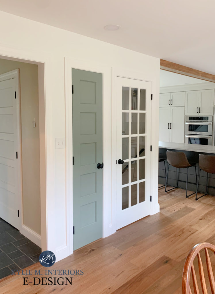
3. WARM WHITE PAINT COLORS
WARM white paint colors are the third type of white for walls, cabinets, and trims.
Like any other warm paint color, warm whites will have undertones of yellow, pink, or even a wink o’ green. The brighter the white is (90+ LRV), the less likely you are to see orange and green.
Why?

Sherwin Williams Greek Villa: IMAGES, Info, & More
Well, we’d be going down a BIIIIIG rabbit hole, so I’ll keep it super simple (and touch on cool whites in the process, killing two birds with one stone, or feeding two birds with one scone if you’re a positive thinker)…
Blue, yellow, and red (pink) are PRIMARY colors and don’t need to be mixed with any other color to be what they are.
Orange, green, and purple are SECONDARY colors, meaning you need to mix two primary colors to make them. Well, in colors with high LRVs, you have less opportunity for color mixing only because these colors have so little colorant; that’s what makes them SO WHITE!
DONE!
In this next photo, we darkened Benjamin Moore Cloud White just to give it a bit more oomph (a super technical term)…
We can also pull our first two types of white into the picture now, as warm whites will either be BRIGHT or SOFT:
- A BRIGHT WARM white (LRV approx. 87+) – the brightness gives us that higher LRV
- A SOFT WARM white (LRV approx. 82-86) – the softness gives us that slightly lower LRV
Sherwin Williams Alabaster: IMAGES, Info, & More
In this next photo, Benjamin Moore Gray Owl looks gorgeous with Cloud White on the trims.

If you want to increase the warmth of a warm white, you’ll partner it with a shade of gray or even a more muted, not overly warm neutral like taupe or greige. Opposites attract and make each other stronger (just like me n’ Tim).
WHERE TO USE WARM WHITE PAINT COLORS
- In almost any palette, as long as it’s not TOO crisp and cool
- They can offer an interesting contrast to many gray paint colors as they slightly enhance each other
- Warm BRIGHT whites are nice for dark rooms, either due to small windows, no windows, or poor interior lighting
- Not always the best for marble or quartz countertops
- They’re a nice balance to rooms with cool, north-facing light
- Often nice in homes from the early 2000s, full of travertine tiles, older-style granite countertops, and some outdated beige finishes.
Benjamin Moore Simply White, a bright, warm shade of white
WHERE ARE WARM WHITES MORE CHALLENGING?
- When partnered with cool or true white products, i.e., traditional white subway tiles or white appliances
- With existing ‘non-warm white’ trims and cabinets, especially cream or cool whites
- South-facing or western afternoon light, if the white is considerably warm
- Tricky with traditionally brighter and cooler products such as marble tiles and countertops
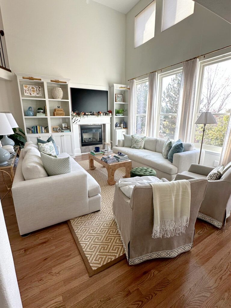
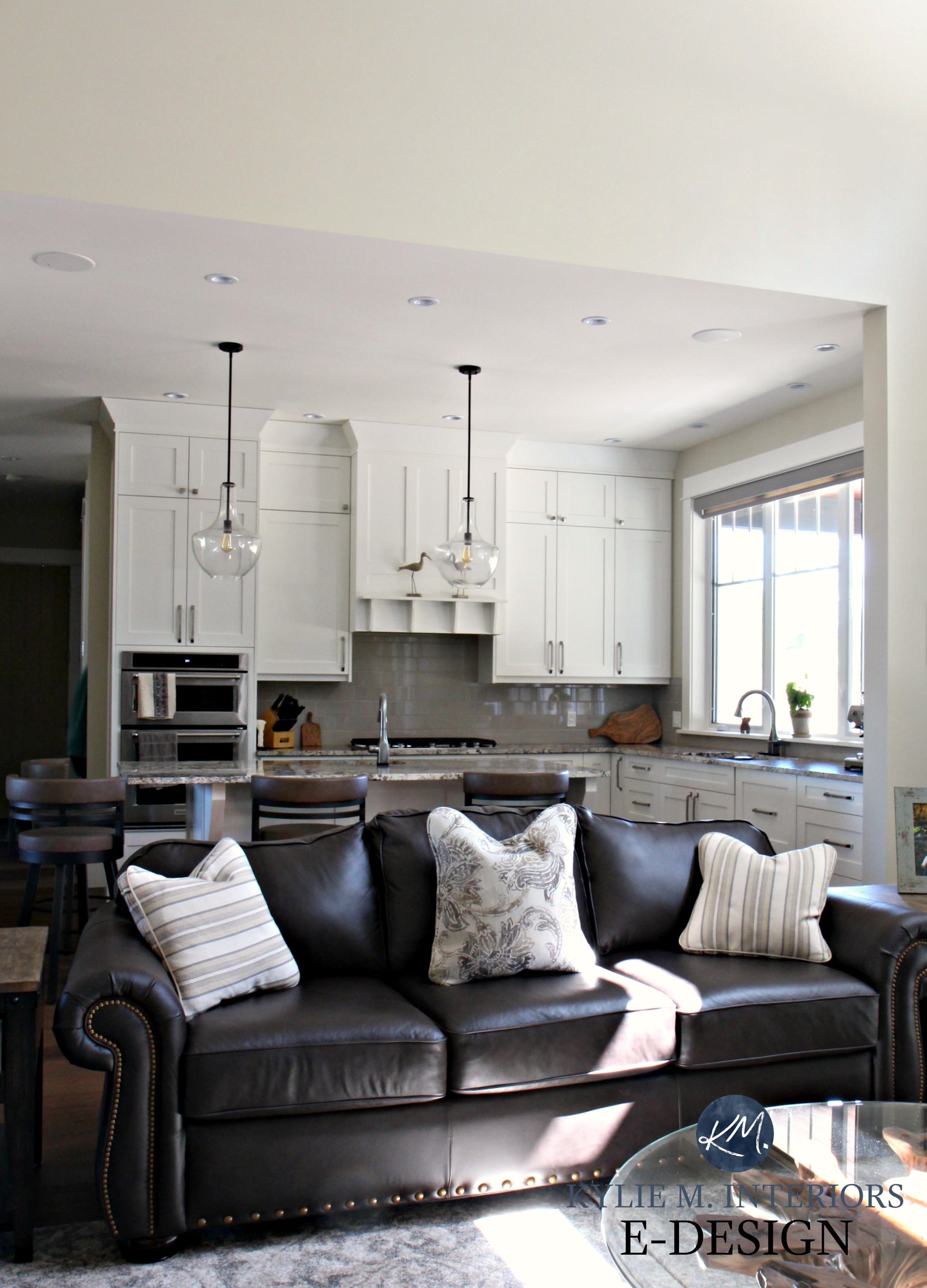
In this next living room, the warm white fireplace surround is too warm for the TRUE white preferences of the marble tile…
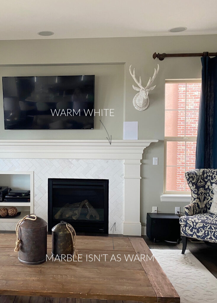
The above comparison makes the white trim look almost cream. However, on its own, it’s likely a very pretty SOFT WARM white like Alabaster.
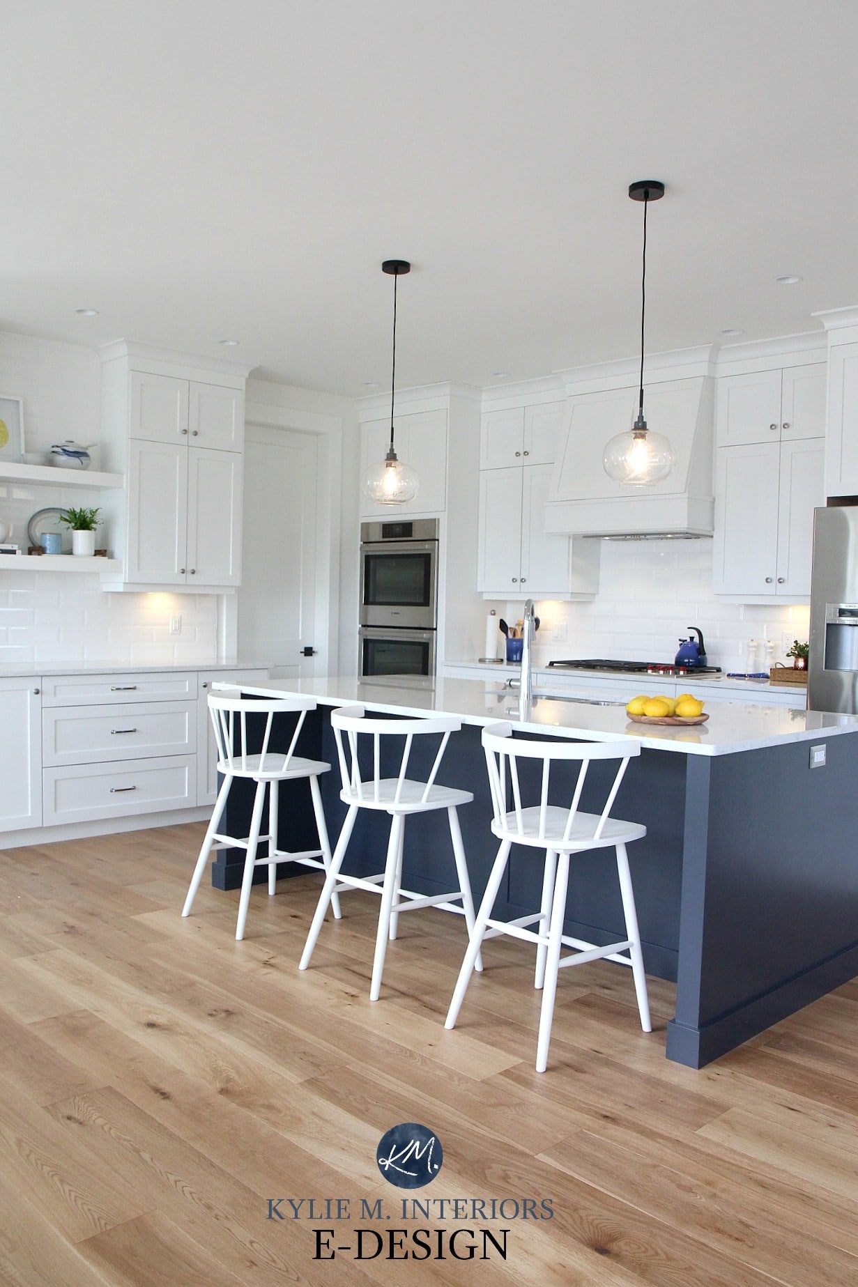
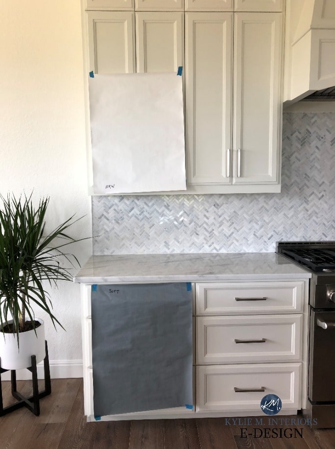
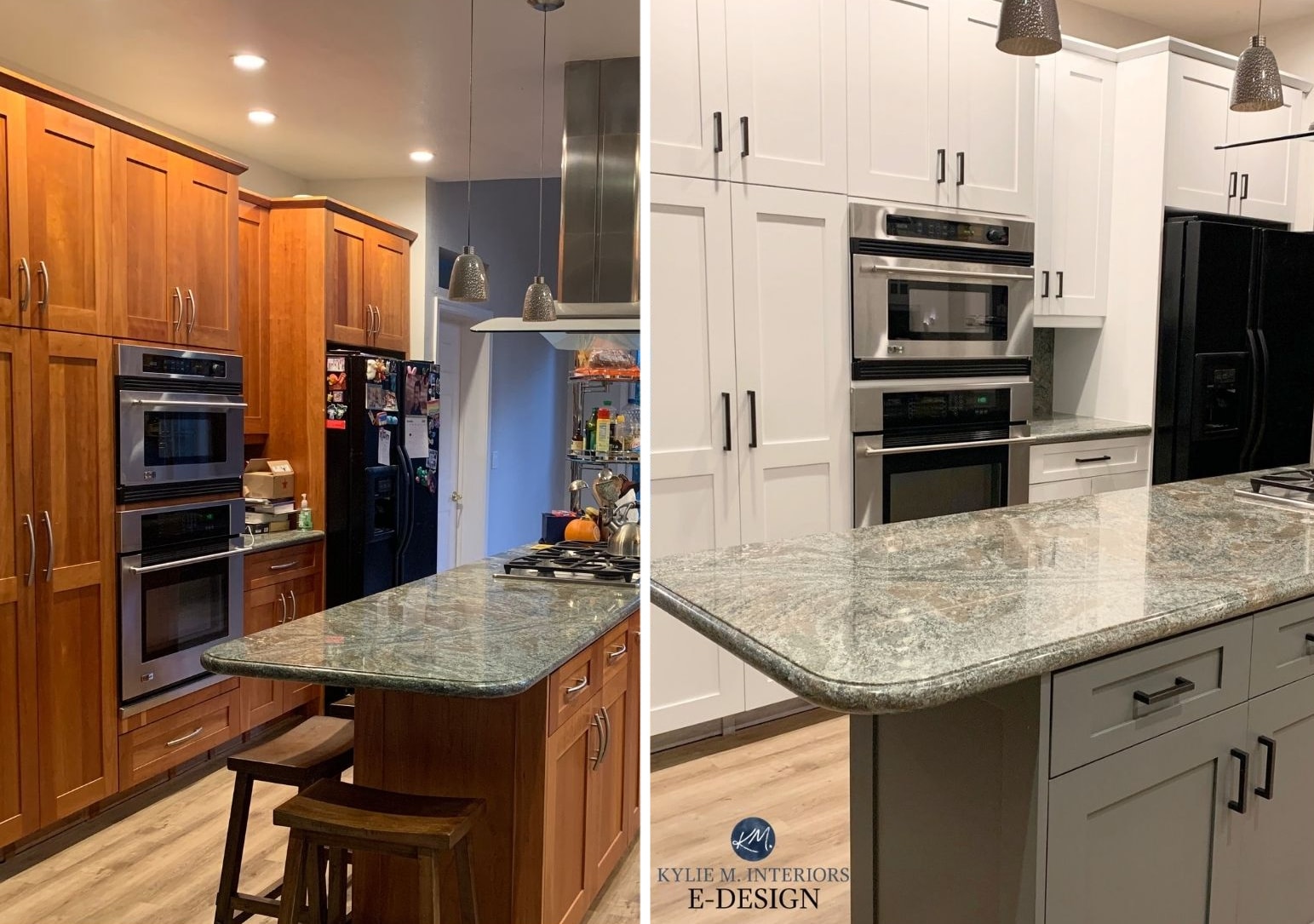
As shown in the next photo, warm whites won’t suit cooler surfaces nearly as well as BRIGHT or TRUE whites. The warm white of the cabinets below clashed with my Online Color Consulting client’s existing countertop and backsplash. I suggested Sherwin Williams High Reflective White as a more suitable alternative.
The FIVE BEST Almost FOOL-PROOF Whites for Your Home
THE MOST POPULAR SHADES OF WARM WHITE…
- Sherwin Williams Pure White
- Benjamin Moore Simply White
- Benjamin Moore White Dove
- Benjamin Moore Cloud White
- Benjamin Moore Swiss Coffee
- Sherwin Williams Alabaster
- Sherwin Williams Greek Villa
4. COOL WHITE PAINT COLORS
Just like gray paint colors, cool whites will have either blue, green, or purple undertones, with blue being the most common. Remember, we only need one ‘color’ to make blue – BLUE, whereas we need two, blue + red (purple) or blue + yellow (green). So, the softer your white is, the more likely you are to get those secondary undertones.
Kylie M YOUTUBE Review of Benjamin Moore Revere Pewter
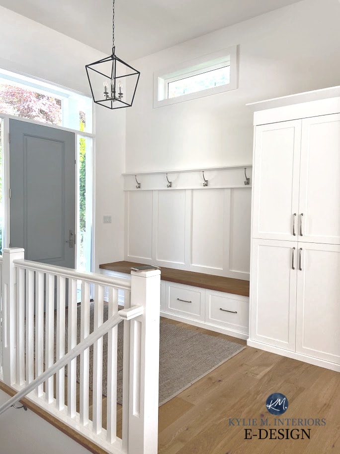
Benjamin Moore Super White is a freakin’ STUNNING cool white and a beautiful contrast to the warmth of the wood flooring and bench seat in this next photo…
As it relates to cool white colors, we get to bring our first two whites in again, as they’ll be either BRIGHT-COOL or SOFT-COOL:
- A BRIGHT COOL white (LRV approx. 88+)
- A SOFT COOL white (LRV approx. 82-87)
WHERE TO USE COOL WHITE PAINT COLORS
- Partnered with other similarly cool paint colors or interior finishes – make sure the undertones jibe!
- With white appliances (brand dependent)
- With many marble surfaces, particularly soft, cool whites
- A nice balance to southern or western afternoon sunshine, as they offer balance to the warm sun coming in the windows
- Alongside many brands of white windows (more so bright, cool whites)
My TOP 10 Exterior E-DESIGN Makeovers
WHERE ARE COOL WHITES MORE CHALLENGING?
- With existing ‘non-cool white’ trims and cabinets
- North-facing rooms, as the light is already cool coming in the windows, and a cool paint color will compound the effect
- With warm interior finishes, i.e., beige tiles and carpet or countertops with a warm white/cream in them
THE MOST POPULAR COOL WHITE PAINT COLORS
- Benjamin Moore Decorators White
- Benjamin Moore Super White
- Sherwin Williams Ceiling Bright White
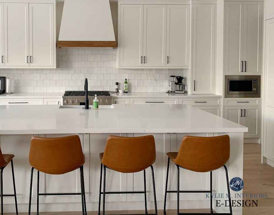
5. TRUE WHITE PAINT COLORS
While SOFT WARM whites are the most popular shades of white, TRUE white paint colors definitely have a following.
Similar to Sherwin Williams High Reflective White
And you’d think there would be one universal white amongst brands that was just good ‘ole white, but because white (in the paint world) only goes up to an LRV of 94 – not 100, which is PURE white, every brand has its version of white.
If we had a white with an LRV of 100, it would be the same white regardless of the brand. Sadly, there is no universal white paint color for residential use.
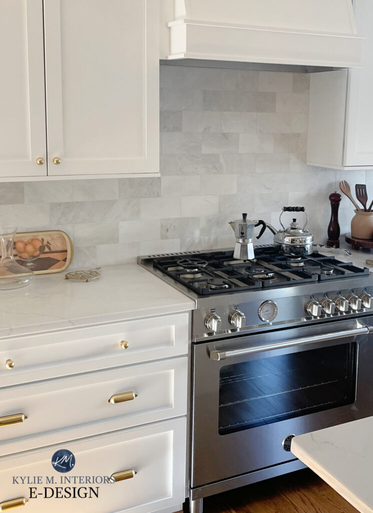
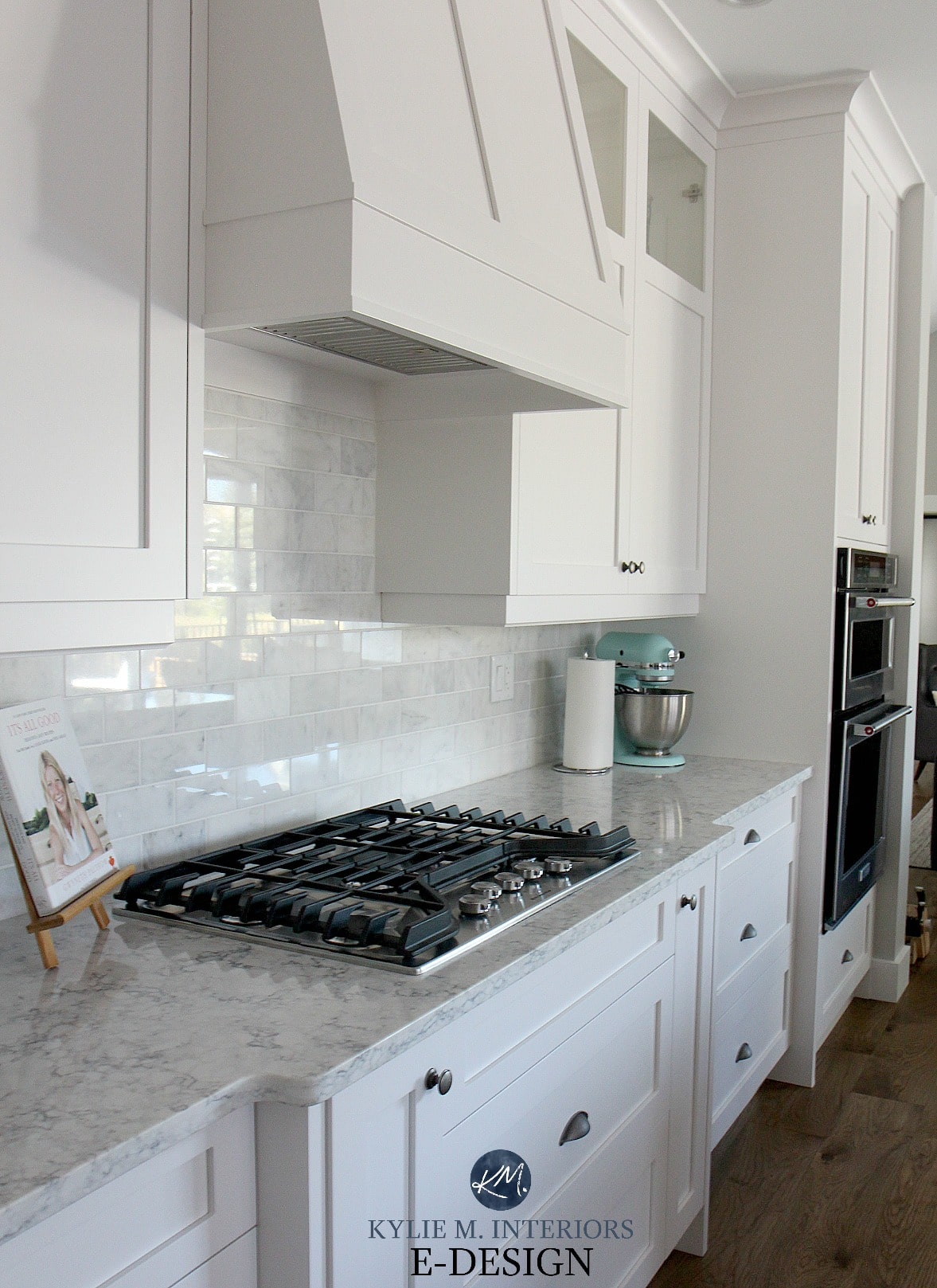
As shown in this next photo, Sherwin Williams High Reflective White is a wicked pretty partner to the marble backsplash and popular, marble-look white quartz countertop…
Benjamin Moore Chantilly Lace is in my TOP THREE fave white paint colors, along with Sherwin Williams Pure White and Benjamin Moore White Dove. It’s just a weeeee willy wink softer than High Reflective White, but a whack whiter (again, sorry to be so technical) than Pure White and White Dove.
The 3 Whites I Would NEVER Paint Cabinets or Trim
This next beautiful bedroom is clad in a shade of green-gray with Behr Ultra Pure White on the trims and doors…

I rarely refer to Behr, but as there are SO FEW good, true white paint colors, it’s worth a mention.
WHERE TO USE TRUE WHITE PAINT COLORS
- They partner well with some white appliances (including GE Cafe White)
- Traditionally white subway tiles often best suit true white paint colors
- White windows from many popular brands
- With some cool and warm whites, depending on the application and how you’re partnering them up (the true white is often best as the trim/cabinet color)
- With many of the popular quartz or marble-look countertops
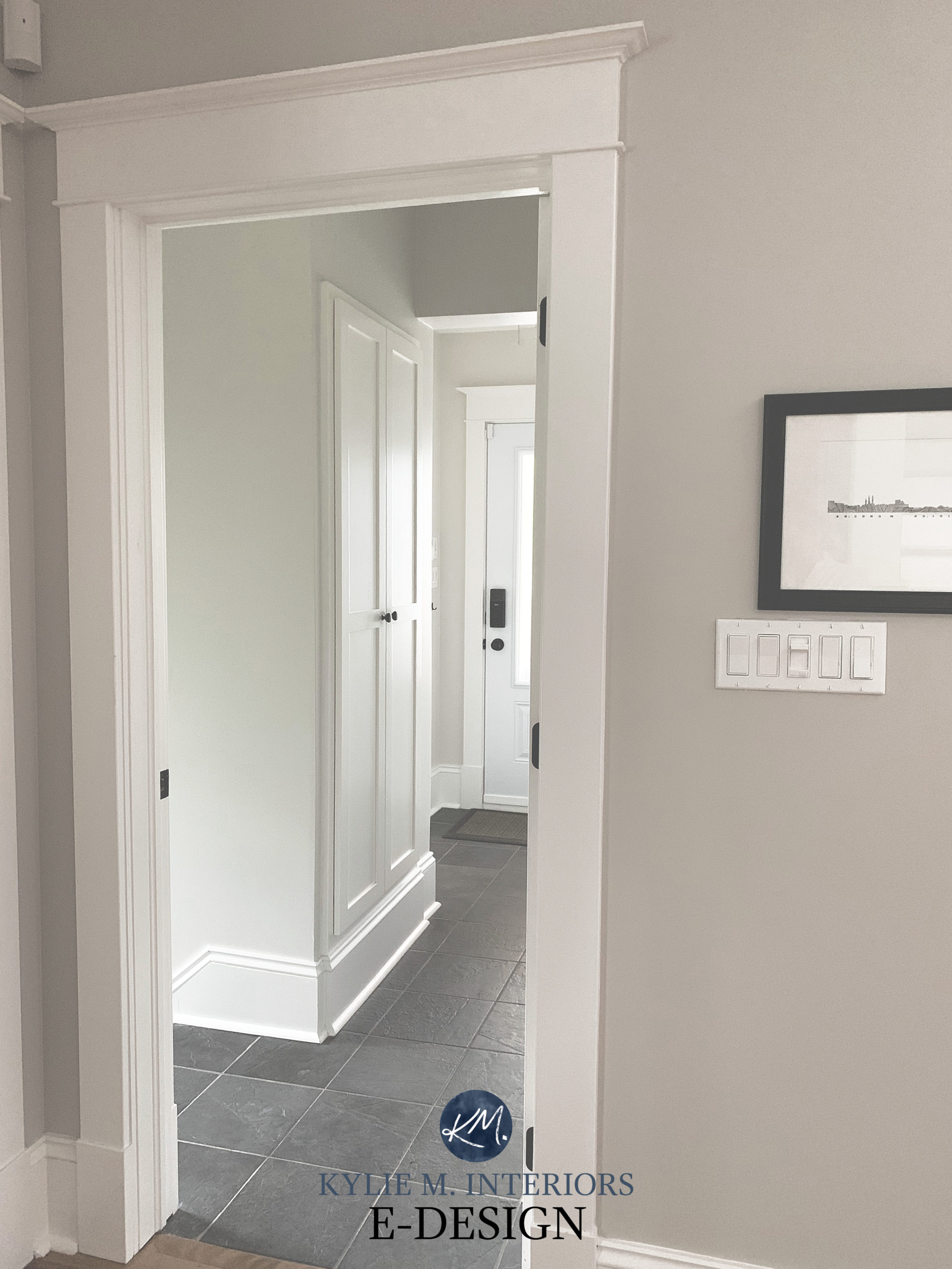
Remember, just because a color is WHITE doesn’t mean it will lighten up any old space. In this hallway, even a true white like Benjamin Moore Chantilly Lace looks muted…(and looks WICKED with a gorgeous navy blue accent like Hale Navy – HALE YES!)

WHERE ARE TRUE WHITE PAINT COLORS MORE CHALLENGING?
True white paint colors aren’t as EASY as you’d think…
- Having no undertone, they’ll be very susceptible to picking up colors from their environment, such as appearing bluer in northern light or more yellow in southern light (note that any color with a high LRV can exhibit this effect).
- True whites are fussy with finishes in a room that don’t have equally as TRUE whites, i.e., a countertop with a warm white fleck in it.
- With beige and tan finishes, true whites can be particular. ‘Fine’ for trim, but a tough sell on walls or cabinets (can depend on exposure as well as other finishes)
THE MOST POPULAR TRUE WHITE PAINT COLORS
- Sherwin Williams High Reflective White
- Benjamin Moore Chantilly Lace (technically it’s a bright white, but due to its limited undertones, it looks pretty darn white)
- Behr Ultra Pure White
The 5 WHITEST White Paint Colors
CAN YOU USE DIFFERENT WHITES ON WALLS, CABINETS, & TRIMS?
If you want to see me twitching in the corner with my thumb in my mouth and an empty bottle of wine and funnel by my side, go ahead – mix whites. And while you CAN mix some whites (it’s easier to do if one of the whites is ‘true’), it can also be a SUPER hot mess.
The Two White Paint Colors That Go Together
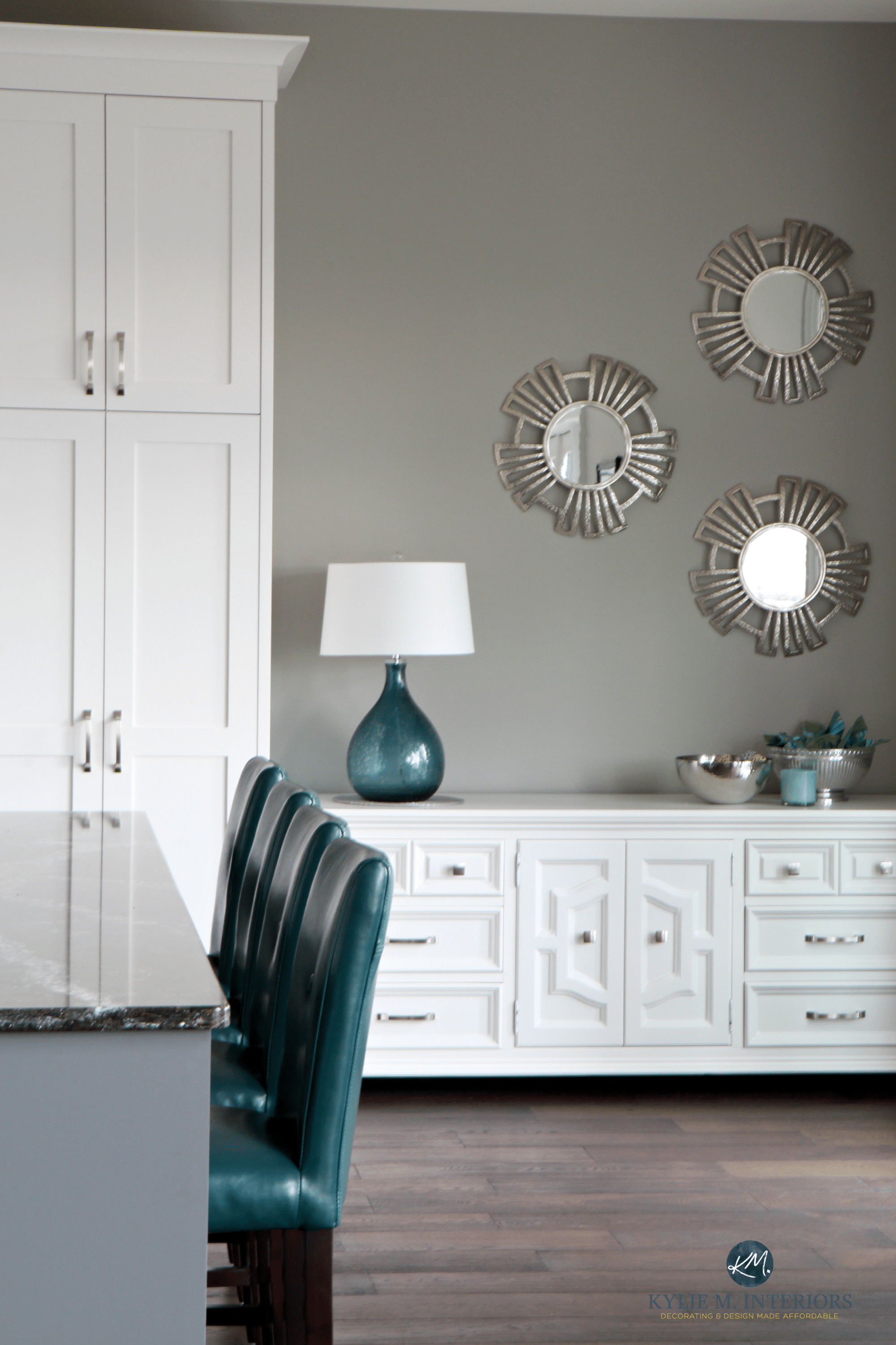
In this next photo, the soft, warm white pantry door, bright white trim, bright white molding on top of the cabinets, and glazed creamy cabinets make me die a bit inside every time I see them…
If you do want to mix whites, here’s a big fat tip/word of warning: READ THIS BLOG POST (or read it once you’re done with the rest of this one).
WHAT ABOUT STOCK WHITE CABINETS (FACTORY-WHITE)
If you have cabinets from the store (in stock) or the manufacturer, you may not know which white they are. This can make it really hard to choose coordinating wall colors, trim colors, countertops, and backsplashes.
To help you along, I wrote a blog post dedicated to this topic…
How to Design With Stock or Factory White Kitchen Cabinets
The NUMBER ONE key to picking the BEST white for the job: COMPARE!
Nothing beats comparison when choosing white paint colors, and I have some specific tips on how to do it.
If you compare whites like THIS, it’s much easier to see which one works and WHY!
1. Don’t use white paper or poster board as your comparison white. Why? These are notoriously cool and come in many different versions. While they can work well enough for colors with more depth, they’ll OVEREXPOSE the undertones in any well-intentioned white. I often conduct a white paper comparison to gauge the basic idea, but I don’t rely solely on it.
I tend to use BM Chantilly Lace as my ‘baseline’ white and compare other shades to it. Or, Behr Ultra Pure White works, too.
The 5 WHITEST White Paint Colors
2. COMPARE whites to each other. I’ve put together the best white paint colors from Samplize for direct comparison.
Save money on sampling and get my MY FULL WHITE BUNDLE HERE
That was a TON of info to digest, and I didn’t even give you an appetizer. Let’s clean things up a bit…
THE 5 TYPES OF WHITE
- BRIGHT WHITE
- SOFT WHITE
- TRUE WHITE
- WARM WHITE
- COOL WHITE
PEOPLE ALSO ASK…
WHICH WHITE IS BEST FOR WALLS OR CABINETS?
It depends on the needs of the surrounding surfaces. Generally speaking, a subtle, SOFT WARM white is a good choice for the average home, such as Sherwin Williams Pure White.
True white is often too stark, and cool white is almost ALWAYS too cold. Again, COMPARE whites to see which one suits your finishes!
Sherwin Williams Pure White (Agreeable Gray cabinets)
WHAT’S THE MOST COMMON OR POPULAR WHITE FOR WALLS?
It depends on the brand, but Sherwin Williams Pure White, Benjamin Moore White Dove, and Benjamin Moore Chantilly Lace are three of the top shades of white for walls (and cabinets).
Benjamin Moore White Dove: IMAGES, Info, & More
So, there you have it! Want to learn MORE about white? Oh, have I got some good posts for you – keep reading to the bottom of this blog post, and you’ll find a whole bunch to wet your white whistle…ermm, that sounds rude, doesn’t it? I hope so – wink wink.
IS THERE A SOFT OR BRIGHT WHITE WITH BEIGE UNDERTONES?
Sadly, no. There are some amazing shades of off-white with beige in them, but to get warmth in white, you need yellow and pink.
There isn’t enough tint in white to make a more creatively blended shade of white-beige!
WHAT’S THE BEST WARM WHITE WITHOUT YELLOW UNDERTONES?
Here comes some more tough love. There is no ‘best warm white’ with no yellow. For a white to be warm, it needs yellow or pink undertones. If you want a warm white with no yellow, you get a white-pink, as the warmth needs to come from SOMEWHERE. I mean, if you’re okay with white-pink, you’re in luck, as Benjamin Moore Atrium White is beautiful. However, I bet you want a white with no yellow AND no pink.
Sherwin Williams Pure White
The closest you’ll get in the white world to a warm white with no yellow is Sherwin Williams Pure White and Benjamin Moore Chantilly Lace.
From there, you can play with the Kelvins of your bulbs, leaning away from anything around 2500-3000. However, if you remove all the warmth, including that from the light bulbs, you end up with a cold or stark-looking white.
Benjamin Moore Chantilly Lace looks like a nice, simple white, even though it has a wink of warmth!
READ MORE
How to Pick the Best White for Your Cabinets
Benjamin Moore White Dove vs The TOP WHITE PAINT COLORS!
The 3 Whites I Would NEVER Paint Trim or Cabinets
The FIVE BEST Almost FOOL-PROOF Whites for Your Home
NEED HELP?
Get the Online Paint Color Expert that DESIGNERS hire!

ORIGINALLY WRITTEN IN 2021, UPDATED IN 2025


Hi Kylie,
I enjoy reading your blog where you share so much information and advise! Years ago we painted our cabinets SW Alabaster to try to go with a Formica Crema Mascarella countertop (never liked it). It was all a compromise. Recently, we repainted the walls in Alabaster. Probably because of the sheen of the SW Pro Classic, the cabinets look different than the walls. I have thought about painting my counter top and at least the bottom cabinets. It is a 12×17 room with a west facing window and small opening to a south facing living room, also recently painted Alabaster. There are cabinets along the one long wall and appliances at one end. The other short side has a small dining cabinet that could be painted. We have a long eat in table on the other long wall. It is a wood table worth keeping and refinishing, as well. Reading other posts make me concerned about a choppy look if I only paint the bottom cabinets. Maybe I should just choose a blue or blue green for uppers and lowers and paint my counter top an off white to go with the walls. Thanks in advance for any direction you can give.
Diane
Hi Sonja – YES, nothing drives me crazier, but it’s just the nature of the beast! BTW, I had something similar happen in a few of my rooms with White Dove (but not in others for some reason). I had a gallon of White Dove mixed up 25% darker for the walls in one room, with regular White Dove on the trim and it WORKED, but that’s TOTALLY trial and error.
Crema Mascarello is one of my fave countertops, although I know you aren’t a huge fan. I don’t mind the idea of you doing the lower cabinets a darker colour, as long as it’s not TOO DARK or high contrast. My goal would be to blend the lower cabinet colour with that lovely medium toned warm gray in the countertop, so along the lines of BM Metropolis perhaps. I thought about SW Dovetail, but it could be a bit too gray and not enough of a soft purple undertone for you. You might even consider doing ALL of your cabinets, but I haven’t seen your kitchen, so that might not work for you. Maaaybe SW Mega Greige or Keystone? Good ones to just check out anyway.
But, what I know FOR SURE is that I wouldn’t do blue or green cabinets – you’ll have a HOT MESS of colours on your hands!
Thanks for your reply, Kylie.
The pretty soft grays do look good, but I have been fighting with a yellowish-gold oak wood look flooring. That is where I need to spend replacement money. More decisions:) Thanks for your time.
Wow that email came out with words chopped up.
Diane
Hmmmm, that’s weird? It’s good on our end and I checked with my Mom and hers was good? I wonder if it’s just on certain internet providers???
This was so helpful! I clicked on the link to the home redo in Pure White, but didn’t find the answer to my question… what is the trim and ceiling color in that home? Thanks!
So many whites! I’m going to keep browsing your site. I’m going to be painting a great room in our new place. It has light yellow cabinets (unsure of the wood- light maple?) And I don’t want to make the wrong choice! It is an north & east facing room aswell! I’d like a white we could use as a base throughout the house, so Im thinking of a soft white- thoughts? We would like a white that’s not to intense on the eyes but also bright as we are moving to the north island!
Hi Nicole! Well, I went for White Dove recently in our home which has mostly northern light and I ABSOLUTELY LOVE IT! For some white lovers it’s a bit too soft, but for me, it’s perfect. I also don’t love yellow and I find it settles as soft and slightly warm without flashing too yellow on me ;).
Thanks Kylie, this is so helpful. Now I know a soft white can be either warm or cool. I guess I always thought soft and warm were the same thing. Your articles are always very informative.
Hi Gina, I’m so glad it helped! Sometimes once you get it all broken down it’s easier to pick the right one – thank you for your note ;).
I am learning so much about whites that I wish I had known a few months ago. We are remodeling our home in stages and started with our master bath (mostly because the shower was leaking and unusable). I thought I had my colors picked out. Soft white subway tile, very light & creamy greige floor tile, medium-toned stained wood cabinets, Greek Villa for the walls, and SW High Reflective White on the trim and doors. Greek Villa looked great when sampled on the walls, but once painted, it showed an obvious green-grey undertone. It clashed with the floors and did not look pretty. The room faces north east. We are switching to SW Cotton White 7104, which presents as a creamy off-white even as the light changes through the day. The big issue is that we were told that SW High Reflective White does not come in any of the paints recommended for trim, doors, and cabinets. I was told that their High Hide White base for the Emerald Urethane is probably closest to the High Reflective White, but when they made a sample for me, it seems cooler than HRW. Maybe not, but it seemed to be from the little paint card they dried for me.
Since I know I want to stick with a slightly warm palette, and High Reflective White is one of the few whites that does not tend toward gray or blue in the bathroom, we had hoped to use it throughout the house (trims & doors) and on the kitchen cabinets downstairs. You frequently suggest High Reflective White for kitchen cabinets, doors, and trim. My question is, what SW paint product in HRW is being used for these surfaces? High Reflective White really works out best for us in terms of an all over trim, door, and cabinet color. I’m pretty confused right now about how to get it in a durable paint. Any direction here is appreciated!
Thanks.
Is there any white (or very light) paint that I could pair with north facing SW Extra White that might warm it up or even just tone down the ice? I have lovely light birch floors, and dream of warm white walls and trim throughout the house, but the icy blue cast of my Extra White trim and cabinets is a giant thorn in my side. I’m sure the BM Beach Glass currently on the walls isn’t helping, so I’m ready to put up something that will (plus, I’m tired of the Beach Glass). Having the cabinets painted isn’t in the budget just yet, but I’d be willing to take on the trim if there’s something that might help.
Hi Kylie,
I’ve just ordered a package of your e-Books and follow your blog. From researching your videos as well, it has been so helpful in deciding on colours for our kitchen Reno. With north and east facing windows, we’ve decided White Dove for cabinetry, and Collingwood for walls. We LOVE Collingwood and have painted our entire basement, bathrooms and bedrooms with it. (except one girls bedroom west facing with Simply White…gorgeous!) All the trim, baseboards and doors need a refresh (I think Cloud White currently) and wondering what you thought for colour? Can one paint the trim in the kitchen White Dove to match the cabinets and do Simply White in the rest of house? The two rooms are separate.
We are redoing a south-facing living room in Collingwood (currently Pashima and soooo green!) and having built-in shelves and bookcase made. Would Simply White be a brighter choice for mantle, shelves and bookcase against Collingwood? I have the larger paint samples but I need help to decide. Thanks in advance!!
So, we have honey oak in our home. Getting rid of most of it. Had our walls painted grey…lazy gray, came out more blue. We actually like it. We are keeping much of the oak baseboard, because many of the big rooms have dark warm wood furntiure. And it makes me feel…a little like a cozy craftsman feel. (plus who wants to paint a whole house of trim)
Well, i did the bathrooms…and we decided to paint all the doors white. I tried to have the store match our ceiling white…wrong answer. It seems too bright. I am trying to find a white tone that works with SW Lazy gray and honey oak trim.
Any suggestions?
Dear Kylie,
Firstly, thank you for, so kindly, (and with humour) educating us in the world of whites. It’s been highly instructional for me as I’ve returned again and again over the past few years to get a handle on the whole matter. I think in the world of…well, in everything, you’re likely a true gem among many.
Now, for the question:
Without respect to anything else (e.g. artificial lighting, direction, subtlely warm subway tile backsplash) that I’ve already learned about from you, do you consider Wilsonart Laminate “Oiled Soapstone”(4882-38) countertop with its gray/blue (and even sometimes greenish) appearance in the same category as many of the “marble” ones you speak of which requires a “soft cool”? Should I treat it the same or can the depth of it handle a soft warm like SW Pure White?
Right now, I’ve been starting with BM Oxford White but find it going blue-ish high up on cabinetry, in spots, because of the sometimes dominant northern light. (It’s a north western exposure and I’m using north as dominant…thank you!:-) And sometimes it just seems just a bit flat.
Lorna
New brunswick
Disappointed that I’ve not had a reply :-(.
Hi Lorna, I’m trying to do a better job of keeping up with my comments – I do receive approx. 3+ dozen per day! I also haev Instagram and FB to keep up with and I won’t farm it out to AI, as I will only give authentic responses! And…I have my Online Consulting business, where my readers have paid for my advice – so, I’m doing my best!