
A Sherwin Williams Pure White Paint Makeover
The Right Bones & The WRONG Paint Colour!
Sometimes a home comes into my inbox that has everything going for it – everything but the paint colour. And this home was DEFINITELY one of those.
I loved what I saw in the before photos; the cabinets, lighting and appliances all looked great, but the dirty dingy paint colour was weighing it down. So what did we do? We went white (and I’m not just referring to my fave wine).
When it comes to white paint colours, it can be hard to find one that works every time in every home – because that magical paint colour just doesn’t exist! However, Sherwin Williams Pure White comes DAMN close and it certainly saved the day this time.
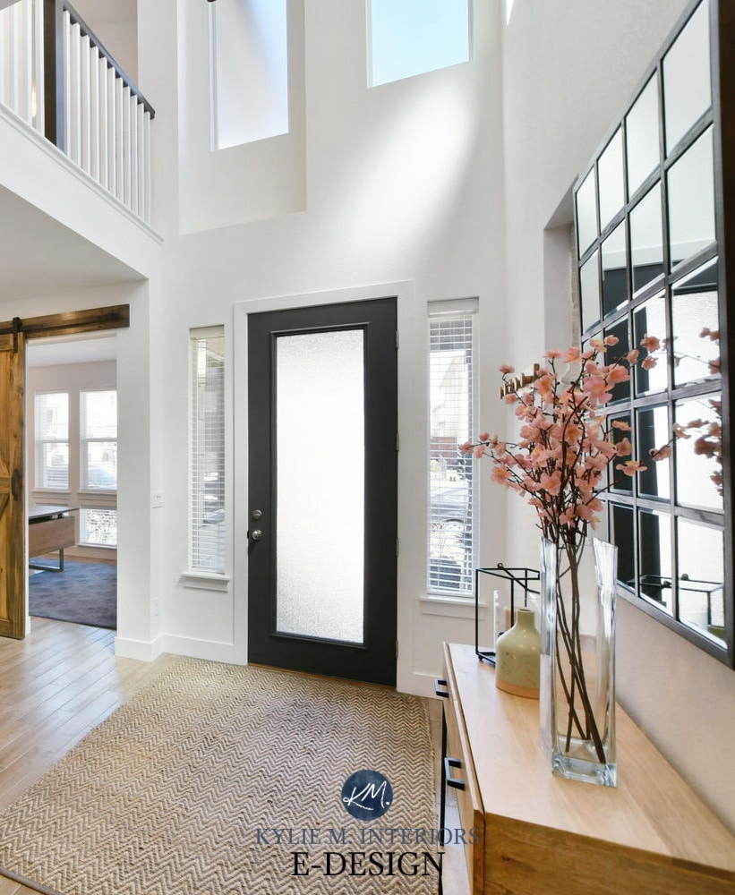
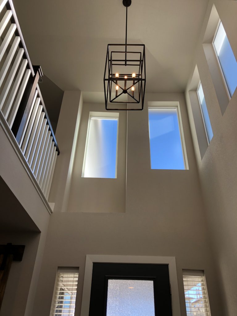
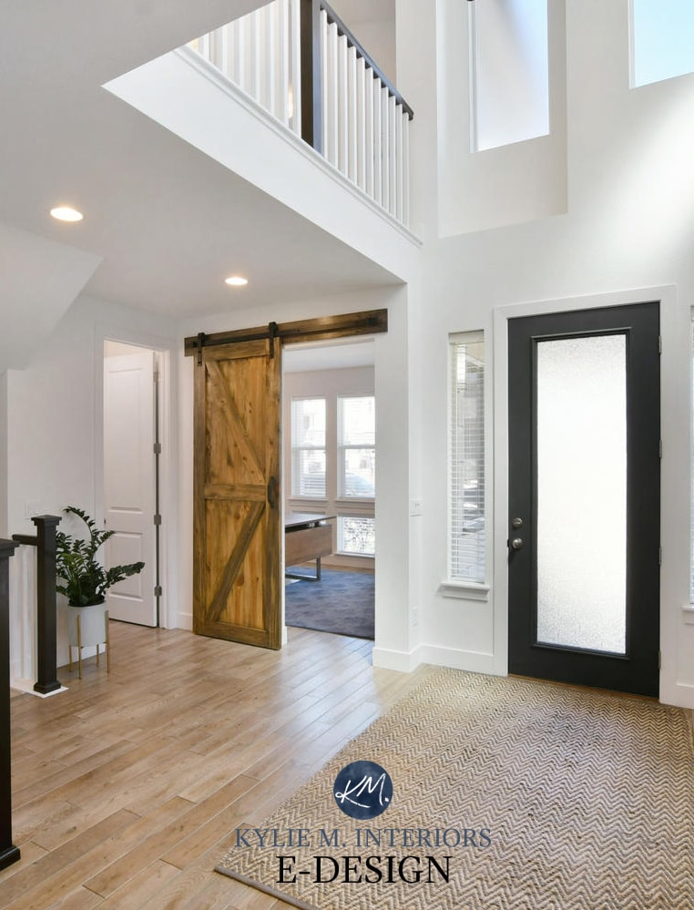
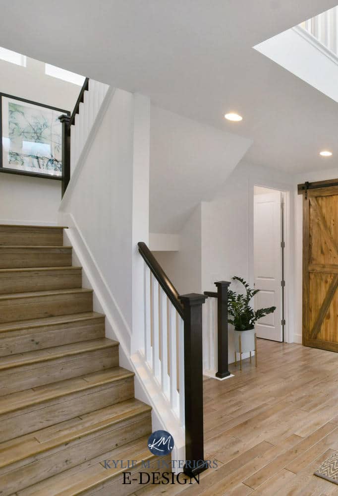
The Foyer, Staircase and Office
Before, the architecture was great, as was the light fixture, but things were lookin’ a weeeee bit murky…
AFTER, it’s like it was always meant to be (just like me n’ Tim – RIGHT TIM???)
BTW, ALL after photos are courtesy of Rich at Western Exposures Photography – awesome job.
Look at how the white walls POP against the black front door, stair railing and gorgeous sliding barn door going into the home office. White is one of the BEST ways to get strong features of a home to stand out…
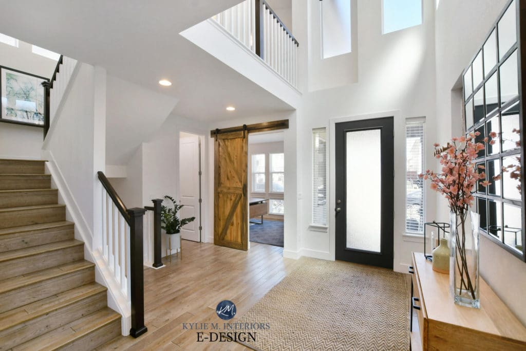
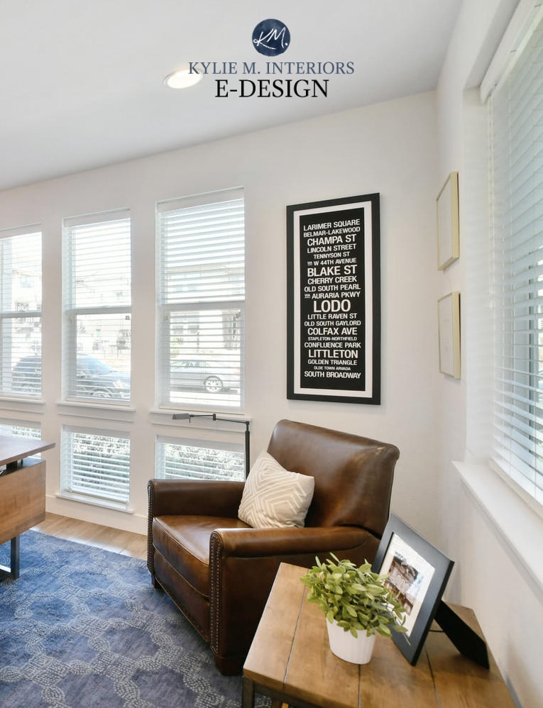
Pure White also created a seamless transition between trim, ceiling and wall. Not that this space NEEDED to look any bigger, but this application creates a larger, less cluttered look…
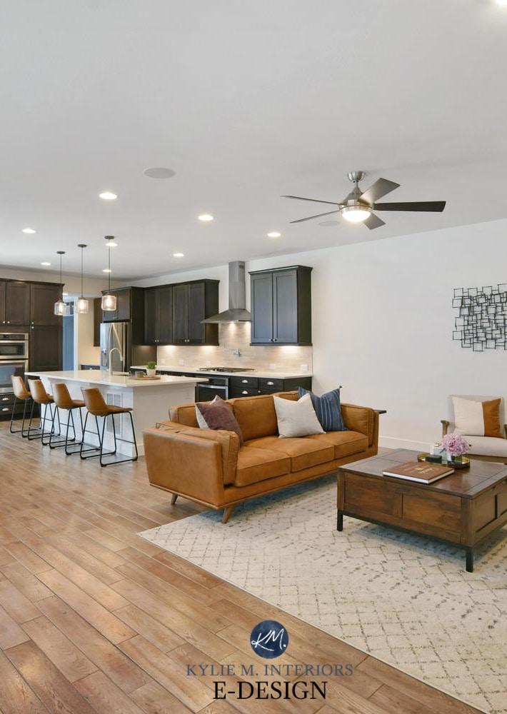
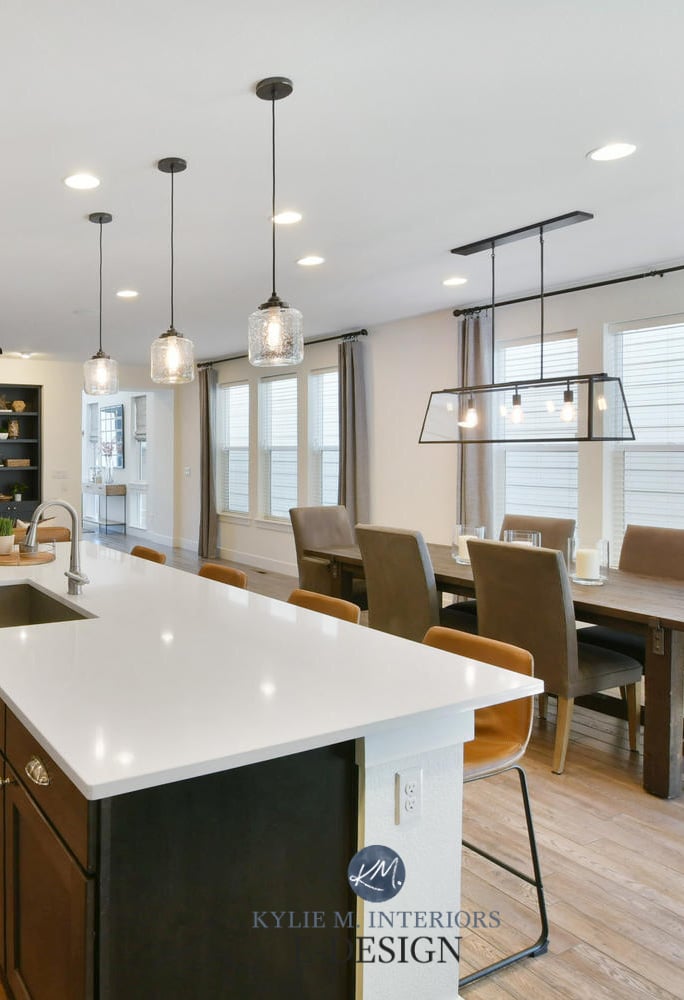
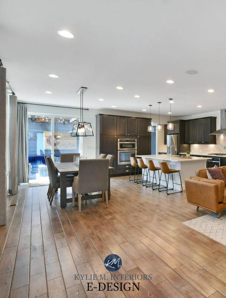
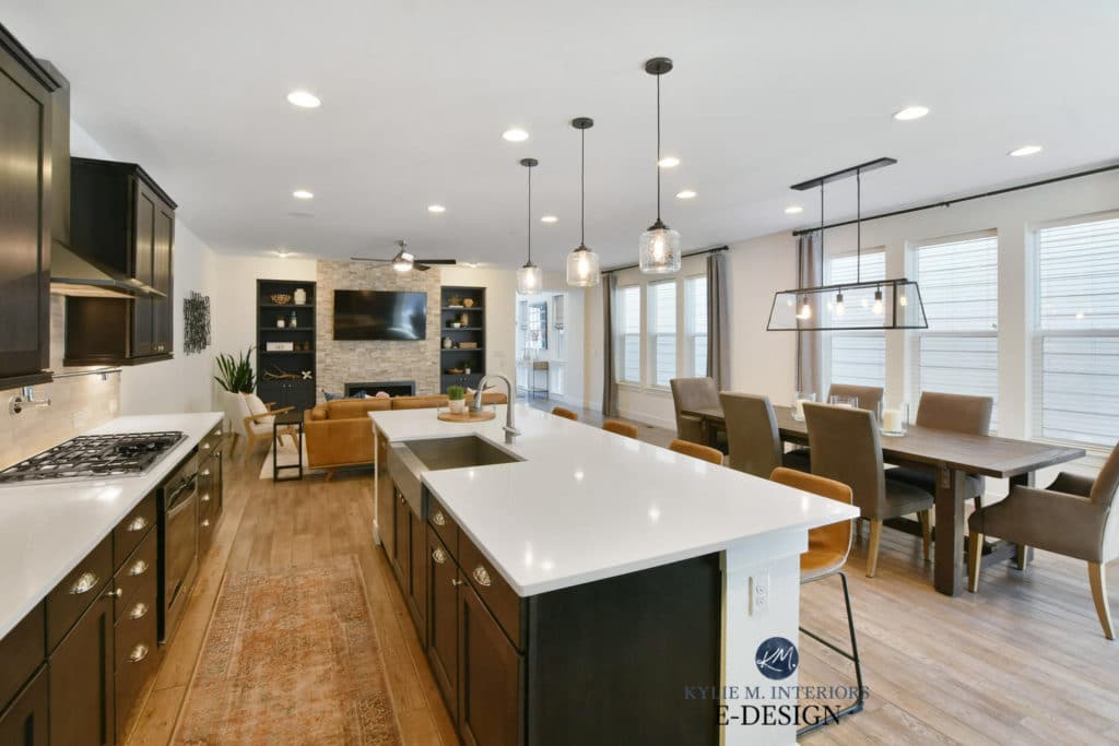
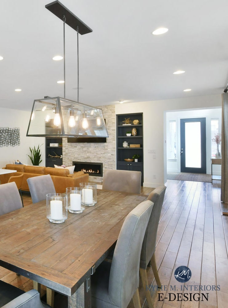
Now, moving along to the REAL showstopper of the home – the open living area.
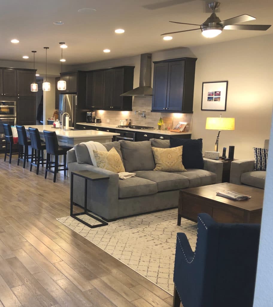
The Open Concept Living Area
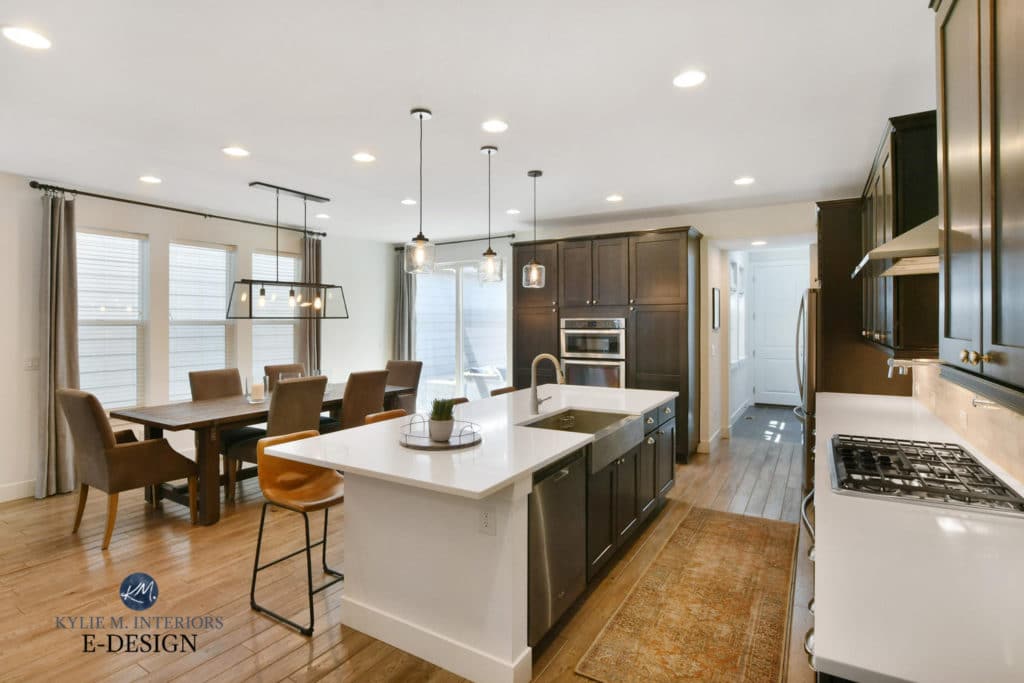
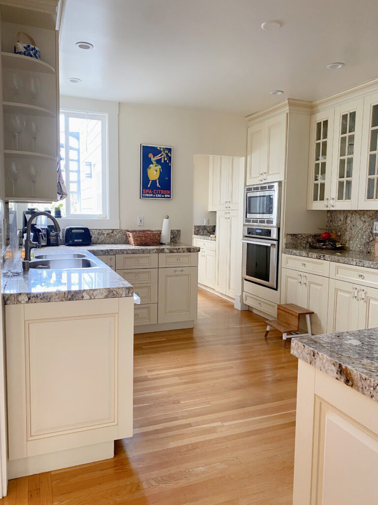
Before, the paint colour made the dark wood cabinets look dated and in need of some paint themselves (seriously, I will paint ANYTHING)…
But AFTER, I’m actually inspired to put dark wood cabinets in my own home! Not only do they ground the space, but they also create a gorgeous contrast with the soft white of the walls…
Read more: The Best Paint Colours for Dark Wood Trim
And seriously, cognac/tobacco coloured leather is my long-time love, I’ll NEVER get tired of it. But I also said that about the perm I got two years ago (#wishIwasjoking)
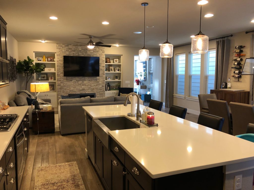
Taking a look at the dining and kitchen areas – woooooof. If you know me well, you know I say that when I don’t like the looks of something, or when Doug (our dog) asks me a question.
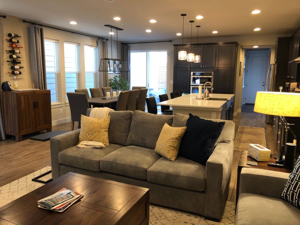
After, LET THERE BE LIGHT! Sweet hallelujah…
I’d add some filler words, but I know you’re all here for the pretty pictures. JUST JOKING, I know you’re REALLY here for my charm and wit…riiiight? I’m pretty sure only my Mom would answer yes to that one.
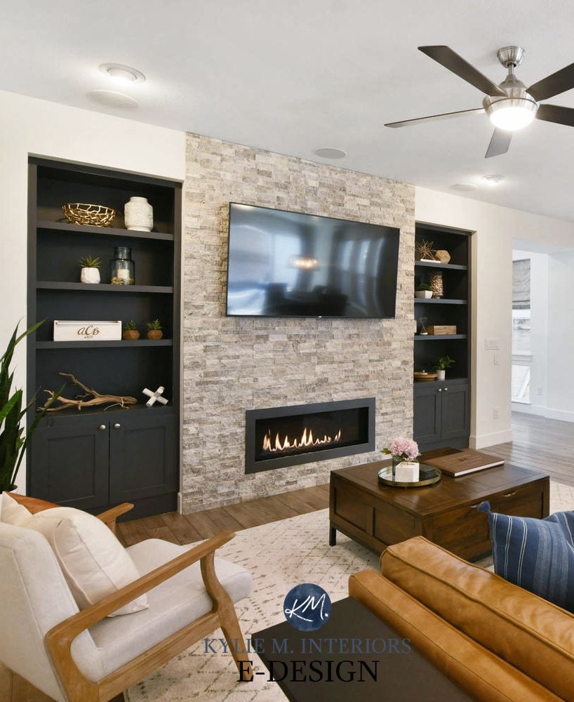
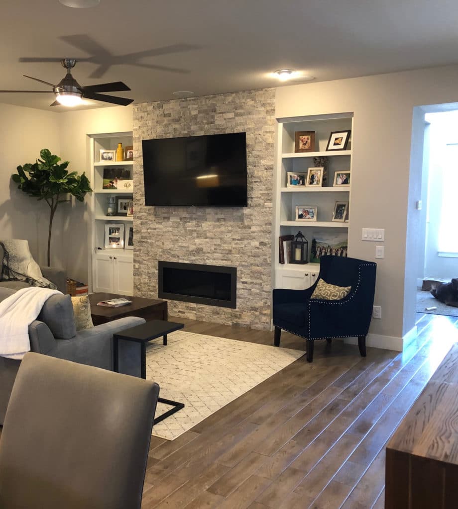
On to the next zone, which had a gorgeous stone fireplace and built-ins, but was CRAVING a little KLC…
Seriously? Seriously…
LOOK AT THOSE FREAKIN’ BUILT-INS! Benjamin Moore Cheating Heart was the PERFECT paint colour (see more ideas here) as it grounded the space, gave contrast to the stone fireplace and white walls AND brought some of the contrast of the kitchen into the living room. Painting the built-ins DARK was important for flow based on the dark stain of the kitchen cabinets.
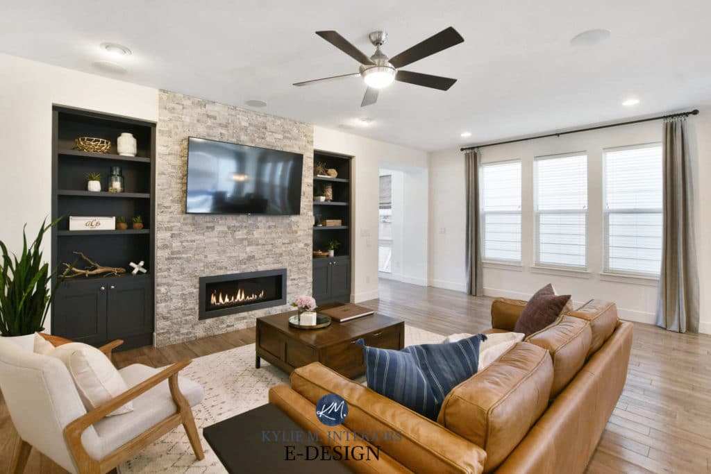
BTW, stunning photography by Richard at Western Exposures photography, he totally captured the brightness and beauty of this family home.
NEED HELP?
Check out my Online Paint Colour Consulting and E-Books!
Chat soon,

READ MORE
Paint Colour Review of Benjamin Moore White Dove
Sherwin Williams Pure White in a Brand-New Home!
The 5 WHITEST White Paint Colours


What is the Benjamin Moore equivalent to pure white?
Hi there looks fab! Please tell me, did you use “simply white” for kitchen/family room?
Thanks kindly
Julie
Hi Julie, that’s actually ALLLLL Pure White in a south-facing room, which could account for that bit of extra warmth you’re seeing 🙂
Would Pure White work on a western facing wall with slate gray and gold accents?