
The 5 White Paint Colors I Rarely Recommend for Cabinets & Trims (& Why)
Welcome to the 5 wicked whites of the west. When choosing the best white paint color for trims, doors, and cabinets, would you rather have a white as flexible as a 10-year-old gymnast or one as flexible as an 80-year-old armchair aficionado? Personally, I’d rather have a white in the form of wine – in ma belly.
Now, I know you’re shaking in your cute lil’ boots, hoping that your white or creamy-toned trim or cabinet color isn’t on the hit list—and it might be. I can imagine some of the comments I’ll get from readers who these whites’ and LOVE them. And I agree—some homes can pull off these whites fantastically. Others? Not so much.
Now, you’re probably wondering what’s REALLY WRONG with choosing these colors for your cabinets or trim—what’s the big deal?
WHAT’S THE BIG DEAL?
- These colors set the stage for wall colors, finishes, furnishings, and accents.
- They’re the framework for your walls, windows, cabinets, and floors
- They’re the starting point for any successful color scheme.
If these colors are limiting, you’ll have a fraction of the choices you might have with a more flexible shade of white or even a flexible off-white.

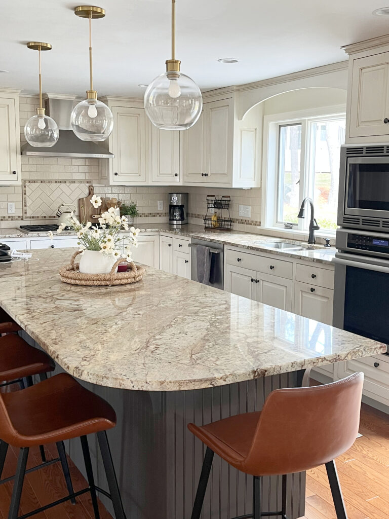
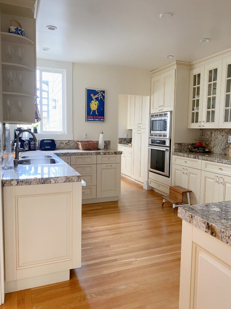
Somebody chose a too-creamy white for these modern, updated finishes.
The colors I’m referring to pop up on cabinets and trims all the time, and they have too much yellow. I rarely come across whites that are too blue, green, or purple (only because they aren’t used very often)—it’s always the warm whites that throw things off-whack in a design plan.
Now of course, there are warm creamy whites and off-whites that come naturally to a home, in which case, they make a ton of sense…

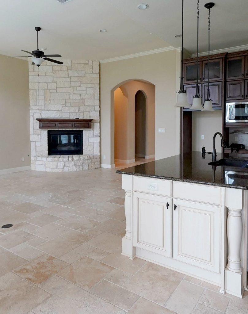
If you love a Tuscan-style kitchen, cream cabinets can be beautiful!
If you have one of these whites or creams and it looks good now, GREAT. However, if you want to change your decorative direction in the future, you could have a big problem.
You see, my favorite and most recommended whites are flexible. They don’t even come close to being too cream or yellow (for most homes); they’re just ‘subtle and warm.’ They suit warm and cool colors, as well as a wide range of neutrals, for paint colors and finishes. Now the buggery colors that I’m going to reference are ALSO warm – they just aren’t as subtle about it. The stronger yellow in them reduces their flexibility and prevents them from accommodating nearly as many other colors and finishes.
Pretty? HECK YES? Limiting? Definitely.
However, if you WANT cream-yellow cabinets and aren’t worried about flexibility or resale, these colors might be right up your alley.
So what ARE these white wonders, you ask? Let’s take a peek…
1. SHERWIN WILLIAMS ANTIQUE WHITE SW 6119
Antique White is number one on my hit list. While it’s a super popular color for cabinets and trims,
- People treat it as though it’s a white, even though it’s not (even though ‘white’ is in its name), and
- It’s not at all flexible regarding finishes and coordinating wall colors.
On walls? It’s amazeballs. On cabinets and trims? It’s a hard no from this color cowgirl.
As for resale, it’s awfully warm and picks up the early 2000s, Tuscan-era vibe, which many buyers are trying to get away from and update.
With Antique White’s LRV of 72, not only is it not white, but it’s also on the dark end of the off-white range. The darker and creamier your cabinets and trim are, the more limiting your options will be for surrounding finishes.
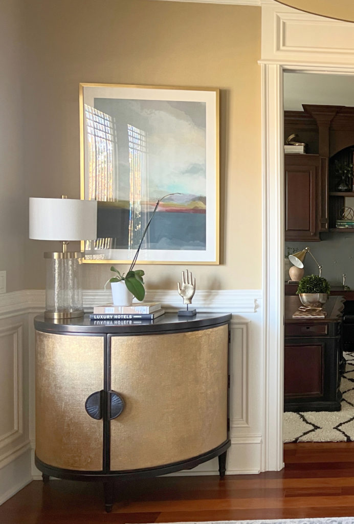
Here’s a door and trim painted Antique White.

Notice the depth and vibe of the surrounding Samplize Peel & Stick paint samples. Pretty? Sure, but there’s not much of a range there (more colors can work, but many have similar vibes to these).
This next kitchen is painted in Antique White.
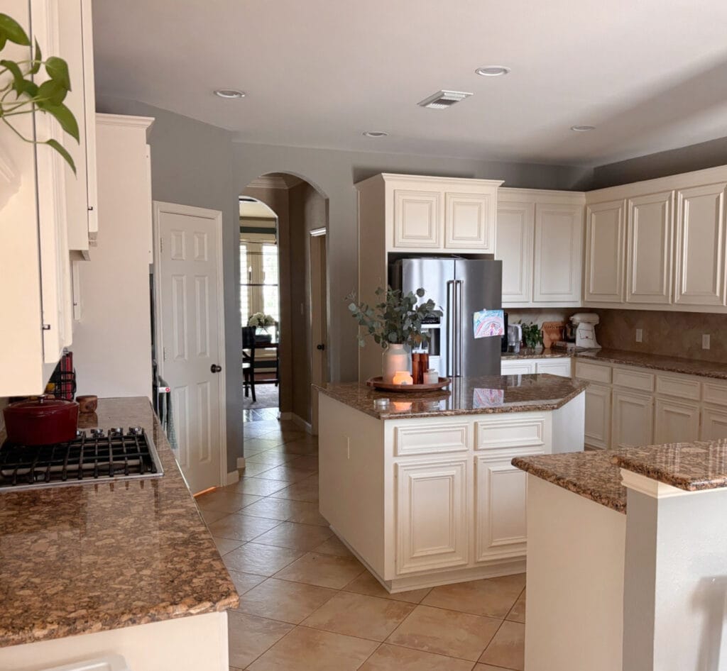
I would LOVE to see knobs on the doors and handles on the pulls of these cabinets – they look a lil’ nekkid.
Paint Color Review of Sherwin Williams Antique White
It looks lovely, soft, welcoming, and warm – this isn’t about it being a bad color, it’s about it not being a VERSATILE color that helps you decorate or make different decisions in the future.
PROS & CONS OF ANTIQUE WHITE
- It’s beautiful for a Tuscan-style home
- Because it has ‘white’ in its name, many assume it can be used as a white, when it rarely should be
- It has a soft, creamy warmth that’s pretty for walls
- It’s not remotely flexible as a cabinet or trim color
WHAT I RECOMMEND INSTEAD
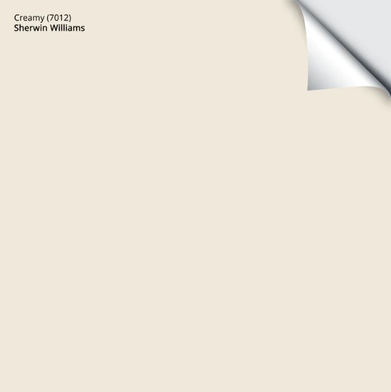
If you love Antique White’s warmth, take a look at Sherwin-Williams Creamy (which is also on my hit list); it could be a good happy medium between minimal versatility and a LOT.
Sure, it’s also on my hit list, but I’d way rather you choose Creamy over a color like Antique White for most kitchens and trims.
Here’s your Peel & Stick sample of Creamy…
Now, this next white is one I wouldn’t necessarily PICK for trim or cabinets, but if it’s already in place, it’s a bit easier to work around than most others, and that color is…
2. SHERWIN WILLIAMS DOVER WHITE SW 6385
Dover White isn’t the WORST warm, creamy white for cabinets and trims because it’s brighter than a few others on this page (a ringing endorsement, for sure). That doesn’t mean I recommend it much, not unless it makes a TON of sense for that home and its particular finishes.
This next kitchen looks STUNNING with its Dover White cabinets – no doubt about it…
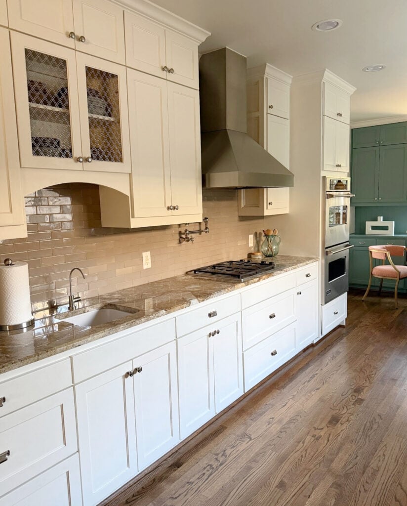
However, once you step outside of the kitchen and have this same white on your trim, finding coordinating wall colors isn’t easy.
This is because Dover White has a reasonable degree of yellow, which makes color coordination challenging. Also, if you’re pairing it with your original granite countertops and want to update them to something more modern one day – good luck, Chuck.
As shown in the next photo, Dover White is often paired with granite countertops that aren’t equal in warmth, making it look more yellow…

While each finish is pretty on its own, Dover White prefers a countertop with a more noticeable cream-yellow OR a black countertop.
Paint Color Review of Sherwin Williams Dover White
Are you surprised that some of these aren’t really WHITE? The challenge is that, because most of WHITE in their name, people treat them like one – that’s half the problem.
WHAT I RECOMMEND INSTEAD
Take a look at Sherwin Williams Alabaster. This is a soft, beautiful, warm white paint color. I suggest it to my Online Paint Color Consulting clients allllllll the time – for good reason – it works.
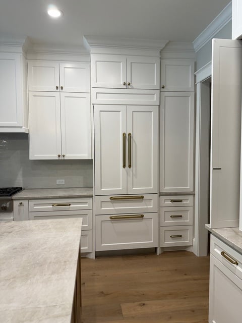
3. BENJAMIN MOORE NAVAJO WHITE OC 95
At the beginning of any Online Color Consult, I ask, ‘Do you need a trim color suggestion, or do you have an existing trim color that you’d like me to work with?‘ When Navajo White or the previously mentioned Antique White is noted, I make a mad dash for the wine cabinet and grab the nearest funnel, anticipating the glory of explaining why these colors are hard to work with and likely won’t be easy to update.
Here’s Navajo White in this entryway with Benjamin Moore Cloud White trim. This works great as a warm white flexible trim is on the walls, and Navajo White does its best work on the walls…
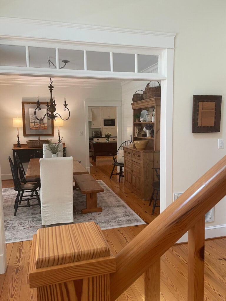
Don’t get me wrong—Navajo White is an amazeballs shade of cream for walls, but on other surfaces, it’s not so hot.
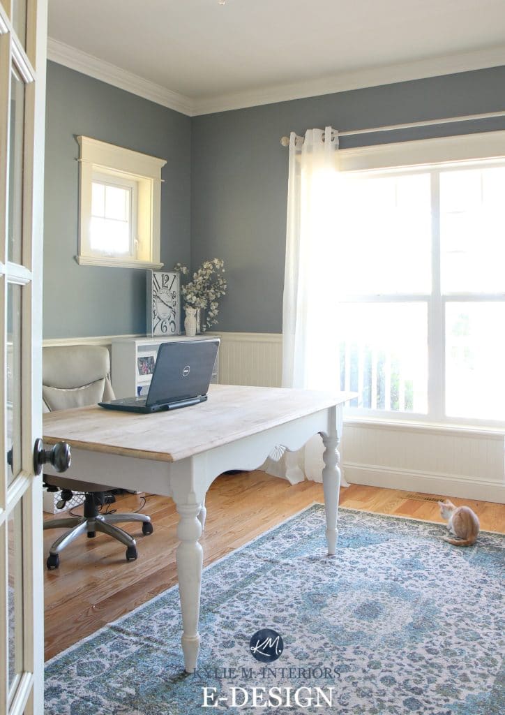
The Best Paint Colors to Update Cream Painted Cabinets & Trim
In the above home office, look at the color of the small window trim vs. the crown molding – that’s the difference between Navajo White and a more flexible white. When we buy a home, we rarely walk into a perfect slate; in this case, the owners didn’t want to repaint ANY of the trim in their recently purchased home. So, it was about finding a happy medium between what worked best for both trims AND the homeowner – and I think we did it! However, if all the trim were a flexible white, our options would’ve opened up CONSIDERABLY.
In this next home, Navajo White looks gorgeous on the trim and wainscoting – no doubt about it…
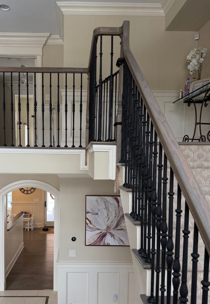
But let me know how it goes when you want to change the wall color from beige or tan and need to still coordinate with your Navajo White trims.
Whites or creams with too much yellow will be harder to coordinate in the short AND long term.
My Paint Color Review of Benjamin Moore Navajo White
WHAT I RECOMMEND INSTEAD
While there’s a world of difference between these colors, I’d go for Benjamin Moore Cloud White or White Dove instead of a heavy cream like Navajo White.
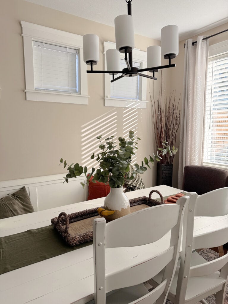
Cloud White with Benjamin Moore Manchester Tan
4. SHERWIN WILLIAMS CREAMY SW 7012
Oh, I’ll be burned at the stake like a wicked little Ginger witch, but seriously, please don’t choose Creamy for your trim or cabinets. If you already have it and it’s working for you, then kudos. However, if you’re choosing trim/cabinet colors from scratch, you may want to look elsewhere for your perfect shade of white.
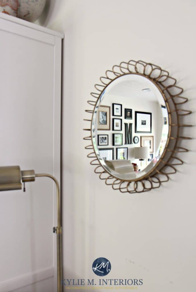
Why?
Creamy has too much yellow. If you dream of long-term flexibility, this color won’t deliver. If you’re considering RESALE and want a trim color that suits a wide range of tastes, this isn’t it.
The one thing going for it is its LRV. Creamy’s LRV is 81, close to the white range. Being this bit brighter than others on this page makes it a bit more flexible, but its yellow still holds it back from being a top shade.
Subscribe to my YOUTUBE channel for more great Kylie M. content!
In the photo of the stairwell below, you’ll see Creamy on the walls and Benjamin Moore Cloud White on the trim—right where they belong! Of course, everything washes out in sunlight, so you’ll want to see the contrast where the baseboard/wall meets to see the shift.
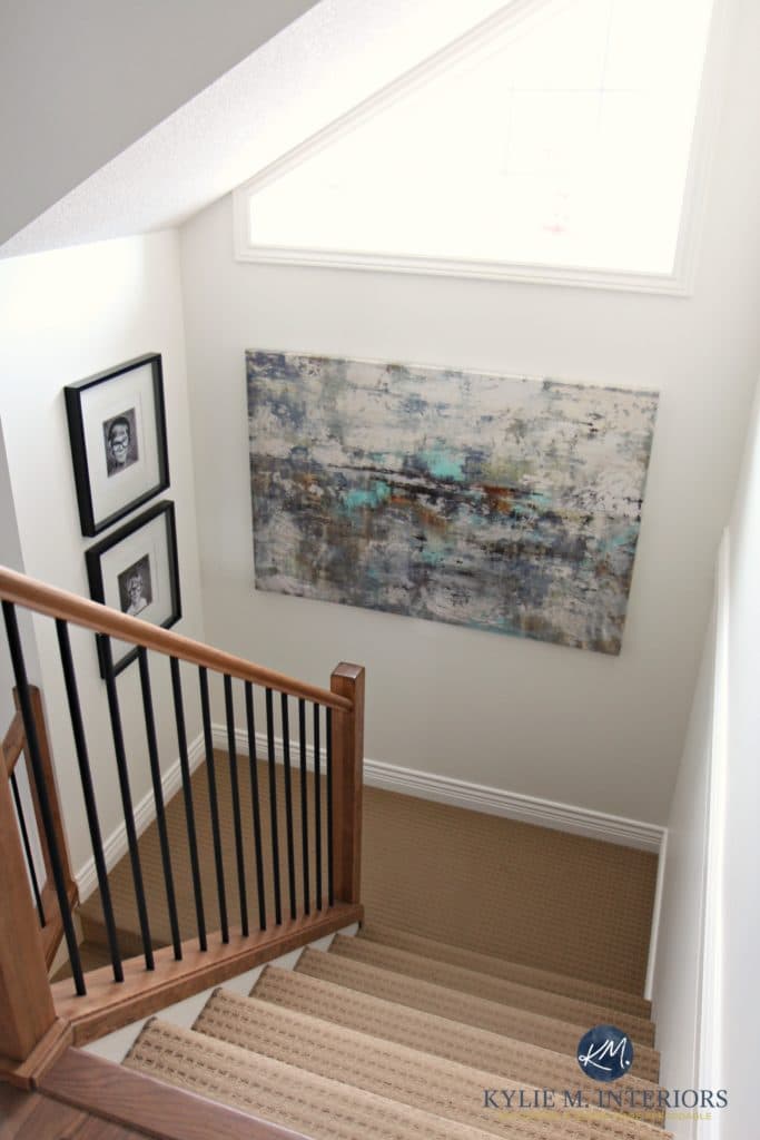
Creamy colors like these are best suited for WALLS – rarely for trims, doors, and definitely not cabinets.
Are there exceptions? Heck yes! The odd granite/backsplash combo begs for warm yellow-based colors like this—that actually need them to look their best. However, they’re few and far between.
How to Update Older Granite Countertops
Certain styles also lean considerably warmer (e.g., those who love richer beige or cream walls), in which case creamy whites can be gorgeous on trims, doors, and cabinets.

Paint Color Review: Sherwin Williams Creamy
WHAT I RECOMMEND INSTEAD
Bump just one little bit up to Sherwin Williams Alabaster, which is one of my most recommended warm white paint colors for walls, cabinets, and trims.
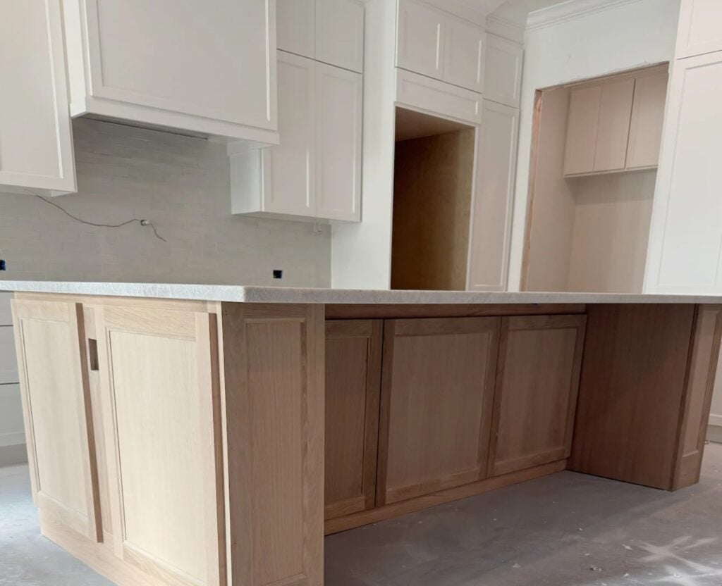
THE PROS AND CONS OF CREAMY
- Of them all, Creamy is the best one for cabinets and trims, if you really don’t want a more traditional, flexible white paint color.
- It’s beautiful for walls, and you can color drech, using it on trims/doors/cabinets, too.
- It’s a bit yellow for the average, modernly updated kitchen or bathroom.
Check out Kylie M’s Online Paint Color Consulting – let me make it easy for you!
5. BENJAMIN MOORE LINEN WHITE OC-146
Linen White is beautiful…if you want cream walls. However, if you’re looking for a warm shade of creamy white for your cabinets, trims, or doors, this could be a far cry from your home’s best choice.
Again, it comes down to the degree of yellow. Linen White has too much yellow to be flexible. Might you love it? YOU BET, in which case, you can fill your little creamy leather boots. However, many other shades will be better if you want flexibility and appeal for resale.
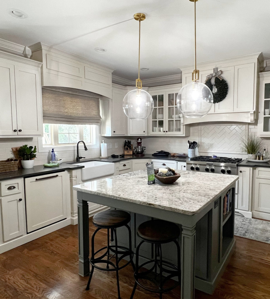
Is Linen White beautiful on these next kitchen cabinets? You bet your booty it is – it’s stunning with the classic, timeless, honed black granite countertops. However, updating the surrounding finishes (even just the wall color) while keeping Linen White in place will be challenging.
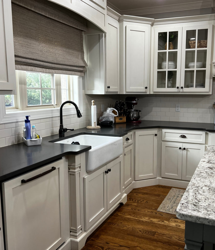
Again, some kitchens or homes NEED creams or creamy whites. However, if you have the average home, you’re probably better off with a more flexible shade of white.
FREQUENTLY ASKED QUESTIONS
For any random quandaries and queries…
WHY DO SOME WHITE PAINT COLORS LOOK YELLOW ON CABINETS?
There can be several reasons your cabinets pick up a yellow or creamy hue…
- You chose a paint color with a decent yellow base.
- It’s being compared to finishes that aren’t as warm/yellow, and the contrast is popping the yellow (e.g., a white subway tile backsplash that’s whiter than it)
- The cabinet paint has an alkyd or alkyd emulsion with resins that turn yellowish over time.
- The cabinet paint has warmth to it already, before you added any paint pigment to the gallon.
Before you panic, try adjusting the Kelvins of your light bulbs and see if that helps.
In this kitchen, notice how the cabinet picks up considerably more warmth than the lovely, warm white on the walls, trim, and door (this isn’t ideal)…
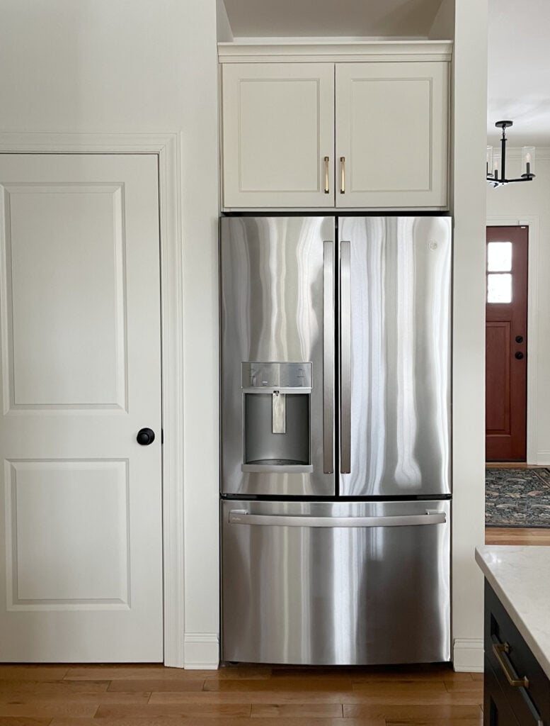
WHY I RARELY RECOMMEND THESE WHITE PAINT COLORS
They’re often chosen because the homeowner doesn’t like traditional white cabinets and loves their creamy, warm look. And I agree, they can be beautiful. But the most important part of creating a color palette is ensuring your paint colors coordinate with the surrounding finishes. Often, these ‘warm creamy shades’ are loved by people, but not by as many finishes.
WHAT ARE THE BEST WHITE PAINT COLORS FOR CABINETS & TRIMS?
The best white paint color for YOUR cabinets and trims is the one that closely matches its surrounding finishes. And you can only figure that out by sampling and comparing a range.
- The 5 Best, Almost Fool-Proof White Paint Colors
- The Best Creamy White & Off-White Paint Colors
- Benjamin Moore’s Best Warm White Paint Colors
- Sherwin Williams Best Warm White Paint Colors
SUMMARY
- Antique White, Creamy, Linen White, Dover White, and Navajo White are too creamy and warm for today’s average kitchen and popular wall paint colors.
- I don’t recommend them because they don’t have flexibility on a large scale.
- All can be beautiful as wall paint colors, paired with a brighter, warm white paint color on trims or cabinets.
Get the best paint color advice with Kylie M’s Online Paint Color Consulting packages – I’d love to help!

Updated with new content and images in 2026





Was considering painting my office Medici Ivory. ( I have 80’s honey oak trim.) It is south facing with one window, but only receives the sun for about three hours 11 am – 3 pm. The garage blocks out the morning sun and the trees block out the afternoon sun. After looking at the colors you mentioned in the article, I am thinking maybe Medici Ivory is similar to these colors?
Hi Kylie – Love your input of levels of warmth and cool, so informative. We are repainting the entire house trim in Pure White in Charleston. The hardwood floors are sort of a java/mocha dark brown. I am torn about walls – Lots of windows so exposures from South and West…I am not a warm white girl more of a gray tones but do not want gray. Steer me please!
Hi Kylie,
New construction paint choices are stumping me. Walls will be SW Natural Linen ( should work w all my fabrics & wood). Originally chose SW Aesthetic White for cabinets/ doors/ trim( builder gives 1 color choice).
But need your advise on a soft white since countertop in kitchen will be Silestone Silken Pearl.
So glad I found your website . I signed up for 5 days of paint advise. Your e consult are all sold out.. ugh. Builder needs choice asap so hope you can help in this forum..
I have SW Antique White for my trim and molding. I want to paint my ceiling a lighter color. Should I use the same color SW Antique white? If not which color do you suggest. I am going crazy 🥴
Hi Michelle,
I’m following your post because we have tons of Antique White trim/molding cabinets etc. I’m wanting to paint the ceiling and walls. We have no idea what color would look best. Right now it all looks blue because we used repose on the walls. Let me know if you have suggestions on ceiling and walls for antique white trim.
Hi Holly, if you go to my home page, you’ll find a big blog post on this exact topic and I’ll be posting a video soon! https://www.kylieminteriors.ca/the-16-best-wall-colours-for-cream-cabinets-trim/
I’ve heard you do not like Dover White for trim but I have it in all my rooms and painted my Master Bath vanity that color. I do not have any issues with it. I really don’t see a problem with it. Perhaps I’m just good at choosing colors to go with it.
My bedroom is painted linen white (eggshell) and the trim/doors are also linen white (satin). I love it! I do not like linen white walls with a brighter white trim.
Well, there you go, the perfect example of when it CAN work!
Kylie, I am going to have my brick fireplace lime washed. My walls are, Benjamin Moore White Dove. I am thinking of using Sherwin-Williams Alabaster. I want a creamy soft white leaning towards taupe for the lime wash. Thoughts?
Hey Denise, there’s not reeeally enough different between White Dove and Alabaster to do this, and Alabaster doesn’t pick up taupe. If you want a creamy soft white, your 100% best bet is to use the creamy soft white you already have – White Dove!
I inherited Dover white trim, and it is the worst. So yellow.
Thank you for writing about the new trim of “creamy white”, which means a yellowish to tan color of kitchen cabinets, when I am asked design questions of will the creamy look okay with the dated granite, or trim, that’s when I wish they had chosen an off white , instead. Such a hassle!
Not sure what to put on the wall I have weston sand cabinets from RTA
I have watched all your videos and tried numerous paint samples and need help. Our kitchen cabinets are coconut with toasted almond with a glaze. The walls were painted SW portabello which was a great contrast with the creamy milky cabinets but I want to lighten up the room. Any suggestions? We are replacing granite and backsplash too (but not cabinets). Thank you!!
Oooo Mary, these ones are always tough and aren’t something I can handle in the comment section. it’s not just the glazed cabinets, it depends on which countertop/backsplash you’re doing, too! You may want to check out my consulting! https://www.kylieminteriors.ca/hire-kylie/
I think we got lucky, because I’m pretty sure our trim and cabinets are either creamy or roman column and our walls are alabaster but everything looks light and airy in the house. I’m not a huge fan of trim being darker than the walls, but somehow it works.
Haha, okay, that’s funny. And seriously, I bet it’s gorgeous. It’s more that some people put these warmer, creamier whites with finishes that don’t suit them where it becomes a problem!