
The 9 Best Light (& Off-White) Cabinet Paint Colors (PART 2)
THE MOST POPULAR & TRENDY CABINET PAINT COLORS
Are you not a fan of white kitchen cabinets? Do you want to update your wood cabinets with paint but want a softer look? Or maybe you’re designing your kitchen from scratch and want something just a bit different. No matter your situation, I’ve got some gorgeous off-white and light-depth colors for you.
However, before we start, you know I ALWAYS have an opinion. The difference between my opinion and that of your sister, mother, and nosy neighbor is that mine is based on experience and knowledge (seriously, I’m not trying to toot my own horn; I’m just keeping it real). This means that it’s not personal.
This post may contain affiliate links. If you make a purchase through links on our site, we may earn a commission.What I suggest has less to do with personal tastes and more with helping YOU find the best paint color for you and your home.

Heck, you’re the one who has to live in it, and I want to make YOU happy!
The above is my lead-in to saying that while off-white cabinets are definitely in style and undeniably beautiful, they come with risks. And because this is a topic unto itself, I’ll summarize it here and give you a link to the full blog post at the end of this one.
WHY OFF-WHITE CABINETS ARE TRICKY
- They’ll greatly limit your paint color choices for your walls. I could go into more detail, but you’ll find the link to PART 1 at the end of this blog post.
- They’re trendy NOW, but so were cream cabinets in the early 2000s (that most of my current clients are cursing and trying to change).
- Some of my clients ask if their cabinets should be white or off-white, to which I say—your kitchen will give us the answer! However, if you’re starting from scratch and can coordinate everything at once, white cabinets are more timeless. Off-white cabinets are trendy but will only be timeless in the odd home (let’s assume your home isn’t odd).

That said, I understand if you’re not swayed and can’t wait to pick your kitchen’s perfect off-white paint color. Remember, I have light-depth cabinets in my home (and they’re gray, so they’re a DOUBLE-WHAMMY in the trend-related world – the double-whammy is also Tim’s favorite Friday night move). This means that I’m preachin’ to my own choir. However, you gotta love the home you have!

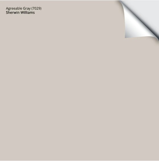
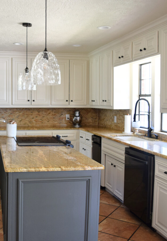
1. SHERWIN WILLIAMS AGREEABLE GRAY 7029
Agreeable Gray can be a gorgeous choice for kitchen cabinets and will be popular for 2024. It is a light-depth greige with minor undertones, which makes it suitable for various countertops and backsplashes (especially today’s modern white and off-white quartz counters).
In this next beautiful space, Agreeable Gray is on the kitchen island, trim, board-and-batten, and French doors, along with Benjamin Moore Chantilly Lace on the lower and upper cabinets…
Below is a close-up of the board and batten and window trim in the rest of the room…so stinking pretty!
Agreeable Gray is also a great choice as it’s not overly warm OR cold, giving you more flexibility down the road.
Get your PEEL & STICK sample HERE…
SIMILAR PAINT COLORS TO COMPARE WITH AGREEABLE GRAY
Because you should NEVER pick a paint color without comparing it to others.
- Benjamin Moore Collingwood
- Benjamin Moore Rodeo
- Benjamin Moore Revere Pewter
- Sherwin Williams Colonnade Gray
- Sherwin Williams Repose Gray
Remember, even if colors share characteristics, there will ALWAYS be shifts in LRV (depth), undertones, or temperature (or all three). It’s about COMPARING colors to see which key features best suit your interior finishes!
Here’s Agreeable Gray again with a gorgeous Sherwin Williams Iron Ore island…

Why Agreeable Gray is a Popular Best Light-Depth Cabinet Color
Agreeable Gray’s Paint Color Review
2. SHERWIN WILLIAMS ACCESSIBLE BEIGE
The color world has shifted, and many of the most popular colors are in the warm range – including cabinet colors.
One of my favorite options is Accessible Beige. The kissin’ cousin to Agreeable Gray, Accessible Beige offers a bit more warmth, sitting on the bones of a beige base.

Accessible Beige has an LRV of 58, which puts it on the lower end of the light range. In a slightly darker kitchen (like above), it can look a bit more muted and darker. However, in a kitchen with moderate natural light, it brightens up nicely…
Of all the colors on this page, Accessible Beige most closely nods at 2026’s Cashmere Kitchen trend.
COLORS TO COMPARE WITH ACCESSIBLE BEIGE
While Accessible Beige is usually at the top of the list, a few shades give it a run for its money…
- Benjamin Moore Edgecomb Gray
- Sherwin Williams Aesthetic White
- Sherwin Williams Natural Tan
Sherwin Williams Accessible Beige Color Review
3. SHERWIN WILLIAMS WHITE DUCK 7010
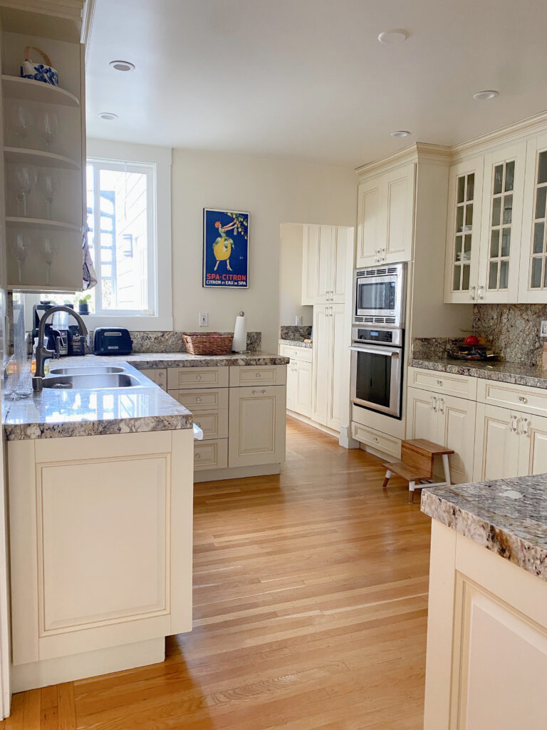
White Duck is among the few exceptions to my hesitation with off-white paint colors. Sometimes, a kitchen needs the subtle softness of off-white cabinets to suit the surrounding finishes. This is OFTEN the case with some of the warmer, popular granite countertops from the early 2000s.
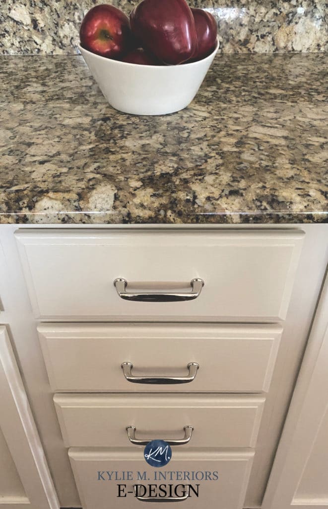
White Duck is like a modern cream paint color. While it has a yellow undertone, it’s grounded by a neutral base. This foundation makes White Duck look much calmer than the cream cabinets of the early to mid-2000s. And if you’re looking at White Duck, you HAVE to check out Shoji White, too; it’s gorgeous.
SIMILAR COLORS TO COMPARE WITH WHITE DUCK
- Sherwin Williams Shoji White is very similar but is a touch more muted with a wink less orange hiding in it
- Sherwin Williams Aesthetic White is a bit more beige-inspired (mad love)
- Benjamin Moore Ballet White, which is a bit darker and creamier/warmer than White Duck
- Benjamin Moore Edgecomb Gray
Get your PEEL & STICK sample HERE…
Paint Color Review: Sherwin Williams White Duck
4. BENJAMIN MOORE CLASSIC GRAY OC-23
Classic Gray is undoubtedly one of the more popular off-white warm gray paint colors. Just keep in mind that it can look a bit warmer than expected on kitchen cabinetry (there’s a reason for this, but I won’t nerd out on you…this time).
COLORS TO COMPARE WITH CLASSIC GRAY
- Benjamin Moore Balboa Mist
- Benjamin Moore Collingwood
- Sherwin Williams Egret White
- Sherwin Williams City Loft
By the way, there will always be shifts in LRV (depth), undertones, or temperature (or all three) – no colors are exactly the same. COMPARE, COMPARE, COMPARE!
Benjamin Moore Classic Gray Paint Review
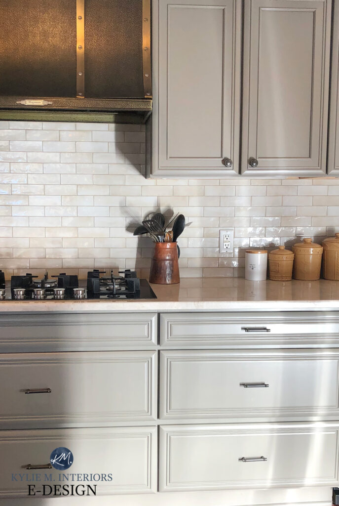
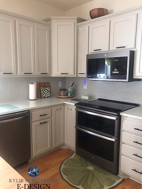
5. BENJAMIN MOORE REVERE PEWTER HC-172
Ahhhh, here is where my weakness lies (well, here and with Ryan Reynolds, who I’d lay with any time—just joking, Tim). Revere Pewter is a light-depth, warm grey (it could be greige) paint color. Its subtle green undertone can be a pretty match or complement to some of the popular white quartz countertops—including mine!
See our kitchen remodel HERE
That’s right; Revere Pewter is the color I chose for my cabinets. However, cabinets often look a bit lighter than you’d expect due to the finish of cabinet paint (satin is my recommendation for most kitchens). To account for this, I darkened my cabinets approximately 25%, just to put a bit more meat on their bones.
Get your PEEL & STICK sample HERE…
COLORS TO COMPARE WITH REVERE PEWTER
- Sherwin Williams Worldly Gray
- Sherwin Williams Colonnade Gray
- Sherwin Williams Amazing Gray
- Benjamin Moore Rodeo
6. SHERWIN WILLIAMS AESTHETIC WHITE 7035
I LOVE Aesthetic White for walls and cabinets. Again, many granite countertops and tile backsplashes don’t suit white cabinets. In these cases, a soft neutral like Aesthetic White can come in DARN HANDY.

The wall color hasn’t been updated. The island is Sherwin Williams Grizzle Gray with a TON of light on it.
Aesthetic White is an off-white beige. However, rather than being a traditionally warm beige, it’s like it’s been gently dipped in GRAY.
You might not see this wink of gray; compared to most previous colors, it will look warmer. HOWEVER, as far as beige/tan paint colors go, it’s pretty darn muted.
Get your PEEL & STICK sample HERE
COLORS TO COMPARE WITH AESTHETIC WHITE
Because you should NEVER pick a paint color without comparing it to others.
- Sherwin Williams Accessible Beige
- Benjamin Moore Maritime White
- Benjamin Moore Winds Breath
Paint Color Review: Sherwin Williams Aesthetic White
7. SHERWIN WILLIAMS MODERATE WHITE 6140
While Moderate White isn’t one of the TRENDY choices, it’s often on the hit list when a home calls for off-white cabinets.
Why isn’t Moderate White as popular?
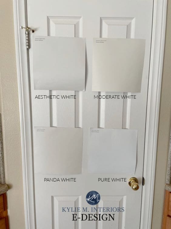
The more popular off-white cabinet colors are warm gray, greige, taupe, and tan families. Moderate White is a beige, so it has an ORANGE undertone. But holy heck, does it suit a lot of interior finishes!

This is because Moderate White has warmth without going too peachy. Sure, that point can be open to perception, but trust the little Ginger – there are colors out there that make Moderate White look like a perfect neutral in comparison – it’s MODERATE and modest!
I rely 100% on photos from ONLINE PAINT COLOR CONSULTING CLIENTS – thank you for sending yours in!
COLORS TO COMPARE WITH MODERATE WHITE
- Sherwin Williams Divine White
- Benjamin Moore Maritime White
- Benjamin Moore Feather Down
- Sherwin Williams Aesthetic White
If I’ve said it once, I’ll say it again…
There will ALWAYS be shifts in LRV, undertones, or temperature (or all three) between colors. It’s about comparing colors to see which key features best suit your interior finishes!
Benjamin Moore Moderate White Paint Color Review
Benjamin Moore Maritime White (below) is another beautiful approach to beige for kitchen cabinets…

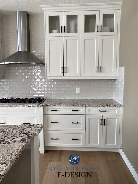
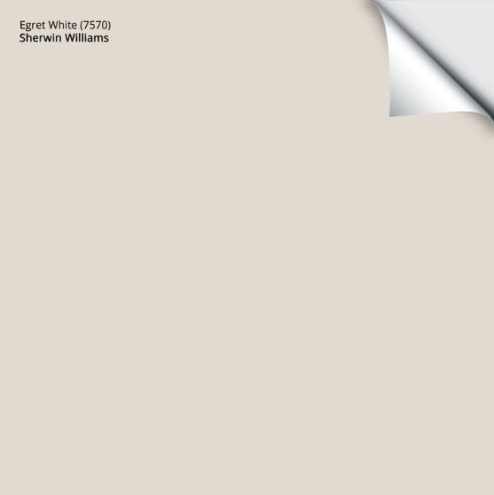
8. SHERWIN WILLIAMS EGRET WHITE 7570
With current paint color trends being much warmer, I see Egret White being a pretty big hit – not just on walls but on cabinets and exteriors, too. And while it can be slightly warm for some of the popular quartz countertops, it could be PERFECT for yours!
I don’t have a sample of it in action on cabinets, but here it is as a sample (far right)…
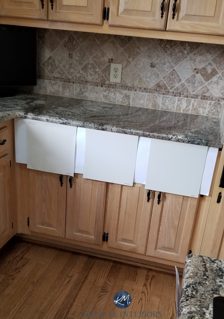
This is a kitchen that DOESN’T want white cabinets!
Egret White is a bit darker than Classic Gray, but it’s similar in approach: a warm gray/taupe that can lean warmer on cabinets than expected.
Here are a few other colors to compare with Egret White…
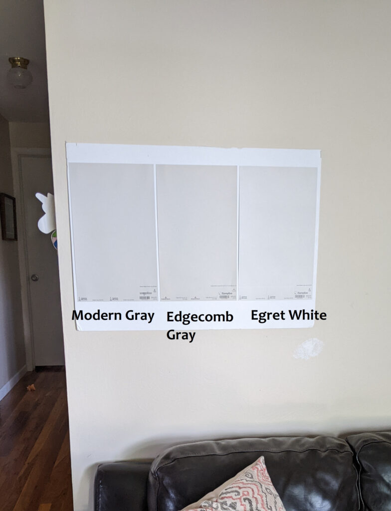
Sherwin Williams Modern Gray / Benjamin Moore Edgecomb Gray
Get your PEEL & STICK sample HERE
Paint Color Review of Sherwin Williams Egret White
9. SHERWIN WILLIAMS SHOJI WHITE
Shoji White has risen in the ranks over the last year or two. What was once a color rarely looked at has become hugely popular for walls, exteriors, and cabinets.
Shoji White is very (ahem, VERY) similar to White Duck (#3). With a soft, muted warm backdrop, Shoji White is backed by a touch of taupe, whereas White Duck leans slightly greige.

How to Update Granite Counters Without Replacing Them
While I don’t have many photos of cabinets painted Shoji White (other than the above example), here’s a great look at Shoji with some comparable colors (thank goodness my clients aren’t painting those glorious oak cabinets!)…
REVIEWS: BM Classic Gray (#4 in this blog post) | BM Pale Oak | SW City Loft | SW Egret White (#8) | SW Kestrel White
Lastly, let’s talk about Creamy White…
BENJAMIN MOORE CREAMY WHITE AS A CABINET PAINT COLOR
I have nothing against Creamy White; it’s a lovely color used successfully in Studio McGee’s kitchen. But just as with any paint color, this doesn’t mean it’ll work in your home.
Creamy White is warmer than the above options and more saturated (chroma/color). It’s still neutral but has more meat on its bones…very creamy bones (a slight flashback to the early 2000s in the wrong space). And it can look gorgeous, I get it, but here are only TWO situations where I would consider Creamy White…
- You’re doing pretty much exactly what Shea has done. Unless you carefully coordinate, as Shea did, you could get some seriously clashing undertones. I can show you some gorgeous creamy whites and off-whites, but they must suit your finishes.
- Your finishes specifically match Creamy White. Matching is different from coordinating. Shae coordinated warm/cool, which takes some serious skill. I’m talking about you having finishes that have a cream in them to connect with.
Personally, I wouldn’t do Creamy White and have recommended it to about two clients (out of 10,000+). You do you, boo. I’m here to give you the best advice to get you on the right path!
Do you want a cabinet color with more DEPTH than the colors shown here? Check out The Best Medium-Depth Greige, Beige, & Mushroom Paint Colors.

READ MORE
SHOULD You Paint Your Cabinets an Off-White Paint Color?
Sherwin Williams Origami White: Paint Color Review
6 Questions to Ask BEFORE You Paint Your Cabinets White
Get the best paint color advice…
Check out my Online Paint Color Consulting


Great information as usual! Long time reader here; I love your in-depth analysis of colour and the insight you provide – so very helpful. Just wanted to mention though – the McGee project you link uses BM Swiss Coffee OC-45 throughout (including the kitchen cabinets), not Creamy White OC-7. They do refer to it as being “a creamy white” but definitely specify using Swiss Coffee.
THANK YOU! I meant to link it to the McGee family kitchen which is in Creamy White, rather than the Cove which IS Swiss Coffee! Thanks for catching this – I’m fixing it right now!
I think I have the perfect example of why off-white cabinets are tricky. We just moved into a new build. This townhome is open layout, 3 floors with loft on the 2nd, and the only spaces/rooms that have doors are the bedrooms and bathrooms. The cabinets are factory finished in a lovely off-white shade that has blue-green undertones. They coordinate beautifully with the quartz countertops which are carrara venatino. The builder chose the colors for the trim and walls and suggest that we don’t repaint the walls for a year, at which time they will come in an fix any nail pops and settling issues. The trim is bright white, the walls a creamy off white. Not only do the undertones of the walls and cabinets clash, but I’m willing to bet that they are similar LRV.
So now I realize that the whole house wall color (undertones and LRV) is going to be dictated by my kitchen cabinet color! And, if I don’t want to paint all the trim in a year (which I don’t), the wall color will be limited by that bright white as well!
I don’t even want to think about it, but have consoled myself that I will be consulting you in the Spring when we can paint again. Maybe it will make a good blog post!
AHHHHH, Donna, I’m sorry to hear this! And yes, it’s the whole ‘similar LRV’ thing that can really throw things off-whack! And just saying, you COULD PAINT now and he can still fix the nail pops/settling in a year :), it will just be on a better colour!
Shea used Swiss Coffee in the Cove Remodel, which she describes as a creamy white. I only know this because I’m slightly obsessed with that specific project. It probably works because the undertones are more yellow green and pull from the more golden veining in the Calacatta marble she used for the counters and backsplash.
Ahhh, I’m probably looking at the wrong project – thank you! I do love Swiss Coffee too :). Now I’m going to figure out WHICH project was Creamy White!
FOUND IT! I had it mixed up with the McGee family home kitchen project – which IS Creamy White – I tagged the wrong project! Thanks for letting me know :).
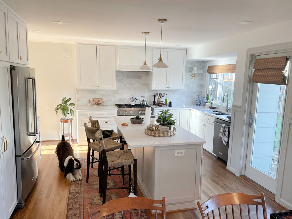
Thank you for this! So much good info. Question – do you know the upper cabinet height and what size pulls were used on them in your first photo with “ Backsplash is TBA”? I love their size proportion with relation to the cabinets.
I’m sorry, I don’t!!
Hi Kylie! I LOVE your blog! For our new build I’m thinking of using Aesthetic White for walls in *most* of our home paired with Pure White ceilings/trim. Our kitchen island will be walnut and I’m trying to determine if I should go with Pure White for our perimeter cabinets OR could I actually do Aesthetic White for a softer look maybe paired with Pure White on our hood vent? Off white cabinets do make me nervous but when done right, I do love. Thank you!
Hey Sophia, this is ALLLL sounding good. For longevity, I do LEAN INTO Pure White cabinets, even though Aesthetic can be lovely on cabinets. I just think you’ll get more enjoyment in the longterm :).
Thank you very much for taking the time to respond! We have a very open floor plan so my other question would be, if I were to brave AW on cabinets, would you recommend I still carry it to the walls with Pure White trim/ceilings? Or at that point would another wall color fit better? Pure White on walls seems to stark for my liking. I did see a photo where the gal did Aesthetic White cabinetry and her walls were Alabaster at 75%. Thoughts on this? Thank you again, Kylie!
Sophia – I am in the same boat!! Considering AW for whole house and darker stained island, but so torn as to either Pure White for perimeter cabinets or jump in to light depth. I’m not opposed to white cabinets so I’m wondering if the flexibility of white will keep me from taking the plunge. What colors are you considering to pair with pure white and AW?
Hi Ashley! So sorry I’m just now seeing your comment. I am still undecided. Most recently I have concluded Pure White would be the “safer” choice then I came across a kitchen where someone had done AW cabinetry and I loved it. Such a hard choice! My husband prefers a little contrast on the walls so I’m almost thinking AW w/Pure White trim would be our ticket. That being said I think Pure White on the cabinetry would work well since the surrounding walls will bring the needed warmth being AW. We have a very open floor plan. Metal finishes in kitchen will be polished nickel faucet and brass pendant lights/cabinet hardware. What have you decided on?
I’ve learned so much from your posts! Our Egret White kitchen cabinets will be installed next week and I can’t make up my mind whether to go with a darker or lighter wall color (or also paint Egret White). I was thinking about Agreeable Gray, but based on your other posts, it sounds like a larger 15-20 point difference in LRV is needed. Would love to go lighter on the walls and/or warmer, but worried that an LRV of 85+ would be too light. It’s a north facing room (relatively open floor plan), that also gets some light from east and from entry (south).
Would love to do a color consult, but afraid I waiting too long.
Oooo, that’s TOUGH with the depth of Egret White! I agree that with a north-facing room, white can be tough. I mean, White Dove is great for a north-facing room, but it’s not my FAVORITE choice with Egret White – I prefer Egret White with SW Pure White or BM Chantilly Lace, both of which lose some feels in northern light. How about getting a sample pot made of Agreeable Gray 25% darker, see how that looks? This isn’t a HUGE SHIFT, but it can be around 3-5 LRV points, which can make a nice difference. Even 50% darker can work (and isn’t nearly as drastic as it sounds, it wouldn’t get you even as dark as Anew Gray, which is the next shade darker than Agreeable).
Thank you!!! I will try Pure White or Chantilly Lace. (BTW, I keep checking your openings for a full consult and will grab one when “back in stock”).
Hey Debra! I’m away next week, but send me an email today or tomorrow (if you get this in time) and I’ll fit you in for when I’m back, okay?! kylie@kylieminteriors.ca
My walls are all SW Creamy. I’m trying to pick a cabinet color and considering aesthetic white or white duck or even dove white. Any favorites when my whole house is Creamy? (Natural oak floors).
Oooo Amy, with Creamy walls, I would stay away from all of those! Creamy has a good dose of yellow in it and will demand more warmth in a light shade.
Grant Beige doesn’t make your cut on recommended off-white cab colors, but I am seriously considering it. You say good things about it elsewhere. Is it worth considering for my kitchen? Thank you! Jane
Ooo, that’s because Grant Beige is quite far off from the off-white world! To be an off-white, its LRV should be approx 73-81. Grant BEige has an LRV of 55, so not only isn’t it off-white, it’s on the DARK end of the light range – almost a light-medium!
A off-white beige or tan is more like SW Aesthetic White, BM Maritime White, China White 🙂
I love your posts! I could read them all day long .. ! There is one thing that confuses me and thats when to darken / lighten 25-50% a color. I painted my cabinets in Edgecombe and they came out sooo yellow OMG , I had them professionally painted but when i got them back I repainted myself all over again 🙁 in Collingwood darkened 25% .. You mention you darkened Revere Pewter on your cabinets but in this article Revere has the lowest LRV ( 55ish ) Given the sheen of the cabinet paints shouldn’t all the above colors be darkened at least by 25% to bring them truest to color or do the colors you recommend already take into account the shift of color in the sheen? I would HATE to have to relive repainting cabinets ever agian ..
Oooo, i see you connecting dots – LOVE IT! Yes, that 25% can account for the way a color can look via the sheen, more so when a kitchen gets reasonable (or more) natural light! I’m also wondering if they used an oil/alkyd based paint or lacquer as that can have a color like EG looking more cream – this said, I’ve found it generally DOES do that on cabinets and exteriors too!
I am so sad that I only discovered you today on YouTube. I wish I would have found you 6 months ago as I would have hired you to consult me! I am 50% through a major home remodel including gutting the entire kitchen and starting from scratch. The interior walls have already been painted Accessible Beige but now, I really love the idea of AB perimeter cabinets and Urbane Bronze for the island. We are literally meeting the cabinet contractor this week to make our final decisions so he can start building the cabinets. Would it be a huge mistake to have the cabniets and walls AB? Is there another color you would suggest for the cabinets that would be complimentary with the AB walls? I watched your videos on YouTube about Accessible Beige and felt that your advice was what I had thought as well which is to go significantly lighter (like White Dove) or darker Greige or Taupe. Neither of those are very appealing to me for the cabinets. Would love to hear your thoughts.
Hi Dianna, I wish you’d found me too! There are people who would DEFINITELY do all Accessible Beige. I wonder though, if you might check out SW Aesthetic White, which is kind of like an off-white take on AB??? I mean, I haven’t seen your finishes, but it’s lovely!
I’d also LOVE to see how it turns out!
Hey Kylie. My MIL just painted her cabinets along with her doors and trim natural cream by BM. Her counter tops are dark (from the 90s early 2000s). What color do you recommend she use for the walls?