
Revere Pewter vs. Colonnade Gray, Agreeable Gray, Edgecomb Gray, & More
COMPARING POPULAR SHADES OF GRAY…& GREIGE
For those of you who’ve dabbled in gray, I’m sure you’ve heard of Benjamin Moore’s Revere Pewter, the most popular gray paint color.
Well, I’m here to turn your color world on its purdy lil’ butt and introduce some comparable shades. I will preface this by saying that I have mad love for Revere Pewter; it’s my main squeeze. However, these colors prove that I clearly have a few mistresses.
This post may contain affiliate links. If you make a purchase through links on our site, we may earn a commission.The most important part of finding your room’s best paint color is to sample and compare.
Revere Pewter might seem like the perfect color for your walls and cabinets, but then you compare it to Agreeable Gray or Colonnade Gray, and all of a sudden, there’s something about Revere Pewter that isn’t quite right. OR, via comparison, you find out that Revere Pewter is your perfect shade – awesome possum!

By the way, do you know why this review is a PERSONAL one? I’ve lived with many of these colors in my various homes. I’ve seen these colors in all exposures and had fun learning about them—it doesn’t get much more personal than that (or it does, but that’s my ‘other blog’—wink, wink).
So, let’s explore these colors and see what they’re all about. Although they might seem similar, their tweaks could make a world of difference to you and your home!
REVERE PEWTER vs. SHERWIN WILLIAMS COLONNADE GRAY
Revere Pewter and Colonnade Gray are similar shades for a few reasons…
1. Their LRVs are close, with Revere Pewter sitting at 55.05 and Colonnade Gray at 53. This makes Revere Pewter the lighter option, but not by much.
2. Both can grab a green undertone.
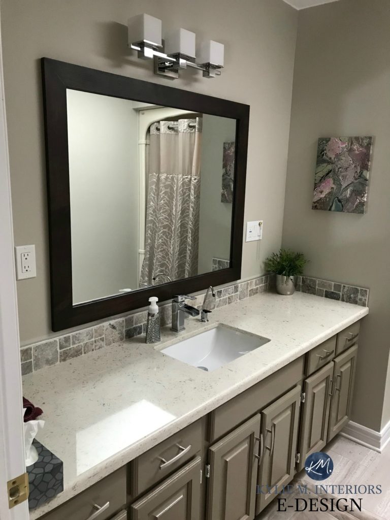
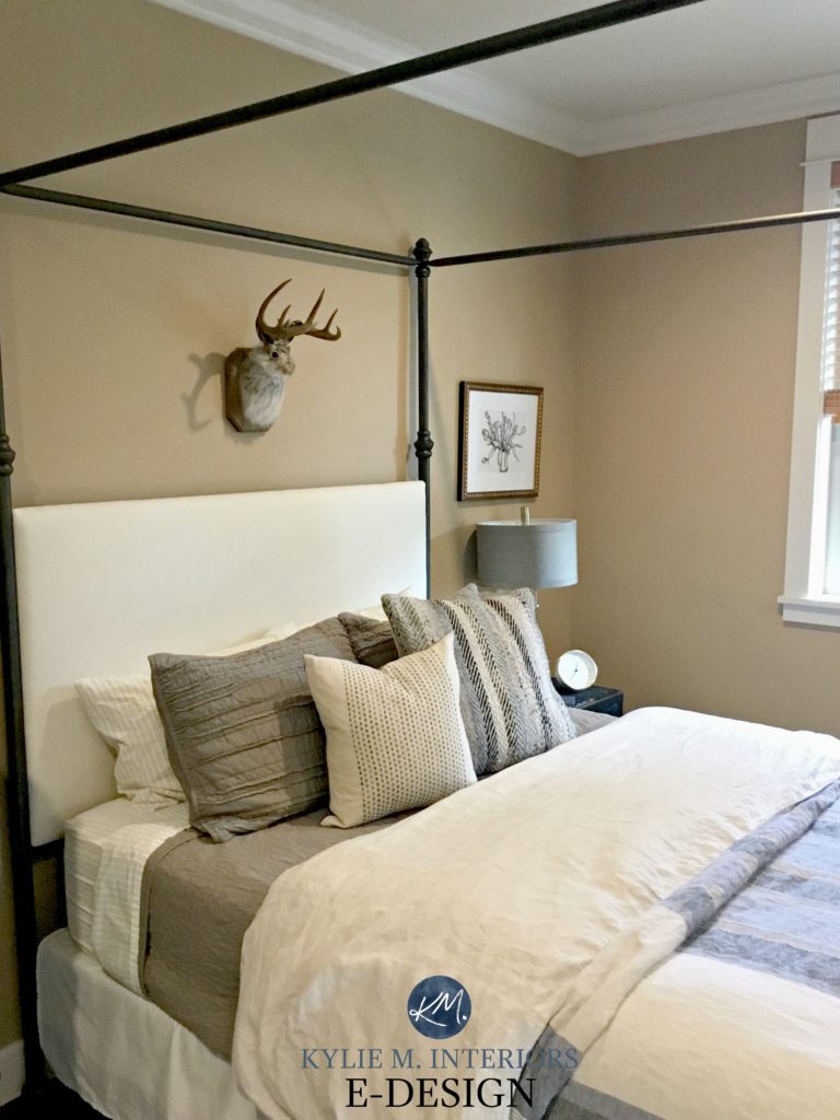
Revere Pewter with an accent wall in Benjamin Moore Kitty Gray
However, regarding undertones, Revere Pewter is more likely to grab green and a slightly muddy warmth. Colonnade Gray can also do this, but not to the same degree.
- Colonnade Gray might be better if you find Revere Pewter too warm.
- If Colonnade Gray looks flat or slightly blue/violet, Revere Pewter might be the better choice, as it’s more likely to grab a touch of green.
- If Colonnade Gray is too cold, but you don’t like warm colors, Revere Pewter could be just the tweak you need.

Revere Pewter left | Wickham Gray right | Cloud White trim
Sherwin Williams Colonnade Gray
In this next image, Colonnade Gray picks up a more of an earthy, warm green undertone…
Here’s Revere Pewter looking beautiful on board and batten with Soft Chamois walls and White Dove trim…

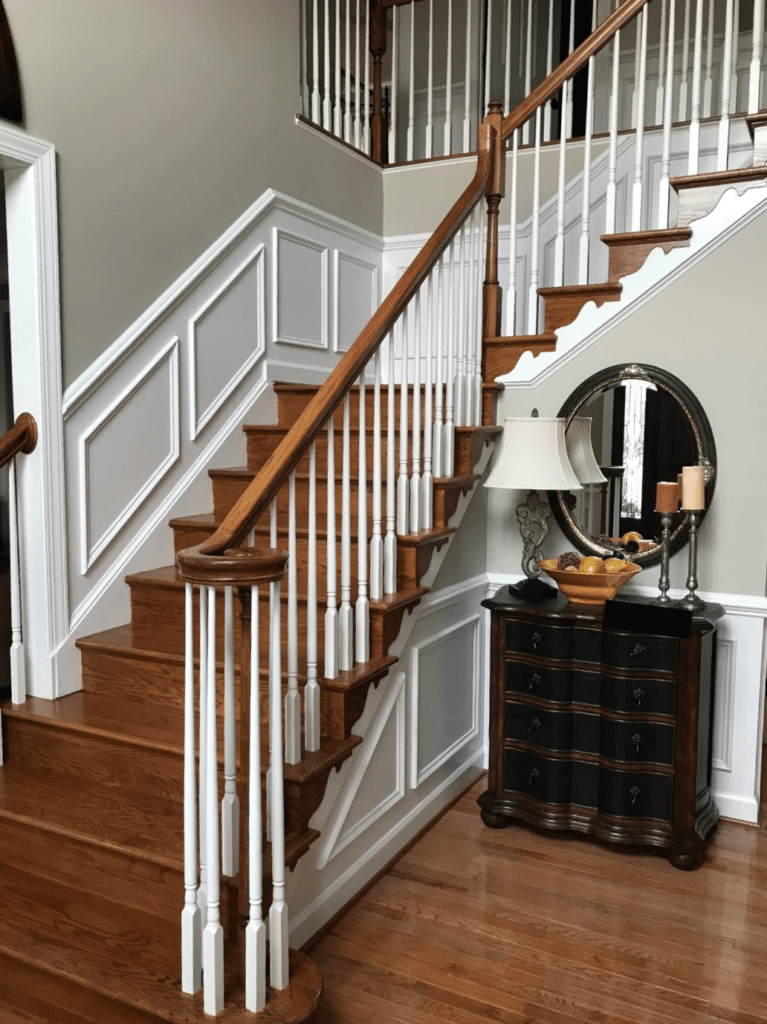
This next entryway shows Revere Pewter as strong as it ever looks—this is more of an exception, not a rule, but it can happen. Revere Pewter’s green undertone usually falls back more like it does on the lower wall in this image, but it’s not as strong as the staircase wall. (I LOVE its earthy hue in here with the wood tones!)
The Best Paint Colors to Update Golden Oak
In comparing the undertones of Colonnade Gray and Revere Pewter in the previous images, you should see a subtle but consistent shift to more gray with Colonnade Gray and a more earthy warmth with Revere Pewter.
The Best Paint Colors to Update Wood Cabinets, Trims, & Flooring
My FULL Paint Color Review of Sherwin Williams Colonnade Gray
- WHICH ONE IS BEST FOR CABINETS & DOORS? Most people lean into the earthy, organic warmth of Revere Pewter over Colonnade Gray, but it greatly depends on the surrounding finishes.
- WHICH ONE IS BEST FOR A DARK ROOM? Both can struggle in a dark room because of their warm backdrop and lower LRV.
- HOW ABOUT A BRIGHT ROOM? Thanks to their LRVs, both colors hold up reasonably well in bright rooms!
Get your CURATED COLOR BUNDLE for easy sampling, including Revere Pewter & Colonnade Gray!
REVERE PEWTER VS. SHERWIN WILLIAMS AGREEABLE GRAY
Ooooo, this is a tough one! When it comes to popular colors from Sherwin Williams, Agreeable Gray is near the top of the list. However, which color has been in Benjamin Moore’s TOP 10 for 14+ years? Revere Pewter.

Sherwin Williams Agreeable Gray
Regarding depth, Agreeable Gray has a leg-up on Revere Pewter, as its LRV of 60 is a bit more appealing to the average homeowner. Not every room can handle depth, and even Agreeable Gray can be a bit heavy for darkish rooms. However, it has a 5-point lead on RP.

Benjamin Moore Revere Pewter
When compared, Revere Pewter has a muddier warmth than Agreeable Gray. That’s not to say that Agreeable Gray isn’t muddy; it is, but Revere Pewter has a slightly more organic, nature-inspired look.
And, of course, undertones. Agreeable Gray is a safer bet if you don’t love green undertones. Sure, it can grab the odd green hue, but not as much as Revere Pewter.

Sherwin Williams Agreeable Gray
- WHICH ONE IS BEST FOR CABINETS & DOORS? Again, it’s a tough call. Both can be stunning on cabinets and doors (I have Revere Pewter on both). However, more people are choosing Agreeable Gray’s slightly softer, muted warmth over Revere Pewter.
- WHICH ONE IS BEST FOR A DARK ROOM? Agreeable Gray is better for a dark space, but you must supplement with good interior lighting and the right Kelvins, or it will fall flat.
- HOW ABOUT A BRIGHT ROOM? Both colors do alright. Sure, Revere Pewter’s lower LRV helps it out, but there isn’t a HUGE difference.
My FULL Paint Color Review of Sherwin Williams Agreeable Gray
REVERE PEWTER VS. EDGECOMB GRAY
While the previous shades showed similar colors, Revere Pewter and Benjamin Moore Edgecomb Gray have a lot less in common.
Benjamin Moore Edgecomb Gray
Sure, they have some similarities: both shades are muddy and warm, organic and natural. However, that’s where the similarities stop.
Edgecomb Gray has an LRV of 63, so it’s tucked nicely in the light range (my favorite range for the average home). This puts it 8 points higher than Revere Pewter’s 55.05.

Benjamin Moore Revere Pewter
If you have a dark room that you want to look brighter, both colors can struggle, but Edgecomb Gray has a better shot as it’s lighter. This said, if you have an overly bright room, while both will wash out, Revere Pewter will hold itself better.
Edgecomb Gray is warmer than Revere Pewter, straddling the worlds of beige and gray with ease. On the other hand, Revere Pewter caters to gray-greige.
As for undertones, Edgecomb Gray is pretty well-balanced between greige and taupe and doesn’t cater hard to green (common greige) or pink (common in taupe). The same can’t be said for Revere Pewter; that bad boy caters to a mild green hue over any other undertone.
- WHICH ONE IS BEST FOR CABINETS & DOORS? Oh, hands down, Revere Pewter wins the cabinets and door wars. Not to say Edgecomb Gray can’t be beautiful, but it’s super limiting as it won’t accommodate as many wall color partners (even RP is tough, and HERE’S WHY).
- WHICH ONE IS BEST FOR A DARK ROOM? While Edgecomb Gray is much better than Revere Pewter, thanks to its higher LRV, both will look dingy without good interior lighting.
- HOW ABOUT A BRIGHT ROOM? Definitely Revere Pewter. Edgecomb Gray does okay, but with full hits of natural light, Revere Pewter holds up a bit better.

Sherwin Williams Egret White | White Heron | Edgecomb Gray | Modern Gray
My FULL Paint Color Review of Benjamin Moore Edgecomb Gray
REVERE PEWTER VS RODEO
Okay, NOW we’re playing with fire. If I have an Online Color Consulting client considering Revere Pewter, I love tossing Benjamin Moore Rodeo in the mix.
Why?
Benjamin Moore Rodeo
Revere Pewter is often a bit dark and heavy for a space, as more so than many light-depth neutrals, it needs the right environment. While Rodeo has similar needs, because it’s lighter, it can slide into a darker room a bit better. This is because Rodeo has an LRV of almost 60, making it a good chunk lighter than Revere Pewter (‘chunk’ being a technical term).

Benjamin Moore Revere Pewter
As for undertones, both can grab a green hue, although Revere Pewter is a touch muddier and more likely to do so.
My FULL Paint Color Review of Benjamin Moore Rodeo

- WHICH ONE IS BEST FOR CABINETS & DOORS? Because of its lower LRV, Revere Pewter is more popular for cabinets and doors as it will accommodate more wall color partners.
- WHICH ONE IS BEST FOR A DARK ROOM? Both need light to come to life; otherwise, they’ll look dingy and drab. However, because of its slightly higher LRV, Rodeo is better.
- HOW ABOUT A BRIGHT ROOM? The brighter the room and the higher a paint color’s LRV, the more it will wash out. For this reason, Revere Pewter holds itself a bit better in an overly bright space.
READ MORE
Is Gray Still Trendy for Walls, Cabinets, & Exteriors?
The Best Taupe & Greige Neutrals for Your WHOLE Home
My Paint Color Review of Sherwin Williams Worldly Gray
NEED HELP?
Check out my Online Color Consulting E-Design!


Originally written in 2017, awesomely updated in 2025


I own a small ranch home with my kitchen open to my living room. I painted my living room, dining room ,hallway and kitchen Colonade gray, I looked at a lot of gray’s before choosing.
I have heard some say that there is a touch of green, I really dislike green and i have never seen a green hint in my home.
My finished basement is getting done in Agreeable gray.
I love Collonade gray!!!!!!
Well Kathy I’m glad to hear this! It’s this kind of info that helps readers decide if it will work for them – thank you!
Can you mix Collanade grey with cool greys? OR is that a complete NO.
Hi Erika! I would, as long as they are softer ones, so ones that aren’t to crisp/clean – ones that have some decent blue/green undertones in them would be quite pretty! (ie: Magnetic Gray)
Hi Kylie,
Can I use Collonade Gray if I have antique white moldings, trim, doors, woodwork all throughout my home?
Hi Margaret, it does depend on how creamy/warm the antique white is. If it’s super subtle than probably yes, but if it’s creamier, it could just be too warm…
I have colonnade gray in my living & dining room. Almost a year since I painted, I haven’t seen that green peek through. However the beige undertone comes forth every so often. Its great in the dining room because I have large windows but in the living room, its somewhat dark. Overall, I like the color. No major sneakey undertones and I think it commits to a grey for the most part.
SN: Colonnade gray LRV is 53 and RP is 55.
Hi Julie, thank you for letting me know! I JUST painted the main floor of our new home in this colour (north facing) and i LOOOOVE it. There’s only 1 part of 1 wall where a minor green comes up in the later afternoon, but fractional. It is really just an awesome greige!
What is this hate for a gray paint that has a green undertone? The most beautiful neutral paint I ever had in a living room was Martha Stewart’s Cord. The tone was a bit beyond light. Cord was such a chameleon that guests would ask, “What color is it? Gray? Green?” I’d love to use it in my present home, but it no longer exists. I’ve called Martha Stewart and Valspar, the company that manufactured it, hoping to get the formula, with no luck.
Hi Joan, I do like a gray with a green undertone – including Revere Pewter! However, I’ve found that with my E-design clients, on the questionnaire that they answer, it is one of the more common preferences, to avoid a ‘gray with a green undertone’! Purple and pink undertones also rank high as colours that they want to avoid – each to their own! 😉
I have used SW Colonnade Gray in our last two houses. I’ve yet to pull any green undertones, but it does pull quite a bit more blue than the swatches or online pics show! Obviously I don’t mind that bc I continue to use it, mainly to keep things simple. Quite a few of my friends have went with it as well and are happy. One time down the gray paint sample hole was enough for me lol
With that being said, we got some granite in our master bath and it’s a lot more gray/blue than I expected and just too close to the Colonnade paint color. (I got frustrated and let my husband make the final decision on the granite-last time that will happen) Our bathroom window is shaded and frosted-so little natural light (this may be the ONLY room I’ve noticed Colonnade pulling the tiniest bit of green). Is there a similar color maybe with higher LRV you would recommend swatching? I’ve tried PPG Fossil Gray, Valspar Cool Slate, Olympic North Beach and a couple others. I may try some whiter tones, any suggestions which ones to start with?
Hi Brittyn! I’m sorry, but without seeing the granite and the bathroom itself, I really can’t begin to tell you what would look good! If you’re interested, I do have affordable E-design services, might do the trick? https://www.kylieminteriors.ca/online-decorating-design-services/ Then I can look at photos and questionnaire answers and come up with some options that actually make sense!
~Kylie
My husband and I remodeled our kitchen a couple of years ago—white cabinets, golden oak hardwood floors, and white/taupe/grayquartzite countertops. I was leaning toward Revere Pewter for the walls, but wasn’t 100% sure. Then I found BM York Gray, which to my eye was ALMOST the same as RP but just a very tiny bit different. I can’t really say how because side by side paint chips look virtually the same, but I just seemed to go for the YG instead and it looks awesome on the walls. Now I’m looking for something for the adjacent LR and FR. Collonade Gray is nice but is there a BM color like it (sorry, SW). Honestly, I’m a huge fan of BM paints and have always used them, and I have no desire to try any other brand!
I’ve been obsessing over your site since we decided to paint our house and used a lot of your suggestions with doing my SW color consult. BUT we have tinted windows because of East/West facing rooms and Colonnade Gray at 50% looks icy blue! I was convinced until they did a sample wall for me this morning and now…lost…and they come tomorrow.
Oooo, those tinted windows are tricky. I wonder if a subtle shift to Amazing Gray would help?
Awesome post Kylie. Many years ago I chose cream blinds (actually I now think they have yellow undertones). I love the Colonade Gray but have concerns about painting the room in CG because of the blinds. My trim is also beige and will be painting them Decorater White BM. Am I making a big mistake since blinds are this creamy/beige/ yellowish color? Love love love your blog.
Oooo, I don’t know Vivian, the Decorator White trim makes me AWFULLY nervous with cream/beige/yellowish blinds, it will definitely highlight them via the contrast with the white. I worry about THAT more than I do the Collonade!
Hi,
I am planning to paint my bedroom and would like to do one accent wall with a navy blue such as Hale Navy or Gentlemen’s Grey (something along those lines) and I am looking for a color that coordinates. I was considering Revere Pewter or Collanade Grey but I’m worried about any undertones they might pick up from the dark blue. I do not want the bedroom to end up looking baby blue next to navy. Would either of those colors work? The room is south facing. I am looking for a greige to go with the navy and not an icy/cool grey.
Thanks for any help!
Hi Jaime, I think those are a great place to start! If you go much warmer you risk losing the pretty navy/greige connection!
EEeeekkkk! Decided on Anew Gray (over agreeable or amazing) for my light floors, they are birch, have turned to a yellow/honey color….NOW I think Colonnade may be the better choice! I want “gray” to tie into my kitchen and addition, but know my colors are warm, so looking for the coolest warm gray there is! LOL
Thoughts Anew or Colonnade for light floors, decent light – dark brown leather furniture! Have SW barn red and SW ramie on the walls now…
Thanks!
Hi Susan! If I were to choose between the 2 (and I have, because I have Collonade in my own home!), it would be Collonade as you’ll get a bit less of a greige/taupe effect up against the more yellow/honey coloured wood 😉
I have honey oak cabinets and honey oak floors – would Collonade Gray work with all the honey oak? My appliances are the new black stainless steel.
Hi Diane! It actually depends MORE on your countertop/backsplash, but generally, Collonade can be quite pretty with the warmer woods 🙂
Love this blog. Don’t see any comments for exterior color. I’ve had my heart set on Revere Pewter for my florida home – contemporary with no trim contrast. The contractor prefers Sherwin-Williams. I have lots of sunshine and greenery. Should I go with revere pewter, colander gray or worldly gray?
Hi Daryl! For the exterior, Revere can be beautiful, but it will probably look a bit warmer than you expect, I’m always surprised by it! You might find that Colonnade holds that colour just a WINK more as it’s a touch grayer. And of course it depends on your exposures/stone/brick/roof, but generally I do like Colonnade.
Hi! Would any mauve or pink type shades go with this color?
Hello,
I have a dark basement with only one tiny window on the northside. I’m looking for a gray that will lighten up the room, but don’t want it to look tan or beige. Can you recommend one.
Thanks .
Hi Kylie, how does SW skyline steel compare to collonade gray? I’m thinking either one for the main body of our house.
Hello,
I am torn between Revere Pewter and Collonade Gray. My living room furniture is a suede royal blue and the flooring has touches of brown, gray, and tan. Trying to see what color paint will look best in that room to brighten it up and the undertones won’t clash.
Off the top, I lean more into Colonnade than Revere Pewter from what I’m hearing, just because it’s a bit cleaner :).
I’m so bummed. I’ve waited a long time to be able to use Revere Pewter and Edgecomb Gray.
No matter what room I tape the paint swatches up on the wall in,, and in multiple places in each room, they both look majorly purple toned to me. Doesn’t matter if I have them up in a south, west, north or east facing room- all very purple looking.
Such a bummer
I thought it’s maybe the paint swatch being funky (the ones from the BM store) and that maybe getting the actual sample paint would make a difference but I’m not so sure since they look so purple.
Hi Stephanie, they really SHOULDN’T be looking that way, and certainly not in every room, which leads me to think you might be placing the samples right on your old paint colour. Perception can really skew things and it’s SO IMPORTANT that you surround your samples with white (poster board is great because it’s thicker) to separate the OLD from NEW!
You mean you had the paint lightened 25 percent? I’m debating between that and 50, so you happen to have a pic?