The MOST POPULAR Gray & Greige Paint Colours
Partner post: The 9 Best Benjamin Moore Best Gray Paint Colours
For those wanting to update their home, gray and greige are definitely two of the most popular choices. But with the THOUSANDS of colours out there, where do you even BEGIN?
Right here.
I’ve decided to touch on some of my favourite gray and greige paint colours from Sherwin Williams, along with some gorgeous photos from my E-Design clients for visual support. These colours should get you WELL on your way to the best paint colour for you and your home!
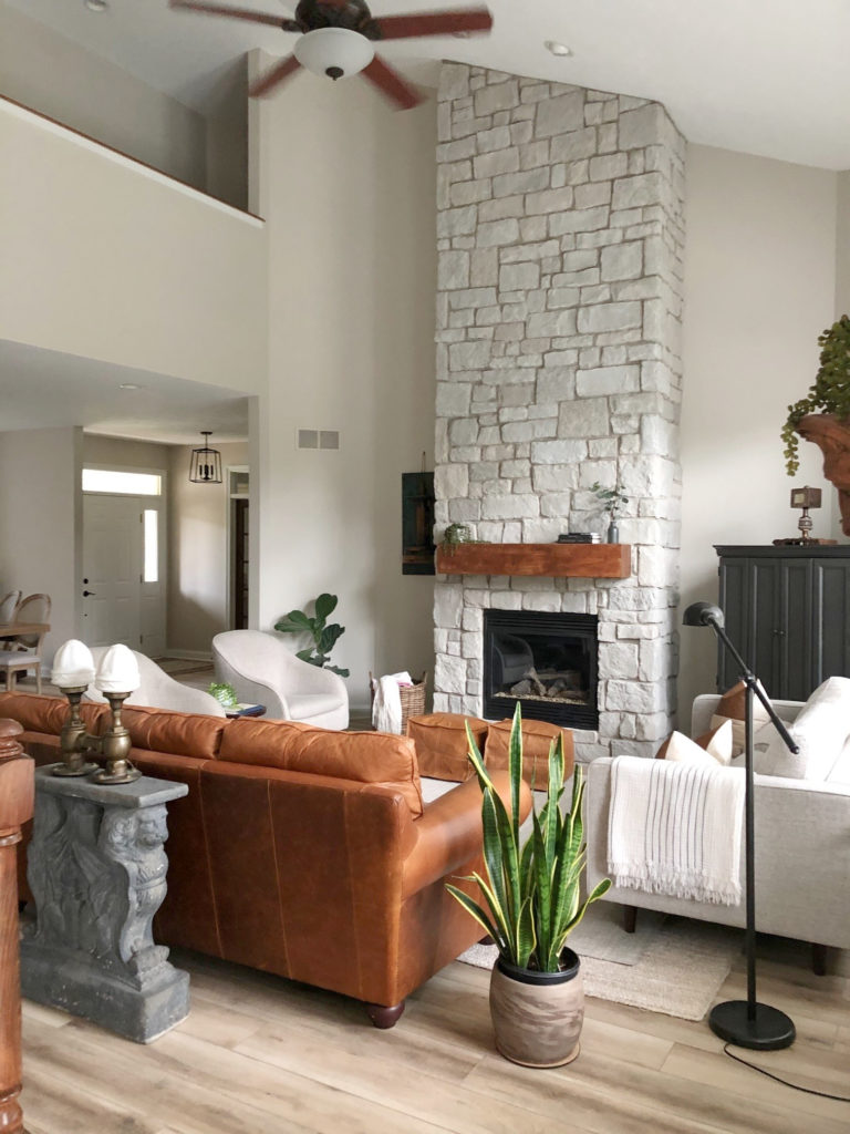
1. SHERWIN WILLIAMS REPOSE GRAY SW 7015
Whether you’re preparing your home for sale or living in it, Repose Gray is a popular warm gray paint colour. Repose Gray is a light gray that has SUPER subtle brown undertones with a wee dab of violet but can be VERY unreliable with it. There’s not enough brown to qualify it as a greige, but enough to add softness and stop it from falling icy cold.
With an LRV of 60, Repose Gray is a light colour, but a ‘heavy light’, as it doesn’t have the fresh, bright feeling you’d expect in a typical light paint colour. It will hold itself nicely in a well-lit room, brightening up, but can look a bit drab in a darker, shadowed space.
However, Repose Gray isn’t the most PREDICTABLE gray and you’ll want to read its colour review to learn more. You can also see it in The 3 Ninjas of the Gray World.
Check out my video review of this stunning colour too!
Paint Colour Review: All About Sherwin Williams Repose Gray
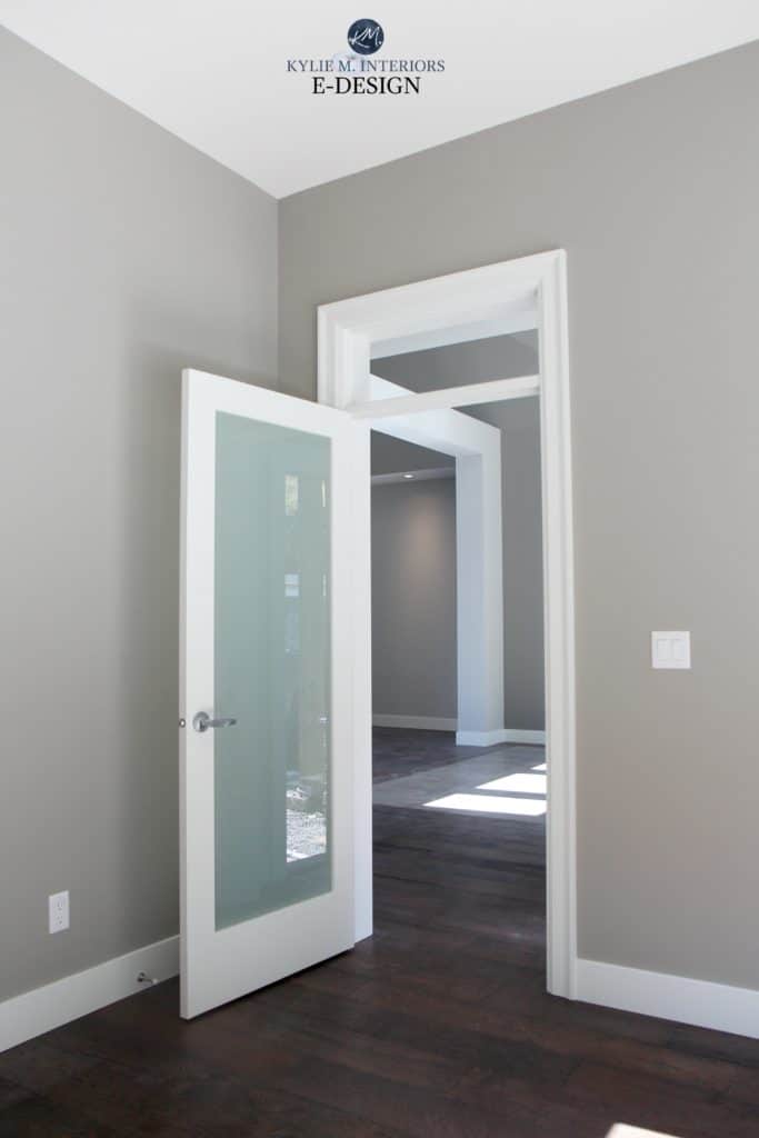
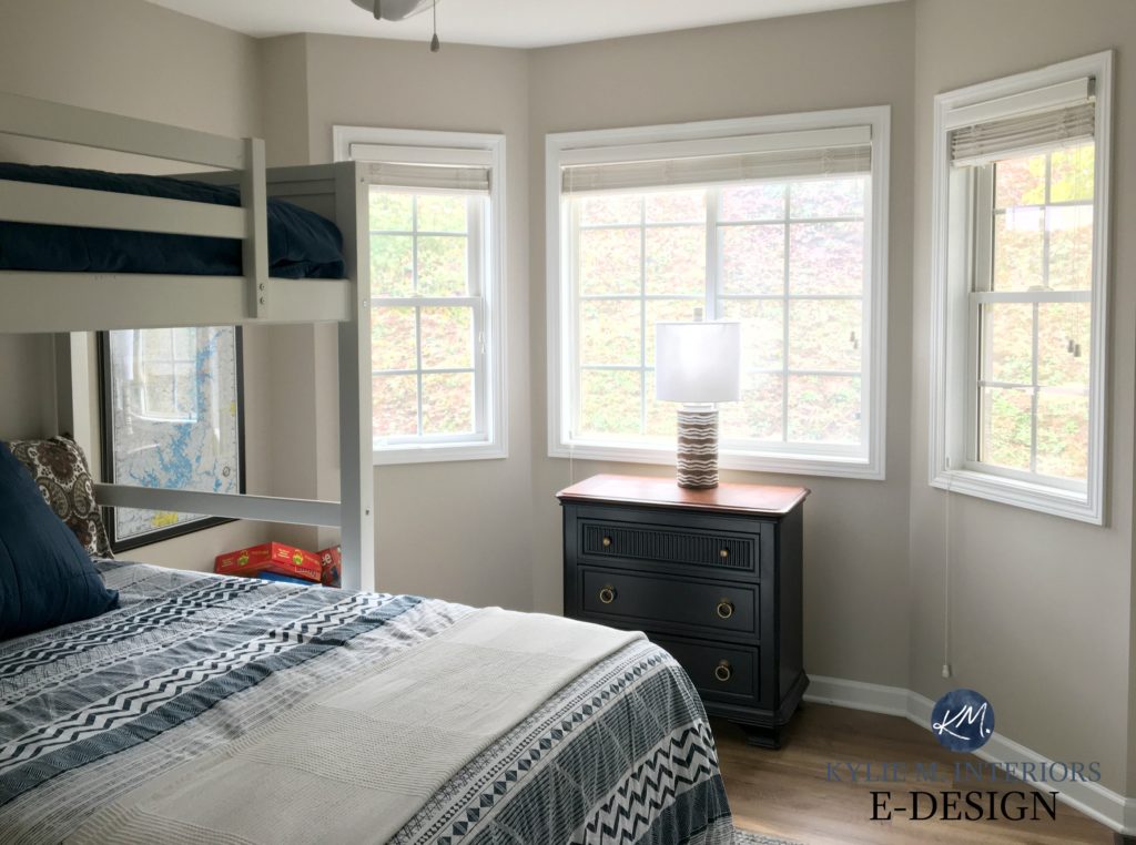
2. SHERWIN WILLIAMS BIG CHILL SW 7648
Big Chill is one of my FAVE slightly cool grays. It has a wink of a stormy blue undertone, but it’s not an icy cold colour – it’s calmer than that. Compared to the EVER popular Benjamin Moore Gray Owl, Big Chill has far less green-blue undertone, making it look more like a ‘typical’ gray.
The LRV of Big Chill is 62, so it’s classified as a light colour. It’s the PERFECT depth when you want a colour that holds itself well in slightly darker areas (as shown below) but doesn’t wash out completely on well-lit walls. (Read all about LRV)
Colour Review Sherwin Williams Big Chill
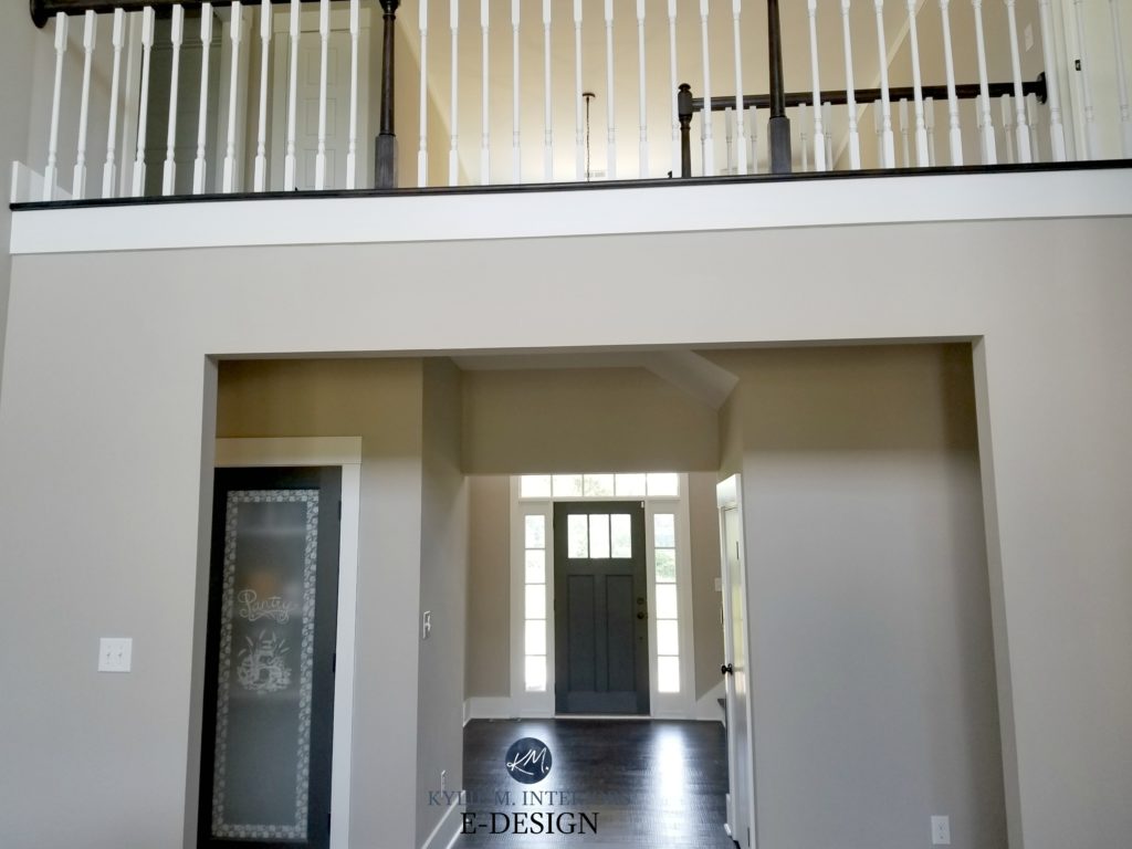
3. SHERWIN WILLIAMS ANEW GRAY SW 7030
Anew Gray is a light-medium depth greige. Unlike its lighter version, Agreeable Gray (which we’ll look at shortly), Anew Gray settles quite nicely between gray and beige, whereas Agreeable often caters to gray.
With its LRV of 47, Anew Gray will add depth and personality to a room without weighing it down, AS LONG AS your room has adequate natural or interior lighting. And while Anew Gray isn’t as warm as beige and tan, its subtle warmth takes a more passive approach that adds a pretty softness to any room.
Paint Colour Review of Sherwin Williams Anew Gray
4. SHERWIN WILLIAMS TINSMITH SW 7657
Tinsmith is a light-medium gray with cool, but not icy cold undertones that can flex slightly blue (sometimes SLIGHTLY blue-green). Check out the shift when the light’s turned on/off…
Tinsmith has an LRV of 57, so it’s tucked nicely in the light-medium range. If you want a bit LESS undertone, check out Sherwin Williams Sweater Weather.
Paint Colour Review of Sherwin Williams Tinsmith
5. SHERWIN WILLIAMS COLONNADE GRAY SW 7641
Colonnade Gray is one of my FAVES and in fact, I used it in our last home. Hated the home; loved the colour!
Colonnade Gray has an LRV of 53, so it’s firmly in the light-medium range. This means it could be a touch dark for a dark room or hallway. As for undertones, Colonnade lightly favours green, but can EASILY flash into any of the cool undertones.
The Difference Between Revere Pewter and Colonnade Gray
Sherwin Williams Paint Colour Review of Colonnade Gray
6. SHERWIN WILLIAMS SILVERPLATE SW 7649
Silverplate is a slightly cool gray that hits JUST the spot when you’re looking for a gray that isn’t too ‘this’ or too ‘that’.
With an LRV of 53, Silverplate might be a bit heavy for a dark room, but looks sharp, clean and inviting in a reasonably well-lit room, especially with cool bulbs. Silverplate is similar to Tinsmith, but a bit stormier looking and slightly more likely to flash blue-green (but favours blue).
Paint Colour Review of Sherwin Williams Silverplate
Undoubtedly, you’ll be heading out shortly to grab paint samples – stop right there! I want you to check out SAMPLIZE PEEL & STICK. Samplize offers peel-and-stick paint samples that are more AFFORDABLE, EASIER and more ENVIRONMENTALLY FRIENDLY than traditional paint pots. Here are just a few reasons why I recommend Samplize to my clients…
- samples arrive ON YOUR DOORSTEP in 1-3 business days, depending on the location
- they’re more affordable than the samples pots/rollers/foam boards that are needed for traditional paint sampling
- if you keep the samples on their white paper, you can move them around the room
Visit the SAMPLIZE website HERE
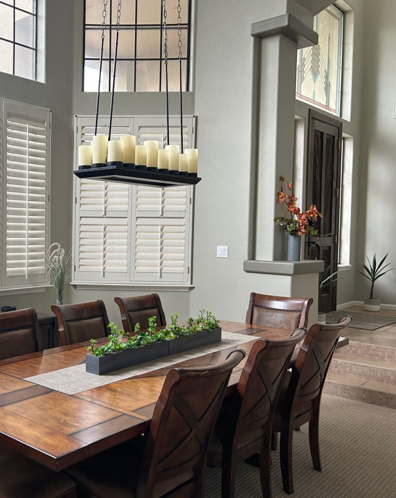
7. SHERWIN WILLIAMS PAVESTONE SW 7642
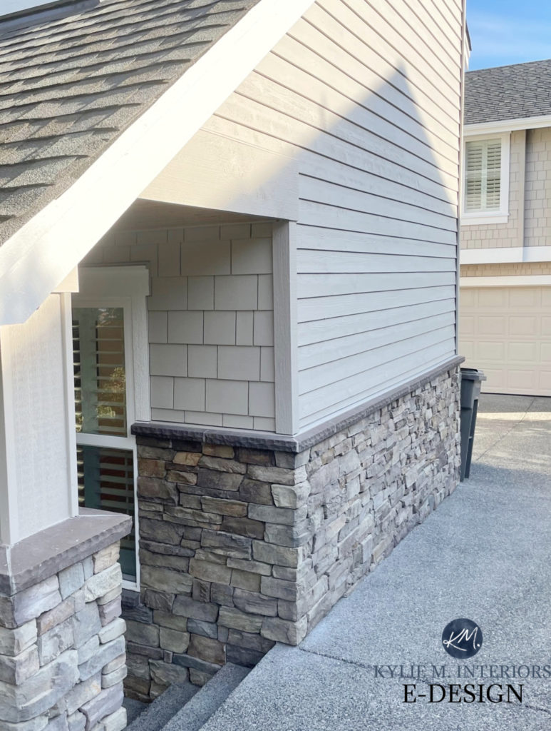
Pavestone is a soft, warm gray-greige that easily picks up a soft, subtle green undertone, especially on exteriors.
Kylie M E-Design
With an LRV of 32, Pavestone might be a bit much for a north-facing or dark, shadowed room. However, in a well-lit space, it’s a stunning, almost medium-toned neutral with an organic-looking, earth-toned base.
Click HERE or on the above image to see available packages!
8. SHERWIN WILIAMS DORIAN GRAY SW 7017
Dorian Gray is one of the more popular grays with a bit more depth/value. While more traditional grays lean to the cool blue or green side, Dorian Gray has a weeee willy wink of warmth in it, offering a softer, more subtle look. While it CAN pick up a touch of green, it generally sits in the violet end of the undertones, but even then, they’re SUBTLE.
Dorian Gray is a beautiful choice for any reasonably well-lit room. With an LRV of 39, it’s a medium-toned paint colour, but when paired with the right white, the contrast is wicked gorgeous! If you’re looking for something DARKER, check out this blog post.
FULL Paint Colour Review of Sherwin Williams Dorian Gray
FOLLOW ME ON INSTAGRAM, I’D LOVE TO SEE YOU THERE!
9. SHERWIN WILLIAMS WORLDLY GRAY SW 7043
Worldly Gray is a beautiful warm grey-greige with a subtle green undertone.
Worldly Gray is the lighter version of Amazing Gray. Both colours can pick up a subtle green undertone, so if you’re sensitive to green (even on the most PASSIVE scale) you may want to read about #10 instead.
Paint Colour Review of Sherwin Williams Worldly Gray
Paint Colour Review of Sherwin Williams Amazing Gray
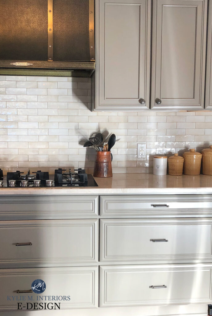
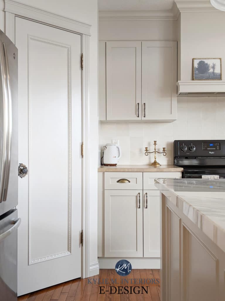
10. SHERWIN WILLIAMS AGREEABLE GRAY SW 7029
While Worldly Gray and Agreeable Gray are very similar to each other, they aren’t quite the same. Both are trying to sneak into the ‘greige’ world as they have far more beige in them than the average gray, however, Agreeable Gray has slightly more flexible undertones (while only MILDLY favouring green). On the other hand, Worldly Gray humours just a BIT more green, making it more greige looking. That being said, both can EASILY pick up any of the three cool undertones given the right conditions.
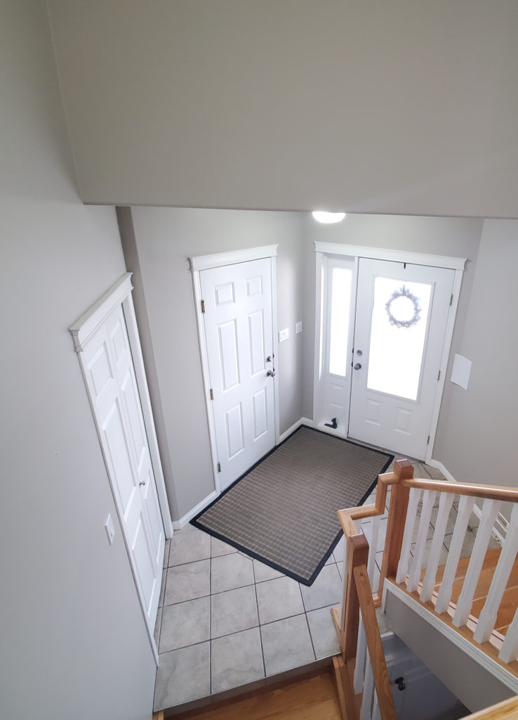
This next image shows my client’s BEFORE photo. Notice how Agreeable Gray looks a touch green compared to the violet undertones in the flooring. I’m eagerly awaiting the AFTER photo with her new and improved paint colour choice!
Agreeable Gray looks STUNNING on these painted kitchen cabinets…
Paint Colour Review of Sherwin Williams Agreeable Gray
11. SHERWIN WILLIAMS ON THE ROCKS SW 7671
On the Rocks is a popular gray paint colour not just because of its depth, but because of its flexible violet undertones. While some grays come across as icy cold, On the Rocks has a softness to it that doesn’t necessarily make it warm, but it’s nowhere near an icy cold look.
On the Rocks has an LRV of 62, putting it RIGHT in my happy place as it relates to paint colour depth.
FULL Paint Colour Review of Sherwin Williams On the Rocks
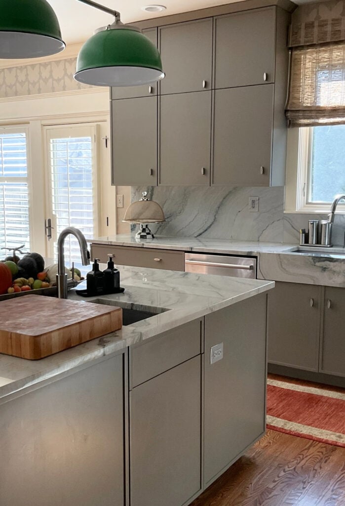
12. SHERWIN WILLIAMS DOVETAIL SW 7018
If you’re looking for a gray paint colour with a bit more depth, whether it’s for your walls, cabinets or exterior, Dovetail is one of the BEST. With its super passive undertones, Dovetail is one of the go-to charcoal gray paint colours.
Dovetail with Repose Gray on the walls
And because it’s always nice to see some comparisons…
FULL Paint Colour Review of Sherwin Williams Dovetail
Get your SAMPLIZE PEEL & STICK SAMPLES of Kylie M’s recommended grays and greiges.
Before we finish our time together, I want to touch on a few COMMON questions…
DO GRAY & GREIGE GO TOGETHER?
Yes, gray and greige do go together, but the gray shouldn’t be LIGHTER than the greige, or the combo can look off. Or turning that around, the greige should be lighter than the gray.
WHAT’S THE MOST POPULAR GREIGE PAINT COLOUR?
Sherwin Williams Agreeable Gray is one of the best greige-taupe paint colours. However, depending on your PERCEPTION of what a greige really is, Benjamin Moore Edgecomb Gray also takes a run at the title!
ARE GREIGE & GRAY STILL POPULAR PAINT COLOURS?
Every colour has its place. Generally speaking, grays are not as trendy as they have been, and greiges and taupes are becoming more popular due to their WARMTH. At some point, this scale will tip us RIGHT into beige, but we’re not there quite yet!
IS GREIGE REALLY JUST A VERSION OF WARM GRAY?
Some greiges can definitely pass as warm grays, including top colours like Sherwin Williams Agreeable Gray and Worldly Gray. However, we’re talking about two different groups – warm grays and greiges. Greiges are WARMER THAN warm grays and have their own category.
READ MORE
The 12 Best WHOLE HOME Gray & Greige Paint Colours
How to PROPERLY Sample Paint Colours
The 8 Best WARM NEUTRAL WHOLE HOME Paint Colours
6 Budget-Friendly Home Update Ideas
The Best Benjamin Moore Gray Paint Colours
The 4 Best Warm Gray Paint Colours
NEED HELP?
Check out my affordable E-Design and Color Consultation
Chat soon,
ORIGINALLY POSTED IN 2019, AWESOME UPDATED IN MID 2022
Comments 182
Please post some photos with rooms that have wood trim instead of only white trim. House over 100 years old and I don’t want to paint the beautiful woodwork
Thank you for your comment Lori! The problem is finding ‘good images’ (as I’m sure you’re finding!) It’s difficult to find photos of updated spaces with fresh wall colours where they keep the wood trim. I will get looking though as you make a very good point – thank you!
~Kylie
I’d like to see photos with dark wood trim as well. That’s the reason I’m on this site. I was hoping to find help in choosing the right paint color for my 1926 home.
Author
Hi Marlene, I have a blog post dedicated ENTIRELY to dark wood trim, you can see it here! https://www.kylieminteriors.ca/update-dark-wood-trim-with-the-right-paint-colour/
I LOVE your insights on color and subtle undertones and what lighting does to paint. I really need a post about grey paints that are pretty in a dark room that gets only shadowed light (southern-facing-with-big-pine-trees-blocking-the-sun kind of light.) You tend to mention the grey’s that look great in a well lit room, but don’t have much positive to say about grey in a “natural-light challenged “ space. I know the real solution is to cut down the neighbor’s trees, but…
Author
Hi Lisa! Well…it’s a tough one. Grays can be tough in a shaded room that isn’t super well-lit. If you look at slightly cleaner ones vs warmer ones it could help a bit. I mean, they are soft grays, but aren’t overly WARM GRAYS, so colours like SW Big Chill and On the Rocks. It’s tough though and you’ll need some interior lighting and clean white trim to help them out!
I’m having that problem as well. I have lovely stained wood trim and doors and cabinets that I refuse to paint white. All this gray will go away soon. When I moved in my house (30 years ago!) the walls were painted gray. A color called sterling. The carpet was a shade of gray as well. It all changes and then changes back. Just go with h what YOU like.
Hello. I painted all walls in my lower level Sherwin Williams Gauntlet Gray. Can you suggest a white to go with for the moulding, casing and base trim? Floor is a medium to dark wood. Thank you!!
Scott
Hi Scott, thanks for asking! I’ve found that White Dove OC 17 is a nice compliment because it doesn’t have as much yellow as many of the other whites/off-whites. Other than that, I’m a big fan of ‘regular old white’ which Benjamin Moore can’t do (you have to tint their paints) but other brands can. Hope that helps Scott!
~Kylie
Great stuff. I have repose gray as our main living area, after getting tons of samples. Have no regrets whatsoever and still in love with the color!
Good to hear Taylor – I do love Sherwin Williams as he’s really giving ole Benjamin Moore a run for his money! Repose Gray is one of my uber faves and I’m glad you love it too 🙂 And don’t be afraid to send pics, if they are quality enough I might put them on my site! (but I would watermark them to my site just so nobody else takes it)
~Kylie
Loved your post, so many excellent tips! I am painting a living room which has high ceilings, poor natural lighting and oak trim around the windows and doors. Is there a gray shade you suggest given these factors?
Do you have a recommendation or 2 for grays that go with dark wood trim and baseboards (modern straight edges and corners in a deep cherry wood color)? I’m having difficulty finding the right color for our living room and den. Thanks!
Hi Jenn! I’ve started referring most questions like yours to my Online Consulting so that I can get photos of your space and give you the best solutions possible! Your particular questions (2 grays) would be $40. With my recommendations I include 3 paint colours as well as explanations so you can understand how they might act in your home. If this interests you at all here is the link… https://www.kylieminteriors.ca/online-decorating-design-services/
Thank you for asking!
~Kylie
Thank you, thank you, thank you!! From the lady with 9 different stripes of gray on each wall. This helped me a lot! Off to Sherwin Williams I go for a sample of Amazing Gray.
Hi Danielle,
AWESOME! These are the comments that I love to get! I’m so glad I was able to help and if it turns out – send me some photos girl!
~Kylie
LOVE this! I love how you described the grays so perfectly. This is so incredibly helpful. Thank you!
We are building a new home and plan on painting it agreeable gray. Would a soft gray tile be a good combination or should we stick with a tan tile? I have a sample of what we’re going for, but I can’t add the picture.
Hi Carranda, you might want a tile that is the same blend of neutrals that Agreeable is. Too gray might end up looking blueish or cold compared to Agreeable, too tan might end up looking dirty. A tile that is a soft gray with a ‘greige’ feel to it would be best.
If you’d like any more help you can check out my Online Consulting, where you can send photos and what not… Hi Shelley, thank you for asking! Because questions like yours are more complex and due to the amount of questions I receive in a day, I generally refer to my Online Consulting. This way I can see photos of your space and make the best recommendations possible. https://www.kylieminteriors.ca/online-decorating-and-e-design-services/
Hope to hear from you!
~Kylie
Hope that helps!
~Kylie
Kylie, I’m trying to transition from a beige house to more of a gray. I think I can get away with using Agreeable Gray or Collonade Gray in my living room. The problem is going to be my kitchen. ALL of my tile, backsplash, and granite are tan. I had wanted to use the same paint color throughout the whole house, but as you mentioned, my kitchen tile looks dirty next to such a fresh gray color. I have somewhat of an open concept because the walls are open at the top in some places there is no distinct stopping point for paint. I can change to a different color for the kitchen, sunroom, and dining room, but they are all visible from the living room. Do you have any suggestions for a more brown color that would compliment Agreeable Gray or Collonade Gray and help my kitchen not look dirty in the process?
I absolutely love reading all your articles. I am having a difficult time deciding on a color. I am debating between revere pewter, anew gray, or amazing gray. We are painting our open floor plan, main areas all the same color which face East, West, and North and has a good amount of natural light. Any suggestions on which to pick? Thank you for your help!!! 🙂
Hi Amber! Revere Pewter can flash a bit green and muddy, Anew is quite greige feeling with a taupe-ish base and Amazing is a greige with less taupe in it. Check out SW Collonade Gray as I think it combines all of these into 1 epic colour.
If that doesn’t work, check out my Online Consulting. I’ve kept it really affordable so that homeowners like you can get the answers they need! https://www.kylieminteriors.ca/online-decorating-and-e-design-services/
Hope that helps! ~Kylie
Thanks Kylie!! We went with Collonade Gray and I absolutely love it!!! Thank you for the suggestion!
You are most welcome Amber, I’m so glad it worked out for you – yahoo!!
~Kylie
I’m trying to find the right gray for my kitchen and living room actually the whole house but I have in the kitchen I have the white quartz and white cabinets and I’m looking for a nice Gray can you help me
Author
Hi Pat, thank you for your note, I do try to give as much free info as I can on my blog and if that doesn’t work, then it might be time for some E-design – it’s affordable and fun!
~Kylie https://www.kylieminteriors.ca/product-category/interior-paint-palettes/
Thank you for the post Kylie! I am one of those folks who obsesses over wall color and can take many months before I finally make a decision! I chose Repose Grey for my family and dining room. For my bedrooms I would like a shade darker (true grey and little to no beige undertone). I was considering Amazing Grey. What would you advise? I appreciate your help!
Obsessed!
Hi Enedra! So if you are looking for a colour that is a shade darker than look no further than Mindful Gray. It has the exact same undertones as Repose. That being said they are gray with a soft taupeish undertone which makes them slightly softer feeling than a lot of the cool grays out there. You can also look at Benjamin Moore Chelsea Gray which is ‘QUITE’ a bit darker, but very striking! I used it in our last home in our bedroom and loooooved it. Hope that helps!
~Kylie
Thanks so very much for this information! I have been obsessed with gray for MANY years (ashley gray, chelsea gray, stone are all Benjamin Moore favorites!) and now find we are in need of staging our home. We prefer to stay in the “greige” family and are just trying to lighten and neutralize the walls a bit. Your tips were super helpful! I’m off to the Sherwin Williams store…..!
Awesome Annie! Yes, Sherwin Wiliams is really giving Benjamin Moore a run for it’s money with regard to the ‘wild world of Gray!’
(have you checked out Collonade by SW? If not, you can read more about it here… https://www.kylieminteriors.ca/collonade-gray-vs-revere-pewter-the-battle-is-over/
Chat soon,
~Kylie
You also may consider “Modern Gray”. A very SLIGHT (and I mean SLIGHT) hint of a pink tinge or hue, but color is FAB! I used it as trim on my house with Fawn Brindle and Black Fox on the front door. It’s a beautiful combo.
Thanks Kelley, I DO love Modern Gray and if I were to do my top 12, it would be right there! And you’re right, it does pick up a barely there pinkish hue, without being ‘pink’, so it’s a lovely soft colour. And good job on the colour palette, that would be LOVELY!
~Kylie
Yikes! Now I’m panicking about having chosen Modern Gray for my interior. I don’t want any pink! Would Mindful Gray be better? Snowbound is the trim color.
Author
Hi Shelly. It’s nothing strong, but you might find that Mindful Gray sits a bit better for you – but that’s without seeing your space/lighting of course 🙂
Suggestions for wall color with SW Alabaster trim?
I just remodeled my kitchen with Alabaster painted cabinets (formerly oak), white beveled subway tile, and dark gray/black granite, but I’m struggling with commiting to a wall color since the house has an open layout so the color would be in the dining and living rooms as well. I’ve considered Balanced Beige, but it almost looks dirty next to the cabinets and backsplash. Dorian Gray is pretty, but I’m worried it would be too much for the open layout.
Hi Lynda! Your question is a bit more complex and I’d have to refer it to my Online Consulting where you can actually send me photos and I give you a questionnaire to fill out. If that interest you at all, here’s the link. If not, just go with your gut instinct. If your instincts are telling you that Dorian Gray is a bit too heavy (and I wouldn’t be surprised, it’s a skookum colour) then keep lookin’ gal! https://www.kylieminteriors.ca/online-decorating-and-e-design-services/
~Kylie
What is the lightest true greige paint color with an LRV of 64 or lighter with no weird undertones just a true neutral gray beige.
Author
Hi Wendy, when it comes to that, it’s ALL about perception. Some would say BM Edgecomb Gray, others would say it’s too warm and would go to SW Agreeable Gray. Both have MORE passive undertones than many other greige paint colours 🙂
I absolutely love reading all your articles! I really hope you can help me! I’m having a hard time choosing a color for my bedroom. I have poor natural light and my room is small. I have expresso color furniture. I currently have revere pewter in my livingroom which I love! However, my bedroom is next to my livingroom and I would like something to compliment the paint in my livingroom. I was looking into the Greige colors and I was thinking on painting my bedroom mindful gray or just stick with revere pewter. I want a color that compliments all my different color bedding. My floor medium light wood. I would love your advice and suggestions. Thank you.
Because your bedroom is lower light, you might want to stick lean toward a colour like Mindful Gray which is a bit more fresh feeling as Revere Pewter can feel a touch heavy/muddy in a low light room. I’m also a HUGE fan of BM Collingwood – it’s a stunner!~
~Kylie
Im completely torn and have purchased at least 10 sample paints that i love until i put them on my walls. Im replacing all my browns and taupes to black, grays & whites.
I have just bit the bullet and painted out my oak staircase white my oak.kitchen is next to be white.
I have painted my kitchen walls Peppercorn SW (I love the dramatic look) against my white California shutters. I have also painted all my interior doors Beluga by Behr (black to the eye)
Now Im looking for the Perfect Gray for my foyer and my upper hallway to compliment to black interior doors and the peppercorn kitchen.
The lightening in my home isnt excepting of the Greiges (turns them peachy or brown). I would like a true grey, im fine with a blue undertone opposed to green, brown or purple.
Ive sampled Collonade SW, Coventry Gray BM, Passive SW, Woodsmoke SW, Driftwood Grey MS, Revere Pewter BM. To name a few.
None have the umph Im looking for, I want the doors to pop and the look to be classic, sleek, modern.
Please help, im gray blind at this point
Melissa
Hi Melissa, I refer most questions like yours to my Online Consulting where I can look at photos, but to give you something to go on remember that youre Peppercorn has a blueish/purple undertone so you’ll want to keep those tones in mind with your new colour. I’ve recently worked with Big Chill by Sherwin Williams and it had both of these subtle undertones as it’s a gray with cool undertones. Stonington Gray is also a bit winner with its slightly blue undertone. Definitely stay away from Revere Pewter and Collonade. You’ll find Big Chill is a wee bit more ‘gray’ than Passive, while still having similar undertones.
Hope that helps!
~Kylie
Hi Kylie,
I have half of my open living/kitchen area painted SW Amazing Gray, but am uncertain if it is a good fit. You mentioned above that this paint color has a brown/taupe underdone. Throughout the day I see more of a blue undertone to it, and at night it will look slightly more gray. I have honey oak trim and cabinets and am wondering if this can cause more of a blue tone to come out. I have been doing research, but cannot come up with a clear answer. I was hoping for more of a neutral gray that will go well with honey oak wood work, brown counter tops and black appliances. I am tempted to bite the bullet and paint my remaining walls to see if the coloring improves once all of my current beige walls are covered and I no longer have another color to compare to, but prefer not to spend another $100 on paint that could potential be a poor choice. Would you be able to offer suggestions on a gray that goes well with honey oak and do you have any feedback on why I am seeing a blue undertone with the Amazing Gray? Thank you!
Hi Becky, yes undertones can be tricky….Now rest easy with the knowledge that Amazing Gray does not have any blue in it. I’m thinking this might be your exposure (Northern exposure can sometimes cast a soft blue light). I’m wondering if you need to warm the colour up a bit, which should be a wise choice given the other products in your space. Sherwin Williams Urban Putty is a pretty colour (although not gray…but it is neutral).
Short of that, you can check out my Online Consulting where I have some affordable packages for Paint Colours, this way you can send me photos and we can have some fun! https://www.kylieminteriors.ca/online-decorating-design-services/
Hope that helps!
~Kylie
I painted my daughter’s room agreeable grey and used gold accents and coral. Wanting to paint living room and cannot decide between Anew grey or repose grey? What is the difference?
Hi Jasmine, thanks for asking! You’ll find that Repose Gray is more ‘gray’ whereas Anew definitely has a more brown/taupe base to it. Also, Anew Gray is about 1 tone darker than Repose so it will feel a bit heavier…
Hope that helps!
~Kylie
Great review of grays. In my new house focusing on cool colors, I have used Repose gray with SW Pure white trim and I love it. My son wants to use Mindful Gray in their main living/kitchen area which gets a good amount of natural light and Repose gray in halls with less light. What is the best trim color for both? Unfortunately their blinds are more of an off-white color. Thanks
Hi, I’m so glad you love these gray colours too! Now of course Eider White is the lighter version of these colours, but it usually isn’t quite light enough for trims. One idea is to have Eider White reduced by 25-50% (lightened) so that it’s the ‘same colour’ only lighter. Another off-white that I like is actually Benjamin Moore White Dove (which SW should be able to colour match quite well). A slightly warmer, but not too yellow option is SW Creamy (but keep in mind it is warmer than the above 2 options).
I hope that helps, thanks for visiting my lil’ blog!
~Kylie
Do you know anything about functional gray? Undertones? If it looks good with dark wood bedroom furniture? With cherry in it? Thank you!! I just can’t find much on functional gray but the samples looks nice
Where do you find your art?!? I love the horse picture and the huge bicycle picture you have on another post that covers a book case.
Well I get a lot of it at Home Sense, but that bicycle was from Urban Barn and the horse was from this random store in Nanaimo called ‘The Quilted Duck’. Artwork IS so personal and it’s only the odd piece that really strikes me and then HOPEFULLY it also matches our home!
~Kylie
Hi Kylie! What are your thoughts on Sherwins Williams Passive gray? I have their Carbon in my husband’s office and love it. We just bought a new house (with loads of different woods throughout) and I am considering either Passive (which seems very close to the Carbon colour I loved) or Repose Gray as the main colour. I am worried that the Passive will be too cold though as I live in northern Canada but I really dislike beige walls (Revere Pewter just looks beige to me. I really dislike it as a colour). Thoughts?
Hi Sarah, thank you for your question! While I’m happy to answer quick and generic questions, when it comes to questions readers have pertaining to their home, I do refer to my Online Consulting.
This is only because I receive dozens of questions from my readers everyday and just can’t answer them all AND keep up my business!
If this interests you, please check out my affordable Online Consulting – https://www.kylieminteriors.ca/online-decorating-design-services/
Thank you for your understanding and thanks for visiting my site!
~Kylie M
Just painted my living room Sherwin Williams Useful Gray. Didn’t think I would ever find the perfect color for my “vision” for this room, but this is it. I just keep walking around the room staring at the walls with a big goofy smile on my face 😀 It really comes across on my walls as more beige than gray, but what a lovely neutral backdrop for the aqua and white beach cottage theme I’ll be introducing into the room. I love all your very helpful posts.
What grays would you recommend for a n open floor plan that gets primarily eastern light? The flooring will be a medium gray oak.
Good Morning! We are building a new home and are wanting to paint it gray. We originally thought of doing Gaunlet Gray but the neighbors house is that color so we were thinking instead of doing a darker gray go lighter. The house is all shake siding, white windows, large stained wood with glass front doors, stained garage doors, and stone in two different places on the front of the house( the stone color would compliment a gray because it has grays, tans, and greige colors in it). The two colors I’m considering are Mindful Gray or Repose Gray. Do you have an suggestions or pictures of of homes with those colors on the exterior?
Thank You,
Amanda
Your site has been so helpful! I have been wracking my brain for months trying to select an overall color for our new home. Thanks to you, I have finally chosen Agreeable Gray. Now I need to select a white for the ceilings. Can you please suggest some nice whites that will work with the Agreeable Gray walls? I would GREATLY appreciate it!
I’m so glad it’s been helpful! I actually really like Benjamin Moore White Dove which is a slightly warm white with a grayish base that totally calms it down 🙂
~Kylie
My house does not have alot of natural lighting or any lighting for that matter! I just had the wood tile- grey/brown in color installed. I wanted to go with a grey color for the walls (to accent more of the grey and less of the brown in the tile, but not to dark, and a nice bright white for the baseboards, what color would you you suggest for both walls and baseboards for a room that does not get alot of light? (wish I could load a picture on here!) 🙂
Hi Kayla, thank you for asking. While I do my best to answer ‘generic’ decorating/paint questions, when it comes to specific rooms/needs I direct my readers to my Online Consulting, this way I can look at photos and spend some quality time with you and your home! It sounds like you would be in the ‘Open Layout’ Package which is $85. Here is the link if you are interested ? https://www.kylieminteriors.ca/online-decorating-design-services/
~Kylie
Trying to find the perfect shade of gray for my bathroom. It gets a lot of nateral light and I don’t want the paint to appear washed out but I do not want it to look dark either. I have been lookin at your 10 favorite SW gray colors. Very pretty! Which warm, soft gray would you suggest that I try?
Thank you!
Hi Catherine, thank you for asking. While I do my best to answer ‘generic’ decorating/paint questions, when it comes to specific rooms/needs I direct my readers to my Online Consulting, this way I can look at photos and spend some quality time with you and your home! It sounds like you would be in the ‘Single Room Paint Colour’ Package which is $45. Here is the link if you are interested 🙂 https://www.kylieminteriors.ca/online-decorating-design-services/
~Kylie
Thank you so much for your thorough reviews of these gray colors! It is so helpful. I noticed the discussions on these centered around using these colors on the walls. Any thoughts on using them for cabinets? We will be painting our upper kitchen cabinets in SW Antique White and would like to paint the bases gray. Any suggestion on SW gray colors to focus on?
Hi Laura, thank you for asking. While I do my best to answer ‘generic’ decorating/paint questions, when it comes to specific rooms/needs I direct my readers to my Online Consulting, this way I can look at photos and spend some quality time with you and your home! Here is the link if you are interested, you might find what you need under ‘Decorating and Design Ideas – Random Questions’ 🙂 https://www.kylieminteriors.ca/online-decorating-design-services/
~Kylie
Thank you for all your articles. They truly help and your description of light was awesome! So in this article you talk about greys being more muddy, do you have a list of more clear colored greys?
Hi Stephanie! Good question and I actually I was just at a clients home today, taking some photos of a beautiful, more ‘clear/clean’ gray (which usually tend to be more blue or purple toned). I’m going to be starting a blog post on that topic today, stay tuned 🙂
~Kylie
Like your video on agreeable gray. You talk about a clean white for trim. Which white is it?
Thanks
Paul
Good question Paul, it’s actually just ‘Benjamin Moore White’ – as white as it gets!
Thank you for this video and wonderful description! I read through all the comments to see if someone else asked the question “What white did you refer to as the clean white?” and here it is!!!
Thank you!!!!
Also, wonderful to know that 2 years later it is still a wonderful neutral gray!
Good article – very helpful. We are building and have Kitchen cabinets and Great Room built ins in Amazing Gray and a Kitchen Island in Urbane Bronze. We are planning to use Worldly Gray as our main wall color (Great Room, halls, etc.) Will this provide enough contrast so that the Great Room built ins are not “lost”.
Thank you so much for this post. I previously failed miserably with gray for my house. We recently bought a new home and I read and studied your posts regarding grays. I was terrified of making another gray mistake. With much stress and prayer lol I chose worldly gray for all main living areas, amazing gray for my sons room and my daughter chose repose gray for her room. I’m in love. It looks beautiful. Your understanding of color is amazing. Thank you!!!!
Hi Kylie,
Love your helpful website! Looking to paint a bedroom with white trim and light gray walls. I have blush/pink faux silk curtains and a pretty soft blush quilt with white linens underneath. I was wondering if you might suggest a gray that would be a pretty compliment to the pink. I love wearing gray with pink and thought it would be lovely in a bedroom. Thanks so much !
Hi Betzie – I am sure we can find the perfect grey for you! I will need a bit more info and am attaching a link to my ‘Single Room’ package for you. Once I have your info and pictures we can get started! https://www.kylieminteriors.ca/product/single-room-paint-colour-up-to-3-rooms/
Thank you for the great information on the different grays! Which gray would you recommend with Sherwin Williams Navajo White trim?
Hi Kim, thank you for the comment! Because I get SO many personal questions in a day, I would need to refer you to my E-design, so I could get a look at your space and see your answers to the questionnaire! I give as much info as I can for free and if that doesn’t work, then that’s the next step! If that interests you, here’s the link to check it out 🙂 https://www.kylieminteriors.ca/product-category/interior-paint-colors/
~Kylie
Kylie,
I’m remodeling my kitchen and getting very worried that my choices may not be as cohesive as I think they are. What design selection should I select to get your input on my choices as well as recommendations for wall color and counter tiles and hardware.
Hi Bea! It sounds like you would do well with the ‘Create Your Own Kitchen’ package. You can let me know what you’ve chosen and I can certainly let you know if you’re on the right path, as well as come up with 2 other palettes for you to consider! If that interests you, here’s the link… https://www.kylieminteriors.ca/product/create-your-own-kitchen/
~Kylie
We just had our formerly gold-walled living room painted Agreeable Gray. It’s a very large room with 20′ ceilings. I’ve been living with the color as we add new pieces of furniture, new rug, new accents, but no matter how hard l try to like it, it just feels very cold to me. I see no brown at all in it. Help! I need a warmer gray (and for my spouse to not scream at me since we just spent alot having it painted). Thanks!
Hi Beth, normally I refer personal questions to my e-design as I get SO many in a day! A quick colour for you to check out would be SW Accessible Beige, which is the cousin to Agreeable. Agreeable is more like a gray with a GOOD beige undertone. Accessible Beige is a BEIGE with a gray undertone – sometimes darkening by 25% can also add a bit of depth for those tall walls, helping them feel a bit warmer!
~Kylie
Hi there!
We are currently building a new home and starting to feel the stress of picking colours! As our exterior colour we are thinking Gauntlet – is there a white trim you would suggest to along with? Also, planning to do a fun front door in a shade of green?
As for the interior I am a white person but still want the cozy feeling. Do you suggest painting the ceiling, trim, doors & kitchen cabinets all the same and which is the best white for that?
Love this blog! Can’t wait to hear from you 🙂
Emily
Hi Emily, thank you for the note! Unfortunately do to the HUGE amount of questions and e-design consults I receive in a day, I am unable to answer personal questions. I try to give as much good info for free and if that doesn’t work – then e-design is the next step! If you would be interested, here’s the link if you are interested ???? https://www.kylieminteriors.ca/online-decorating-design-services/. This way I can look at your house plans and do things the right way!
Thank you 🙂 Kylie
Hi Kylie! I just LOVE your blog and videos…so incredibly helpful! You are amazing! I have decided on Agreeable Gray for my first floor made up of small rooms. I want something neutral and light because of the size of the rooms however I fear that it might be too light. Anew Gray I think would be too dark. What would be a good amount to darken Agreeable for more depth but still keeping things bright?
Hi Michelle, absolutely! I do this with paint colours ALLL the time. I usually start out with 25% and see if that fixes it. If not, I go up to 40-50%. If that doesn’t fix it then I’m probably needing to find a different colour 🙂
Your articles are very informative! We are building a farmhouse and deciding on paint colors. I believe I will like warm white walls in the open areas and a warm gray in the bedrooms. Do you think SW- Dover White and SW- Repose Gray will work well together along with SW-Alabaster trim?
Hi Nicole, thank you for the note! Because I get so many personal questions in a day and need to prioritize my e-design clients I would need to refer you to my Online Colour Consulting, which is affordable! https://www.kylieminteriors.ca/online-decorating-design-services/
~Kylie
thank you Kylie for sharing a wealth of information!
Your online consulting was the best investment! You took the guess work and hesitation out if the color selection. You are affordable, easy to do business with and well worth every penny! Can’t wait to share my before and after pictures
Well thank you Millie, what a lovely note to get and I can’t WAAAAIIIT to see the photos!
~Kylie
We are building a log home. With so much wood I wanted my kitchen to make a statement. I was leaning towards grey cabinets and wanted my hood to be a focal point. What color gray would you think would look best in a log home? I have looked at so many pictures, that its overwhelming.
Thank you
Shirley
Hi Shirley, thank you for the note! Due to the amount of questions/emails I get in a day, I do refer personal questions to my e-design as it is affordable and fun! A question like yours would be under the ‘Random Questions’ and would be $65. This way I can give you several options to choose from based on photos of your home/lighting situation/etc…
Here’s the link to the packages if you’re at all interested! https://www.kylieminteriors.ca/online-decorating-design-services/
~Kylie
From the research I have done I love Gray Owl and Worldly Gray! My house right now is SW Functional Gray and I feel as though it is a bit to “heavy” for my bedroom! I have two 7ft. windows in my room and it’s on the back part of my house facing south and the windows are South West. I would like something “light, clean and fresh” would recommend Gray Owl?
Hi Kendra, those are both fabulous colours! I think for that fresh lift that you’re looking for Gray Owl is probably a better choice. Worldly gray would still be better than Functional for sure, but Gray Owl has those cool undertones that really add the fresh vibe!
~Kylie
What’s your opinion on SW Light French Gray? Appears close to SW Repose, but worried it might look too dark in common areas. Thank you!
Good question! I’ve just been exploring this colour more myself lately and will be doing a youtube video next week on it. From what I see on the small samples, it’s a bit more of a typical ‘cleaner’ gray than Repose, while Repose has that wink of brown in it. Grays have undertones and LFG leans a bit purple, without being ‘colourful’ and it really should still ‘act like gray’ without doing the blue/green thing. I’ve found REpose Gray to be a bit unpredictable sometimes with it’s undertones, whereas Light French Gray should probably do what it’s supposed to, without adjusting too much. I would think that both colours could be a wink heavy in a main living area if there isn’t at least a ‘reasonable’ amount of natural light coming in, meaning I might be inclined to lighten them by 25%…
HOpe that helps and stay tuned for the video!
~Kylie
What’s your opinion for nice crisp grey that doesn’t really have a blue undertone. I am wanting to paint our open concept living room /kitchen that doesn’t have much natural light and I don’t want it to be to dark! Help! 🙂
Author
Hi Michelle, WEEEELLLLL, a nice crisp gray generally does have blue in it…I would think your BEST bet for a crisp gray that is as neutral as possible would be SW Big Chill. Depending on your exposure and interior bulbs it might hit the spot but it can pull a weee wink blue – nature of the beast!
~Kylie
Kylie thank you so much for this article! It helped us tremendously! We tested so many greiges in our small north facing family room (with patio doors), and finally decided on Agreeable Gray! We love it! It definitely reads a touch green at times but we felt that was preferable to the mauve undertones of Collingwood or beige of Edgecomb. Cheers!
I have really been enjoying your blog and I love gray paint and am excited to paint my living room/dining room gray. I typically prefer the cooler grays but I have a bluish/gray couch from the Shelter collection, West Elm. I am thinking something along the lines of Agreeable Gray would look a little better on the walls than a cool gray. Is there anyway you would be able to steer me in the right direction? Thank you!!
Author
Hi Ashley, yes that might work for you! I’ve had Agreeable Gray lean ‘considerably’ more gray many times, even though it’s a greige type of colour, so it could hit the spot!
Hello and thanks for your blog. I have a lot of beige in my tile and accessories but am wanting a more modern grayish paint. Right now I am using Nantucket Gray in my kitchen and living rooms and Manchester Tan in the rest of the house. So I am looking for a greige I guess that looks great with gray or beige and brown things…. And wondering what you think of Versitile Gray from SW?
Thanks
Author
Hi Rebecca, you might find Versatile gray a touch too purple toned. Maybe check out Dorian Gray???
I really enjoyed reading your blog, lots of wonderful information on gray paint.
We have a large great room that we have been considering painting worldly gray at 50% reduction as we don’t want it too dark, just a bit of color on the walls vs keeping them white. Our great room faces east and we get a lot of light from sunrise through 4pm. We have white shutters, gray sectional with lots of colors of blue for the throw pills, and a mix of wood and light tile floors. I just read your post above about Light French Gray, which do you prefer? Thank you, Lisa
Author
Hi Lisa! Well Light French Gray and a 50% reduced Worldly Gray would just be SO different from each other. From the sounds of it, I think that something like Agreeable Gray lightened could work. It’s REALLY similar to Worldly Gray, but Worldly can pick up a weeee wink of green and is a bare touch warmer.
~Kylie
Hi Kylie,
Have you looked at SW Conservative gray, I like green hue in it. Will it be washed out in a room with North/East and South window?
Hi Kylie,
In my area, the Parade of Homes color of choice seem to be SW Knitting Needles. I fell in love but in my house it pulls lavender. My 2 story great room does happen to be North facing, however, I’m sure some part of those homes are northern facing and I didn’t see any lavender at all. Have you tried this color in any of your homes? Do you have an opinion on undertones for this color? It seems that when I was painting amazing gray in my half bath it also looked lavender until I was done so… I will be happy to do a paid consult, but wondering about your take on this color in general. Thank you!!!
Author
Hi Tracy! Not surprising, Knitting Needles can TOTALLY do that, I would think even more so in the northern facing spaces. Sometimes it’s relative to what it’s with as well, for example of your trim is a warm white, not a clean white or if you have warm toned woods, this could encourage it along. I find that in north facing spaces it can be HARD to get grays to NOT pick up a touch of purple and some people are more sensitive to it than others. Now Amazing Gray could…a bit…but if anything it’s a greige with a very vague green undertone, so I’m glad you stuck it out! However, with Knitting Needles it IS lavender than you’re seeing. For a subtle shift, check out SW Silverplate which is absolutely stunning. Still a cool gray, but it should save you from the purple!
~Kylie
Hi Kylie,
This was sooo helpful. We currently have inset accent walls painted in Mega Greige and looking for a lighter greige (lighter than Perfect Greige) for the whole great room area. While we like gray, our furniture is light beige and kitchen is in the beige family as well and afraid something too gray will not match. My husband doesn’t like colors that read too green or purple (room does not have a lot of light). What are your thoughts on Collanade, Useful, Agreeable and City Loft? Thanks!
Author
Hi Michelle, thank you for the note! When it comes to more detailed questions where it helps to see photos, I do need to refer to my e-design. I try to give as much info as I can via my blog and if that doesn’t work, maybe it’s time for e-design. If it helps, of those, Agreeable is the only one that I would do with Mega Greige 🙂 https://www.kylieminteriors.ca/online-decorating-design-services/
~Kylie
I am in love with the grays, and I am getting more insight from your site than anywhere! Thank you!
My dilemma is that in my home office, I am doing a deep, yet bright sapphire accent wall. My furniture is classic dark cherry colored and black (stuck with it). All the pictures with the beautiful grays I see are showing lighter wood or whites. Any suggestions on a good gray for this situation? With the blue accent wall I’m scared a blue undertone would be too much, but I don’t want a gray feeling cold like cement. No Browns anywhere in the room, accent colors are aqua and coral. Area rug and wall accents are black/white . Any suggestions appreciated! I spent 12 hours a day in this room, so I know I’m overthinking it LOL
Author
Hi Chris, thanks for the note! When it comes to personal questions i do need to refer to my E-design. This way I can look at your photos/questionnaire and come up with options that actually make sense! I try to give as much complimentary info as I can on my blog and if that doesn’t work, then it might be time for a personal touch! If that interests you, the link is here… https://www.kylieminteriors.ca/product-category/interior-paint-colors/
Chat soon!
~Kylie
Hi! Just discovered your work, love your insight!
Can you advise, my house is painted one color, not sure the color, a builder’s tan with all almond color trim and doors etc. (Yuk, I prefer white) but oh well. So the floors and cabinets are a warm maple, except for some ivory carpet in the great room. I’m thinking of repainting, not sure what to use, and our living space is mostly North facing, not a lot of natural light except I the sun room. Was thinking of going for an accent wall around the fireplace because that small wall is super shadowed with two Windows, on either side of fireplace. I love the light tan /beige colors, but am open to a greige accent wall.
What do you think?
Author
Hi Brenda, thank you for your note! When it comes to personal questions I do need to refer to my E-design! I try to give as much helpful, complimentary info on my blog and if that doesn’t work, it might be time for a closer look! If that interests you, the link is here… https://www.kylieminteriors.ca/product-category/interior-paint-colors/
Chat soon!
~Kylie
Which looks better with Comfort Gray–Accessible Beige or Agreeable Gray? I’m also thinking of adding in some navy blue in the room, and I think AB would look better with that. Thoughts?
Author
Hi Emily, both would be okay, but I might lighten both by 25% to shift the contrast a bit. And they would BOTH be great with navy, I’ve seen AG go considerably gray in some rooms, meaning it’s a natural partner to navy (north facing rooms particularly).
Hi, Is Agreeable Gray a warm gray? If so , does that mean On the Rocks is cool? I want to try a warm so I can avoid painting my medium brown stained trim since we have crown molding, chair rails, built-ins etc….thank you for helping me u understand warm vs. cool!!
Take care,
Jen
Author
Hi Jennifer! Yes, Agreeable Gray is a WARM gray, but depending on your exposure it can flex gray and even pick up a wink of blue (north facing rooms in particular). So while it is a warm gray compared to gray, it doesn’t always strike me as a particularly warm colour in general. Also check out BM Edgecomb Gray…
~Kylie
Finally, someone who understands color. Do you ever think about the age of the house and the colors used in it. My house is Old! and some of the beige/tan colors just seem to strike me as an old color in an old house. Have you even considered doing a blog on that?
Love your posts.
Thank you so much for your time and help. I love that you have suggested a BM color. That has been my preferred brand, but a painter I had hoped to hire uses SW…so I explored and bought lots of SW colors. If I am doing this myself, I feel more comfortable with BM. I love white dove for trim I have to paint. Is it ok with agreeable and edgecomb or even sw popular gray? Thanks again .You are the best
Just wanted to let you know I settled on collingdale for the walls and am hoping the painter can tint his preferred trim paint white dove. Thinking to do our built ins dark gray or black. Would love your opinion.
Our Home has Sherwin Williams Agreeable Gray throughout. Most of our Living room, Dining Room, Office, and bedroom Furniture is a darker walnut and chestnut wood colors. Do you think this will be too much of a contrast and make areas seem chopped up to the eye?
Author
Hi Sandy! Yes, a lighter paint colour with darker furniture can chop things up a bit, adding contrast, but it can also be a nice way to balance a space so that it isn’t too heavy/dark. Anew Gray is a light/medium tone that would be slightly lower contrast, but some people would find it too heavy, depending on the amount of natural light you have…
Trying to find a nice contrasting dark gray tone to paint our Kitchen Island and Range hood. Our walls are agreeable gray/ southern exposure and the upper cabinets are painted in Pure White. We live In Seattle Wa , were it’s gray almost everyday. We must be crazy to pick gray?
Regards
Author
Hi Sandra, when it comes to personal questions I have to be careful, as I haven’t see your flooring, countertop or anything, so it’s just guessing at that point! If you’d like me to take a look at those things, I do have an affordable E-design service which is fun too! https://www.kylieminteriors.ca/online-decorating-design-services/ And no, you’re not crazy! The right gray can be a soft backdrop and a dark one can add a nice contrast to white cabinets!
~Kylie
Have decided upon SW Perfect Greige for large great room. I have a wall I’d like to paint a much darker gray as an accent wall. What do you think of SW Peppercorn with Perfect Greige? I saw you mention it has purple/blue tones to it, which makes it sound like it wouldn’t go with Perfect Greige at all. 🙁 Any other suggestion for a darker gray to go with Perfect Greige? Thanks so much!
Author
Hi Rhonda, you’re right, those greiges can be tricky! It would be best if I took a look at your room, which would be via my E-design. Otherwise I’m just guessing on what will not only work best for Perfect Greige, but for your furniture/flooring/exposure as well! That would fall under the 1 Room Paint Colour ($55) and that way I can spend some quality time with your room, rather than just guessing! https://www.kylieminteriors.ca/online-decorating-design-services/
All of the trim in our house is SW Maison Blanche. What a greige color would you suggest with that trim color? We just want to repaint the walls in our house not all the trim. We also have wood floors.
Author
Hi Amy! I do try to give as much helpful info on my blog, and if that doesn’t work, you might like to check out my E-design it is affordable and fun – this way I can look at photos of your space and spend some time with it! There’s more to consider, such as exposure, amount of natural light, furnishings, etc…and I don’t like to just guess! https://www.kylieminteriors.ca/online-decorating-design-services/
~Kylie
Hi Kyle, It’s so difficult to pick paint out with so many to pick from. I boiled down to SW Dorian gray and Mega gray for my living room. I live in a small rowhome and only have one window. I have a chocolate couch and one wall is brick with like a cement color. I don’t wanna go real light like repose, I want some color. Can you tell me the difference with ghise teo and any suggestions?
Author
Hi Diana! Well, you will find that Mega Greige is a bit warmer, whereas Dorian Gray has a bit more gray in it. That being said, I prefer Dorian Gray for your purpose (without seeing the home, based on what you’ve written), simply because it has that touch grayer in it, which might feel a stitch fresher than the more greige Dorian. I wonder if you might entertain Anew Gray or Mindful Gray??? They are just a bit lighter, but will still offer some contrast with white trim!
~Kylie
I am loosing my mind trying to decide on the paint color for my son’s nursery. I LOVE “greige” colors. But I can’t stand the green undertones of some of them. Revere Pewter is one of my favorites but I keep seen the green coming through and I am afraid the navy would intensify that?. I have ” Repose Gray” in all the common areas of my house. The theme for a nursery is Nautical (Navy & white stripe curtains) and these particular room has light coming from east and north side. Do you have any recommendations to keep the room on the desired pallet (navy, greige, mint) PLEASE?
I am currently looking at BM: Rodeo, Edgecomb Gray, Agreeable Gray. SW: Colonnade Gray, Nautica: Nautica Gray. (And a million more)
Any suggestions would be greatly appreciated!
Author
Hi Brenda! It sounds like you’re having a tough time and I don’t know that my just throwing a colour out will help as a lot does depend on the size of the room, quality of light coming in, flooring, etc…I mean, off the top of my head, I might look at BM Edgecomb Gray, but that IS only a guess for you…If you’d like me to take a look, I do have E-design which is affordable and fun! You can check it out here… https://www.kylieminteriors.ca/online-decorating-design-services/
~Kylie
Kylie,
I wanted to take a minute to THANK YOU for your “guess”. It is more valuable than you think when I get that overwhelmed! 🙂 Edgecome Gray was always on my list and I decided to give it a try! Once I put it next to the fabric I was using for the curtains, I knew it was the right choice for this project. Let see how it goes. And I will definitely consider your services for my future projects!
Thank you again for your time, your posts and your advice.
Brenda.
Author
Well Brenda, thank you so much! I get so many questions that it’s SO nice to get a compliment like yours – THANK YOU THANK YOU!
Love, Love, Love your stuff! Oh Goodness, could we use your help , Kylie. Currently have NINE SW paint swatches down.. (painted on cards- just like you suggest) and we are stuck! We even have a custom blend between Agreeable Gray and Accesible Beige! (Worldly Gray?? lol) Looking for a warm gray with a higher LRV. Would even go with a greige or not so tan-tan… (wool Skein is one of our swatches)… suggestions?? High ceilings, crown molding, new house. Feeling lost! Thanks so much.
Author
Hi Kate, it sounds like you could use my E-design services, which are affordable and fun! This way I can look at photos of your space and your questionnaire and give you 3 options that will help you focus in one what your room needs – it could make your life so much easier! If you want to check it out, here’s the link… https://www.kylieminteriors.ca/online-decorating-design-services/
~Kylie
What would be a Sherwin Williams color that is comparable to BM Chelsea Gray? My painter uses SW paints. I’m thinking about using SW Colonnade gray on my kitchen cabinets and would like my island to be darker and like the look of BM Chelsea Gray. Love your blog. You have a wealth of information on it. I finally understand LV. Thank you much!!!
Author
Thanks Tracy! Your best bet might be SW Classic French Gray, although it doesn’t have QUITE the same softness. I also like SW Dovetail!
I love the Benjamin Moore Wickham Gray colour, and I am trying to find a SW one that is very similar. Would you be able to let me know a couple of options?
Author
Hi Jaclyn, you could check out SW Tinsmith or Front Porch – definitely along the same lines, although not the same 🙂
Kylie, I have searched your site for an answer to this generic question. I need a gray like Agreeable Gray but with a LRV of at least 60. AG is too dark for my space.
Thank you!
Julie
Author
HI Julie, have you thought about lightening AG by 25%. The undertones can shift slightly, but it would be the same idea as choosing a new colour in that LRV range!
Hi Kylie!
Thank you for writing this as I did a search on best gray’s from SW and your blog popped up. This is after buying 7 colors trials and getting very frustrated! We went with Collonade Gray, and LOVE LOVE LOVE IT for our great room. It’s exactly how I pictured in my mind, but couldn’t make the connection to the paint color without purple and blah showing up! So, thank you! I’m going to send you some pix of the shelving units we have to pick a color to go with the Collonade. Thanks so much for your help!
Laura
Author
Laura, I love to hear this – thank you! I actually just painted OUR great room in Collonade too and seriously – SO stunning – I’m pretty much obsessed with it. I will be doing a blog post about it at SOME point along with all of the feature colours I paired with it. Thank you for the note!
~Kylie
Hi Kylie ,
In my livingroom we have a tan couch , the room is north and south facing. Our kitchen is north without a lot of natural light . I’m trying to decide between accessible beige and colonnade. Not sure if I should put collonade in the livingroom with the tan couch or the accessible beige. I would use the other color in the kitchen .
Thank you,
Holly
Author
Hi Holly, there is SO MUCH to consider when suggesting colours, like furniture/countertops/flooring, so I would totally be guessing. For questions like yours, I do refer to my E-design services! I try to give as much complimentary info as I can on my blog and if that doesn’t work, it might be time for a closer look! https://www.kylieminteriors.ca/online-decorating-design-services/
Oh the world of picking a grey is a tough one ! I am ordering a wallpaper that’s a charcoal grey with metallic copper geometric shapes in it online and am having trouble picking a lighter grey for the walls . Any suggestions on which one of these would go best with charcoal? Thank you !
Author
Hi Shelby, you’ll want to figure out what TYPE of gray is in the wallpaper – gray will have 3 undertones, blue, purple or green, so your charcoal should lean slightly into one of those. You would then pick a light colour with the same undertone. I could throw a bunch of ideas out, but they could be TOTALLY WRONG with your wallpaper if the undertones are different!
Hello Kylie.
First off, I just gotta say I think you are pure genius. I love that there is someone else who is as OCD about color as I am. (Just joking.) I’ve been scouring your site for info on the ‘new neutrals’ and color theory … so incredibly helpful, thank you so much for sharing your knowledge.
I have a general question… what darker colors do you feel would complement Revere Pewter (or similar… Collingwood or Edgecomb) for a south-facing living room accent wall? I’m focused on Chelsea Gray but would like options in the navy to warm gray ranges.
Thanks, and please keep on being awesome!
Brenda
Love your blog/videos and expertise!
I’m building a small ranch, (1350 sq ft) South East facing and only get one color choice. I’d like a warm neutral with blue//green undertones. I like SW comfort gray, SW knitting needles and SW gossamer veil.
Any advice?
Thanks!!
Hi Kylie!
I love your site, and I used to live in your neck of the woods in Port Moody. I am tired of my beige walls, but scared of white. I like gray but can’t afford new flooring. Can you do gray walls with light beige carpet?
Thanks for your advice!
Kristi
Author
Ooo Kristi, I have a blog post for you! Hopefully it will help 🙂 https://www.kylieminteriors.ca/how-to-change-from-beige-to-gray-greige/
~Kylie
Hi Kylie!
I’m having a hard time deciding which gray to paint my office it’s 9ft X 12ft with navy carpet, I’ve narrowed it down to Sherwin Williams Dorian Gray or Repose Gray, what are your thoughts??
Thanks for any advise,
Teri
Author
Hi Teri, it all depends on your natural lighting and how much you have! Repose would be a softer, lighter look, Dorian can be a more moody look, but I’ll warn you that i HAVE seen Repose Gray pick up a vague green, which wouldn’t be as nice with your navy carpet (doesn’t mean it will, but it can). And even though Dorian Gray is a darker version, it doesn’t tend to do that. Hope that helps!
Thank you for responding, I have one window but the natural light is minimal. I have part of my kitchen painted in Dorian gray, which I love. But I’m stuck with the blue carpet and I don’t want and chance of it looking green so Dorian Gray it is!
Thanks again,
Teri
Author
You are welcome, glad it helped!
I would love to get your take on Sherwin William’s Basalt Powder and Gracious Greige. They’re new HGTV colors, and there aren’t very many reviews out there.
Hi Kylie,
Do you have a video on modern gray by Sherwin Williams?
Author
Nope, not yet, as it hasn’t been a very popular one with my e-design clients. In general it is a warm gray, trying to be a greige that can pick up a very (very) vague pinkish/taupe tone…if that helps 🙂
Need help picking interior color for whole house. I’m debating between Sherman Williams Wordly Gray & Agreeable Gray Which do you think? Also what color for trim, doors…white, off white?
Thanks in advance!!!
Author
Hi Melissa, when it comes to personal questions, I do refer to my E-design! I try to give as much helpful free info as I can on my blog and if that doesn’t help, it might be time for a closer look. If you’re interested, the link is here, I’d love to help! https://www.kylieminteriors.ca/online-decorating-design-services/
~Kylie
I”m confused – the chart shows analytical gray in the 10 but then there is no description for it. I am strongly considering going with that one and found this page on a search about it. Did it get dropped off your top 10?
Author
Hi Kimberly, it did! To give you some tips though, Analytical Gray is a light-medium greige that has a soft green undertone to it that is more noticeable than what you’d find in Amazing Gray. It has a lovely muddy look that would be that bit warmer in a southern room but a bit more greige looking in north. I hope that helps!
Hi Kylie,
I love your wealth of information on your website, and I find the information about LRV especially helpful. Thank you. In your opinion what is the difference between BM Edgecomb Gray and SW Agreeable gray. Both are warm grays, but I think that BM Edgecomb is a bit more greige. Would one work better in a combo light room (meaning an open room with a lot of light in one area and the other space a little darker?
I noticed that BM Edgecomb can read more beige in less light. How does Agreeable gray stand up to that?
On my sample board, Agreeable Gray is blue…anywhere I take it and Edgecomb Gray is a creamy warm gray with no weird undertones.
I have an open layout room. Kitchen, living room. It’s a large space . The opposite wall of the kitchen is an empty wall. We do not have windows or a fireplace. I copied the model home and found 2 mirror windows to place on wall- one on each side – a nice big wall click in between and I will be getting a nice white electrical fireplace for under the clock. I painted the wall a different color than the rest of the space. The house is new construction and is painted in Sherwin Williams Metro Shell color (wall & ceiling). Until I figure out a color the one wall does add warmth. I actually like the Metro Shell color as it is creamy and light. My question is- in an open layout
Does having the one wall a different color make sense?
Thanks and when ready I will consult with you on a perfect color!
Would Sherwin Williams Agreeable Gray coordinate with an accent wall in SW Fireweed in the living room?
Thanks!
Hi Kylie! I have a 1960’s house with wood trim everywhere I plan on painting all Cloud White from your suggestions, and I was thinking a darker grey for doors. My kitchen and dining has a lot of orange wood tone cabinets I can’t change now, so looking for a grey that will work with the new white trim. The room has a ton of light from two oversized windows directly opposite each other facing East and West. I haven’t seen those directions talked about more And I’m wondering what you would suggest for a nice grey for wall, and a darker grey for doors? And if you still think cloud white is good for trim? Also doing the front room was thinking a shade darker then kitchen. It also has a giant East facing window that covers most the wall. Thanks for any help! I just don’t want my grey to be too beige. -Jenny
Author
Hi Jenny, thank you for your note! I actually have an E-design service just for this! I try to give as much complimentary as I can on my website, but if that doesn’t work you might want to think about sending me photos and filling out the questionnaire so that I can spend some time with your home! https://www.kylieminteriors.ca/online-decorating-design-services/
~Kylie
Hi Kylie! I enjoy reading your posts and watching your videos! I have been researching color.. and read that you should not use Mindful Gray and Dorian Gray in the same room that they will not go together .. I would like to know your opinion on this and why not? I was thinking of transitioning these colors from one wall to the next.
Thank you!
Author
Hi Shelly! The funny thing is that they are okay together, but the contrast is so subtle that it’s there’s not a big shift – you’ll get more of a shift just with the walls shadows. Now this range of colours CAN pick up a very vague green undertone, particularly in the lighter range, so that could be what they are referring to because as it darkens that tendency goes away a bit. For me, it’s the lack of contrast, not the colours that throw me personally 🙂
Stunning photos! I think the grey pant goes really well with the hardwood flooring
Hi Kylie! I LOVE your blog and colour reviews!!! They have greatly helped me to understand the painting ERROR I made in my son’s room. I tried to purchase a one room colour consult to fix it but you are sold out? I will definitely your consultation business for other rooms in my house as I would greatly eliminate my stress! My husband has agreed to repaint and wants it done quickly so I’m on a time crunch.
Here are the details:
– My son’s room is SOUTH facing and I originally painted it Stonington Grey but it turned out completely light blue!
– The room has Warm Rustic Grey furniture and Navy Accents
– I tried Revere Pewter and I found it too muddy. I tried Collingwood and it appeared too white/washed out.
Based on your blog, I was thinking SW Agreeable Grey or SW Collonade? I would GREATLY appreciate any feedback you could offer!!
I am building a home and we are leaning towards Light French Gray for an interior color. We have had terrible issues in the past with grays tinting blue and purple in different lights. What are your thoughts on Light French Gray? Is it likely to taint another color?
Author
Oooo, I actually just did a Youtube colour video on this that I’ll be posting soon! So, Light French Gray can pick up a subtle purple undertone or even a wink purple/blue with the right lighting (like northern). Every gray will pick up either blue, green or purple, so it’s about picking the undertones you can live with. It also has a bit more depth than the average ‘light gray’. I want you to also check out Big Chill, On the Rocks and Crushed Ice :).
I am thinking of painting my LR, DR, Kit. Worldly Gray, looking accent color for under my chair rail.
Author
Hi Tonia! It would all depend on your flooring/countertops/decor etc…but my first thought is to continue with the vague green undertone that Worldly Gray has and go down the colour stripe to something like Felted Wool or Anonymous if you want more contrast!
Love your article! I’m currently building my first home and I chose the color Mindful Grey to paint my kitchen cabinets. The back splash will be white with white trimming. But now I’m having a hard time picking a color for the walls. I’m thinking a beige but I’m not sure what color to try? I love the greige colors but am scared it might be too much grey in the room since the cabinets are somewhat greige. Any advice would be so appreciated!! Thank you for your time.
Hi Kylie,
What is a SW or BM gray color that is similar to First Star (cool, but not icy cold – as you wrote) that has an LRV a little bit lower – mid 60s? It is for a north/east bathroom.
Although can you even notice that much of a change or do I need to drop to low 60s?
Thanks
Andrea
Author
Hi Andrea, I wonder if you might like SW Big Chill a bit more, perhaps darkened by 25%? I’d notice the difference!
Im sick – my painter painted my island Amazing Gray and during the day it has a blue/violet tone to it. Have you ever seen this? My sample did NOT do this so Im sick about it.
Thanks
Author
Oh dear. Did he use Sherwin Williams paint? If not, it could simply be the colour match. All it takes is for undertones to be slightly off and things go wonky. I’ve even had SW mix things up on me. I have Revere Pewter on my cabinets, which is certainly SIMILAR, and I don’t have blue/purple in site! They get hit with a bit of south and a bit of north-facing light.
My only other thought would be bulbs – are you using daylight or cold bulbs?
What about a light gray with a green tone. I HATE PURPLE! I was thinking I would paint this room Neutral Ground because it is my go-to neutral but I MAY be able to handle a light greenish gray
Hi Kylie
I have painted my West facing Living room, kitchen, Dinning room in Agreable gray and love it. I’m considering getting rid of the white trim, what are your thoughts on a tone on time look? I would like a complimentary color maybe pavestone??