
Gray Paint Colors & Their 3 Main Undertones
Do gray paint colors have undertones? You bet your booty they do!
Gray is right up there with white as the sneakiest paint color when it comes to undertones. Just when you think you picked the perfect shade, you paint your walls and end up with a subtle (or not so subtle) shade of blue, green, or violet. OH, JOY!
The key to picking the PERFECT gray is to figure out which undertone you want—because you’ll get one whether you like it or not.
GRAY PAINT COLORS & THEIR 3 UNDERTONES
Gray has three undertones – blue, violet, and green. You might like to think you can avoid them, but you can’t – like taxes, death, and empty wine bottles, they will haunt you. Even the MOST NEUTRAL gray will be susceptible to change based on the exposure of your room, landscaping outside the window, interior furnishings, and your perception of how a color looks. Some people are more sensitive to undertones, and while the color itself and ‘what is in it‘ is not subjective, how you SEE the color (vs someone else) IS!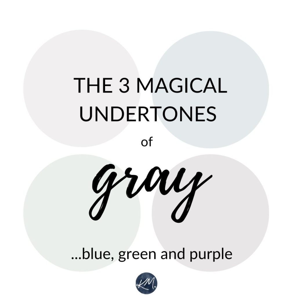
You could have looked at any of the above blobs (a super technical term) under certain circumstances and thought they were pretty darn gray. However, they’re great examples of the many faces that gray can have—and they aren’t always that obvious!
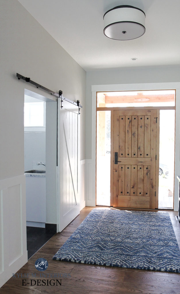
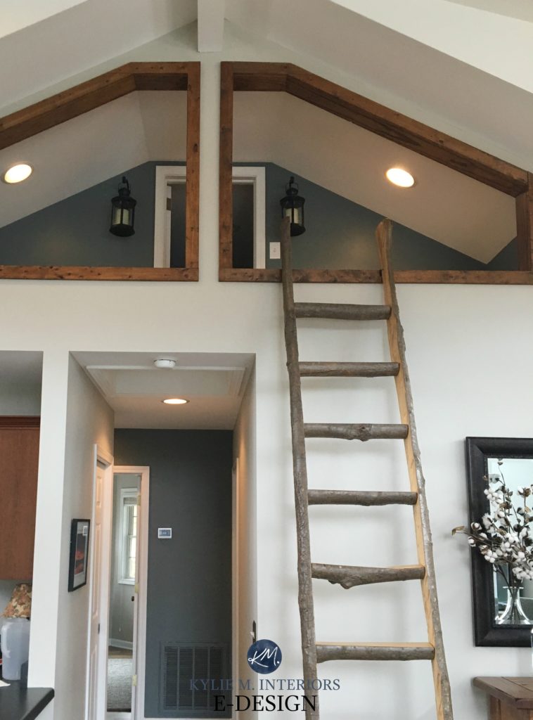
GRAY PAINT COLORS WITH BLUE UNDERTONES
Gray with a blue undertone isn’t the most popular choice, but it’s close!
- a gray-blue can be either fresh (cool) or stormy (more subdued/earth-toned)
- it can also have a blue undertone that leans slightly violet, making it seem a touch cooler (this can be open to perception)
- a gray with a blue undertone can also pick up a wink o’ the Irish. I won’t say it’s ‘warmer,’ but it’s certainly a softer look
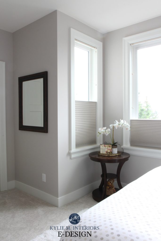
Paint Color Review of Benjamin Moore Stonington Gray
Gray with a blue undertone can be a great choice for a south or west-facing room, but can OFTEN be a bit too cold/flat for a north or east-facing room.
THE 3 MOST POPULAR GRAY PAINT COLORS WITH BLUE UNDERTONES
1. SHERWIN WILLIAMS BIG CHILL SW 7648
Big Chill is one of my favorite shades of gray. With its subtle, slightly cool blue cast, it hits just the right note. I also love Sherwin Williams Gray Screen. Gray Screen is more popular amongst gray lovers, but Big Chill is the best in my books as it’s more subtle.
Paint Color Review: Sherwin Williams Big Chill
2. BENJAMIN MOORE STONINGTON GRAY HC-170
Stonington Gray is a gorgeous stormy gray-blue with a wink more depth. While not all grays are timeless, Stonington is one shade that keeps in kickin’, thanks to its muted undertones and flexible vibe.
The slightly darker Benjamin Moore Coventry Gray and Sherwin Williams Silverplate are pretty, too. Occasionally, all three can flash slightly blue-green but heavily favor blue.
Paint Color Review: Sherwin Williams Stonington Gray
3. SHERWIN WILLIAMS TINSMITH SW 7657
Tinsmith is a light-medium gray with a soft, blue undertone. Add a wink of green and you”l have the ever-lovely, Sherwin Williams Front Porch.
4. SHERWIN WILLIAMS NORTH STAR 6246
I was hesitant to mention North Star as it picks up more blue, but DAMN, is it ever pretty!
North Star could be a gorgeous choice if you love gray-blue and want to see your color’s undertone in a big way. However, if you have northern exposure, it could look AWFULLY cold, and it is often better for south—or west-facing rooms.

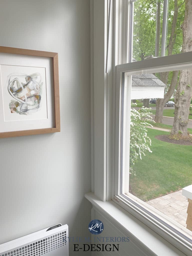
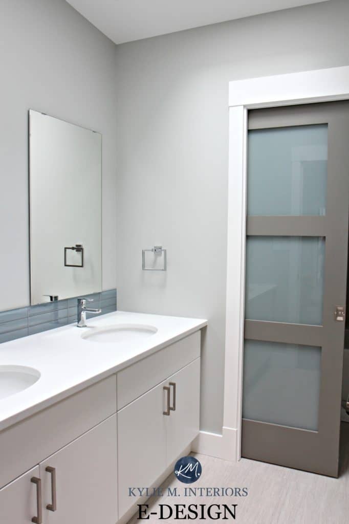
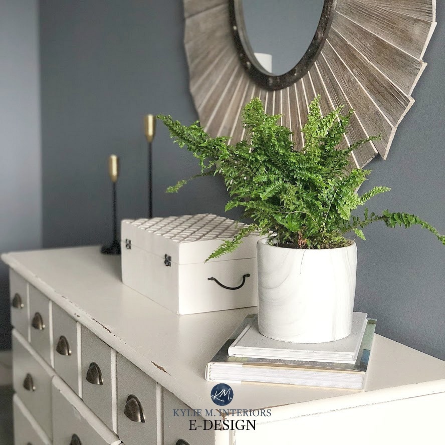
GRAY PAINT COLORS WITH VIOLET UNDERTONES
Gray with a violet undertone is the most popular undertone in gray as far as interior finishes go. Funny enough, many people come in wanting a blue undertone, but once they see the needs of their interior finishes, they understand how purple is often the better choice!
- gray-violet can appear a bit more fresh-clean or more grounded-stormy
- a cool gray-violet is more likely to pick up a touch of blue
- gray with a violet undertone can also lean a bit warm
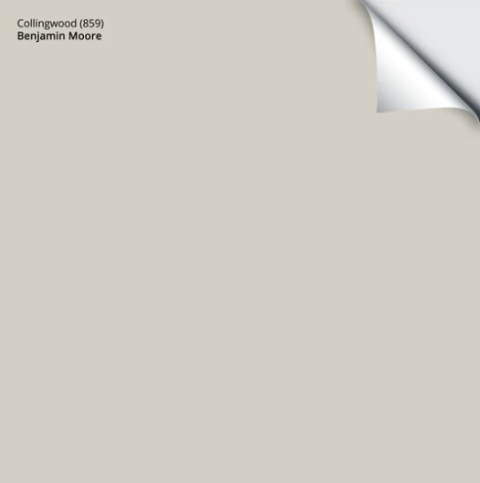
Paint Color Review of Benjamin Moore Collingwood
Gray with a purple undertone can be suitable for most exposures, but because it’s cooler, is better suited to south and west-facing rooms. The ones with just a touch of brown often do better in north or east-facing rooms as they aren’t quite as cold.
This type of gray is also OFTEN found in many of today’s popular laminate, marble, and quartz countertops.
The Most TRUE GRAY Paint Colors from Benjamin & Sherwin
The 10 Best Paint Colors to Create Calm & Reduce Stress
THE 3 MOST POPULAR GRAY PAINT COLORS WITH A VIOLET UNDERTONE
While there are about a dozen I could rattle off the top of my head, these are the top three…
1. BENJAMIN MOORE COLLINGWOOD OC-28
Collingwood is a soft, warm gray with an oh-so-lovely purple undertone. With a moderate LRV, it is a great color for the average room with the average (or more) amount of natural light.
Sure, trends are shifting sharply away from gray. However, there’s nothing wrong with the right shade in a few rooms, especially if that color suits the interior finishes more than anything else!
My Paint Color Review: Benjamin Moore Collingwood
Your paint sampling life just got a whole lot easier…
2. BENJAMIN MOORE ABALONE 2108-60
Regarding grays with a bit MORE purple go, Abalone is hands-down my fave. However, you must love a bit more commitment to violet, as that’s what you’ll get!
Paint Color Review: Benjamin Moore Abalone
The 13 Best Gray Paint Colors With VIOLET Undertones
3. BENJAMIN MOORE BALBOA MIST OC-27
Balboa Mist is a soft and gentle approach. It’s lighter than Collingwood but has that same subtle tendency to lean into purple. However, it can flash slightly purple-pink in the odd light, whereas Collingwood is more likely to hold firm. If you like this look but want lighter walls, check out Benjamin Moore Classic Gray (it’s amazeballs).
Paint Color Review of Benjamin Moore Balboa Mist
GRAY PAINT COLORS WITH GREEN UNDERTONES
While I’m a massive fan of gray-greens, I’m not in the majority. Not only are gray-greens not as popular as gray-violets, fewer interior finishes suit them. Also, gray-greens are pretty sneaky…
- a gray-green that’s cool-toned will look more green-blue
- cooler gray-greens risk looking minty if there’s too much green or green-blue
- a gray-green that’s warm and has a green that leans slightly into yellow. This warm gray will turn greige if you add enough warmth while keeping the green subtle (Revere Pewter is a great example of a warm gray-green)
Check out Benjamin Moore Revere Pewter on the wainscoting and trim in this home office…
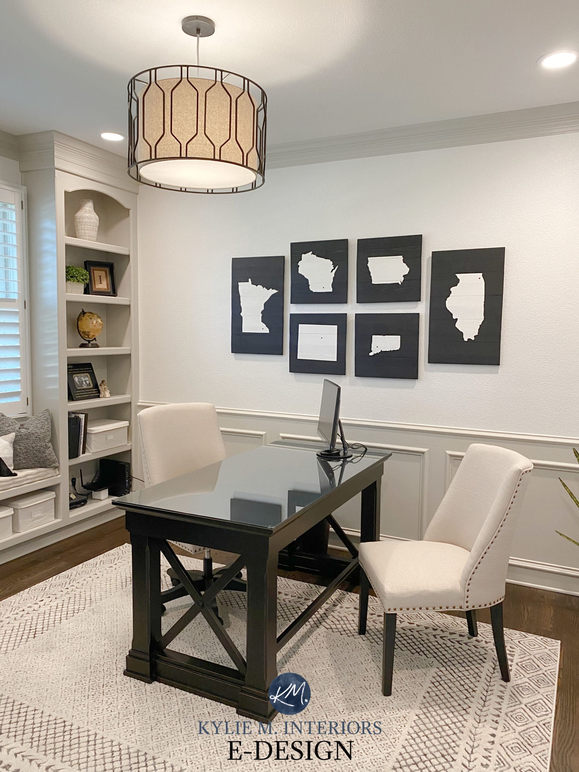
See the WHOLE HOME HERE
Paint Color Review of BM Revere Pewter
Gray with a green undertone is pretty but definitely the least popular of the bunch. When I have clients looking for gray, this is often the undertone they say they’d like to avoid.
Why?
1. It’s least likely to look like a ‘traditional gray’.
2. As mentioned, fewer interior finishes suit gray-green, certainly not compared to gray-violet.
THE 4 MOST POPULAR GRAY PAINT COLORS WITH GREEN UNDERTONES
In the wild and wonderful world of gray-greens, there aren’t many great options to explore. Here are a handful of my favorites.
1. BENJAMIN MOORE REVERE PEWTER HC-172
Undoubtedly, Revere Pewter is the best, most popular gray with a green undertone. Rather than casting a cool shadow like some grays can, Revere Pewter is more of an earth-toned, warm shade of gray.
Color Review: All About Benjamin Moore Revere Pewter
2. BENJAMIN MOORE GRAY OWL OC-52
Oh sure, it has a green undertone, but that’s not all! Gray Owl can also look totally gray or even gray-blue (it’s a ninja)

Paint Color Review of Benjamin Moore Gray Owl
3. SHERWIN WILLIAMS WORLDLY GRAY SW 7043
To look at Worldly Gray, you’d see a soft, warm gray or greige paint color. Look a little more, and you might see the wink of green hiding in it! I could also nod towards Sherwin Williams Colonnade Gray, although it’s a bit of a ninja with its undertones!
Paint Color Review of Sherwin Williams Amazing Gray
4. SHERWIN WILLIAMS COLONNADE GRAY SW 7641
I love Colonnade Gray—so much that I painted a lot of our last home in it. It has a very passive warmth that will die down in northern light and perk up with south-facing light. It also has a mild preference for a green undertone but can easily slip into the others.

Paint Color Review of Sherwin Williams Colonnade Gray
And don’t forget, DARKER grays and charcoals have undertones, too!
A color like Wolf Gray might look ‘charcoal’ on the paint chip, but paint that big bad wolf on the wall, and you’ll see a BEAUTIFUL blue-purple rise up!
THE MOST NEUTRAL GRAY PAINT COLORS WITH NO UNDERTONES
That elusive perfectly neutral gray you’ve been searching for? It might not be as easy to find as you think. Finding a gray with no undertones is like finding a full wine bottle in my fridge (in other words, not bloody likely). However, you will learn helpful tips, color pointers, and more in this blog post: What Are The Best TRUE Gray Paint Colors with NO Undertones?
SO WHAT DOES THIS MEAN TO YOU, THE HOMEOWNER?
It means that when you’re choosing YOUR perfect gray paint color, you need to do the following:
1. FIGURE OUT WHICH GRAYS BEST SUIT THE INTERIOR FINISHES IN YOUR HOME! As you know, I have tons of articles on gray paint colors, so use me and abuse me (links at the bottom of this article). And if that doesn’t work, my Online Color Consulting is fun too!
2. CLARIFY WHICH UNDERTONES YOU NEED TO AVOID. Your exposure, furniture, and finishings will dictate which undertones you need to focus on and which ones you WON’T want. And just because YOU love a particular undertone doesn’t mean your home can handle it.
3. SAMPLE SAMPLE SAMPLE! I can never stress this enough, particularly with wine tastings. It’s not enough to just slap some paint on your wall and say, ‘It looks too blue.‘ The key is to order your Samplize sheets (or purchase traditional sample pots) and take a closer look.
READ MORE
Gray Paint Colors: The 2 Types for Walls, Cabinets & Exteriors
The 5 Reasons You Keep Picking the Wrong Paint Colors
The Most TRUE GRAY Paint Colors from Benjamin and Sherwin
North, East, South, West – Which Paint Color is the Best?
Can I Paint my North-Facing Room Gray?
How to Forgive and Embrace Gray Paint Colors
Do you want to know what YOUR perfect cool gray paint color is?
Check out my E-design and Virtual Paint Color Consulting packages!

ORIGINALLY WRITTEN IN 2020, UPDATED FOR YOU IN 2024!


Fantastic post! I hope the entire population hrough the world reads this. You are so right! The world of grays are so diverse. Great post.
Thank you Karen! I’m glad it’s resonating – so far so good!
~Kylie
Great article, thank you.
What if I wanted to downplay the green in my kitchen ‘s glass backsplash? It wasn’t supposed to be green, but soft grey, however, because it’s glass, it lends green at times
Thank you
Ooo, that can be tricky. Opposites attract, so if you were to put a gray with a purple in it, you might notice the green even MORE. If you do a blue/gray, things could feel a bit wonky – mismatched. Sometimes the best way to dilute the impact of a colour is to not fight against it, but rather go with it very mildly. A few mild grays are BM Moonshine, SW Gossamer Veil or maybe even BM INtense White. Without seeing the room it is hard to say for sure as your exposure/countertop can play a part in things too. If you’d like me to take a look and spend some time with it, I do have a fabulous E-design service! https://www.kylieminteriors.ca/online-decorating-design-services/
~Kylie
Thank you. I will contact you soon !
What are the undertones of SW Agreeable Gray?
Hi! Agreeable Gray doesn’t have TONS of undertone and is more susceptible to picking it up from the environment. It can pick up a subtle blue in north facing rooms and sometimes a tiny spot of purple…
I have just found your blog and you are absolutely amazing! I will definitely be using your colour consulting one the next few weeks as I try to decide on colours???? I have one quick question that can’t wait though???? do you think white dove is too grey to use for kitchen cabinetry in a north facing kitchen (leaning towards northeast)? I will be doing a carrara marble backsplash and so I am worried about pairing it with cloud white but so far cloud white looks the best in my space. I have to firm up on cabinetry colour today and I have said cloud white but am second guessing myself! I have read that white dove can look dingy in some kitchens and wondered if a north facing kitchen would do that.
This is my last comment. LOL . I know simply white should be the perfect white (I read your post on whites) but it looked almost pinky in my space and kind of glowed in a strange way. So it is out of the running.
Oooo, I would say that is more about your lighting or something reflecting on to it – it is definitely an ‘anti-pink’ kind of white!
BTW, you can improve the brightness of White Dove slightly by asking them to add 4 ounces of white to a gallon – this tweaks it just slightly – I would say that Cloud White is likely a bit too creamy warm for Carrara Marble!
Yes I was thinking that too???? I can’t lighten white dove because the cabinet company just needs a colour name. So you aren’t opposed to white dove in a north facing kitchen then? I might switch to that if you think it is okay
Hi Kylie
Your are the best and I am slightly (ok more then slightly obsessed) with all your paint color info. I have recommended your sight to anyone that talks to me about paint lol. We recently painted our main lr SW repose and main bath Sw Rainwashed. I am thinking of SW sea salt for master bedroom. But I am really hung up on small bedroom off of living room. It has two windows North facing and East facing so it does get that nice morning sun. I am trying to keep things neutral fresh (if that’s even a thing) to go along with my coastal decor but the bedroom I am inquiring about I would like a beachy neutral but it the walls be decorated with Grateful Dead framed posters and tapestry (my sons love if the Grateful Dead) I am thinking BM Edgecomb after reading your info. Any thought, recommendations is greatly appreciated. One last thing I have BM Wyndam Cream in my Kitchen one wall borders the SW Repose do you think those two are ok together ?
I liked your article and currently looking at the color Drizzle by Bher paints. Would this color go well for a west to north west exposure?
Hi Marlene, unfortunately I focus primarily on Benjamin Moore and Sherwin Williams paint colours, but from what I’m seeing online, it might fall a bit cold/flat in the afternoon…
Hello Kylie,
Regarding Sherwin Williams grey paint colors like Repose Grey or Silver Plate is the primer mixed in already. I have heard that the primer being mixed in already from SW makes for a better and faster overall painting experience.
Thanks
Guy
Hi Guy. Some of the paint/primer products can be a bit better, but not always. If you are in a situation where you need to use primer, it isn’t a very good substitute, I would use real primer. As for a ‘general experience’, I’ve found that SW products are good enough (not in the white range, but in every other range) that it’s hard to go wrong with any of their mid-line paints with regard to coverage, so I wouldn’t let that be a huge selling feature 🙂
Finding your blog was a game changer for me ! I have been a painting junkie for yrs .
I think I understand LR V now !
I have new construction , interior was Agreeable Gray SW. With our exposure it just sucked up all the light. Nothing agreeable about that ! It just looked yellowish 🙁
Behold Gray Owl. Used +50% , -50% , and reg formula . My dreams have come true !! Now I’m on to tweaking everything else to jive with this beautiful , crisp , soft , PERFECT color !n
Thank you for all this information!! I have been looking for an article which sorts out the different cool undertones of gray.
We are looking to repaint our living/kitchen/diving room area which has windows that face north and south. We have tall, vaulted ceilings that currently have very dark, brown/reddish beams. The floors and trim, however, are a more orangish-brown color. Which undertone of gray do you suggest for this type of room? I’m struggling to find what works with all the warm wood and yet doesn’t appear too cold with the north/south windows and the vaulted ceiling.
Thank you!!!
Would gray fit better as a countertop or as wall paint for a kitchen?
Hi Kate! Well, it’s all pretty relative to the room, the cabinets, flooring, exposure, etc.. so I totally can’t say!
What gray goes best with cherry floors? I Currently have earthy paint colors (brown, green, maroon) and I want to brighten it up to make more modern, clean and bright
Hi Jenna, thank you for your note! I actually have an E-design service just for this! I try to give as much complimentary as I can on my website, but if that doesn’t work you might want to think about sending me photos and filling out the questionnaire so that I can spend some time with your home! A lot can depend on exposure and other things like furnishings, fireplace, countertops – all that jazz. https://www.kylieminteriors.ca/online-decorating-design-services/
~Kylie
I need a gray for the majority of my home, with west, east exposures. I prefer green undertones. I want all white (not creamy) cabinets to be white. I must use SherwinWilliams paint. What gray would you recommend and with what white?
Hi Lynda, thank you for your note! I actually have an E-design service just for this! I try to give as much complimentary as I can on my website, but if that doesn’t work you might want to think about sending me photos and filling out the questionnaire so that I can spend some time with your home! https://www.kylieminteriors.ca/online-decorating-design-services/
~Kylie
Hi Kylie,
Besides paint consulting, do you offer any packages for e-design? I’m looking for help with paint and kitchen and bath lighting.
Hi Brooke, thank you for asking! At this time I only offer to consult for paint colours 🙂
Hi Kylie
I really like the blue undertone in grey and wonder if you have ever looked at SW Zircon? I’m trying to figure if it leans more blue or green or how exposure would affect it. It appears to be similar to BM Stonington Grey and seem bluer than SW Big Chill but I’m getting confused. Really don’t want a green undertone.
Thanks.
When I went to get a sample mixed of Collingwood gray, the lady that did it told me it has no blue coloring in it. So how can it have a purple undertone because don’t you need blue and red to get a purple?
Hi Crystal! Sometimes it can be about the type of black they use in the mix as well, as some blacks have a good degree of blue in them. And regardless, it still does come up with a purple undertone! Compare it to the likes of BM Gray Owl or Stonington Gray and you might see it a bit more :).
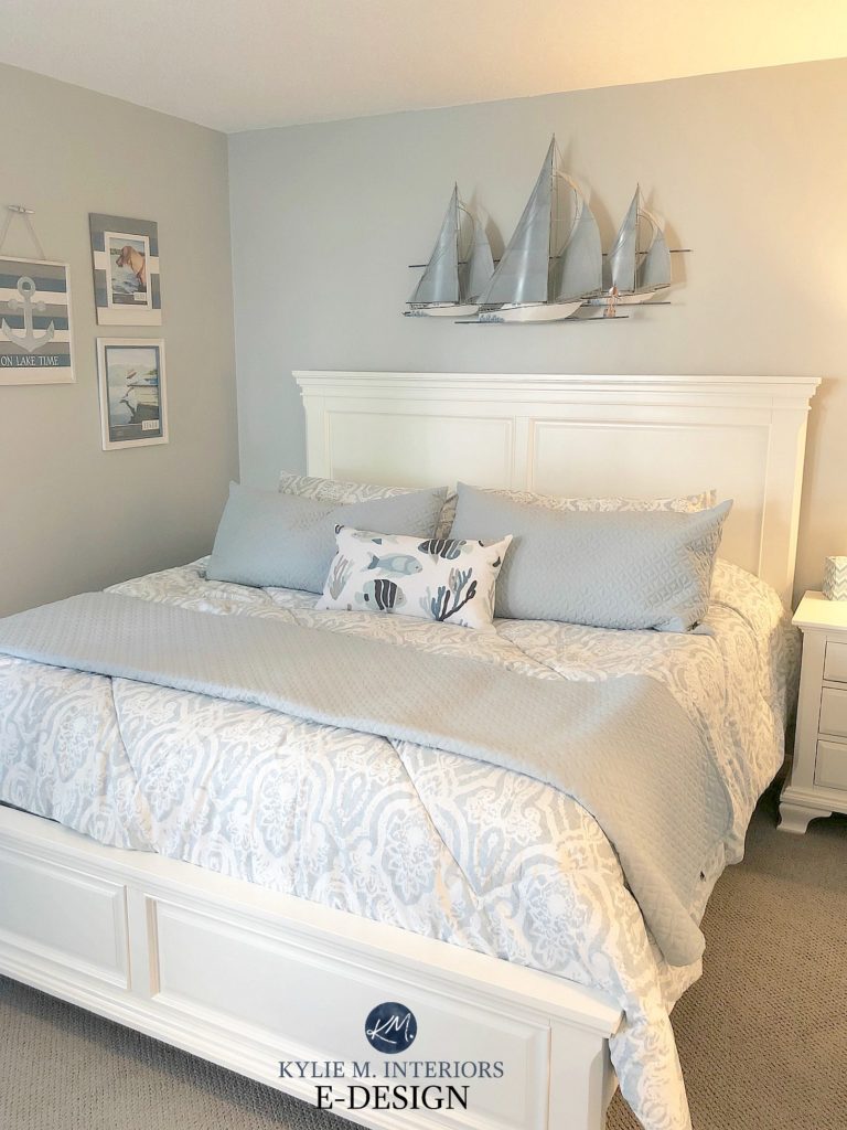
My sister-in-law introduced me to your website and I am just fascinated. After reading it for only one day I have already learned so much. I am about to redesign the master bedroom and the first thing I must choose is the quilt/shams and coverlet. I love the bedroom you have shown in your website. The one with the white headboard, the nautical sailing ships above and the pillow with the fish. I have searched Wayfair for something similar but cannot find anything close. Could you tell me where you found this quilt and could you share the paint colour you used in the room ? Thank you .
Hi Patricia, well I’m so glad your sis-in-law shared my site – sweet! Now, I’m not sure where the quilt was from, that was actually the inspiration piece for choosing the paint colour, which is Sherwin Williams Tinsmith! What about a store like Bed Bath and Beyond or something like that??? Also check Overstock, although they often carry similar things to Wayfair ;).
Hello! What mid-tone color goes well with a mustard yellow sofa, with lots of light in the room and green trees outside?
https://scandinaviandesigns.com/collections/sofas/products/delphine-sofa
I have just painted Edgecomb Gray and for some reason the Shaker Beige walls where they might makes the beige look more orange. Is there a beige colour that would go with Edgecomb but not go orange or yellow or green?
Hi Kylie, 2 years ago, my son and I bought new houses, 5 doors apart, and we found your blog and read with enthusiasm how to pick the right color paint. I am happy to say, we both found your information amazing, and we both found and love our paint choices from your expertise. Your knowledge of paint color is wonderful, and just thought I’d leave a reply and let you know that. 2 years later, we still love and know we got it right. Thank you for your amazing help through your web and blog.
Hi Marcy! Look at me – SO backed-up with blog comments! Thank you so much for taking the time to leave this comment. I get a LOT OF questions and it’s just so nice to read a note like this ;).