
5 Reasons You Keep Picking the Wrong Paint Colours
HOW TO PICK THE RIGHT PAINT COLORS (the alternative title)
When it comes to choosing the best paint colour for your room, it isn’t just about what you want. In fact, what you want comes in pretty low on the priority list.
Sherwin Williams Pure White & Light French Gray
HOW RUDE, right? Well, the truth is, if you pick a colour you love but it doesn’t suit your room – it won’t look good. If you’re not concerned with how things coordinate and just want a pretty wall colour, you can fill ‘yer lil boots (while visualizing me crying and twitching in a corner with a wine bottle and a straw). However, since you’re reading this blog, I’m going to safely assume otherwise.

Sherwin Williams Canvas Tan
There are FIVE MAIN REASONS why paint colours don’t work, and today, we’re talking about all of them with links to helpful blog posts if you want a little more.
Ready, Eddie?
1. YOU CHOSE THE WRONG UNDERTONE
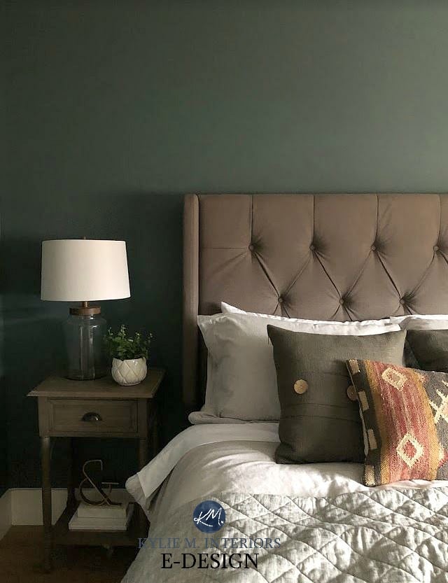
When choosing paint colours, it’s important to coordinate the undertones of your paint colour with your existing finishes, otherwise, you risk CLASHING undertones.
In this next photo, Benjamin Moore Manchester Tan looks okay at first glance, but look a little closer and you’ll see the yellow-green undertones of this paint colour slightly clash with the passive pink undertone in the wood flooring…
WHAT ARE UNDERTONES?
The undertone is the colour hiding underneath the MAIN colour you see. For example, you might see a particular colour as ‘gray’, but it’s never just gray, there’s always a ‘colour’ hiding in it (read more here).
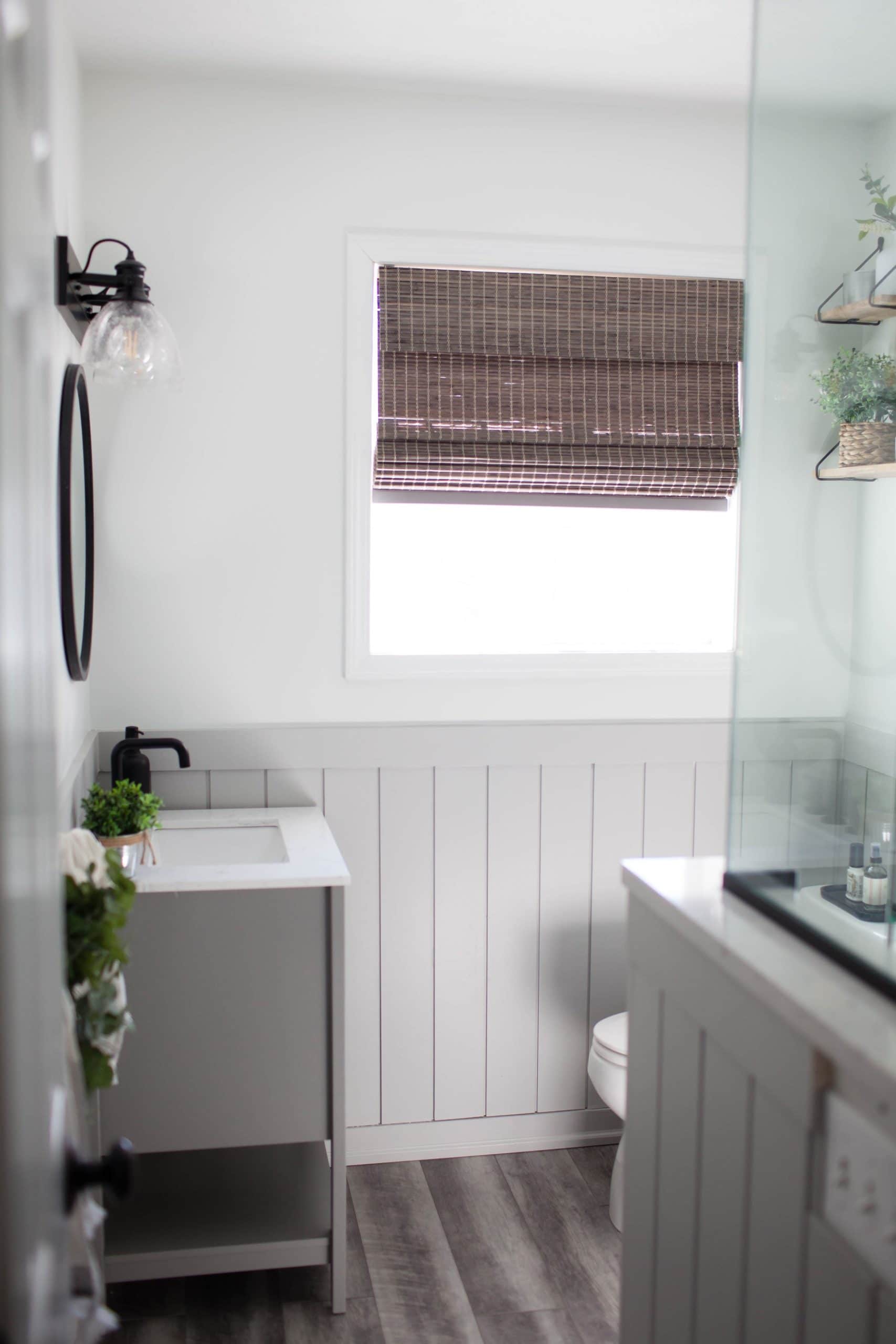
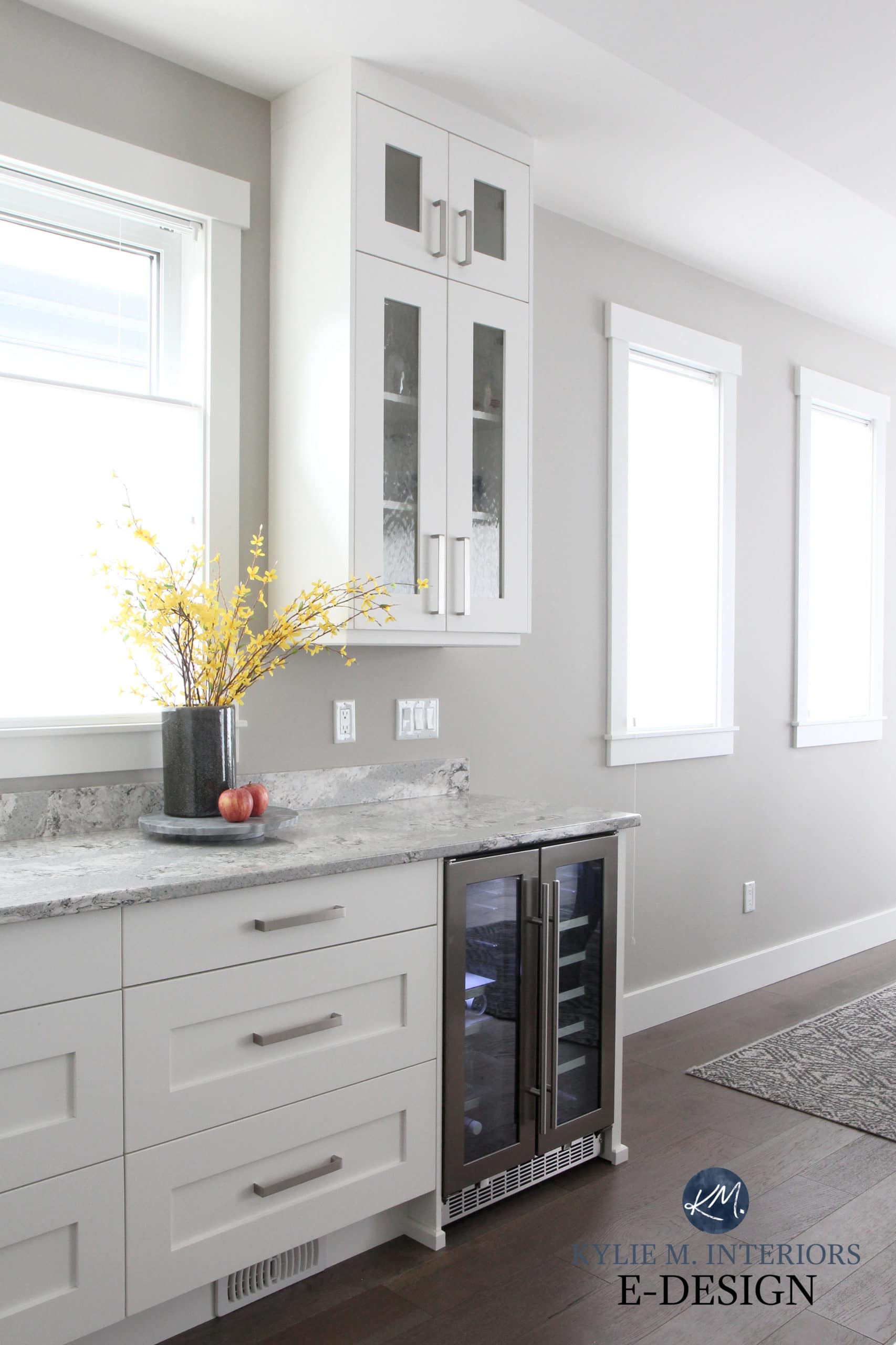
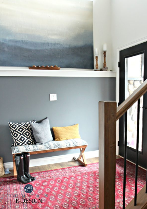
In this next photo, notice the gray wash on the shiplap wall – gray with a violet-blue undertone. So, what type of paint colour looks great on the walls? A gray with a violet-blue undertone, of course, which is why Benjamin Moore Trout Gray looks so stinkin’ GORGEOUS…

As shown below, Benjamin Moore Stonington Gray is a gray paint colour with a blue undertone, which connects with the blue (blue-green) tile backsplash…
Because whether you like it or not, you can’t get away from undertones (Pantone’s Colour of the Year aside, which isn’t super applicable to the real-world of decorating). If you don’t see a paint colour’s undertones right off the bat, try to find them.
And this goes for your finishes too! It doesn’t matter if your carpet looks beige, your sofa appears greige, or your countertop SEEMS like a pretty darned neutral gray – they all have undertones.
The key is to coordinate the undertones of your paint colour with the undertones of your existing finishes – whether you love these undertones or not.
And what’s the BEST way to find the undertones of a surface or paint colour? COMPARE COMPARE COMPARE. If you’re thinking of painting your walls gray/beige/cream, bring home several versions with varying undertones. See which ones visually connect with your countertop/carpet/etc… and also notice which ones FIGHT with your surface. This might not help you understand which undertones you actually HAVE, but it will help you see which paint colours work (and you can ask a paint store employee what the undertones are or refer to my blog).
The 3 Undertones You’ll ALWAYS Find in Gray Paint Colours
2. THE EXPOSURE OF YOUR ROOM DOESN’T SUIT THE COLOUR YOU CHOSE
The exposure of a room plays a big part in how colours are PERCEIVED. It’s one of the reasons why the white that looks warm in your friend’s home looks cold in yours. Or why the cream you love looks perfect in your bathroom, but way too yellow in your living room – EXPOSURE MATTERS!

Benjamin Moore Storm & Sherwin Williams Accessible Beige
And I could dive DEEP on this one, but, a) I have a fear of deep water; and, b) I have SEVERAL blog posts dedicated to this exact topic, and at some point, I even exhaust myself.
However, I’ll give you a quick example…
Let’s say you want to paint your north-facing room gray (blue undertone). You have this same gray in a south-facing room and LOVE it. However, when you paint your north-facing room this colour it looks daaaamn cold. Why does it look so DIFFERENT? Whereas in the south-facing room, this gray balances the warm yellow sunshine, in a north-facing room (which has a cool gray exposure) painting the walls a gray-blue is like a cool double-whammy (also what Tim calls his fave Friday night move).

Benjamin Moore Arctic Gray
The Best Paint Colours for Different Exposures: NORTH / SOUTH / EAST / WEST / MIXED
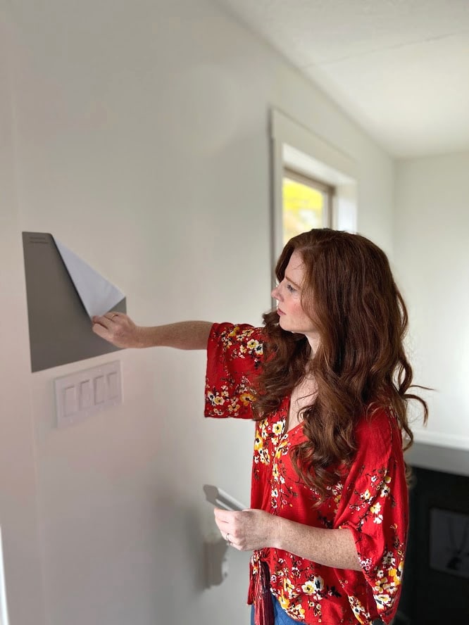
3. YOU DIDN’T BRING YOUR PAINT SAMPLES HOME
This one kills me EVERY time. I would encourage everyone to never go to the paint store with the goal of bringing home a gallon of paint. Do your research first, narrow things down a bit (you can follow me on Pinterest or Instagram for some GORGEOUS colour ideas), and go in locked n’ loaded with the names of samples you want to bring home.
Why?
Benjamin Moore Knoxville Gray
Because the lighting in paint stores is THE WORST! And even if it’s not the worst, it’s not YOUR lighting and YOUR exposure.
This next photo shows Sherwin Williams Colonnade Gray…
This next photo ALSO shows Colonnade Gray…you’d think you were looking at an ENTIRELY different colour!

4. YOU DIDN’T GET BIG ENOUGH SAMPLES OR SAMPLE CORRECTLY
While I understand the need for small paint chips, they shouldn’t be used for CHOOSING paint colours. There is NO way to get even a vague idea of how a paint colour will look on the large-scale from that wee sad little chip; it’s like biting the corner of a tortilla chip to see how your fully-loaded nachos taste.

Sherwin Williams Big Chill, Silverplate, & Benjamin Moore Nimbus
Colours need to be seen on a larger scale so you can see how the light might play off them. They also need white paper surrounding them so your old colour doesn’t influence your perception of your NEW colour.
This is why I ALWAYS recommend SAMPLIZE (US).
I recommend SAMPLIZE to all of my clients, and personally, haven’t bought a single sample pot since I started using them. They’re more affordable and easier and that’s good enough for me. I don’t peel and stick ’em though. I tape them to a white poster board so I can reuse them, and I need the white poster board for separation from my original wall colour.
Here’s a link to the SAMPLIZE site if you’re curious!
5. YOU FORGOT ABOUT LRV
You know that feeling when you finish painting your walls and wonder why they look lighter or darker than you THOUGHT they would? It all comes down to LRV.
Benjamin Moore Super White (south-facing)
LRV is Light Reflectance Value. EVERY PAINT COLOUR has an LRV number and it basically lets you know how light or dark a colour is on a scale of 0 (black) – 100 (white). I’ve written EXTENSIVELY on this topic as it’s in my TOP THREE most important details about paint.
Learn ALL about LRV: The Ultimate Guide to Choosing Paint Colours With LRV
And lastly, you can just hop into my SEARCH FUNCTION, type in a keyword, and have 400+ articles at your fingertips – do your research BEFORE you start slappin’ paint on the walls!
PARTNER POSTS…
The Ultimate Guide to Choosing Paint Colors Using LRV
How to Get the Perfect Color: LIGHTEN & DARKEN
How to Choose the Right Kelvins For Your Paint Color
Kylie M’s Ultimate Guide to Paint Colors & Their Undertones
The 5 Blog Posts You Need to Read BEFORE Choosing a Paint Color
NEED HELP?
CHECK OUT MY ONLINE PAINT COLOUR CONSULTING
Chat soon,


Again, love love love your content and your helpful links and that sassy sense of humor! Thank you!! Ps I am painting my stairtreads abd my banister Urbane Bronze it’s a slow go but in 3-4 months I will send a pic. My husband is general contractor and you know the wife is always the last to get her house down lol
HECK YES, I seriously would love to see it all done! I’m obsessed with Urbane, as you probably know ;).