
Why Your Paint Color Looks Wrong: Undertones & Lighting Explained
If you’ve ever painted a room and it didn’t turn out as expected, it’s easy to blame its undertones. And sure, understanding what undertones (biases) actually are goes a long way toward helping you find your room’s best paint color… but undertones aren’t everything.
Exposure, interior lighting, surrounding finishes, perception – these things greatly affect how a paint color looks, aside from the color’s original intentions. These affect how a paint color appears from room to room and at different times of day. They also make you want to drink a vat of wine like a Viking.
So, how do you choose the best paint color for your room? You keep on readin’ and keep on learnin’.
ARE UNDERTONES REAL OR JUST A MYTH?
Giddyup, sparkle farts, this is a long one…
Technically, there’s no such thing as an UNDERTONE; however, it’s a word that’s commonly used to describe a color’s bias towards one color or another – where it leans. For example, a beige with an orange undertone might also be described as…
- A beige with an orange bias.
- A beige that’s balanced between yellow and red
- A beige that leans toward orange

To put it simply, the term ‘undertone’ is like slang for the way a paint color leans. There. Done.
All of the above – undertone, bias, leaning – these are all measurable things (I measure them daily); it just comes down to the terminology you prefer. Bias and leaning are technical; undertone is layman’s terms.
If you want to get technical, fill yer lil’ boots, I’m here for you. However, in my daily work, as one of the top color experts in North America, I often refer to biases and leanings as ‘undertones’ as it’s a widely used term and it works. And while some get their knickers in a knot over the word ‘undertones’ it’s all good. We all just need to take a deep breath…
I’m just picking paint colors here, people, I’m not saving lives (only rooms and marriages).
#savingroomsonecoloratatime
At the end of the day, it’s all in how YOU learn best and what makes sense to you.
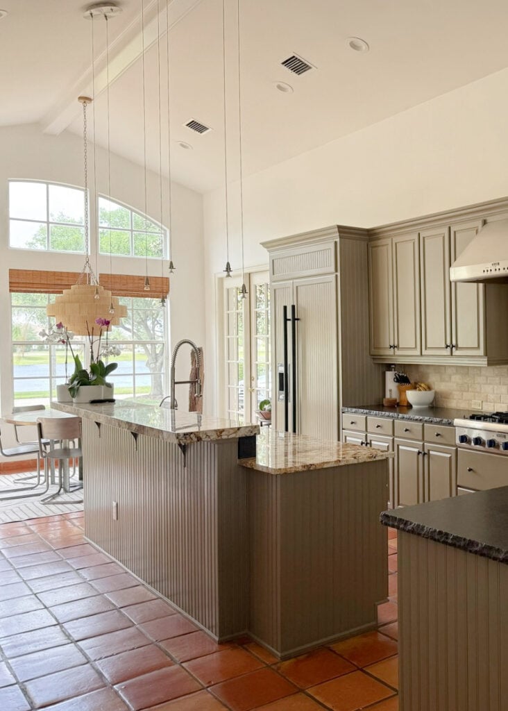
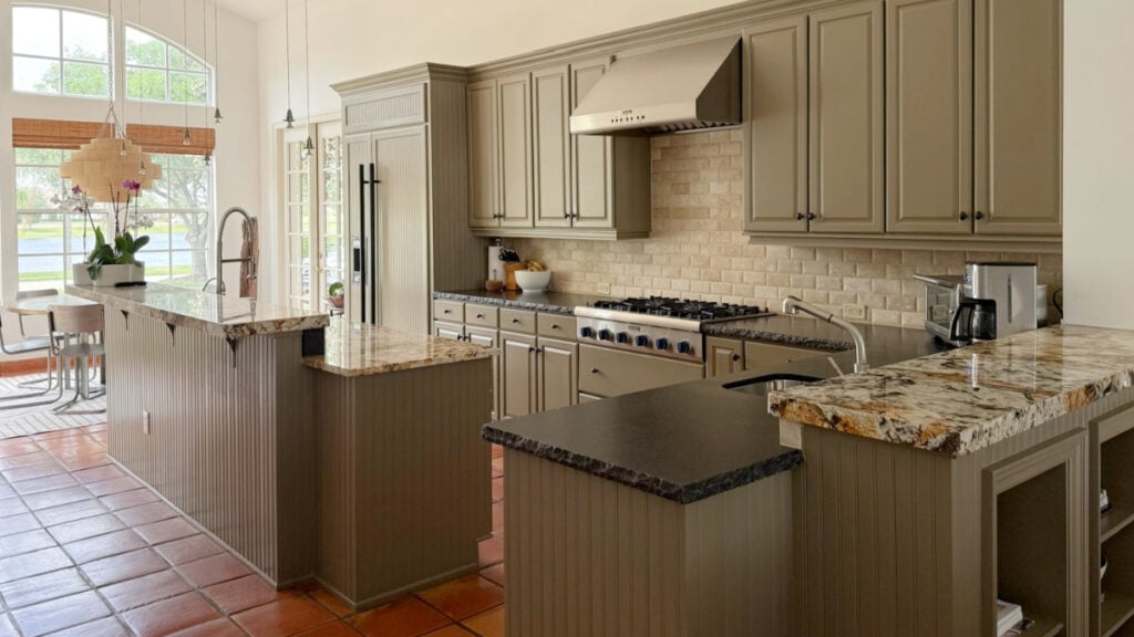
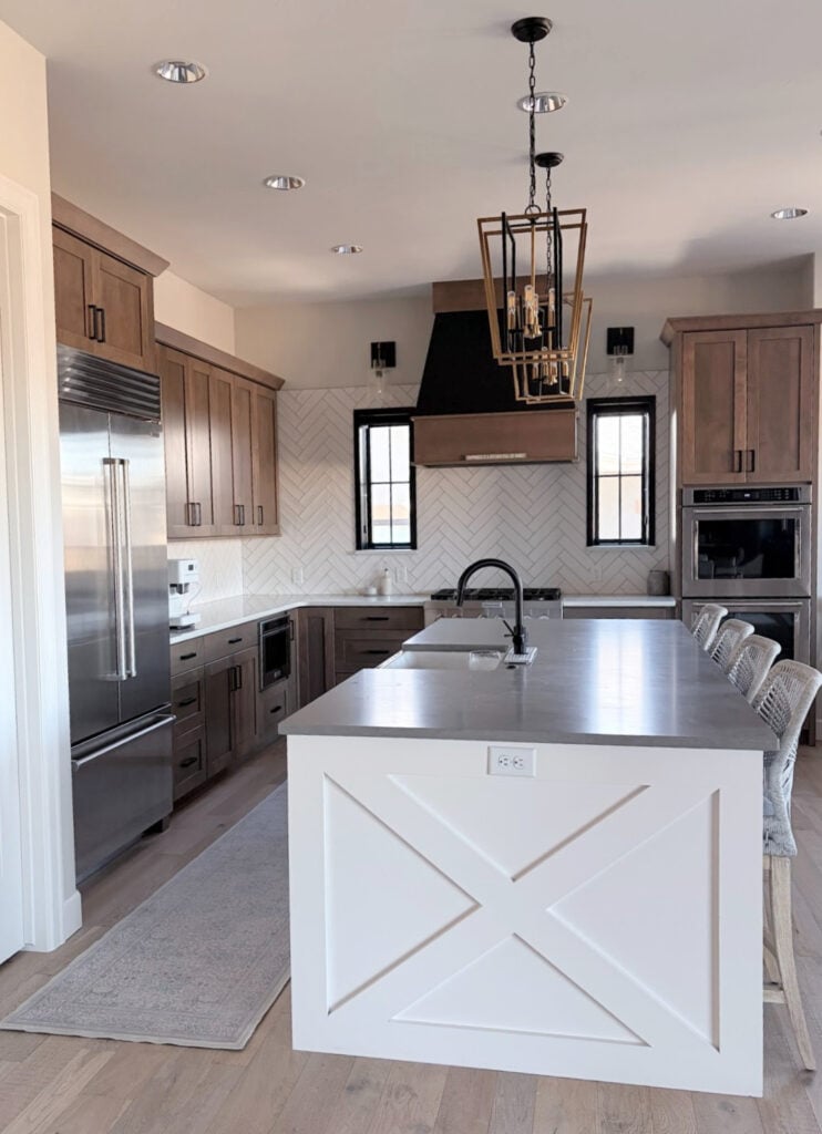
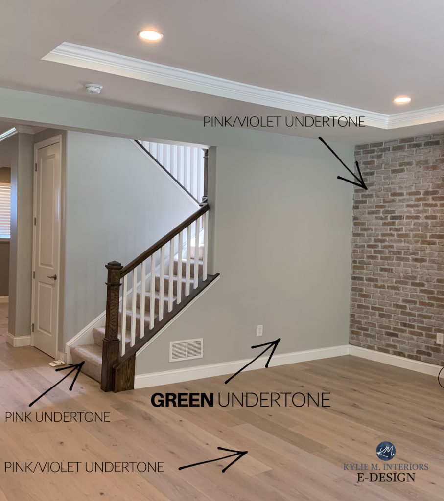
Do these kitchen cabinets have a green undertone or a green bias? Both are true!
But aside from a color’s natural bias (undertone), many other factors can greatly affect how your paint color looks.
WHY PAINT COLORS LOOK DIFFERENT IN EVERY ROOM (OR ON EVERY WALL)
There are 4 main factors affecting how a color looks – regardless of its undertones/bias.
- A room’s exposure
- Interior lighting (including a light bulb’s Kelvins)
- Surrounding finishes
- Perception
For example, take a look at this…
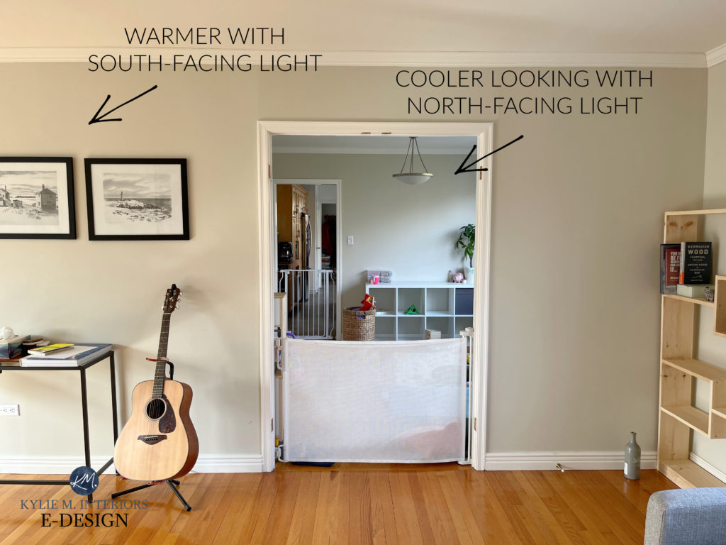
Neither room has interior lighting – both are being lit by the natural light coming in the window – one is south-facing, one is north-facing. Enough said.
Just because a color has certain undertones or a certain bias (technically), doesn’t mean they’ll show up at the party or that others won’t.
In this next home, Benjamin Moore Decorator’s White shows its purple undertone mostly on the crown molding…
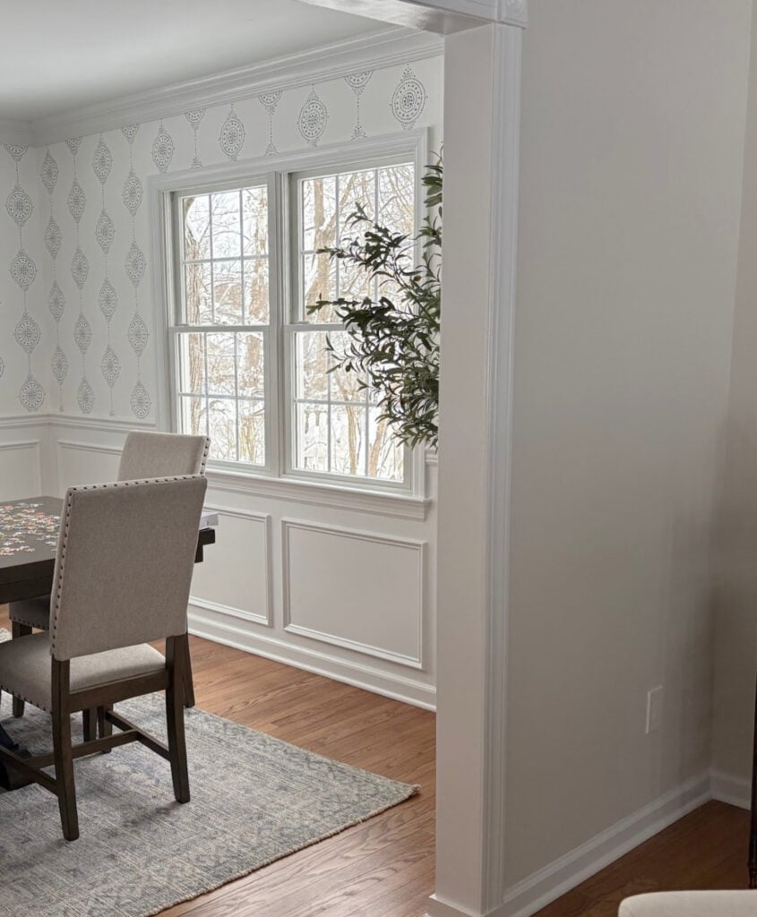
However, it’s not as noticeable on the wainscoting and door trim. Thank you, natural light and surrounding finishes, for doing your job.
But just because a color can change drastically in different conditions, doesn’t mean its original guts aren’t set in stone. If it started out as a gray with a purple bias (gray with a purple undertone), it IS that. It’s only that the surrounding environment can change how it looks.
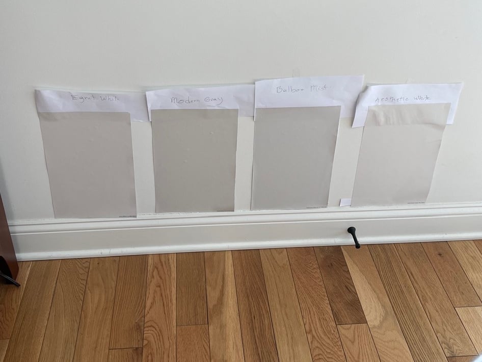
REVIEWS: SW Egret White | SW Modern Gray | BM Balboa Mist | SW Aesthetic White
This is why sampling a paint color in the room it’s going in is SO STINKIN’ IMPORTANT!
- Use large swatches (no wee little paint chips) and move them around throughout the day(s).
- If you’re using the same color in multiple rooms, explore how it looks in each room in different lighting conditions.
- Put your samples alongside each bossy finish to see how they relate

Sherwin Williams Network Gray is a gray with a blue undertone. That blue has a minor green bias.
Understanding and coordinating undertones is one of the most important steps in choosing the best paint color for your home.
1. HOW A ROOM’S EXPOSURE AFFECTS PAINT COLORS
The natural light coming in your windows will affect how a paint color looks (as shown in a previous example). While I’ve written blog posts on each exposure, here’s the short n’ curly…
NORTH-FACING LIGHT
A cool, blue light that can make warm colors appear a bit cooler and flatter. However, north-facing light can enhance cool colors like blue, green, purple, and those undertones.
Check out this next space…
- The far end of the room (left) is north-facing.
- The right side is south-facing.
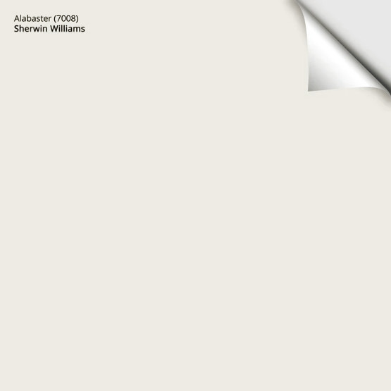
Notice how Sherwin Williams Alabaster looks in the two opposing exposures. Cool, eh? If someone tells you that exposure doesn’t affect paint colors, they must be higher than Snoop Dog on an airplane.
The Best Paint Colors for North-Facing Rooms
SOUTH-FACING LIGHT
While south-facing light washes out colors at noon, throughout the rest of the day, this natural light is warm; enhancing warm colors and softening the effect of cool colors.
Here’s the previous room from a different angle (above). Notice how Alabaster starts shifting from left to right as the south-facing light has less of an effect.
The Best Paint Colors for South-Facing Rooms
CLICK HERE to get a large, peel & stick sample of Sherwin Williams Alabaster…
EAST & WEST-FACING LIGHT
The redheaded step-children of the exposure world (I can say that as I am one).
In the morning, east-facing light can make colors appear a bit warmer in the morning, but expect things to fall flat in the afternoon.
Sherwin Williams Drift of Mist in north-east light
Colors can look a bit flat in morning west-facing light, whereas afternoon western exposure is gloriously warm, gaining in warmth throughout the afternoon. This warmth can greatly adjust/add warmth to even the most well-intentioned colors.
Paint Colors for East-Facing Rooms | Paint Colors for West-Facing Rooms
2. THE KELVINS OF YOUR BULBS & PAINT COLORS
Lighting is such an underrated part of design and decorating. And I’m not talking about fixtures, I’m talking about literal light bulbs.
Light bulbs have Kelvin ratings; the most common are 2700K, 3000K, 4000K, and 5000 K.
2700K is the warmest (though there are lower numbers that are warmer). 5000K is said to be more like daylight and colder than a witches nipple.
And while I have an entire blog post dedicated to this topic, here’s the short n’ curlies…
WARM PAINT COLORS: These often thrive in 2700K-3000K light, depending on which warm temperature you prefer. Most people lean into 2700, but 3000 is totally normal, especially for bathrooms and some kitchens.
Warm paint colors will not thrive in light bulbs that are 4000K or higher. I mean, you do you, but your room won’t look inviting.
COOL PAINT COLORS: While neutral or cool bulbs can enhance cool paint colors like blue, green, purple, and neutrals with those undertones, this doesn’t always create an inviting, welcoming look. While warmer bulbs will tweak (add warmth) to cool colors, it can be a pretty look.
If you like clinical, keep it cool. If you’re open to moderation, try 3000K and see how it feels.
And don’t forget about the CRI of your light bulbs!
3. SURROUNDING FINISHES
Your room’s surrounding finishes can affect how a paint color looks, often just based on perception or comparison.
For example, place a relatively neutral color like Sherwin Williams Agreeable Gray next to a finish with a stronger purple-pink bias, and Agreeable Gray COULD look a bit green…in comparison.
However, place Agreeable Gray with finishes that are better coordinated with it, and it looks different…

This is why sampling and comparing a range of similar colors, in different places around your room, at different times of day, is SO IMPORTANT!
4. PERCEPTION
Regardless of what a color is scientifically, what it looks like to YOU is what matters if it’s you living in your home.
For example, some people find Sherwin Williams Accessible Beige to be more of a greige-taupe, not a beige…

Others see Accessible Beige as a beige – it’s just one dipped in gray, so it’s calm and organic.

And it makes sense, as Accessible Beige (and every color) changes appearance depending on a room’s exposure, interior lighting, and surrounding finishes.
But it doesn’t matter, as long as YOU love and it suits your home’s finishes.
The thing is, some people will avoid a certain color because of others’ perceptions.
- Your neighbor doesn’t like gray; she thinks it’s boring and lacks creativity – that’s her perception.
- Your Mom thinks Revere Pewter is too beige-toned. Your Dad thinks it’s too gray. Cool beans. What do YOU think when you sample it in your home and compare it to other colors?
HOW DO YOU FIND A PAINT COLOR’S UNDERTONE OR BIAS?
While you can do online research and talk to the paint store employees, you’ll get a mixed bag of right and wrong answers (other than on my blog – wink wink).
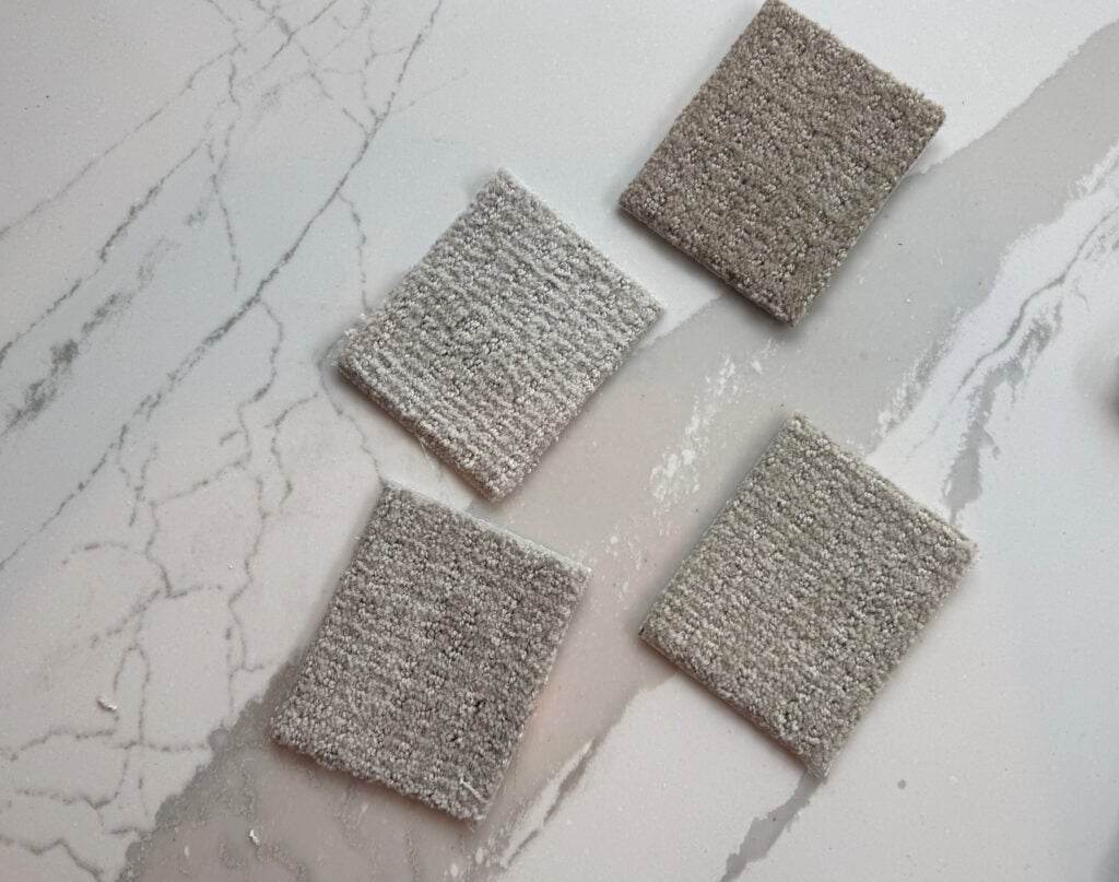
- One of the best ways to see the undertones in a paint color is COMPARISON. Grab a range of similar colors. Look at the differences and see if you can put a color name to them, eg. that one looks a bit more green, or that one looks more orange. This doesn’t mean it IS exactly that, but it’s a place to start.
- Blurring your eyes can help.
- Take those similar shades and place them 100% vertical with any surfaces you’re coordinating with. See if the undertones of your finishes lean into any particular samples or potentially clash or don’t connect with them.
- If that doesn’t work, start doing your research – my blog is a great place to start!
Paint Color Undertones: What’s in White, Gray, Beige, & Beyond
Let’s pretend that you want a blue paint color with a green undertone. Online images led you to this image of Benjamin Moore Woodlawn Blue, and that’s the look you want…
Looks pretty, eh? Now, let’s compare it to similar shades in your space…
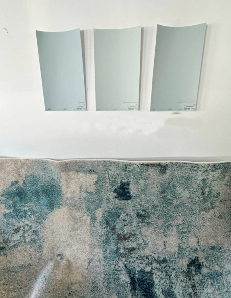
Waaaait one holy hot minute, do you think that far left sample is Woodlawn Blue? Think again…
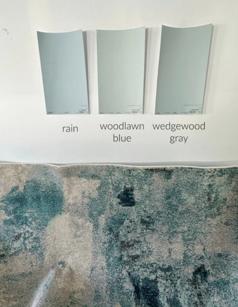
Just because a color looks good in one room (or online), doesn’t mean it’ll look the same in yours. If the above were your room, you’d see how Woodlawn Blue pics up much more green. In fact, even though it looks blue in the bedroom image, it’s a green with a good blue bias/undertone (and a dollop of gray for good measure – and yes, dollop is a technical term…for sure).
Get the best paint color advice with Kylie M’s Online Color Consulting Packages
You’ll also look at your samples under various lighting conditions. Check out this example…
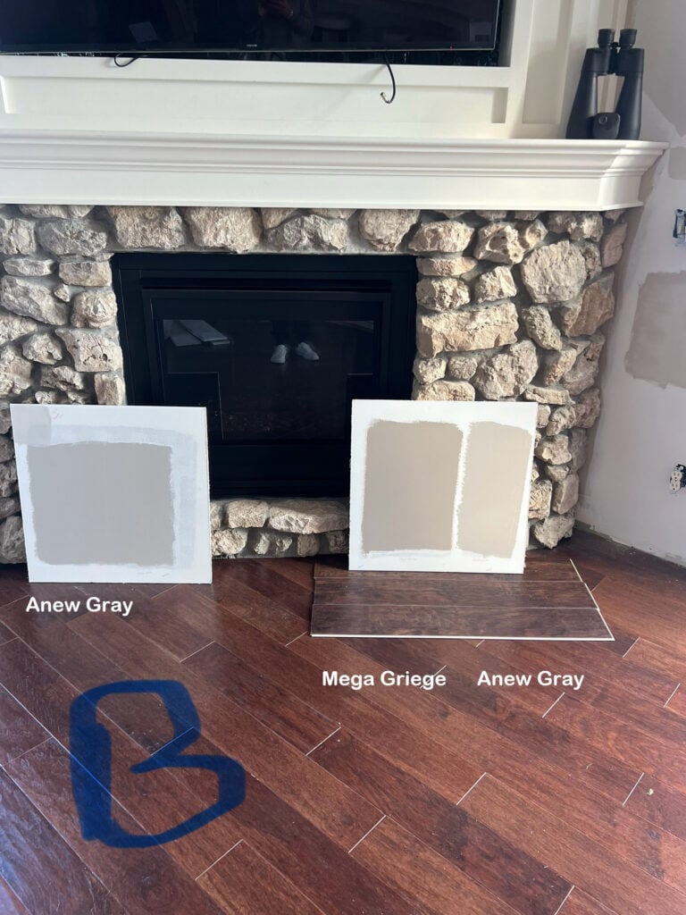
Even a slight shift in location makes Anew Gray appear grayer (with an almost purple undertone), whereas it appears warmer closer to the window, seeming to pick up a bit of orange-pink – this is ALL because of the natural lighting. But regardless, it’s a great color with this stone fireplace (it’s like I know what I’m doing or something…)
But how do you coordinate undertones?
Well, there are two approaches…
- MATCH: The undertones in your paint colors could match the undertones in your countertops, tiles, carpet, etc.
- CONTRAST OR COMPLEMENT: The undertones in your paint color could contrast or complement the undertones in your finishes in a thoughtful and purposeful way. However, it can easily turn fugly if you don’t know what you’re doing. Often, the first approach is the point of least resistance.
The Best Whole Home Off-White Paint Colors
If you really pay attention to the above words, you’ll realize that your home’s hard and soft finishes call the big color shots — not you (Mike drop).
If your home’s finishes call the shots, does this mean you might not love the undertones in your room’s BEST paint color?
Yup.
However, if you ignore your finishes and their needs, you’re more likely to clash with them, which isn’t doing you or your home any favors.
It’s not just paint colors that need undertone coordination; finishes like carpets and countertops do too.
However, it’s important to remember that you’re not a color expert – you don’t HAVE to be good at this; it’s not always easy. If you take your time, sample, and compare a range of colors, you have a better chance of finding the right shade. If not, you know who to call.
Paint Color Undertones: What’s in White, Gray, Beige, & Beyond
FREQUENTLY ASKED QUESTIONS…
In case you have a few more thoughts floating around the ole noggin’.
WHAT’S THE DIFFERENCE BETWEEN WARM & COOL UNDERTONES?
A paint color’s natural bias tells you which way it leans – warm or cool.
WARM COLORS: Will be yellow, orange, red, or pink, or have those undertones (some purple and green here and there). Warm neutrals include beige, tan, greige, taupe, cream, and brown.
COOL COLORS: Will be blue, green, purple, or have these undertones. Cool neutrals include white, gray, and black.
HOW DO UNDERTONES AFFECT HOW A COLOR LOOKS?
A paint color’s undertones or bias are often what make a color interesting. For example, a muted, subtle gray could look flat and boring, but a gray with a gorgeous green hue could have more personality.
However, undertones don’t act separately from a color or ‘affect’ a color – they ARE the color – they’re what the color is made of. From there, natural and interior lighting, surrounding finishes, and perception can adjust how they appear.
SUMMARY
- Paint color undertones can also be referred to as ‘a color’s bias’ or ‘the way a color leans’.
- A color’s undertones can disappear completely based on a room’s lighting conditions, exposure, and interior finishes.
- One of the best ways to find a paint color’s undertones is to compare similar shades.
- Always sample paint colors in the room they’re going in, in different lighting conditions, and against the bossiest finishes.
PARTNER POSTS…
Kylie M Answers Your Top Paint Color Questions!
The Ultimate Guide to Choosing Paint Colors Using LRV
How to Choose Your Kitchen’s Best Paint Colors
Get the best paint color advice with Kylie M’s ONLINE PAINT COLOR CONSULTING!

Updated for fresh content and images for 2026


I’ve been wondering about undertones. Great blog post and very informative!
Wahoo, I’m glad you found it helpful!!
Kylie! You are the master color educator and your posts have helped me a lot! Here is the tough one……I have an eastern/southern light with white trim unknown undertone dilemma! You posts are so VERY helpful, so thank you in advance for any advice you could give!
We have a great room with wall of windows that stretches from the (open concept) living room to the kitchen. I am remodeling the kitchen due to a flood. (No fun, no fun atttaaalll!) Anyhoo, the windows sit facing the east/south, therefore all my paint changes greatly throughout the day. I have a stock trim color that is white with kind of a grey (blue grey green) undertone, so I am stuck on which cabinet color and wall color would be best! Cabinets get direct east light, but lots of light everywhere all day and afternoon!
Now, I am honestly spinnning because I need to pick a cabinet color that matches the floor and the trim…. I have come to love both BM Natural Cream or BM Creamy white…. here is where it gets tricky. The Natural Cream can ready really muddy/ grey at times but looks nice and creamy neutral in some light, particularly afternoon and with interior lighting…. Subsequently Creamy White can hold up to the grey light days but at times can come off yellowish. Lastly at this time we have drywall up everywhere so things look grey and I feel like it is making the yellow tones pop more than they would if all my home were bathed in creams, ya know? I like the Creamy white with my floors and wood island, but worry it can look yellowish in some light. Flooring is a med to light wood tone that can pull yellow as well, but both colors look nice against the floor in any light.
Thanks in advance for this mess! LOL