
How to Choose Paint Colors Without Regret: Common Questions Answered
Choosing the perfect paint color is tricky business for most homeowners. Why does my paint color look pink/purple/green in my room? Why do colors look different in different rooms? And the big one – ‘How do I choose paint colors that work with my finishes?’
Between a room’s exposure, interior lighting, and personal tastes, along with the above variables and concerns, doing your research is important. This is why I’m answering homeowners’ top paint color questions in the never-ending search for ‘the best paint color’.
Whether you worry about undertones, changes in lighting, or keeping up with trends, Kylie M. has you covered – literally and figuratively…in paint. So, let’s get this color party started.

By the way, if you don’t see your question below, please leave me a comment! If it has enough mass appeal, I’m happy to add it! Who knows, maybe I’ll even create an entire blog post around it!
*Updated with current information and images for 2026
1. WHY DOES YOUR PAINT COLOR LOOK PINK, GREEN, PURPLE, YELLOW ETC.
While the easy answer is that ‘you mistakenly chose a color with those undertones‘ (which could very well be the case), many factors affect how a paint color looks on your walls, cabinets, or exterior…
While both these colors are gray, they both reflect a purple or purple-pink hue/undertone.
WHAT’S OUTSIDE YOUR WINDOW? If you have a lot of green outside your window, and choose a light color with no committed undertones, it can easily grab that green and run with it. The same goes for a red-stained wood porch or fence, and so on.
WHAT’S THE EXPOSURE OF YOUR ROOM? The color of your natural light changes throughout the day.
- NORTH-FACING: Cool, blue light (reflecting the sky). On cloudy days, it’s still blue, but it’s blended with gray and flatter. North-facing light can make blue, purple, and green undertones look stronger.
- SOUTH-FACING: Comes across warm, but is actually a well-balanced light. Colors often look their truest/best in south-facing rooms.
- EAST-FACING LIGHT: Is soft and warm in the morning, washes out colors at midday, leans cool-blue in the afternoon (enhancing blues, greens, and purples, just like northern light).
- WEST-FACING LIGHT: Cool and blue in the morning, washing out colors in the midday, but enhancing warm neutrals and colors (red/orange/yellow/beige/cream) in the afternoon, adding more red (pink) tones as the afternoon progresses.
This next warm neutral is GREATLY influenced by each room’s blend of exposures…
If you want to learn more about exposures, I gotchu, boo…
North, East, South, West: Which Paint Color is The Best?
WHAT LIGHT BULBS DID YOU CHOOSE? The Kelvin of your light bulbs plays a HUGE role in how paint colors look. I could go on…and on…But I actually have a blog post about it. Also, read this one about your light bulb’s CRI.
WHAT IS YOUR PAINT COLOR PAIRED WITH? Let’s say you have a countertop with green hues. You choose a gray that seems pretty darn neutral (when in fact, it can reflect some purple). Placing this color with an opposite, like green, can ENHANCE its undertones – colors that might otherwise be less noticeable.
This is why you should do a buttload of research before you start slappin’ paint colors on your walls. I have hundreds of reviews – use my SEARCH function. Even if I don’t do a specific review on a color, many are mentioned in ‘group’ blog posts.
2. WHAT PAINT COLORS ARE CURRENTLY TRENDY?
Paint color trends are warmer than in previous years, except for some darker accent colors. Gone are the days of gray-on-gray, and even white-on-white…on white is fading. In my Online Paint Color Consulting, Kylie M YouTube channel, and Instagram, I see a lot of style shifts happening, and here are a few…
OFF-WHITES ARE SUPER POPULAR RIGHT NOW
Subtle, warm, neutral paint colors are huge right now in the design and color world. While many are leaning toward shades of beige and tan, others love the flexibility of warm, non-beige neutrals.
WARM, SOFT WHITE PAINT COLORS ARE STILL GOING STRONG
While almost any white paint color was up for grabs in previous years, warmer, creamier whites are currently trending.
More importantly, not as many aren painting every surface white. While it’s still happening, and I’m seeing more variation between walls, trims, and cabinets.
DARK GREEN IS STILL SUPER POPULAR
As far as ‘colors’ go, green is huge, especially in the painted cabinet world. While lighter shades of green show up more in bedrooms, medium to dark green paint colors, including sage greens, are showing up everywhere – on cabinets, doors, accent walls, color-drenched rooms, and more.

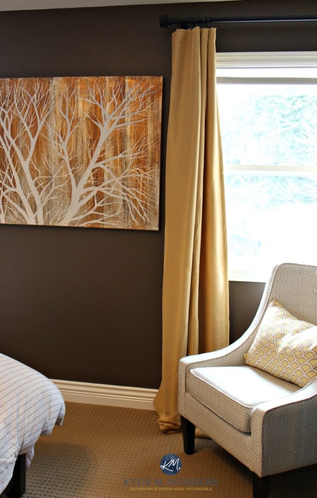
BURGUNDY & BROWN ARE BACK IN STYLE
While burgundy isn’t getting many rave reviews from my followers and readers, it’s back. Expect to see this 90s shade pop up in powder rooms, home offices, front doors, and even cabinetry. The big difference between now and 30 years ago is that you’ll see FAR less forest green, navy blue, and gold with it.

Apparently, oxblood red is in style, too; however, I’ve had very few clients request it.
As for brown, it’s not hitting the design scene quite as hard, but some gorgeous darker shades are popping up.
SOFT BLACK HAS REPLACED TRUE BLACK
Black was huge in previous years, especially on exteriors. Sure, black will always be a popular choice for front doors; its popularity is fading for other surfaces. That is, except for some shades of soft black, which are still trending.
Your paint sampling life just got a whole lot easier (and more affordable)…

Here’s a Peel & Stick sample of Iron Ore
3. HOW DO YOU CHOOSE THE RIGHT PAINT COLOR FOR YOUR ROOM?
The first step to finding your perfect shade is to remove yourself (and your emotions) from the equation. That’s right…
It’s not all about you.
While this can be hard, stepping back and considering your room’s needs makes it easier to focus on its important features and bossiest finishes.

Understanding Paint Colors & Undertones: A Color Expert’s Guide
WHAT ARE YOUR ROOM’S BOSSIEST FINISHES?
This can include countertops, tiles, fireplace surrounds, large furniture pieces, etc. Consider which colors these pieces best suit. Not sure? Consider the main color of your bossy surface(s). For example…

BEIGE. If your bossy surface’s main color is beige or tan, check out a range of modern, updated neutrals. Some warm whites can also work with beige surfaces, so play around, sample, and compare.

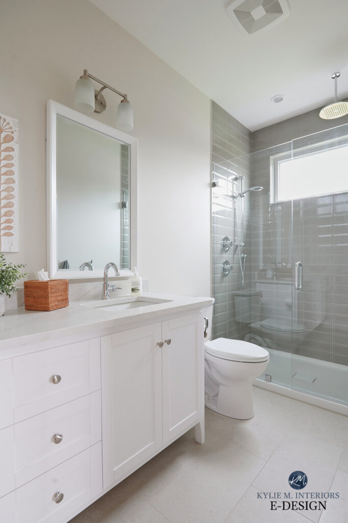
GRAY. If gray is the main color in your bossy finish(es), you may want to lean into this gray and its undertones on your walls or cabinets.
On the other hand, you might want to shift to a softer, warmer look (as paint trends are moving in that direction). Consider a range of greiges and taupes. Throw in some warm whites to see if they brighten and update your space without clashing with your surface.

Sherwin Williams Pure White is the perfect choice for this gray quartzite countertop.
When sampling paint, it’s important to compare colors – this is how you see undertones, depth, and temperature changes.
WHITE. If the main finish you need to humor seems white, is it a warm or cool white? Get a sample of Sherwin Williams High Reflective White and notice if your surface seems warmer or cooler than it.

Of course, you might have other colors/surfaces to consider—heck, you might even want some color on your walls or cabinets! This blog post is for ‘general advice’ rather than specific advice.
4. SHOULD YOU USE LIGHT OR DARK COLORS IN SMALL ROOMS?
This is where your personal taste can come into play a bit more! Sure, you want to humor your room’s finishes and exposure, but consider your INTENTION for your room.

Benjamin Moore Cinnamon Slate Color Review
- Do you want your small room to look bigger? Light, coolish colors are the best way to do this. While bigger isn’t always better (wink wink), the illusion of size can be refreshing in a small space.
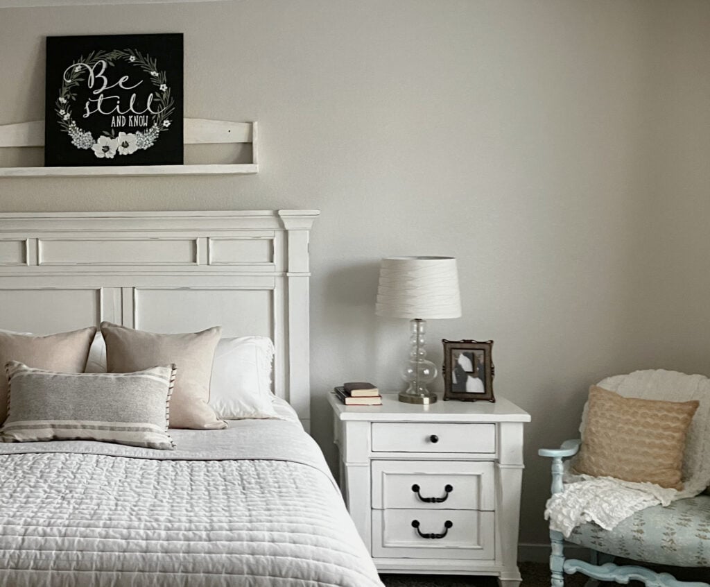
- Do you want your small room to look cozy and intimate? In this case, you might like these Samplize collections of dark gray-blue paint colors or dark gray-greens.
- Or maybe you want your small room to have a big personality! LET’S HIT SOME COLOR, BABY! Check out this blog post full of my favorite medium to dark green paint colors and these dark shades of blue.
Below, you’ll find a collection of some of my favorite dark colors. You can use them to paint an entire room, accent wall, kitchen island, front door, or whatever you want!

Kylie M’s Dark Color Collection
5. HOW DO YOU PICK THE RIGHT UNDERTONE IN A PAINT COLOR?
Ahhhh, that’s a big question. How do you choose the right one? By not choosing the wrong one (just joking #notreallyjoking). Seriously, though, it gets tricky as not everyone sees undertones. Some people pick them up easily, others need training, and some never see them.
Understanding Paint Colors & Undertones: A Color Expert’s Guide
In the next image, the walls are painted Benjamin Moore Stonington Gray, a gray with a blue-green hue. Because the floor has purple undertones, it better suits Sherwin Williams Lazy Gray (the fireplace color is also off).

On its own, Stonington Gray might seem like the perfect shade. However, compared to a range of grays, it’s easier to see how a gray with purple flows better with the flooring.
4 STEPS TO FINDING UNDERTONES
1. Almost every finish has undertones (yours probably isn’t the exception); it’s just a matter of figuring out what they are. This isn’t just for neutrals but for colors as well! For example, gray can have blue, green, or purple undertones (or a blend). Blue paint colors can be blue-purple or blue-green, depending on which way they lean.
2. The 100% BEST WAY to find the undertone your room needs is to compare similar colors. Often, you can look at a color and think, ‘Yeah, that looks beige,‘ but then you compare it to another beige and see how one is a bit more pink or yellow. The same goes for greige and taupe paint colors. They can look more or less neutral, but when comparing a range, you should see an ebb and flow between green, purple, and pink undertones.
Compare 4-6 versions of ‘similar colors’ to see the changes in undertones.

Kylie M’s Favorite Light Taupes
3. Stick each sample to the wall (samples should always be perfectly vertical) and see how they relate to your finish.
- They should butt up to your finish as much as possible (which is hard with sofas, so place them on the wall so you can see them as a backdrop to your sofa).
- Surround your sample with white paper on the three open sides. This separates your sample from your existing paint color, giving you a more unbiased look at how it relates to your finish.
- If you have the space, hang three samples at a time and try to notice how each one’s undertones do/don’t connect with your surface.
How to Properly Sample Paint Colors
4. Move your samples around. At this point, you may be able to narrow things down to a few samples. Move these around the room, placing them against white trim and any other important finishes. Look at them in different conditions, such as day/night/sun/clouds, and see which ones settle the best overall.

There won’t always be a color you love 100% of the time, with every finish, in every type of light – some colors and rooms need a little grace.
6. SHOULD YOU USE ONE COLOR IN YOUR WHOLE HOME?
There are a few things to consider when answering this…
- What layout/type of home do you have? Often, older homes with character suit a varied palette that leans into the home’s character.
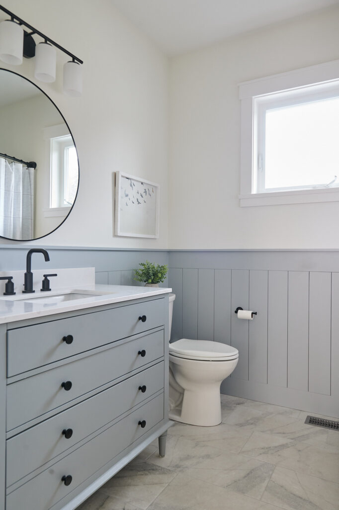
- Do all of your finishes suit the same color? I encounter this a lot in my Online Paint Color Consulting. Clients purchase the ‘whole home’ package, but in perusing their photos, I can see that while many rooms will suit one color, other rooms (most often bathrooms) don’t. In this case, you might have to embrace a two- or three-color palette.
- If you’re considering resale, it’s often best to paint the main living areas/hallways the same color. From there, you can add a second or third color to bedrooms, bathrooms, etc., but it’s not necessary.
- If you’re not selling, what do YOU like? Personally, I love variation. We don’t plan to sell (but ask me next month), and I have my main living areas painted Benjamin Moore White Dove. I’ve also carried this color through to my trims and ceilings. However, I’ve branched off with color in our bedrooms, bathrooms, and laundry room, as that’s what I love in my home! However, I keep resale in mind and choose colors that aren’t just what I love; they also suit my home and its finishes.

The Best Beige & Tan Paint Colors for Your Whole Home
7. HOW OFTEN SHOULD YOU REPAINT?
Again, it’s never a quick answer (I’m sure you don’t read my blog for my brevity).
Are you hard on your home? Do you have kids or pets who muck up your walls? a) Investing in quality paint will dramatically improve its lifetime over less expensive lines. I personally love Benjamin Moore ScuffX for this—it’s amazeballs. No matter what they tell you, less-expensive paint isn’t nearly as washable.
Do you like to keep up with color trends? If so, you can expect a repaint every 5-7 years, depending on which trend we’re in. This is why it’s nice to commit moderately, especially if the current trend is a bit less…safe (i.e., painting your trims or cabinets non-white).

The Best Dark Green Paint Colors
Are you considering resale? If so, when? If your current color is reasonably on trend, you plan to sell in 3-5 years, and you’re not hard on your walls, you shouldn’t need to repaint. However, if your resale plan is 5-10 years away, depending on where we are in the trend cycle, you might need to adjust your approach.
This is a good reason to keep things simpler (neutral) in your main living areas and commit to braver trends in your secondary rooms.
Why?
It’s easier to paint a single room. It’s harder and more expensive to paint multiple rooms or your entire home.
The Best Paint Colors to Help Hide Dirt

The Best Off-White Paint Colors
8. WHY CAN’T I TOUCH-UP MY WALLS?
Contrary to popular belief, no, you can’t touch up your walls…ever. It doesn’t matter if you painted a day ago or 10 years ago.
Or, I suppose you can if you’re okay with a less-than-perfect finish – you do you.
There are a bunch of scientific reasons why it’s not possible (which I won’t get into – not without a buttload of wine), but here’s some food for thought…
You’re adding a new layer of paint, using a different technique. Even if you roll your paint over previously rolled walls, is the room temperature and humidity the same? Did you use the same amount of paint and pressure?
While some brands can get reasonably close, throw a little light on that wall and you’ll see that close ain’t good enough.
This means that when you need to touch up a wall, you need to repaint that section – yup, the whole thing, or atleast to where there’s a natural, not too noticeable break.
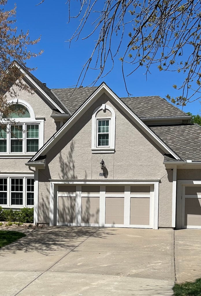
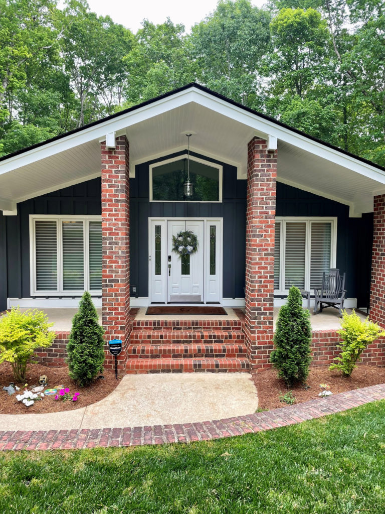
9. HOW DO YOU CHOOSE EXTERIOR COLORS THAT SUIT YOUR HOME?
When choosing your home’s best exterior palette, consider its finishes and surroundings.
To help you out, I’ve made a list. This list can shift depending on how much visible brick/stone you have (or maybe none at all) or how visible your roof is from the front, but it includes some ideas to get you coordinating.

Because the roof is more flexible, this siding color was chosen to coordinate with the brick and mortar.
1. STONE OR BRICK. If your home has a reasonably noticeable stone or brick detail, you should humor it. Look at the colors in your stone or brick to see if they offer inspiration. Often, the colors in your stone include one or two colors that will suit your siding or stucco. You can often find accent colors in your stone or brick by matching or contrasting a particular color!
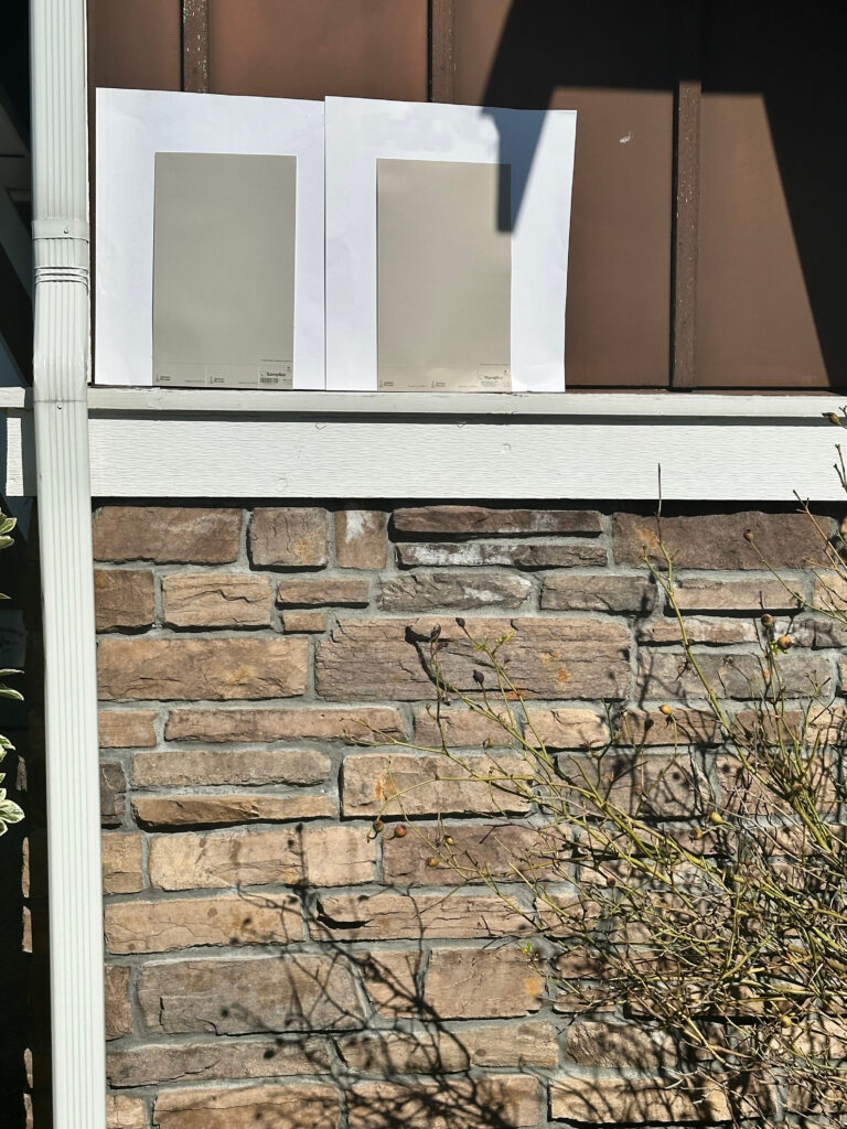
Also note the MORTAR around your stone and brick, as you can lean into this for your main color.
2. ROOF. I love driving around town and admiring color palettes. But nothing makes me more twitchy than an exterior palette that doesn’t consider the roof. Sure, if your roof isn’t prominent from the front, that’s no biggie, but if it plays any part in the overall curb appeal of your home, it matters…a lot.
To learn more about this topic, check out this blog post: 4 Tips for Choosing Your Perfect Exterior Paint Color.
3. WINDOWS. Make sure to humor your window’s needs, especially regarding trim color. While almond (beige/tan) windows can be tricky, brown, white, and black windows have their needs!
4. EXPOSURE. Consider the front of your home’s exposure and how it can affect your paint color.
Of course, there’s landscaping, driveways, and more, but the above four topics are usually the big bosses!
Do you have a question that’s not covered above? If it has enough mass appeal (not too specific to your personal color situation), I’m happy to answer it in this blog post – leave me a comment! If you need more hands-on help, you know who to call.
10. WHAT PAINT COLORS BEST HIDE DIRT?
Sure, there are colors you can lean into to hide dirt.
But it’s not fun to paint your home a color that hides dirt rather than a color you LOVE.
Before you sample varying shades of neutrals that may or may not match your interior finishes, consider the type of paint you use. I know brands tell you how ‘this paint is washable’ when, in fact, many are wipeable, at best. Being OCD, this is a subject close to my heart as I like my white walls to always look clean…always,

Let me introduce you to Benjamin Moore Scuff-X and Sherwin Williams Scuff Tuff.
These paints are formulated for commercial use, specifically for schools and institutions that experience heavy daily wear and tear. When we built our lake home, I chose ScuffX for the walls, trims, and doors because, as an Airbnb, I didn’t want to repaint every six months to keep it looking fresh and clean.
And, hot damn – it works! This paint really is washable. Not only that, it DETERS oil and dirt.
And no, I’m not being paid to say this – I pay myself in personal high fives, wine, and Cornuts.
I experimented with Sherwin Williams version of washable paint – Scuff Tuff, matte finish, in my laundry room. I applied one coat and found it to be a bit shinier than Benjamin Moore’s ScuffX. Also, word on the street among professional painters is that it’s good, but not as good as ScuffX, although still good.

QUICK SUMMARY (TL;DR)
- To find your best paint color without making mistakes, do your research to find out its undertones and coordinate it with your interior or exterior finishes.
- Consider your room’s exposure when choosing a paint color, as each exposure affects how paint colors look.
- If you’re having undertone or temperature challenges, look at your light bulbs before you repaint your walls – and no, you can’t do touch-ups.
READ MORE
The Ultimate Guide to Choosing Paint Colors Using LRV
The Best Warm Neutrals to Paint Your ENTIRE Home!
Is White Still Trendy on Walls, Cabinets, & Exteriors?
Get the best paint color advice…
Check out my Online Paint Color Consulting


I’ve watched most of your videos. Your color reviews comparing whites and beiges are very helpful! I haven’t found any of your videos or any others online that show to choose trim colors to use with darker paint colors- in my case SW Foggy Day for example. How do you suggest one go about finding the right shade of beige that will work with darker colors (exterior), other than choosing from the paint strips they’re on? Foggy gray just has gray and silver colors on the color strip. Any help would be greatly appreciated!
Oooo, trim colors with dark colors – the great thing about dark colors is that most of them are SO darn flexible – there are few limitations! It’s more about which type of contrast you want! For example, BM Chantilly Lace or SW White Snow could give a clean contrast, BM Super White offers a more crisp one, whereas colors like SW Pure White, Alabaster and BM White Dove are a softer contrast :).
I have gone back and forth between timeless or a little bit trendy on my kitchen cabinets and with your help and valuable information I have decided to go timeless!
I have to stay with Sherwin Williams, if I could I would go BM White Dove for cabinets, trim, ceiling ect… (your love for White Dove has sold me) but my GC only uses Sherwin Williams and says he can do a color match at SW> Everything I am reading White Dove by Benjamin Moore cannot be duplicated and that leaves me with 2 choices – SW Pure White and SW Alabaster –
I have considered SW Cheviot, SW Marshmallow, SW Greek Villa, SW Cold Foam, SW Sjoji White – you name it I have considered it –
My main area is open concept and I have a full back wall, all West facing windows, 7′ tall, 2 are big at 48 x 84, a set of full glass French doors @ 84″ and then 3 dining room windows @ 36 x 84 each- my home is the epitome of flat AM and bright, warm and cozy in the afternoon.
I am having a hard time making a decision because I have Almond windows and West facing windows- choosing a classic color is a challenge and my painter is awaiting my decision.
My hope is I can go with Alabaster or Pure white for trim, cabinets ect.. but does the almond color windows limit the options on what I can do for a trim? Would Alabaster look better over a Pure white?
For reference my trim color, cabinets, crown, doors ect was SW Creamy and although it read as white as it could it still had a yellow hue to it, but not terrible since I had a lot of good light shining in most of the day. For wall paint I am considering SW City Loft, SW Taupe of the Morning, SW Neutral Ground – current paint color in the main area is SW Balanced Beige and SW Accessible for all hallways and bedrooms.
Can you help me decide the best color for my trim?
Hey! While it’s hard to say without seeing your space and finishes, with the types of wall colors you’re explaining, Pure White is often a better fit! Alabaster can work with some but PW is a bit more flexible ☺️
What are your thoughts on painting the cabinets the same white as the walls? We will be moving and the cabinets, countertops, and floors are all dark brown. The countertops and floors will be staying, but I am painting the cabinets a warm white, either Pure White or Alabaster. Could I also do the walls in the same, but maybe in a flat paint so it is offset a little?
Hey Julie, in most situations, this is my favorite way of using white! You can read more about that here :). https://www.kylieminteriors.ca/white-paint-colors-walls-cabinets-trim-do-they-need-to-match/