
The 6 Best Paint Colors for Almond or Bone Bathroom Fixtures
Beige Tubs, Toilets, & Sinks – these colors have you covered.
Almond bathrooms can be buuuutt-ugly, and I have no problem saying that without worrying about insulting you and your butt-ugly almond bathroom.
Why?
Because I have owned a butt-ugly almond bathroom, I’ve felt your exquisite pain. But, I’ll also clarify that not ALL of them are that bad (whereas some give you a run for your money).
Thank goodness paint is the easiest and most affordable way to transform any space in your home. Who knows, maybe your bone-inspired bathroom is just a few coats away from looking fabulous!
So, read on my almond-challenged friend!
LET’S CALL IT LIKE IT IS…
Start treating almond as a color, rather than a ‘thing’. In my work as an Online Color Consultant, I often hear ‘…my almond tub, my bone-colored sink,’ but when you think about it, what exactly is almond?
Well, almond is a light tan (the odd time, beige)
And that’s why it’s so darned awkward! If it were a normal beige or tan, it would be dark enough to accommodate a broader range of colors (I mean, what doesn’t go with tan, right?)
However, because it’s a light tan it can look dirty and dated when placed with the wrong colors.
But regardless, once you start treating ‘almond’ like an actual color, you can incorporate it into a color scheme that complements it – rather than fights with it.
THE BEST DARKER PAINT COLORS FOR BONE OR ALMOND FIXTURES
There are many ‘tan’ tubs out there with different undertones. While one person might have a more passive, muted, almost creamy tan, another will have one with a pink, yellow, or yellow-green undertone (yellow-green is the most common). This means that these colors aren’t fool-proof with EVERY tan fixture, as there are many manufacturer finishes out there – but they sure are a great place to start!
We’re starting with darker shades.
Why?
Whereas lighter colors will be more fussy about the exact almond, bone, or creamy tan bathroom fixture they’re partnered with, many darker paint colors suit or accent a wider range of these finicky finishes!
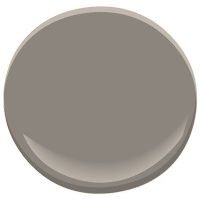
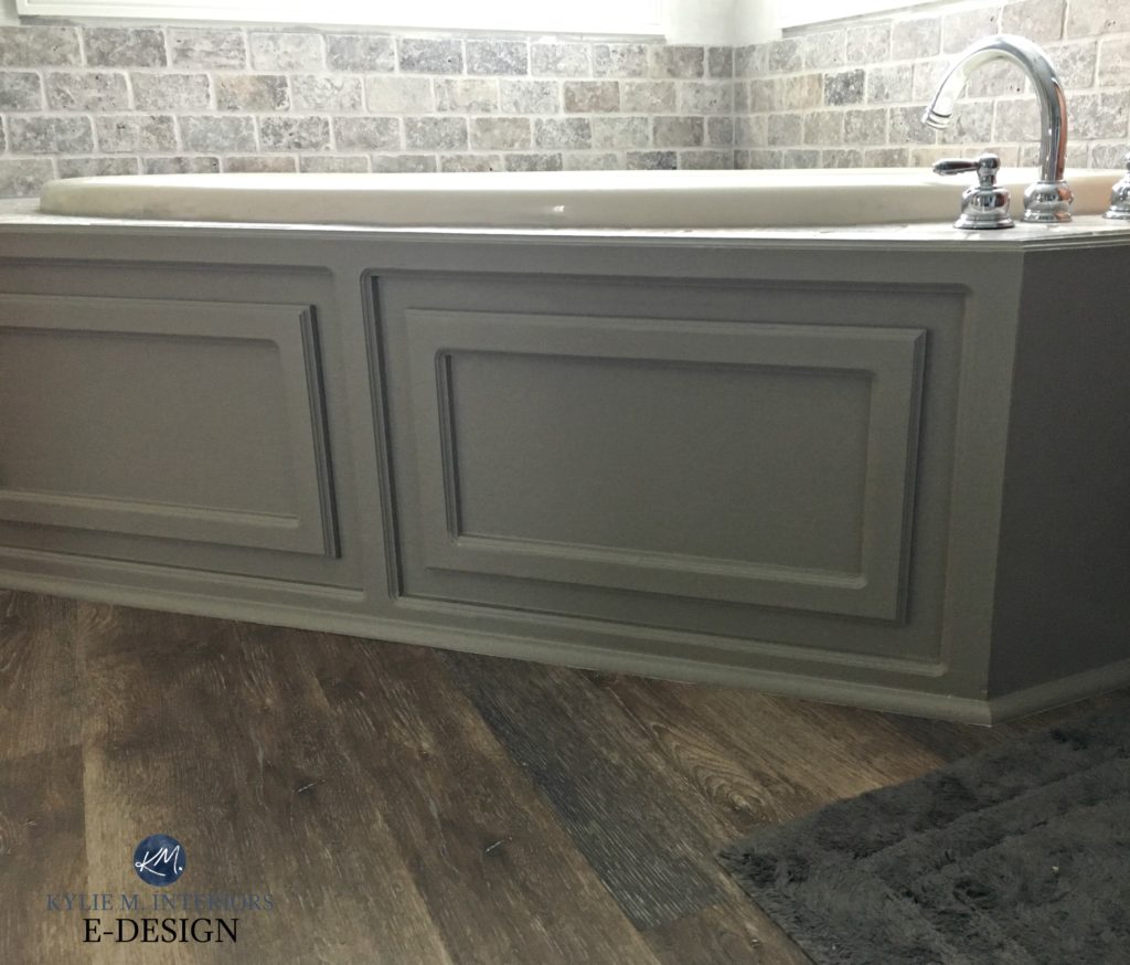
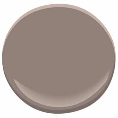
1. BENJAMIN MOORE KINGSPORT GRAY HC 86
Kingsport Gray is a subtle mix of gray and brown, meaning it’s a greige; however, it FAVORS brown over gray. It’s also one of my favorite options for kitchen cabinets and bathroom vanities, especially those from the 80s, ’90s, and 2000s.

The New Era of Laminate Countertops and Why They Rock
While the above photo doesn’t have almond fixtures, you can see how nice it would look as the countertop has some warm almond-inspired tones.
Please remember that I use ONLY my E-Design client’s photos on my blog. Sometimes, I won’t have exactly the photo I need, but I’ll do my best to show you what I’m talking about with a photo or ‘paint blob.’
SAMPLE & COMPARE THESE COLORS WITH KINGSPORT GRAY
These colors will have different undertones and depths, but the comparison can help you decide which is BEST with your particular almond sink, toilet, or tub.
- Benjamin Moore Iron Gate
- Benjamin Moore Equestrian Gray
- Sherwin Williams Keystone Gray
Can you STRETCH your bathtub into the slightly lighter Ashley Gray? It never hurts to try!
The 6 Best Paint Colors for a Bathroom Vanity
2. SHERWIN WILLIAMS MEGA GREIGE 7031
Mega Greige is a soft medium-toned greige that doesn’t cater much to green undertones (common with greige) or violet (common with taupe). And while it can be touchy with some, it can hit the perfect spot with quite a few standard almond/beige bathroom finishes.
Not only can you use Mega Greige on your walls, but you can also consider it for your vanity (you’d paint one or the other, not both).
In this next image, why is Mega Greige a great choice?
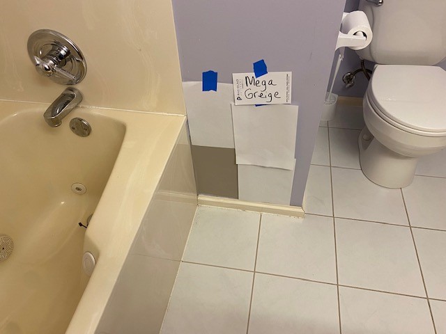
The strong color of the tub surround doesn’t agree with the tile floor – they have different needs. However, one thing they do agree on is that they both like the color of the GROUT around the tile! That’s right; grout can be a great place to pull a color!
I’m sure my client was hoping for a lighter, more modern color, but their bathroom wasn’t ready!
SAMPLE & COMPARE THESE COLORS WITH MEGA GREIGE
These colors will have different undertones and depths, but the comparison can help you decide which is BEST with your particular bathroom fixtures.
- Sherwin Williams Keystone Gray
- Benjamin Moore Kingsport Gray (previously mentioned)
- Sherwin Williams Anew Gray
Bathrooms have a variety of needs, and it’s not always about the color of your fixtures. Find the color that also works with your countertop and any tile work.
3. SHERWIN WILLIAMS TONY TAUPE 7038
Tony Taupe is a soft, medium-toned beige-brown but leans nicely into gray, so it doesn’t have a typical golden look. Whether you want to paint your bathroom walls or update your vanity, Tony Taupe is better than most beige-inspired colors as it ‘can’ pick up a tiny touch of green that often suits almond-toned bathroom fixtures.
SAMPLE & COMPARE THESE COLORS WITH TONY TAUPE
These colors will have different undertones and depths, but the comparison can help you decide which is BEST with your particular bathroom fixtures.
- Sherwin Williams Portico
- Benjamin Moore Indian River
- Sherwin Williams Balanced Beige – might be a bit too light, but worth a shot.
The 5 Best Sherwin Williams Beige Paint Colors
The Most MODERN Beige & Tan Paint Colors
4. BENJAMIN MOORE SMOKED OYSTER 2109-40
Smoked Oyster is a beautiful blend of purple and a warm gray/taupe – a fabulous color for some personality! It has the potential to be amazeballs with many travertine tiles, which are often found with beige-almond bathroom fixtures. However, if you have the yellow-green version, stay far away, as the purple and yellow-green won’t love each other! This color prefers the more subtle, lighter color beige-ish fixtures.
SAMPLE & COMPARE THESE COLORS WITH SMOKED OYSTER
- Benjamin Moore Stone Harbor
- Benjamin Moore Silver Fox
The 9 Best Purple Paint Colors
The 8 Best Darker Greige & Taupe Paint Colors
5. SHERWIN WILLIAMS URBANE BRONZE & PORPOISE
Urbane Bronze and Porpoise are two wicked pretty, darker shades of greige. While they would be pretty ambitious as a wall color for a bathroom, they can make a vanity look gorgeous!
SAMPLE & COMPARE THESE COLORS WITH URBANE BRONZE
- Sherwin Williams Anonymous
- Sherwin Williams Grizzle Gray (gray-green)
- Benjamin Moore Amherst Gray (gray-green with a subtle warmth)

THE BEST LIGHT WALL PAINT COLORS WITH ALMOND/BONE BATHROOM FIXTURES
More so than the darker shades, it’s important to sample and compare similar shades when you’re looking at lighter colors.
Why?
Because light to medium-depth colors are closer in depth to your almond fixtures, it will be more obvious if the undertones are slightly off or, even worse – completely clash.
And as I mentioned earlier (because I love repeating myself)…
Bathrooms have various needs, and it’s not always about the color of your fixtures. Pay attention to the needs of your countertop and tile or linoleum, too!
And even more so than the darker shades, it depends on how light or dark your bathroom fixtures are as to which color coordinates the best.
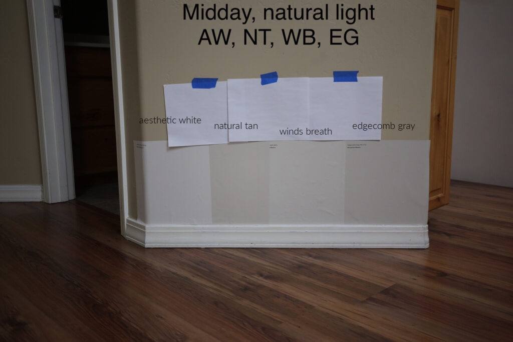
Many of the colors in this next image (I’ll include links below) are great options to try…
How they look HERE versus how they’ll look with your almond fixtures can be quite different, so don’t judge them too hard by this.
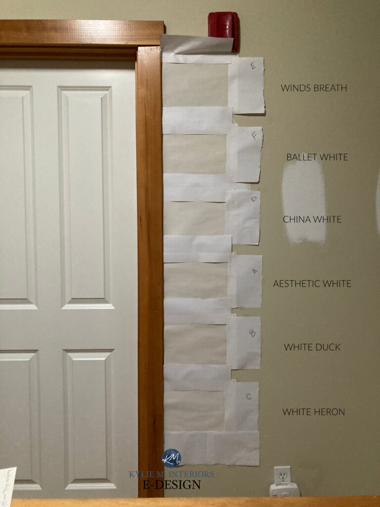
1. BENJAMIN MOORE WINDS BREATH OC-24
Winds Breath is a super versatile neutral, especially for an outdated bathroom with tricky finishes. With an LRV of almost 70, Winds Breath sits near the top of the light range. It has soft gray undertones nestled in a bed of cream and tan.
Again, I only use photos from my Online Paint Color Consulting clients and readers, so I don’t always have JUST what I need. However, these comparisons show Winds Breath with a few of my faves…
Sherwin Williams Aesthetic White | Natural Tan | Benjamin Moore Edgecomb Gray
Get the online paint color expert that DESIGNERS hire!
2. BENJAMIN MOORE WHITE DOWN OC 131
White Down is one of my fave off-white colors. Please note that your tan fixtures may end up being DARKER than your walls; this will happen with any off-white paint color. However, it’s still a pretty and fresh combo, especially if you support it with the right bathroom decor.
SAMPLE & COMPARE THESE COLORS WITH WHITE DOWN
- Sherwin Williams Creamy
- Benjamin Moore Navajo White
The 5 Best Cream Paint Colors: Benjamin Moore
The 5 Best Off-White Paint Colors
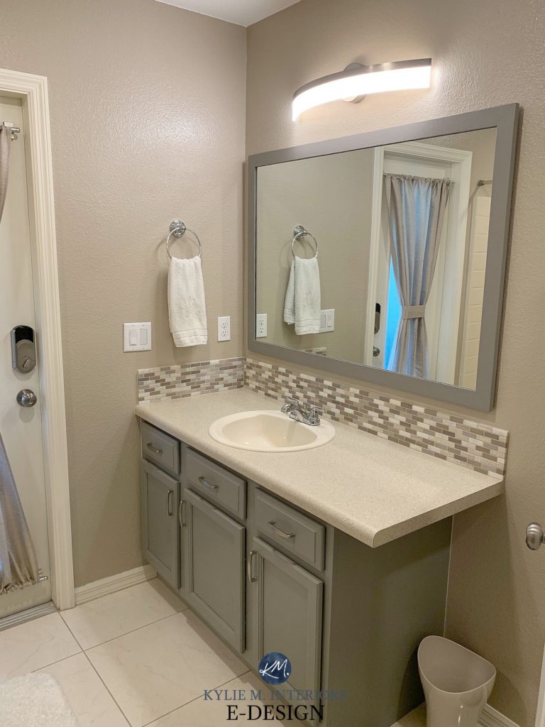
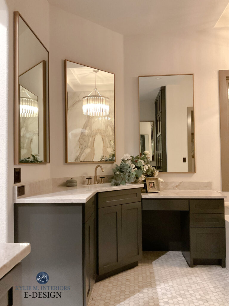
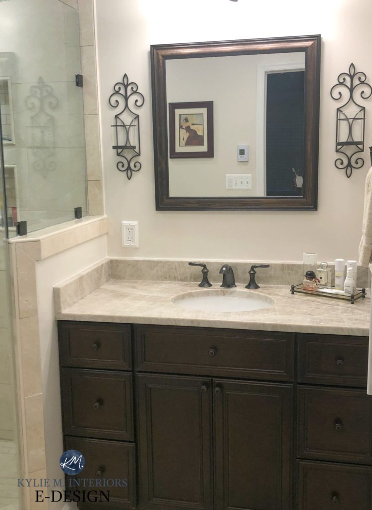
3. BENJAMIN MOORE REVERE PEWTER HC 172
Revere Pewter is another interesting choice for an almond-inspired bathroom. If you’re going for a beachy theme, this soft gray and subtle green undertone can be enhanced with off-white towels and blue-green accents. However, it’s best in a bathroom with a more MUTED almond finish.
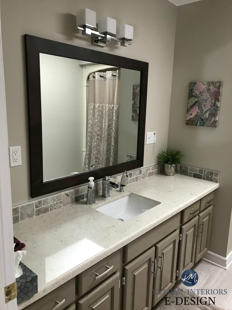
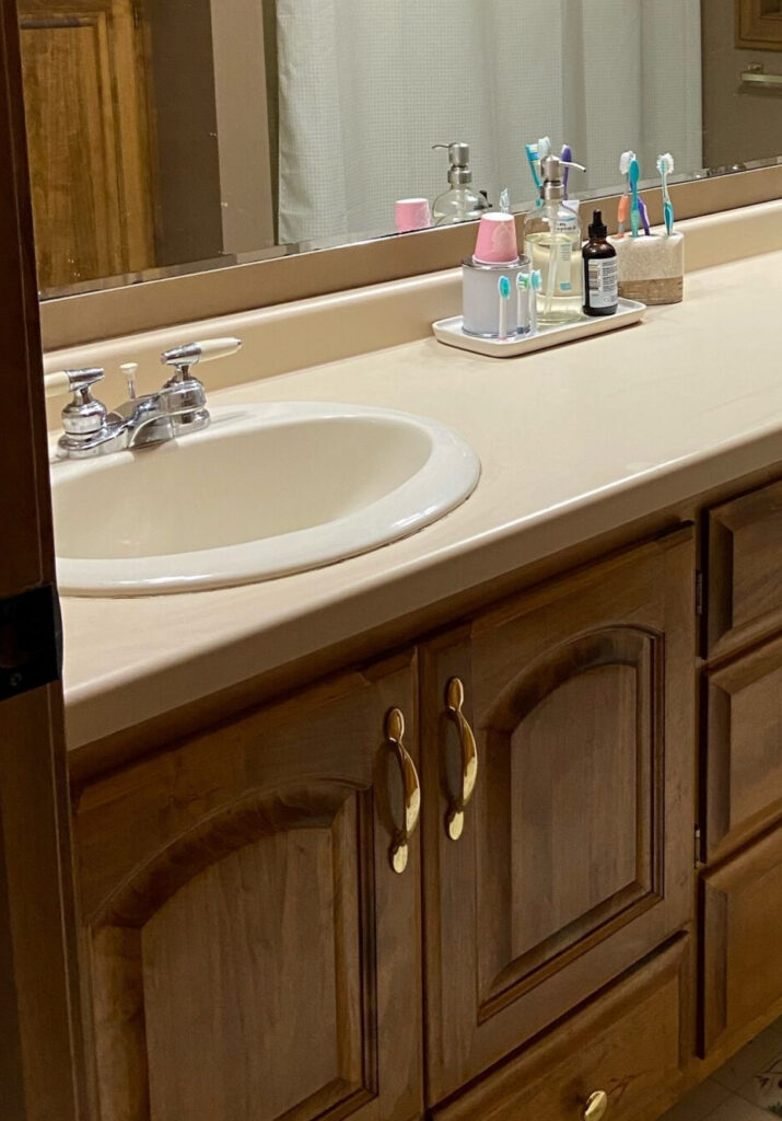
Above, you’ll see a Kingsport Gray vanity with Benjamin Moore Revere Pewter walls. Revere can SOMETIMES be a wink muddy/green for some almond fixtures. You can see how they relate here when you look at the shower surround reflected in the mirror.
SAMPLE & COMPARE THESE COLORS WITH REVERE PEWTER
These colors will have different undertones and depths, but the comparison can help you decide which is BEST with your particular bathroom fixtures.
- Sherwin Williams Amazing Gray
- Sherwin Williams Jogging Path
- Benjamin Moore Fieldstone
- Sherwin Williams Intellectual Gray
The Best Gray and Greige Paint Colors
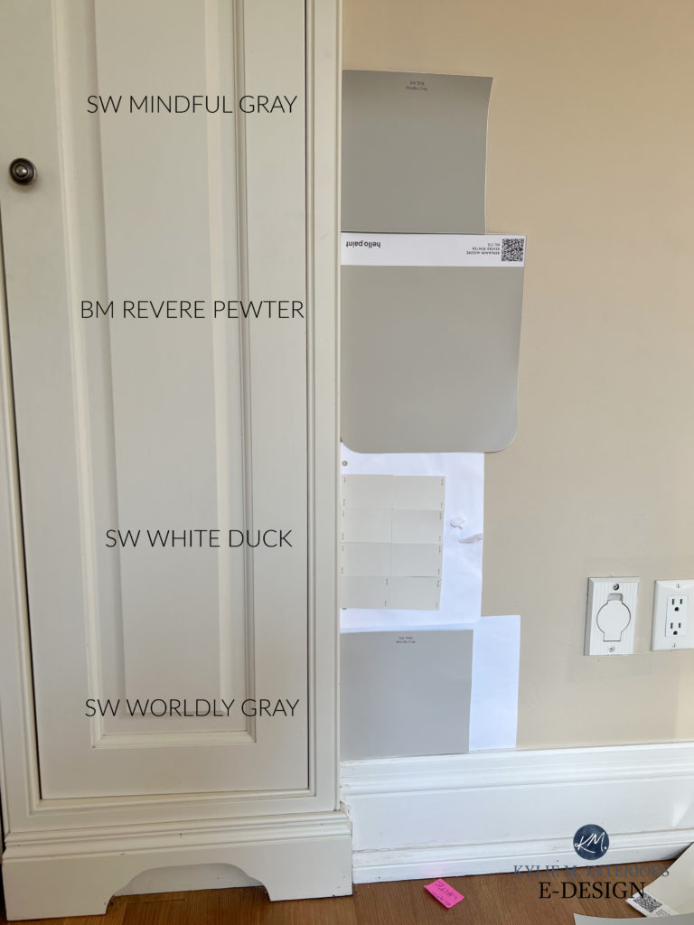
4. SHERWIN WILLIAMS WHITE DUCK
White Duck is a super flexible shade of off-white. It’s also a hybrid that can’t decide which neutral it loves the most – cream, tan, or a muted ‘almost greige.’ This makes it a great option to sample, as it could have the flexibility your space needs.
This next photo doesn’t show an almond bathtub or toilet, but it does show a pretty bone-cream-colored trim and door…
Revere Pewter was also mentioned earlier!
Again, it all comes down to exactly HOW light or dark your bathroom fixtures are and their exact undertones.
My FULL Paint Color Review of Sherwin William White Duck
SAMPLE & COMPARE THESE COLORS WITH WHITE DUCK
- Sherwin Williams Shoji White is SUPER similar, just make sure it doesn’t look pink in comparison.
- Benjamin Moore Winds Breath
- Sherwin Williams Aesthetic White
5. BENJAMIN MOORE BALLET WHITE
Ballet White is a classic color from BM’s off-white collection. Ballet White is quite similar to White Duck, but if White Duck fell a touch flat/gray for your room, Ballet White could save the day with its enhanced (but still muted) cream backdrop, along with a bit more depth (LRV of almost 72).
The finishes in this next bathroom are travertine, and no almond or bone is in sight. However, the travertine tile gives you a great idea of how good Ballet White can look with earth-toned finishes and fixtures…
COLORS TO SAMPLE & COMPARE WITH BALLET WHITE
- Definitely the previously mentioned Sherwin Williams White Duck and Shoji White
- Benjamin Moore White Sand
6. SHERWIN WILLIAMS ACCESSIBLE BEIGE 7036
I wanted to hit you with Aesthetic White and Accessible Beige, but feel like Accessible might hit a few more bathrooms (you’re welcome to check out both). These are beiges with a feather-dusting of gray in them.
Unlike most traditional beiges that have a more golden look, these are suuuper subdued. Aesthetic White is kind of like the off-white version of Accessible Beige.
FULL Paint Color Review of Sherwin Williams Accessible Beige
FULL Paint Color Review of Sherwin Williams Aesthetic White
SIMILAR COLORS TO COMPARE WITH ACCESSIBLE BEIGE
- Sherwin Williams Natural Tan (definitely)
- Benjamin Moore Clay Beige
POINTS TO PONDER
- If you want drama, warmth, interest, and personality, you could paint your walls darker. However, those dark walls might show drips after a hot shower if you don’t have a great ventilation system (common in homes with almond fixtures). Learn more about paint finishes here.
- A lighter neutral will give you a lighter and brighter look and let you accent with browns, blacks, and earth tones. However, with varying shades of almond/bone, it can be tricky to find the one that works just right (not all bones were created equal…wink wink). See some beautiful cream paint colors here.
More Ways to Update an Almond Bathroom
PAINT COLORS THAT DON’T LOOK GOOD WITH ALMOND OR BONE BATHROOM FIXTURES
WHITE
White or off-white walls will only accent the almond-nessity of your tub and white will make the almond look dirty.
PINK, ROSE OR PEACH
Any version, whether light, medium, or dark, will look terrible with almond or bone fixtures.
ALMOST ANY COLOR THAT’S LIGHTER THAN YOUR BATHROOM FIXTURE
Most light colors will make almond look dirtier than it is.
BLUE & GREEN
These colors can be touch-and-go in a bathroom. While you can humor some green-blue-grays, be careful not to contrast too much with the warm tones of your fixtures.
And remember, there are other things to consider in your bathroom, such as your countertop, flooring, exposure, and, of course, your PERSONAL taste! Be sure that your chosen color satisfies as many of those as possible.
READ MORE
Ideas to Update an Almond or Bone Bathroom
The 11 Best Warm Neutral Paint Colors That AREN’T BEIGE!
How to Create a Timeless Home – 4-PART SERIES
Get the online paint color expert that DESIGNERS HIRE!
Check out my E-Design and Online Color Consulting Packages!

Originally written in 2016, updated in 2025


Hi Kylie-
Thanks for steering me in the right direction. i have a windowless almond bathroom with almond toilet, faux travertine ceramic floor and polished real travertine wall. Only one wall and the ceiling bulwark need painting as the other wall is a smoky mirror. This house was built in 1987. knew pinks were out but have been going into all kinds of colours and getting nowhere. Friends are advising an off white with only ochre but that is too light I feel, like you do. The exterior of this Ottawa townhouse is Navaho White. So far I like Farrow and Ball Farrow’s Cream with the travertine, but it’s maybe making the bathroom too dark. I can’t change things yet as we just moved in a year ago and money is in short supply. The previous owner got rid of the almond counter and replaced it with a dark brown and glass vessel sink with chrome faucet. The ceiling light is fluorescent inside a bulwark covered by egg crate over the counter area. Should I try a lighter colour like Ringwold Ground? Fallow is too light from what you’re saying. And I so agree it has to be yellow toned and nothing else. Ochre or yellow oxide is my favourite colour
Thanks for your advice here.
Regards-
Joanne
Hmmm, while we don’t have Farrow and Ball here, I did look it up and Cream does look too dark! It seems to me like Ringwold Ground looks a lot like Navajo White from Benjamin Moore??? I’ve also really enjoyed BM’s Maritime lately because it’s cream – without too much yellow. It might not be warm enough for you, but it’s certainly worth looking at! And to confirm you question, you are totally on the right lines going for a light cream (not as light as off-white but not as heavy as a heavy cream) – I think this is where you’ll find a happy place between your almond and travertine!
And as long as the colour has that subtle yellow in it, it will look cool with Yellow Oxide as long as you stay away from the ‘fresh, almost pastel based yellow/cream colours)
~Kylie
What trim color would you use with Maritime White walls?
Hi Lilly, I’d keep it pretty clean and simple with Chantilly Lace 🙂
Hi Margie! That’s a great idea! I did focus on Almond but there’s really quite a wide array of fixture colours out there – black, brown, purple, blue – all the colours in the rainbow 😉
(ps, I would lean toward Palladian as Whythe might be a bit heavy looking)
~Kylie
Kylie, thank you SO MUCH for this blog post! When my home was built in 2005, the builders used a bone/bisque off-white 6 inch tile in both the hall and master bathrooms. The tile and grout are still in excellent condition but I wanted to lighten both bathrooms, which were originally painted with Sherwin Williams Moderate White, to achieve that fresh, clean farmhouse white look. I was devastated when the test area of Sherwin Williams Alabaster (my pick) made the shower tiles look peach. I feared I would have to settle for a blah khaki-cream bathroom just to get the walls to coordinate with the shower tile that went all the way to the ceiling.
In desperation, I searched for “white paint for almond tile” hoping against hope that maybe somebody had a suggestion. I found your blog and while I wanted to fully trust your decorating experience, I admit I bought samples of Sherwin Williams Creamy and Panda White. The Panda White was almost an exact match to the tile color. The Creamy was a few shades lighter and much closer to the white I wanted. I decided to trust your advice and painted the walls Creamy. By the time it dried, I was in love! I had the crisp white bathroom I wanted but it blended SO WELL with the bone colored tile that there was no clash! The bathroom looks farmhouse-y and fresh! My master bathroom is next and I’m doing SW Creamy again since I know it is going to look spectacular. Your blog has saved my farmhouse design dreams! Thank you so much and hugs from Houston!
Shanta, this is fabulous news and JUST what I love to hear – I’m so happy for you! It’s great when you can take something challenging and make it work so that it actually is like you ‘planned it all from scratch!’ Ya done good 😉
~Kylie
I have almond sink, toilet and tub/shower. I also have gold faucets. What colors would you suggest because I also have gold faucets?
Hi Ann! I do try to give as much helpful info on my blog, and if that doesn’t work, you might like to check out my E-design it is affordable and fun – this way I can look at photos of your space and spend some time with it! https://www.kylieminteriors.ca/online-decorating-design-services/
~Kylie
Hi , how would mindful grey work with bone fixtures and black cabinet and black slate flooring. The vanity top is a yellowish mable
. Thanks Diane
Hi Diane, off the top of my head it strikes me as just a bit too gray and drab looking for the warmth of your products, you may want to lean a bit more into a muted, beige tone of sorts 🙂
Hi, I have almond fixtures in my small bathroom. We currently have an oak vanity. We don’t anticipate staying in this house much longer so we are looking for a more affordable way to update the vanity. I am considering sanding and painting the vanity. I am wondering if you have any color recommendations you think would be suitable with the almond fixtures. I was thinking something along the chocolate browns. A color that would possibly tie in with the almond fixtures and either the SW Creamy paint or the BM Gentle Cream paint. I would love to hear your suggestions. thank you!
HELP! What a great site this is…..I have remodeled my master bath with Chiaro travertine tile in the shower and flooring, with fwhite vanity and cabinets. Skirting (baseboard) is also a beautiful creamy “wheat” color. I only have 2 walls and have spent a fortune on all the different sample colors. I’m beside myself since nothing seems to be a true compliment to the travertine. Can’t be gray, can’t be off white. I just painted Benjamin Moore’s Cabot Trail – too dark and Bone White which comes close but needs something a bit darker to compliment the tile. You suggested accessible beige which I may try next. Color should be warm, Painters come tomorrow and I have to decide today. Any suggestions would be appreciated!!!
First, I love your site! I’m on an extremely tight budget and want to update my 1980’s almond bathroom. What are the colors on that chart? The bathroom had a west facing window and all the greige paints look gray and seem to make the almond stand out more, I like Agreeable Grey, but it almost looks white.
Hi Susan! The colours on the chart are more just basic placeholder blobs – not specific references as those are always off from what a colour REALLY looks like!
Thanks! My oppinininafed family decided on Balenced Beige wall color. It’s better than the current lime green. My vanity is currently painted bright white. Any recommendations on a new paint color for that. I think I may try doing the countertop in a spray stone effect , maybe the light brown Rust-Oleum. I’m also going to frame the big mirror and paint the god-awful silver Hollywood lights rubbed bronze.
Hi! This is just what Im looking for! Im buying a condo in Florida circa 2004 and everything (floor tiles, bathroom tiles, sinks and vanity) is beige and unfortunately its in excellent condition so it seems wasteful getting rid of it all… but I’m grossed out because I am loving gray and white neutrals in NYC where I live. I loved your suggestion for smoked oyster color and really wanted to see what it would look like with and beige based bathroom and tiles but the link isn’t working. Can you please fix it?
Oh man, I’m SCANNING my files, trying to figure out what the heck I was linking to and I can’t figure it out! I’ll keep looking, but in the meantime, I took that link out. It IS super gorgeous though and worth grabbing a sample of!
What do you think of a clay/rust color, such as SW Spiced Cider perhaps, for a small windowless bathroom with a tan shower? This is for a teenage boy that wants BOLD and COLOR. Thank you!
I think that sounds VERY COOL! Just keep in mind that colours in this depth can show more moisture on the walls and I do know how teen boys love their hot drippy showers!
I made the mistake of painting the bedroom Eider White ( it looks great with my gray furn with hint of blue) and now I have to find a paint color to blend in the adjacent bathroom with almond tile!! oops! Any tips on coordinating a grey tint bedroom with an adjacent bath with almond tile?
Asking for a friend because I would never had made that rookie mistake :0).
Ermmmm…sooooo…the problem is that warm colours don’t love to be partnered with colours that are lighter and cooler than them, so ANYTHING you’d consider for the bathroom…short of white, won’t really look great with Eider White. Your best bet would be to find a light-medium warm gray-greige with a green undertone as the green would ‘complement’ the purple of Eider White will hopefully humouring the almond tile too!
Tell your friend it happens ALL the time and Eider White is a sneaky bugger ;).
Thanks for responding! I was really stumped. I am now looking at magnetic gray and worldly gray. I think one of these will work.; both colors I pulled off of other posts on your site. You are the oracle of almond tile.
–Stacy
I am renovating to sell my townhome (stripped bathrooms and all flooring to renovate and then met hubs) and am not pulling out the tub/shower combo in my master and spare baths. Spare bath has SW Natural Choice and looks fantastic because of great lighting. Small master looks awful no matter what color is on walls. So far painted SW creamy and Nat Choice and no go. Now opting for SW Softer Tan, a near match for the shower tub. Your article articulates why that should work. I am trying to NOT accentuate that awful 1988 color Choice.
Kylie,
If you can please disregard my post asking the question of the paint color in the picture with the brown mirror on this blog. I see that the color was listed below the picture. I thought I had looked for that, but I guess I did not. Thank you, love your website and advice.
Your tips were, as always, so helpful. I did laugh reading the list of colours that don’t go with almond fixtures. I think my bathroom manages to contradict every single piece of advice you give.
I currently have very pale pink walls which make the “linen” fixtures look slightly nauseous. I suspect the wall color was supposed to go with the pink of the sunset in the tiled nautical scene that makes up part of the bath surround (I only wish I was kidding). All this is nicely finished with a pure white vanity top, and orangey woodwork.
Somehow I hope to make all of this live together, and look like it belongs in this decade – though I may have to settle for this century.
Many thanks, again, for your thoughtful articles.
This article saved me so much aggravation and money. My daughter purchased a home that was built in 1975 and renovated a lot of it, but the bathroom was ugly as could be and there was only so much she could spend. We actually chose a color in the same family as one of the recommended ones called “A Dash of Pepper” by Sherwin Williams and the transformation was amazing. Thank you so much!
Victoria, it’s comments like this that make my day – THANK YOU THANK YOU!
Hi Kylie! Thank you for your inspirational and informative site! I may have missed it, so my apologies for asking – what is the vanity base cabinet color that is paired with the Tony Taupe walls? Thanks so much!
Thanks for asking, Michele! That’s SW Dovetail 🙂
Thanks for your advice. In my windowless bathroom in my 1991’s home, one wall and the ceiling need painting. Friends suggest an off-white, but it feels too light. My preference is a pink-toned shade, but my partner doesn’t seem to keen. Should I opt for a lighter color?
Oooo, I would avoid pionk when it comes to almond fixtures, as pink can easily clash with the more common, slightly yellow-green undertone in bone fixtures!
Hi Kylie,
I have bone coloured bathroom fixtures and I have decided to paint my oak cabinets and repaint the walls, but before I do that I want to change the flooring. I don’t know what colour direction to go with the flooring. I can’t do a wood look lvp because I have laminate flooring that is butts up to the bathroom flooring.
Do you have a consult package that can help with picking out flooring as well as cabinet and wall colour choice?
I have a 1988 bathroom. I want to paint but need help. I have an almond shower/tub, almond tile with white grout, almond toilet and almond sink with a swirl white but mainly almond. I was looking at Sherman Williams coastal plains?? What do you think?