
Sherwin Williams Porpoise & Anonymous: Undertones & More
Porpoise and Anonymous are becoming synonymous with the words gorgeous, dark, and greige. That’s right: dark warm neutrals, like greiges, are more popular as gray takes a back seat to softer, organic designs.
Popular for entire rooms, accent walls, kitchen cabinets, exteriors, doors, and trims, colors like these are showing up in our Instagram and Pinterest feeds for good reason – they’re badass and beautiful.

Updated with new content and images for 2026
But just because a color has great reviews or is a popular crowd-sourced suggestion doesn’t mean it’s the best color for your home. Colors look different depending on a room’s exposure, light bulbs, interior finishes, and more. So, let’s see if Porpoise or Anonymous could work for you.
99.5% of the photos in my blog are of REAL HOMES from my Online Color Consulting clients, readers, and friends. While not always magazine-perfect, they’re packed with ideas and proven color choices to help you create a home you’ll love.
WHAT TYPE OF COLORS ARE ANONYMOUS & PORPOISE?
Do you wonder whether Anonymous or Porpoise is gray, greige, taupe, or brown? Well, you’re not alone. In fact, that’s one of the most common questions.

These colors are greiges. What does this mean? It means they’re warmer than gray, but not as warm as brown. They also have a natural bias (undertone), which we’ll get to shortly.
Colors like these are grounded, organic, natural-looking colors.
THE LRV OF ANONYMOUS & PORPOISE
With its LRV of 13, Porpoise is a good dose darker than Anonymous and its stated LRV of 20 (according to the SW website). This means they’re both in the medium-dark range.
Would you paint an entire room one of these colors? While some would go with Porpoise (myself included, as I LOVE dark colors), more people would look to Anonymous, as it’s a bit lighter while still having a beautiful warmth and depth.
Not sure what LRV is? It could save your paint-lovin’ life – read all about it HERE.
If you have a dark room, both of these colors can be touchy; however, their warmth and undertones make them better than flatter, cooler grays. Sample carefully and play with your light bulbs to see if you can squeeze them in! Personally, I love them in small rooms as they add instant drama and personality…
HOW WILL THEY LOOK IN DIFFERENT LIGHTING?
Any paint color will change how it looks depending on your room’s exposure (natural light) and interior lighting.
If your room is north-facing or has eastern exposure, colors like Anonymous and Porpoise can be a great way to add softness and warmth, without diving into the world of brown, which not everyone is ready for.

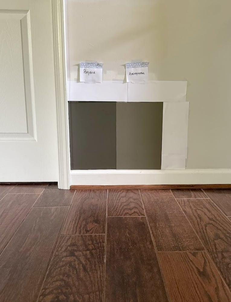
Porpoise is on top, Anonymous is next, followed by SW Adaptive Shade and BM White Dove
As for south-facing rooms, these colors are awesome, as they can lean into their natural warmth a bit more, but again, don’t go brown. THAT SAID, it can be open to interpretation, as a few of my clients find it too brown. However, compare them to an actual brown, and you’ll see what I’m talking about.
What about light bulbs & Kelvins?
If you paint your cabinets or a room Anonymous or Porpoise, it makes me think you like a moody, organic look. In that case, try bulbs with a color temperature (Kelvin) of around 2700K. Too warm? Bump up to 3000K, but I’d hesitate to go much higher.
WHAT ARE THEIR UNDERTONES?
The term ‘undertones’ is another way to describe the way a color leans, or its natural bias.
Want to know the WILD thing? Based on their color measurements, neither color is in the green family. However, in the real world of paint, where a color’s ‘family’ doesn’t mean everything, both colors easily lean into green…very easily.
If you don’t like green undertones, will these colors bother you?
Probably – that’s how susceptible they are to shifting green, REGARDLESS of your room’s lighting, exposure, or other finishes.
WHAT’S THEIR BEST WHITE TRIM OR CABINET COLOR?
Sherwin Williams Porpoise and Anonymous aren’t too fussy. However, with all of those wondrous whites to choose from, how do you choose? I’ve narrowed it to the 3 I suggest most often to my Virtual Color Consulting clients…
- Sherwin Williams Pure White (which isn’t ‘pure’ at all) has a pretty softness and vague warmth.
- Sherwin Williams Alabaster is awesome if you want a bit more softness, warmth, and a slightly lower contrast (depth-wise).
- I also love swappin’ brands when it gets me the right color, which is why Benjamin Moore White Dove is a fabulous choice – resting in the bosom between the previous 2 shades.
The Best White Paint Colors from Sherwin Williams
THE BEST PLACES TO USE PORPOISE & ANONYMOUS
- Single rooms
- Accent walls
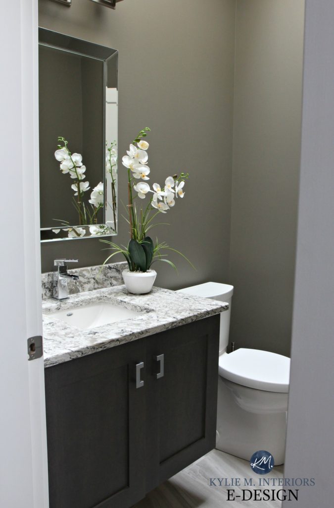
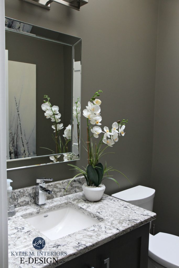
- While they’re definitely used in entire kitchens, they’re most popular on smaller-scale items, such as islands, bathroom vanities, and built-ins.
- Exteriors, including the main house color, trims, garage doors, gutters, and front doors
Now, let’s dive a little deeper (skinny dipping recommended).
WHERE ANONYMOUS & PORPOISE LOOK BEST (& WHERE THEY DON’T)
I’ve worked with these 2 colors a lot, and they’re often on my client’s shortlists. Let’s see where they pop up the most…
ON EXTERIORS
Porpoise and Anonymous are awesome exterior paint colors. Whether for your siding/stucco, painted brick, trim, or front door, these 2 shades have gained traction in the last few years because of their flexibility.
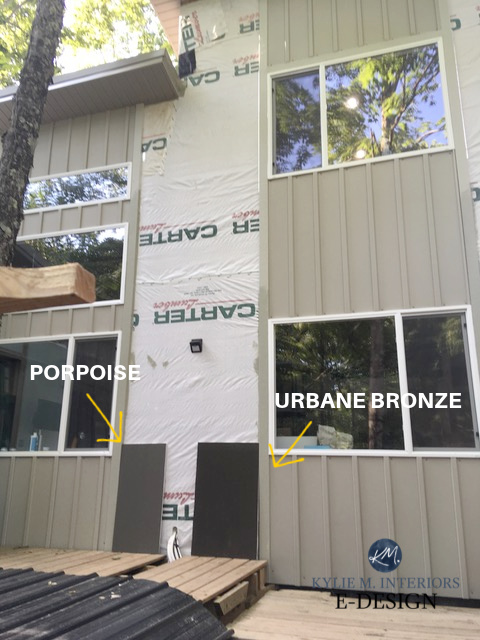
While they often fall in 2nd and 3rd place to the amazeballs, Sherwin Williams Urbane Bronze (which we’ll explore shortly), not everyone wants a color that dark, in which case, these 2 are top contenders.
5 Tips for Choosing an Exterior Paint Color
ON KITCHEN CABINETS AND ISLANDS…
In the words of the Great Stone Cold Steve Austin (yes, I was a wrestling fan in the early 2000s), can I get a HELLLLLLS YEAH? Again, not everyone is ready for skookum-dark shades and wants something a bit softer.
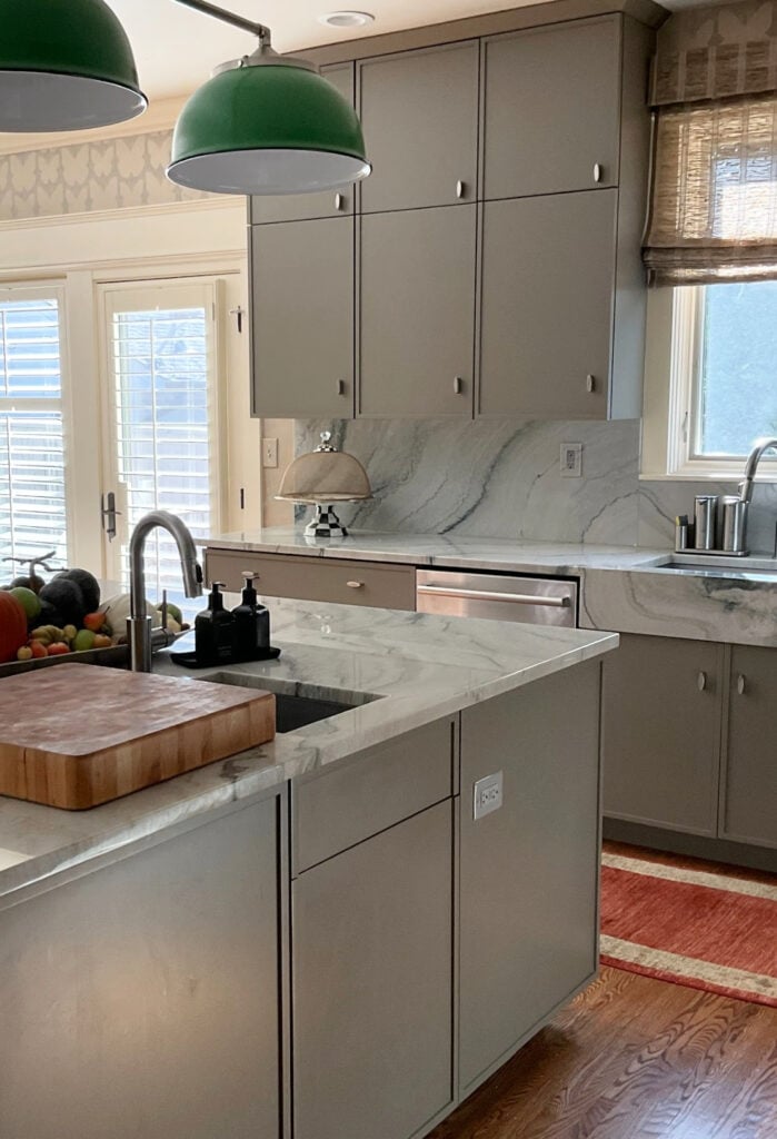
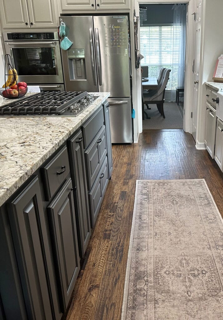
Whether it’s for an entire kitchen, island, built-ins, or bathroom vanity, Anonymous and Porpoise are super popular shades. They coordinate and accent a wide range of countertops, tiles, and bricks.
HOW ABOUT SINGLE ROOMS OR OPEN-CONCEPTS?
Yes…and no. If you have a single room and want it painted a dramatic, moody color, Porpoise and Anonymous are awesome choices. However, being so dark and bold, they’re too much for open-concept spaces.
DO THEY GO WITH WOOD TONES OR CREAM CABINETS?
You bet your cute little booty they do! They suit a wide range of wood stains and coordinate well with many cream cabinets or trims – even those with glaze on them!
While the goal is to paint these cherry red cabinets below, you can easily see how a color like Porpoise accents them…

While Porpoise looks as light as the previous bathroom walls, remember: your lighting and finishes will 100% affect how a paint color appears!
Here’s your peel & stick sample of Anonymous…

COLORS THAT ARE SIMILAR (ALTERNATIVES) TO PORPOISE & ANONYMOUS
When it comes to finding similar colors between brands, it’s tough as there will always be shifts in undertones, depths, and temperature. Let’s compare a few alternatives…
ANONYMOUS & PORPOISE VS. URBANE BRONZE
Ahhhh, Urbane Bronze – like gas after beans, it’s a force to be reckoned with. Urbane Bronze is a madly popular color, especially on accent walls, front doors, kitchen islands, and exteriors.
Among the 3 shades, Urbane Bronze is the darkest, with a wickedly dark LRV of 8. While Anonymous and Porpoise sit in the medium-dark range, Urbane Bronze is DARK. So, while the other 2 can be explored for some darkish rooms, UB is usually too heavy.
As for which way they lean, you’ll notice that Urbane Bronze is a bit less warm, but can easily appear with green hues, just like the others.
Sherwin Williams Urbane Bronze Color Review
DOES BENJAMIN MOORE HAVE ALTERNATIVES?
Yup, Benny has a few worth sampling and comparing…
- Benjamin Moore Squirrel Tail
- Benjamin Moore Roosevelt Taupe
- Benjamin Moore Iron Gate and Gargoyle.
If you’re thinking of color-matching between brands (ie, getting Benjamin Moore to make a Sherwin Williams paint color), you might want to read THIS first.
WHAT COLORS GO WITH ANONYMOUS & PORPOISE?
Because Porpoise and Anonymous are on the darker end of things, they’re actually a lot more flexible than the LIGHTER end of the greige range.
- STORMY GRAYS: Light-medium to medium-toned stormy grays with blue-green undertones
- OFF-WHITES: These colors suit a super wide range of flexible, warm off-whites such as Sherwin Williams Moderate White, Aesthetic White & White Duck
- LIGHT NEUTRALS: Light greiges with similar tendencies and a range of beige/tan paint colors.
- CREAMS: Many muted, soft cream paint colors pair well with Porpoise and Anonymous as accents.
- BLACK: It’s hard to go wrong with a simple black or soft black paint color.
READ MORE
Paint Color Review: Sherwin Williams Gauntlet Gray
Paint Color Review: Sherwin Williams Dovetail
Get the best paint color advice with Kylie M’s Online Paint Color Consulting – I’d love to help!


Kylie-
We are painting our new build SW anonymous. We have a lighter neutral stone on the house, black roof, and planning to do white trim. Would BM white dove blend okay with factory finished white gutters and garage doors? Or is SW Pure white a better option?
I want a softer look for the white, but don’t want anything sticking out.
Of the 2, Pure White will be more subtle with factor white gutters/garage doors, whereas White Dove will be that bit warmer. You will still see a shift between your gutters and Pure White, it just won’t be as strong 🙂
Just painted our wood siding colonial house white duck- the wood is cedar and it looks AMAZING. I tried amazing gray shutters (darkened 30%) and it was a bit too washed out. Looking at lower LRV colors now. Do you think Anonymous be a good option?!
It could be lovely! I like Felted Wool too 🙂
In the picture with the urbane bronze and porpoise panel, is the siding on the building Anonymous? thanks
Nope, I’m not sure what the original color is 🙂
Hi Kylie, I’ve learned so much from your blogs and videos. Can Porpoise or Anonymous as a vanity color pair nicely with rustic looking tan floor tile? Walls will be a neutral off white.
Oh, I pair Porpoise with beige/tan tiles allll the time – I would trust its depth to work more than Anonymous (having not seen the tiles, of course) 🙂
Love your blog.
First, we bought a townhome that is in great shape, good quality, but dated. we have a honey oak kitchen and floors. The ceilings are high, if that matters and the nook brings in a lot of light. We are refinishing the floors so they will still be oak, just a bit better. With the amount of honey oak in our house and the trim, I am thinking we will replace with painted cabinet doors. the wall will be Alabaster.
• I am thinking Porpoise for the cabinets.
• adding a rug
• letting the table and chairs add modern interest in the nook
Secondly, am I crazy for not wanting to paint all of the trim? We have the ability, my husband and I both come from design fields, but I wonder if we start that process, we will be taking away from some the look of the town home.
We are mid century modern transitional.
(The living room/dining room beyond have a sectional in the deepest of neutral greens, ochre and wine accents with multiple woods on the furniture.)
Hmmmm, it’s SO hard to say without seeing your home, but with doing NON-WHITE cabinets, it can be so much easier to keep wood trims in play. It doesn’t always go as well when cabinets are painted white. I’m definitely intrigued by your plan!
We building a new home and have chosen porpoise as our main body color. Half the house is a very pretty brick with lots of tones that pop next to porpoise. I’m working on the soffit and fascia. We want lighter, but not too light. Would you ever mix up porpoise at 75% or less to be an accent color? I’m not too excited about the other SW colors on that strip, but I do love the porpoise and the urbane bronze. Thank you, Amy
Hey Kylie,
I am looking to do a feature wall with SW anonymous. We have a cool toned charcoal grey upholstered bed however and warm medium toned hardwood floors. What colour would you recommend on the remaining walls to keep the bedroom earthy, moody and warm? The bedroom is north facing but does have a lot of pot lights and big windows spanning one wall. Using AI as a starting point, SW balanced beige was a suggestion. Would love to pull in warm wood tones and camel color accents as well if that plays a factor!
Hi Kylie, I’m a long-time fan of your blog. We selected SW porpoise for repainting (solid stain) the siding of our contemporary home. We are looking at creamy off-whites for the trim, because real whites can appear so stark outdoors. Which cream off-white would you pair with porpoise? The house has a red brick chimney and porch, and a prominent grayish-tan roof. Thank you!
Hmmmm, it’s hard to say without seeing the home, but what about something like SW Aesthetic White, White Duck, or Shoji White? They can warm up on exteriors, which is why I didn’t go TOO creamy 🙂
Exactly! The interior of my house is mostly Shoji White, but I like Aesthetic White and White Duck too. Probably can’t go wrong with any of those options :). Thank you!