
The Best Paint Colors to GO WITH Red Wood Stains: Oak, Cherry, Maple
Wood Trims, Floors, & Cabinets: Colors That Update & Add Style!
Do you have red-stained wood cabinets or flooring? Or maybe you have trim with a particularly picky red or pink hue? Don’t worry; I’ve got one particular shade of red coming to save the day (it happens to be on my head).
That’s right, I’m putting on my superhero cape, and this little Ginger has the BEST paint colors to coordinate with your tricky wood stain!
Whether you have red oak, cherry, or maple with a red stain (or a different wood species entirely), you have two choices…
1. ACCENT YOUR RED WOOD STAIN
Many think leaning into a color like green or blue is a great way to tone down their red or pink wood. After all, isn’t there enough red already? However, opposites attract and can strengthen each other. When using opposite colors, you often accent your wood stain rather than softening it. And neither is wrong; it just depends on which way you want your wood to go (up is usually the answer, am I right???) Okay, that’s enough sexual innuendos…for now.
If this is your style, I’ve got the blog post for you.
However, keep in mind that it depends on your perception…
Accenting your red-stained woods can sometimes look outdated rather than updated.
This isn’t always the case (as shown below), but it easily happens. If you’re worried about this, more modern neutrals like the ones in this blog post could be your best bet.
2. GO WITH YOUR RED-STAINED WOOD – LEAN IN
Going with it is the best option if you want to lean in or soften the effect of your wood trims, cabinets, or flooring (or furniture!). This doesn’t mean your walls must be red or pink; however, red and pink-friendly colors go a long way to humoring your stain without jacking it up!

THE DIFFERENT TYPES OF RED-STAINED WOODS
Whether you have red oak, white oak, cherry, maple, trims, cabinets, flooring, or furniture, you want to note which color combination you have.
RED-PURPLE
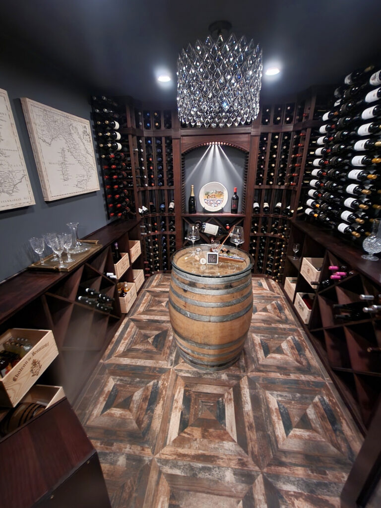
Wood finishes with a red-purple hue are some of my favorites. They respond well to the right wall color. These woods tend to be darker and are often reasonably rich.
The following examples have a good dose of red and purple. Some red stains seem a bit more red-pink (especially white oak), but most cater to purple. The bottom right leans more pink…

RED-ORANGE or RED-PINK
While I have a soft spot for Ryan Reynolds, Cornuts, wine, smoked oysters red-purple, something must be said for beautiful red-orange-stained wood.
Red-orange isn’t as common as pink-orange, a combo found in lighter woods (as the lighter version of red is pink). Some stains are in between worlds, leaving them more ‘open to interpretation’ as to what colors you’re looking at!
There are also a lot of red-pink stains, which are MOST common with red oak flooring.

The above dining room shows red oak flooring with a pink hue
Although this wood is both red and orange, the orange is stronger on the trims. But notice the pantry-style doors—they seem a bit more red in spots!

PINK-YELLOW OR PINK-ORANGE
Many people see these wood finishes as more yellow or orange (and they often have a LOT of these colors in them), but that pink can throw a curve ball! Pink-yellow (or yellow-pink, depending on which color is more dominant) finishes are a bit trickier. But they aren’t impossible when you have a little Ginger tucked in your back pocket (wink wink).
These woods are PINK, not red, because if it’s a lighter wood, what’s the light version of red? Pink!

However, these lighter woods are a blog post series unto themselves! Of course, it won’t hurt to read both, as many of the same colors apply. When you’re done with this one, check these out…
- The Best White Paint Colors With Pink or Pickled Wood Stains
- The Best NEUTRAL Paint Colors with Pink-Red Oak
- Accent Colors to Go With Pink, Pickled, or Red-Oak Finishes
BEFORE WE GET STARTED…
- Sure, your red-stained trims, cabinets, furniture, or flooring might seem bossy, but there are probably other things to consider, including countertops, stone, tiles, furniture, and your rooms’ exposure. Make sure you’re honoring all of your room’s needs—sometimes, there’s an even BIGGER boss at play!
- A lot can depend on a) how red your wood finish is, b) what other undertones it has mixed in (e.g., orange, yellow, purple), and how much there is compared to other finishes in the room.

In other words, these colors are a great place to start, but if you’re second-guessing yourself and are wondering about the above, you can find me HERE (no, not the local winery).
GRAY-PURPLE COLORS WITH RED WOOD STAINS
Check out warm grays with purple hues to coordinate with your red oak, maple, cherry, or even mahogany. Cool grays can seem sharp against many wood stains, but add a bit of warmth, and you can create a natural, subtle palette between your walls and your wood.
For example, Benjamin Moore Abalone is wicked pretty. This warm shade of gray winks demurely at the world of taupe without tipping its hat too beige. If you don’t love purple, this might leave you a little twitchy, but at the same time, if you’re dealing with red-toned woods, this is a great color to lean into.
Paint Color Review of Benjamin Moore Abalone & Barren Plain
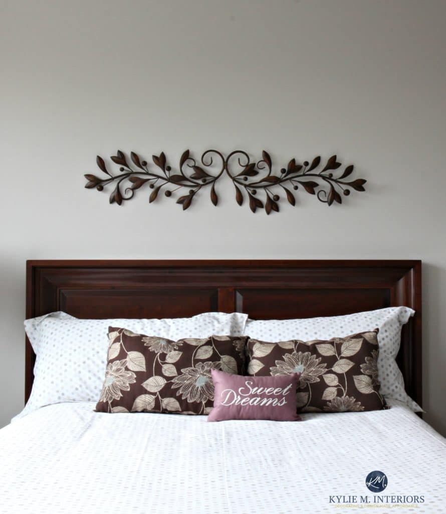
The headboard in this bedroom below has a strong red-purple undertone. Notice how stunning Abalone looks against it (it’s like I know what I’m doing or something).
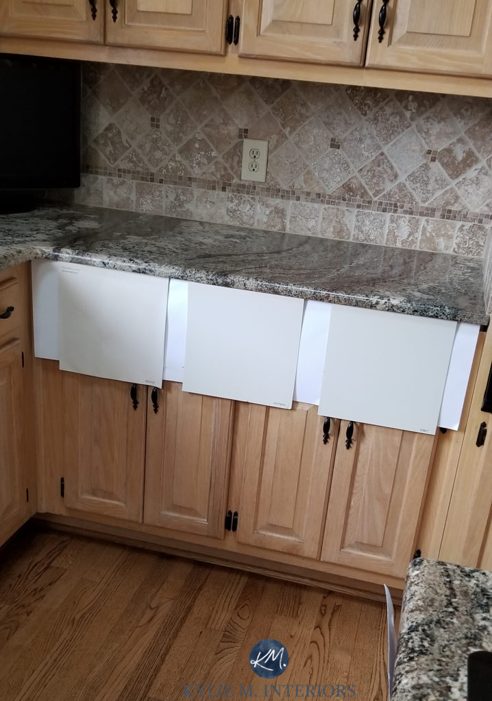
And I appreciate it’s tough to SEE these colors below (always remember to have white paper beside your samples!), but this shows (left to right) Benjamin Moore Smoke Embers, Cumulus Cloud, and London Fog (links below)…
Benjamin Moore Collingwood has to be one of the more popular choices for red-purple wood stains, but it also looks fab with red-orange…

While its purple undertone doesn’t always show up at the party THIS much, it sure is nice when it does. Sample and compare similar shades to find the one that hits your happy place (but don’t tell your husband, as he’s been trying to hit that for YEARS).
This red oak table has a strong violet-red-pink stain.
WARM GRAY-PURPLES TO COMPARE (LINKS GO TO THEIR REVIEWS)
Just because Abalone looks amazeballs in the above room doesn’t mean it’s the best color for yours. Sample, compare, and have some fun!
- Benjamin Moore Portland Gray is a fantastic color for those who love to see a noticeable purple hue without being slapped upside the face by it.
- Benjamin Moore Barren Plain offers a more muted, grayed-out look than Abalone while still having a gorgeous purple backdrop.
- Sherwin Williams Twilight Gray offers a muddy, slightly taupe-inspired take on Abalone.
- Benjamin Moore Abalone (one of my uber faves).
- Sherwin Williams Light French Gray offers more of a flirty nod towards purple than a full commitment, but it’s worth checking out.
- Benjamin Moore Collingwood has to be in the bunch; it’s a gooder.
- Benjamin Moore Smoke Embers is a luscious gray with a purple undertone. Cumulus Cloud (previously shown) isn’t one of my favorite colors to sample with red woods.
- Benjamin Moore London Fog. Just watch that its undertones skew purple for you.
- Sherwin Williams Requisite Gray has to be one of my favorites. It’s darker than a few of the above shades but so stunning with red-stained woods.
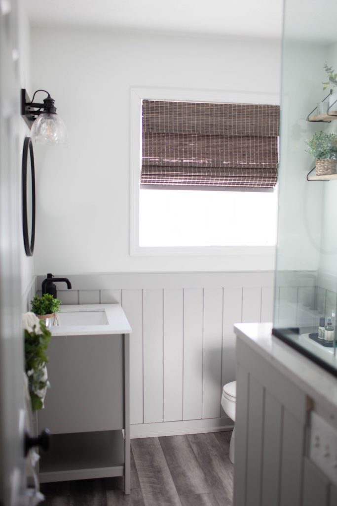
While the flooring in this next bathroom is gray LVP, you can see how pretty Light French Gray is with the purple-red hues of the bamboo blind.
Paint Color Review of Benjamin Moore Portland Gray & Cement Gray
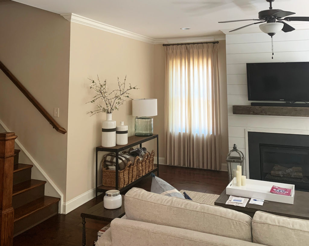
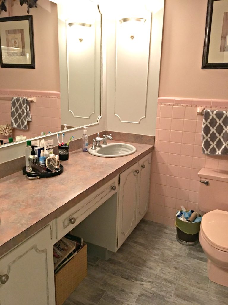
Like many warm gray-purples, Sherwin Williams Heron Plume hovers between the warm gray and taupe worlds. Here, it looks soft and subtle in this mid-century-style entryway…

This next bathroom has a paint color similar to Heron Plume…

Ideas to Update Your 2000s Bathroom
TAUPE PAINT COLORS WITH RED WOODS
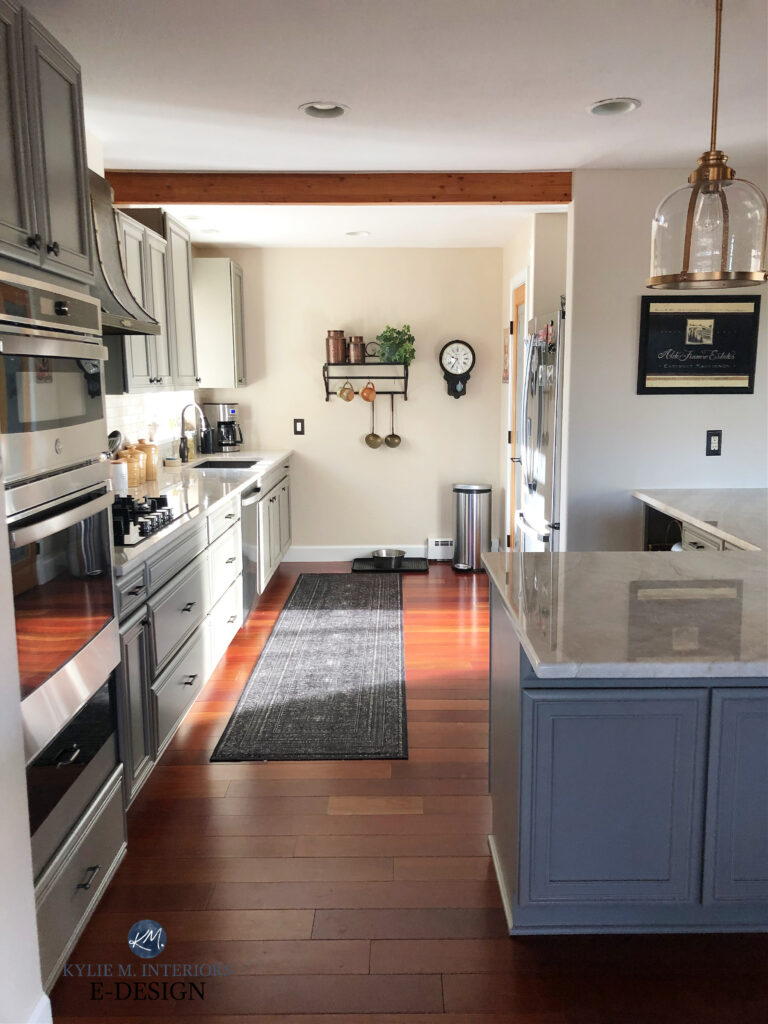
Taupe is one of my favorite colors to coordinate with red and pink cabinets, trims, and floors (or furniture). Woods with red or pink can be quite warm-toned, so it makes sense that a warm paint color with similar undercurrents would look good.
These beautiful maple cabinets have a red-orange stain (the floor is more of a purple-red stain). Notice how the taupes in the Zellige-look subway tile backsplash complement the undertones of these woods…

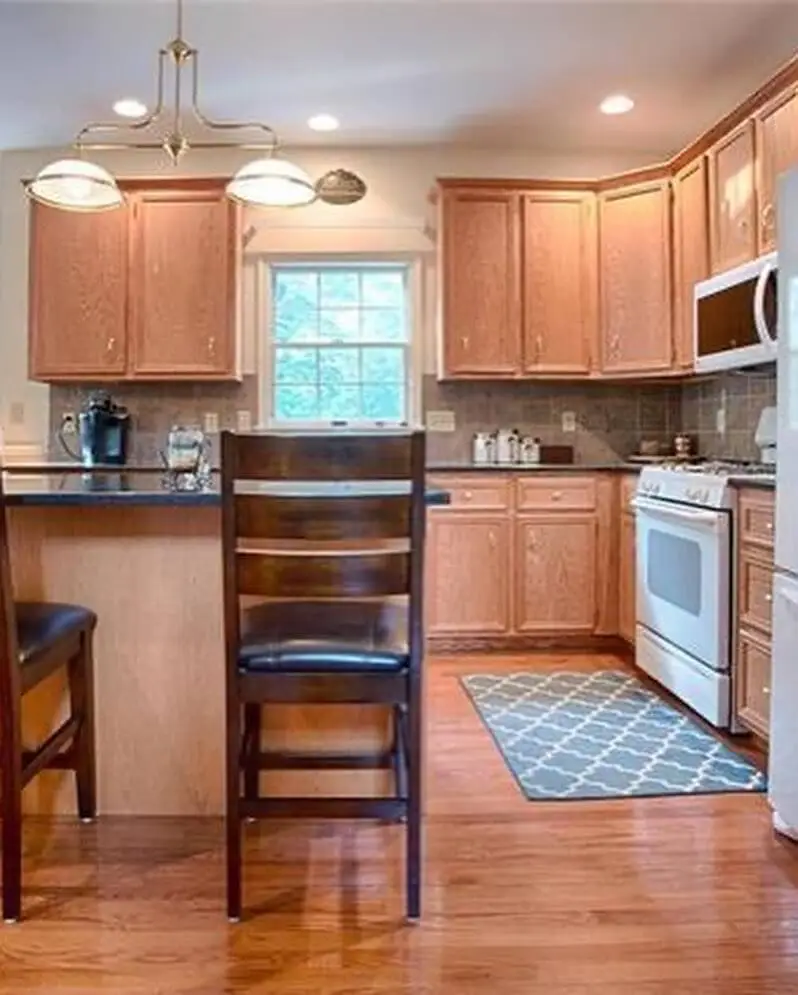
This next kitchen has maple cabinets with a similar stain profile to the previous one. The walls in this kitchen were previously green, which contrasted with the stain on the cabinets, making them look more dated…

Look at how fresh and updated the cabinets and flooring look with a new wall color…

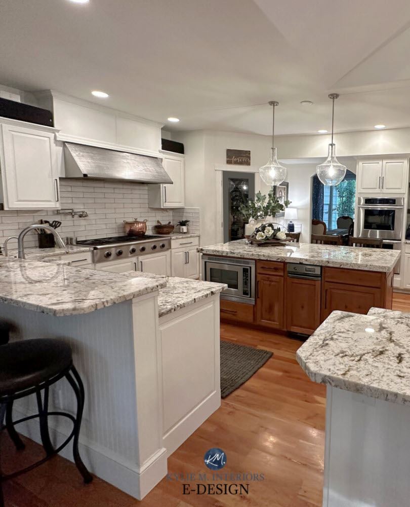
For this Online Color Consultation, we chose Sherwin Williams Egret White—one of my favorite shades of taupe with super subtle undertones. This was a great choice as we had red-toned flooring and cabinets to consider, as well as an older-style granite countertop.
GAHHHHH, just look at how friggin’ gorgeous this taupe looks against these cherry-red kitchen cabinets…

Ideas to Update Your 2000s Home
TAUPES TO SAMPLE & COMPARE (WITH LINKS TO REVIEWS)
- Sherwin Williams Versatile Gray has to be one of my favorites if you’re good with a bit more depth.
- Sherwin Williams Egret White is one of the more popular choices with my online clients.
- Benjamin Moore Pale Oak commits a bit more to its pink undertone, but DAAAAMN, it’s pretty!
- Sherwin Williams Popular Gray is a pretty standard approach to taupe.
- Sherwin Williams City Loft is like Egret White with a bit more undertone.
- Sherwin Williams Perfect Greige has a bit more depth and is ridiculously beautiful with red woods.
- Benjamin Moore Classic Gray hovers between warm gray and taupe.
- Sherwin Williams Heron Plume for a soft, subtle approach.
- Benjamin Moore Mocha Cream for a commitment to taupe without loads of color (although THAT is open to perception).
Here’s Pale Oak (the sample on the right) with a dark red-purple wood fireplace surround. Look at how well it complements the mantel and the beige-taupe tones in the fireplace surround…
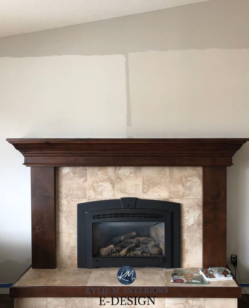
Remember, it’s not just about your wood stain – pay close attention to surrounding finishes, too!
I don’t have an image of City Loft with darker red oak or cherry, but I do have it with a lighter maple with a pink hue…

Paint Color Review of Sherwin Williams City Loft
City Loft reads more like a warm gray in some lights. This means it could be a touch too cool (or warm!) for some spaces, depending on your room’s exposure, interior lighting, and surrounding finishes. Sample and compare similar shades to see which best suits your wood finishes. City Loft is a gentle, soft shade of warm gray/taupe. With muted violet-pink undertones, it’s a great option that leans into the undertones in your wood without putting you too deep in the color pool.
In this next image, the oak cabinets have a reasonably strong pink undertone. Luckily, so does the backsplash, which means they both humor similar shades!
While I’d love to give you EVERY color I’ve got up my sleeve, I have Online Color Consulting clients who paid to have me pick their colors personally! An image like this is great to get the creative juices flowing, and you can use my blog (or my services) to get where you need to go!
And just because it’s such an IMPORTANT point to make, I’ll say it again…
NOTHING will make your red or pink stain go away other than painting or restaining it.
It would help if you decided whether you want to lean in or lean out. I’m usually on Team Lean-In for the most natural, less forced look, but you do you!
BEIGE PAINT COLORS WITH RED WOOD STAINS
I dabble in this one lightly. While there are some clear winners, if your wood stain is obscenely red or pink, some beiges can be too orange or even orange-yellow in comparison.
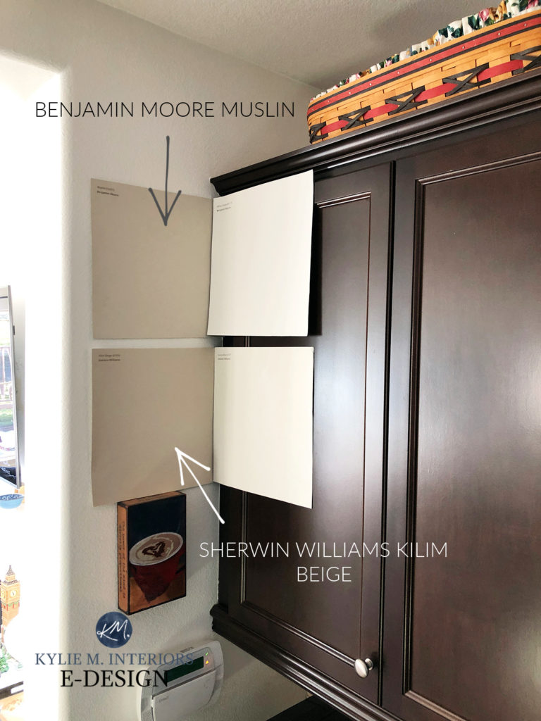
However, if you have just the right blend of red, you can create a pretty wicked palette, starting with Benjamin Moore Muslin. This particular shade of beige can look great with wood stains that contain red, pink, and orange.
Before, this kitchen, eating nook, and sunroom were suffocatingly warm. Between the woods and warm wall color, there was a LOT goin’ on…

After, everything takes a huge sigh of relief with a more modest warm neutral like Muslin on the walls…

Sherwin Williams Natural Linen is another badass and beautiful shade of beige. Shown here against an exotic wood floor with reasonably strong red tones, Natural Linen looks lovely, as the floor also has a good degree of orange.

The Best Paint Colors to Update Beige Tiles, Carpets, & Countertops
While many of the 2000s finishes in this next kitchen are considered outdated, if you need to work with what you have, you may as well pick a beautiful paint color to go WITH them, rather than against them!

Not entirely updated? Sure. Beautiful? You bet your booty it is!
Check out this next image, which shows oak closet doors very similar to the pickled oak you often see on kitchen cabinets and trims…

Get your own personalized color selection via Kylie M’s Online Color Consulting.
While the above wood is pickled, colors like this can also be beautiful with darker, richer stained red woods.
I also LOVE a range of off-whites with red or pink-stained woods, especially those with a beige undercurrent…


Some of the above can be too yellow for the average red-pink wood, but it depends on your wood’s blend of undertones. Many of the above shades are in the upcoming list.
And how can we talk about red-orange wood stains without touching on Sherwin Williams Kilim Beige? While it got a bad rap, as colors like this were overused in the early 2000s, it still finds its place in the right home, ESPECIALLY since trends are leaning warmer…
Sherwin Williams Simplify Beige is one shade that often gets overlooked due to…
a) its stronger undertones
b) its position in the fan deck, as it doesn’t hang out with the top shades.
However, in a room with red or pink-stained woods, like red oak, a color like Sherwin Williams Simplify Beige can be stunning…


If you’re looking for a lighter shade, Benjamin Moore Maritime White is a beautiful, well-balanced beige that offers a subtle wink of warmth to your walls…

The Best Paint Colors to Update Dark Wood Trims, Cabinets, & Floors
BEIGE PAINT COLORS TO SAMPLE & COMPARE (WITH LINKS TO REVIEWS)
- Sherwin Williams Kilim Beige
- Benjamin Moore Muslin
- Benjamin Moore Maritime White
- Sherwin Williams Moderate White
- Sherwin Williams Divine White
- Sherwin Williams River’s Edge
- Benjamin Moore Shaker Beige
- Sherwin Williams Simplify Beige
THE BEST WHITE PAINT COLORS WITH RED OR PINK WOODS
Many feel that white is their best bet to update and coordinate with their red wood finishes. While it’s not a baaaad idea, I personally lean into the above colors—warm gray, taupe, and beige. But it’s not all about me (not all the time), so I want to show you a few colors to sample and compare with your particular trims, cabinets, etc.
I get nervous because while white can be a great choice for trims and cabinets (a smaller scale), as a WALL COLOR, whites are very high contrast with wood, and just the contrast alone can make your wood seem stronger. However, sometimes, it is what it is, and white is the best choice based on a homeowner’s tastes and other finishes.

Also, the most popular shades of white contain yellow. While this can be fine with redwoods, some can clash with too much red-orange, red-pink, or red-purple.
The warmest shade of white I’d explore with the average red oak or red wood stain is Sherwin Williams Alabaster. Look at how amazeballs it looks in this beautiful 1990s kitchen update…
Here’s another looky-loo at Alabaster with granite countertops…

Ideas to Update Older Style Granite Countertops
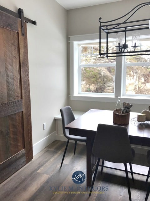
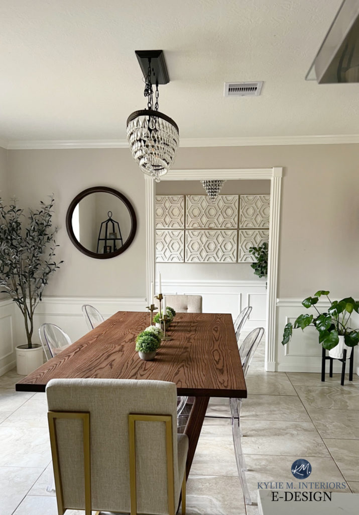
I also love Benjamin Moore White Dove, shown on the wainscoting in this dining room (below), with Sherwin Williams Worldly Gray on the upper walls. You can find more colors like Worldly Gray in THIS BLOG POST.

WHITE PAINT COLORS TO SAMPLE WITH RED WOOD (LINKS TO COLOR REVIEWS)
- Sherwin Williams Alabaster
- Benjamin Moore White Dove
- Sherwin Williams Pure White
Sherwin Williams Snowbound is another interesting one. Depending on whether there’s a brighter white around, Snowbound can look more or less like a soft white OR you might notice some exciting undertones pop up!

There is no ‘one color suits all’ paint color – sample and compare!
FULL Paint Color Review of Sherwin Williams Snowbound
NEED HELP?
ACCENT COLORS That Go With Red Wood Stains
Are Older Wood Cabinets Trendy Again?
My Favorite Off-White Paint Colors
The Best Paint Colors to Update Dark Wood Trim
The Best Paint Colors to Update Golden Oak Cabinets
NEED HELP?
Check out my Online Paint Color Consulting!


I have enjoyed the many hours I have spent pouring over and rereading your. blog posts and listening to your YouTube videos. Your posts are fun, professional and enlightening. I find it amazing I can now identify wood colors and consider whether a color will change in my north facing well lit living room. Would you consider writing about how to coordinate GE mat white appliances with wood cabinets?