
Benjamin Moore London Fog 1541: Undertones, LRV, & More
While often passed up for the ever-popular Revere Pewter, Benjamin Moore London Fog has a lot to offer the average home.
However, as with all paint colors (especially color ninjas like this one), London Fog can change its tune based on a room’s exposure, interior lighting, and surrounding finishes. So, how do you decide if it’s the best color for you? You research (thanks for visiting me), and you sample carefully.
IS LONDON FOG A WARM GRAY, TAUPE, OR GREIGE?
London Fog is a warm neutral – too warm to be gray, but not nearly warm enough to be beige. This parks it in the greige-taupe range. Some like to define taupe by purple-pink undertones and greige by green undertones. If this is you, then London Fog is a taupe, which we’ll talk more about shortly.
As for some people thinking that London Fog is gray, some of it comes down to perception and exposure. Most say London Fog is too warm to be gray, as it doesn’t ‘look’ like a typical gray. Others see it as gray, as it’s not nearly as warm as their favorite shades of taupe. You do you, boo.
You might find that London Fog changes its tune depending on your room’s exposure, leaning slightly warmer in one and grayer in another.
North, East, South, West – Which Paint Color is the Best?
THE LRV OF LONDON FOG
London Fog has an LRV of 56.44 (according to the Benjamin Moore website). This LRV makes London Fog a light-depth paint color, but it’s definitely on the heavy side of this range. If you have a dark room due to poor lighting or small/no windows, this depth of taupe can make the walls look a bit muddy and drab.

However, if you have a bright room, this added depth will help it hold firm against bright light, not washing out as much as lighter colors will.
Not sure what LRV is? It could save your paint-lovin’ life – read all about it HERE.
WHAT ARE LONDON FOG’S UNDERTONES?
As we learned above, London Fog often appears with a subtle purple (purple-pink) undertone, but doesn’t go buckwild. In my experience (which is vast at 12,000+ online color consults), London Fog tends to read ‘neutral’ or just slightly purple (slightly being an overstatement). Rarely have I seen it flash green, but when it does, it’s on an exterior or being compared to a warm gray or taupe with legit purple hues.
LEFT TO RIGHT: Benjamin Moore Smoke Embers, Cumulus Cloud (another ninja), London Fog
Here’s your Peel & Stick sample of London Fog…

WHAT’S THE BEST WHITE TRIM OR CABINET COLOR WITH LONDON FOG WALLS?
When it comes to the best white paint colors for London Fog, I lean towards…
- Benjamin Moore White Dove
- Benjamin Moore Chantilly Lace
- Sherwin Williams Pure White
The 8 Best Benjamin Moore White Paint Colors
WHAT COLORS ARE SIMILAR?
If you’re looking for colors that pick up what London Fog is throwin’ down, I’ve got some great samples to compare…
- Sherwin Williams Alpaca offers more commitment to a purple undertone if that’s what your finishes demand.
- Benjamin Moore Collingwood always leans into purple but comes up slightly lighter, softer, and more gentle-looking than London Fog.
- I’d definitely sample and compare London Fog with Benjamin Moore Rodeo.
- It’s hard to beat the popularity of Sherwin Williams Agreeable Gray when it comes to flexible neutrals – it’s 100X more popular than London Fog.

My FULL Paint Color Review of Sherwin Williams Agreeable Gray
If I had to choose RIGHT NOW, I’d choose Agreeable Gray over London Fog.
WHERE DOES LONDON FOG LOOK BEST?
Not every finish or room can handle London Fog’s warmth or undertones. Let’s look at a few considerations…
BENJAMIN MOORE LONDON FOG WITH CREAM TRIM OR CABINETS?
That’s a hard no from this little Ginger. London Fog doesn’t get along very well with cream – not in a close relationship, anyway.
Cream cabinets and trims are always challenging when updating surrounding walls. You might find this helpful.
LONDON FOG WITH WOOD TRIMS OR CABINETS?
Whether you have wood trims, cabinets, or flooring, London Fog can be a beautiful complement, offering only a slight contrast to the average wood stain.
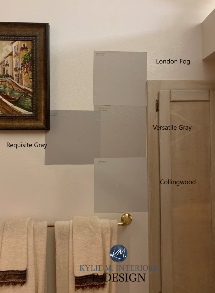
Sherwin Williams Requisite Gray | Versatile Gray | Benjamin Moore Collingwood
LONDON FOG AS AN EXTERIOR PAINT COLOR?
London Fog can be an excellent exterior paint color as long as it complements your finishes. Luckily, it’s a color that often pairs well with many common stone facades and the mortar around brick.
5 Tips for Choosing an Exterior Paint Color
WHAT COLORS GO WITH LONDON FOG IN A PALETTE?
While it greatly depends on whether you need a partner color for cabinets, an accent wall, or an adjoining room, here are some shades to explore…

- Medium-toned grayed-out greens can look stunning with London Fog
- Light shades of muted green look pretty in adjoining rooms, as well as greige paint colors
- super muted off white paint colors
- Medium-depth or darker gray-blues
- Any color that’s cooler than London Fog (including cool and warm grays) should be the same depth or DARKER than London Fog.
READ MORE
The Best Light to Medium Taupe Paint Colors
The Best Light to Medium Greige Paint Colors
Paint Color Review of Sherwin Williams Egret White (mad love)
NEED HELP?
Check out my Online Paint Color Consulting!


ORIGINALLY WRITTEN IN 2020, UPDATED IN 2025


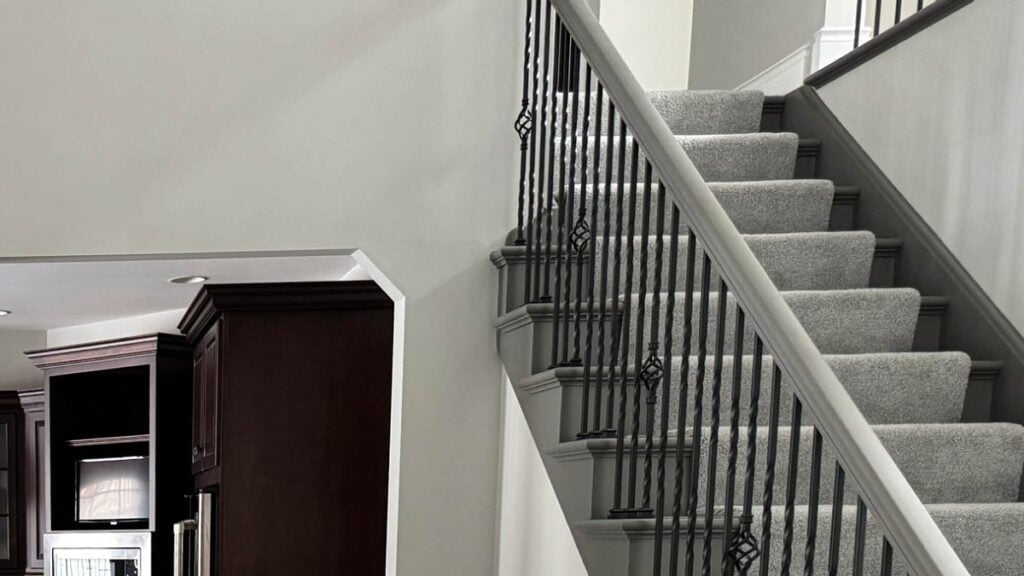
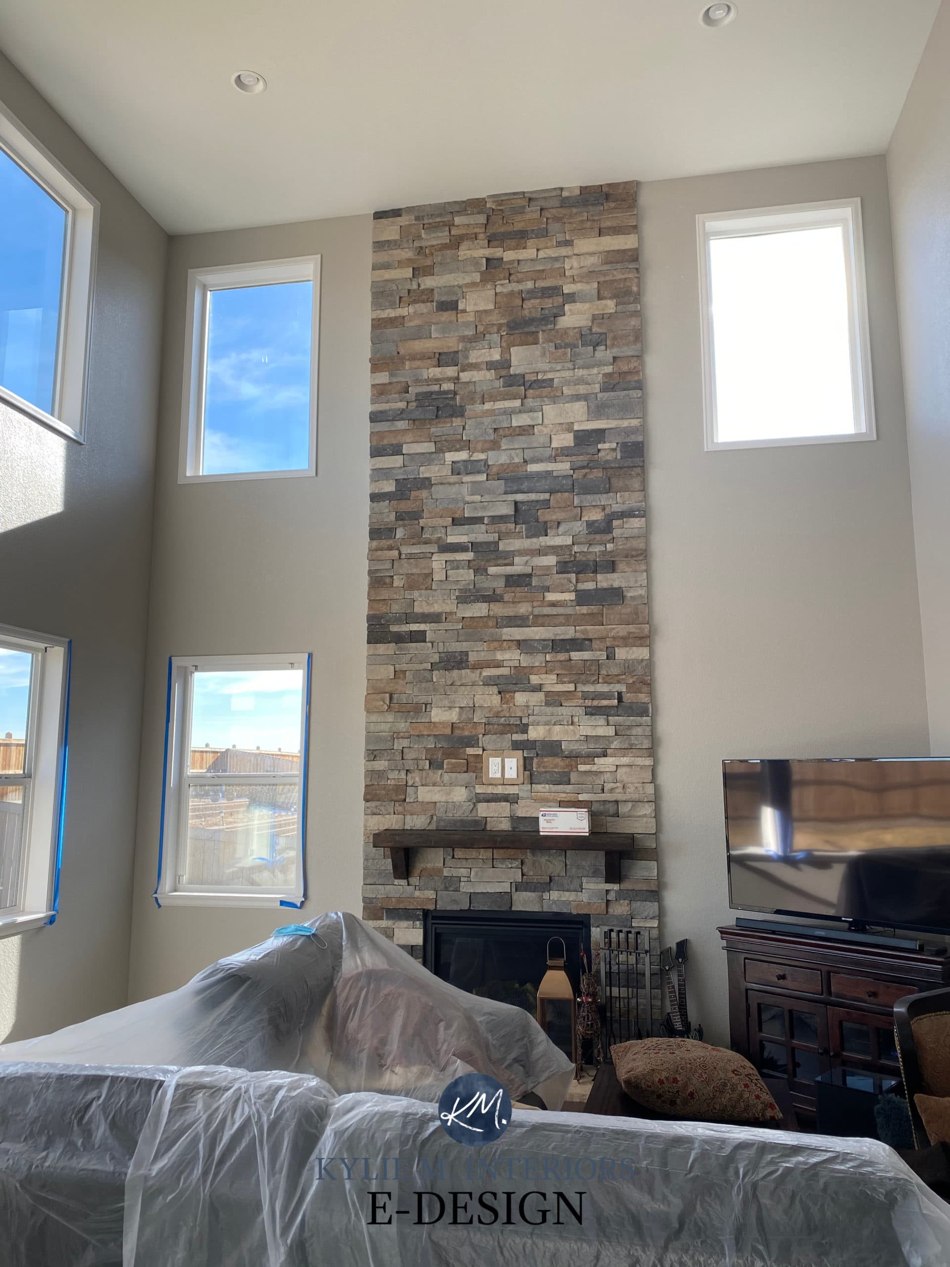
Is that your home with the floor to ceiling fireplace? Would you mind if I ask what stone you used for your fireplace? We just painted our family room London Fog and are looking into doing a similar fireplace! Thank you!
It’s not, I’m sorry!!!
What slightly darker shade would go with this for outside trim color if we use this for the main exterior color ?
I have a 16×16 north-facing LR with two smallish windows but lots of passive light. I love London Fog,. What would you recommend for the ceiling and trim? Everything changes color wildly depending on the time of day and the wall. It drives me batty. The rug is wheat/light camel.
Oooo, I might enjoy the softness of BM White Dove 🙂
I did what you suggested, Kylie! It came out great. The White Dove is gorgeous against the London Fog. I could see how LF could drive some people mad: sometimes it’s green, sometimes it’s violet. But I think it’s super interesting! Thanks so much for your wisdom and guidance.
WAHOOOOO, I’d love to see photos of it (if you don’t mind) as I just don’t have enough photos of this bad boy in action! kylie@kylieninteriors.ca But if that’s not your comfort zone, that’s ALLL good too ;). MERRY CHRISTMAS!
I just tried to do that, Kylie! But the message got returned to me, domain name unknown? I’m happy to share, just let me know how!
I figured it out. The dreaded “a letter” syndrome!! Hope those pics help! I can send more once the room is more finished.
That’s funny, I think a lot of people miss the ‘M’ in the middle!