
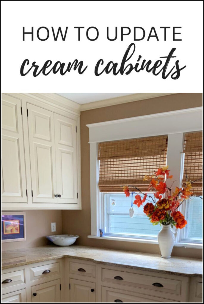
How to Update Your Cream Cabinets & Trim: COMMON QUESTIONS
IDEAS TO MAKE YOUR CREAM CABINETS LOOK MORE MODERN
When it comes to updating a kitchen or bathroom with cream (or off-white) cabinets, it’s not just about finding the best paint color (you’ll find a link to some later in this blog post); it’s about understanding WHY it’s the best.
This is why I’m hittin’ the most common questions about cream cabinets and trims (via my comment section, Kylie M Instagram, and Kylie M YOUTUBE channel).
So, without further ado, let’s get this cream-inspired color party started!
CAN I PAINT MY WALLS WHITE WITH CREAM CABINETS OR TRIM?
You can stop looking and agonizing – that magical color doesn’t exist (insert wine here). It doesn’t matter whether you’re looking at a warm white paint color or a true white; NO white will work, no exceptions (I’m sorry!).
Why?
- If you partner your cream cabinets (or trim) with a white paint color, your cabinets will look MORE YELLOW in comparison. If this is okay with you, fill yer boots, but it isn’t usually the desired look.
- If you partner your cream cabinets with an off-white paint color that’s the SAME DEPTH as your cabinets, you risk some seriously clashing undertones – the two colors will be fighting for the same color slot. You have to mix and match these so…carefully.
But don’t worry, all is not lost (which we’ll talk about shortly).
Let’s look at some examples. Sometimes SEEING what doesn’t work helps you make the best choice for your home…
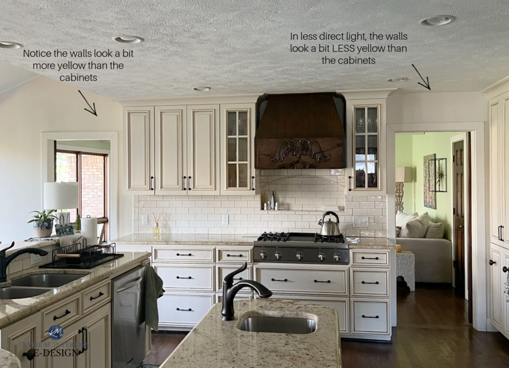
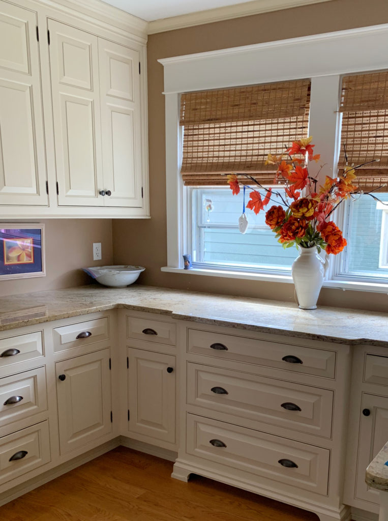
In the above photo, these cabinets COULD look more subtle if the walls and trim were the same as the cabinets. Instead, because a lighter white was used on the walls, the warmth of the cabinets is much more apparent. And heck, the above cabinets aren’t even overly creamy! Sure, a warmer white would’ve been a ‘bit better,’ but no screamin’ glory.
If you want to exploit your cream cabinets, fill yer lil yellow-hued boots.
However, remember that depending on which warm white or cream you have, a brighter white is likely to make your cream look even creamier.
Take a look at this next photo. You’ll see a range of warm, off-white neutrals against very creamy cabinets. Notice how much richer and more yellow the cabinets look compared to these warm off-whites…
Sherwin Williams Aesthetic White, Divine White, White Duck
Don’t worry; these samples weren’t intended to be ‘coordinating wall colors’ – they were for a different project. This said, I’m grateful as they came in handy for this blog post as a great example of what DOESN’T work!
Now, let’s try to pair another kitchen with cream cabinets with a warm white or two…
This first example shows Sherwin Williams Antique White cabinets with a sample of Benjamin Moore Cloud White, a popular warm white paint color.
While it never hurts to try, notice how much more yellow the cabinets look compared to a warm white – examples like these are important to see!
It’s one thing to have cream walls and white trim; it’s a WHOLE ‘nother thing to turn that around.
And here’s Sherwin Williams Creamy, a warm off-white on Antique White…
LOOK AT HOW GOLDEN YELLOW THOSE CABINETS LOOK IN COMPARISON! I mean, sometimes you don’t know until you try, but once you’ve tried and it doesn’t work, it’s time to move on (I tell this to Tim every Friday night).
Remember, just because you don’t want to hear it doesn’t mean it’s not true (said with love, wink wink).
Hopefully these examples show you how challenging it can be to have white or off-white walls with cream cabinets or trims.
Now, let’s move onto some solutions.
THE EXCEPTIONS – THE FUN PART!
1. If you have cream cabinets that are on the HIGH of the off-white range (LRV of 78-81), you can get DARN CLOSE to soft white on your walls.
How?
You can repeat your cabinet color on your walls!
For example, Sherwin Williams Creamy is a popular soft white/off-white with a slightly lower LRV. When a color like Creamy has this high LRV, it’s slightly more likely to act like a soft, warm white than an off-white, making it a GREAT choice for walls & cabinets (& trim).
While the shift is subtle, this kitchen has Sherwin Williams Alabaster cabinets and trim, and Creamy walls
2. If you have darker/heavier/more yellow cream cabinets or trim and are dead-set on having off-white walls, I suggest painting your walls and cabinets the same color; there simply isn’t another safe choice in the off-white range.
For example, look at how gorgeous Antique White walls can look with Antique White trim…

That’s right. Keep things simple and seamless, and let the shift in paint sheens do the work for you. Even if this color is more yellow than you want…
You can’t always get what you want when you have cream cabinets.
You can try lightening your cabinet color by 25% to get a slightly lighter look. It won’t make your cabinets look less yellow; if it were me, I’d stick with the same color.
How to Update Older Granite Countertops
I know it can be frustrating. I get the odd comment from readers (some of which I delete as they’re quite rude) about how they were hoping for ‘better information and solutions‘. Some are phrased as though ‘it’s my fault there aren’t better solutions’.
Modern Paint Colors to Update Cream Cabinets & Trims
I could tell you to try ‘this white and that neutral‘ if that’s what you want to hear, but this doesn’t mean it will look good. If it were that easy, you’d already have found your color.
I’m here to give you the best advice I possibly can in what is a tricky color conundrum (in other words, don’t kill the well-intentioned Ginger messenger – I’m here to help).

The Best Paint Colors to Go With Cream Cabinets & Trims
HOW DO I MAKE MY CREAM CABINETS OR TRIM LOOK LESS YELLOW?
When it comes to cream cabinets, it’s not about making them look less yellow – they ARE a yellow hue paint color. And if this is your concern, it’s more about not making them look MORE yellow.
It’s hard to turn cream into something it’s not – and it’s not white.
Of course, you have a much better chance of a muted look if your cream color has a high LRV (which we’ll learn about shortly). However, short of that, you HAVE cream-yellow trim.
Here are a few tips…
1. DON’T USE AN OFF-WHITE THAT DOESN’T MATCH YOUR CABINETS
A white, off-white, or light-colored paint color that’s the same depth or lighter than your cream cabinets will make your cabinets or trim appear more yellow…

Between the white walls, taupe backsplash, and non-creamy countertop, the boat was missed on this palette.
If you have a chance with an off-white or light-depth paint color, it either needs to be the exact same color as your cabinets or DARKER than your cabinets (with jibing undertones).
Light & Modern Paint Colors to Update Cream Cabinets & Trims
2. AVOID COOL COLORS
Walls painted in a cool paint color (i.e., gray or blue-green) can make your cream cabinets or trim look more yellow in comparison…
Sherwin Williams Comfort Gray – BEAUTIFUL combo, but that yellow sure lights up!
The same applies to some greige and taupe paint colors, in particular, lighter ones. While these are warm paint colors, they’re ‘cooler than’ cream (but better than gray).
3. PAINT YOUR WALLS THE SAME CREAM AS YOUR CABINETS OR TRIM
This is a tricky one, as the flow to any adjoining rooms with white trim can be tricky, but sometimes you can’t hit EVERY need with one color. When it comes to paint colors and design, you must do what suits the room itself first, and then work out from there.
Sometimes soft and simple is best – Benjamin Moore Navajo White
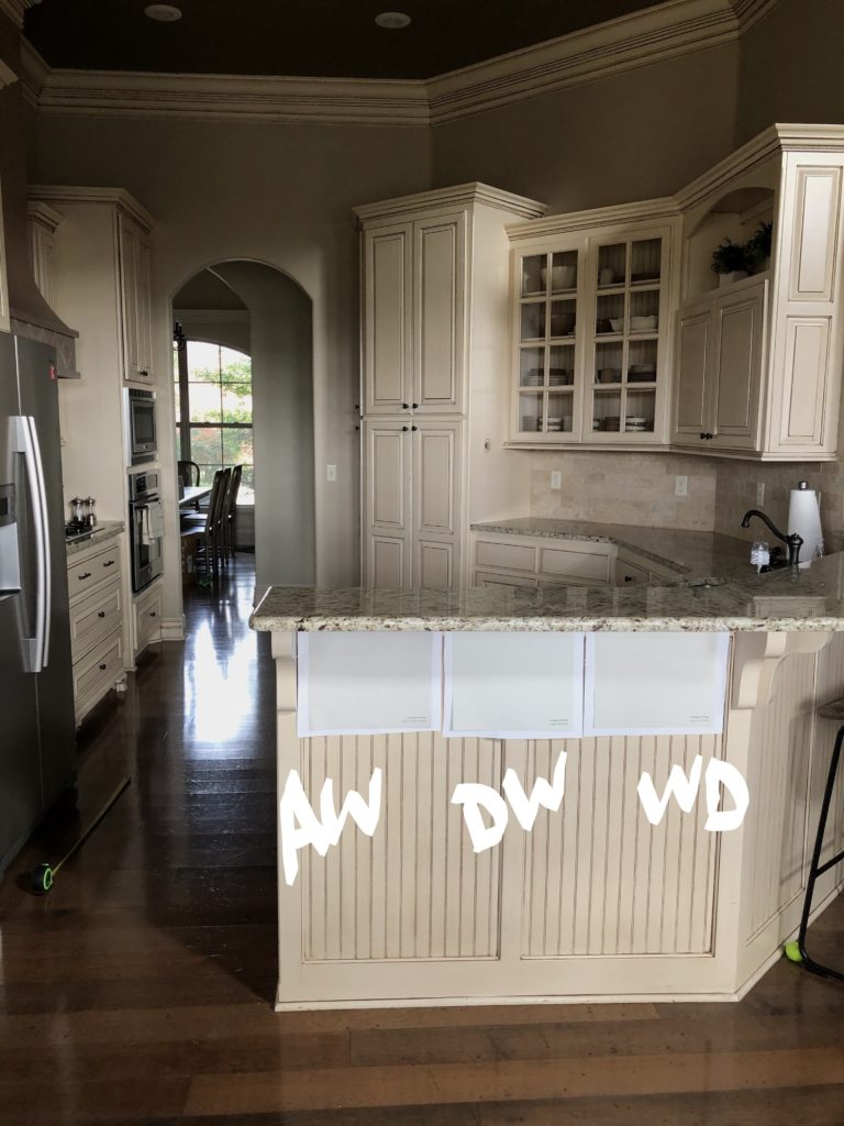
In the following example, my clients have Sherwin Williams Antique White cabinets with a glaze on them (making things next-level tricky). The glaze makes it tough to work with as it tweaks the original color and intensity.
How to Update Your 2000s Home: 5-PART SERIES!
Their original goal was to find a warm white, but it wouldn’t work with these cabinets (we explored warm white in a previous image with Cloud White). By eliminating other potential options (i.e., beige), we landed on Antique White, 25% lighter, which is as CLOSE to white as we’ll get! Even though the match isn’t 100% and varies from one side of the wall to the other, they got the brighter look they were going for!
Sometimes, when the ideal world doesn’t exist (the ‘ideal world’ usually being white cabinets that are easy to update and coordinate with’, it’s about finding the NEXT BEST THING.
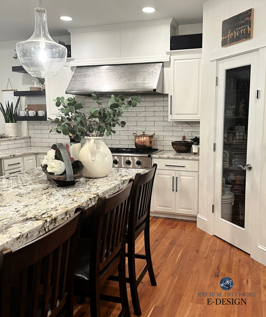
This next kitchen has VERY creamy-yellow cabinets; the best solution is cream walls. This being said, while cream cabinets are often the best choice for granite countertops from the early 2000s, if starting from scratch, we’d choose a cream with less yellow in it…
4. STICK WITH WARM, MUTED NEUTRALS
Neutrals in a light-medium to medium depth are often your best shot at reducing the look of your cream cabinets. But remember, cream cabinets ARE cream cabinets, and short of painting them a more flexible white, they are what they are!
This last point isn’t one my Online Color Consulting clients usually want to hear, but it works.
CAN I PAINT MY WALLS GRAY OR GREIGE IF I HAVE CREAM TRIM OR CABINETS?
YES! But let’s be honest; it’s never that straightforward…
Warm colors rarely love being partnered with colors that are COOLER than them AND the same depth or lighter.
I want you to inscribe that on the annals of your soul (I’ve been made aware there are two ‘n’s in annal, duly noted). And while things change as warm colors get DARKER, tread carefully if you’re anywhere in the white to medium range.
The #1 Secret to Coordinating Warm & Cool Paint Colors
While the wall color matches the backsplash in this next kitchen, the cream cabinets clash…
Warm colors best tolerate colors that are cooler than them if they’re DARKER than them.
And I’m talking about a good 20+ LRV points or more (it can vary depending on how yellow your cream is). By the way, I don’t mean just COOL colors; I’m talking about colors that are simply ‘not as warm as‘ the color they’re being partnered with. If you look at warmer options for your walls, you can sometimes bump down to 15 LRV points difference.

Once you memorize that magical tip, your paint-pickin’ life will be SO…MUCH…EASIER (you’ll learn about LRV shortly).
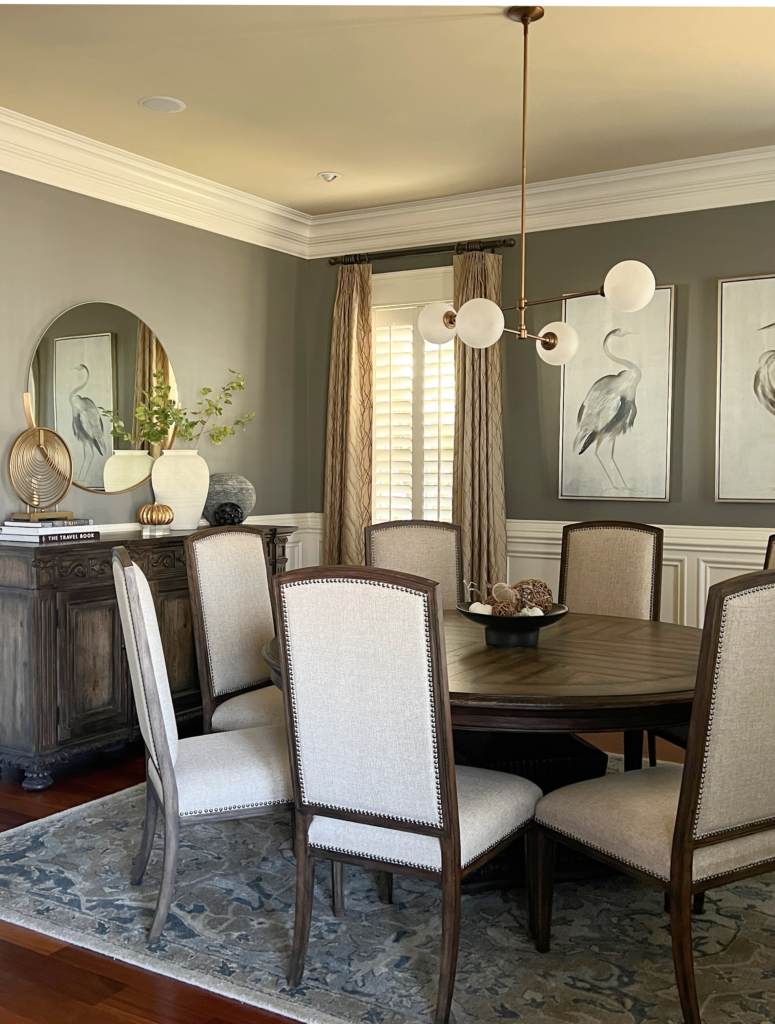
This dining room has Sherwin Williams Creamy on the trim. Because Creamy is ALMOST a white paint color, it looks gorgeous with Chelsea Gray walls. It also helps that Chelsea Gray is significantly darker than Creamy, so they don’t come close to competing depth-wise…
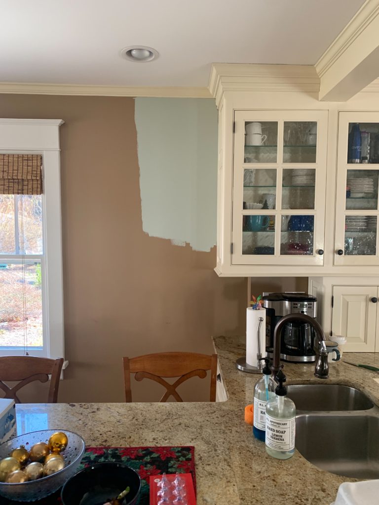
As shown in this next space, the walls are too cool and too light for the creamy off-white warmth of the trim and cabinets…
These walls are painted Sherwin Williams Agreeable Gray, and it ain’t workin’
Even if the LRV were lower, this cool-toned paint color doesn’t suit the surrounding finishes. The above is a great example of someone who wanted a particular color on their walls, regardless of whether it made sense.
Pick paint colors for the home you HAVE, not the home you WISH you had.
Next, let’s look at cream cabinets (similar to Sherwin Williams Antique White) with Sherwin Williams Worldly Gray and Popular Gray. These two colors are 15 and 11 LRV points (respectively) lower than Antique White.
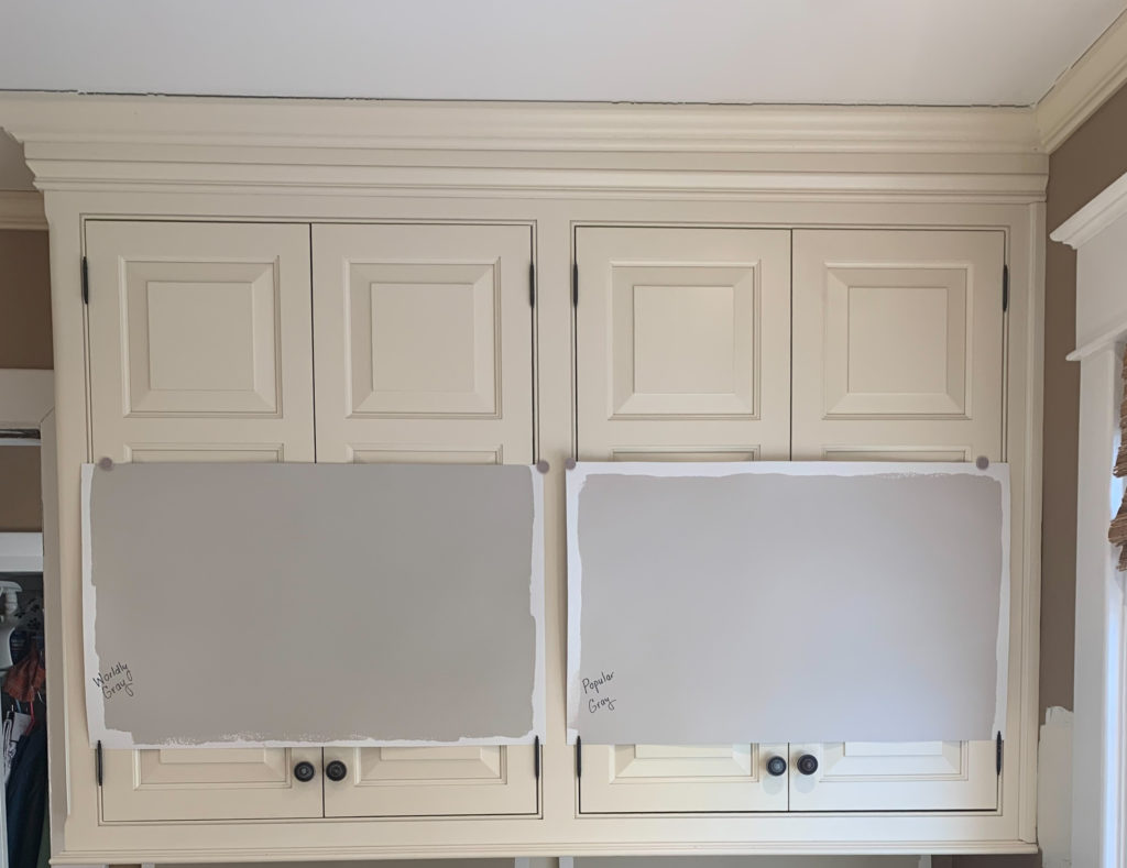
These weren’t options I loved, but my client wanted to try them, and sometimes you just don’t know until you try!
Notice how Worldly Gray (left) sits a bit better than Popular Gray (right). However, neither is any screamin’ glory. While Worldly Gray is ‘better,’ it’s still very questionable and makes the cabinets look darn warm in comparison. I’m always happy to humor clients when they want to try something like this, as sometimes they need to see why it doesn’t work.
In this next photo, my client had cream trim (color unknown). Luckily, it wasn’t super dark or yellow-cream, meaning we had more flexibility. Even then, we had to darken Edgecomb Gray by 25% to increase the LRV between the two colors and get some kind of play between them…
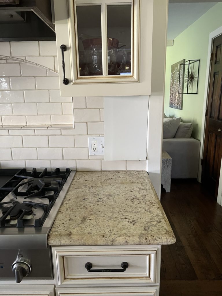
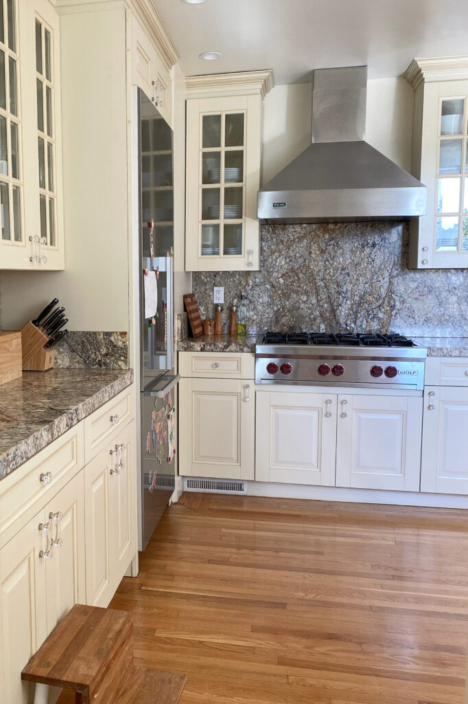
In this next kitchen, in between the cream/yellow hues of the cabinets, orange-pink undertone in the countertop, and white window trim, it’s a tricky one. However, it has some beautiful bones!
The Best Classic Cream Paint Colors for a Traditional Kitchen
HOW MANY LRV POINTS SHOULD BE BETWEEN MY CREAM CABINETS & WALLS?
To find paint colors that look good with your cream cabinets or trim, you’ll want to start with colors approximately 20 LRV points LOWER than your cream color (I said 15 earlier, but that’s a stretch). This is why it’s SO IMPORTANT to nail down which cream you’re dealing with (or as close as possible).
If you don’t know what LRV is, I HIGHLY RECOMMEND READING THIS (it’s amazeballs).
The closer the two paint colors are in depth, the more you risk them competing. You need APPROX. 20+LRV points between your cream cabinets/trim and your wall color.
WHAT WALL COLORS GO WITH CREAM OR OFF-WHITE CABINETS (OR TRIM)?
I swear, when I read online info, it’s like some advisors pull colors out of their…well, out of thin air. One site says, ‘blue, taupe, white, gray.’ Seriously, thanks – I’ll pass on pretty much all of those.
But this is a huge question, one that deserves a full blog post unto itself…
The Best Paint Colors to Go With Cream Cabinets & Trims
One more example…
I can appreciate why these next homeowners want to avoid painting their trim the same cream as the cabinets (Sherwin Williams Antique White. However, by avoiding cream, they created a creamy hot mess (no comment), which isn’t doing their home or our eyes any favors…
However, the above situation isn’t as straightforward as it seems. Sure, it’s easy to say, ‘They should just paint the cabinets the same color as the trim,’ but the thing is, the TRIM isn’t the best color for the older-style granite countertop and travertine tile backsplash.
Sometimes, the foundation of a room just isn’t solid enough to make the right move forward, or at least not in the direction a homeowner wants to go. In this case, saving your money is best until you can make larger-scale changes.
So, what do you do?
I know these might not be the answers you want, but the answers you want could have you ending up with a butt-ugly room. You came here for my honest advice, wit, and charming personality…riiiight? Sometimes, the answers you don’t want to hear are the best solutions for your home until you’re ready to make larger-scale changes OR adjust your preferences and/or expectations.
READ MORE
The Best MODERN Cream Cabinet Paint Colors
The Best Wall Paint Colors for Cream Cabinets & Trim
The Best Off-White Paint Colors
The 13 Most Popular Cream Paint Colors
The Best Warm Paint Colors that AREN’T BEIGE!
The Best Off-White & Light Depth Kitchen Cabinet Colors
Need help?
Check out my expert ONLINE PAINT COLOR CONSULTING packages!

ORIGINALLY WRITTEN IN 2023, UPDATED IN 2025


On a former home I sold a couple of years ago, the kitchen cabinets were creamy “white” (slight pinkish undertones) with a subtle glaze over the paint. I struggled with what to do with the walls as I prepared to ‘update’ the home prior to my move, and ended up re-doing [painting] my entire main area of the home (living, kitchen, dining, hallways) a color I hit on that worked beautifully. I chose Sherwin Williams Oyster Bar (NOT Oyster Bay!) which was a truly perfect and unexpected spot-on match to the cabinets making the area look seamless. I didn’t fight the creamy, but recommend going with it, but leaning towards ‘softening’ the effect. It ended up being a color that reminded me of the softness of BM’s Gray Owl, but leaning more warm-beigy, rather than Owl’s ‘gray’. I did everything in a flat/matte finish which kept the ‘softness’. I think people have to look far beyond the top 10-20 ‘popular’ colors and explore the entire fan deck when trying to ‘correct’ or update! I feel the stark, harsh white that’s been trending in the late teens & early 2020’s is going to be the bugaboo in just a year or two. Anyway, I think soft & creamy is more ‘home-y’ than the current crystalline primer-ish white that ends up looking cheap and worse than builder-grade, in my opinion.
This is timely. Thanks!
I have been working on my kitchen for 107 years. I am getting ready to order the paint. I had decided to not even mess around and just paint the cabinets the same white as all the trim in my house which is Behr Swiss Coffee (not to be confused with BM of the same name). I have hemmed and hawed about a wall color and had finally decided just to do a flat sheen of Behr Swiss Coffee for now because my kitchen faces north and I have looked at paint colors till it is just silly. I just couldn’t come up with anything that struck me as a good idea.
So, seeing you say to just use the same color on the walls as the cabinets cements my choice and just gives me one less thing to think about.
I never hopped on the grey trend and I am absolutely loving that the creams and beiges are back.
In fact, I am about to paint my north facing low light basement. I had always intended to use Knoxville Gray which is in my husband’s office and is delightful. But now I am thinking a crazy choice of Everard Coffee, simply because I doubt anyone else is using it and I think it will compliment my linen sofa beautifully.
What a great note to get Lori! Let’s hope you can spend the next 107 years enjoying your home! And Everard Coffee is DELICIOUS! I had a dark brown room in one of our last homes and LOVE it. With paint color, it’s often about finding that color that suits your home, but that ALSO makes you happy – whether it’s trendy or not!
Hi Kylie! I cannot find my previous post, so I am using this blog. I need some help with trim color. We painted our kitchen cabinets Aesthetic White with your help and Love them!!! In our bright light they show up quite light (they look white, but soft). For the trim, we sampled SW Pure White, but it is a bit too white in contrast against the cabinets. We sampled BM White Dove and it is a bit too creamy. Is there something in between that would work? Or, bite the bullet and have the trim whiter than the cabinets? By the way, we also sampled Aesthetic White trim, but it shows up more beige than the cabinet color and does not compliment the Agreeable Gray walls (we are not changing walls at this time). We have rich brown/black/gray/cream granite counters, and tumbled stone backsplash with gray/taupe/grout, and Urbane Bronze Island. Thank you so much!
Ooooo, with the Agreeable Gray walls/Aesthetic White cabinets, it’s about finding something they both AGREE on. While you might not love Pure White, they both can handle it. I suppose you could tryyyyy Aesthetic White 50% lighter and see what that looks like – could be a happy medium?
I have watched so many of your video color reviews and read so many of your articles. You are incredible at what you do! I’m hoping you may be able to help me with a dilemma. We are building our final retirement home with my husband and I having differences of opinions. Haha. He loves the revere pewter on the walls which I actually do too. What trim do you suggest for this color. Now to the dilemma. He wants wood cabinets while I wanted to paint them. Can you tell me which wood cabinets and stain you would use with the revere pewter walls or do you usually just deal with the paint stuff? Or could you even just tell me if you would go light, medium, or dark cabinets with revere pewter and whatever trim you suggest. Thank you so so so much!
Hi Erin! Well, Revere Pewter looks gorgeous with White Dove and Sherwin Williams PUre White. HOWEVER, it’s your countertop and backsplash that will really determine which is BEST. As for wood cabinets, I’m a big fan of ‘middle of the road’ stains – not too light, too dark, and not too COLORFUL. If you can find the blog post of our kitchen cabinets in Revere Pewter, our wood floor is my happy medium :).
What do you mean when you say 25% lighter? Will the person tinting the paint at BM or SW know what this mean?
You betcha – they SHOULD!
You are my only hope. I am begging, please …. Somehow, wave your magic wand and fix my HUGE dilemma. We purchased my husbands dream home. Craftsman style, interior stone, very large exposed cedar beams and wood floors. Think Tahoe mountain style house. Open concept, entry, dining, kitchen, living room and breakfast area, are all one space. The kitchen came with cream glazed cabinets cream island base ( a hideous back splash but that is a different headache altogether) . I believe the granite counters are Taj Mahal. The house came with wise owl / snip of tanin paint . And I hate it! Hate it! I feel like I live in a dark cave. I’m glad I found this blog, because my intention was to repaint the entire interior walls and trim , some shade of white,( Swiss coffee) to lighten the space up. Or possibly paint a very pale light gray color, repose gray or lighter.
But NO I do not like yellow cabinets. There is no way we can repaint the cabinets for now.
And I’m stuck !!!! I can’t tolerate brown or beige walks. I can’t go darker, my mental health will suffer. I do not see a way out of my nightmare. Does it sound over dramatic in regards to paint selection? Maybe, but I can not risk “ ruining hubby’s dream house” and the options that have been suggested are just as bad as what I already have.
Please help.
It’s not dramatic at ALL, Erin, I totally get it. Our homes are our happy places (or they should at least be one of them). I stress out massively about my own home, I get it. Your ONYL best bet is to try to find a paint color that matches your cream/glazed cabinets as CLOSE as possible – it’s hard with glazing, but you should be able to fiond something. If you go along the lines of Swiss Coffee, your cabinets are going to look more yellow/dingy/dirty. If you go light gray/Repose/Agreeable, you’ll have one heck of a hot paint color mess. Painting your walls the same as the cabinets might have to be the happy medium until you can paint the cabinets!
Hey Kylie- Big fan & need help! I’m repainting my kitchen & dining room & have cream colored cabinets (comparable to SW creamy paint color) & brown busy marble countertops. I was thinking of painting the kitchen SW creamy to match the cabinets & use SW pure white for trim/baseboards & then white subway tile backsplash but worried that combo will make cabinets look more yellow. Suggestions on paint color, trim and tile welcome! Really stuck on the trim color and tile color & love the subway tile look.
Please help. Inhave spent over $100 in paint samples and I can’t find the right paint. I have watched all your videos. I have the cream cabinets that look more on yellow side with the gloss please tell me what off white color you recommend and what other tan/beige color does not make the yellow pop. Thank you
Hi Mariah! I’m sorry, I just can’t say without seeing your home. I do know that there won’t be an off-white, so you can stop sampling them. You might also find some colors to sample here https://www.kylieminteriors.ca/the-16-best-wall-colours-for-cream-cabinets-trim/
Remember, when you have a tricky finish like cream caibnet, sometimes what you want vs what suits your finishes can be different!
If I have cream cabinets and antique white trim, can you update the trim to antique white 25% lighter to give more range of paint color for the walls?
Well, if the cabinets are the same color as the trim, you’ll still be in the same spot. If they’re LIGHTER than the trim, that could help a bit!
I have BM Linen White on my trim and windows. I cant change it. Was gonna paint kitchen cabinets Westinghouse White and kitchen walls same color. But keep linen white trim. Its this gonna be a big mistake??
Hey Melissa! Assuming you mean ‘Westhighland White’, I sure wouldn’t! A color like Linen White is tricky and it’s best to repeat it rather than compete with it :).
Thank you for updating this blog post! My kitchen cabinets are kilim beige. I recently tried loggia for a wall color. It does not look good. I think it would look good if I went with a darker color on the same paint strip but that would be too dark for me. What do you think about natural linen for walls with the kilim beige cabinets? Are kilim beige walls my only option?
Ooof, that’s a tough one as Kilim Beige is pretty solid of a beige. Maybe try taking it to the paint store and have them lighten it by 50% – see how that looks. Also, look at SW Moderate White and see how it feels :).
I remember seeing the original post when I too was desperately looking for advice, but now it’s 2025 I see no new content at all here, while really the mood is getting “warmer” year after year! I have seen photos of yellow creamy cabinets with white walls, and gray backsplashes, which really did contrast, but somehow still looked fresh and updated. I wish you would show something like that, in 2025 as an update to your original post, which basically says “you’re f’d” if you have cream cabinets.
Hey L.G.! When I update blog posts, I always add new images and content – but maybe no content striking enough to make a big difference for you and your home. REmember, I write for FREE, so hopefully, you don’t have to buy a design book or a hire a designer!
The thing is, I don’t ‘borrow’ images from other Creators – I only use photos from my clients, readers, and friends. While some others have opted for creamy cabinets with success, I haven’t had any clients do it, in fact, most are still avoiding cream cabinets because of their limitations.
And I appreciate feeling frustrated (via the ‘f’d comment), but please don’t blame me, I’m just trying to offer the best solutions I can find without clashing with your home and its finishes. I do the best I can, but the challenges that come with cream cabinets and trims with aren’t my fault – I’m just here to help!
Hoping you might feel it benefits the conversation and weigh in on *CEILING* color with this creamy combo;
I have (and admit chose, and admit still very much like the warmth of) antique white cabinets. They’re SW Antique White believed to be the hextoral equivalent to BM Barely Beige (among it’s several other names).
I’m all in on Barely Beige for my walls (on the basis my preferred wall paint finish is matte, which SW doesn’t offer, but BM does, and I always go with the paint company’s closest match for formula predictability.)
Here’s where I’d like to be creative, and inject some unexpected color; haint blue ceilings with this.
Thoughts? I know I must go with something greener and duller on the chip to not highlight the yellow undertone, but I’ve seen it here in the south and love it.
You think I’d regret and go back to white? Any magic color suggestions for haint blue ceiling abd BM Barely Beige?
Much appreciate your insight.