
The 15 Best Earth-Toned ‘Neutral’ Paint Colors (Medium-Depth)
Organic, nature-inspired shades for any surface in your home
Whether you’re painting your room, cabinets, trims, or exterior, if you’re watching trends for what’s in style, you might be looking for a color with more meat on its bones. ASK AND YE SHALL RECEIVE!
While some prefer the timeless look of white kitchen cabinets or off-white walls, not every home suits a light, bright look. Also, not every homeowner WANTS that look for their home (myself included). Hence, today’s blog post is about my favorite moderately dark, warm neutrals.
This post may contain affiliate links. If you make a purchase through links on our site, we may earn a commission.Medium-depth colors inspired by nature – in particular, rocks, clay, and organic matter (no manure though…that’s this blog post).
Of course, the colors of stone and clay can change depending on where you live, but the idea is that these neutrals have a smoky, grayed-out, earth-toned look. Sure, there are some undertones here and there, but they have an almost rustic, stony vibe (which is different from a stoned vibe, which makes choosing paint colors much easier).
But first, because this isn’t a “tell you what to do” design blog but a “teach you how to do it” one, let’s debrief the colors we’ll be discussing.
COLORS THAT QUALIFY AS EARTH-TONED NEUTRALS
When it comes to the wild world of earth-tones, there’s a buttload. For the sake of this blog post (with a focus on neutrals), this includes…
- Taupe & greige – taupes have a purple-pink undertone; greiges cater to green
- Beige and tan – beiges have an orange undertone; tans cater to yellow (with some blends)
- Warm, stony grays
WHAT LRV WILL THESE COLORS HAVE?
The depth of a color is determined by its LRV number. Every paint color has an LRV number on a scale of 0 to 100, from black to white.
The colors we’ll be looking at range from 25 to 45 (give or take a few).
The Ultimate Guide to LRV & Paint Colors

If you want a cooler, more colorful earth-tone, I have a blog post for that (linked at the end of this one).

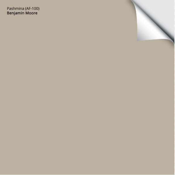
1. BENJAMIN MOORE PASHMINA AF-100
Pashmina is the OG of the mushroom world (without the token hallucinations). With an LRV of 44.2, this gorgeous warm neutral is in the light-medium range, winking closely at the medium depths. As far as cabinet depths go, it’s a great happy medium for those who don’t want anything too light or too heavy-looking.
Pashmina is hands down, my favorite earth-toned neutral paint color…but it’s not all about me.
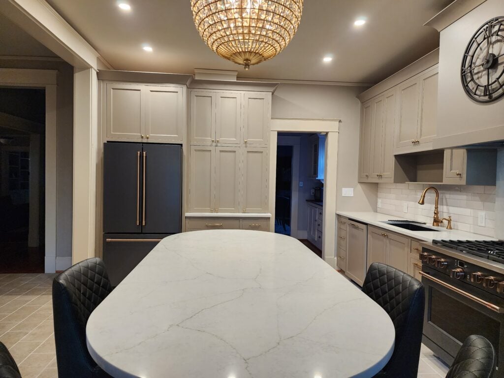
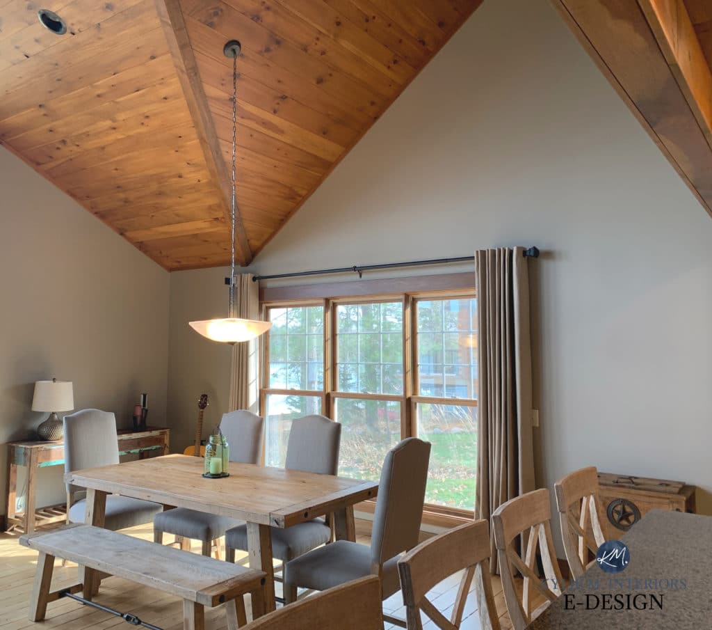
In the kitchen below, Pashmina is on the cabinets (with Sherwin Williams Urbane Bronze on the island). Look at how Pashmina looks in the natural light versus the areas that don’t receive direct light…
Not only is Pashmina referred to as a mushroom paint color, but it’s also a greige thanks to its vague green undertone. As for the balance between gray and beige, Pashmina leans warmer as it caters to beige.
FULL Paint Color Review of Benjamin Moore Pashmina
Here’s your Peel & Stick sample of Pashmina…
2. SHERWIN WILLIAMS INTELLECTUAL GRAY 7045
Intellectual Gray is a gorgeous greige paint color (it’s a bit too warm to be gray). Being a greige, it has a green undertone; however, it’s SO SUBTLE that you might not even see it.
With an LRV of 36, Intellectual Gray is in the medium range, but not at the heavy end.

Intellectual Gray painted interior doors with Sherwin Williams Natural Linen walls
Intellectual Gray is popular for single rooms, but not for entire homes (its green undertone can be limiting). It’s also a gorgeous option for cabinets or exterior siding/stucco.
3. SHERWIN WILLIAMS TONY TAUPE 7038
It was a toss-up between Balanced Beige and Tony Taupe, but Tony’s ability to go a bit deeper won me over (wink, wink). With its LRV of 37, Tony dabbles in the medium depths.
My Paint Color Review of Tony Taupe
Tony Taupe is pretty muted as far as darker shades of beige go – it doesn’t have the typical ‘golden’ look of traditional shades.
That said, it’s not gray enough to be a taupe or greige. This is what makes Tony Taupe a popular choice for those who want warm walls, but nothing too ‘early 2000s/Tuscan-inspired’.

4. SHERWIN WILLIAMS FELTED WOOL SW 9171
If you’re a fan of green undertones, you’ll love Felted Wool. If you don’t love green hues? THREE SLAPS WITH A WET NOODLE!
Seriously, though, while green undertones aren’t everyone’s jam, as far as earth-tones go, they’re pretty popular.
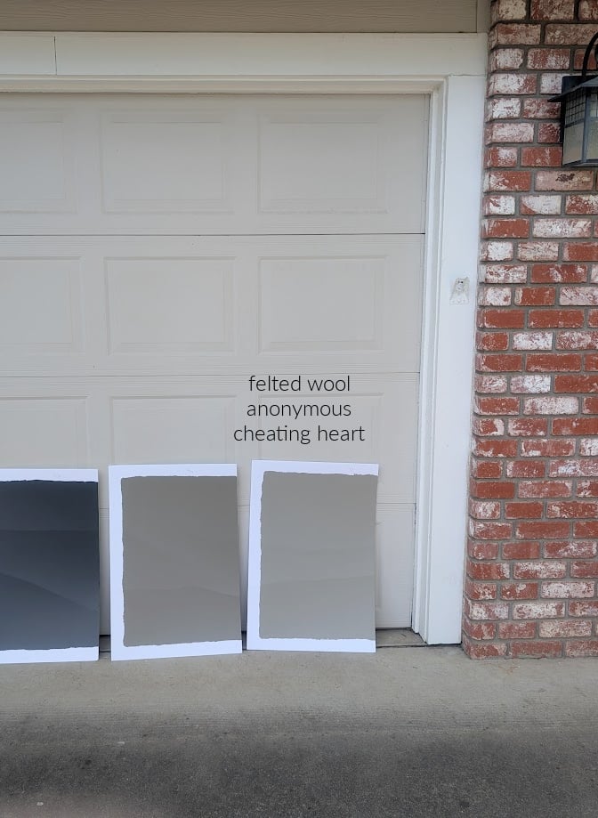
LEFT: BM Cheating Heart | MIDDLE: SW Anonymous (which is also amazeballs, btw)
Felted Wool is a greige with an LRV of 28, putting it in the medium depths (quite comfortably). While the green is noticeable, it’s nicely buried in a solid greige base.
In this next photo, the green in Felted Wool is a bit easier to see on the lower cabinets versus the uppers…
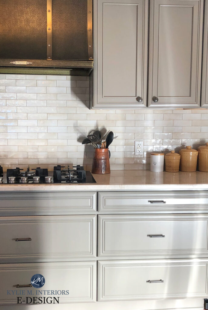
Back to undertones, Felted Wool’s green undercurrent is noticeable but not remotely overwhelming, making it a great choice for exteriors, cabinets, and walls. Felted Wool is more gray than beige in the battle between the two.

Remember, it’s not just about you; it’s about listening to your home and its finishes!
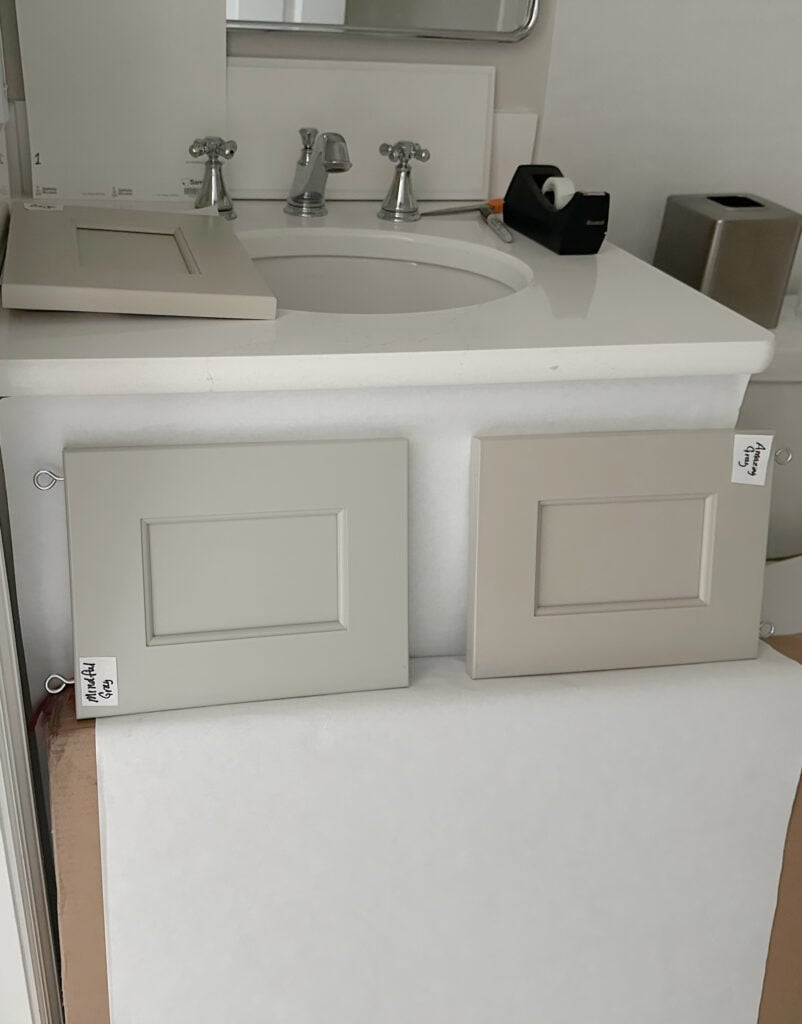
5. SHERWIN WILLIAMS MINDFUL GRAY 7016
Mindful Gray is one of the lighter, grayer, earth-toned neutrals on this page. However, it’s just TOO good not to mention.
Sherwin Williams Mindful Gray vs Amazing Gray
With an LRV of 48, Mindful Gray sits more in the light-medium range. As for color, it’s a warm gray that picks up a greige hue thanks to a soft green undertone that ‘usually’ shows up (but not always.
This next comparison is a great way to see Mindful Gray’s soft warmth…

LEFT TO RIGHT: SW Network Gray | SW Gray Clouds | SW Mindful Gray
Sherwin Williams Mindful Gray Color Review
If Mindful Gray is lighter than you had in mind, take a gander at Sherwin Williams Dorian Gray, or the darker look of Dovetail…

6. SHERWIN WILLIAMS MEGA GREIGE 7031
Mega Greige is an interesting color as it doesn’t cater hard to greige or taupe, giving you great flexibility. Now, if you’re finishes crave a wink of green or purple undertone, you may need to adjust to a new color; however, if you’re looking for a great happy medium, this could be it.
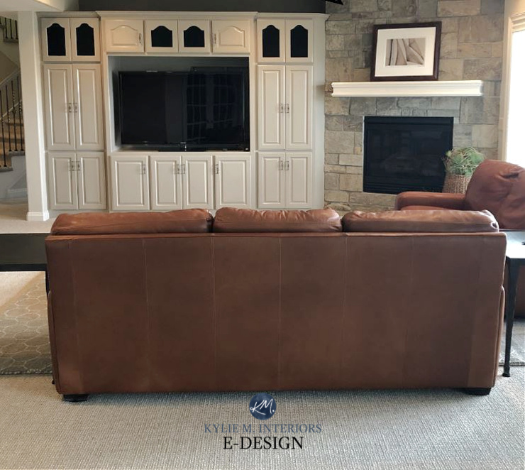
Mega Greige has an LRV of 37, making it a soft, medium-depth, earth-toned neutral. In this family room shown below, Mega Greige is the perfect neutral to complement the stone fireplace…
Color Review of Sherwin Williams Mega Greige
If you love Mega Greige as much as I do and want to check out similar shades, look at Benjamin Moore Plymouth Rock, which is a bit lighter. I also love Sherwin Williams Keystone Gray, a bit darker than Mega Greige and awesome for cabinets and islands.

How to Update Your 2000s Home – 4-PART SERIES
7. SHERWIN WILLIAMS UNIVERSAL KHAKI
While it’s taken a hot minute to grow on me, I’m slowly learning to love Universal Khaki.
Universal Khaki is a dark tan paint color, dipped in greige. With an LRV of 40, it’s on the lighter end of the medium-range.
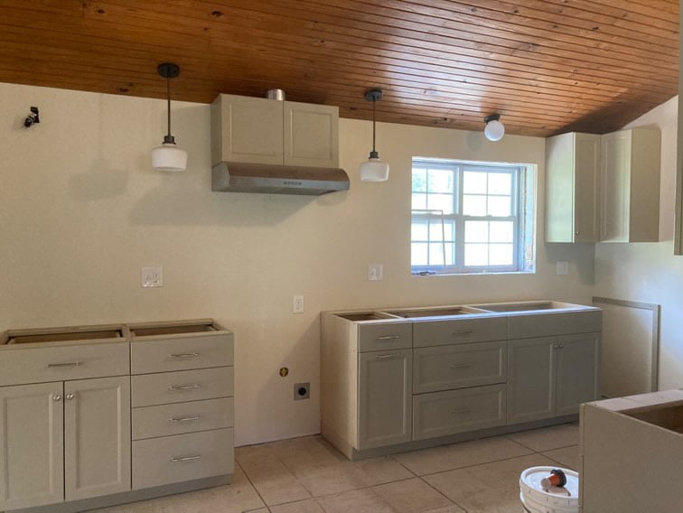
While I sure as heck wouldn’t paint my entire interior this color, Universal Khaki is great for a single room, as a complement to lighter adjoining rooms. It’s also gorgeous for kitchen cabinets, as shown above and below…

While it looks more greige in the above photos, expect its tan foundation to pop up in most rooms.
Sherwin Williams Universal Khaki Color Review
8. BENJAMIN MOORE ROCKPORT GRAY HC-105
Rockport Gray is one of Benjamin Moore’s best greige paint colors. While it’s not OVERTLY greige, as its green undertone is subtle, it’s there.

With its LRV of 36.61, Rockport Gray has its beautiful butt planted firmly in the medium depths, making it a popular choice for exteriors, in particular.
As shown in this next room, a greige like Rockport Gray can be a pretty, earth-toned, organic complement to wood finishes…

Benjamin Moore Rockport Gray Color Review
9. SHERWIN WILLIAMS PAVESTONE SW 7642
Pavestone is a gorgeous shade of greige. However, whereas some of the colors on this page cater more to beige, Pavestone leans more toward gray with a glorious green undertone (subtle).
WAHOOOOOO, this next image actually shows several of the previously mentioned colors…

LEFT TO RIGHT: SW Pavestone | SW Intellectual Gray | BM Pashmina | The dark sample is SW Urbane Bronze | The white is SW Pure White
Here’s another look at Pavestone in a dining room with a special guest…

Paint Color Review of Sherwin Williams Pavestone
Pavestone has an LRV of 32, putting it smack dab in the middle of the medium-depths. If you like Pavestone and want a nice comparable, check out Sherwin Williams Acier.

10. SHERWIN WILLIAMS TAUPE TONE 7633
If you haven’t noticed, Sherwin Williams kicks Benjamin Moore’s arse in the whole ‘stone-clay-inspired paint color’ department. As for Taupe Tone, it’s similar to the previously mentioned Tony Taupe, but you’ll find more of a taupe (grayish) base in this color.

Sherwin Williams Taupe Tone in the foyer, Natural Tan trim, den similar to Sherwin Williams Anonymous
This means that Taupe Tone is an actual taupe tone, although a) it definitely caters to beige over gray, and b) it has subtle undertones compared to some of the more traditional shades of taupe.

As for depth, Taupe Tone has an LRV of 36, so it’s a wee wink darker than Tony Taupe.
Here’s your Peel & Stick sample of Taupe Tone…

Do you want more COLOR? Check out The Best Cool Earth-Toned Paint COLORS
Remember, comparing similar paint colors is an important part of finding your perfect shade!
11. SHERWIN WILLIAMS PERFECT GREIGE SW 6073
Perfect Greige is a popular taupe paint color for interior walls and exteriors—even kitchen cabinets and islands! But while you might see greige in its name, Perfect Greige is anything but.

Never judge a wine by its label or a color by its name.
Perfect Greige is definitely a taupe paint color. This isn’t to say its undertones are overwhelming, but they sure as heck don’t grab green!
Perfect Greige has an LRV of 42, making it one of the lighter shades on this page. Compare it to Taupe Tone, and you’ll see the difference between a subtle taupe (Taupe Tone) and a REAL taupe (this one).

Paint Color Review of Sherwin Williams Perfect Greige
12. BENJAMIN MOORE KINGSPORT GRAY
If you’re looking for a color with a rich warmth without too much brown or beige, Kingsport Gray could hit your happy place. And if you haven’t had your happy place hit in a while, it could be just what you need.
With an LRV of 25.05, Kingsport Gray is one of the darker shades on this page, and between gray and beige-brown, it caters to the warmer end of things – brown.
Paint Color Review of Benjamin Moore Kingsport Gray
Kingsport Gray is one of the more classic choices, especially for cabinets, as it doesn’t cater hard to purple or green and has a super grounded, earth-toned look.

13. BENJAMIN MOORE ASHLEY GRAY HC-87
If Kingsport Gray goes too far with its depth, Ashley Gray might be the perfect step back. Ashley Gray (also known as Waynesboro Taupe) is a gorgeous shade of taupe. It picks up the look of Sherwin Williams Keystone Gray but is a bit lighter, thanks to its LRV of 33.45.


14. SHERWIN WILLIAMS FAWN BRINDLE SW 7640
Fawn Brindle is one of my favorite moderate shades of greige, as it’s subtle in undertone and depth. Being a greige, Fawn Brindle has a green undertone that’s definitely there but not overwhelming. It also stops this color from flashing purple in most situations.

Fawn Brindle is a medium-depth paint color, which we know thanks to its LRV of 35. While it shows up in rooms and on cabinets, it’s super popular on exteriors as it can mimic the look of some concrete finishes.
Paint Color Review of Sherwin Williams Fawn Brindle
15. SHERWIN WILLIAMS STICKS & STONES SW 7503
Sticks and Stones is a great option if you want a taupe with a bit more commitment to an undertone without flashing overly purple or pink. It has a similar approach to Keystone Gray but is slightly lighter and more taupe-looking. You’ll see how Keystone Gray comes across as reasonably balanced with its undertones compared to Sticks and Stones taupe.
Sticks and Stones has a nice, grounded, grayed-out brown look. While it’s a touch warmer than some other taupes, there’s still some gray tucked in there. With its LRV of 31, it’s a medium-depth paint color.
Here’s your Peel & Stick sample of Sticks and Stones…

READ MORE
The Best Cool Earth-Toned Paint COLORS (Benjamin Moore version)
Benjamin Moore’s 8 Best Dark Greige & Taupe Paint Colors
Sherwin Williams Universal Khaki: Paint Color Review
NEED HELP?
Check out my Online Paint Color Consulting!


Thank you Kylie for sharing so much knowledge about colors. Makes me want to try them at my house! My entire interior is painted in BM Simply White. I am inspired to try an accent color on one wall in living room. I am loving sage colors -sorta green gray that look a bit more green than gray:) but not too dark. Is there such a color that will look good with BM Simply White. The room has natural light mostly from west and south west windows.
Ooo, have you looked at SW Evergreen fog? It’s definitely more green than gray, but not OVERWHELMINGLY green by any stretch! I also love October Mist 🙂
Thank you!! Will check them out.
What is the cabinet paint color in the kitchen with the black fridge? Love it
I’m wondering too. She uses this picture in many posts but never discusses the details of it.
Hi! I have to be careful of how much complimentary info I give when clients have paid for a consult to get their personal colors – some people prefer that I not share – I do my best :).
Would any of these warm, moderate, neutrals on kitchen cabinetry coordinate with Accessible Beige Walls and Alabaster trim?
Oooo, I’d say your best bet would be along the lines of SW Balanced Beige (which you might darken to get a bit more contrast with the cabinets 🙂 I also love SW Felted Wool!
Hi! I am looking for a neutral putty/mushroom/beige for our living room built-ins (wall color is Greek Villa). We get afternoon sun from the West as well as North and East facing windows/doors. We also have a lot of trees so we get a lot of green reflections at certain parts of the day. Any ideas??
When you have green reflections, it can be nice to lean into that, rather than fight it. For example, I’m a big fan of Pashmina (I have it in my office which runs off my White Dove hallway). Some prefer to lean into taupe, but with Greek Villa, I cater a bit more towards greige over taupe (or violet-pink undertones).
Hi Kylie!
I purchased a sample of Edgecombe gray to paint in my bathroom with two southern exposure windows and the paint was extremely washed out. I then purchased a sample of stone and that is too dark. Do you recommend darkening the Edgecomb gray or is there something in between those two colors. Thanks for your help.
*Stone Hearth