
The Best Cool Earth-Toned Paint Colors (Benjamin Moore version)
Organic, earthy cool hues, brought to you by Mother Nature (& me)
When it comes to popular paint colors, blue, green, and purple lead the way by a long shot… as long as they’re earth tones. Sure, there’s always room for brighter, more cheerful colors, along with simple neutrals, but when it comes to actual ‘colors’, earth tones are where this bus stops (along with Starbucks and the odd garage sale).
But what makes a color an earth-tone?
Today’s most popular earth-toned paint ‘colors’ (not neutrals) have a neutral base of gray or brown, which calms them. If you add too much of a neutral base, you get an ‘earth-toned neutral with colorful undertones‘. That’s not what we’re looking at today.

So, are all of these colors COOL earth-tones?
No, but for the sake of the title, I had to include the word cool.
Why?
Because this blog post isn’t about yellow, orange, red, rust, brown, or any ‘traditionally warm paint earth-toned paint color‘. Instead, these colors sit on a base of either blue, green, or purple, which are well-known cool paint colors. Some of the greens and purples listed below are warm versions of those colors. Capiche?
MOVING ALONG!

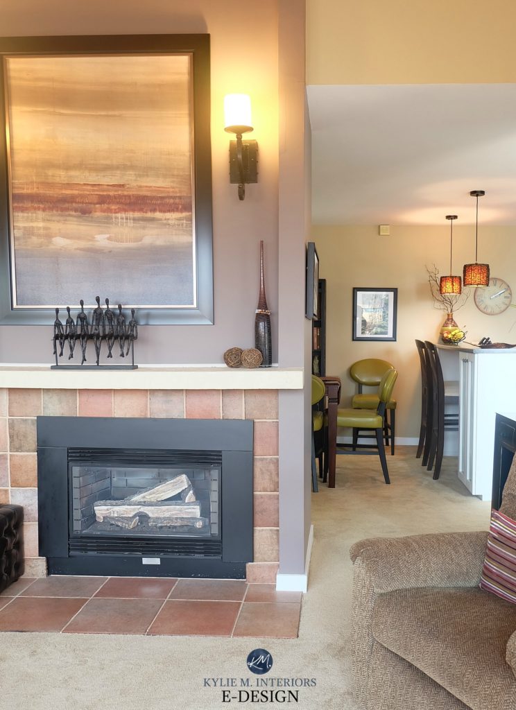
I love that my client stopped the TV screen at this exact spot…she knows me well.
Now, if I were to go balls-out on this, we’d be here all day, as there’s no shortage of badass and beautiful earth-toned paint colors. So, we need some boundaries (something I’m not usually a fan of, but I’ll try ’em on for today).
EARTH-TONES IN THIS BLOG POST
- Some are reasonably color-forward, but don’t leave the earth-toned world.
- Others have much more gray or brown, reducing the degree of visible color.
- As for depth, while there are beautiful colors in the off-white and light range, this blog post includes colors with a bit more meat on their bones.
We’re looking at colors with LRVs between 20 and 55 (give or take a few).

And to make things a bit more fun (funner?), we’re doing a ‘this vs. that‘ format. Ryan Reynolds vs. Ryan Gosling? White wine vs. gin and tonic? Tough call. It’ll be much easier to choose your favorite paint color.

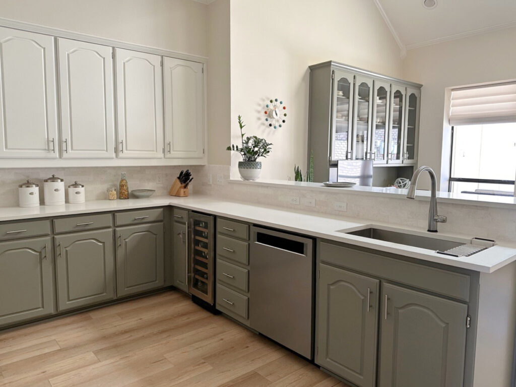
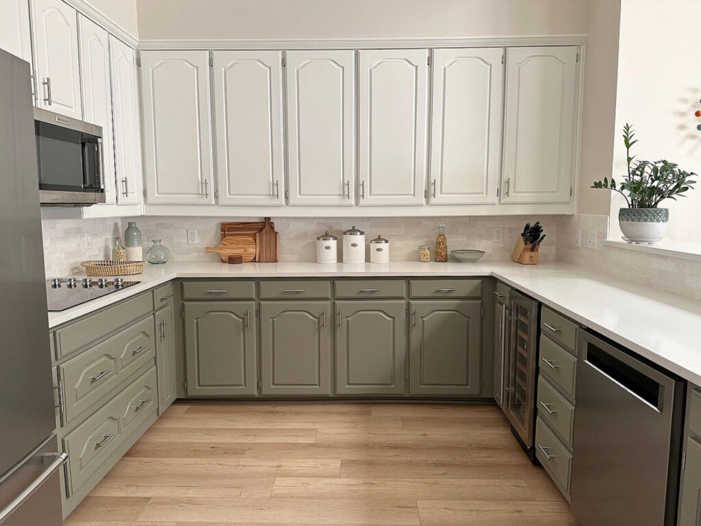
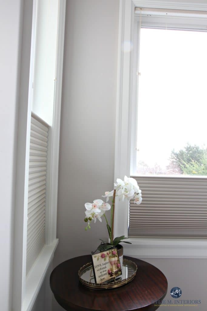
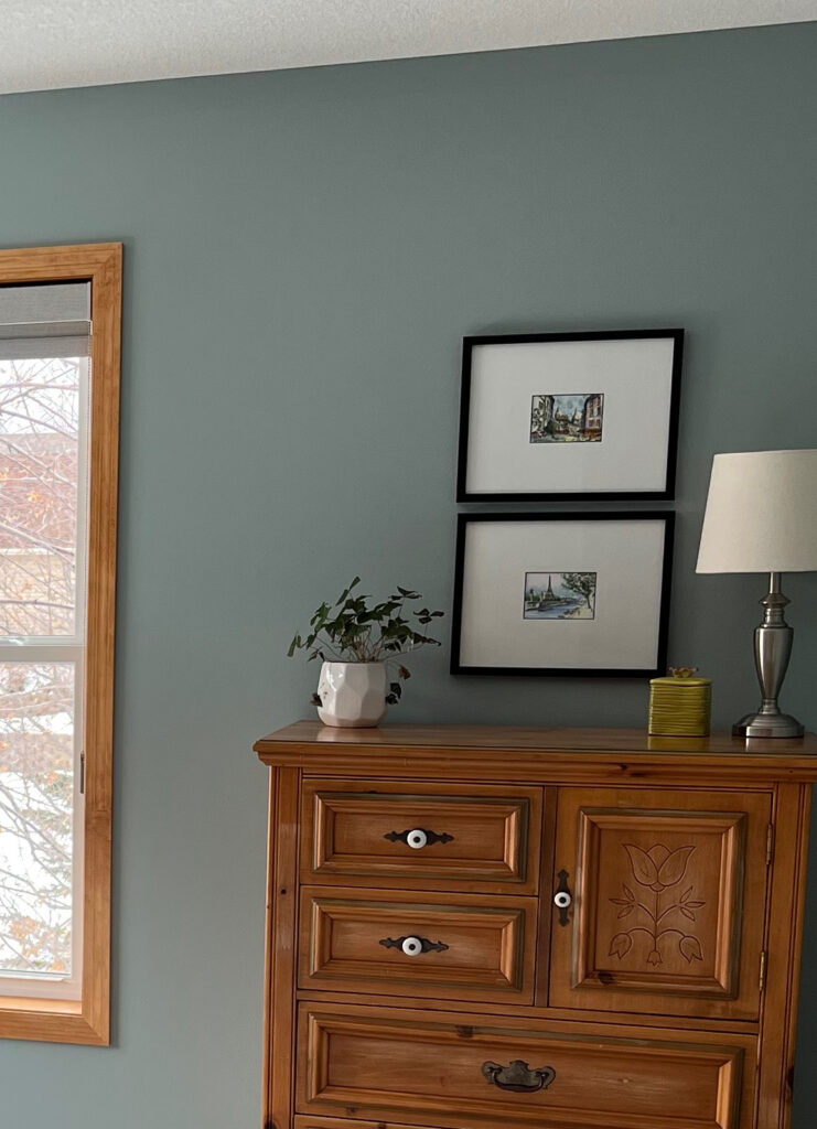
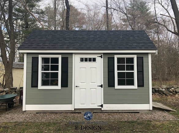
BENJAMIN MOORE OCTOBER MIST VS. FIELDSTONE
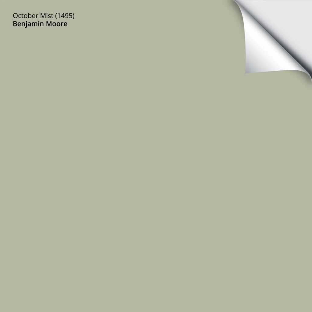
Over the last 3 to 4 years, you’ll be hard-pressed to find a color more popular than October Mist.
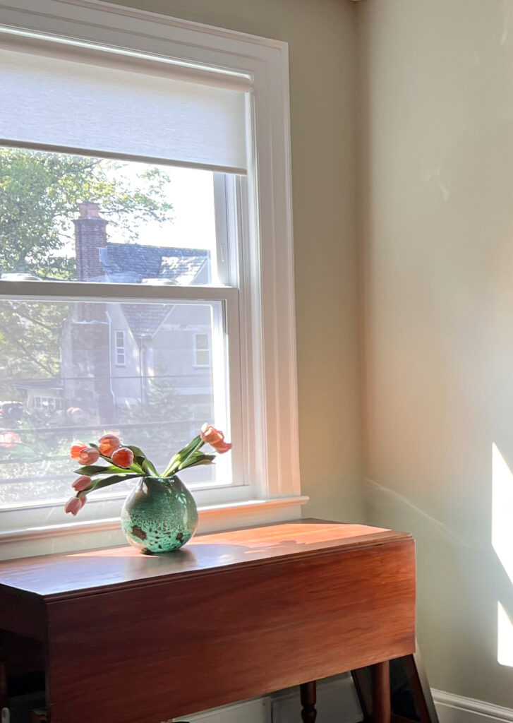
October Mist is a light-medium depth green paint color. While it has a bit of warmth, it’s not too ‘olive-inspired’ or yellowish. If anything, it can look a bit like a cool green in the right (or wrong) lighting. As for depth, it has an LRV of 46.54.
While the title of this blog post says ‘cool’ paint colors, I can only say so much in a small space. While many greens are warm, they still fit this blog post’s purpose quite well.
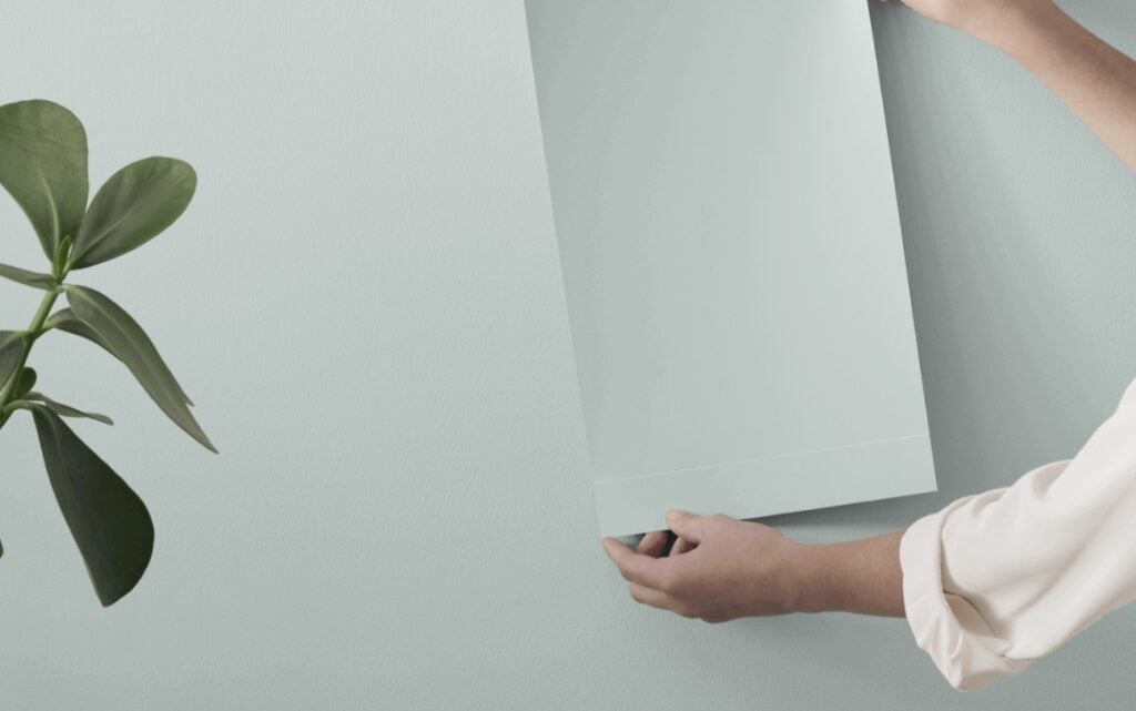
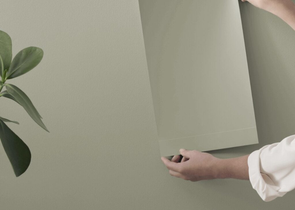
Here’s your Peel & Stick sample of October Mist…
Benjamin Moore October Mist Color Review
Then, let’s mute things a bit with the toned-down look of Fieldstone. While I don’t have an image of it in action, here’s a great shot of it in sample form…

Fieldstone has an LRV of 42.73, making it a light-medium depth and comparable enough to October Mist (although it is a bit darker). Where you’ll see a HUGE difference is in their approach to color.
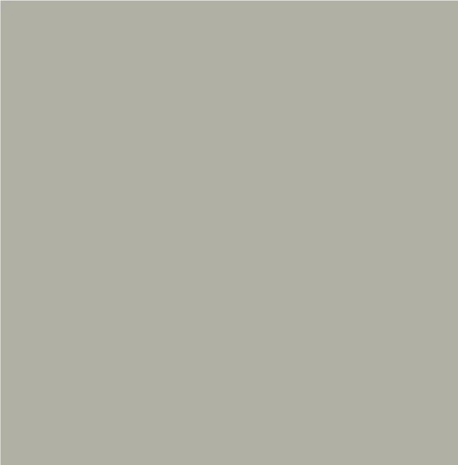
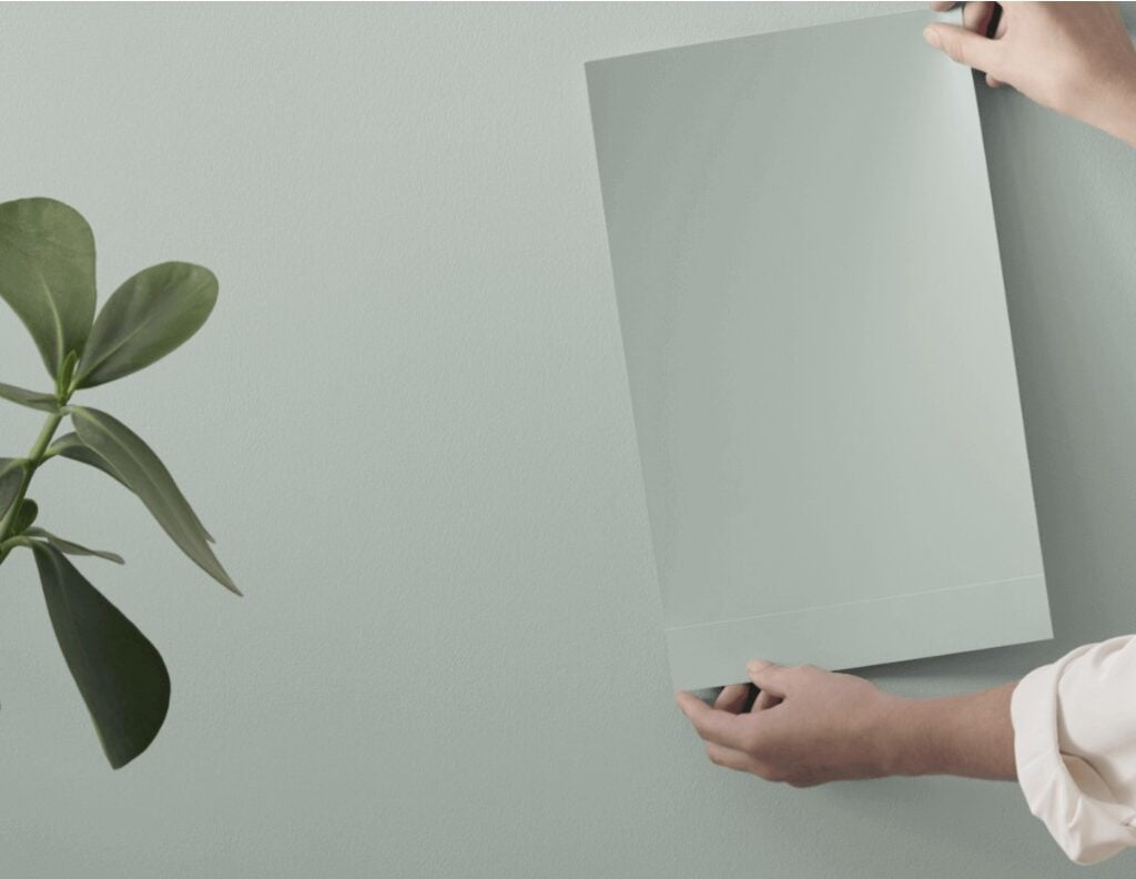
Peel & Stick of Fieldstone HERE
Whereas October Mist comes in with a pretty standard, earth-toned approach to green, Fieldstone levels the field with a BUTTLOAD more gray (look it up; it’s a thing)
If you love the look of these, check out The Best Sage Green Paint Colors.
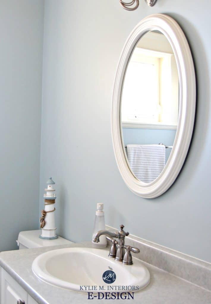
BENJAMIN MOORE WEDGEWOOD GRAY VS. BEACH GLASS
Wedgewood Gray is a beautiful, light-medium depth shade of blue. But it’s not just blue that it has going for it; there’s also a dose of green, along with a modest gray backdrop.
With an LRV of 49.59, Wedgewood Gray is a light-medium depth paint color.
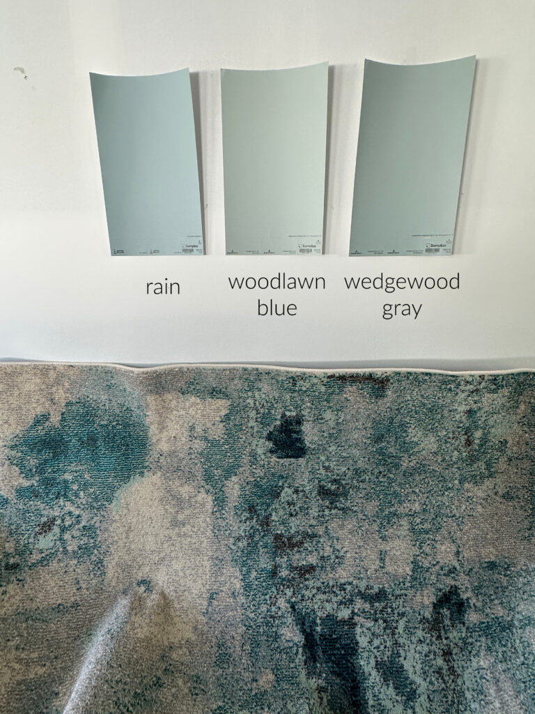
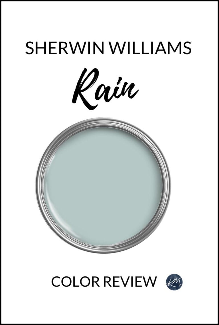
SW Rain | BM Woodlawn Blue
As for Beach Glass, this bad boy calms the tatas with a soothing, relaxing approach – I’m not sure Wedgewood Gray can even compete. With a smoky allure and blue-green blend, Beach Glass is a popular blue paint color for bedrooms and living rooms.

As for depth, Beach Glass has an LRV of 49.7, which is more or less the same as Wedgewood Gray.
So, the big difference between these two colors is that Beach Glass has a more moody, coastal vibe, while Wedgewood Grays has a more ‘beachy, slightly fun’ look.
If you love colors like these, sample and compare them with a few of these blue-green blend paint colors.

99.5% of the photos in my blog are from my Online Color Consulting clients, readers, talented photographers, & friends— because real homes deserve to be celebrated (dirty laundry & all!) While not magazine-perfect, they’re packed with timeless (and some trendy) home update ideas & the best, proven paint color choices to help you create a home you’ll love.
BENJAMIN MOORE CINNAMON SLATE VS. SMOKED OYSTER
While not everyone loves purple (myself included), once we add a neutral base, it’s easier to get on board the Barney-inspired love boat.

The Best Paint COLORS With Wood Finishes
Starting with Cinnamon Slate. This particular purple is perfection (if you ask me). With a modest neutral base, Cinnamon Slate’s warmth and commitment to color make it a hot choice for rooms that need a bit of personality, without going overboard.
Here’s a Peel & Stick sample of Cinnamon Slate…

As for depth, it has an LRV of 19.71, making Cinnamon Slate a super skookum medium-depth paint color (that winks hard at the medium-dark range).
Paint Color Review of Cinnamon Slate
But then there’s Smoked Oyster – fabulous on walls and crackers.
Smoked Oyster takes a much more muted, earth-toned shot at purple. With a substantial, warm, organic base, Smoked Oyster is more of a polite nod at purple than a full commitment.
As for depth, it has an LRV of 22.98, making it lighter than Cinnamon Slate, though not by much.
Peel & Stick of Smoked Oyster HERE
While Smoked Oyster and Cinnamon Slate are my faves, you might find more purple paint colors you love to sample and compare! If too much color scares your pants off, check out the best gray paint colors with purple undertones.
BENJAMIN MOORE WATER’S EDGE VS. CLOUDY SKY
Water’s Edge, also known as Van Courtland Blue, definitely pushes Mother Nature’s patience. This glorious shade has a less neutral, earth-toned background, making it a bit more color-forward… but hot damn, is it ever pretty.
Peel & Stick of Water’s Edge HERE
Water’s Edge has an LRV of 31.48, making it a pretty solid, medium-depth paint color. Along with ‘some gray’, Water’s Edge has a touch of green hiding in its undercarriage.
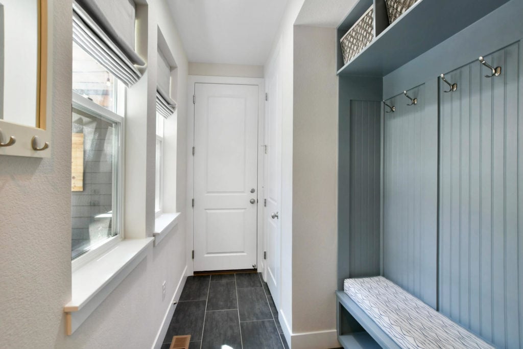
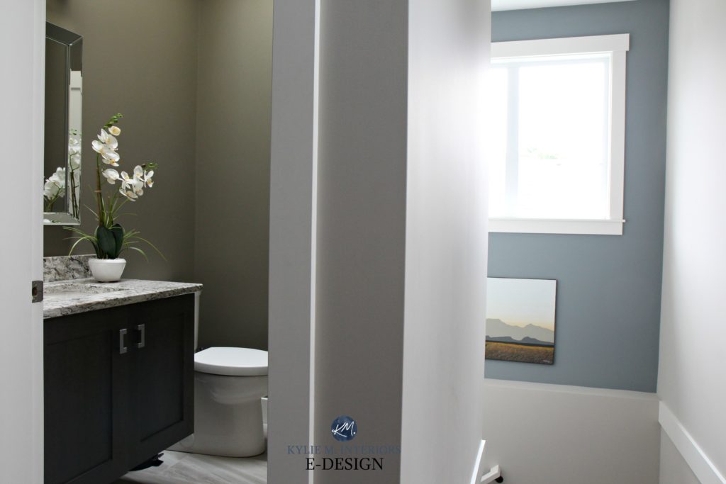
As for Cloudy Sky, it has an LRV of 33.31, so it’s a similar depth (a bit lighter), but as you can see on the woodwork in this mudroom, it’s grayer and stormier…
Thank you so much to my Online Color Consulting clients for sending in your photos – you make my job a heck of a lot easier!
If stormy, smoky blue paint colors are just what you need, awesome. If not (or for the sake of comparison), check out a few more in this blog post: The Best Blue-Gray Paint Colors.
Ooooo, Benjamin Moore Steep Cliff Gray is pretty badass, too…

Benjamin Moore Gibraltar Cliffs Paint Color Review
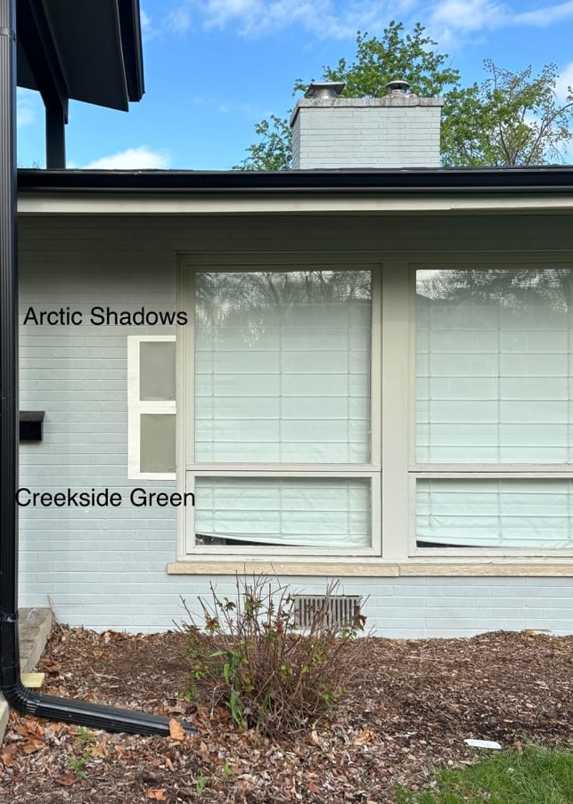
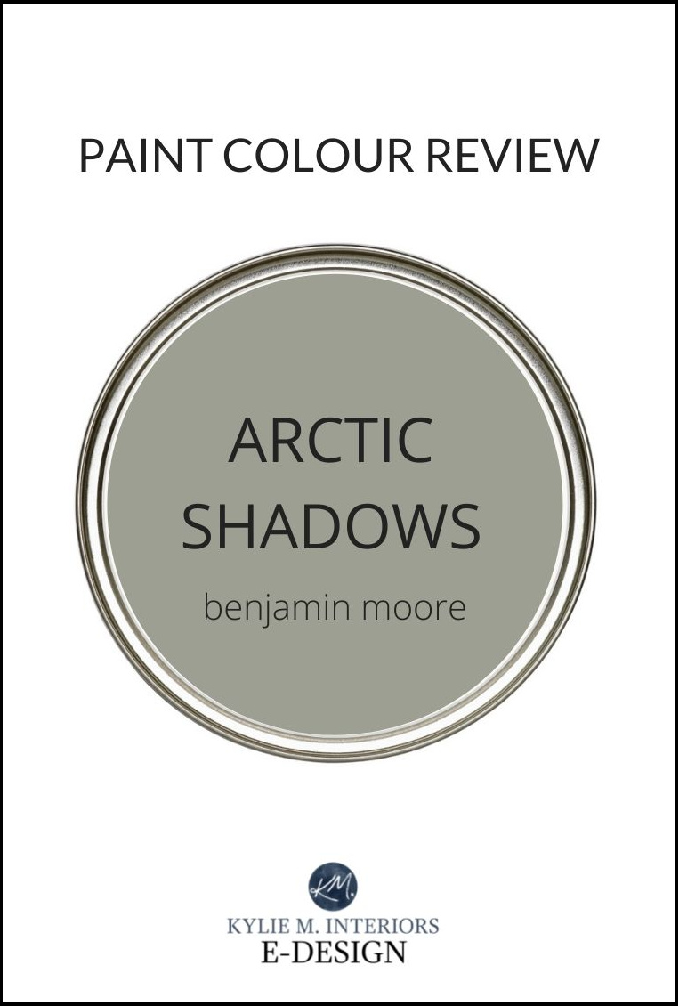
BENJAMIN MOORE CREEKSIDE GREEN VS ARCTIC SHADOWS
Creekside Green is one of my favorite green paint colors from Benjamin Moore. While it offers a commitment to green, it’s not remotely overbearing.
And it’s a friggin’ CHRISTMAS MIRACLE, as I have both colors in the same image…
5 Steps to Finding Your Perfect Exterior Color
With its LRV of 31.43, Creekside Green is a wickedly pretty, medium-depth green that’s popular for bedrooms, as well as painted kitchen islands and exteriors.
As for Arctic Shadows, as you can see above, it’s more grounded and earth-toned, with a higher degree of gray. As for depth, it’s darn comparable, with an LRV of 32.48.
Here’s your Peel & Stick of Arctic Shadows…

I also love the slightly darker take on Arctic Shadows – Antique Pewter…
Antique Pewter has an LRV of 25.4 and a bit more depth/green than its predecessor.
6 Budget-Friendly Kitchen Update Ideas
And because sampling and comparing is THE MOST IMPORTANT PART of choosing your best paint colors, check out: The Best Green-Gray Paint Colors for a few more great options.
BENJAMIN MOORE MAUVE DESERT VS. ELEPHANT GRAY
If you’re a fan of purple paint colors, but want a lighter approach, let’s spend some time with these two…
First up, Mauve Desert is a commitment to color. Does it go too far? That comes down to perception. Personally? Yes, but if we’re talking about ‘going too far‘, I’m not one to talk.
Peel & Stick of Mauve Desert HERE
Mauve Desert has an LRV of 37.77, making it a medium-depth color, but on the softer end, for sure. It’s also a warm purple paint color, but not by a ton.
Also, thank you to Samplize Peel & Stick for sharing images when I don’t have a particular color in my files!
Peel & Stick sample of Elephant Gray HERE
As for Elephant Gray, it offers a more subtle approach. You’ll still get a whack of purple on your walls, but it’s tempered by a gorgeous, warm gray base. As for depth, Elephant Gray has an LRV of 41.5.
So, if you want more color, Mauve Desert could be your best bet. However, if you lean towards the more subtle end, check out Elephant Gray.
For a softer, lighter look, check out Benjamin Moore Abalone…
BENJAMIN MOORE SMOKE VS WALES GRAY
Smoke has been kickin’ the blue world’s butt for a long time. With a stormy approach to blue, Smoke is the epitome of ‘earth-toned blue paint color’.
The Best Laminate Countertops On a Budget
However, it has another color up its sleeve – green. While it’s not remotely dominant, it easily stops this blue from leaning blue-purple.
As for depth, Smoke has an LRV of 56.39. This makes it one of the lighter colors on this page, sitting at the top of the light-medium range.
Benjamin Moore Ocean Air is another brilliantly beautiful blue hue, even if it’s not quite as earthy as some…

The Best Light Blue Paint Colors
Moving onto Wales Gray, it has a smokier, coastal approach with a lot of gray mixed into its gray base (and weeee whispers of green)…

While you aren’t here for earth-toned neutral paint colors or Sherwin Williams, here are some links to the above colors (I won’t tell): SW Analytical Gray | SW Argos | SW Sensible Hue | SW Amazing Gray | SW Magnetic Gray
Wales Gray has an LRV of 53.54, making it a light-medium color and a bit darker than Smoke.
Peel and Stick of Wales Gray HERE
Smoke is great if you really want to see blue on your walls. If you like blue but prefer a passive approach, Wales Gray could be the better choice.
If you want a few more colors to sample and compare, you’ll find ’em here: The Best Blue-Green Blend Paint Colors.
BENJAMIN MOORE GRAY MIRAGE VS. PARIS RAIN
If you’re like me and fall head over heels for almost any shade of green, you have to check out Gray Mirage.

Gray Mirage is a beautiful, shade of green, with a warm, earth-toned base. With its LRV of 53.78, Gray Mirage still has some meat on its bones compared to lighter, softer green paint colors. However, it doesn’t have the visual weight of the previously mentioned October Mist.
As for Paris Rain (also known as Mountain Air), it’s still reasonably green-forward, but offers a slightly more muted, earth-toned look at green…

The Best Paint Colors With Wood Finishes
Paris Rain has an LRV of 52.69, making it pretty darn similar in depth to Gray Mirage, just more neutral.
If you think sage is all the rage, read this page: The Best Sage Green Paint Colors for Cabinets | The Best Sage Green Paint Colors for Walls
BENJAMIN MOORE MOUNT SAINT ANNE VS. RAINDANCE
While these two are super comparable, they have one BIG difference – undertone.
Starting with Mount Saint Anne, it’s a beautiful, stormy blue paint color. It has a reasonable gray backdrop and ‘some’ green.
With its LRV of 41.9, Mount Saint Anne is on the light end of the medium range. This means it’ll contrast beautifully with your white trim (options below) without being as weighted as a darker medium shade.
Now, flip over to Raindance, and you’ll see the same colors – blue, green, and gray, but this time, there’s more green and less blue.
With its LRV of 43.47, Raindance is only a smidge lighter than Mount Saint Anne. The REAL difference is in the degree of green mixed in.
And while the EVER GORGEOUS and drool-worthy Benjamin Moore Gibraltar Cliffs almost made the list…it didn’t, but you should look at it anyway…
REVIEWS – LEFT: SW Anonymous | MIDDLE: SW Colonnade Gray | RIGHT: BM Gibraltar Cliffs
BENJAMIN MOORE RAINTREE GREEN VS. STORM CLOUD GRAY
Raintree Green is as lovely and organic as it sounds. With a good dose of green and a modest neutral backdrop, Raintree Green covers the ‘earth-toned green’ world quite well…hopefully with several coats of paint.
Peel & Stick of Raintree Green HERE
With its LRV of 32.38, it’s snugged up tight in the ample bosom of the medium depths.
Now, comparing that to Storm Cloud Gray, you’ll see a shift in commitment.
Storm Cloud Gray still has a green base, but a stormy gray foundation takes a HUGE edge off. With its LRV of 28.88, it’s in the medium-depth world.
WHAT ARE THE BEST WHITE TRIM COLORS WITH EARTH-TONES
While some colors have specific favorites, a group of white paint colors tends to suit the average earth-toned blue, green, or purple.
- Benjamin Moore Cloud White is famously gorgeous and pairs well with many of the colors listed above.
- For a brighter contrast, check out Benjamin Moore Simply White.
- Benjamin Moore Chantilly Lace offers the cleanest look without being a stark or cold white.
- Lastly, Benjamin Moore White Dove is a fan (and personal) fave.
ARE EARTH-TONES TRENDY?
Oh, you bet your cute lil’ booty they are. Right now, we’re immersed in a world of earth-toned neutrals, oranges, greens, and more. While blues and purples aren’t at the top of the list, they still show up regularly.

While trends ebb and flow, many earth-toned paint colors have a more timeless look compared to more colorful, committed paint colors.
PHEW, we did it. Obviously, there’s a ton of colors I didn’t include. But stay tuned, as I’ll be doing a similar blog post on Sherwin Williams’ top earth tones soon!
READ MORE
The Best Earth-Toned NEUTRAL Paint Colors
The Best Blues & Blue-Greens For Bedrooms
Get the best paint color advice…


Hi Kylie – these are gorgeous colors? Can you tell me what the color is in the very first photo – the one with the rocking horse! Thanks!
Ahhh, that’s the glorious Benjamin Moore Sea Star!