
The 12 Best Paint ‘COLORS’ to Update Wood (maple, oak, cherry, & more)
BLUE, GREEN, & MORE for wood cabinets, trims, & floors
Golden and honey oak, maple, mahogany, pine, alder. There are so many species of wood and stains, and all of them have their best accenting paint color partners. So, where do you start when finding a color that makes your wood come to life?
Right here.
When it comes to updating and painting a room with wood cabinets, trim, flooring, or furniture, it all comes down to your INTENTION.
- Do you want to soften the effect of your wood finish – even slightly camouflage it?
- Do you want to ‘accent’ or complement your wood and make it come to life?
- Or maybe you’re somewhere in the middle.

In my popular blog post: The 20 Best Neutral Paint Colors to Update Wood, we talked about neutral paint colors to soften the look of wood stains. That’s not what this blog post is about.
Today, we’re diving in (skinny dipping, if you must know) into the world of blues, greens, blends, and more – colors to bring your wood finish to LIFE!

However, that brings up a different topic…
WHAT COLORS UPDATE GOLDEN OAK & OTHER WOODS?
When it comes to UPDATING the look of a wood finish, this job is best done with neutral paint colors (with exceptions). Sure, YOU might think that blue-green is the best color for your honey oak cabinets or cherry red flooring, but this doesn’t mean it UPDATES the look of your home. It rarely does. Instead, it ACCENTS your wood, which can be darn pretty, but…
Pretty doesn’t always = updated
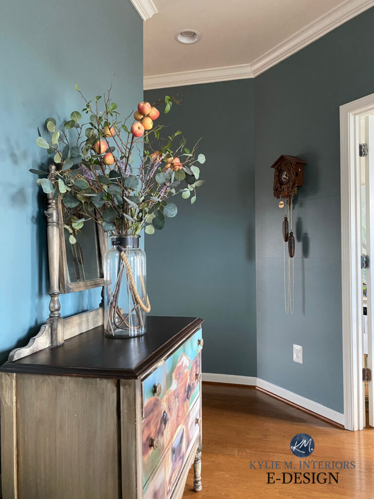
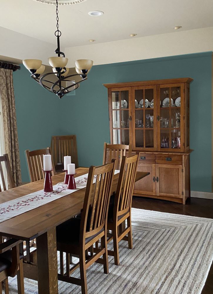
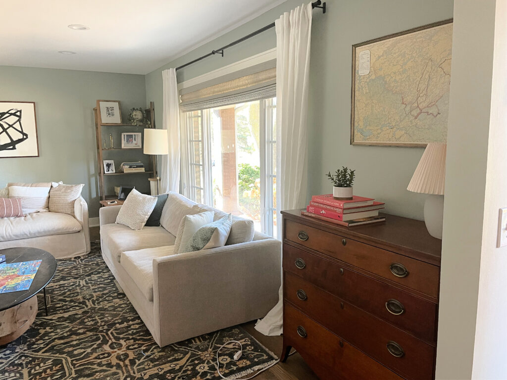
The color on these walls below (my client’s BEFORE image), shows how a blue-green blend can highlight and accent warmer wood stains…

Sure, the play of the blue-green with the golden oak cabinets is PRETTY and interesting, but it’s as updated looking as a well-chosen neutral would be. And that’s okay. Not all of us worry about resale or others’ opinions; we just want some badass and beautiful paint colors that make our hardwoods rise in their full glory!
One of the main exceptions is older homes. Heritage and mid-century homes often benefit from a little color – colors that bring their wood’s finer details to life.

Benjamin Moore’s Best Green Paint Colors
This is why we’re here today—to look at colors that will bring your wood finish to life, either with a wee wink of color or something more daring. It’s up to you which hue you choose (other than Hugh Hefner, who is not on today’s menu).
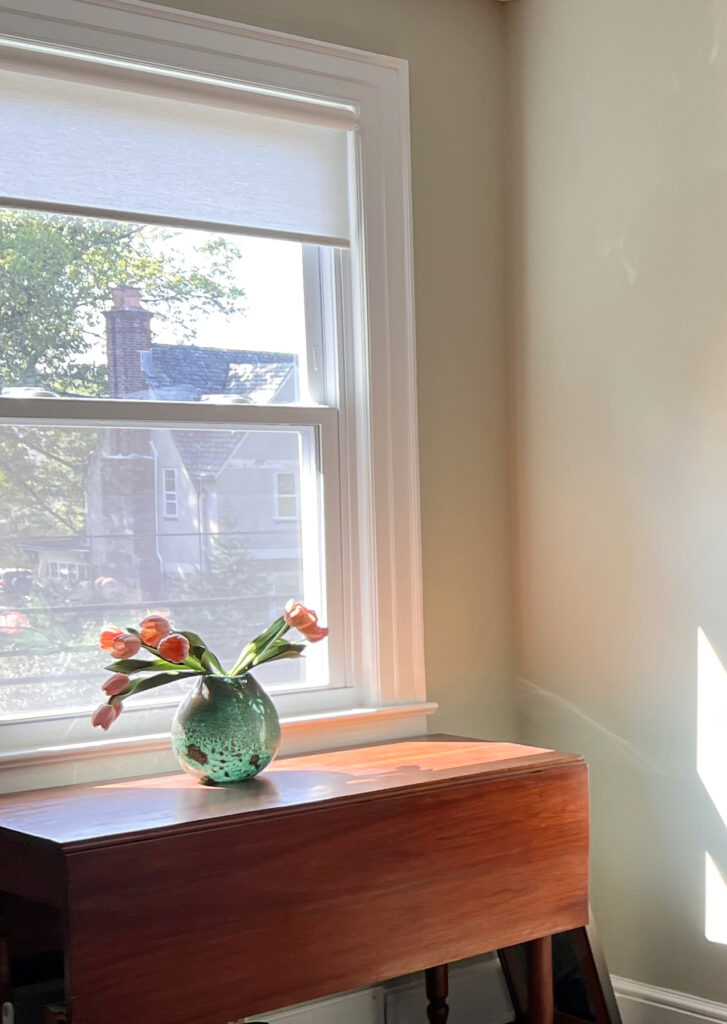
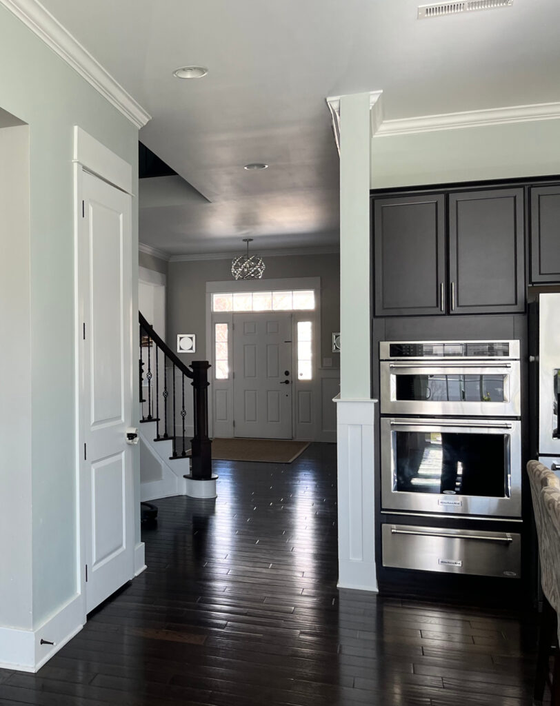
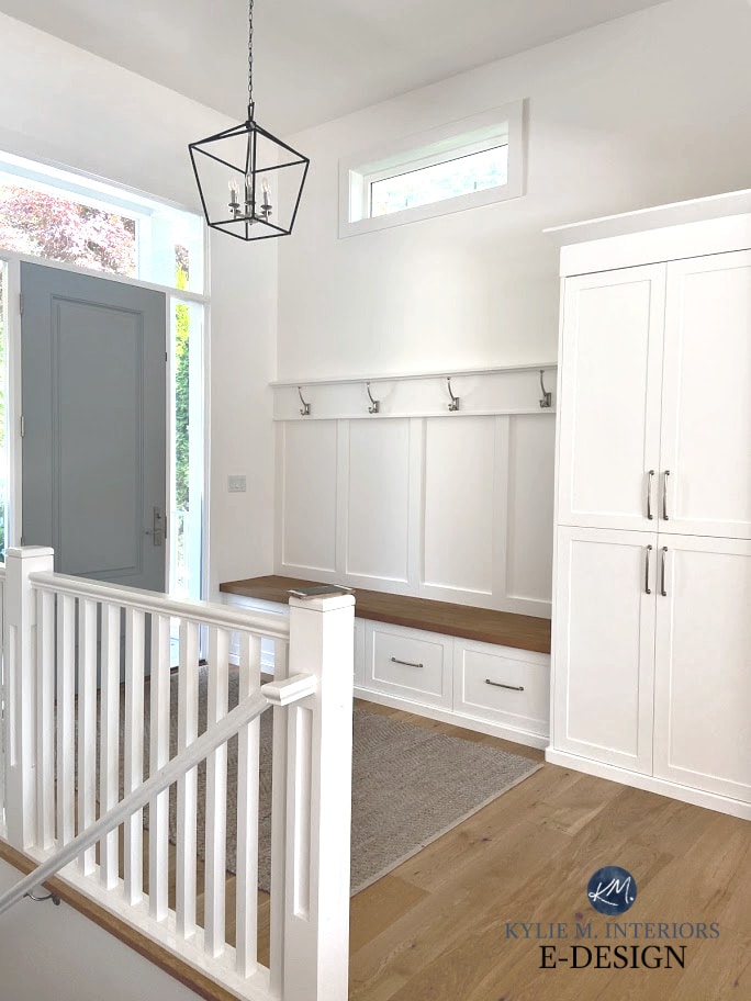
Now, you CAN get a reasonable amount of contrast between neutrals and wood finishes, especially regarding light and cool colors. As shown in this photo below, the warm neutral in the entryway contrasts with the orange wood trim and floors because the paint color is so light…
The DEPTH of the color offers contrast – not the temperature…
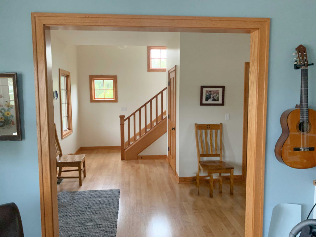
On the other hand, you get a different type of contrast when you compare the wood trim (fir) to the blue on the walls closest to you – equally as pretty, just a different approach to contrast!
WHAT COLORS ACCENT WOOD?
As shown above, some neutrals can accent wood tones, depending on their depth and temperature. However, it’s more popular to accent wood trims, cabinets, and floors with COLOR. But if you were hoping for shades of yellow, orange, and red, you’re reading the wrong blog post.
Why?
Besides the odd gray-wash wood (which can pick up cooler tones of violet and blue), wood finishes are mostly warm-toned, with red, orange, and yellow undertones. Whether you’re dealing with honey oak, maple, cherry, mahogany, or pine (or ANY wood), if you pair it with warm tones like yellow, orange, and red, you risk BLENDING your wood rather than accenting it.
So, for today’s purpose, we’re focusing on beautiful shades of blue, touch of purple, and glorious greens, along with a few slightly more subtle shades with neutral roots.
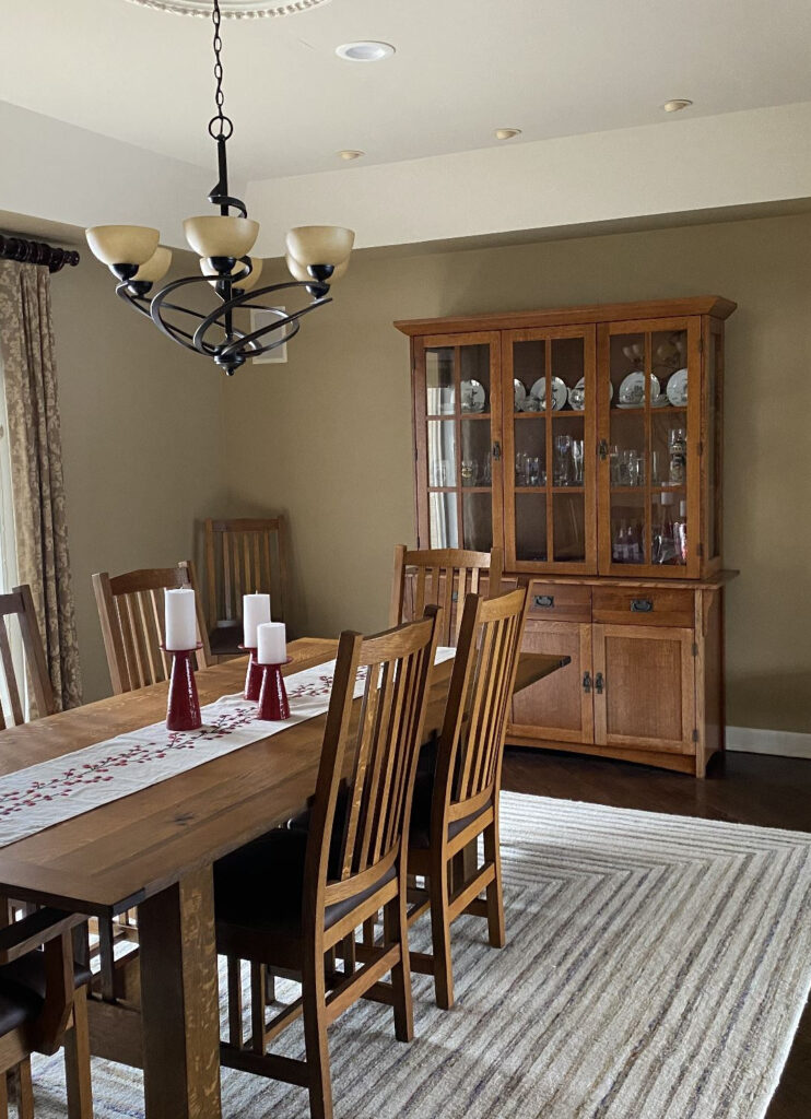
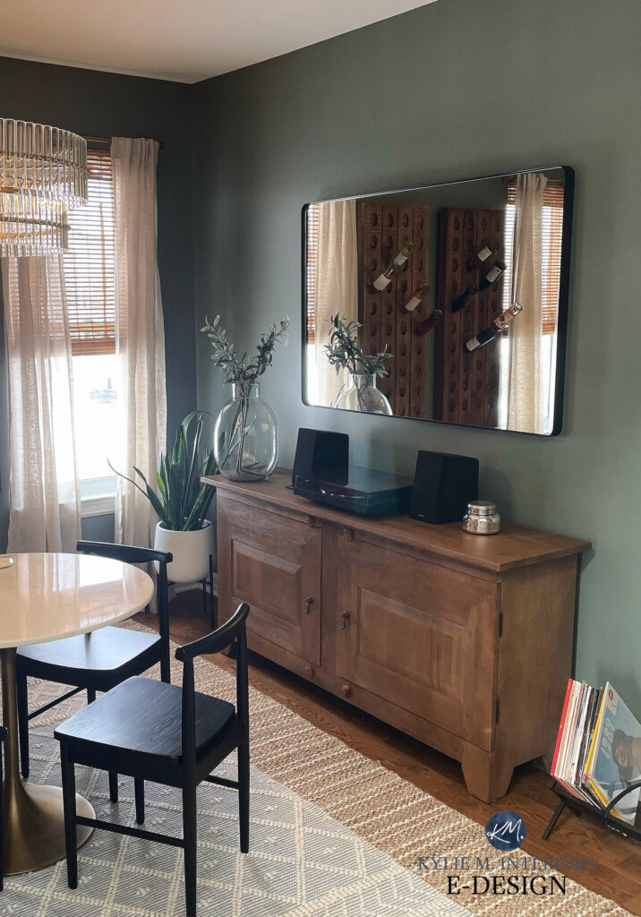
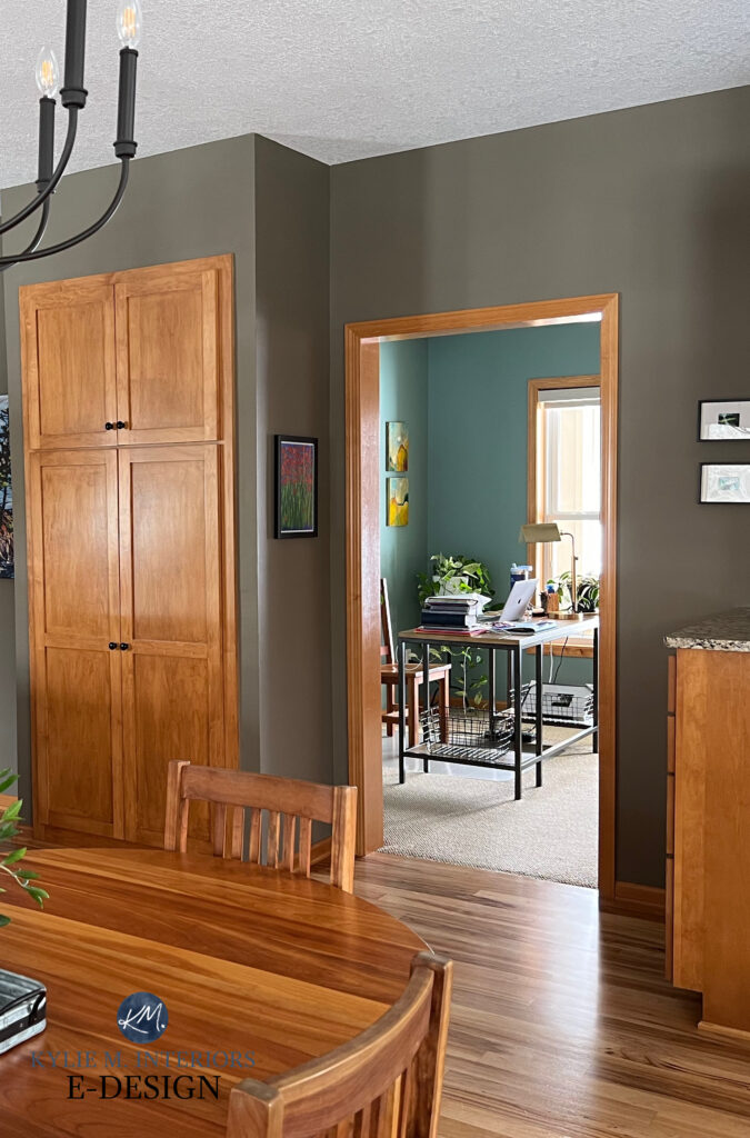
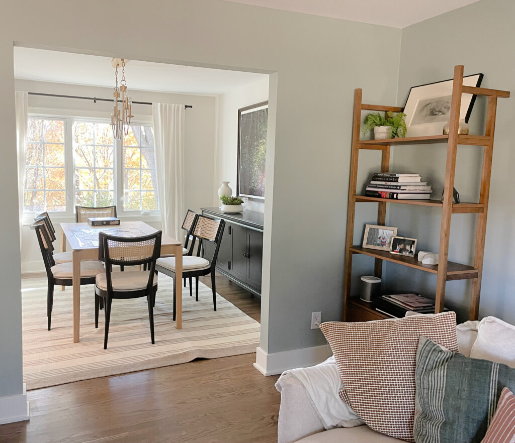
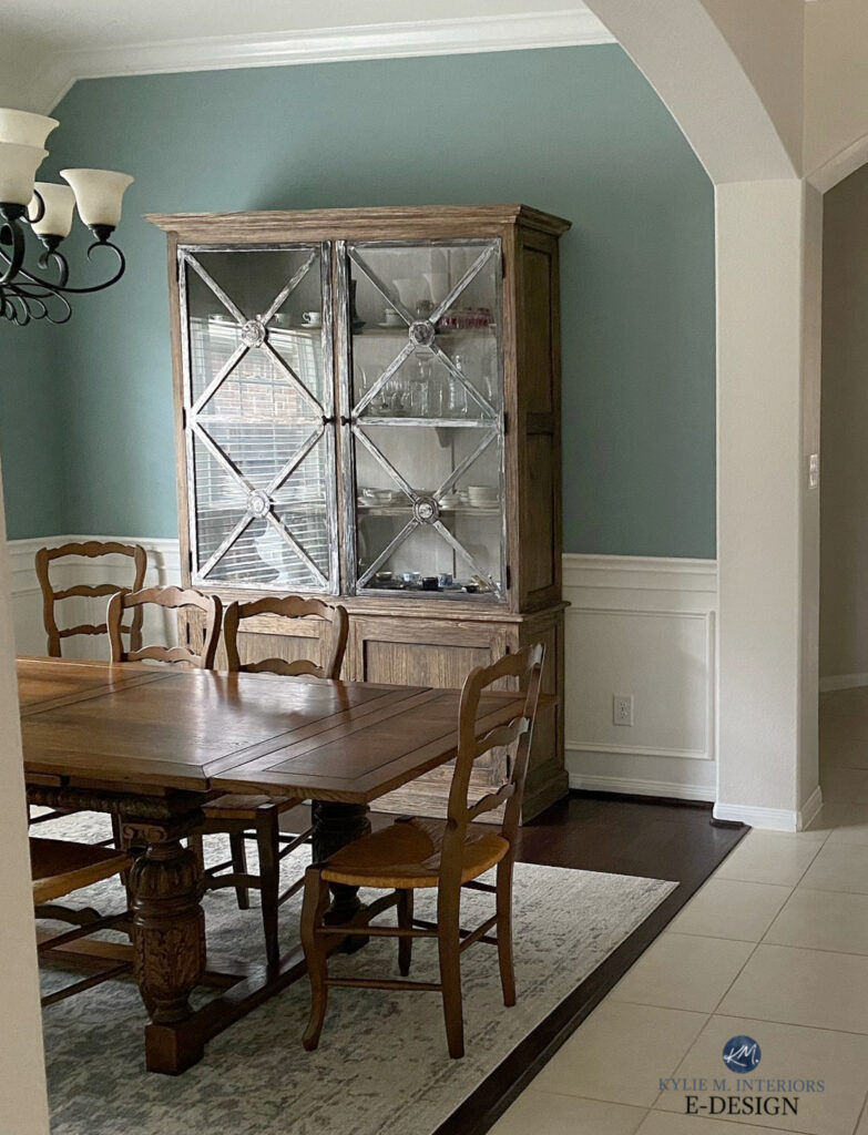
Check out this dining room below. The warm neutral on the walls (Benjamin Moore Great Plains) works if the homeowners want a lower-contrast look.
Now look what happens if we toss a little green in there…
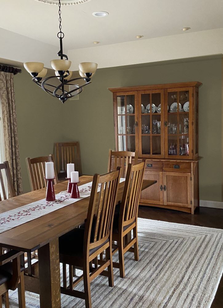
And I didn’t even do a COOL green, which would pop even more. Instead, I chose a warm, earthy shade of green (Benjamin Moore Passion Vine).
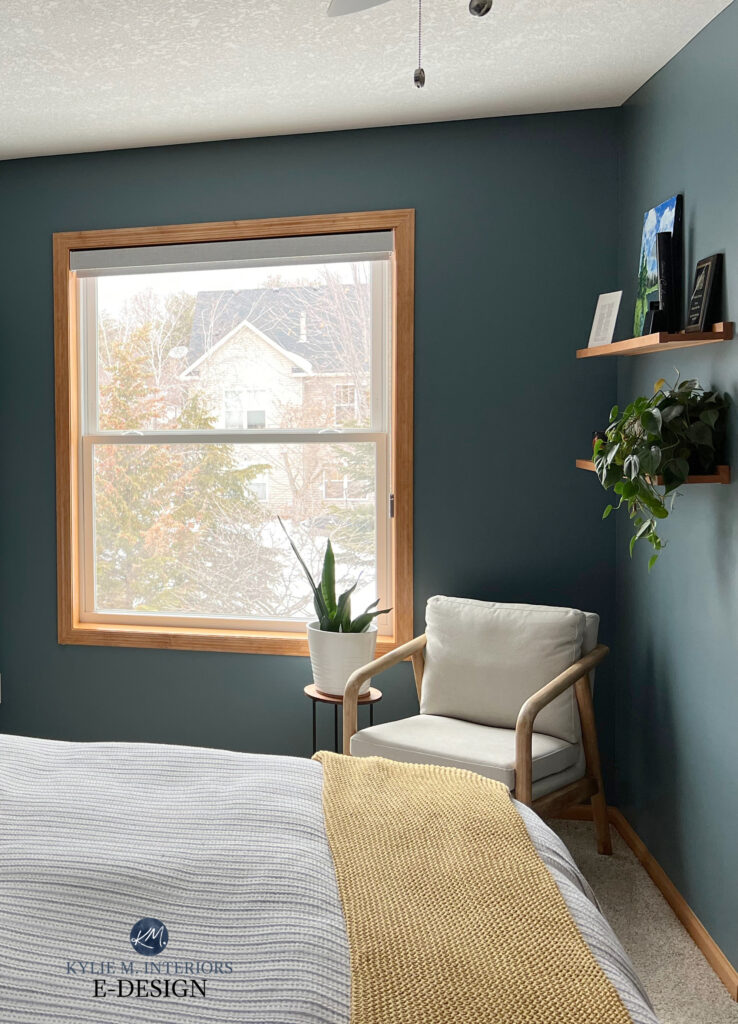
As for this next image, I wouldn’t ever put this color with these drapes, but it shows you how a cooler, stronger blue-green pops with the wood furniture…
Again, it all comes down to your INTENTIONS, do you want to soften your wood (no pun intended) or do you want to accent it?
So, without further ado, let’s get this color party started!
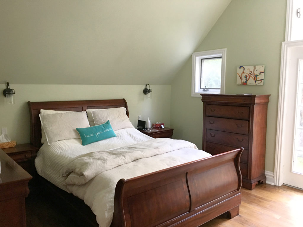
1. BENJAMIN MOORE OCTOBER MIST 1495
When it comes to the most popular shades of green, particularly those that are a bit lighter, it’s hard to beat October Mist.
While it has a bit more meat on its bones than typical light shades of green, October Mist has such a great, organic vibe that contrasts so nicely with a wide range of white trims, as well as wood finishes…
October Mist is also an interesting option. While it’s a warm green, it doesn’t go as yellow as many other shades and can even look a bit cool in comparison to them.
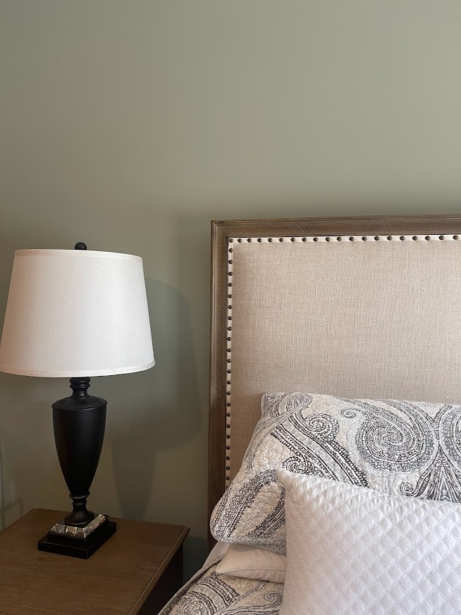
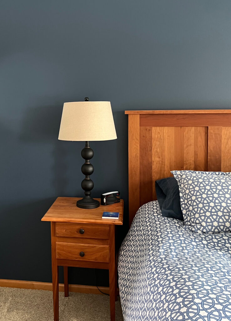
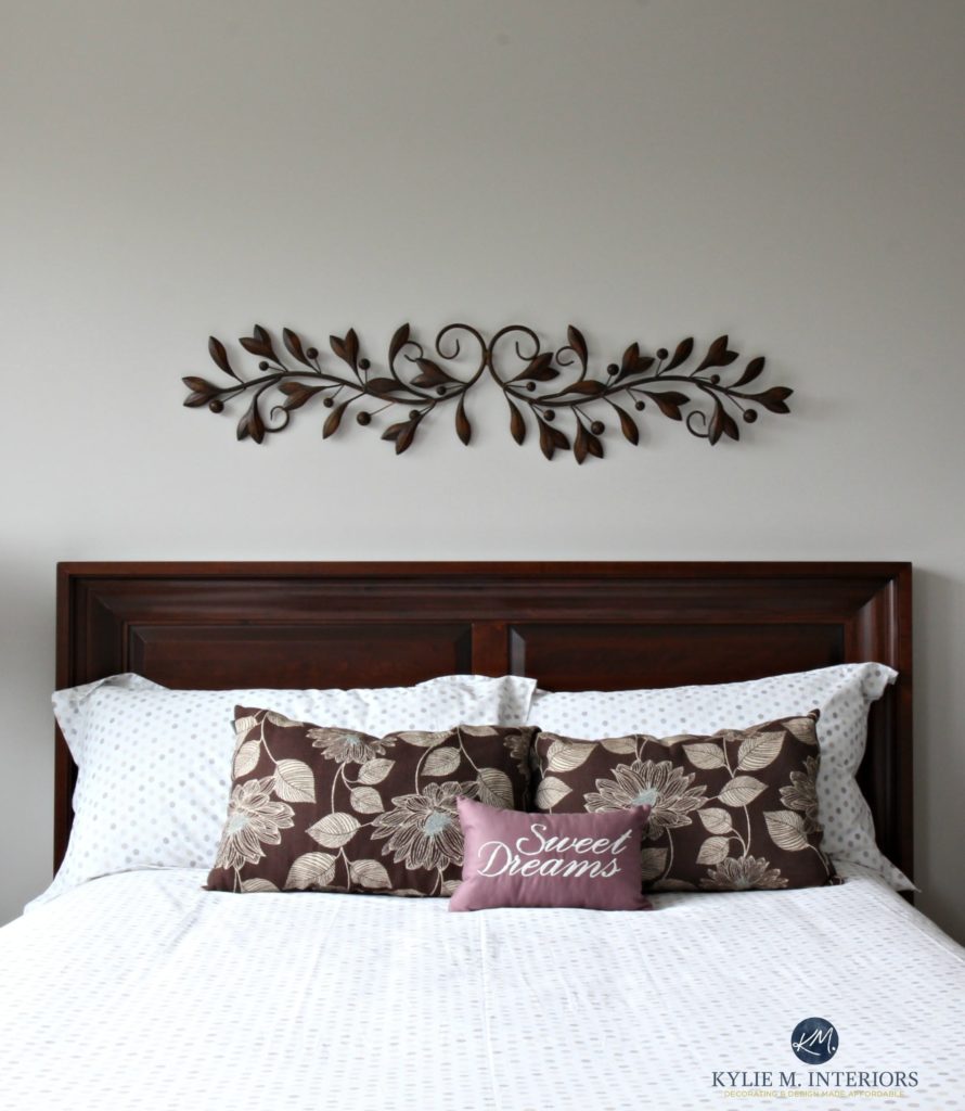
You can see how pretty October Mist is with the above red-orange stained table, while also being amazeballs with the grayed-out tone of the wood-detailed headboard below…
Benjamin Moore October Mist: IMAGES, Info, & More
2. SHERWIN WILLIAMS RETREAT SW 620
Retreat has hit the streets hard and is one of the most popular greens right now. What’s so appealing about Retreat is that while it’s a bit cool, the blue doesn’t really show up to the party, leaving you with a muted, green-gray look on your walls…
Plus, Retreat’s subtly cool backdrop makes it a great contrasting color to a wide range of wood stains – everything from yellow-orange, and orange-pink, to red and pink!
You’ll also see Sherwin Williams Pewter Green popping up a lot, which is like a darker take on Retreat. If you go a bit lighter than Retreat, you hit Sherwin Williams Acacia Haze.
FULL Paint Color Review of Sherwin Williams Retreat
3. SHERWIN WILLIAMS SEA SALT SW 6204
Sea Salt is a stunner and a great complement to most woods for a fun, fresh look. Sea Salt is a light-toned green blend with a gray-blue undertone to calm it down. Because it’s a cool shade, it’ll accent your wood stain, but having a degree of gray in it keeps things a wink more subtle.
Look at how Sea Salt contrasts with the dark violet undertone of these espresso wood cabinets and dark-stained oak floors…
Because the wood in the above space isn’t OVERLY colorful and that bit muted itself, it doesn’t overreact with a cool color like Sea Salt.
Sea Salt has an LRV of 63, parking it right in my happy place. However, as far as green-grays go, it’s super unpredictable, looking a bit greener in one room and quite COMMITTEDLY blue in another! Read ALL about Sea Salt in its color review.

You’ll also find that Sea Salt isn’t too fussy about which wood stains it goes with, as it can humor a wide range of yellow, orange, red, and pink hues.
It’s also important to COMPARE COMPARE COMPARE—never pick a color without looking at similar shades. While Sea Salt is a color unto itself, for a similar (but tweaked) approach, check out…
- Benjamin Moore’s Quiet Moments for a calm, coastal vibe
- Sherwin Williams Comfort Gray offers a bit more depth with a similar blend
- Silver Strand is a nicely grayed-out blend of blue-green-gray
- If you want a bit more color, Sherwin Williams Rainwashed is stunning
Paint Color Review of Sherwin Williams Sea Salt
Here’s your PEEL & STICK SAMPLE of Sea Salt…
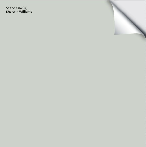
Delivered to your front door in 1 DAY!
4. BENJAMIN MOORE CHEYENNE GREEN 1502
If you’re a green lover, Cheyenne Green is worth checking out. This warm shade of green has a bit more depth, with its LRV of 49.83, making it a light-medium depth color.
Here it is (left) with light maple cabinets (with Benjamin Moore Herbal Escape on the right). Neither color looks as warm as it can…

If you like the look of Cheyenne Green, but want something a bit lighter, take a look at Benjamin Moore’s Paris Rain, which is equally as pretty, but a bit softer…

The Best Light Green Paint Colors
99.9% of the photos in my blog are from my Online Color Consulting clients, readers, talented photographers, & friends— because real homes deserve to be celebrated (dirty laundry & all!) While not magazine-perfect, they’re packed with ideas & proven color choices to help you create a home you’ll love.
5. BENJAMIN MOORE KNOXVILLE GRAY HC-160
While Knoxville Gray might look a bit intimidating and dark in the fan deck, HOLY HECK is it ever stunning in real life!
Knoxville Gray is a very solid, medium-depth blue-green blend. However, it does have a noticeable dollop of gray calming it down – not enough that it lives up to the name Knoxville GRAY, but it gives it a more organic, earth-toned look. Check it out in this home office…
How to Update Wood Cabinets: 4 PART SERIES
Knoxville Gray is partnered with Benjamin Moore Texas Leather (also known as Stampede) in the above home. These colors are wicked pretty with this home’s orange-stained wood trims and cabinets.
Get the best color advice…
Check out my Online Paint Color Consulting services!
With its LRV of 15.68, Knoxville Gray isn’t joking around – it’s got some serious meat on its bones. But while it’s in the medium-dark range, its degree of color (chroma) helps it show up, even in a darker space.
Here’s another good look at Knoxville Gray in all her glory…
Notice how well she plays with the orange-red stain of the wood floor without being overly punchy or super ‘teal.’ But, if you WANT teal, I’ve got some!
Get the Online Paint Color Expert that DESIGNERS hire!
6. BENJAMIN MOORE IMPERIAL GRAY 1571
Imperial Gray is a gorgeous blend of blue-green and gray, creating a soothing, calming combination with many wood tones. While it’s a bit grayer than many of the colors on this page, it still has enough color to contrast with many wood finishes.
The Best Calming, Soothing Paint Colors
In the above photo, you can see how beautiful the blue-green paint color looks with the red stain on the dresser. However, these types of colors can be equally stunning with yellow and orange-stained woods.
Here’s Imperial Gray in the same room, just at a different angle, shown with more orange-stained wood…
The Best Paint COLORS with Pink-Toned Wood Finishes
Compare Imperial Gray to other similar shades to see which is best for your space. Check out…
- Benjamin Moore Beach Glass, which has a bit more meat on its bones
- Gray Wisp is like a softer, gentler version of Imperial Gray
- And the beautiful and very subtle Sherwin Williams Argos
- Wythe Blue is perfection if you want a bit more COLOR on your walls!
The 18 Best Blue and Green Paint Colors for Bedrooms
7. BENJAMIN MOORE ANTIQUE PEWTER 1560
Whether you’re painting kitchen cabinets, an accent wall, or an entire room, Antique Pewter is a gorgeous approach to green…
Antique Pewter is a warm green, as rather than having a gray undertone, it has a greige one, giving it a subtle warmth without flashing too much olive green.
Remember, it’s not just about accenting your wood cabinets, trims, and floors with wall colors. Be sure to explore color on your kitchen cabinets, island, underwear, bathroom vanity, and even the inside of your front door!
The 15 Best Medium to Dark Green Paint Colors
Here’s your Peel & Stick sample of Antique Pewter…

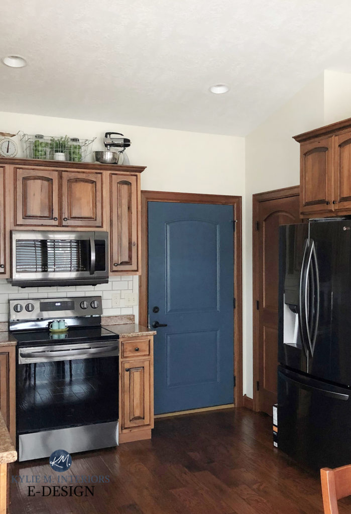
8. BENJAMIN MOORE HALE NAVY HC-154
There’s something to be said for poppin’ that wood stain with a wicked dark shade of navy blue. And when I’m looking for that true blue hue, my first stop is usually Benjamin Moore Hale Navy…
FULL Paint Color Review of Benjamin Moore Hale Navy
Hale Navy isn’t messing around with its depth and saturation. However, it does have a bit of a gray backdrop, stopping it from looking like a primary blue, which can be overwhelming for the average home.
And it doesn’t need to look maritime or naval-inspired. Hale Navy is a great transitional shade of blue thanks to its lack of real commitment to blue-green or blue-violet.
That said, with an LRV of 8.36, Hale Navy can be a bit too dark for rooms that don’t get at least moderate light. In this case, you might also check out Newburyport Blue…
Just look at her poppin’ with that orange-red wood stain! LOVE IT!
Here’s another beauty, Sherwin Williams Bunglehouse Blue with Benjamin Moore Ballet White walls, wood cabinets, and trim with a red undertone…
The 13 Best Navy Blue Paint Colors
The dark wood trim and cabinets (above) contrast with the off-white neutral on the walls (via the difference in DEPTH) as well as the blue of the door (via the difference in color TEMPERATURE)!
Remember, you can add contrast to your wood via your paint colors DEPTH and/or TEMPERATURE.
9. BENJAMIN MOORE STRATTON BLUE HC-142
While Wythe Blue and Palladian Blue get a lot of attention, there’s something to be said for Stratton Blue (also known as Del Mar Blue). While they all share a love of blue-green with a dose of gray for luck, Stratton Blue has a bit more junk in its trunk with its LRV of 37.77.
As shown in this dining room (adjoining room painted Benjamin Moore Edgecomb Gray, 25% lighter), Stratton Blue offers a wicked contrast with white trim. It also lets wood finishes come to life, especially those wood tones that are a bit more muted to start with…
The Best Cool Earth-Toned Paint Colors (Benjamin Moore)
And of course, you know that comparing is one of the most important parts of sampling paint colors the right way. To start, compare Stratton Blue with…
- Sherwin Williams Quietude is a bit lighter and softer
- Sherwin Williams Halycon Green offers a touch more of a muted look
- You might even check out the more earthy, grayed-out look of Benjamin Moore Raindance
The 13 Best Blue-Green Blend Paint Colors
10. BENJAMIN MOORE FERNWOOD GREEN 2145-40
Again, it can be hard to go wrong with green. Fernwood Green is a warm green paint color with JUST enough of a neutral base to calm it down while leaving a GORGEOUS green hue on the walls!
As shown in the photo above, woods with a red or pink undertone can look stunning with green paint colors. However, I also love how yellow-orange-toned woods look equally as much.
And because you never want to choose a paint color based on how it looks with itself, compare it to these similar shades:
- Benjamin Moore Soft Fern for a softer, airier look
- Benjamin Moore Guilford Green
- Sherwin Williams Grassland
11. SHERWIN WILLIAMS GRIS SW 7659
Admittedly, Gris should be in the Top 20 NEUTRAL Paint Colors With Wood Finishes blog post, not this one, but as with my obsession with Cornuts and white wine, I couldn’t help myself.
Gris is a medium-depth shade of GRAY. However, its saving grace for the sake of this blog post is that it has a decent whack of blue and green in it, giving it a wink of personality without hitting the more colorful end of things.
I have MAD LOVE for this color with any number of wood stains!
I highly recommend comparing Gris with…
- Sherwin Williams Mineral Deposit
- Sherwin Williams Magnetic Gray
- and the ever-lovely Benjamin Moore Coventry Gray
12. BENJAMIN MOORE PROVIDENCE BLUE 1636 (CHARLOTTE SLATE)
If you love the idea of Knoxville Gray but find it a touch too heavy, you have to check out Providence Blue…
As shown with the orange-stained wood trim in the above guest bedroom, Providence Blue has a decent amount of green while still catering to blue. And while it has some gray, it has more color than Knoxville Gray—more color = more contrast!
Here’s your Peel & Stick sample of Charlotte Slate…

13. BENJAMIN MOORE ABALONE 2108-60
There are a few reasons I didn’t include much purple in this blog post, but the main reason is that almost none of my Online Color Consulting clients ask for it! However, this doesn’t mean that you’re not craving a little violet infusion.
I’m hittin’ it subtle with Benjamin Moore Abalone. This is a warm gray-violet, so while it has purple in it, it’s not a purple-centric color at all…
To see more colors like Abalone, read this: The Best Neutrals With Pink or Red-Toned Wood
Abalone looks STUNNING with red-stained woods that lean a bit into purple, like the above headboard, but can also handle some yellow-orange and orange-pink stains.
If you want a bit more purple, I’ve got it – but you have to go to this blog post to get it!
READ MORE – LEARN MORE!
5 Ideas to Update Oak Cabinets – (PART 1)
MORE Ideas to Update Your Wood Cabinets – WITHOUT a Drop of Paint! (PART 2)
The Best Hardware to Update Wood Cabinets (PART 3)
The 20 Best NEUTRAL Paint Colors to Update Wood Trims & Cabinets (PART 4)
Get the best color advice…
Check out my Online Paint Color Consulting services!

ORIGINALLY WRITTEN IN 2024 UPDATED IN 2025


Extremely helpful article!
Maybe I just missed it (although I reread 3 times!) what is the blue-green color in the third picture of the dining room at the beginning of the article?
Love your work! I learn so much. Really appreciate how you teach with words and pictures.
Oh gosh, I just put a general color in there as an example, but I’d say that’s pretty similar to something like SW Peacock Plume!
I love that you came out with more posts on dealing with wood colors. They are so helpful! I especially like how you added what color woods do and do not work with specific paint colors. I also love that you have posts on how to update with beige tile. What to do when you have both? (besides drown my sorrows in a vat of wine) I absolutely love the contrast with the blue-green in the first picture, but imagine if that space had Joseph’s tile-of-many-beiges instead of wood floors. Is there any hope????
Tracy, what a great note to get! Seriously, if there’s a specific topic I can hit for you (and as long as it has mass appeal), I’m happy to do a blog post or even a Youtube video on it!
Such a lovely in-depth review of colors! I would LOVE to hear more thoughts on more mid-tones to calm historic dark wood. Historic houses with oak wainscotting are so tough. I don’t like high contrast light LRV colors OR blah beiges. What’s a girl to do?!
Ooooo, I LIKE THIS IDEA! The challenge is that I don’t always have the right/enough images. If you’d like to send some photos of different rooms in your home with this lovely dark wood, I might be able to make it all happen AND you can get some gorgeous color ideas!
kylie@kylieMinteriors.ca