
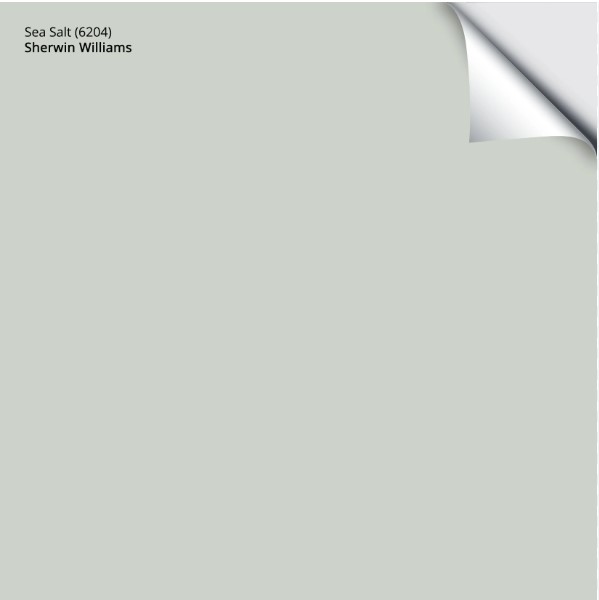
Sherwin Williams Sea Salt SW (6204): Undertones, LRV, & Real-Home Results
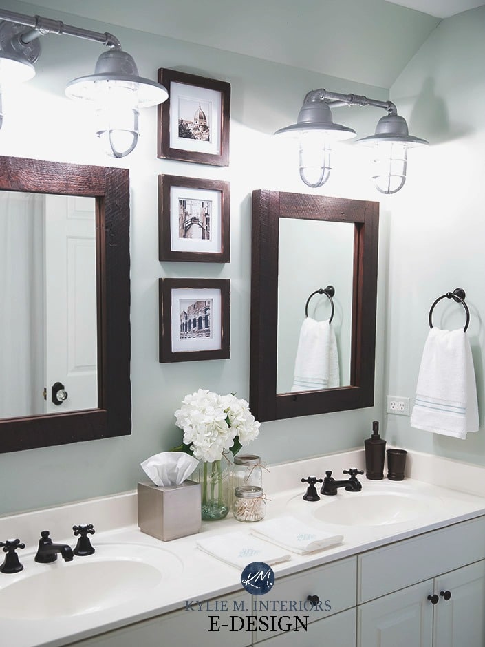
Sherwin Williams Sea Salt is a light, cool green-gray paint color. It works well on interior walls, especially bathrooms and bedrooms.
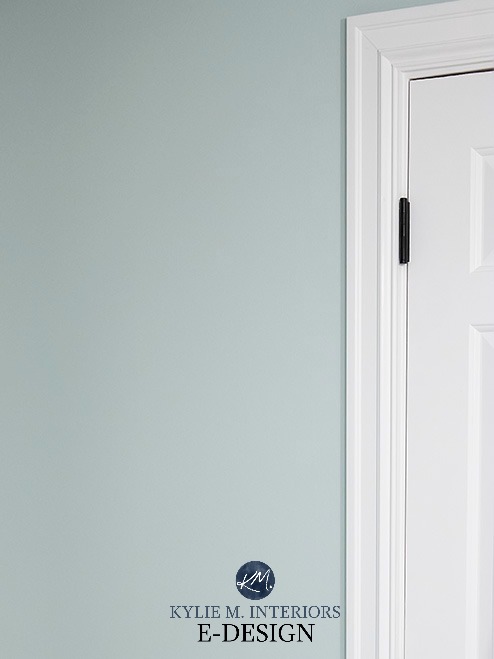
With its sneaky undertones, Sea Salt can shift in appearance based on exposure, interior lighting, and surrounding finishes.
As far as colors (not neutrals) go, Sea Salt and other beachy-themed paint colors are the most popular with today’s homeowners, for sure. But does that make them good for your home? Let’s find out.
Before we get started…
Not only have I worked with this color daily with my E-Design clients, but I also painted a BIG OLE sample and strapped it to my body for the day (the non-kinky form of body paint). Paint sample on one hip, wine bottle on the other – I was locked n’ loaded! I looked at it in north and south-facing rooms – morning, noon, and night, so I could get a better idea of how it works and then share that info with you.

And let me tell you, I needed that bottle of wine – in a sippy cup. By the time I was done, my brain was swimming with the many ways Sea Salt changed throughout the day. I mean, every color will change on a room-to-room/wall-to-wall basis, but it must be the mix of undertones in this bad boy that makes it the ULTIMATE color ninja.
So, the photos of these rooms are just examples of what you might expect from a color like Sea Salt in various situations – it ain’t gospel, but it might be as close as we’ll get…just call me Saint Kylie.
Ready Betty?

WHAT TYPE OF COLOR IS SW SEA SALT?
While it can read as surprisingly blue, in the core of its tricky little heart, Sea Salt is green-gray. Will it ever look GRAY? Nope, its color will always shine through. Will it look blue? It sure can, in a big way; however, more often than not, it reads as a slightly more green-centric color.
WHAT’S THE LRV OF SEA SALT?
Sea Salt has an LRV of 64, which means it can help a room feel lighter and brighter as it will reflect artificial and natural light into the space, but it’s not so light that it will save a dark room or OVERLY wash out in a reasonably well-lit one.
If you have a dark room, the beauty of Sea Salt will be diminished due to the degree of gray in it, although it still offers a soft, coastal vibe.

What is LRV and How to Use it to Pick a Paint Color
In a well-lit room with a few different exposures (common in open concepts), Sea Salt will likely vary on a wall-to-wall basis throughout the day.

The Best Paint Colors for Dark Wood Trim & Cabinets
WHAT ARE THE UNDERTONES OF SW SEA SALT?
Sea Salt is a mix of water and salt. Mwahaha. Sea Salt is a mix of green and gray. However, while this green might have gray, it also has blue.

That’s right, even though it’s a green-gray, Sea Salt is INFAMOUS for looking blue – and not by a little bit, by a LOT. That’s right, the world’s favorite green-gray paint color is a flasher – and it flashes blue, leaving green in the dust.
- Sometimes, Sea Salt is a beautiful blend of green and gray, but it’s a cool green (green-blue) rather than a warm green (green-yellow).
- Occasionally, it will lean considerably into its green side, more often in a south-facing room or a room with warm light bulbs.
- It’s also well known for going green-blue or blue with only a nod towards green, more often in north-facing rooms with diffused light. Part of the ‘recipe’ for this paint color is a blueish black, meaning it can subtly influence the foundation of this color in the right lighting situation.
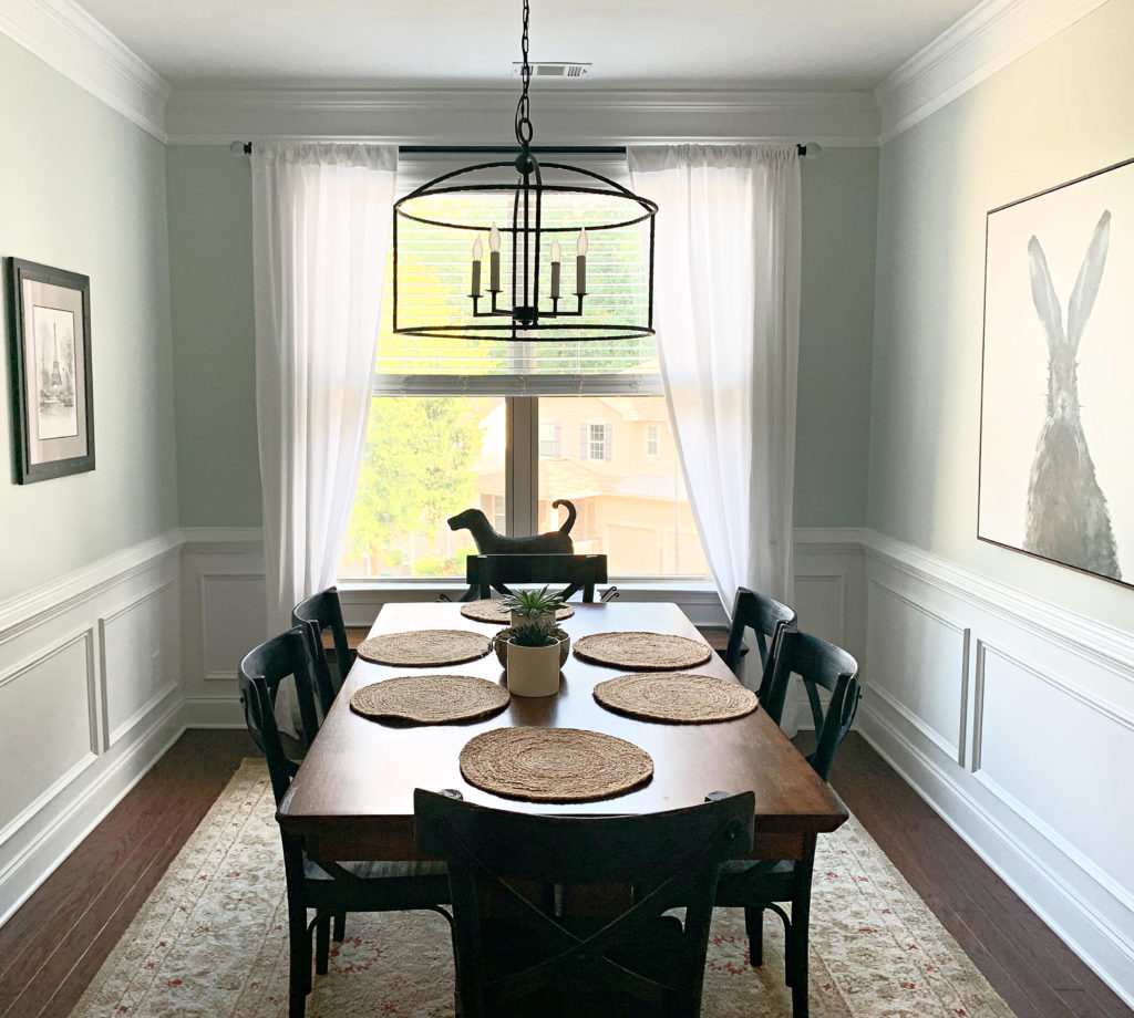
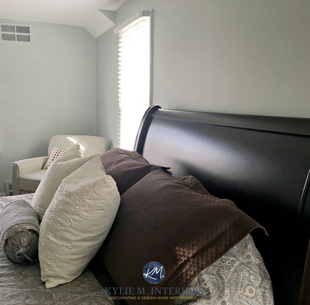
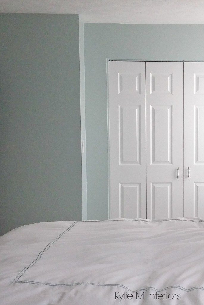
This next photo is as blue as you can expect Sea Salt to look (it RARELY goes this blue…)
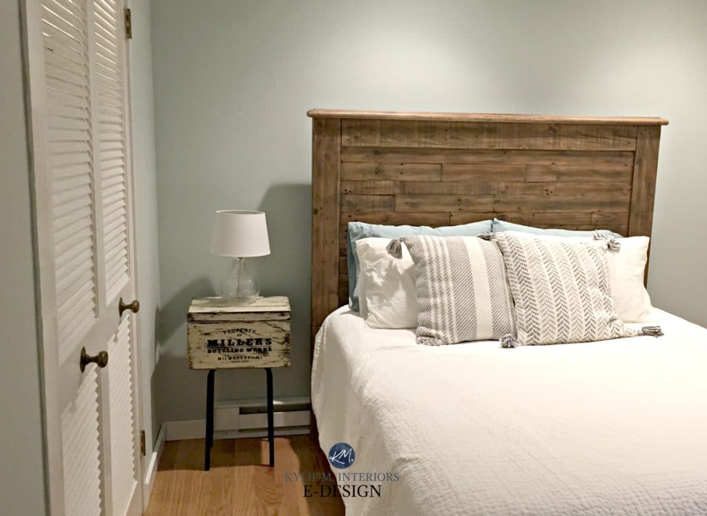
Sea Salt also has the potential to look as green-gray as this next bedroom…
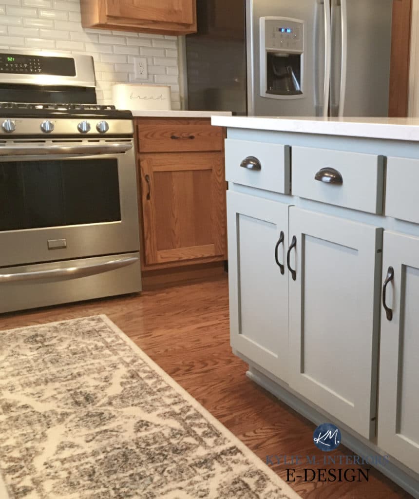
IS SEA SALT A GOOD COLOR FOR CABINETS?
Generally speaking, no. Sure, there’s the odd coastal or country kitchen or bathroom that can pull it off, but it’s usually too non-committal for most finishes and spaces (as a cabinet color).
Get your Peel & Stick sample of Sea Salt HERE!!
WHAT COLORS ARE SIMILAR TO SEA SALT?
While Sea Salt is a creature unto itself, there are several colors you should compare with Sea Salt. It’s the shift in undertones, depths, and temperatures that can help you see why one color is better than another!
Here’s a short list…
- Sherwin Williams Rainwashed for more color
- Sherwin Williams Comfort Gray for more depth
- Benjamin Moore Gray Cashmere for a smokier look
Now, let’s look at a few specifics…
SEA SALT vs. RAINWASHED
I LOVE Rainwashed…almost as much as I love Sea Salt. If you want a bit more commitment to color and blue, Rainwashed could hit the spot. While it’s still a blue-green blend with gray, it has more intensity than Sea Salt.
Rainwashed has an LRV of 59, making it darker than Sea Salt and its LRV of 63. While they’re both in the light depths, Rainwashed has more meat on its bones.
Paint Color Review of Sherwin Williams Rainwashed
SEA SALT vs SILVER STRAND
Sherwin Williams Silver Strand is the perfect color if you want a color that blends blue, green, and gray more evenly than Sea Salt (or Rainwashed). This isn’t to say Silver Strand will look gray; it just has more gray than Sea Salt.
As for depth, Silver Strand has a stormier, smokier look than Sea Salt, not just because of its added gray but because of its LRV of 59.
Paint Color Review of Sherwin Williams Silver Strand
The 8 Best Blue and Green Paint Colors: Benjamin and Sherwin
SEA SALT vs. COMFORT GRAY
Now, we’re comparing apples to apples! Both Sea Salt and Comfort Gray are green-gray blends that can pick up an interesting amount of blue. Where you’ll see the real difference is in depth. Comfort Gray has an LRV of 54, putting it in the light-medium depths. And whereas Sea Salt is a bit iffy on cabinets, this added depth makes Comfort Gray a good option for kitchen islands, cabinets, and bathroom vanities!
WHAT WHITE TRIM OR CABINET COLORS GO WITH SEA SALT WALLS?
If you’re painting your cabinets or trim and need the PERFECT white paint color, I’ve got some beauties for you…
- Sherwin Williams Pure White is absolutely bangin’
- Benjamin Moore’s White Dove is pretty for a slightly softer look
- Sherwin Williams Extra White or Benjamin Moore Chantilly Lace offers a cleaner, crisper contrast
Benjamin Moore Cloud White (below) is as warm as you’ll want to go with Sea Salt…
How to Choose the Best White Paint Color
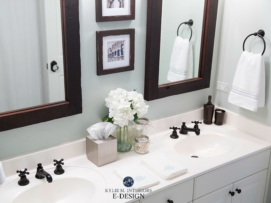
SW SEA SALT WITH MARBLE TILES & COUNTERTOPS
Sea Salt will look beautiful with MOST marble and can be a great option to avoid gray walls or cabinets…
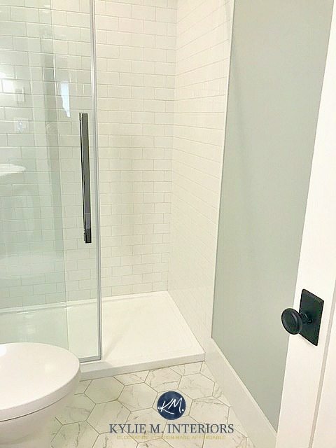
It’s also a fresh, clean look with white…
WHAT COLORS GO WITH SEA SALT?
Oooo, Sea Salt definitely plays favorites when it comes to creating a color palette! Here are some ideas to get you started…
- many light shades of gray look gorgeous with Sea Salt, especially if there LRVs are HIGHER than Sea Salt’s.
- darker green-gray with similar undertone profiles
- muted, flexible, warm off-white paint colors
- many creamy white paint colors
DOES SEA SALT GO WITH CREAM TRIMS & CABINETS
Nope. I’d love to tell you it’s pure magic, but it’s more of a hot mess. Sea Salt is too light and cool to go with cream finishes. You may want to read this blog post.
DOES SEA SALT GO WITH WOOD TRIMS & CABINETS?
Whether you have wood cabinets, trims, flooring, or furniture, Sea Salt can be a gorgeous color partner. Just remember that opposites attract and can strengthen each other, so any red, pink, or yellow stains could look more obvious. Sample carefully and see how you feel.
My next Online Color Consulting client hired me because Sea Salt didn’t look great with her red-orange dark wood trim (I can’t wait to see the after photos!)..

However, some people love this look, so if you love the above combo, fill your little salty boots!

A SUMMARY OF SHERWIN WILLIAMS SEA SALT
There’s A LOT to consider when choosing a paint color – LRV, exposure, personal tastes, and the needs of your home. Trust me, I learn more and more EVERY DAY about how these factors can affect the appearance of a color. Here’s what I’ve learned from this salty color adventure…
- I need to avoid carrying a bottle of wine with me throughout the day—I will then not have any left for the evening.
- Sea Salt prefers to go green rather than blue, but not always.
- If you have a north-facing room that’s bright and you don’t use many artificial lights, Sea Salt may appear slightly bluer.
- Once you add interior lighting (as long as it’s not those stark, harsh white bulbs and catering to a slightly lower Kelvin), the green may return and balance things out.
- If you have a south-facing room, the green may be more apparent as the warm sun rays react to the cool tones of Sea Salt.
READ MORE:
The 8 Best Blue and Green Paint Colors: Benjamin and Sherwin
The Best HAINT BLUE Paint Colors for Your Front Porch Ceiling!
The Best Calm & Stress-Free Paint Colors
NEED HELP?
Check out my Online Color Consulting Services!


ORIGINALLY WRITTEN IN 2018, UPDATED IN 2024


I love Sea Salt and recommend it often. It’s such a great color and as you say is quite the chameleon. I painted nearly half my home this color and it looks great with my dark floors. It’s a breathe of fresh air in a greige world.
Hi there,
First off, great info…thanks!
We have an older home full of douglas fir wood trim in reddish brown tone. Our floors are hardwood with golden tone. Wondering if you think sea salt would work in my kitchen. The cabinets are off white and the room gets a lot of light. Finding it confusing to choose color as we have different colors of wood here.
Thanks
I have a little mudroom that i have been wanting to paint sw sea salt. But im afraid itll make it look smaller! Not much light. Would you ever recommend getting the color lightened by 50 percent? Or would it not be *sea salt* anymore?
Hi Jenny! Well, it wouldn’t be Sea Salt, but it would be a similar IDEA. At 50% lighter you can expect the undertones to shift quite a bit, so you’ll likely see more green (maybe minty?). One thought that I like to keep in mind with small rooms/not much light as that a) can I get a better fixture that takes 3 60w bulbs and b) I’d rather have a small room with personality than a boring one. That doesn’t mean you have to do Sea Salt, but it might make you feel differently about the colour in general! BM has a lighter similar look with Healing Aloe, but again, you’re getting darned close to mint. If you love mint, then you’re set!
Hi Kylie, Sea Salt at 50 percent would that change the color in a bathroom?
Oooo, at 50% I wouldn’t be surprised to see more green in it! 50% is a considerable change. 25% is more subtle. You can still see a shift in undertones at 25% sometimes, but you definitely can at 50%!
Hahahaha oh my gosh..thanks for this article. Sea salt is the color that broke my brain.ive been thinking I was crazy all these years… I love it but the room I painted is definitely blue. Bluer than your photos even. I love it to this day but it was certainly not the grey I thought it would be. I painted samples in different spots and it definitely changes color depending on the room.
Hey there Kylie thanks to all of your advice , sample pot and samplize I have basically decided on Sea Salt for the whole house. Any recommendations on keeping the grey out and whether you see this as a fresh 2021 Nuetral?
I love this color and your opinion!!
Patti
I continue to deliberate over this color
I have dark wood, warm tones and a lot of blue green in my accent pieces. What are your thoughts??
Thanks!!!
Patti
Oh Patti, it’s ALWAYS hit and miss! My first thoughts are that it could be a lovely compliment to your wood and warm tones, but there’s no saying what it will actually do!
I have a west facing bedroom and Sea Salt looks way more blue than I wanted. I still cringe at the extra fees to the builder that I paid to get two colors of paint in my house, then feeling like I want to paint over it because I want the green to show through. I am not a fan of light blues and I still am considering painting that big room over but afraid a similar problem will happen. I need that bottle of wine!
OH MAN, I’m sorry to hear this! I know, it’s hard. Sea Salt is well-known for doing this (it’s a bit of a bugger). If you want to see more green, I wonder if you might like Liveable Green? That being said, I haven’t seen your home or exposure, so it’s just a place to start 🙂
I’ve finally decided on Sea salt for a guest bedroom and wondered about trim. I’ve used white dove or alabaster in most of our home but some of your pictures look like trim was more bright white? What’s your recommendation, it’s a south facing room. Thanks Kylie!!
Well, Sea Salt is PRETTY flexible. I prefer White Dove over Alabaster, as it’s that bit less yellow, but Chantilly Lace gives a CLEANER more crisp contrast, so it just depends on the look you like!
Would this be ok on a bathroom wall with the vanity painted in SW Naval or Cyberspace?
Ehhhh, it can be okay, but Sea Salt is unpredictable. If it leans into its green, I like it a bit less. If it leans blue, which it OFTEN does, it could be okay.
Kylie, your blog is so helpful. I’m looking at sea salt and rain washed for my exterior west – facing home. I don’t want our home to lean too bright or aqua. Several in our coastal neighborhood ended up that way on accident (eeps!) The samples I’ve painted make sea salt look muted and almost gray greeen. Rainwashed looks perfect, but I am worried once it is all over the house that will change! I’m hoping for a pretty, subtle and somewhat sophisticated coastal feel but not overtly beachy, if that makes sense. Comfort gray leans too gray. Any thoughts on that?
I know this runs in the same line as Comfort Gray, but I’ve seen SW Oyster Bay turn out QUITE lovely! Otherwise, it sounds like Rainwashed is what you’re looking for!
Thank you!! Any thoughts on how you think Sea Salt and Rainwashed would react differently to western facing light? Would they be more gray, green, or blue?
I want to say how helpful this article was but now my head is spinning! We are building a small house and I was originally planning on SW Spare White for all walls and SW Sea Salt for trim and doors. Now I am feeling like I could be all wrong. I am going for a relaxing coastal vibe and most decor will be in greens and blues. I would love your thoughts!
What color grey would coordinate well with Sea Salt? Thank you!
What is a good taupe/beige that goes with sea salt? I have Sea Salt 50% lighter on my walls in the main areas of my home (hallway, dining, living room, kitchen) and I LOVE it! I have Pure White trim. I want to paint the interior doors a taupe/beige/tan/warm gray kind of color.