
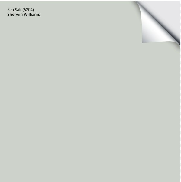
Sherwin Williams Sea Salt SW (6204): Undertones, LRV, & Real-Home Results
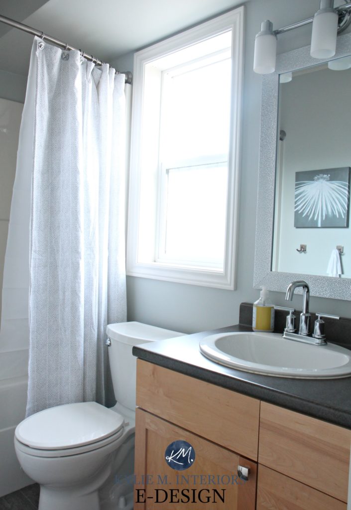
Sherwin Williams Sea Salt is a light, cool green-gray paint color. It works well on interior walls, especially bathrooms and bedrooms.
With its sneaky undertones, Sea Salt can shift in appearance based on exposure, interior lighting, and surrounding finishes.
As far as colors (not neutrals) go, Sea Salt and other beachy-themed paint colors are the most popular with today’s homeowners, for sure. But does that make them good for your home? Let’s find out.
Before we get started…
Not only have I worked with this color daily with my E-Design clients, but I also painted a BIG OLE sample and strapped it to my body for the day (the non-kinky form of body paint). Paint sample on one hip, wine bottle on the other – I was locked n’ loaded! I looked at it in north and south-facing rooms – morning, noon, and night, so I could get a better idea of how it works and then share that info with you.

And let me tell you, I needed that bottle of wine – in a sippy cup. By the time I was done, my brain was swimming with the many ways Sea Salt changed throughout the day. I mean, every color will change on a room-to-room/wall-to-wall basis, but it must be the mix of undertones in this bad boy that makes it the ULTIMATE color ninja.
So, the photos of these rooms are just examples of what you might expect from a color like Sea Salt in various situations – it ain’t gospel, but it might be as close as we’ll get…just call me Saint Kylie.
Ready Betty?

WHAT TYPE OF COLOR IS SW SEA SALT?
While it can read as surprisingly blue, in the core of its tricky little heart, Sea Salt is green-gray. Will it ever look GRAY? Nope, its color will always shine through. Will it look blue? It sure can, in a big way; however, more often than not, it reads as a slightly more green-centric color.
WHAT’S THE LRV OF SEA SALT?
Sea Salt has an LRV of 64, which means it can help a room feel lighter and brighter as it will reflect artificial and natural light into the space, but it’s not so light that it will save a dark room or OVERLY wash out in a reasonably well-lit one.
If you have a dark room, the beauty of Sea Salt will be diminished due to the degree of gray in it, although it still offers a soft, coastal vibe.

What is LRV and How to Use it to Pick a Paint Color
In a well-lit room with a few different exposures (common in open concepts), Sea Salt will likely vary on a wall-to-wall basis throughout the day.

The Best Paint Colors for Dark Wood Trim & Cabinets
WHAT ARE THE UNDERTONES OF SW SEA SALT?
Sea Salt is a mix of water and salt. Mwahaha. Sea Salt is a mix of green and gray. However, while this green might have gray, it also has blue.

That’s right, even though it’s a green-gray, Sea Salt is INFAMOUS for looking blue – and not by a little bit, by a LOT. That’s right, the world’s favorite green-gray paint color is a flasher – and it flashes blue, leaving green in the dust.
- Sometimes, Sea Salt is a beautiful blend of green and gray, but it’s a cool green (green-blue) rather than a warm green (green-yellow).
- Occasionally, it will lean considerably into its green side, more often in a south-facing room or a room with warm light bulbs.
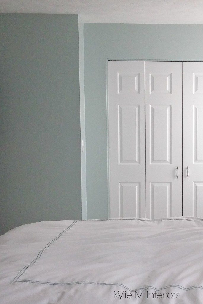
- It’s also well known for going green-blue or blue with only a nod towards green, more often in north-facing rooms with diffused light. Part of the ‘recipe’ for this paint color is a blueish black, meaning it can subtly influence the foundation of this color in the right lighting situation.
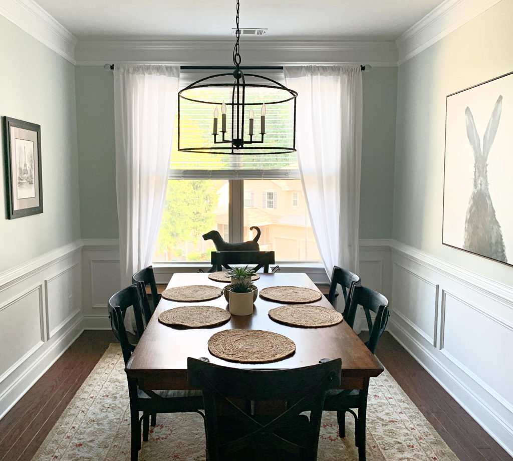
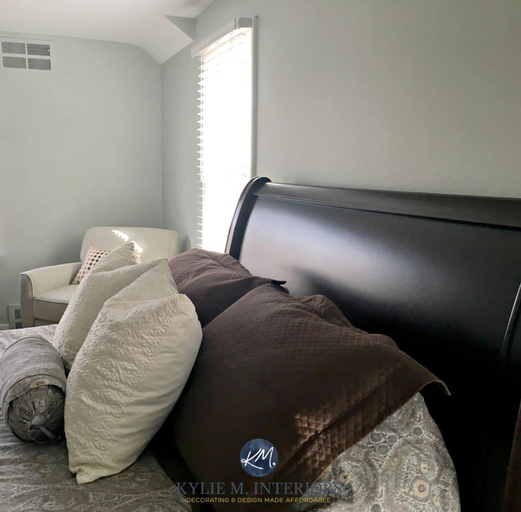
This next photo is as blue as you can expect Sea Salt to look (it RARELY goes this blue…)
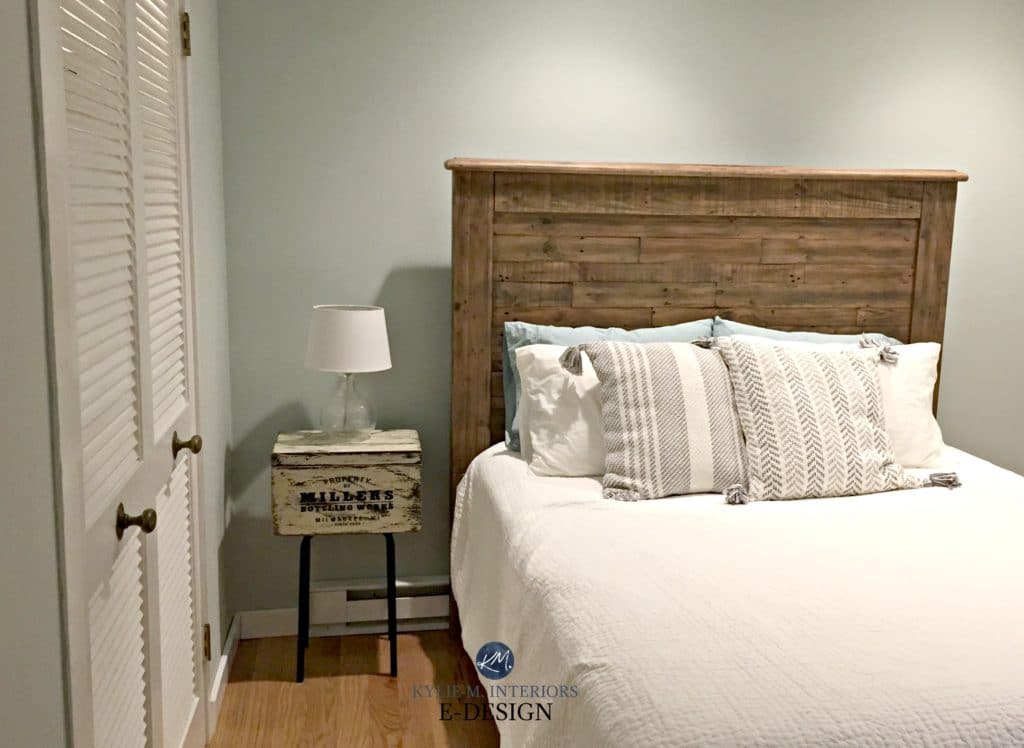
Sea Salt also has the potential to look as green-gray as this next bedroom…
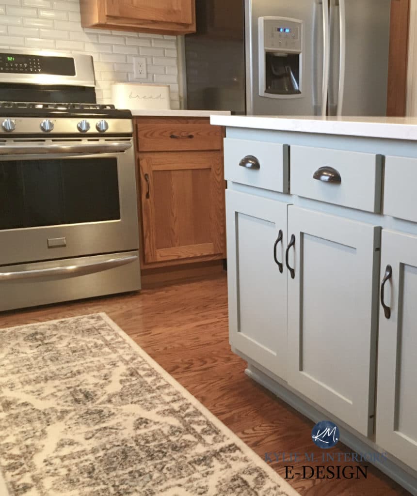
IS SEA SALT A GOOD COLOR FOR CABINETS?
Generally speaking, no. Sure, there’s the odd coastal or country kitchen or bathroom that can pull it off, but it’s usually too non-committal for most finishes and spaces (as a cabinet color).
Get your Peel & Stick sample of Sea Salt HERE!!
WHAT COLORS ARE SIMILAR TO SEA SALT?
While Sea Salt is a creature unto itself, there are several colors you should compare with Sea Salt. It’s the shift in undertones, depths, and temperatures that can help you see why one color is better than another!
Here’s a short list…
- Sherwin Williams Rainwashed for more color
- Sherwin Williams Comfort Gray for more depth
- Benjamin Moore Gray Cashmere for a smokier look
Now, let’s look at a few specifics…
SEA SALT vs. RAINWASHED
I LOVE Rainwashed…almost as much as I love Sea Salt. If you want a bit more commitment to color and blue, Rainwashed could hit the spot. While it’s still a blue-green blend with gray, it has more intensity than Sea Salt.
Rainwashed has an LRV of 59, making it darker than Sea Salt and its LRV of 63. While they’re both in the light depths, Rainwashed has more meat on its bones.
Paint Color Review of Sherwin Williams Rainwashed
SEA SALT vs SILVER STRAND
Sherwin Williams Silver Strand is the perfect color if you want a color that blends blue, green, and gray more evenly than Sea Salt (or Rainwashed). This isn’t to say Silver Strand will look gray; it just has more gray than Sea Salt.
As for depth, Silver Strand has a stormier, smokier look than Sea Salt, not just because of its added gray but because of its LRV of 59.
Paint Color Review of Sherwin Williams Silver Strand
The 8 Best Blue and Green Paint Colors: Benjamin and Sherwin
SEA SALT vs. COMFORT GRAY
Now, we’re comparing apples to apples! Both Sea Salt and Comfort Gray are green-gray blends that can pick up an interesting amount of blue. Where you’ll see the real difference is in depth. Comfort Gray has an LRV of 54, putting it in the light-medium depths. And whereas Sea Salt is a bit iffy on cabinets, this added depth makes Comfort Gray a good option for kitchen islands, cabinets, and bathroom vanities!
WHAT WHITE TRIM OR CABINET COLORS GO WITH SEA SALT WALLS?
If you’re painting your cabinets or trim and need the PERFECT white paint color, I’ve got some beauties for you…
- Sherwin Williams Pure White is absolutely bangin’
- Benjamin Moore’s White Dove is pretty for a slightly softer look
- Sherwin Williams Extra White or Benjamin Moore Chantilly Lace offers a cleaner, crisper contrast
Benjamin Moore Cloud White (below) is as warm as you’ll want to go with Sea Salt…
How to Choose the Best White Paint Color
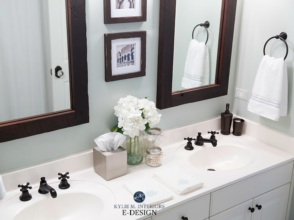
SW SEA SALT WITH MARBLE TILES & COUNTERTOPS
Sea Salt will look beautiful with MOST marble and can be a great option to avoid gray walls or cabinets…
It’s also a fresh, clean look with white…
WHAT COLORS GO WITH SEA SALT?
Oooo, Sea Salt definitely plays favorites when it comes to creating a color palette! Here are some ideas to get you started…
- many light shades of gray look gorgeous with Sea Salt, especially if there LRVs are HIGHER than Sea Salt’s.
- darker green-gray with similar undertone profiles
- muted, flexible, warm off-white paint colors
- many creamy white paint colors
DOES SEA SALT GO WITH CREAM TRIMS & CABINETS
Nope. I’d love to tell you it’s pure magic, but it’s more of a hot mess. Sea Salt is too light and cool to go with cream finishes. You may want to read this blog post.
DOES SEA SALT GO WITH WOOD TRIMS & CABINETS?
Whether you have wood cabinets, trims, flooring, or furniture, Sea Salt can be a gorgeous color partner. Just remember that opposites attract and can strengthen each other, so any red, pink, or yellow stains could look more obvious. Sample carefully and see how you feel.
My next Online Color Consulting client hired me because Sea Salt didn’t look great with her red-orange dark wood trim (I can’t wait to see the after photos!)..

However, some people love this look, so if you love the above combo, fill your little salty boots!

A SUMMARY OF SHERWIN WILLIAMS SEA SALT
There’s A LOT to consider when choosing a paint color – LRV, exposure, personal tastes, and the needs of your home. Trust me, I learn more and more EVERY DAY about how these factors can affect the appearance of a color. Here’s what I’ve learned from this salty color adventure…
- I need to avoid carrying a bottle of wine with me throughout the day—I will then not have any left for the evening.
- Sea Salt prefers to go green rather than blue, but not always.
- If you have a north-facing room that’s bright and you don’t use many artificial lights, Sea Salt may appear slightly bluer.
- Once you add interior lighting (as long as it’s not those stark, harsh white bulbs and catering to a slightly lower Kelvin), the green may return and balance things out.
- If you have a south-facing room, the green may be more apparent as the warm sun rays react to the cool tones of Sea Salt.
READ MORE:
The 8 Best Blue and Green Paint Colors: Benjamin and Sherwin
The Best HAINT BLUE Paint Colors for Your Front Porch Ceiling!
The Best Calm & Stress-Free Paint Colors
NEED HELP?
Check out my Online Color Consulting Services!


ORIGINALLY WRITTEN IN 2018, UPDATED IN 2024


Hi again Gee! You’re right, I think A LOT of people like Sea Salt in theory after looking at it on Pinterest, but then they try it and it’s often either too green or too…toothpasty. A lot of people switch over to the slightly more blue Rainwashed and find a happy place.
Chat soon!
I did the same thing, expecting to love sea salt in my bathroom and ended up with rainwashed. It’s a much better color for my bathroom.
I just painted my bedroom Sea Salt in my north facing master bedroom. While it’ s a beautiful color it always reads blue/grey. I wanted more green. Sigh. So, I’m going to try customizing the Sea Salt at the SW store today. Thank you for your analysis of Sea Salt. Much appreciated!
Finally! You perfectly explained this color! My kitchen and half bath are painted Sea Salt. My half bath gets very little sunlight and my kitchen has north and west facing windows. No one believes me when I tell them they are painted the same color. My kitchen changes from a washed out, muted greenish grey to grey to green depending on the time of day and the way the light hits the walls. My half bath looks more green/blue than grey. It really is an amazing color and I absolutely LOVE it.
I cannot tell you how many times I have googled a color or something related to design, and found myself finding such good answers to my questions here. Thank you for all of your time and effort; it’s appreciated more than you know!
Oh Laura, that is just music to my ears – THANK you for taking the time to let me know!
~Kylie
Thank you for so much info on Sea Salt. My daughter and son-in-law are building a 600 sq foot cottage for me in their backyard. It has cathedral ceilings. I chose Sea Salt for the entire cottage. It looks fabulous. I move in Nov.
From Margie in Boise Id
Hooray, I’m so glad it worked out for you- I would LOVE to see photos!!!
I love sea salt, and this blog was part of what convinced me to use it, twice within the last year! Obviously, every space is different, but here’s my experience using it in two different homes, (one a flip and one I live in), each with very different lighting. It definitely reads more green than gray. Not that that’s a bad thing. While it’s neutral in the sense that it goes wonderfully with most other colors, it’s not a neutral the way beige or a true gray would be. If you’re aware of that, and okay with it, it’s a great color! Light without being washed out, and changing throughout the day while always staying pretty.
I’ve always been a color person – when I bought my first house in my twenties, I got to work painting in many different colors. By the time we sold it ten years later, trends had changed, my tastes had matured, and I wanted to go more neutral in my current home while still being true to who I am. Enter sea salt in my kitchen. It’s like the guest at the fancy party who fits in, but is just a bit more fun and less stuffy than the rest of the guests. Classy without being boring, if you will.
The last thing I will say is that it goes great with various colors of wood, as well as black and white. In the house we flipped, we used it in a kitchen with white cabinets and backsplash, black countertops, and dark wood flooring. It was gorgeous, and the one room I painted in a color that wasn’t taupe or cream. For my home’s kitchen, we moved into a medium oak museum…lots of tall oak cabinets as well as flooring in a similar tone. The sea salt really tied all that wood I together. It’s a color that makes other colors around it really come to life, and I love that.
I love notes like that – it helps others figure out what they can expect – thank you!
I am looking for a green/gray color to paint my home’s exterior. The salesperson at the SW store recommended Sea Salt with Extra White as the trim. My house is in south Florida with the front having full southern exposure. Lots of sun all year. Would this color work? I haven’t seen any photos of Sea Salt used as an exterior color.
Hi Laura, Sea Salt is beautiful! I’ve yet to use it on an exterior as my clients are often looking for a slightly more subtle/grayed out look. I do have an E-design package for exteriors, and this way I can take a look at your home/roof/stone/etc.. and come up with some good solutions for you! https://www.kylieminteriors.ca/product-category/exterior-paint-palettes/
~Kylie
Kylie your natural ability with color , incredible and sensible color knowledge and witty posts along with several rooms showing a certain color keep me coming back for more. I stumbled across your blog when I was introduced to Pinterest (oh the addiction!) and think you’re the best. Some people have more taste in their mouths than they do as consultants. But you’re uncanny with your skills. I wish there was an online “book page” that you could catalogue your room photos of different paint colours. Thankyou!
Well Heidi, what a fabulous note to get – thank you!!! Now tell me more about this ‘wish’ of yours – an online book page with a catalogue of colours… you have my wheels spinning…can you explain anymore??? If you need to drink wine before explaining that is okay, that’s what I usually do…
~Kylie
hi, i’m having a dilemma about what color to paint an adjoin master bed and bath. I wanted to paint the bathroom sea salt, but I need to also paint the cabinets b/c they are old 80s. I wanted to paint the cabinets oyster bay, but is that enough of a contrast between the walls and cabinets? if that’s not enough of a contrast, should I paint the wall a white and then do the oyster bay cabinets? the bathroom is huge and the cabinets, trim, tile, tub is all white. I’m not sure what color to paint the master bedroom either. our furniture is all dark cherry and it’s on the front of the house, so the bedroom gets a lot of natural light. any suggestions? thanks so much!
Hi Ann, it sounds like you have a few different thoughts going on there. I do try to offer as much complimentary info as I can on my site, and if that doesn’t work it might be time for a closer look via my E-design, it’s affordable and fun! https://www.kylieminteriors.ca/online-decorating-design-services/
~Kylie
I must first tell you how faithful I am in listening to your advice. I painted my family room and hallway based on your color expertise. (Accessible beige & Wool Skein) I am now on to my kitchen and have run into problems with Sea Salt. I love the samples and posted online pictures but my color samples places do not look green, but rather blue on all the walls I have tried. It looks bluish at all times of the day and night. The room has a combination light exposure of Northeast. The cabinets are off white. The walls currently have a yellow color and I am wondering if the current color yellow is what is changing the shade of the Sea Salt to a blue. I need help. I really want a greenish gray with a tinge of a blue undertone, not blue gray. Should the walls be primed to eliminate the current yellow or is that not the problem? Thank you sooo much!
Ooooo, you are under the curse of Sea Salt! I can be a bugger. Hmmm. Tinge of blue, rather than a commitment. I almost wonder if you need to choose a gray/green and then look at your exposure to do some of the blue work for you (subtle but true). Check out SW Conservative Gray, see how it settles for you. I thought about Aloof Gray but it might be TOO cold. I hope that helps! Oh, as for the yellow – YES it can affect things (but would be MORE likely to make things a wink green, rather than blue I would THINK. And yellow is also the strongest colour, so I might prime. Also, rather than putting the samples on the wall, get a nice big poster board and paint 2 coats of the sample on that. Leave a 2″ white border to really separate the sample from the wall colour. This can help a lot!
Hi! Love this! What color did you use for the grey cabinets? That’s the color I’ve been on the hunt for!
Hi Stephanie, you know what’s funny as I think it’s just the shadow/camera work making it look gray – i”m pretty sure they are white! For a look kind of like that, you could check out SW Repose Gray perhaps?
Hey there from Tennessee! I’m pretty set on Sea Salt for my whole main living areas of my house. As they can all be seen together from the front door. Cathedral ceilings with white washed logs to go with. SO here’s my question, what finish of paint is best for this chameleon color? Also note I have lots of kiddos. If that changes your mind on finishes. 😉 Any advice is greatly appreciated, I am buying paint tomorrow. (fingers crossed it’s the right one) Hope to hear from you before then.
Hi Ashley! I’ve found that the Cashmere line in the eggshell finish is nice and washable. It’s an eggshell finish, a wink shinier than what I consider a normal eggshell, but great for the little nuggets running around!
I too am thinking of Sea Salt for my main living areas – would love to see your pics when it’s done!
I’ve had a sample of sea salt on my wall for a few months now. Sometimes I like it. Some days it just looks dreary. Is Rainwashed a brighter version of this color? I want my front living room to be cheery, but not nursery blue.
Hi Joni! Yes, Rainwashed does have a bit more colour to it and ‘SHOULD’ have enough green in it to not look nursery blue, although it does lean considerably into blue over green… 🙂
Please help. We’re just about to do our laundry room;
zero natural light ! … Glazed cream cabinets, oil rubbed bronze hardware. I’m thinking of sea salt. (Or oyster bay, if not too deep or dark?) Or? ( Grey metal -ish W/D). New light fixture …
* (this is the kind of laundry room you walk through to get to the garage from house/hall)
I want paint to pop but compliment the cream cabinets but not get lost, or look dirty or dingy…. I’m afraid of too grey, or too anything.
Hi Leia! Thank you for asking! I actually have an e-design business just for questions like yours – otherwise, I’m guessing as to what your room REALLY looks like. I do try to give as much complimentary, helpful info on my blog as possible, and if that doesn’t work, it just might be time for me to take a look! https://www.kylieminteriors.ca/online-decorating-design-services/
~Kylie
I am looking for a Color that will go on an an accent wall. All other walls are stone isle by SW
The room is south facing. I am looking for blue tones.. Have looked at sea salt but think I should go darker. Any suggestions
Hi Sandra! when it comes to personal questions, I do refer to my E-design! I try to give as much helpful free info as I can on my blog and if that doesn’t help, it might be time for a closer look, otherwise, I’m totally just guessing as to what your room REALLY looks like. If you’re interested, the link is here, I’d love to help! https://www.kylieminteriors.ca/online-decorating-design-services/
~Kylie
Hi Kylie,
Would sea salt work with cream colored kitchen cabs? ( Yellow).
Counter tops are basically rich dark brown ,Cambria quartz ( laneshaw). Rectified porcelain floors ( golded/ (yellow). Lots of natural light from North and west. My hubby loves edgecomb . But I love cool colors! He’s a warm color guy.
We are clashing! ????
Kindness,
Holly
Hi Holly, my first instinct is to say no. Only because if the cabinets are quite cream (and cream is a yellow base colour) it would bounce off of the cool colour of Sea Salt. The Sea Salt will make the cabinets look more yellow and the cabinets will make the Sea Salt look more green/blue! 🙂
Glad I saw this, I was thinking of staying with the SW Concord Buff in the bedroom and painting the rest of the house Sea Salt. What is a color that would go with Sea Salt to keep the house cohesive ?
Question: how would you compare this Sea Salt with BM’s colour of the year, Metropolitan? It seems that Benjamin Moore piggy backed on the popularity of sea salt by coming up with their very own greedy gray with a wink of blue…
Hi Henriette! Well, you can rest easy knowing that they are really quite different! Sea Salt is a light green-gray, but it’s a green-gray that LOOOVES to flash into blue. It never looks ‘gray’. Metropolitan is more of a soft, muddy warm gray that can pick up the cool undertones, but is quite uncommital – it can really shift depending on the exposure of the room.
I bought this cute brick bungalow that will soon be my new office and I really want to paint every room in Sea Salt.
I hope the colors are less mint and more warm green blue and grey.
We plan to start painting next week and uncover the hardwood floors after that. ????
Hi Kylie, New to your blog. I’m an artist, so my sensitivity to nuances of color is pretty high :). We just bought a brand new home, all painted Agreeable Gray. I’m not 100% loving it though. I found Sea Salt in terms same SW palette, and that eventually led me here. Thank you for such a thorough discussion of this color.
I guess my concern centers on the warm colored tiles throughout the home, and my generally earth-toned furnishings we will be bringing in (think dark greens, reds, golds). Sea Salt looks like a good choice in my bedroom though, where I have Shabby Chic light blues, whites, pale greens and touches of teal.
Hi Stephanie, thank you for writing! Okay, so I would recommend doing a room or 2 at a time, transition out of it a bit. You might find that you like Agreeable Gray MORE in some rooms and less than others. If you give yourself a bit of visual relief from it, you might find it more liveable. If it helps, I LOVE Agreeable Gray, but agree that it wouldn’t be a colour I could live with on a large scale. And Sea Salt is a GREAT colour to transition out to, you’ll find it can REALLY shift from blue to green to blue-green, so expect some flexibility there! 🙂