
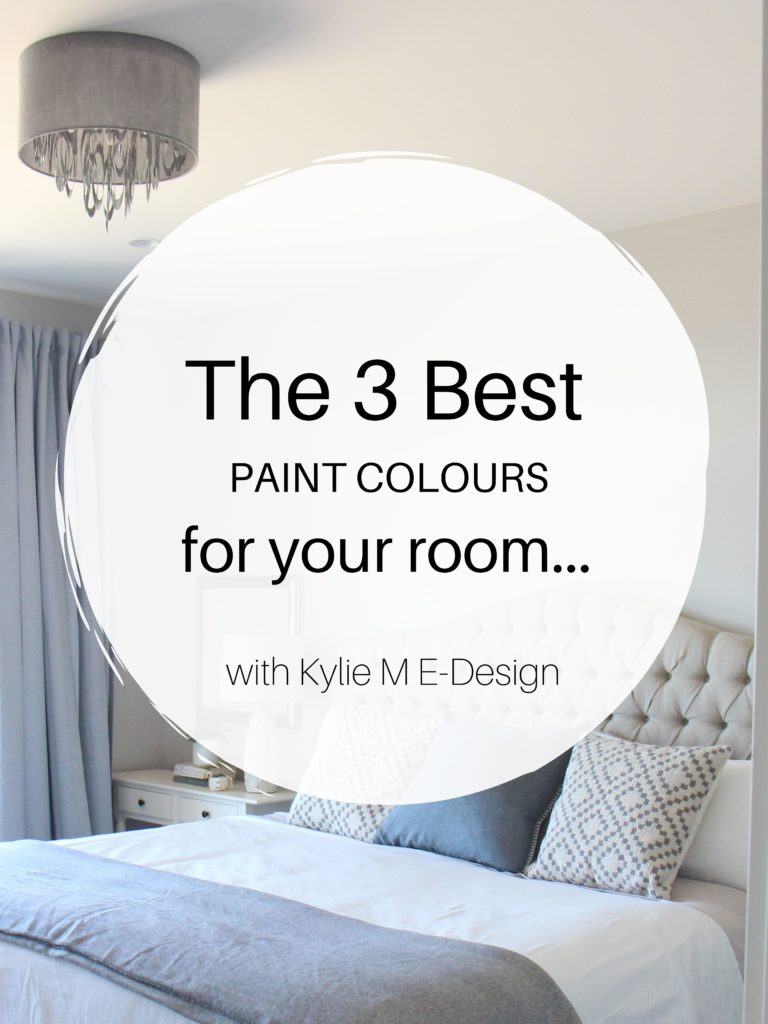
The 10 Best Light & Calming Paint Colors for Stress & Anxiety
The Top 10 Soul-Soothing Light Paint Colors for Any Room
Benjamin Moore & Sherwin Williams
With everything going on in this wild world, I think we could all use some stress reduction via wine, a funnel, and a massage from Ryan Reynolds (or Blake Lively, depending on your preferences—I’ll take either). And nothing reduces stress like picking paint colors—RIGHT? Said nobody ever.
Seriously, though, one of the best ways to create a calm environment is to wrap yourself in a color that soothes your soul—a color that reduces your heart rate and makes you take a deep breath just sitting in it—I mean, not literally sitting IN the paint (I’ve yet to try it, but it could work). Once you’ve got that magical color, you only need a good book and some good company—maybe even a handsome fella like Doug.

Now, of course, there are psychological reasons why some colors are more calming than others. But we all know I’m psycho enough as it is, and there’s ALSO something called PERSONAL PERCEPTION. For example, in some circles, pink is a stress-reducing color. PERSONALLY, it makes me twitch, and if I painted my room pink, it would only increase my stress level, and I might have to cover up those pretty pink walls with some padding to BANG MY HEAD AGAINST. But hey, if you love pink, I can give you the prettiest pink out there.
Also, as a Color Consultant with ADHD and anxiety, I’m not just making this stuff up. And while I also love dark colors, this blog post is geared towards the lighter end of things for mass appeal. When you’re done, check out this blog post too: How to Choose Paint Colors When You’re An Overthinker (also linked at the end of this article).
I can’t guarantee these colors will make YOU PERSONALLY feel more stress-free (although I hope they will). I’m here to get the creative juices flowing to get you thinking about what your best stress-free space could look and feel like.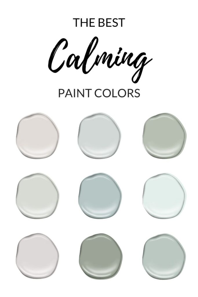
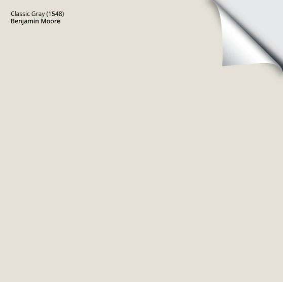
1. BENJAMIN MOORE CLASSIC GRAY OC-23
Classic Gray is a favorite neutral of mine, and I don’t even like its undertones, which speak to the power of the right color in the right room. Classic Gray is an off-white warm gray with a soft, gentle purple undertone. In our last home, I painted our main bathroom with it and loved it. I’ve got it in our guest bedroom in our current home (which I don’t have a super fab photo of yet).
FUN FACTS ABOUT CLASSIC GRAY
- Classic Gray has an LRV of almost 75, so it’s at the start of the off-white range. It gives a softer, more subtle contrast with white trim.
- Because of its undertones, Classic Gray can go SLIGHTLY purple-pink without 100% commitment.
- Classic Gray is a hit with the average home builder (and home stager) as it has TONS of mass appeal.
Not sure what LRV is? THREE SLAPS WITH A WET NOODLE! Just joking (kind of), but you may want to read THIS.
FULL Paint Color Review of Benjamin Moore Classic Gray
COLORS THAT ARE SIMILAR TO CLASSIC GRAY
- Benjamin Moore Silver Satin
- Sherwin Williams Modern Gray
- Benjamin Moore Collingwood
- Sherwin Williams Egret White
Get your PEEL & STICK SAMPLE OF CLASSIC GRAY
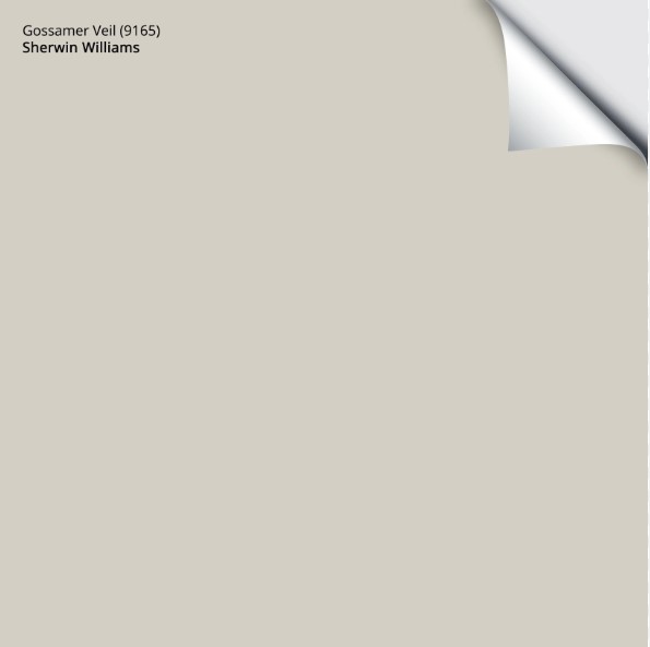
2. SHERWIN WILLIAMS GOSSAMER VEIL 9165
Gossamer Veil is a beautiful approach to gray. With its soft green undertone and a decent dollop of warmth, it reads as a warm gray or greige, depending on its environment.
FUN FACTS ABOUT GOSSAMER VEIL
- While Gossamer Veil isn’t brand new, it’s not one of Sherwin’s original colors.
- Gossamer Veil has gentle green undertones, but they’re not so subtle that they disappear—they usually show up to the party.
- With an LRV of 62, Gossamer Veil is a light-depth color that’s RIGHT on my magic number.
FULL Paint Color Review of Sherwin Williams Gossamer Veil
COLORS THAT ARE SIMILAR TO GOSSAMER VEIL
- Benjamin Moore Light Pewter
- Sherwin Williams Drift of Mist
- Sherwin Williams Crushed Ice
Get your PEEL & STICK SAMPLE OF GOSSAMER VEIL
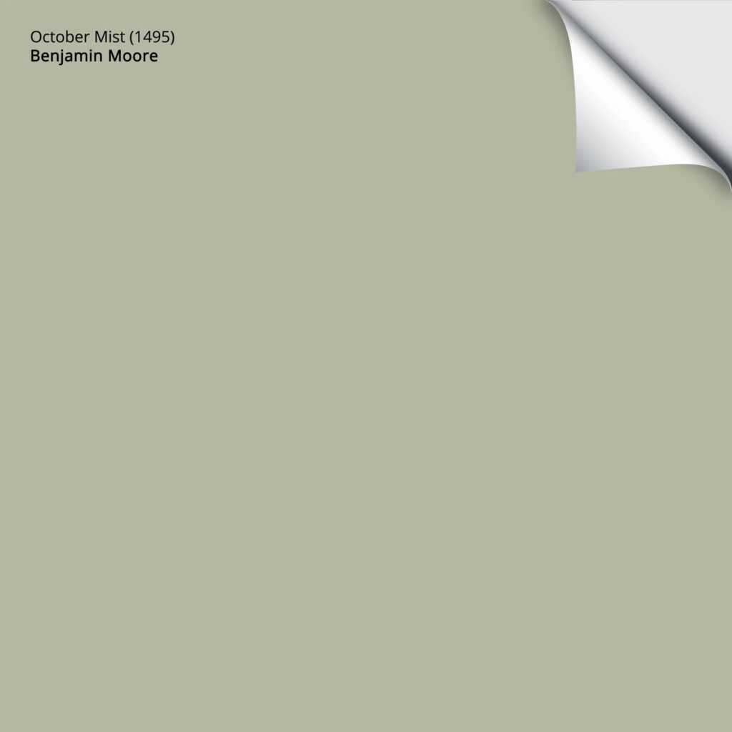
3. BENJAMIN MOORE OCTOBER MIST CC550
October Mist is one of the most beautiful (and popular) calming green paint colors. This isn’t just because of its depth (LRV of 46.54). October Mist is a green with a decent amount of gray in it (a slightly warm gray), which takes the edge off the green, leaving you with a gently infused shade of sage.

Apparently, green is one of the best paint colors for those with anxiety (myself included, as green is my go-to). However, blue is also popular for those needing a calmer environment. Just remember, paint colors are subjective to who is looking at them; it’s important to find colors that speak to you emotionally, not just colors that the experts say are what you need.
FUN FACTS ABOUT OCTOBER MIST
- October Mist is a WARM green, although it can look slightly cooler than traditional, olive-inspired greens.
- October Mist was Benjamin Moore’s Color of the Year for 2022 (and is quite similar to the equally pretty Sherwin Williams COTY Evergreen Fog).
- If you’re looking for a white trim color to suit October Mist, there are TONS of gorgeous options, including Benjamin Moore White Dove and Simply White.
Benjamin Moore’s Best Green Paint Colors
COLORS THAT ARE SIMILAR TO OCTOBER MIST
- Sherwin Williams Softened Green (is greener than October Mist)
- Benjamin Moore Horizon Gray
Get your PEEL & STICK SAMPLE OF OCTOBER MIST
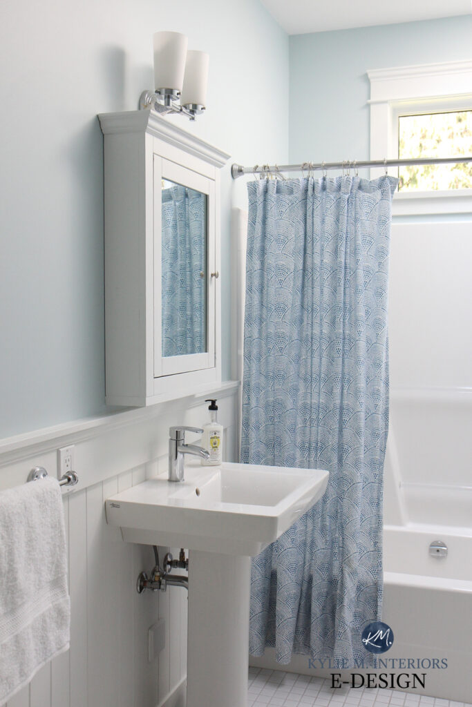
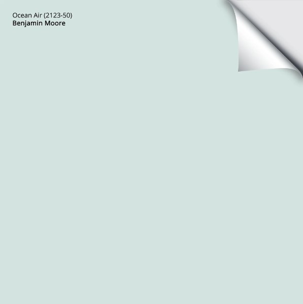
4. BENJAMIN MOORE OCEAN AIR 2123-50
Mmmm, Ocean Air. I can smell it right now—literally, as I live on an island. Really, though, I take a deep breath just looking at Ocean Air. It’s a light blue with a touch of green and a more passive gray backdrop, leaving more color on the table (or on the wall, which would be more the point).
FUN FACTS ABOUT OCEAN AIR
- Ocean Air has an LRV of 73, leaving it sitting pretty in the off-white world.
- Ocean Air is a relatively clean color. It DOES have gray, but considerably less than a color like Mount Saint Anne.
- Ocean Air could be perfect if you like a cheerful but not baby-blue approach to color!
The 2 Types of Blue Paint Colors – Which One Do YOU Love the Most?
COLORS THAT ARE SIMILAR TO OCEAN AIR
- Benjamin Moore Gossamer Blue
- Sherwin Williams Sky High
- Sherwin Williams Topsail
- Benjamin Moore Summer Shower
Get your PEEL & STICK SAMPLE OF OCEAN AIR
NEED HELP? Check out my ONLINE PAINT COLOR PACKAGES!
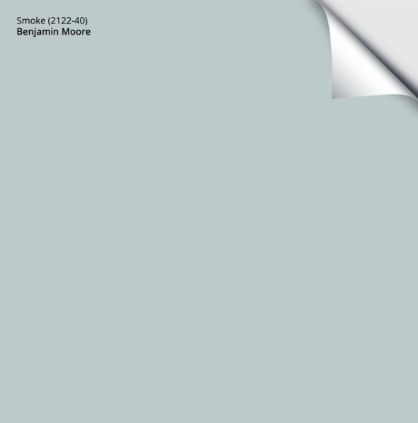
5. BENJAMIN MOORE SMOKE 2122-40
I love Smoke, and I wish I had a photo of it for you, but it keeps disappearing into thin air… get it? Anyway. Smoke is on the blue-green side of things, but ONLY slightly. It also has a soft gray backdrop, which is the backbone of this calming color.
FUN FACTS ABOUT SMOKE
- Smoke has an LRV of 56, so it’s a light-medium-depth paint color. It offers a bit more contrast and body against traditional white trim—I recommend Chantilly Lace.
- If you have a north-facing room, Smoke could be a wee bit chilly, so you might want to check out a few other options.
The Best Blue-Gray Blend Paint Colors
COLORS THAT ARE SIMILAR TO SMOKE
- Sherwin Williams Niebla Azul
- Sherwin Williams Sleepy Blue
- Benjamin Moore Wales Gray
Get your PEEL & STICK SAMPLE OF SMOKE
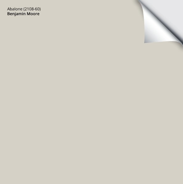
6. BENJAMIN MOORE ABALONE 2108-60
If you’re a fan of purple, Abalone is a great way to nod towards it without going full-out Barney. Abalone is a light-depth warm gray, so it’s a gray with brown in it, with a purple undertone that is subtle but noticeable.
FUN FACTS ABOUT ABALONE
- Abalone has an LRV of 63, which is DAMN close to my magical LRV number! With an LRV of 63, it’s a light-depth paint color.
- If you’re sensitive to purple undertones, DON’T pick this color—it’s not messing around.
- Abalone is a romantic, calming color well-suited to bedrooms and bathrooms.
FULL Paint Color Review of Benjamin Moore Abalone
PAINT COLORS THAT ARE SIMILAR TO ABALONE
- Benjamin Moore Barren Plain
- Sherwin Williams Popular Gray
- Benjamin Moore Collingwood
Get your PEEL & STICK SAMPLE OF ABALONE
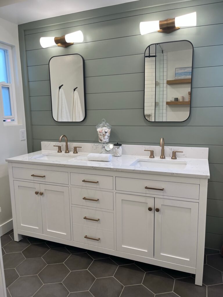
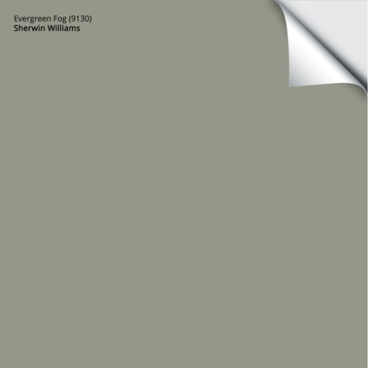
7. SHERWIN WILLIAMS EVERGREEN FOG 9130
While Evergreen Fog is a slightly darker shade of green, its appeal for a relaxing, calming vibe is undeniable.
Evergreen Fog isn’t overly cool looking, making it a versatile choice. Its LRV of 30 makes it a great choice for accent walls, exteriors, kitchen cabinets, and even entire rooms.
FUN FACTS ABOUT EVERGREEN FOG
- Evergreen Fog was Sherwin Williams’ Color of the Year for 2022 and is STILL a popular choice.
- If you want to paint your kitchen cabinets a trendy green but don’t want to go overboard, Evergreen Fog could be your color.
- Lighter shades of Evergreen Fog include Austere Gray and Conservative Gray, which are also calm, relaxing shades of green-gray.
FULL Paint Color Review of Sherwin Williams Evergreen Fog
COLORS THAT ARE SIMILAR TO EVERGREEN FOG
- Benjamin Moore October Mist
- Benjamin Moore Vale Mist
- Sherwin Williams Acacia Haze
Get your PEEL & STICK SAMPLE OF EVERGREEN FOG!
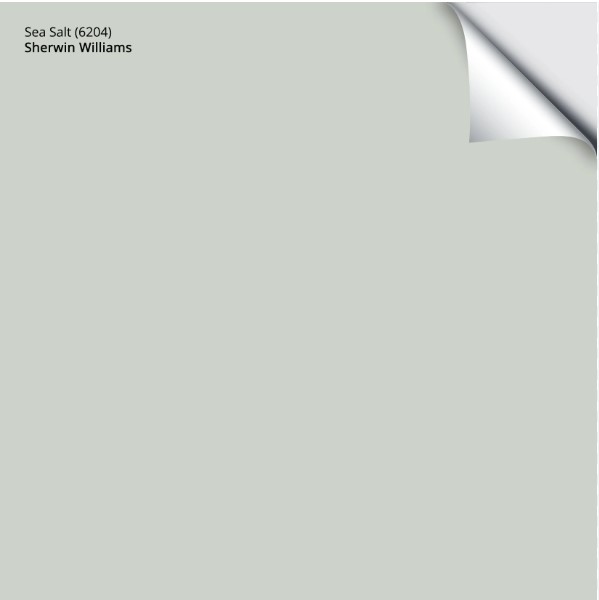
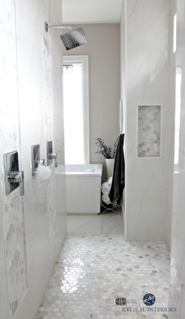
8. SHERWIN WILLIAMS SEA SALT SW 6204
This one should come as no surprise to those in the color world. Sea Salt is a GLOOORIOUS green-gray that OFTEN disguises itself as a blue-gray. It’s SO unpredictable that, more so than other colors, you need to sample it carefully to ensure it looks how you expect.
Sea Salt is surprisingly blue in some rooms, as shown in this playroom…
However, in other rooms, Sea Salt looks FAR more green (encouraged by the low KELVINS of the lighting), with only a whisper of blue to be found…
Paint Color Review of Sherwin Williams Sea Salt
FUN FACTS ABOUT SEA SALT
- It’s FABULOUS on potato chips.
- It is a green-gray paint color that easily flashes into blue-gray but rarely looks like a ‘gray with undertones.’
- Sea Salt is a popular choice for bathrooms and guest bedrooms.
- Sea Salt is also a hit with home buyers.
- Sea Salt could hit the spot if you want a touch of color without being slapped in the face.
Get your PEEL & STICK SAMPLE OF SEA SALT
COLORS THAT ARE SIMILAR TO SEA SALT
- Sherwin Williams Comfort Gray is like a slightly darker version of Sea Salt.
- Benjamin Moore Smoky Green
- Benjamin Moore’s Quiet Moments
- Benjamin Moore Gray Cashmere
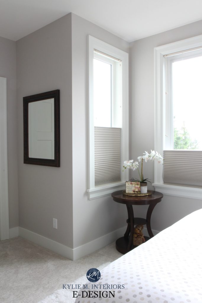
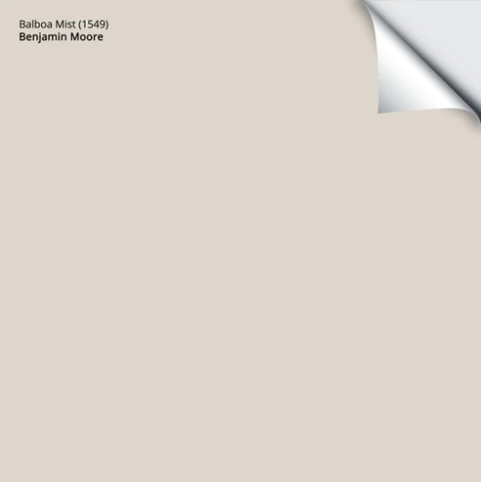
9. BENJAMIN MOORE BALBOA MIST OC 27
Balboa Mist is similar to Classic Gray, but it’s a bit darker while still having a soft, feather-light look. You’ll also find violet undertones in Balboa Mist that can show up more in north-facing spaces than in southern ones.
Balboa Mist is popular in today’s homes as it suits a wide range of white quartz countertops and other trendy finishes, including some from the early 2000s.
FUN FACTS ABOUT BALBOA MIST
- Balboa Mist has an LRV of 67, which will offer a nice contrast with white trim while still looking soft and subtle (I recommend Chantilly Lace).
- Balboa Mist can wash out if your room is OVERLY bright, but it will regain itself once the light is more muted.
- It has slightly purple undertones and can slide JUST slightly purple-pink, but not by much.
Paint Color Review of Benjamin Moore Balboa Mist

The Best Paint Colors to Update Wood Trim, Cabinets, & Flooring
COLORS THAT ARE SIMILAR TO BALBOA MIST
- Benjamin Moore Collingwood
- Sherwin Williams Popular Gray
- Sherwin Williams Alpaca
Get your PEEL & STICK SAMPLE OF BALBOA MIST
And I TOLD you I’d give you the prettiest pink out there, so here it is…
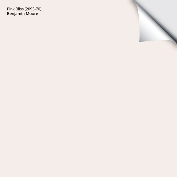
10. BENJAMIN MOORE PINK BLISS 2093-70
Pink Bliss is a light, soft pink paint color. It’s not baby powder pink – but it’s close in my books as it’s a delicate and gentle shade of pink.
FUN FACTS ABOUT PINK BLISS
- Pink Bliss has an LRV of 84, so it’s right up there in the off-white range – soft and simple.
- Pink Bliss is one of Benjamin Moore’s top-selling shades of pink.
- While you won’t find Pink Bliss on many front doors or accent walls, it’s a popular shade for kids’ rooms or adults who want a pretty, gentle color on their walls.
- Also a great stripper name (wink wink).
COLORS THAT ARE SIMILAR TO PINK BLISS
I’d love to show you a comparable Sherwin-Williams pink, but they don’t have any that come even close.
- Benjamin Moore Mellow Pink
- Benjamin Moore Frosted Petal
- Benjamin Moore Pink Swirl
Get your PEEL & STICK SAMPLE OF PINK BLISS
THE TOP 4 CALMING PAINT COLORS
While colors are subjective to those who see them, these are the top shades known to reduce anxiety and stress in the average person.
- GREEN (The 10 Best Light Shades of Green)
- BLUE (The Best Blue-Gray Paint Colors)
- VIOLET (The Best Purple Paint Colors)
- PINK (The Best Pink Paint Colors)
READ MORE
The Best Paint Colors For a Calm, Focused Home Office
How to Choose Paint Colors When You’re an Overthinker Like Me
Sherwin Williams Upward: Color Review (Color of the Year 2024)
The 8 Best Blue-Green Paint Colors
6 Budget-Friendly Home Update Ideas
NEED HELP?
Check out my Online Paint Color Consulting packages – I’d love to help!
Chat soon and stay healthy,

ORIGINALLY WRITTEN IN 2020, OVERHAULED IN 2024


Kyl ie, I painted a large bedroom (it has a window on the east and a window on the.south sides of my home) SW Aleutian. I cannot tell you how gorgeous it came out! Everyone raves about it, including the painter I used. The most beautiful color in exactly the right room. Try it if you ever get the opportunity. Oddly, my daughter is now living in a home that has the same color in a living room that has very little light due to a porch – the color is dead dead dead! I couldn’t believe it was the same shade until I held up my paint fan, but sure as shootin’, it is. Hideously drab color when there’s no light. She cannot wait to get a different shade up on the walls!
Hi Nancy, yes, Aleutian IS a super striking colour! And yes, those darned porch overhangs can kill almost ANY colour, so she’ll also want to supplement with some good interior lighting to help a colour along 🙂
Thanks so much for this post! I always look forward to your posts and was so glad to see this one. I painted my powder room BM Mineral Alloy in November and cannot a get used to the color. I know I want a blue—-lots of white wainscoting. I will be checking out your suggestions for the next two months…????. BTW, I am painting my LR and the moulding in my DR SW Accessible Beige during this stressful time. I picked this color for my foyer/hallway after checking out all your suggestions on your many posts. Love this color, works
So well with new flooring and older items I have to love with right now.
Great post and good timing! Thank you Kylie, makes it feel like things are just… normal! Love all these choices. Now, I know you have a hate in for pink but I have to say I feel very cozy and calm in my midtown Toronto apartment painted in Behr “Malted” A grayed down Bandaid pink paired with white trim, deep navy bedside tables, gold lamps and some dark wood (husband). Love it!
Thank you Kim! I know…there are pink lovers out there and while I see the beauty of it, it’s just not my jam, but I’m GLAD it’s yours – there is a colour for everyone!
Also, that pic of Doug the dog gave me a big smile. He looks so happy go lucky. Great picture.
Kylie, I enjoy your posts and I learned a LOT before I chose a paint color for my main living areas. SW Sea Salt is my calming color. Sometimes it looks green (but a nice green – no pea soup) and then I can be standing at my kitchen sink looking into the living room during afternoon when the sun has moved to the other side of the house, and it looks gray. I just had my master bath painted Sea Salt too. Lots of light there, and it looks beautiful.
Thank you so much Kim! This is so helpful. Not surprising , I have looked at so many of these colors because I want a soft, calm palette in my home. Thank you for the quick and dirty of the not as popular colors. You mentioned BM beach glass. What are your thoughts on this color? Stay healthy everyone!
I painted my bathroom in Beach Glass and i absolutely love it. It looks great with the white cabinets and floors. It’s a beautiful shade.
Thanks Bert! Does beach glass look more blue or green or grey? East exposure room so I don’t want it to look dark. Now between beach glass and bm silver marlin. Thanks!
Perfect timing! Thank you! I think BM Ocean Air is beyond dreamy! How do you think it would play with old yellow/orange oak floors?
Hi Lisa, it could be lovely! They would bounce off of each other, as opposites attract and make each other look stronger. If you wanted to DOWNPLAY your oak, well that might not be the best approach, but overall, I think the combo could be very pretty!
I am trying to update my kitchen without changing our Uba Tuba countertops. The backsplash and floors can be changed eventually so it’s a nonissue.. My kitchen faces northeast but I get some light in from all directions. Wall cabinets will be BM White Dove, Grassland is on the walls and Uba Tuba on the counters. I want to put a little color on the island because I think the Uba Tuba and all that white might be a little much for me. Would the undertones of SW Krypton on the island cabinets work well with the Grassland, White Dove, and UbaTuba. Thank you so much for your input! I have loved your website!
Hi Kris, I’m feeling like Krypton could be a bit too light and could also compete quite a bit with Grassland 🙂
Hi Kris,
I love reading this article – very good information and choices of color. I have a question; I love SW Sea Salt (looking to find a right green-blue-grayish wall color) but worry that it might be too much of a color to use in a living room and a dining room area (open concept, one big area). I don’t want the wall to look too much green or blue. Any suggestions? The painter I hire only want to use SW colors. Thanks.
Emily
Hi Emily, this is a VERY good thing to think about, and something I remind my clients of often. If you’re already a bit concerned, I wonder if you might be a bit more comfortable with the likes of SW Silver Strand or Lattice perhaps???
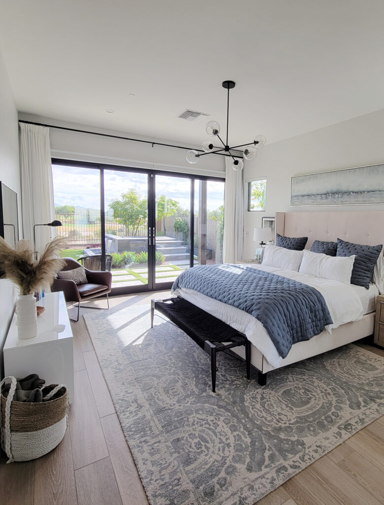
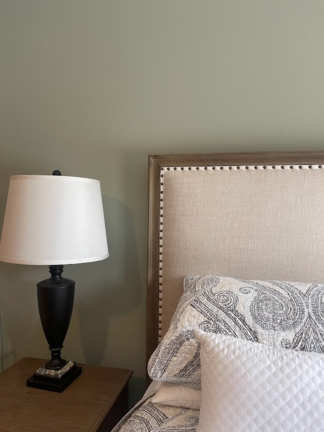
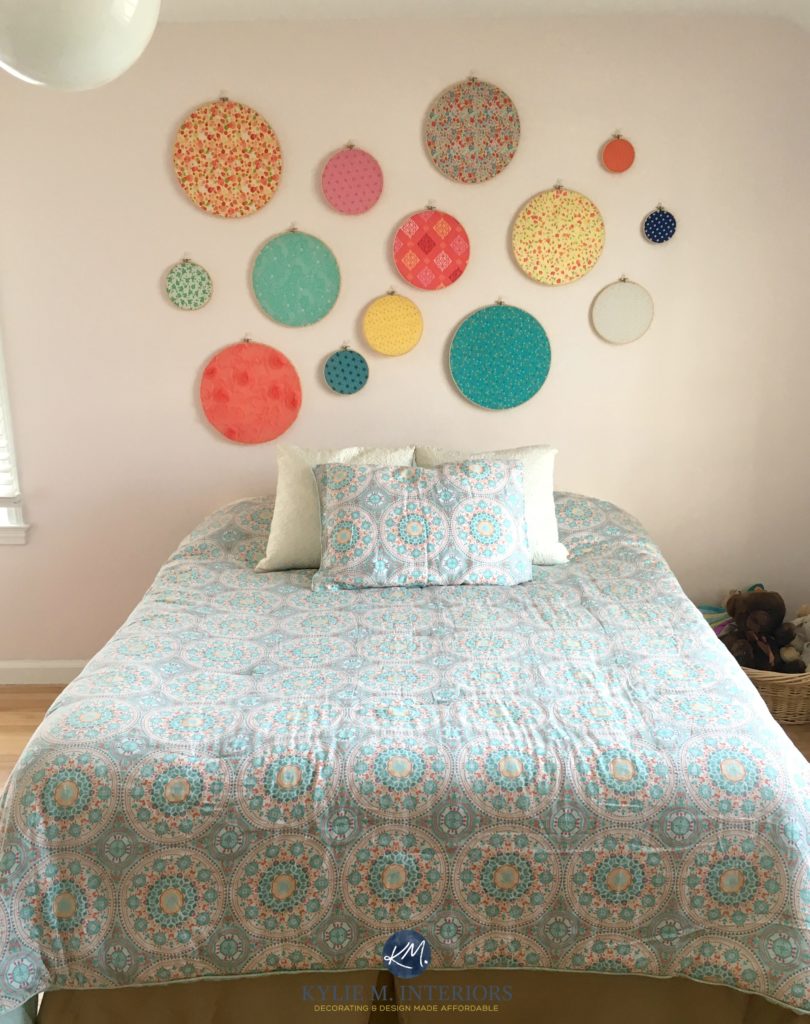
Hi Kylie, I love the paint colour at the top of this post. The one with the white bedspread What is the colour called?
Ahhh, good choice – that’s Benjamin Moore Woodlawn Blue 🙂
I used BM Ashwood in our bedroom . Both north & western facing windows. It is a VERY soft pale greenish gray. BM Simply White trim.
It is so pretty & calming. Beautiful with linen bedding, linen upholstered bed & chair. Used soft ivory silk drapes. Painters, plumbers, carpenters & workers (men) all said it is one of the prettiest rooms they have seen! Ashwood doesn’t show up often on lists but is seriously worth looking into.
Hello Kylie. New to all things decor, including paint, without the tiniest knack or gift for it so I have a great appreciation for all the time & effort you give here. Thank you. Do you know of anything available int the U.S. that is comparable to “Sunday Soul” by Coat Paints?
Hi Sheri, I’m not at ALL familiar with Coat Paints – I’ve never heard of them! Now, this is just me looking at the color online (where looks can be deceiving), but you might check out the likes of SW Versatile Gray/Popular Gray – basically taupes (or VERY warm grays) with a violet undertone. I hope those get you on the right track!
Really like your blog. The humor mixed in, too funny. I have a new build and so lost on what color to use through house
I have used sea salt less 50% in last home, and that also becomes a gorgeous color.
I want light colors in my open kitchen/living room but designer friends say greige. Just don’t like those colors.
Your suggestions are terrific!
I’m so glad you love it! Remember, at the end of the day, it’s YOU that has to love your home. Now, I personally love a whole range of colors. If I were in your situation, I might consider a mix. For example, a soft neutral like SW Egret White or Classic Gray in the main living areas, and then some colors that you LOVE in all the secondary rooms – family rooms/bathrooms/bedrooms/etc…
You can also add personality on interior doors (especially the inside of your front door or french doors!).
I hope this helps a bit :).