
The Best Medium to Dark Teal (Blue-Green) Paint Colors
An Aqua or Teal With Appeal For Every Room…
While trends ebb and flow, there’s one color that stays strong – teal. While it might vary in depth, blend, and intensity, no matter what’s in style, you’ll always find some blue-green blend on the average home’s walls, cabinets, doors, or accents.
BUT WHAT’S THE APPEAL OF TEAL?
- Teal is a blue-green blend. The most popular colors have a decent degree of gray and depth (e.g., LRVs lower than 30).
- Most people see teal as a darker blue-green blend, but some see it as ANY depth of blue-green.
- Teal is often seen as beachy, rejuvenating, and relaxing; however, that’s open to perception.
- Aqua is seen as a brighter, more colorful take on teal.
For the purpose of this blog post, we’re focusing on the medium to darker end of the teal world (lighter versions are HERE) and where these colors look best…
THE BEST PLACES TO USE TEAL PAINT COLORS…
- As an accent wall with a more moderate neutral on the remaining walls.
- On all the walls in a room for an enveloping look.
- For a contrasting palette, kitchen islands can look stunning in teal, especially when the surrounding cabinets are white.
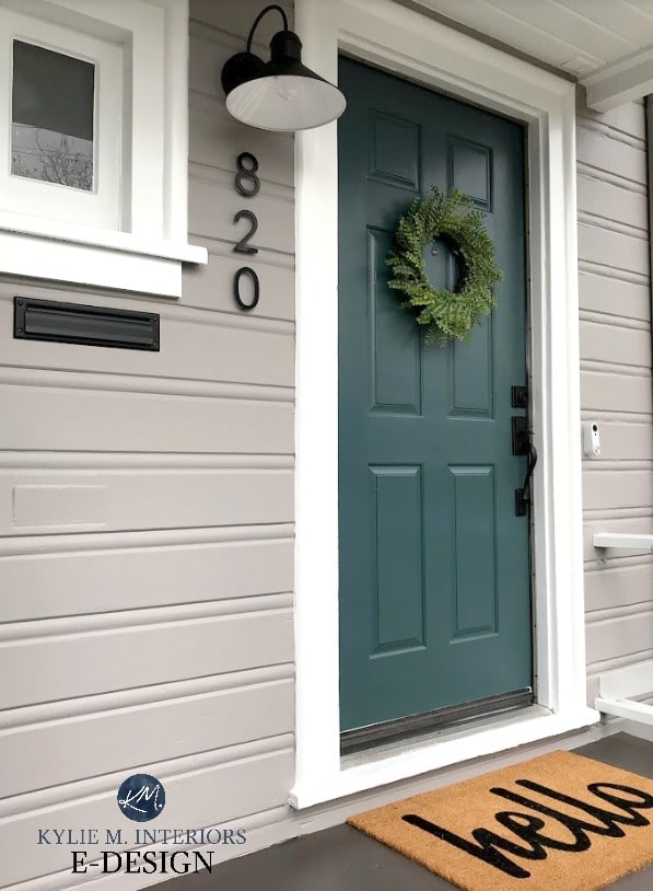
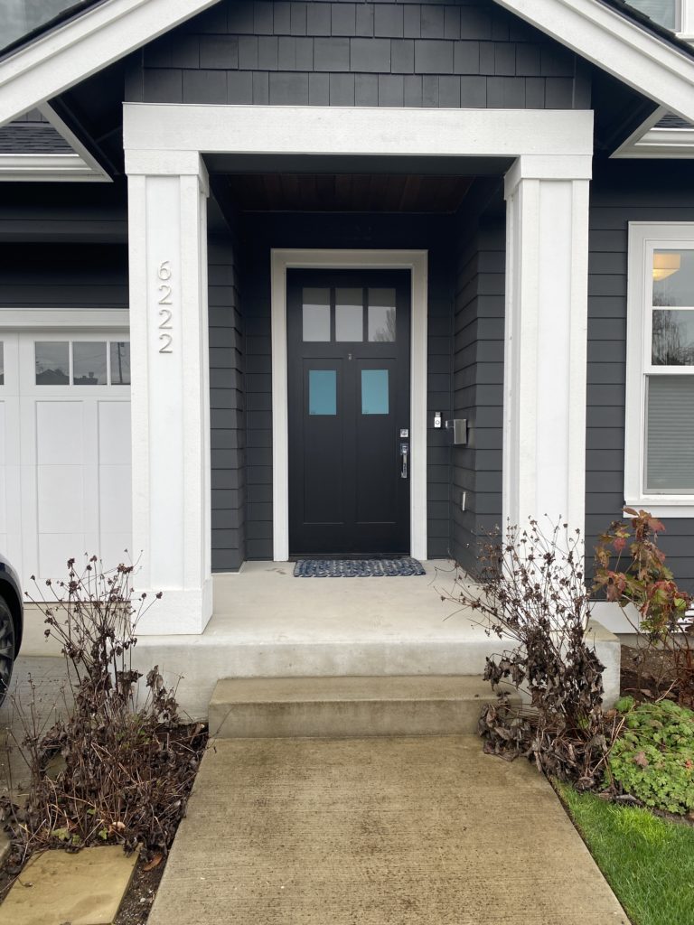
- Teal looks amazeballs on doors—French Doors, the inside of a front door, and the outside of your front door.
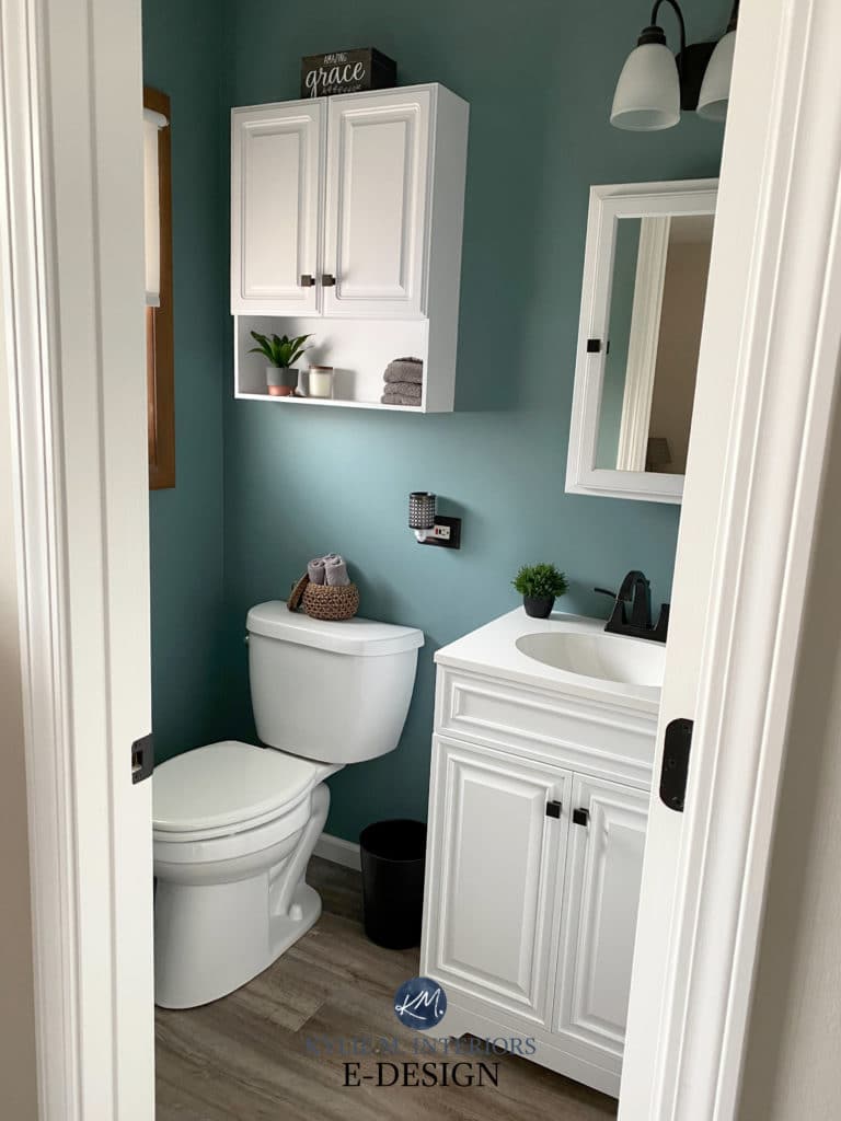
- On a bathroom vanity for a dash of depth and color.
Sure, you can slap teal on all your kitchen cabinets or home exterior, but teal has the most appeal when you’re keepin’ it real on the above finishes.
So, without further ado, let’s explore this bold, badass hue…

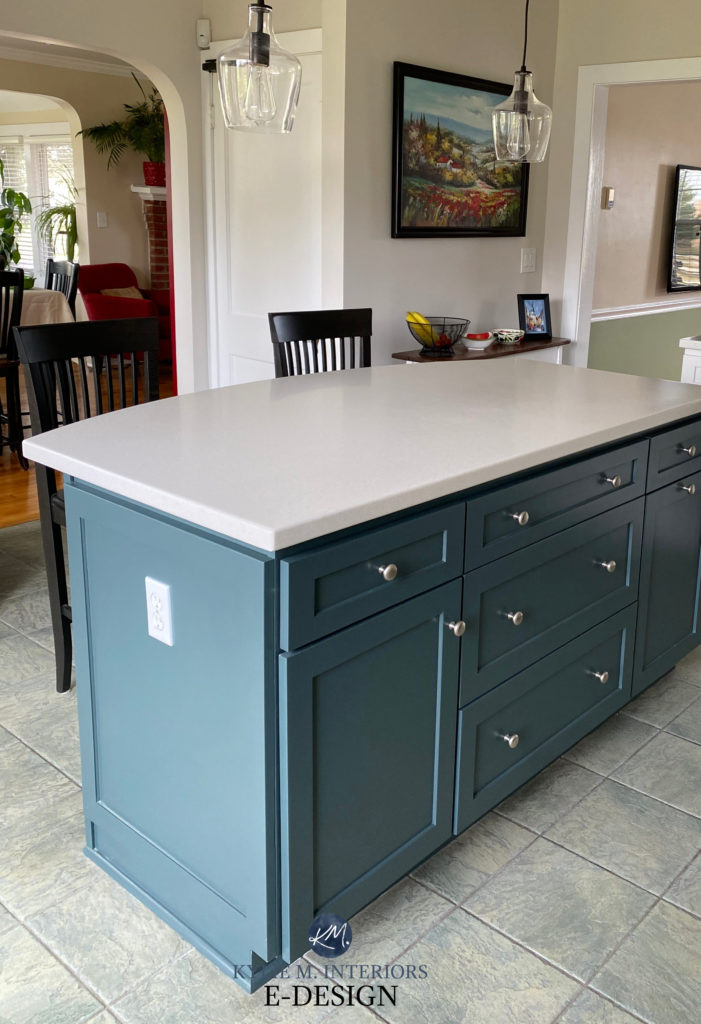
1. SHERWIN WILLIAMS RIVERWAY 6222
We have to start with my favorite—and yes, just like my boyfriends, I play favorites. Just joking; I’m happily married (at least until he reads that comment). Anyway, Riverway is my favorite teal-inspired paint color.

With the perfect (personal opinion) blend of blue, green, and gray, Riverway is a great way to get a teal look without overdoing it in the color department. Of course, if you love cleaner, more cheerful shades, Riverway will be a real mood-killer, but if you’re like me and dabble in earth tones, it should be right up your alley…or your river might be more the point.
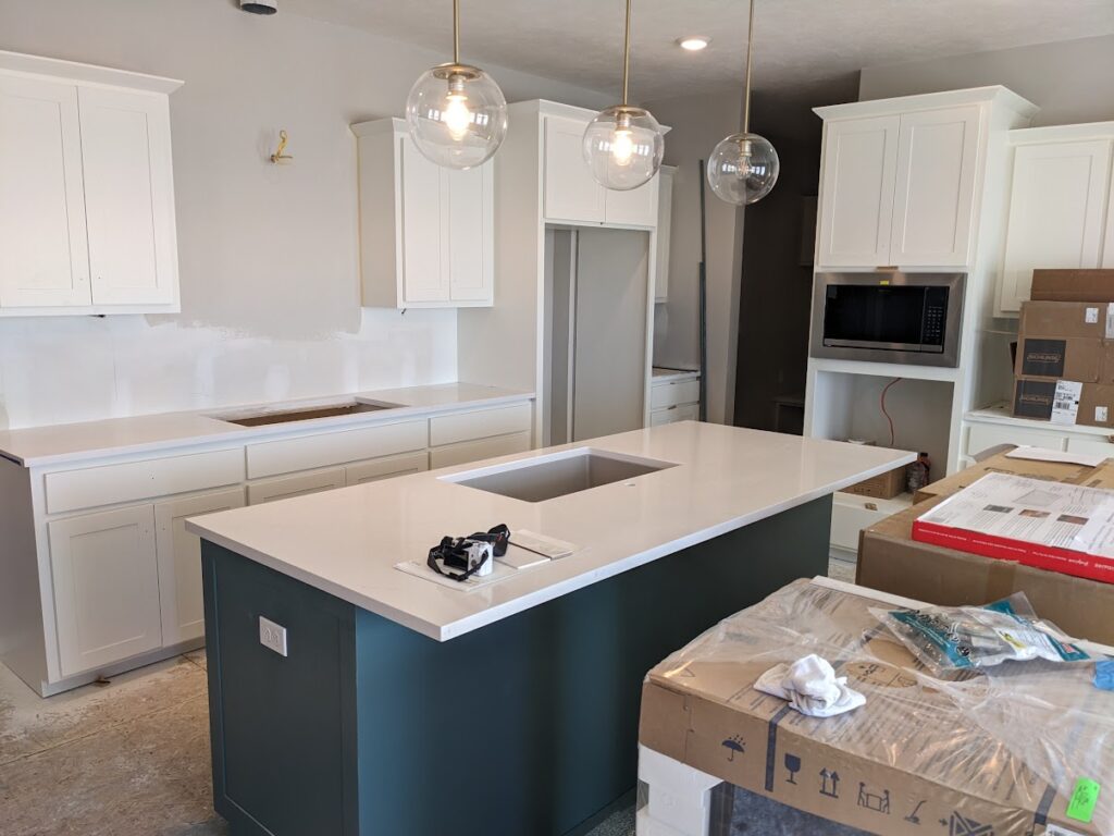
Riverway looks slightly sophisticated on the island in this kitchen. Once wood floors are in, its blue-green should contrast nicely. If you love Riverway, compare it to these other popular shades (which includes some of the colors below!)
2. SHERWIN WILLIAMS STILL WATER 6223
Would you like still water or bubbly? Have you ever been asked that at a restaurant and said ‘Ermmm, can I just have tap water?‘ Anyway, Still Water is one beautiful teal paint color.
Coming with a considerably low LRV of 10, Still Water has some serious meat on its bones while still holding onto the teal-title. This is much different from holding onto the teal-tittie, which is what I first typed.
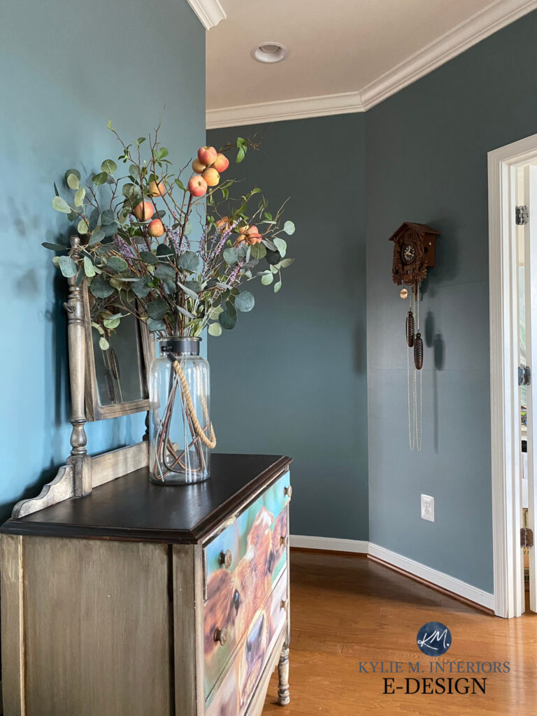
Color-drenched rooms are super popular right now, and one of my Online Color Consulting clients wanted to try a darker hue on your walls, trims, and ceiling – she chose Still Water…

In this next photo, can we just have a moment to look at Ryan? This particular client read enough of my blogs to know that a screenshot of this bad boy would go over well…and it did…and it still does.
The Best Non-White Paint Colors for Trims & Doors

The Best Blue and Green Paint Colors for Cabinets & Islands
Between blue and green, Still Water can be expected to skew a bit green over blue, but the blue is still there to offer some balance.
3. BENJAMIN MOORE AEGEAN TEAL 2136-40
COME TO MOMMA! I love Aegean Teal, not just because it was the Color of the Year for 2021 (I often DON’T like those). Aegean Teal was a great choice as it was popular for 2021 and still retains a degree of popularity, which speaks highly to its longevity.

Get your Peel & Stick sample of Aegean Teal HERE!
With its LRV of 25.13, Aegean Teal is more moderate than several previous shades. Sure, it still packs a wallop, but thanks to its blend, it’s not remotely punchy or heavy.
Aegean Teal is a great blend of blue and green with a mild allegiance to blue over green. It also has a modest gray backdrop, meaning it’s a ‘color-forward’ shade. Like the previous shades, its approach is not overwhelming thanks to a gray undercurrent.
4. SHERWIN WILLIAMS DEEP SEA DIVE 7618
Do you like to dabble in the more colorful end of things? Dive into the deep end with Deep Sea Dive. While it’s not as bright as a few upcoming shades, it has more saturation than the average, popular shade of teal.

As for its blend, Deep Sea Dive is a wickedly balanced shade of teal, with no strong preference for blue or green. Sure, compare it to a more blue-centric teal, and it will seem green—the same goes for a green-centric teal. But in the end, this color holds court with both shades!
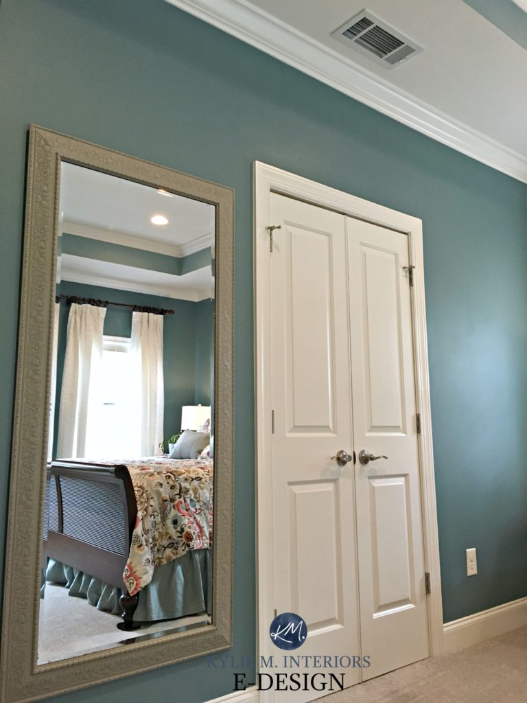
5. SHERWIN WILLIAMS MOODY BLUE 6221
This color is moodier than me at my time of the month. Just joking, I’m a gem all the time, but this color is still pretty darn moody!
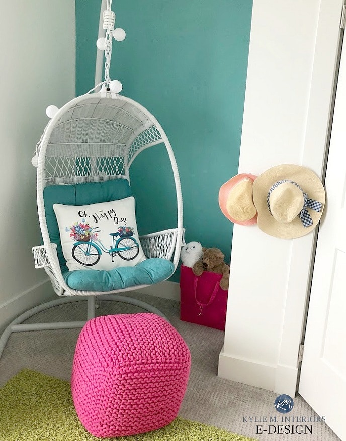
The Best Blue & Green Paint Colors for Your Bedroom
Moody Blue has an LRV of 27, so it parks its moody ole arse in the medium depths – more or less in the middle. This makes it a great option for so many painting projects. While some darker or more colorful shades can be intimidating, a color like Moody Blue is appealing for an entire room, kitchen cabinets (yup, all of them), front doors, and more.
How to Add Personality to a Small Bathroom
Check out my CURATED TEAL COLOR BUNDLE including Moody Blue!
6. BENJAMIN MOORE MEDITERRANEAN TEAL 2123-10
Before Sherwin William’s top teals hit the market, Mediterranean Teal laid the groundwork.
This dark shade of teal has an LRV of 10.56, which is more or less the same as Still Water. The difference is in the blend, as Mediterranean Teal leans harder into green with a more minor blue backdrop. Of course, there’s some gray in there, too – enough to calm it down without hampering its style.
Does this make Mediterranean Teal more of a variation of Hunter Green?
This is open to perception; Benjamin Moore claims it to be so. If you ask me, it has a TOUCH too much blue (and gray) to hit the Hunter Green range, but it’s darn close.

Here’s your Peel & Stick sample of Mediterranean Teal!
7. BENJAMIN MOORE DARK PEWTER 2122-10
If you’re anything like your favorite Ginger, you love grayed-out colors. If so, you might love Dark Pewter.
Dark Pewter has an LRV of 10.79, so it’s pretty skookum. While many of the colors in this blog post have similar LRVs, most have more ‘color’ and less gray—not Dark Pewter. While it’s still ‘color-forward,’ meaning you’ll see blue-green before you see gray, it has much more gray than most others, making it more earth-toned and organic.
In all fairness, while this next kitchen island looks stunning, it’s as colorful as you can expect Dark Pewter to look, likely due to the quality of direct natural light on the end of the cabinet…
Ideas to Update your 1990s Home: 5-PART SERIES
8. SHERWIN WILLIAMS CLOUDBURST 6487
Are you looking for a vibrant, exciting shade of teal? Check out Cloudburst. While its name might have you thinking it has gray in it, you’d be wrong. While it has a bit, Cloudburst is very color-forward, with a dominant blue hue backed up by an undercurrent of green.
And it ain’t no one tricky pony. Cloudburst is great for kids’ rooms, accent walls, beach-inspired rooms, kitchen islands, front doors, and more!
The Best Teal & Navy Blue Paint Colors for Your Front Door
If you like Cloudburst, check out Sherwin Williams Grand Canal, which is the sample on the left.
Here’s a blurry but still helpful shot of Cloudburst samples on a kitchen island for one of my Online Paint Color consults (which all of my images are from)…

How to Update Your Outdated Granite Countertops
9. BENJAMIN MOORE BELLA BLUE 720
As its name suggests (for once), Bella Blue is a gorgeous shade of blue. However, thanks to a decent amount of green, Bella Blue sneaks in as a teal and is great for those who prefer their teal a touch more on the blue side!
How to Pick Exterior Paint Colors – 5 Steps
Bella Blue has an LRV of 17.5. Sweet Bella is in the medium-dark range but reads way more like a medium-depth thanks to its degree of color. If you love Bella Blue but wish she was more wild and crazy, check out Benjamin Moore Calypso Blue.
10. SHERWIN WILLIAMS TEAL STENCIL
If you’re looking for a moderate, medium-depth blue-green blend, Teal Stencil could be the one for you. With a stunning mix of blue and green, Teal Stencil brings some serious color to the table (or your walls) without entering the super ‘colorful’ end of things.
Teal Stencil has an LRV of 19, putting it on the lower, darker end of the medium range. However, its degree of color makes it feel a bit brighter compared to more muted shades.
Here’s Teal Stencil compared to other popular (but lighter) blue-green mixes. This is a great example of its depth and power compared to the softer range of teal-inspired colors…

Stratton Blue | Wythe Blue | Jasper Stone | Sioux Falls
See many of the above colors in THIS BLOG POST.
If you love Teal Stencil, keep reading (even if you don’t, keep reading anyway), as Caribbean Teal picks up where Teal Stencil leaves off—with a tweak!
11. BENJAMIN MOORE CARIBBEAN TEAL 2123-20
If you thought Teal Stencil was a slam dunk, you might want to reconsider. Coming in hot on its teal heels is Caribbean Teal. While you might expect Caribbean Teal to embrace the more colorful end of the blue-green world, it doesn’t. In fact, as far as teals go, it’s pretty tame. Compared to Teal Stencil, Caribbean Teal is slightly grayer while still showing up at the party with bells on.

This said, it’s still very color-forward, with a reasonably balanced, moody, blue-green blend. It just has more gray than you might expect (given its name).
12. SHERWIN WILLIAMS MEDITERRANEAN
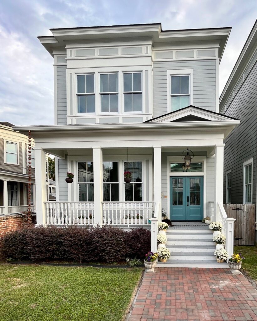
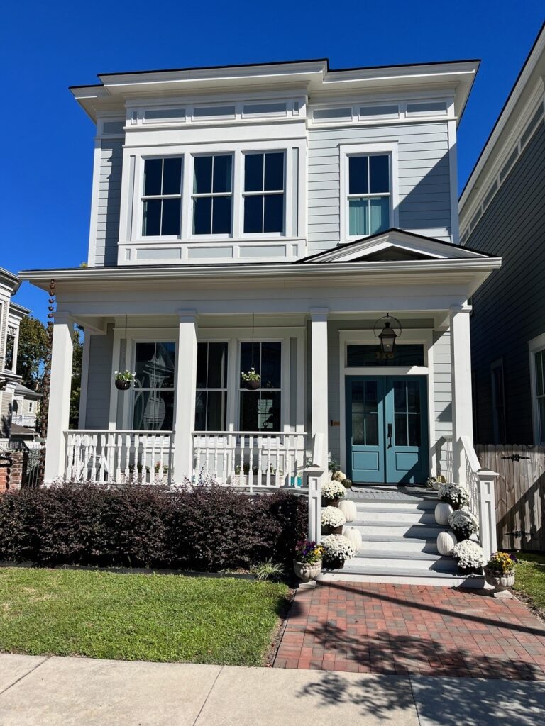
If the previously mentioned Riverway floated your boat, try dipping your toes into Mediterranean. This beautiful blueish hue has a modest green backdrop and gray to calm it down. It’s really just like Riverway, just a bit more blue and a wee wink lighter.
Look at this cutie-patootie exterior slathered in Mediterranean (which is my least favorite word to type, btw). Look at the bottom right corner and how the sunshine lightens and brightens it compared to the main siding area…

Here’s a look from a different angle…

In the above image, notice how Mediterranean seems more blue-centric on the left. However, look at that gorgeous blue-green hue popping up on the top left and bottom right – MAD LOVE!
Schlong story short, if you like a teal that leans a bit more blue, grab a sample of Mediterranean.
13. SHERWIN WILLIAMS SEAWORTHY 7620
Go big or go home. That’s Seaworthy’s motto, thanks to its wickedly low LRV of 7. Now, whereas many of the colors on this page are reasonably balanced, Seaworthy caters to blue. Sure, there’s some green and gray, but expect a more dominant blue hue on your walls, door, or cabinets.

Here’s your Peel & Stick sample of Seaworthy
14. BENJAMIN MOORE KNOXVILLE GRAY HC-160
If your idea of a good time includes a lot of gray, you might love Knoxville Gray. Personally, I’m not a teal fan, as I find it a bit abrasive in my home. But, give me a teal with a ton of gray in it, and we’re talkin’.
Knoxville Gray is a stunning shade with an LRV of 15.68. This means it’s parked nicely in the medium-dark range but reads more like a medium, thanks to its degree of color. With a reasonably balanced blend of blue, green, and gray, Knoxville Gray is a great way to get the look of teal without the intensity.
Here’s Knoxville Gray in a hallway, popping gorgeously with the wood floor and contrasting white trim…
15. SHERWIN WILLIAMS MOUNT ETNA 7625
Ooooo boy, if you thought Seaworthy was one swarthy sailor, you haven’t met Etna. Mount Etna is the darkest and most muted shade of teal on this page. Coming in with a WHOPPINGLY low LRV of 6, Mount Etna is like a teal-black blend, adding instant drama and sophistication to whatever you paint it on.

Here’s your Peel & Stick sample of Mount Etna!
THE BEST, BRIGHTEST SHADES OF TEAL OR AQUA PAINT COLORS
If the above colors feel a bit ‘wha wha wha…’, you must be looking for a teal with some serious color-power. I got you, boo.
However, very few Online Color Consulting clients or readers ask for these shades, so they can’t be the main part of this blog post. Instead, I’ve got a lovely little list for you to check out.

Peel & Stick sample of Benjamin Moore Blue Spa
- Sherwin Williams Gulfstream is a gorgeous, saturated shade of teal with an LRV of 18. There’s also the darker Maxi Teal, but Gulfstream does the job without the more drastic depth.
- Sherwin Williams Splashy is coming in HOT (or cold might be the point) with an intensely colorful approach to teal! This bad boy has an LRV of 21 even more
firewater power than Gulfstream, which is saying a lot. - Benjamin Moore Surf Blue is right down there with Splashy in saturation and color power. Want to lighten and brighten that up? Check out Benjamin Moore Cool Aqua for a brighter but moderately lighter look.
- While Benjamin Moore Blue Spa isn’t as bright as the above aqua-teal colors, it still packs a punch and is a glorious approach to blue and green! With an LRV of 29.38, it’s an awesomely moderate, medium-depth color.
- Benjamin Moore Peacock Blue is one of my favorite, brighter shades of teal or aqua. While some gray calms it down, it’s left with a gorgeous blue-green hue.
If you like the above shades, here’s a CURATED COLOR BUNDLE with a few different colors to explore. Here are some of the lighter shades mentioned.

READ MORE
The Best Blue-Green Blend Paint Colors (lighter)
The Best Teal Paint Colors for Kitchen Islands, Cabinets, & More
The Best Medium to Dark Green Paint Colors
NEED HELP CHOOSING COLORS?
Check out my Online Paint Color Consulting!


I love all your color posts and humor! We recently remodeled our kitchen to all white cabinets, dark wood island. I love color and want to paint a dark blue/green color. BM Vermont Slate or Newberg Green. My living room is an open concept to kitchen and has a 2 ft wall I kept so I could paint 2 colors if I choose. Which beige would you recommend for liv room if I have beige/gold furniture? However I will decorate with blues/greens. Please help! Thank you.
Oh gosh, when it comes to the world of beige, it’s hard to say exactly what your furniture might need. I mean, off the VERY top of my head, maybe Muslin, but that’s a 100% guess as i haven’t seen your space! I do have online consulting if you’d like me to take a look! https://www.kylieminteriors.ca/hire-kylie/
Thank you for sharing this post about one of my favorite forever colors! I can never get sick of looking at it. It’s just a happy, earthy color! These are really bold and beautiful dark teals that I would normally be afraid to use but they look amazing! I moved into a new house and am updating the existing wall colors because it’s blah gold walls. I may be contacting you in the future for color consultation. (But I have all my teal plant pots to keep me happy in the meantime!) Always love reading your blog!
What a great note, and I look forward to hearing from you when you’re ready!
Kylie, which of these would you recommend for a north facing living room with a large window with overhang and large trees?The ones with more green to counter the cooler light I assume? I’m tired of safe colors and want a BIG MOOD maximalist color for my tiny, long space.
I always enjoy your articles, full of insight & inspiration with a spoonful of humor! Thinking of painting a chest & a shelf Knoxville Gray (both in my kitchen). I like Knoxville bc of its heavy dose of gray but wondering if too dark? Have you ever seen Knoxville Gray lighten by 25%?
I always enjoy your articles, full of insight & inspiration with a spoonful of humor! Thinking of painting a chest & a shelf Knoxville Gray. I like Knoxville bc of its heady dose of gray but wondering if too dark? Have you ever seen Knoxville gray lighten by 25%?
I always enjoy your articles, full of insight & inspiration with a spoonful of humor! Thinking of painting a chest & a shelf Knoxville Gray. I like Knoxville bc of its heady dose of gray but wondering if too dark? Have you ever seen Knoxville gray lighten by 25%?