
The Best Paint Colors for Kid’s Bedrooms (that parents love too!)
The 9 Best Colors for a Boys or Girls (bedroom, nursery, or playroom)
Whenever I have clients with kids, there’s often a struggle between what the kid wants and what the parent wants. The kids often gravitate towards colors in the ‘primary’ – aka ‘visual punch in the face’ range (blue/red/yellow), whereas parents often lean towards the softer more subtle versions of these colors. And of course, there’s the odd brave parent who lets their kids pick their own colors – bless their hearts. NOT THIS MOMMA! I’m WAY too much of a control freak for that.
By the way, if you’re looking for less ‘gender-specific’ color options, I have a great blog post for you here: How to Create a Gender-Neutral (Kid’s Room) Paint Color Palette.
So what do you do when you and baby-boo are at odds over paint colors? You read this…
TIPS FOR CHOOSING PAINT COLORS WITH YOUR KIDS
If you want your kid to pick their paint color, you’re probably not even bothering with this blog post. But since you are, I’ve got a few tips to make the paint-picking process a little easier…
1. DON’T LET THEM PICK ANY COLOR THEY WANT
- Ask them to tell you TWO different colors that they might like on their walls – i.e., blue, green, violet.
- Go to the paint store (by yourself) and pick up 3-4 different versions of these colors that you can live with. Don’t go all boring and earthy – stretch your comfort zone a bit and look for colors that bridge the gap between their need for brightness and your personal tastes.
- Show them the 3-4 color chips that you’ve pre-approved and let them pick the one they want, and really, let them pick it. You may have a fave, but you’ve already narrowed it down to what you can live with so leave the rest up to them.
2. IF HONEY BOO-BOO WANTS A DARK OR WILD COLOR, CHOOSE A SINGLE WALL FOR IT
Tell them that three of the walls will remain white/cream/gray and they can put WHATEVER color they want on their one feature wall (usually the wall that the bed is on). When they get bored of this color (which they will) it’s an easy change.
3. INSTALL A CHAIR RAIL
Choose a neutral/off-white/gray for the top portion of the walls and let them choose the color for the bottom (either their own choice or one of the ones you’ve narrowed down for them). This works for a few reasons…
- When they inevitably get bored with this month’s favourite color you won’t even need a ladder to change it up. All it will take is a gallon of paint, a bottle of wine, and an afternoon.
- If lil Johnny chooses Fire Engine Red as his most fave color or sweet lil’ Elliot wants a black feature wall, it won’t feel like you get punched in the face with color every time you walk in the room as the color will essentially be only on 1/3 of the wall space.
- You don’t EVER have to change the top color. If you choose a color that is neutral/off-white/white then all you ever have to change is the bottom.
The Best Paint Colors for KID’s Rooms
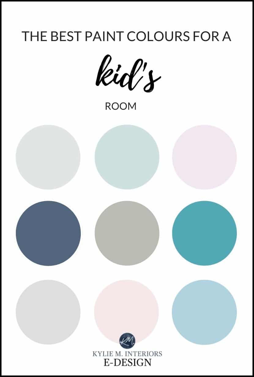
If you’re not sure where to start – gray, blue, pink, or otherwise, these 9 shades will get you going in the right direction.
1. BENJAMIN MOORE STONINGTON GRAY
Stonington Gray is an awesome light gray with subtle undertones. It’s a great color for a south-facing room or a well-lit NORTH-facing room, but you may want to go a touch lighter if you have a room with low light.
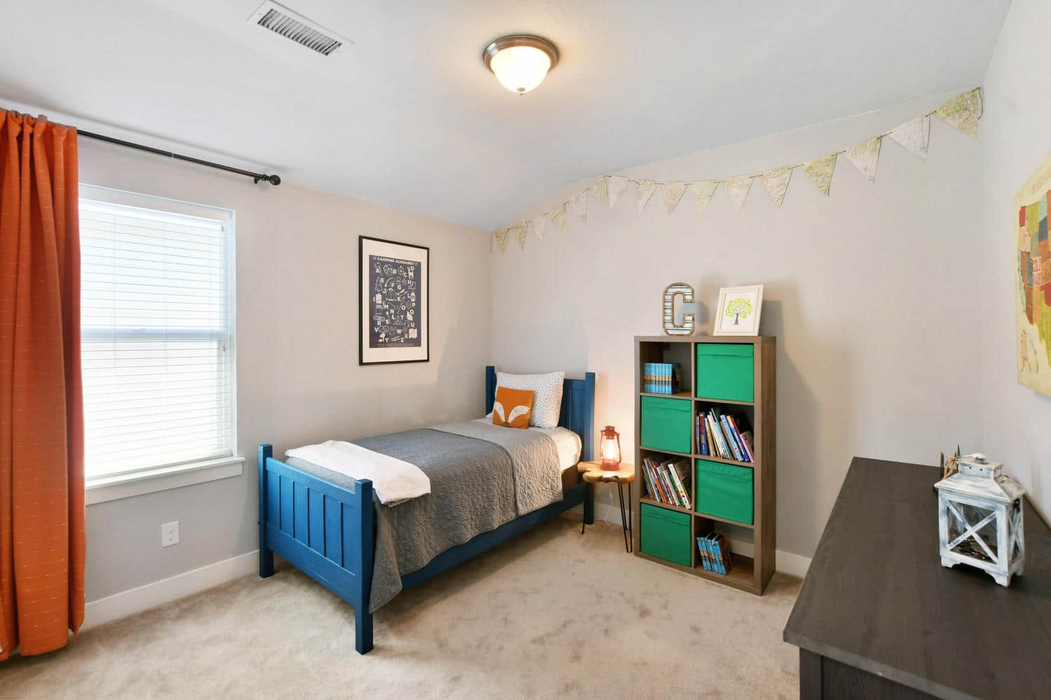
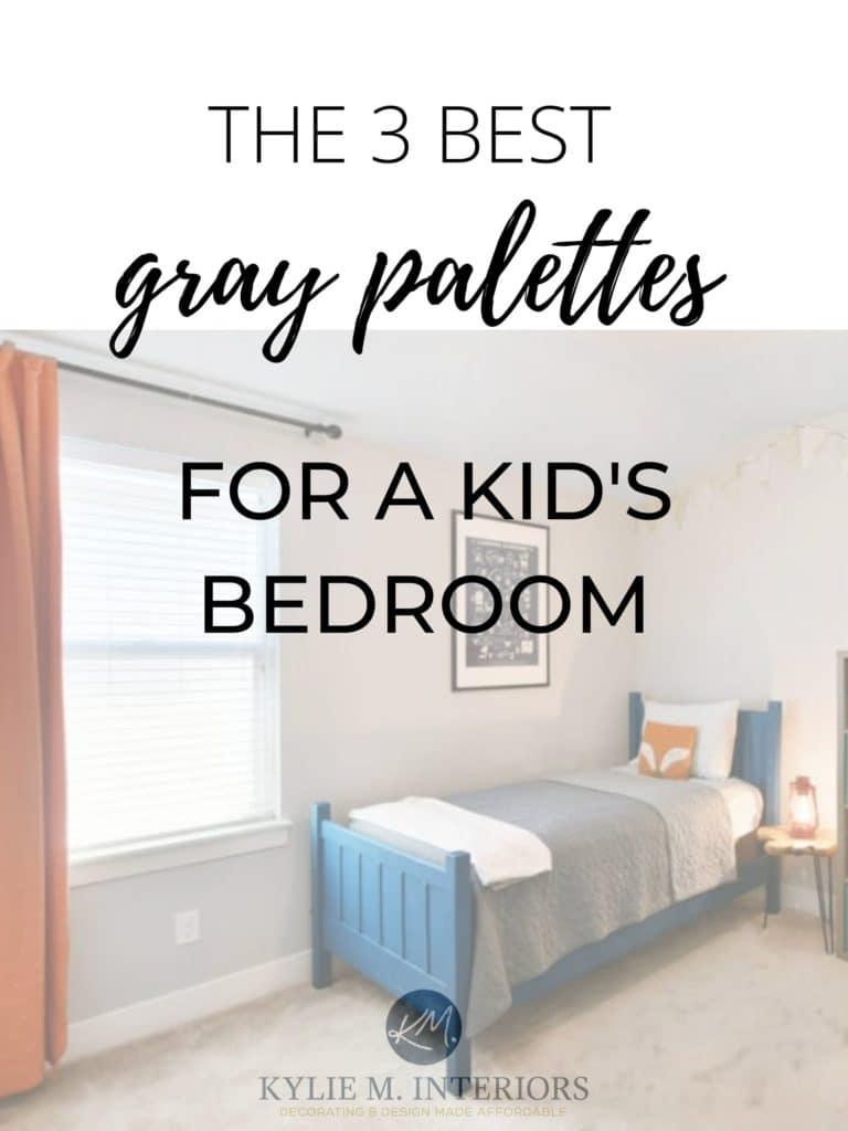
BTW, in the above photo, Stonington Gray looks CONSIDERABLY warmer than it usually does; the color by the orange drape is the truest.
Whether you use Stonington Gray or a similar shade, gray is a great starting place for some of the most classic palettes, including…
- light gray, charcoal, black, pink
- dark gray, green, cream, orange
- light gray, navy blue, white, red
- charcoal gray, tan, off-white, and green
FULL Paint Color Review of Benjamin Moore Stonington Gray
SIMILAR COLORS TO SAMPLE & COMPARE WITH STONINGTON GRAY
- Sherwin Williams On the Rocks
- Sherwin Williams Big Chill or First Star
- Benjamin Moore Gray Owl
2. SHERWIN WILLIAMS SEA SALT OR RAINWASHED
If you love the look of green or blue-green, Sea Salt or Rainwashed are GORGEOUS options. Just be sure to read their full color reviews (linked below) – especially Sea Salt as it can be a ninja!
SIMILAR COLORS TO SAMPLE & COMPARE WITH SEA SALT & RAINWASHED
- Benjamin Moore Woodlawn Blue (shown below)
- Benjamin Moore Palladian Blue
- Sherwin Williams Tradewind
- Sherwin Williams Upward

FULL Color Review of Sherwin Williams Sea Salt
Full Color Review of Sherwin Williams Rainwashed
ACCENT COLORS THAT LOOK GOOD WITH BLUE-GREEN PAINT COLORS
- hot pink
- primary red
- cream & white
- plant green
- orange and yellow
3. BENJAMIN MOORE LILY LAVENDER
If you’re looking for a shade of purple that both you and your child can live with, one that isn’t too punchy nor too passive, Lily Lavender might just hit the spot!

OTHER COLORS TO SAMPLE & COMPARE WITH LILY LAVENDER
- Benjamin Moore Beach Plum
- Benjamin Moore Lavender Ice
- Sherwin Williams Sensitive Tint
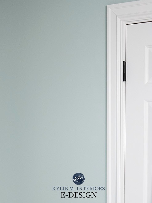
Benjamin Moore Lavender Ice
ACCENT COLORS THAT LOOK GOOD WITH PURPLE/VIOLET
- light gray, white, black
- green, off-white, charcoal gray
- yellow, warm white, green
The Best Purple (Violet) Paint Colors
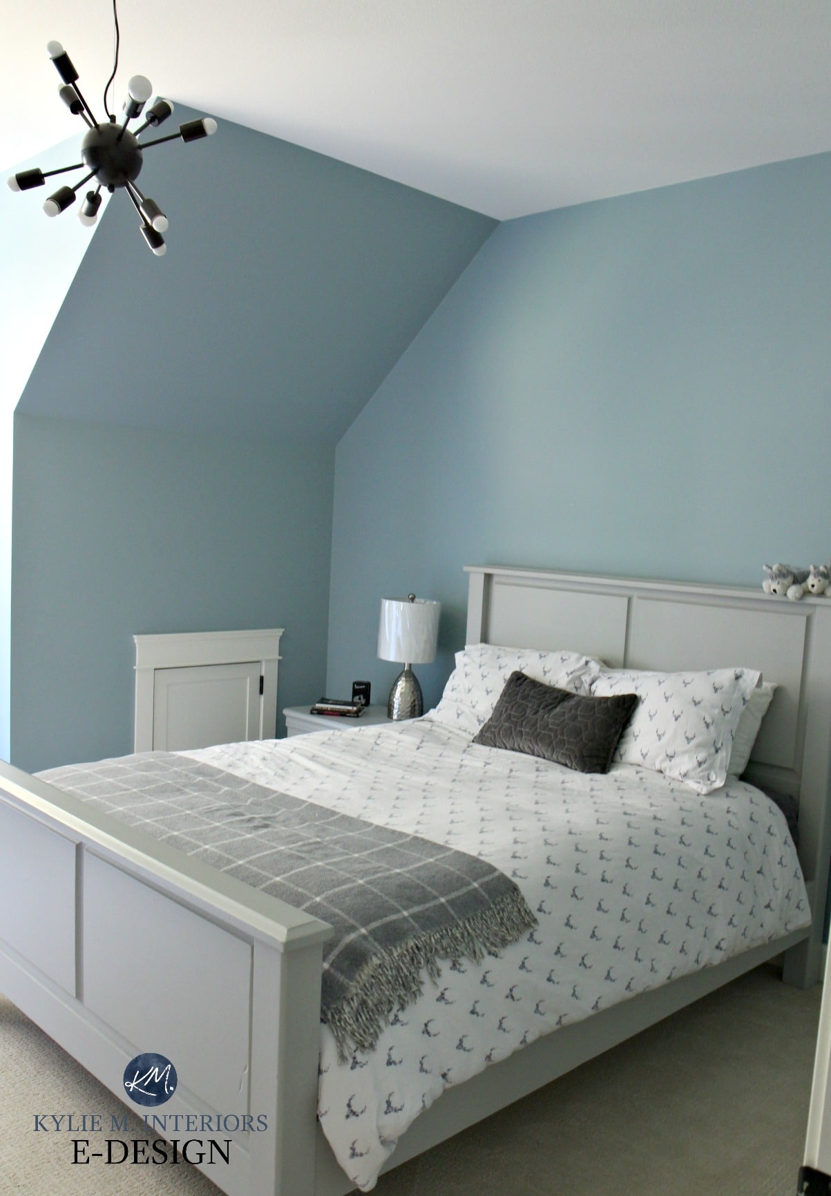
4. BENJAMIN MOORE NEWBURYPORT BLUE OR HALE NAVY
If you’re looking for a striking navy blue that isn’t TOO heavy, Newburyport Blue is a STUNNER. It’s a classic navy blue look without the visual weight of Benjamin Moore Hale Navy, which is equally stunning.

OTHER NAVY BLUES TO SAMPLE & COMPARE WITH NEWBURYPORT BLUE
- Benjamin Moore Van Deusen Blue
- Sherwin Williams Cyberspace
- Sherwin Williams Indigo Batik
- The 12 Best Navy Blue Paint Colors
FULL Paint Color Review of Benjamin Moore Hale Navy
ACCENT COLORS THAT GO WITH NAVY BLUE
- white, almost any type of green
- red, white, charcoal gray
- charcoal, white, hot pink
SAMPLIZE offers peel-and-stick paint samples that are more AFFORDABLE, EASIER, and more ENVIRONMENTALLY FRIENDLY than traditional paint pots.
Samples arrive on your doorstep in 1 DAY!
Visit the SAMPLIZE website HERE
5. BENJAMIN MOORE CHELSEA GRAY
If you’re looking for a gray with a bit more meat on its bones, look no further than Chelsea Gray. This is a SOLID charcoal gray paint color, and while you wouldn’t know it, it’s even slightly warm. It also has a slight green undertone that doesn’t always show up at the party. A color like this also makes for an AWESOME feature wall!

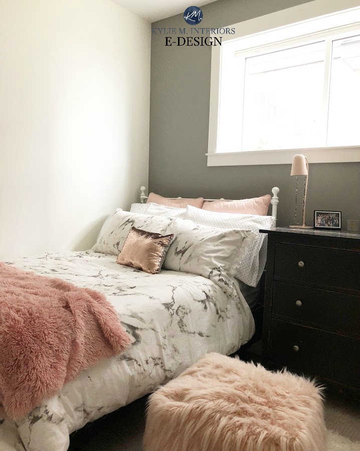
Benjamin Moore Platinum Gray is shown in rose/white bedroom
OTHER CHARCOAL GRAYS TO SAMPLE & COMPARE WITH CHELSEA GRAY
- Sherwin Williams Dovetail
- Sherwin Williams Dorian Gray
- Benjamin Moore Amherst Gray and Platinum Gray
- Sherwin Williams Classic French Gray
FULL Paint Color Review of Benjamin Moore Chelsea Gray
ACCENT COLORS THAT LOOK GOOD WITH DARK GRAYS
- white, green, orange
- navy blue, white, tan
- teal, white, orange
The 10 Best Dark Gray Paint Colors
6. SHERWIN WILLIAMS CLOUDBURST SW 6487
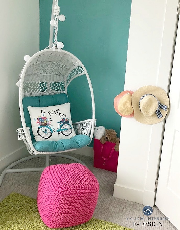
If you’re looking for a FUN color, either for the whole room or as a feature wall, Cloudburst is BURSTING with color, without going too far. Teal can be a great choice for a kid’s room, as like navy blue, it tends to grow with kids a bit better than other colors (i.e., violet and pink).
OTHER COLORS TO SAMPLE & COMPARE WITH CLOUDBURST
- Sherwin Williams Reflecting Pool
- Sherwin Williams Peacock Blue
The 8 Best Blue-Green Blend Paint Colors
7. BENJAMIN MOORE BALBOA MIST OC-27
Balboa Mist is a BEAUTIFUL warm gray with a soft, violet undertone. It looks especially gorgeous with charcoal and white accents.

FULL Paint Color Review of Benjamin Moore Balboa Mist
OTHER WARM GRAYS TO CHECK OUT: Benjamin Moore Classic Gray, Sherwin Williams Alpaca, Benjamin Moore Rodeo, Sherwin Williams Gossamer Veil
8. BENJAMIN MOORE PINK BLISS 2093-70
9. BENJAMIN MOORE COLORADO BLUE 2136-50
WHAT IS THE BEST PAINT COLOR FOR A KID’S BEDROOM?
- Benjamin Moore Hale Navy or Sherwin Williams Cyberspace
- Sherwin Williams Pewter Green
- Sherwin Williams Dovetail
- Benjamin Moore Coventry Gray
- Benjamin Moore Chelsea Gray
WHAT ARE THE MOST CALMING COLORS FOR KID’S ROOMS?
While it can come down to personal preference (as we all have psychological reactions to certain colors), generally speaking, shades of blue and green are the best calming, relaxing colors for kid’s bedrooms.

A FEW MORE THINGS TO CONSIDER…
- What is the room’s exposure? North-facing rooms often suit warmer colors, whereas south-facing rooms love the cooler end of things. Have an east or west-facing room? read THIS
- Is the room dark, does it have good natural and/or artificial lighting? This can play a big part in choosing the best paint color!
- What color is the carpet? Make sure that the undertones of your carpet jive with the undertones of your wall color.
The Best Paint GRAY Color PALETTES for a Kid’s Room: PART 1 of 3
READ MORE
The Best Paint GRAY Color PALETTES for a Kid’s Room: PART 1 of 3
How to Create a Gender Neutral Paint Color Palette for a Kid’s Room: PART 3 of 3
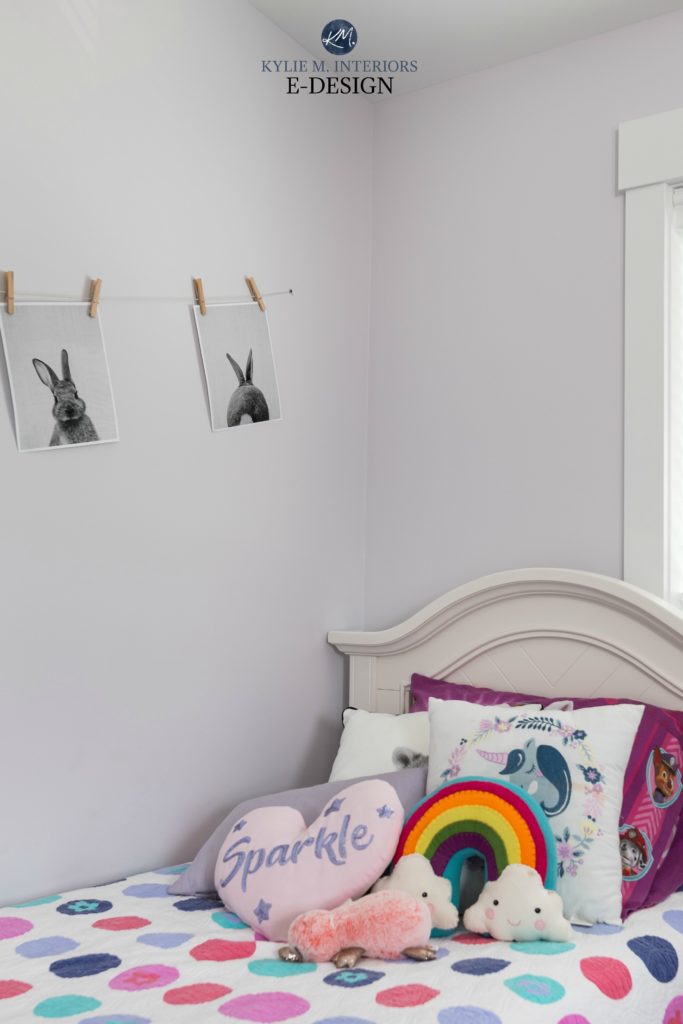
The Best Paint Colors for a Girl’s Room
NEED HELP?
Check out my Online Color Consulting & E-Design Services.

Chat soon,

ORIGINALLY WRITTEN IN 2017, AWESOMELY UPDATED IN 2023


Hey Jordan, I’m almost positive that is was Ben Moore Whipple Blue – not a colour I’ve used on walls yet, but such a beautiful steady blue accent! Thanks for visiting my site!!
Hi Kylie, I just painted my LR which gets a lot of natural sunlight, BM’s Ambiance. It’s too bright and a little too yellow in this south facing room. I’m thinking Man on the Moon will be perfect but want to be sure it doesn’t have a green undertone to it. I’d love to hear your opinion, thank you! Kim
Absolutely, while Navajo does have a bit of a neutral base, the warmth of it will still power through!
Chat soon,
~Kylie
Hi Maria, world maps can really vary in colour, but my gut instinct tells me Gray Owl could be a great choice. Lighter gray with a subtle blue/green undertone.
Thanks for visiting!
~Kylie
Hello, my son really would love to do his bedroom in orange and blue. He would like three walls orange and one accent wall of blue. I am nervous that this will be too much orange. Do you have any suggestions? I really do like the revere pewter. He has a bath outside his room…as a compromise, I could always do orange in the bathroom? I appreciate any help. Thank you!
Hi Annie, I TOTALLY agree that orange walls with a blue accent would be really overwhelming. Orange is such a strong colour that it usually makes for a better accent, you actually get more power out of how it constrasts with neutrals and colours like navy blue. Orange drapes, bedding, accents – that type of thing. An orange bathroom would be okay, but super reflective and again, wouldn’t be my first choice! Revere Pewter is awesome, as are Stonington and Gray Owl – I have blog posts on all of them! (the search function is at the bottom of the home page if you’d like to check them out 🙂
~Kylie
Hello Kylie!
I’ve been following your great advice on choices of paint in a Northern facing room – I chose Monroe Bisque and it turned out to be perfect! Now for my Boys’ Bedroom – a large room which is also northern facing with ‘west facing’ windows. The side walls are multi-level with the current color in Georgian green and white ceiling. My son wants an orange accent wall which I think will be overwhelming. Was actually thinking of painting the room in Blue Danube and then adding Orange accents. Any advice?
Thanks!
Yodit
Hi Yodit, thank you for the note – I’m glad my advice came in handy! I do try to give as much complementary info as I can on my blog and if that doesn’t work, it might be time for a closer look! I have E-design services where I can spend some time with your room and come up with options that actually work, rather than just guessing! If that interest you, the link is here. https://www.kylieminteriors.ca/online-decorating-design-services/
~Kylie
Hi Kylie,
I love your site (informative, humorous, and mentions wine frequently)!
Have two boys rooms to paint (ages 12 and 16), smallish on size, one has east facing window and the other one west (and limited light). Home is 1927 Bungalow in Seattle. I would like to paint walls gray and looking through your “gray advice” ” here and in your other articles, I am thinking that Gray Owl would be a good choice because it looks like it might brighten up a small room. Son one would like accent color red (red upholstered platform bed). Son two would like accent color azure (same bed in azure blue). Does Gray Owl work for these accent colors? Three questions, first there is a picture rail, do I paint gray above the picture rail? I see various opinions about painting “above the rail”. Second, what is a good white color for trim with Gray Owl (considering White Dove)? And third, do I paint ceiling the same white as trim? If not, then what ceiling white color do you recommend with Gray Owl?
Thanks for your advice!
Kathy
Hi Kathy! At first I didn’t read the ‘boys rooms’ and just say ‘boys’ and the fact that they were smallish in size. I found that funny. Anyway 😉
Gray Owl IS flexible for those colours – absolutely! So yes, I would do Gray Owl above the picture rail. I too have seen it both ways and doing the area above the picture rail white (or same as trim) can look nice, but overall, I kind of like the more simple approach of ‘wall surface is wall colour’.
Trim, I’d probably look at BM Oxford White and would do that on trim/ceiling/doors for sure.
I hope that helps!
BTW – I inherited these colors! Haha – I never would have painted Swiss Blue or Grape Ice.
Hi Kylie. I love your posts! We are building a home and my youngest son’s room is a north facing room. He wants a lot of color in his room (he is 6 years old). His bedding is navy, orange, turquoise, red, green, white and chambray. So I was going to do the wall his head board will be on green and the other 3 walls navy but think it may be too dark. He does not have a chair rail in his room. So I considered doing one wall green, the opposing wall navy and the other 2 walls gray owl. But is that too much color?
Hi Mandy! It does sound like a LOT of colour, I would probably pick one (blue is usually better) and partner it with the GRay Owl 🙂
Getting ready to paint my 5 year old son’s bedroom. Three walls will be revere pewter, because it’s what we have in much of our house, and it works with our east/west lighting. We bought him an orange coverlet that he loved because his original request was for a blue accent wall. Now, he’s decided he wants green instead, and the thought of green and orange together is making me a bit squeamish. The image up top with revere pewter, cheddar, and lime are giving me hope! Thanks for that! I got paint chips for the eccentric lime and split pea, but he wants something a little darker. Any suggestion for a little darker green to go with revere pewter? I’m walking a fine line with giving him a room he loves and one I can live with!
Hi Kylie!
Your posts are extremely helpful and I end up going down a long rabbit hole trying to find the right color :-). I was hoping to find some info here on East facing rooms. I checked out your East facing post but those colors just don’t work in my boys’ room. What would you recommend for an East facing boys room with decent natural light (two windows)?
Thank you!
What about something like SW Big Chill or First Star, which are slightly brighter grays which you can jazz up with white/navy blue/black and red accents!
Do you think pink bliss has any undertones? I’m trying to find the pink equivalent of chantilly lace🫠
Pink Bliss definitely has a decent pink hue to it, maybe you’re thinking of something more like Atrium White??? Pink Bliss and Chantilly Lace aren’t very closely related :).
I would like to do a pale pink/ blush in a nursery. What might look good with Alabaster trim?
Ooo, with the degree of yellow-cream in Alabaster, it can be a bit fusys about pale pinks as the yellow-pink can really collide!
Is Lily lavender still one you like? I can’t see the picture with the example unfortunately, and I made the mistake of taking my Lily to the paint store who found the one with her name on it and is convinced it’s her favorite 🙂 She wants a true lavender, but I liked the lighter versions like sugarplum and misty lilac, but I might just be being boring haha. Is there something in between or is it not so in your face purple as the swatch appears to me? We have blonde oak floors and SW pure white trim.