
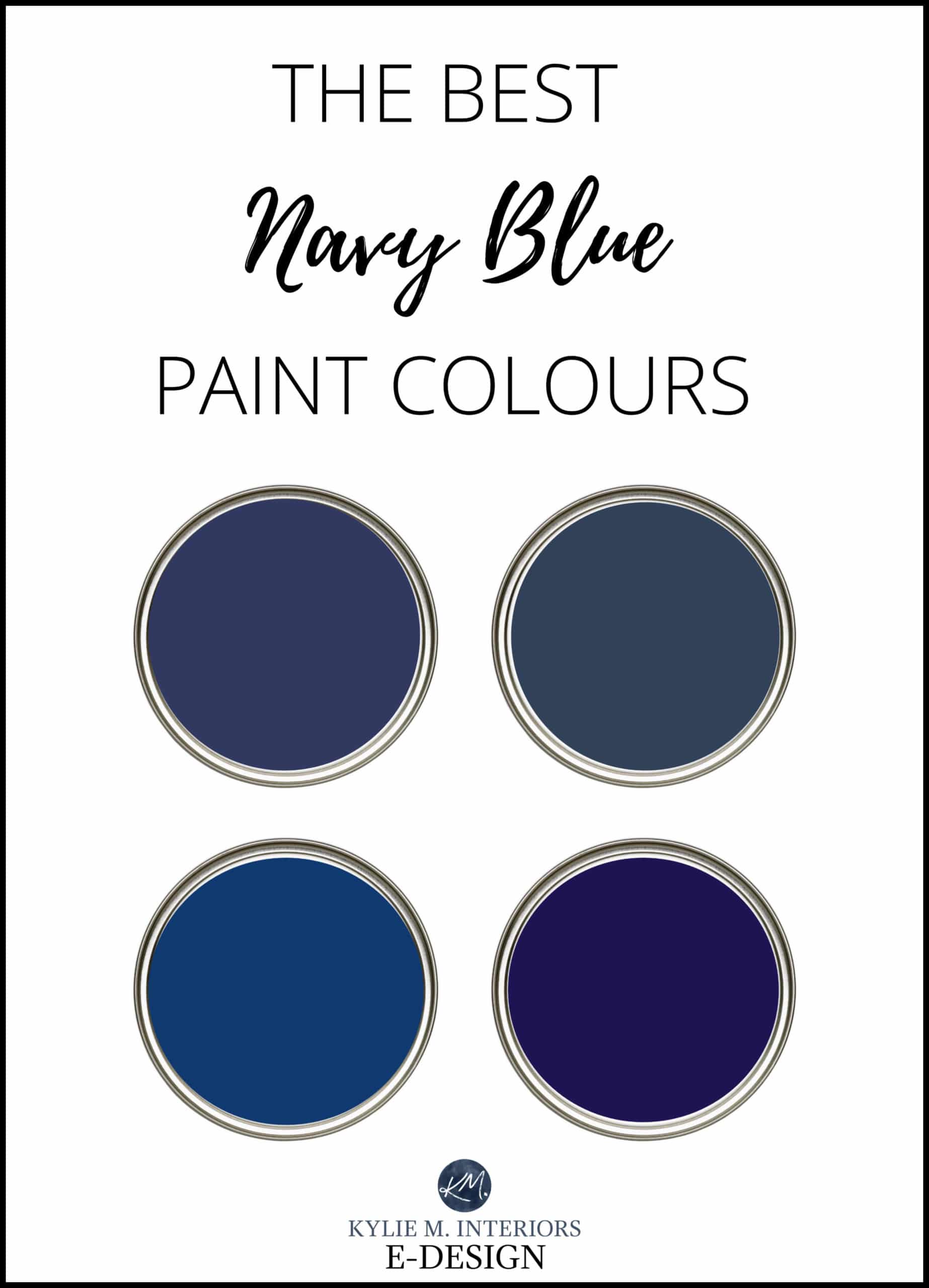
The 13 Best DARK Navy Blue Paint Colors
THE MOST POPULAR DARK SHADES OF BLUE
Whether you’re painting your kitchen cabinets, bathroom vanity, exterior, or front door, FEW colors are as classic and versatile as navy blue.
Navy blue has been kickin’ it a LONG TIME in the design world, and while its popularity ebbs and flows, it’s hands-down one of the colors with serious longevity – an important factor if you want to create a timeless home.
Of course, I can’t tell you that your cabinets, built-ins, or front door will SUIT navy blue; not every home can visually support it. You need the right environment, finishes, and colors to support the strength of navy blue, but these ideas will at least get you off to a good start. And if you find out that blue doesn’t work for you – I’ve got more!
I love to show RELATEABLE & REAL homes, so I ONLY use photos from my Online Color Consulting clients.

Now, before we get into the GOOD stuff, let’s chat about two important points for a minute…
1. THERE ARE THREE TYPES OF BLUE PAINT COLORS
- BLUE-VIOLET (blue-purple)
- BLUE-GREEN
- BLUE
Looking at these two paint blobs, if you looked at EITHER independently of the other, they would look pretty darned navy blue, yet COMPARED to each other, you can see that subtle shift.
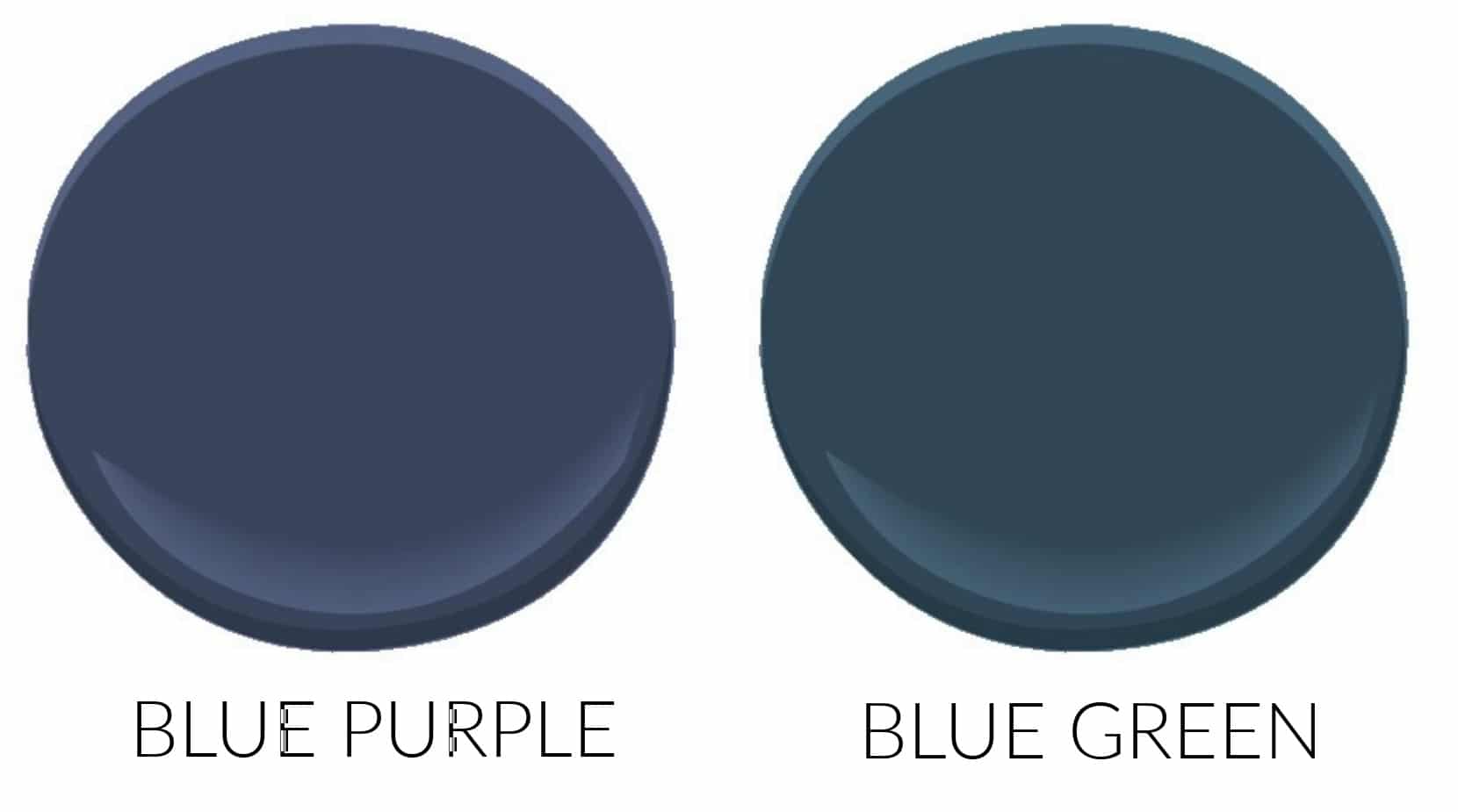
When choosing the best blue for you and your home, you need to figure out which TYPE of blue suits your home’s hard and soft finishes. For example…
- Many marble or marble-look countertops suit a blue-violet vs. a blue-green
- A beachy look often suits a blue-green over a blue-violet
- A transitional or traditional style home usually suits blue-violet vs. a blue-green
The thing with blue (and many paint colors) is that how they look is subjective based on who’s looking at them AS WELL AS the products and OTHER blues they’re partnered with. A relatively neutral blue might look slightly blue-violet if you partner it with a blue-green. On the other hand, that same neutral blue could look a bit blue-green if partnered with a stronger blue-violet!
WHERE’S MY WINE? Seriously, it’s a lot to think about.

2. IT’S ALL IN THE SHEEN (not including Charlie, he’s a hot mess)
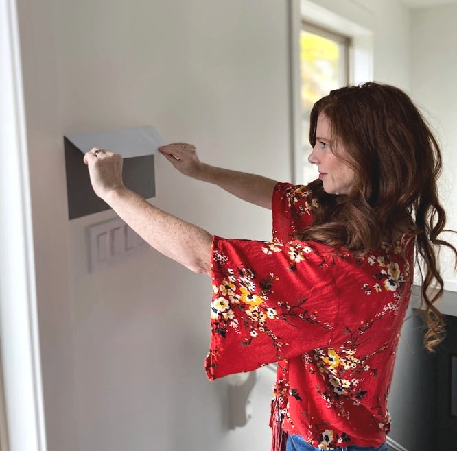
SHEEN affects how paint colors look, so when sampling, it’s important you do four things:
1. Have your samples made in a SATIN finish. Although, I’ve found the sheen on the darker colors from SAMPLIZE is pretty close (darker colors tend to carry more sheen).
2. Pick up a PAPER chip sample of Benjamin Moore Black (2132-10) or Sherwin Williams Tricorn Black. Darker paint colors can look DAMN dark on a small scale. Taping a sample of black to your larger samples will give you a better frame of reference as to their ACTUAL depth and color!
3. Hang your samples 100% vertically. Light reflects differently off vertical surfaces and horizontal surfaces. It’s VITAL that your samples are totally vertical – even a slight lean can skew things (also a reason why you shouldn’t drink too much wine while sampling)
4. Pivot your samples to the left and right to see how they catch the light. Doing this will show you how SHEEN plays with your room’s natural and artificial light.
Cool beans? Alright, let’s DO THIS!
1. BENJAMIN MOORE CHEATING HEART 1617
When I’m looking for a WICKED dark, striking shade of navy blue or DARK GRAY, Cheating Heart has MY heart. With its LOW LRV of 6.89 and subtle blue-violet hue, Cheating Heart is close to the black end of things but has some gray and blue to lift it from the depths. If you have SUPER LOW light, Cheating Heart could look slightly blackish, and you’ll need decent interior lighting to help it out.
Get your PEEL & STICK SAMPLE OF CHEATING HEART
If you compare Cheating Heart to Sherwin Williams Cyberspace (coming shortly), you’ll see they have VERY SIMILAR LRVs. However, Cheating Heart has LESS navy blue/more gray, which sometimes casts a bit more black, and can also be considered a ‘dark charcoal with a blue undertone.’

Cheating Heart with Sherwin Williams Pure White walls
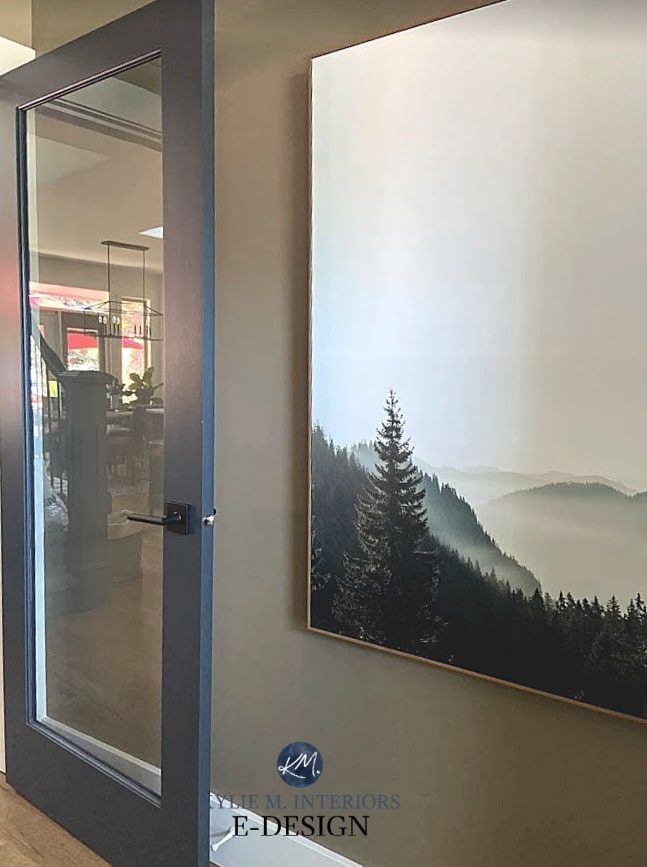
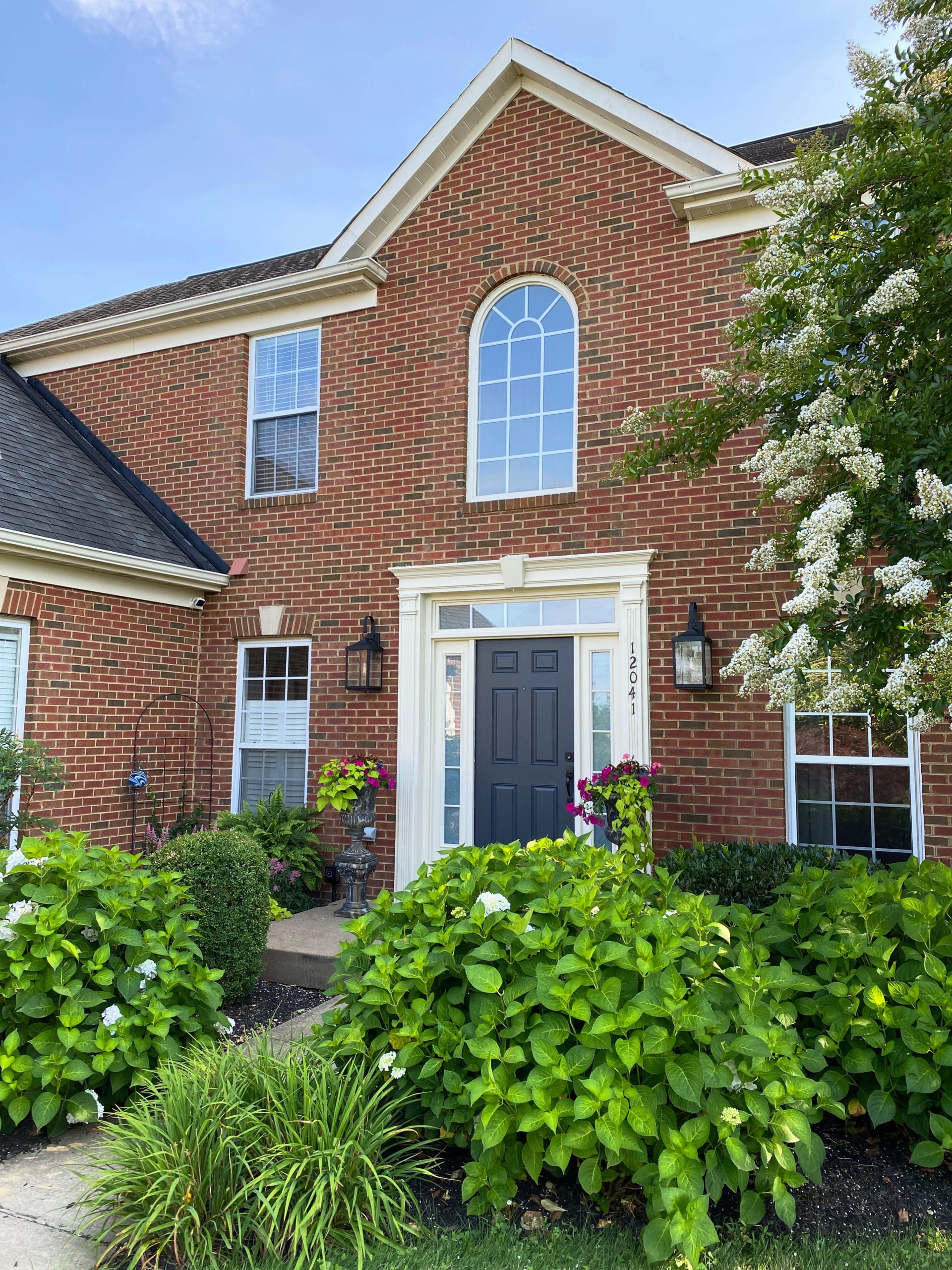
You can also use Cheating Heart on interior and exterior doors…
FULL Paint Color Review of Benjamin Moore Cheating Heart
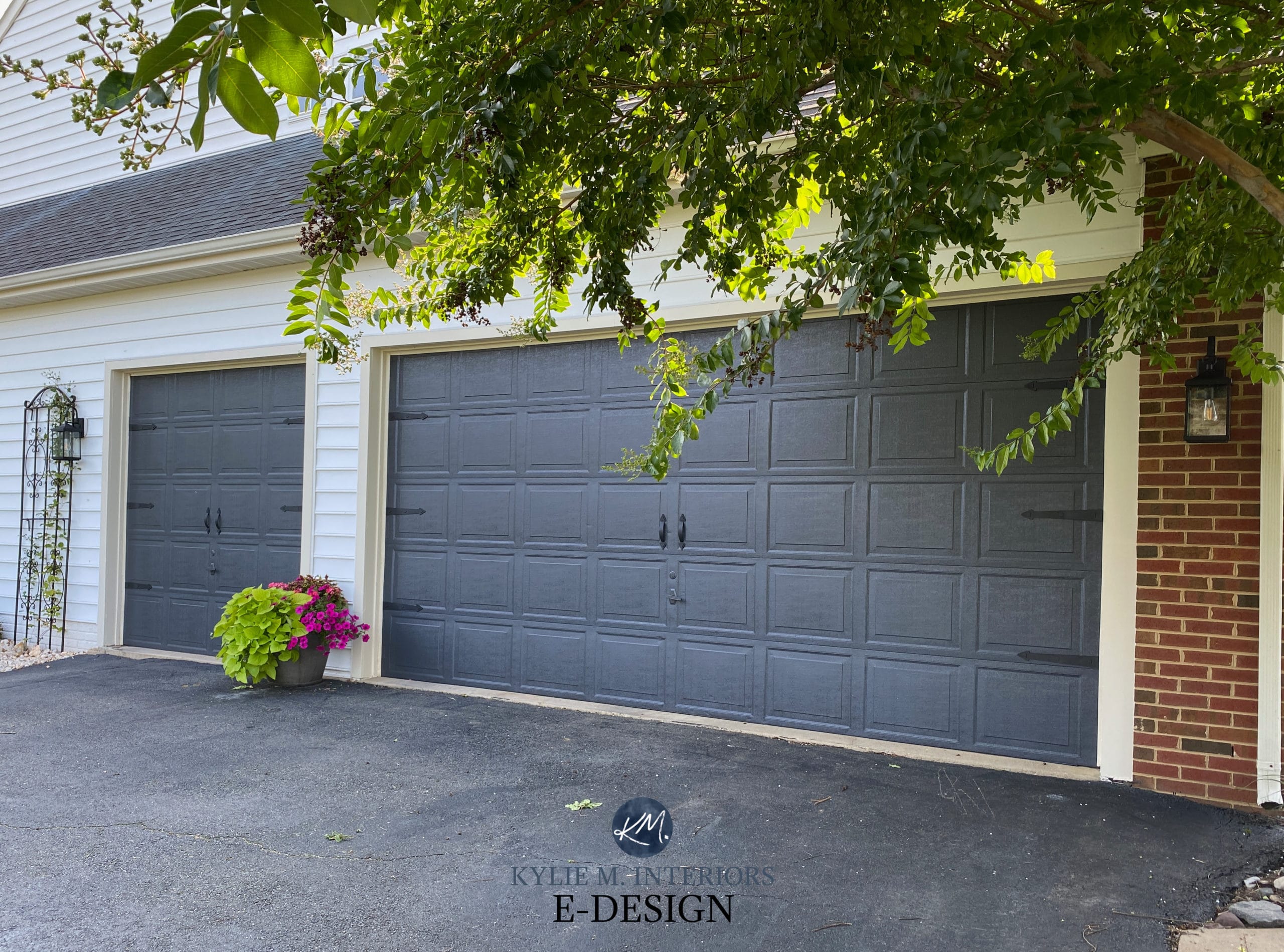
And it’s on the garage door too…
YOUTUBE Video Review of Benjamin Moore Cheating Heart
2. BENJAMIN MOORE HALE NAVY HC-154
Hale Navy is a classic and popular shade of navy blue paint. Not too bright, not too dark, with an LRV of 6.3, Hale Navy is near the top of the heap when it comes to versatility.

Get your PEEL & STICK SAMPLE OF HALE NAVY
Do I love Hale Navy? HAAAAALE YES, I DO! Hale Navy is a shade of blue with just enough of a neutral base to calm it down, so it doesn’t look like it’s trying too hard.
Whether on an island, bathroom vanity, or front door, it’s a classic addition to almost any home.
FULL Paint Color Review of Benjamin Moore Hale Navy
YOUTUBE Video Review of Benjamin Moore Hale Navy
If Hale Navy is TOO BLUE for you, check out Sherwin Williams Cyberspace (below).
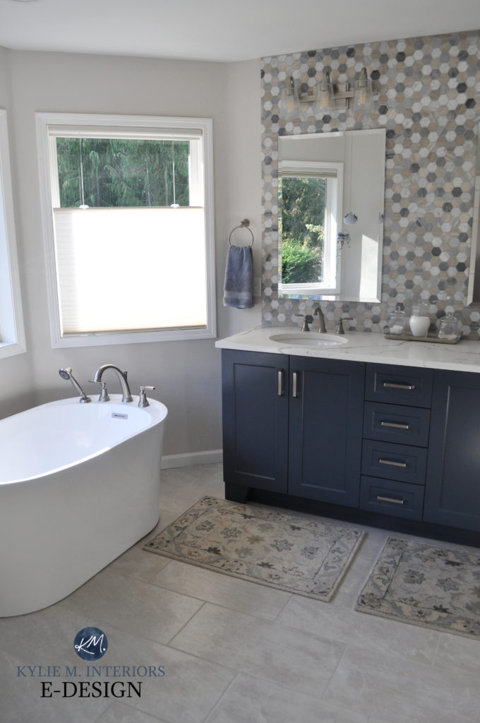
3. BENJAMIN MOORE NEWBURYPORT BLUE HC-155
If you find Hale Navy too dark, Newburyport has a similar approach; it’s just a bit lighter (LRV of 8.28), but still pretty dang blue. Newburyport Blue is often what people think of when they think of ‘navy blue.’ And as with any color, it all comes down to how much DEPTH you want on your surface and how much COLOR you want to see! The great thing about Newburyport Blue is that it’s pretty well-balanced in both regards!
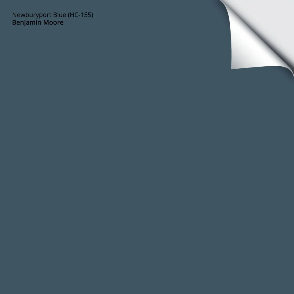
Get your PEEL & STICK SAMPLE OF NEWBURYPORT BLUE
This next photo shows Newburyport Blue as an accent wall. It doesn’t always appear this blue-green, although it favors green OVER violet as it relates to undertones.
Where Should I Paint a Feature Wall, & WHAT COLOR Should It Be?
If Newburyport Blue is too light, return to Hale Navy or check out Sherwin Williams Naval (coming shortly). If you’d like a lighter take on Newburyport Blue, check out the similar approach of Van Deusen Blue.
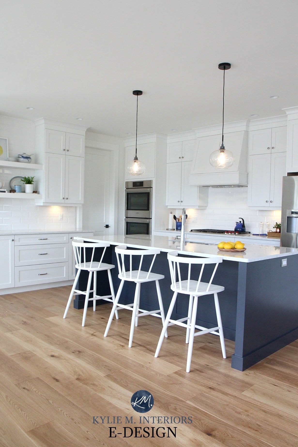
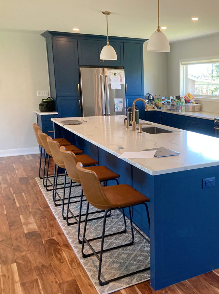
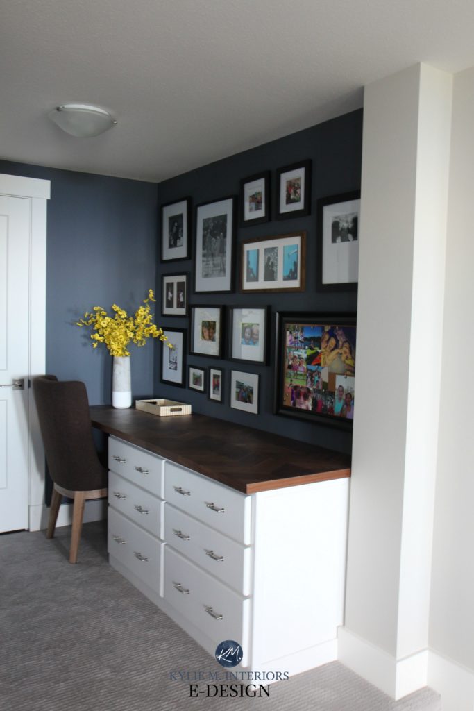
4. SHERWIN WILLIAMS CYBERSPACE 7076
Cyberspace is my PERSONAL fave regarding the best navy blue colors for kitchen islands and bathroom vanities (even feature walls!). Cyberspace is similar to Hale Navy but has a bit more gray, giving it a more subdued approach to navy blue. With an LRV of 6, Cyberspace is a color that really grounds a space with depth without overwhelming it with strong ‘color.’
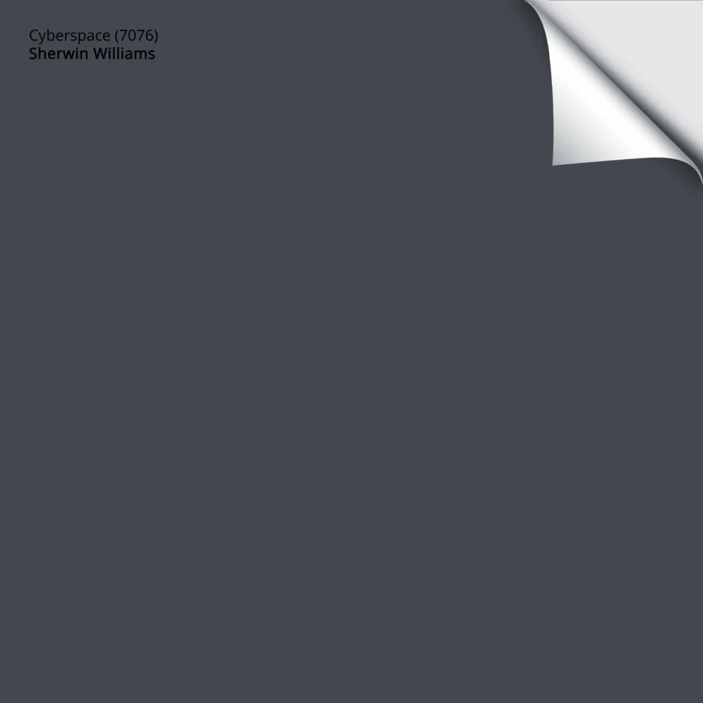
Get your PEEL & STICK SAMPLE OF CYBERSPACE
In this next photo, my client wanted to update the look of her oak kitchen without painting ALL of the cabinets. Cyberspace does the trick and pulls nicely into the flecks in her countertop.
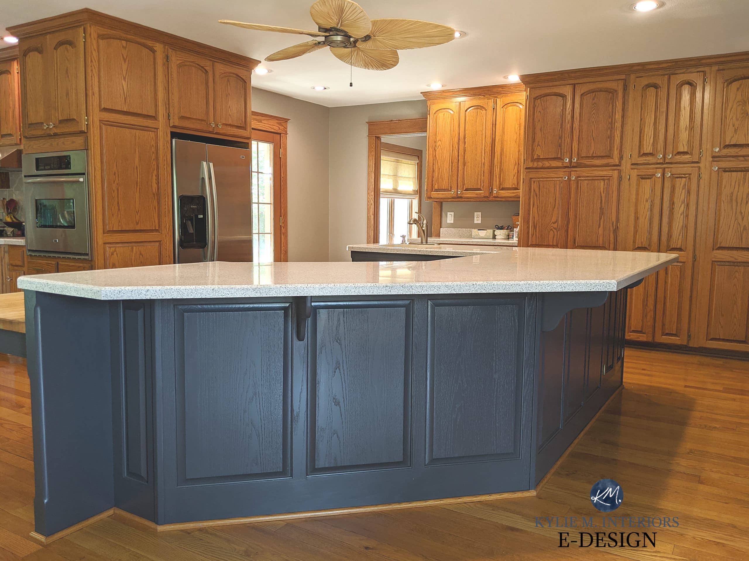
5 Ideas to Update Oak or Wood Cabinets
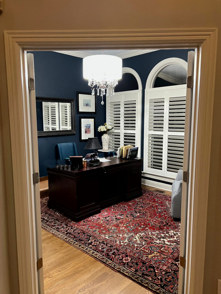
In the next two photos, we used Cyberspace on the built-ins beside the fireplace and the kitchen island…

FULL Paint Color Review of Sherwin Williams Cyberspace
If Cyberspace is more muted than you want, bump back to Benjamin Moore Hale Navy or check out Sherwin Williams Naval (below)!
SAMPLIZE offers peel-and-stick paint samples that are more AFFORDABLE, EASIER, and more ENVIRONMENTALLY FRIENDLY than traditional paint pots.
- Samples arrive ON YOUR DOORSTEP in 1 BUSINESS DAY!
- They’re more affordable than the sample pots/rollers/foam boards that are needed for traditional paint sampling.
Visit the SAMPLIZE website HERE
5. SHERWIN WILLIAMS SEA SERPENT 7615
Sea Serpent is a deep, dark, navy blue paint color with a striking approach that leans just a tiny touch into green (compare it to Cyberspace to see the shift). Sea Serpent has an LRV of 7, so while it’s certainly a dark shade of blue, it’s not as heavy as some on this page.
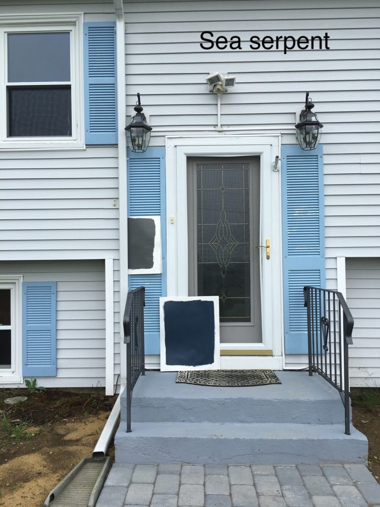

If Sea Serpent isn’t TRUE BLUE enough for you, Sherwin Williams In the Navy (coming shortly) or Naval should do the trick!
The Best Navy Blue and Teal Paint Colors for Your Front Door
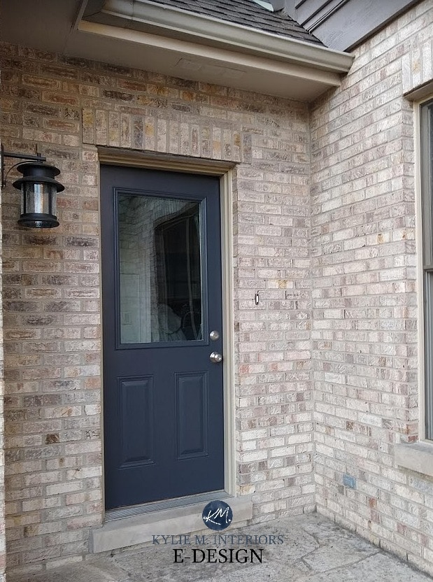
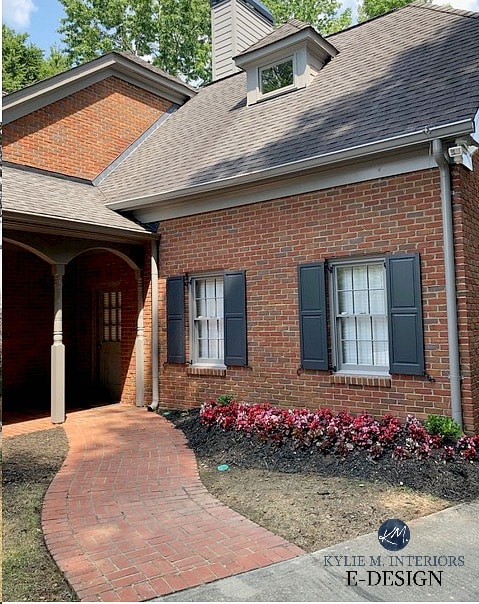
6. BENJAMIN MOORE WROUGHT IRON 2124-10
LRV 6.16
If you thought Cheating HEART was dark, wait until you see Wrought Iron! Wrought Iron is an ALMOST BLACK blend of black, gray, and navy blue, but a blue that leans reasonably into blue-violet.
Compared to Cheating Heart, the blue in Wrought Iron takes more of a backseat, and the black-gray comes forward. In some lights, Wrought Iron can look more like a SOFT BLACK than anything blue-inspired, so it’s SO IMPORTANT to have that little paper chip sample of Benjamin Moore Black 2132-10 handy for comparison.
This next photo with Wrought Iron on a side door demonstrates how it comes to life if given some light to play with!
However, on these shutters, you can see how dark it can POTENTIALLY look…
FULL Paint Color Review of Benjamin Moore Wrought Iron
YOUTUBE Video Review of Benjamin Moore Wrought Iron
7. SHERWIN WILLIAMS NAVAL 6244
Naval has a crazy dark LRV OF 4 – HOLY FREAKIN’ DINAH! While Naval is a SUPER dark navy blue, thanks to its high degree of color (saturation/chroma), it doesn’t look as black as Wrought Iron can. That’s right, Naval has a bit more ‘color’ than the average blue, along with a subtle touch of green hiding deep inside. Tip your sample to see how the light plays off this bad boy and brings him to life!

Before, the color on this door was cute, but the homeowner wanted a darker hue with more impact…
After, Naval came in and did the job…
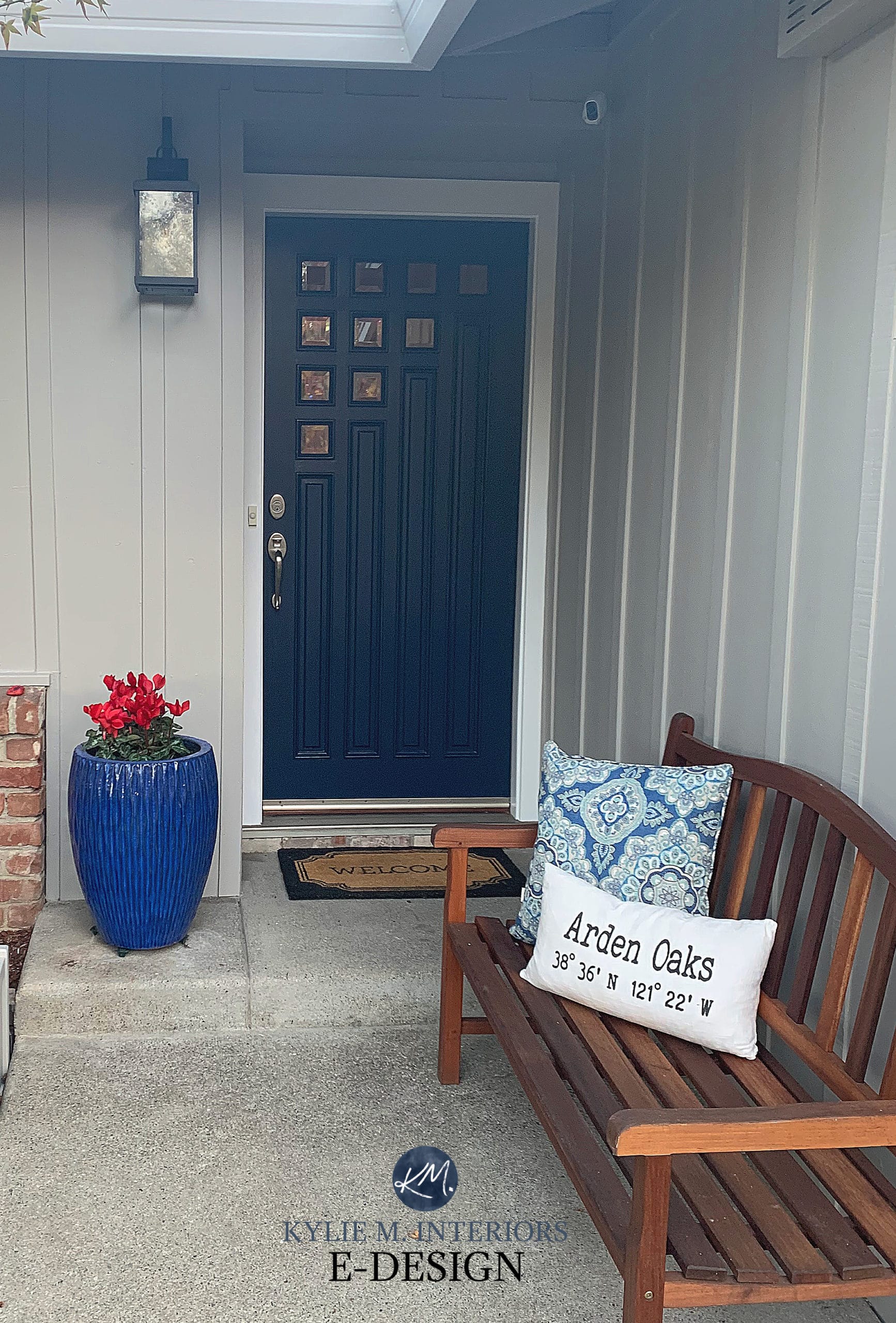
Compare the front door to the welcome mat – the comparison will help you see the COLOR of Naval better.
FULL Paint Color Review of Sherwin Williams Naval
The 10 Best Farrow & Ball Blue Paint Colors
8. SHERWIN WILLIAMS IN THE NAVY 9178
Are you humming along with me ‘…in the navy, yes, you can put your mind at ease’? These words have NEVER been truer. If you’re looking for THE NAVY BLUE OF ALL NAVY BLUES, this is it.
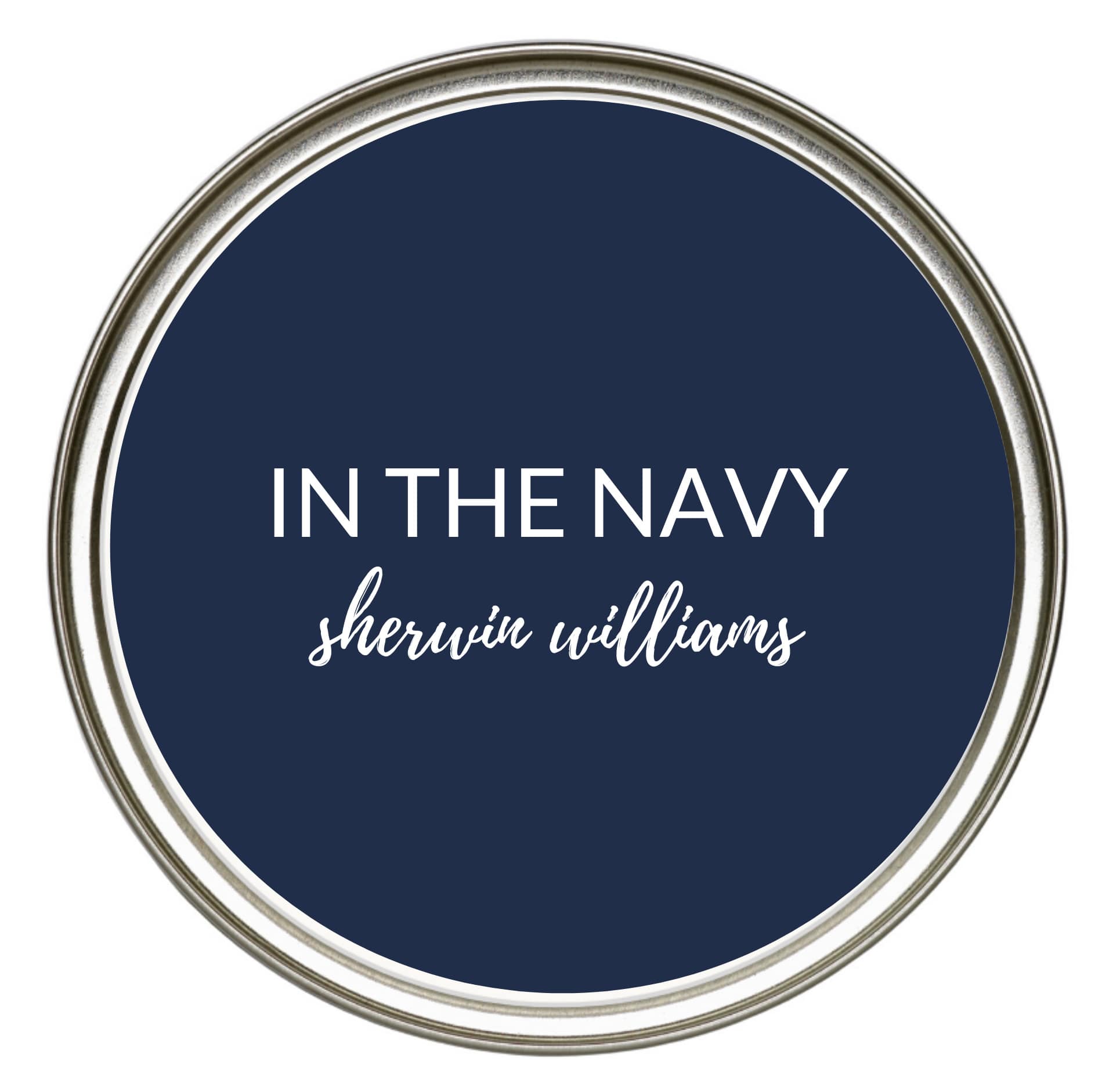
In the Navy pulls NO punches with its dark LRV (4) and striking approach to navy blue, making colors like Benjamin Moore Hale Navy and Sherwin Williams Cyberspace look NEUTRAL in comparison (not really, but I’m just trying to make a point here).
And at some point, I’ll have some FABULOUS photos of it in action – hopefully soon! Until then, you can see it on Pinterest.
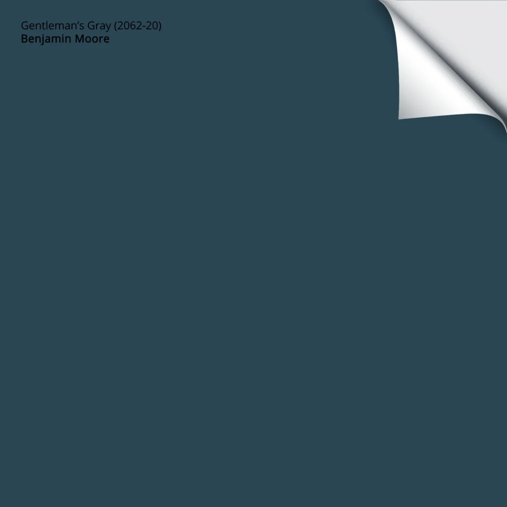
9. BENJAMIN MOORE GENTLEMAN’S GRAY 2062-20
Gentleman’s GRAY? PARDON ME? Gentleman’s Gray is about as far from gray as you can get! However, this color ALWAYS throws me off because while it’s classified as a blue-violet, compare it to ANY OF THE NAVY BLUES on this page, and it looks a touch blue-green. I’m still wrestling with this as I BELIEVE it’s a blue-green (even if scientifically it isn’t). WHERE’S MY WINE?!
BIG THANK YOU to all my Online Color Consulting clients for sending in their photos – you make my colorful little world go round!
Along with its green undertone, Gentleman’s Gray is a STRONG approach to navy blue with much less gray than many of its peers. As for depth, Gentleman’s Gray has an LRV of 7, making it one of the moderate shades of dark blue.
10. SHERWIN WILLIAMS INDIGO BATIK 7602
Indigo Batik is a GORGEOUS denim-inspired navy blue paint color (slightly blue-violet) that’s a bit softer but cleaner compared to the more classic shades of navy. It’s VERY comparable to Benjamin Moore’s Newburyport Blue and also has an LRV of 8.

When sampling Indigo Batik, you might be SURPRISED at how much lighter it looks when the light hits and may want to go a bit darker, in which case you could go back to Benjamin Moore Hale Navy.
Benjamin Moore Anchor Gray Paint Colors Review
QUESTIONNAIRE: Should I Paint My Kitchen Cabinets or Leave Them Stained?
11. BENJAMIN MOORE WESTCOTT NAVY 1624
Westcott Navy is a gorgeous dark navy blue paint color with the right blend of navy blue (slightly blue-green) and gray so that it’s saying ‘navy’ all day long without yelling it from the rooftops.
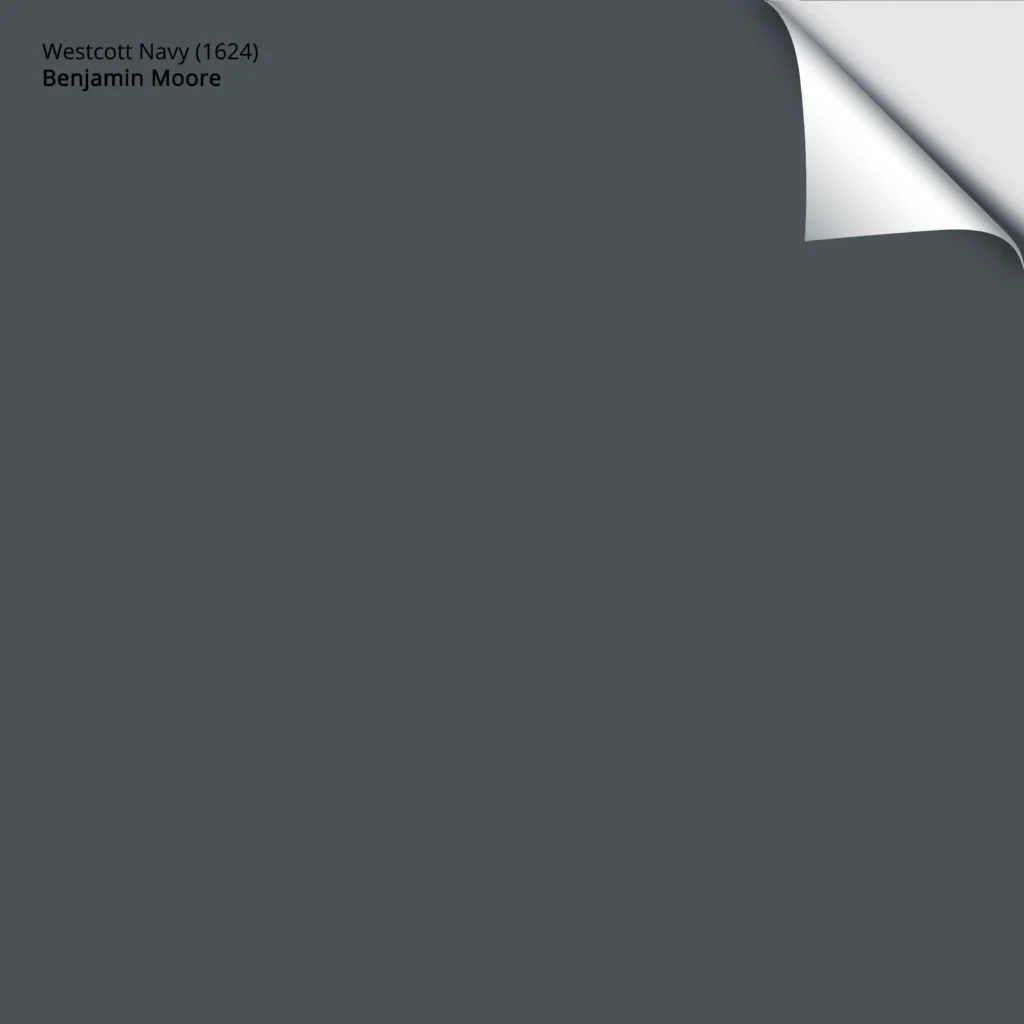
If you like Sherwin Williams Cyberspace, Westcott Navy is similar but is like a subtle, slightly bluer tweak of it. Although its LRV is a touch higher, at 8, this dark blue has some serious visual weight due to its decreased degree of color (chroma).
12. BENJAMIN MOORE DOWNPOUR BLUE 2063-20
Downpour Blue could do the trick if you’re looking for a blue with a little more PUNCH, especially with an LRV of 5.5! While being the STRONGEST and brightest navy blue on this page, Downpour Blue stops shy of being a ‘primary’ blue as it has a subtle bit of gray-black to calm it down…a bit.

NOW, do me a favor and compare Downpour Blue to Gentleman’s Gray, and TELL ME that GG doesn’t look blue-green! Truth be told, even Downpour Blue can look a wink blue-green. Anyways…
If you’re looking for that NEXT LEVEL in brightness in your navy blue, check out Benjamin Moore Blue 2066-10 or Benjamin Moore Patriot Blue, which is WICKED gorgeous. Want something more MUTED? Benjamin Moore Anchor Gray could do the trick!
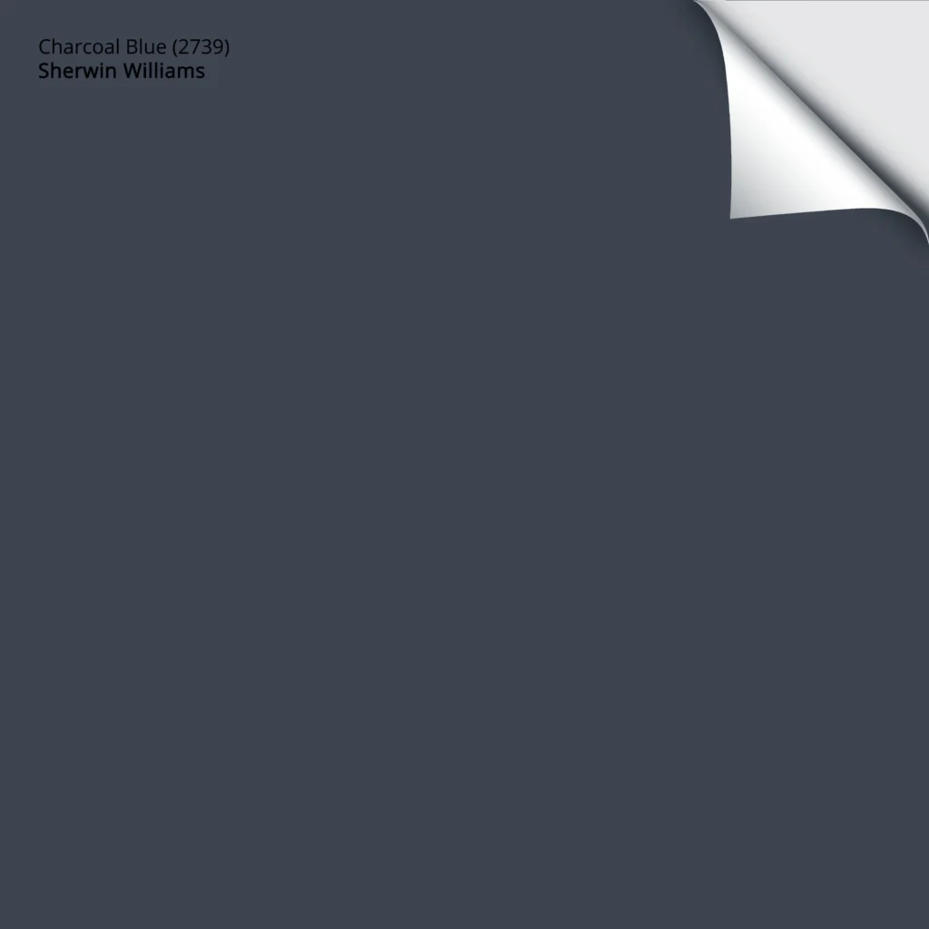
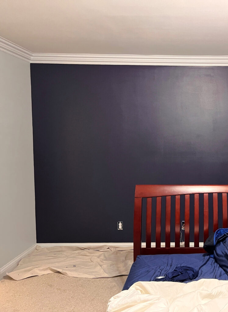
13. SHERWIN WILLIAMS CHARCOAL BLUE 2739
Charcoal Blue is awesome for its moderate approach to navy blue. Not as rich and striking as In the Navy, but not as muted as Cheating Heart, Charcoal Blue is definitely NAVY BLUE; it’s just a softer take on it. As for undertones, Charcoal Blue favors a slight violet undertone with some gray for a calming effect.
Like most navy blue paint colors, Charcoal Blue is a popular choice for kid’s rooms, accent walls, islands, and doors…
WHAT’S THE MOST POPULAR NAVY BLUE PAINT COLOR?
Benjamin Moore Hale Navy is one of the BEST, most popular shades of dark blue for walls, doors, cabinets, and exteriors.
So, there you have it – some GORGEOUS navy blue paint colors for almost ANY paintable surface in your home!
READ MORE
The 6 Best HOA-FRIENDLY Front Door Paint Colors
Benjamin Moore Blue Nova: Color Review (Color of the Year 2024)
Farrow & Ball’s 10 Best Blue Paint Colors
The Best Blue-Green Paint Colors
The Best Paint Colors for a Kitchen Island
The Best Front Door Paint Colors
NEED HELP?
CHECK OUT MY ONLINE PAINT COLOR CONSULTING PACKAGES
Chat soon,

ORIGINALLY WRITTEN IN 2021, UPDATED IN 2023 FOR PHOTOS AND CONTENT


Kylie,
I love this –I was thinking about painting a vanity Navy…and now I know how to pick the one that will work best. I especially liked the photos of the door that went from OK to fabulous when painted Naval (I’m a sucker for a good before & after!)
What about Gale Force?
Thank you so much for this timely article, Kylie. I am starting a blue and white kitchen project and the sheer number of blues is overwhelming! I do appreciate you giving us a review of these colors. Thanks again!
You’re MOST welcome!
Thank you so much for your posts! I’m renovating and they have been a lifesaver. Question about Indigo Batik. I love it and am thinking about painting my boys’ bedroom with three walls Indigo Batik and one wall Pure White. I’ve tested it on my walls and wish it were just a wink darker. What are your thoughts on Indigo Batik 25% darkened? My biggest fear is that darkening it would bring out more purple, which I don’t want. Would love your insights!
Hi Ryan! 25% is pretty subtle – more noticeable in some colours than others. SOME colours can’t actually be darkened anymore and while I THINK you should be able to do Indigo Batik, there’s a chance you won’t be able to. A colour like this has quite a bit of tint going into the gallon of paint and often, the gallon just gets full! Overall, I don’t see any red flags trying it 25% darker :).
I am building a house that has jogging path for siding and Country Ledgestone Bucks County Stone. I’m struggling with a door color and I want a pop of color to brighten & be different and bold. I’m looking at Hale Navy, Cheating Heart and Sea Serpent. Can you give me some advice for the best possible outcome. This is a over 55 community and we have so many Red doors that I want to be different!
Thanks
Tracy Moreau
Which ones on this list would pair well with golden yellow LRV 77? Looking for a Navy front door color in a yellow living room with blue couches far away from the door and warm floors. Any of these Navy shades particularly NOT look good in warm room?
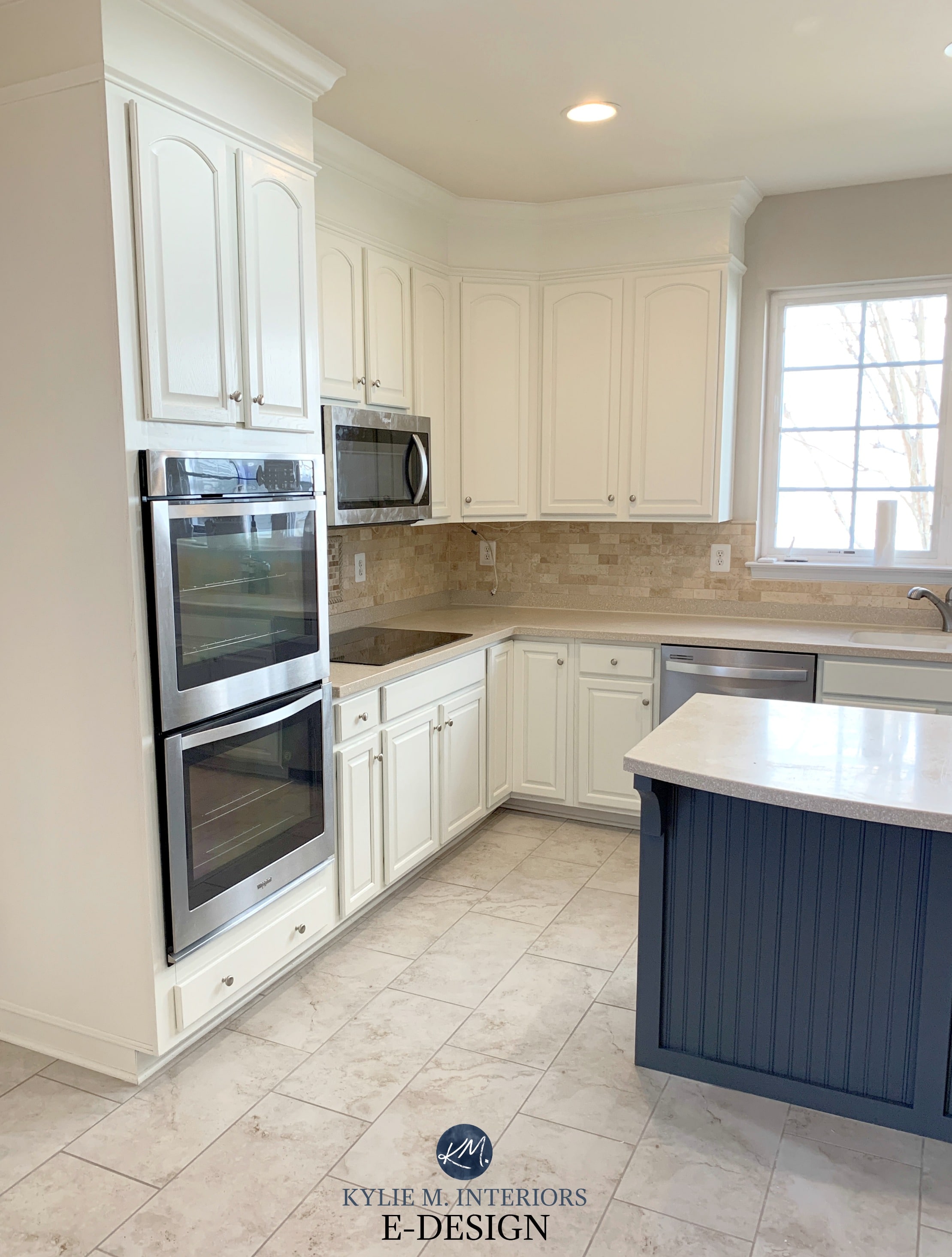
What color is on the center island in the last picture?
ahhh, that’s Sherwin Williams Cyberspace!
What dark blue would go best with SW Moderate White for a bathroom accent wall?
How about BM Hale Navy??