
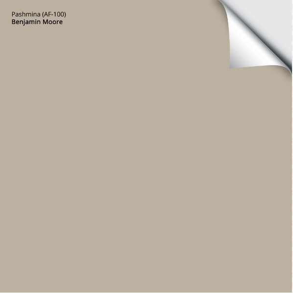
Benjamin Moore Pashmina: Undertones, LRV & Real Home Use
Pashmina is one of Benjamin Moore’s more popular, slightly deeper neutral paint colors. And with trends leaning warmer and more organic, it’s no surprise that it’s showing even more on my Pinterest and Instagram feeds.
Whereas lighter greiges and taupes are great for the average room, Pashmina’s depth and approach make it popular for accent walls, cabinets, islands, exteriors, and more. However, with sneaky undertones, it’s not cut out for every job.
So, let’s wrap ourselves up in the warmth of Pashmina and see what it offers you and your home.
Pashmina is a greige paint color, making it warm. Now, some greiges are reasonably balanced between gray and beige. Others (including many of the most popular shades) cater more to gray than beige. Not Pashmina.
This bad boy tips his hat toward beige, more so than the average greige paint color.

If you have a room with north-facing light or flat afternoon eastern light, you might see Pashmina lean a bit more into its gray base, while still keeping a SOLID dose of warmth. Of course, that’s open to perception; you might find it swings too cool for the look you want.
On the other hand, if you have a south-facing room or western afternoon sunshine, Pashmina can lean into its warmth, winking that bit more at beige.
North, East, South, West – Which Paint Color is the Best?
WHAT’S PASHMINA’S LRV & WHY IT MATTERS
According to Benjamin Moore, Pashmina has an LRV of 44.2. At this depth, it sits in the light-medium range but on the HEAVY end, winking at the medium depths.
This matters because most people wouldn’t paint their whole home a color like Pashmina – it’s too dark. Instead, they might aim for an LRV between 62 and 74. Shortly, we’ll look at which rooms/projects Pashmina is best for.

The Best White & Off-White Quartz Countertops | Urbane Bronze island
ROOMS THAT SUIT PASHMINA’S DEPTH (& THOSE THAT DON’T)
- At this depth, Pashmina could look more like a solid medium tone in a slightly darker room. It can also look a bit drab and dingy, unless you’re going for a muted, organic look.
- If your room is light and bright, even moderately so, Pashmina will appear more like a light-medium depth paint color, but with some real meat on its bones.
Not sure what LRV is? It could save your paint-lovin’ life – read all about it HERE.
WHAT ARE PASHMINA’S UNDERTONES?
Pashmina has a very subtle green undertone. While some see it right away, most of the time it doesn’t stand out in any obvious way.
But you have to be careful, as just like midlife random hairs, undertones can show up in the most unexpected places. For example, if you pair Pashmina with a finish that has more purple-pink undertones, it can seem a bit more greenish in comparison.
On the other hand, if Pashmina flashes purple, pink, or even blue hues at you, you may want to check your interior lighting (the Kelvins of your bulbs) and the surrounding finishes, including your trim. These things can affect how Pashmina looks. That said, with a tendency towards green, those other shades shouldn’t really pop up too much.

SW Pavestone | SW Intellectual Gray | BM Pashmina | SW Iron Ore
In the above image, notice how Pavestone and Intellectual Gray are greiges that a) are grayer, and b) have a more noticeable green undertone, making Pashmina look more NEUTRAL in comparison! That’s how subtle its undertone can be!
BEST WHITE TRIM & CABINET COLORS WITH PASHMINA WALLS
Being a more organic, earth-toned neutral, Pashmina loves soft, warm whites. And while it can ‘politely handle’ bright, true whites, it prefers those that are a little more gentle. Here are a few I recommend to my clients…
- Sherwin Williams Pure White isn’t ‘pure’, it’s soft, but doesn’t have as much warmth as some.
- Benjamin Moore White Dove is my favorite white with Pashmina. Soft, warm, but not overly creamy.
- Benjamin Moore Cloud White can be a beautiful partner for trims and cabinets, too.

Benjamin Moore’s Best Warm White Paint Colors
The 4 Best White Paint Colors from Sherwin Williams
Here’s your Peel & Stick sample of Pashmina…
WILL PASHMINA WORK IN YOUR HOME? BEST ROOMS & FINISHES
While Pashmina can be gorgeous, it can be fussy in certain lighting conditions. Its undertones also make it a trickier choice with the average interior finishes. Let’s start with a large-scale overview of where it works…
WHERE IT WORKS BEST
- Single rooms or, at most, an open-concept, well-lit space. It’s not intended for ‘whole home’ use.
- Kitchen cabinets or islands (or bathroom vanities). Pashmina is a beautiful choice for a more modest, non-dark island color with a wide range of main cabinet colors, including stains and warmer, lighter shades.
- Exterior surfaces, in particular, painted siding/stucco
- As an accent wall with a well-chosen off-white (link coming up shortly)
FUN FACT: Stone-inspired colors like Pashmina are pretty popular on kitchen cabinets right now!
The Best Mushroom-Inspired Paint Colors
WITH WOOD FLOOR, TRIM OR CABINETS…
Pashmina can be beautiful with some wood stains, including flooring, cabinets, and furniture. I would be cautious with super light, natural woods, as well as those with a strong red or pink hue. Instead, focus on woods that are more ‘natural’ looking with a gentle yellow, orange, or brown look.

This wood-look flooring is super happy with Pashmina and its Urbane Bronze island.
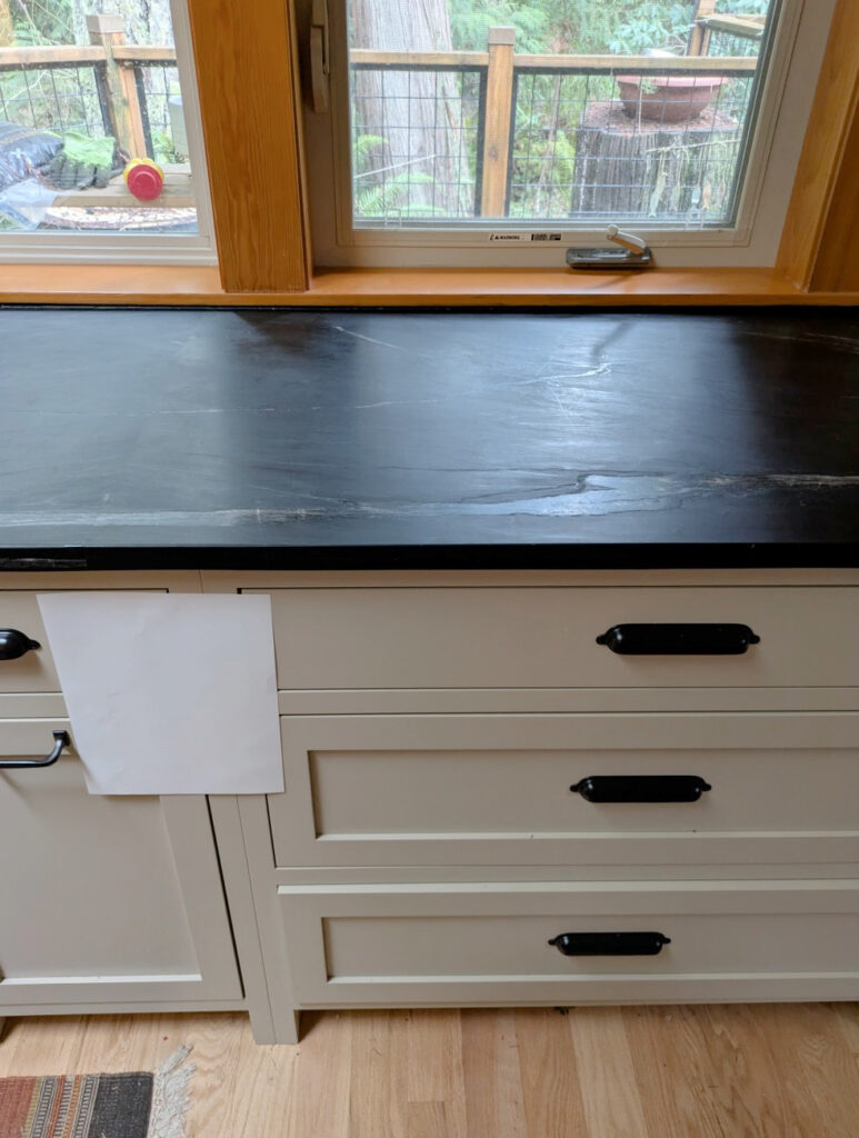
WITH GRANITE COUNTERTOPS & WHITE QUARTZ
In my experience, it can be a touch too greige for the average granite. I’ve found that many granite countertops (especially those that need updating from the early 2000s) cater to colors that lean a bit more purple-pink with their undertones – not green (at this depth). That said, there’s the odd match!
As for white quartz, it should have a bit of this warmth in its veining. Many of the popular white quartzes have veins that are too cool-gray to suit Pashmina. However, some of the more modern, warm quartz and quartzite countertops could suit it quite nicely!
Here’s Pashmina looking badass and beautiful on painted kitchen cabinets. It instantly updates the original granite countertops and travertine backsplash tile…

Get the best color advice with Kylie M’s Online Design Consulting!
WITH KITCHEN CABINETS…
WHITE CABINETS: Yup, as mentioned in the ‘white trim/cabinet’ section, it works well with warm whites rather than bright, crisp shades.
CREAM CABINETS (OR TRIM): It depends. If the cream paint color is muted and doesn’t have too orange-brown of a glaze, it can be a good choice. However, if the cream is too yellow, rich, or the glaze is off, Pashmina can fall a bit flat. Check out this blog post for some better update ideas.
- When it works, Pashmina offers a subtle warmth against the yellow undertone of cream cabinets/trims. This is more likely when your cream is super subdued, rather than rich and warm (the above photo is a good example of a soft, subtle warmth with Pashmina).
- When it doesn’t work, Pashmina comes off almost purplish and flat.
Here’s Pashmina with Sherwin Williams Antique White on the trim and door. It wooooorks, it’s just on the edge of my happy place (Antique White might prefer a bit more warmth)…

That said, it could just be the exposure of this room – you won’t know how it settles in your room until you try!
GRAY, GREIGE, OR TAUPE CABINETS: The only cabinet in this range that’ll really work with Pashmina is an off-white/light greige with a similar approach to undertones (not common), or a dark greige like Sherwin Williams Urbane Bronze.
BEIGE TILE, CARPET, COUNTERTOP: Because these are so common, they’re worth touching on. While the odd beige finish suits a color like Pashmina, it can sometimes look just a bit too muddy. Generally, the more muted and less golden your beige finish is, the better chance it’ll jibe.
COLORS SIMILAR TO PASHMINA (& HOW THEY COMPARE)
Sometimes you need a tweak in undertones, depth, or temperature to find your perfect shade. Or maybe you need an alternative to Sherwin Williams. Either way, sampling and comparing a range are important steps.
Benjamin Moore Rocky Road. If you’re unsure if your finish suits a greige like Pashmina or a color with a bit more purple undertone, you’ll definitely want to compare these 2. While they’re similar in depth and intentions, you’ll see a nice shift in undertones.
What’s better? For the average finish, possibly Rocky Rock. But I like Pashmina more for it’s organic, earthy look.
Benjamin Moore Stone Hearth. If you find Pashmina just a bit too heavy and greige, take a look at Stone Hearth. With its LRV of 48.45, it’s about 25% lighter, and you’ll see a bit more warmth/less inclination toward green.
What’s better? Ahhh, I’d give them pretty equal scores – Stone Hearth is awesome; it just depends on which depth/temperature you prefer.
Here’s Stone Hearth with a few other similar shades…

SW Tony Taupe | BM Indian River (also known as Ranchwood)
Sherwin Williams Loggia. Sherwin Williams doesn’t have a great alternative; they’re all reasonably different. Loggia is lighter and warmer – a bit more beige tan looking than greige. Sherwin Williams Whisper has a similar overall look, but picks up more gray-green undertone, for sure. Sherwin Williams Perfect Khaki is interesting, as it’s a shade darker (LRV 38) and leans a bit warmer.
What’s better? Loggia is awesome. For the average project, I’d probably choose it for its softness.
Here’s Loggia with some goooorgeous soapstone countertops…
Let’s look at a few more…

REVIEWS: SW Accessible Beige | SW Amazing Gray | SW Stone Lion | SW Tony Taupe | SW Mindful Gray | SW Network Gray
COLORS THAT GO BEST WITH PASHMINA (& ONES TO AVOID)
Pashmina can be a bit fussy, so be careful. It also depends on what you need this color for: an adjoining room, cabinets, island, or trim? Or perhaps you want Pashmina as your accent wall color and need a color for the other walls. Whatever you need, I should have it here…
- OFF-WHITES: Pashmina is amazeballs with a WIDE range of warm, subtle off-white paint colors.
- DARKER GRAY-BLUE BLENDS: Gray-blues that are darker can be gorgeous in the same color palette.
- GREEN-GRAYS: Darker green-grays, especially warm ones, can be beautiful. However, even slightly cooler grays with green can be pretty.
- DARK GREIGE: Darker greiges can be ‘next-level’ stunning in the same palette, especially as accent colors.
- DARK BLUES: Darker, muted shades of blue can be stunning. For example, a Pashima exterior with Cheating Heart shutters could be wicked pretty.
COLORS YOU SHOULD AVOID…
- Any color with a pink undertone. Also, be cautious of purple undertones in the light to medium range.
- Pashmina doesn’t love being partnered with gray that’s lighter than it, with rare exceptions
- Overly yellow cream colors.
WHAT TO EXPECT OF PASHMINA IN A REAL HOME
While a color can look awesome in a magazine or online, often, those images are overlit and overedited. Let’s bullet-point a few details to consider…
- It could look murkier and muddier than you might expect unless you have good lighting.
- It has a clay-like look in the average room/cabinet
- While it can work, it won’t coordionate with the average interior finish.
PASHMINA AS AN EXTERIOR PAINT COLOR
Pashmina can be gorgeous on an exterior and is friendly with some stonework and brickwork. However, expect it to look WARMER and more beige vs grayer and don’t be surprised if that wee wink o’ green undertone rises up!
Also, if you’re painting your home a darker color, like a dark green-gray, Pashmina can be a gorgeous trim color!
How Does Exposure Affect Choosing an EXTERIOR Paint Color?
5 Tips for Choosing an Exterior Paint Color
MY HONEST OPINION ON PASHMINA: PROS & CONS
RATING OUT OF 10: 9
I love Pashmina; in fact, I love it so much I had it in my office for a year or two (which is long for me to commit to a color).
It’s a beautiful color for the jobs it’s meant for, especially accent walls, cabinets, islands, and exteriors. And while it’s not great for more than 1 room at a time, with the right lighting, it can be a gorgeous, organic addition to your palette. Not too warm – not too cool – just right.
The reason it loses a point is that sometimes its murky, muddy green undertone makes it a touch of a match with some finishes. Really, though, it’s amazeballs.
READ MORE
The Best Medium Neutrals: Beige, Greige, Taupe
Sherwin Williams Mega Greige Paint Color Review
Sherwin Williams Fawn Brindle: Paint Color Review
Get the best color advice with Kylie M’s Online Design Consulting!

Updated for fresh content and new images for 2026


Hi Kylie! I would appreciate your advice.
My walls are classic grey and I was hoping to do darker contrast trim (and doors) we have loads of windows, open concept and high ceilings so it is very light. Besides lots of wood tones the only other colour in the space is Nantucket grey cabinets. Do you think pashmina would be complimentary in this scheme? Ceilings are chantilly lace.
Thanks for the great post!
Hi Steph! Nope, I would stay away from Pashmina with Classic Gray. Have you looked at BM Metropolis, it’s a warm gray like Classic Gray with a similar undertone profile, whereas Pashmina flashes too warm :).
Thanks!
Thank you for your blog and YouTube videos! I am painting my living room in pashmina! I have already painted my bedroom in BM dark pewter. I love the color but am struggling with finding a complimentary trim color. Any suggestions? I am trying to avoid super clean whites to avoid too much contrast.
Swiss coffee was my choice
Hello. Would Pashmina go with Shaker Beige walls that are adjacent. I was worried about the pink in Shaker Beige. Thank you.
If I have white dove cabinets and pashmina on my island and bar what color should I paint my walls?
Benjamin Moore Edgecomb Gray or BM Winds Breath could be pretty, but it does TOTALLY depend on the colours in your countertops/backsplash 🙂
Hi Kylie! My exterior is Pashmina and I am wanting to re-paint my concrete patio from a similar Pashmina Greige to a warm white. The space has a standard white vinyl privacy fence to one side as well as white vinyl railing to the opposite side so I am also dealing with some STARK white. Do you have a recommendation of the ideal white that would compliment the space using BM Floor & Patio Enamel (I am thinking High Gloss). Many thanks!
Hi Kylie,
Thanks for your tips! I l know beige is more in than gray now— but I’m not sure if pashmina is the one!
We want a whole house interior color and our walls have chair rail in dining and living rooms. I like BM Revere Pewter with White Dove trim- but am really struggling with what darker color to paint beneath the chair rail?? Or do we do all one color? Looking for an accent color for our half bath and mantle.
Keep seeing Tranquility, Amherst Gray, Chelsea Gray….
We also don’t want to be limited when we go to do our kitchen cabinets next year and want a color that is appealing for whole house and plays well with others.
Help!!!
Paint Clueless in SA, Texas 🙂
Exterior paint on ranch home, SW Gauntlet Gray trim, Agreeable Gray for Hardi Plank horizontal siding, and Tricorn Black for shutters and front door?
Sounds lovely!
Hey Kylie,
I love following your blog and am a former island girl in Alberta. I was wondering what your thoughts were on using Pashmina as an accent to Sherwin Williams Natural Tan and Westhighland White?
Thank you for any feedback,
Sarah
Hi there. I have been following you for years – thank you for great content!
We have kitchen cabinets in Egret white, and the room is connected to family room with east, north, and west windows, so mid morning cabinets really flash peach. We are considering pashmina for walls but concerned about clashing. Thoughts? Thank you!!
Oooo, I would be concerned about Clashing too – Pashmina could be a wink too greige for the more taupe look of Egret White 🙂
Hello,
I am having a hard time finding the right color for our kitchen island. We have. Maple cabinets that have the orangey look from turning color over the years. We have the maple floors to match. I painted the island to break things up and do not like the. color it’s to dark.( BM Wrought Iton.) My walls are Manchester tan. My question is would Pasima pair with Manchester tan and the old orangey maple cabinet ? Or should I go lighter? My counter top is very neutral with creams , beiges and had small black veining. Thank you so much !!
Hey Carrie, I’m sorry, I just can’t say without seeing the countertop, as even small shifts in color/undertones can make one color better over another! My original thought is that a bit DARKER than Pashmina makes sense, as it could be too light, considering the depth of the maple cabinets.
Hi hi!
I’m been reading and rereading all your blogs about mushroom paint colors. I’m wanting to paint my interior doors/door frames mushroom color! I’m stuck between Pashmina & Shiitake. Walls, ceilings, and trim are BM Swiss Coffee 75%.
Which one would you recommend?!
Oh jeez, I love them both. However, seeing as I’m sitting in a room painted in it right now, my vote is for Pashmina. I love its depth and I love its slightly organic green undertone – but you gotta do you!
Hi Kylie —
Thank you for your tips! Super helpful! What do you think of Pashmina kitchen cabinets with Taj Mahal Quartzite and maybe Black Satin on the cabinets of the island. I have black stainless steel appliances so was kind of thinking more like a warmer version of a black and white kitchen because I think black and pure white is too stark for my space.
Any suggestions appreciated!
Hi,
We are painting the whole interior of our home edgecomb grey (BM) and have olive Green (BM) accent wall. Would pashmina work as an interior door color instead of white? Thanks I love reading your color reviews