
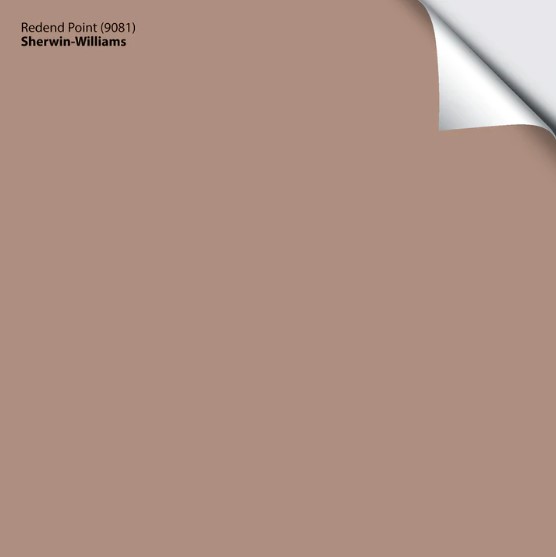
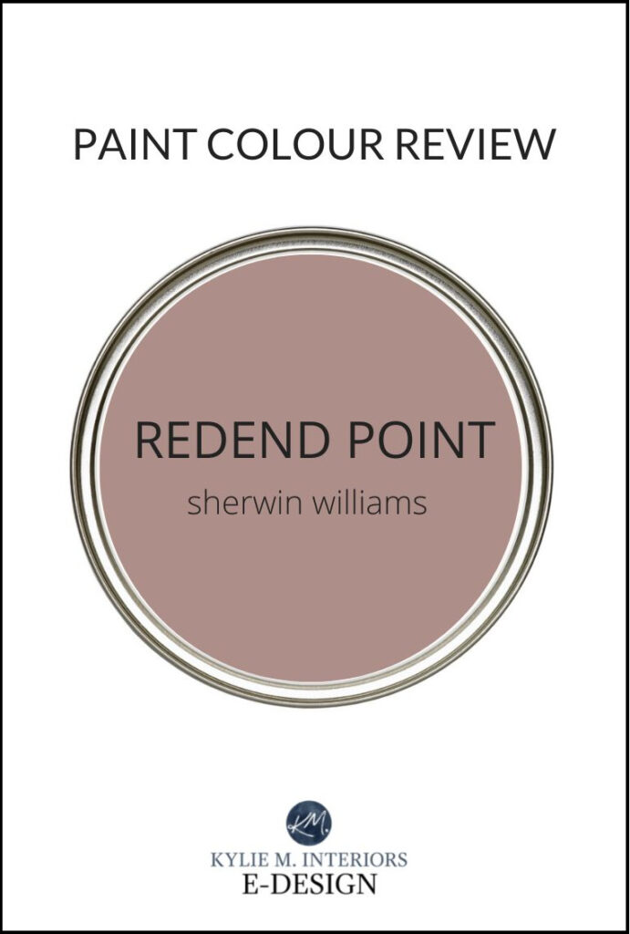
Sherwin Williams Redend Point 9081: Paint Color Review
Sherwin Williams Redend Point: a CONTROVERSIAL color of the year
I’m always curious to see what’s NEXT in the color world. This healthy curiosity is mixed with a GOOD dose of nervous anticipation as I wait to see each brand’s ‘Color of the Year’ pop up in my inbox. And while it was love at first sight for many of us with 2022s Evergreen Fog, it seems like Redend Point isn’t getting quite the same reception (don’t be scared, I’ve got some good info and insights for you).
What’s the ‘general’ opinion of Redend Point?
It seems like Redend Point is hitting many buttons (panic buttons). While I have my own personal opinion of Redend Point (at the end of this blog post), here’s a quick summary of what I’ve come across on my Instagram and in-person conversations.
One popular opinion is that Redend Point hits a BIT too close to home regarding the whole ‘rose, burgundy, hunter green’ episode of the 90s that we’re all still trying to forget. I’ve also heard references to ‘bandaid, fleshy’ and my personal fave ‘wet hot dog’.
However, others are EXCITED by its more obvious warmth (myself included) – including those pink undertones that so many try to avoid.
For many, pink is a four-letter word
And remember, just because OTHERS don’t love this rose/weiner-inspired beauty, doesn’t mean it isn’t the PERFECT choice for you and your home. You might also be surprised to read my PERSONAL opinion at the end!
BEFORE WE GET STARTED…
To show you RELATEABLE & REAL homes, I ONLY use photos from my Online Color Consulting clients. This means I don’t always have the quality photos I need or the RIGHT photos, but DEFINITELY have some SUPER helpful info to help you on your way!
What type of paint color is Redend Point?
The interesting thing about Redend Point is that what it REALLY is, comes down to perception. Some will say ‘oh, it’s a rose for SURE‘, others will be FIRMLY in the PEIGE camp, pink-beige that is.
What do YOU think Redend Point is?
- ROSE
- PEIGE (pink-beige)
- MAUVE
- GREAT WITH MUSTARD & RELISH
In my end of the world, Redend Point is quite confusing. It’s not violet enough to read as a typical mauve, but not orange enough to be cast as a muted terra cotta. IN FACT, Redend Point reads more like a mid-tone brown with considerably noticeable pink-orange undertones. It even nods politely at the dusty rose end of things (but has too much orange to say a full-fledged hello).
I’ve found that sometimes we’re afraid of a color (like Redend Point) when we don’t know what to DO with it OR we’ve had a bad experience with it (90s flashback). I’ll be doing a Youtube video/Instagram video of this color (soon), showing you a few ways to incorporate this color into your home!
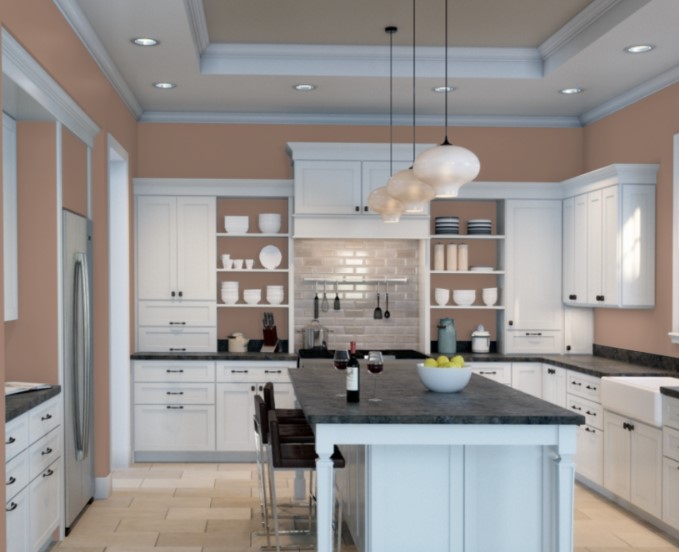
However, because I’ve never referred clients to this color, I don’t have photos of it in action. Instead, I used Sherwin William’s Visualizer to get a feel for this bad boy…
Let’s look at a few details…
- Compare Redend Point to the backsplash tile – it looks GORGEOUS. Why? Because the tile has similar shades in it.
- Compare Redend Point to the countertop and it’s a bit iffy. If the countertop were PURE black, it would be no problem, but Redend isn’t QUITE as happy with the gray-violet hue in there.
- When looking at Redend Point with the travertine tile, it’s oooookay. It’s something I would need to see in person and I imagine Redend looking a bit off with most travertine in real-life.
As for exposures, if you have a north-facing room, the warmth of Redend Point can balance out that cooler light. Its increased color/undertones can also work well for east-facing rooms in the afternoon and west-facing rooms in the morning (when the light is a bit duller).
If you have a south-facing room, Redend Point could get a weeeee bit hotsy totsy when combined with that warm sunshine; the same goes for a room with western afternoon light. Pretty? Yes. WARM looking? You bet your booty it will look warm and will likely tip the scales a bit TOO far.
North, East, South, West – Which Paint Color is the Best?
What’s the LRV of Redend Point?
Redend Point has an LRV of 30, putting it smack dab in the middle of the medium range. With this particular saturation (depth and color combined), Redend Point will do well in a dark room as the increased color helps it stand up to the dark corners and shadows a bit better than a more muted neutral. It also holds up well to intense light – washing out (as every color will) without losing itself.
Not sure what LRV is? It could save your paint-lovin’ life – read all about it HERE.
How to Make a Dark Room Look Brighter – and it ain’t with paint!
The Best LIGHT Paint Colors for a DARK room
Does Redend Point have undertones?
Redend Point has definite pink undertones. However, not all pinks are created equal, and this particular version has a slightly coral-inspired approach, meaning it has a nice dose of fresh squeeze orange in it.
And if you ask me (which you kind of are, btw), it’s this wink of orange that saves the day. Had Redend Point been infused with any more pink, it would be on my personal chopping block for sure.
What’s the best way to sample Redend Point?
Undoubtedly, you’ll be heading out soon to grab paint samples – stop right there! I want you to check out SAMPLIZE. Samplize offers peel and stick paint samples that are more AFFORDABLE, EASIER and more ENVIRONMENTALLY FRIENDLY than traditional paint pots. Here are just a FEW reasons why I recommend Samplize to my clients…
- samples arrive ON YOUR DOORSTEP in 1 DAY, depending on location
- they’re more affordable than the samples pots/rollers/foam boards that are needed for traditional paint sampling
- if you keep the samples on their white paper, you can move them around the room
Get your PEEL & STICK paint sample HERE
Visit the SAMPLIZE website HERE
If I’m painting my walls Redend Point, what’s the best white paint color for my trim?
When it comes to choosing the best trim color for Redend Point, you’ll want to be VERY careful.
Why?
Many of the popular white paint colors have a noticeable degree of warmth/yellow in them. This yellow can clash BIG TIME with the pinkalicious base of Redend Point. The BEST white paint color for trims, ceilings, doors and cabinets will be Sherwin Williams Pure White.
The ULTIMATE GUIDE to White Paint Colors
3 Steps to Picking the Best White Paint Color
The 4 Best White Paint Colors from Sherwin Williams
Is Redend Point a popular color for kitchen cabinets?
Hard. No.
While Sherwin William’s published some literature with Redend Point on cabinets, I don’t see it being popular. Why (insert me twitching here)? It doesn’t look NATURAL on wood cabinets and you’ll be hard-pressed to find a range of countertops that will humor it (short of solid black). If this color were LESS pink and more taupe/greige, then maaaaybe it would have a chance.
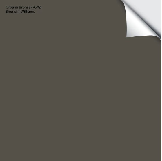
However, I would definitely consider a smaller-scale project like a bathroom vanity, where I could then add some SERIOUS personality and interest to the rest of the room, helping Redend Point feel more at home (ie. Sherwin Williams Urbane Bronze). Heck, I’d probably reverse that with Redend Point on the walls and Urbane Bronze on the vanity.
The Best Paint Colors for Kitchen Island & Bathroom Vanities
The 4 Best Gray & Greige Paint Colors for Kitchen Cabinets & Vanities
Redend Point vs other popular paint colors
Comparison is the KEY to choosing the best paint color for your home. Don’t be afraid to explore other colors to see how undertones, temperatures and LRVs shift…
- Sherwin Williams Hushed Auburn is a GREAT comparison as it shows you how Redend Point’s undertones might not be as strong as you think!
- If you’re worried that Redend Point isn’t as rich and warm as you hoped, compare it to Sherwin Williams Chocolate Powder.
- For a richer, more saturated look, check out Benjamin Moore’s Gaucho Brown. On the other hand, you can simply bump down to Sherwin Williams Moroccan Brown, which comes off richer and darker than Redend Point.
By the way, if you’re considering getting one brand to match another’s paint color, I DON’T recommend it. Read why HERE.
Which paint colors go with Redend Point?
Redend Point actually has a wide range of color partners. The tricky thing is that its BEST partners don’t fall within the ‘most popular paint colors‘ categories, and have us looking a bit outside of our traditional color boxes.
- lighter versions with similar undertone profiles, ie. Sherwin Williams Malted Milk
- LOVELY darker green hues that have been muted with gray/beige, ie. Sherwin Williams Urbane Bronze, Porpoise and Muddled Basil
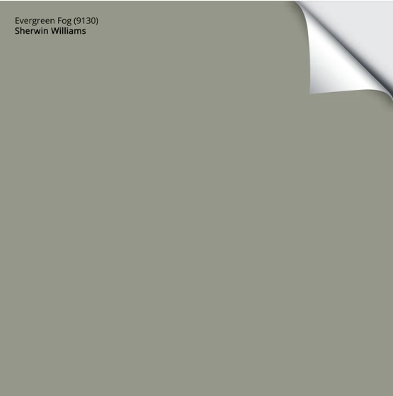
- even Sherwin William’s Color of the Year for 2022 – Evergreen Fog can be pretty in a palette with Redend Point
Remember to check out my upcoming YouTube & Instagram videos for more specific recommendations!
WHAT IS KYLIE’S PERSONAL OPINION ON REDEND POINT?
When it comes to ANY brand’s Color of the Year, I have different expectations. In my wild world of color, a Color of the Year should check off the following:
- a darn good option for more than one type of surface
- inspires the ‘masses’ to try it; gets people excited to get PAINTING!
- speaks to coming trends
- while it doesn’t need to speak to EVERYONE (no color would), it needs to have a fighting chance in today’s average home
Let’s look at Sherwin Williams Urbane Bronze, the 2021 Color of the Year. They REALLY hit it out of the park with this one…
- Is this color good for more than one type of surface? HECK YES! Urbane Bronze suits walls, trims, front doors, exteriors, cabinets – the whole friggin’ gamut!
- Does Urbane Bronze inspire people to get painting? You bet.
- Does Urbane Bronze speak to trends? Definitely.
- Do you think Urbane Bronze could suit the average home (even if it isn’t YOUR personal fave)? It really does!
- Urbane Bronze also looks wicked pretty in a palette with Redend Point.
Get your PEEL & STICK sample of Urbane Bronze HERE
Sherwin Williams followed that up with Evergreen Fog, another BIG hit.
Get your PEEL & STICK sample of Evergreen Fog HERE
Now, let’s see how Redend Point answers the above questions. Keep in mind, this is my personal take on what the ‘Color of the Year’ should be…
- Is this color good for more than one type of surface? It’s BEST for walls only.
- Does this color inspire a lot of people to get painting? From what I’m reading and hearing – no.
- Does it speak to the trends? Yes, trends are leaning warmer!
- Do you think the average home will suit this color? Sadly, no, it will be a tough one to incorporate into today’s palettes and those trying to shift slowly out of the gray world.
LONG STORY SHORT, how do I feel about this color? I like it – I have a sweater in this color hanging in my closet.
- Do I like Redend Point as a cabinet color? A THOUSAND TIMES, NO.
- Do I like Redend Point as a feature wall color? Absolutely, especially with a subtle, pink-inspired neutral on the remaining walls.
- Would I paint an entire room Redend Point? Surprisingly, yes. My first reaction was no (a week ago), but after spending one-on-one time with this color, it’s grown on me.
Why?
Redend Point is subtle and warm. It’s interesting, enveloping, and I could STRETCH it into my home’s existing palette. And while I’m NOT a pink fan, the orange dollop adds some much-needed balance. Sure, it won’t be EVERYONE’S cup of tea; there IS no color that the world can universally agree on, but it sure is getting us talking about it! Had this color been a bit more neutral or even leaned into green as its undertone, I feel it would’ve had a better shot at the title.
READ MORE
Sherwin William’s 2024 Color of the Year: PERSIMMON
Benjamin Moore & Sherwin William’s Colors of the Year – ACCORDING TO KYLIE M.
The Best Whole Home Warm Neutral Paint Colors
The Best Warm Paint Colors That AREN’T BEIGE!
Is Beige Back In Style? Is Beige TRENDY?
Paint Color Review of Sherwin Williams Keystone Gray
What Color Should Your Feature Wall Be?
Not sure which paint color is best for YOUR home?
Check out my Online Paint Color Consulting – I’d love to help!
Chat soon,


I realllly don’t like it. It reminds me of deli meat and if I’m going to be kind, it’s one of those colors like Farrow and Ball Dead Salmon (their ugliest color in my opinion). It doesn’t really know what it wants to be. I can’t imagine a room where this would be the best choice.
This is good feedback, thank you! And I’ve never seen Dead Salmon, thanks for pointing that out – WHAT A NAME!!!
We have started rehabbing houses and I have been obsessed with your blogs. I cannot tell you how much they have helped me!! Anyway, I’m thinking of using Redend Point on an old, small powder room vanity to liven it up and then I’m going to go for drama with Urbane Bronze on the walls. My problem is ALL the doors in the house are Peppercorn….and that isn’t the most ideal with Urbane. But I am really excited to see that Urbane and Redend sure go together!
OKAY yes yes yes, this is what I love to HEAR! While I hesitate on full kitchen cabinets, on a vanity with the right surroundings – AMAZING! Now, re: Peppercorn, my first thought is a) could you paint the inside of JUST this door???? b) if not, at the end of the day, I’m so excited about this that I would do it anyway ;). SEND PHOTOS!!!!
Hi Kylie-I am feeling sort of chicken about putting Peppercorn with Urbane Bronze. Even if I paint the inside of the door- which is a good idea- as you walk in the house, the powder room door will be open and that is one of the first things you will see. Can you think of another color that would “wow” us as much as Urbane Bronze with the Redend Point and go better with Peppercorn?
Resend point should be called “ Milky Liver Sausage”
I love this wet hot dog color! (All the LOLs). I’m so interested to see how it is incorporated into homes. I have wallpaper samples for our primary bedroom right now and the design on my favorite one reminds me a lot of this color. Anywho, thanks so much for another great post!
You know, I love it too, even if it does look like a wet weiner! I’m THINKING about trying it in my home but haven’t quite bit the bullet. I DO need to get going on my Youtube video/Instagram video though, where I’ll show some pretty accent combos!!
I’m really considering painting my small home office in Redend Point with white trim. I want the room to feel warm, cozy, and inviting….after all, I will be spending 8+ hours a day in there. I cannot wait to see the end result. Thanks for your thoughts on this color.
Ooooo, I’d love to see it all done! I’ve been tempted to use it too.
Hi Kylie, do you think there’s any chance this could work in a bathroom with tiles with pink-orange undertones? I’ve read your blog about updating beige tiles but I find neutrals so boring and want to liven the room up!
Hi Kylie! I love your blogs and youtube videos; so informative! This Redend Point color really grows on a person; at first I did not like it, but then after about two days of just viewing it online, I am really liking it. My problem might be that my kitchen is only about a 14-x12 and I have one small north facing window. Would the walls painted this color make the room look too small? I am following your guidelines for Pure White celings, trims & cabinets. Thank you!
i really like this color, I’ve been searching for a new house color (exterior) for weeks, and I wanted a neutral but not necessarily grey, although I would appreciate a color with grey undertones. I like evergreen fog, but my family does not, as the house is currently a bright orange red which I would love to tone down, but not go with the super trendy grey which is kinda on its way out lol.