
The 10 Best Whole Home Off-White Paint Colors
If you’re thinking about painting your entire home the same color, the wild world of warm, off-whites has a lot to offer.
But how do you choose? Beige, tan, cream, taupe? It all comes down to which paint colors best suit the majority of your finishes and the room’s exposure. And only a handful of colors have a chance of working.
This is why we’re spending some quality time with my favorite warm off-whites – colors I suggest DAILY in my Online Color Consulting.

BUT WHY SHOULD YOU PAINT EVERY ROOM THE SAME COLOR?
- You want to save money by buying 5 gallons at a time.
- You prefer a simple palette and don’t like multi-color palettes.
- You’re thinking about selling your home and figure this is the best choice for mass appeal.
And that’s all fine and dandy, but, seriously…
SHOULD you paint every room the same color?
If you ask this color cowgirl, it’s a hard no. While there are a few exceptions, many rooms have specific needs and don’t all suit the same paint color. You’re often doing your home a disservice by slapping one color everywhere. But you do you, boo.

Instead, I prefer moderation – maybe not in my wine drinking or Cornut obsession, but definitely with paint colors. For example…
Consider painting your main living areas (living room/kitchen/dining room/family room/hallways) the same color. Then, branch out in secondary rooms to add a bit (or a lot) of variety. This can be as simple as a tone-on-tone palette or a switch in color families.
The above also gives you the chance to tweak your color palette to each room’s specific needs.

The gray-green in this office would look way prettier playing off a warmer, lighter hallway color.
But, back to the topic of this blog post, you’re looking for the best warm neutrals for your whole home, or at least a whackload of rooms.

The waiting room at Eddins Counselling – I could wait here all day (and lord knows I need the counseling…)
WHAT DEPTH (LRV) IS BEST FOR A WHOLE HOME PAINT COLOR?
If you’re using a single color everywhere, it should ideally have an LRV between 65 and 81 (approx). But for this blog post, we’re looking at those approx. 70 to 81 – more or less the off-white range.
Not sure what LRV is? Check it out – it’s amazeballs.
Sure, some homes can be painted all white (LRVs between 82-94), but a) it’s not as common based on today’s trends, and b) not many homes can actually pull it off.
Aim for a color with an LRV between 65 and 81 (approx).
Remember, you MUST sample colors carefully to see how they look in your home. Exposures, furnishings, and finishes can drastically change a color’s appearance, and you might be surprised at how things shift from one room to another!
And just like with ‘The Best Whole Home Taupe & Greige Paint Colors,’ I have a few points for you to ponder…
THE REALITY OF PAINTING EVERY ROOM 1 COLOR
As mentioned above, you might not be able to satisfy EVERY room, EVERY countertop, and EVERY flooring in your home with one magical paint color. Sometimes, you need a two or three-color palette to suit various finishes.
Do you expect one type of wine to suit your steak dinner, chicken, and Frosted Flakes?
No, you need to branch out a bit, and the same goes for paint colors. So, even with the best, most flexible intentions, these ‘whole home’ paint color suggestions WILL shift from room to room.

Enough chitter-chatter, let’s get at ‘er!
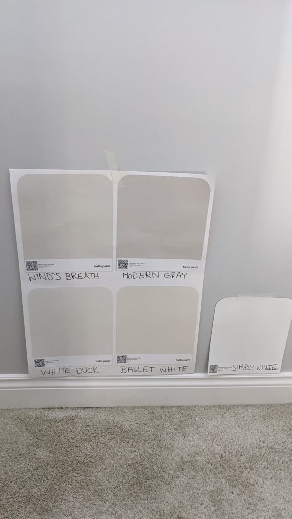
1. BENJAMIN MOORE BALLET WHITE OC-9
I’ve had mad love for Benjamin moore Ballet White for many moons (don’t worry, Mom, these are ‘pants-up’ moons, unlike the alternative, a favorite pastime of mine).
In this next image, Ballet White’s cream base is subdued and subtle…

However, in this next photo, Ballet White’s cream base is easier to see against more muted neutrals (most of which are coming up shortly)…
All of these colors are coming up shortly, except for Simply White.
This next photo makes me ALL kinds of happy (but so does a nap, so I’m relatively easy to please)…
Ballet White has an LRV of 73, so it’s right on the cusp of off-white, which you can see in the photo above. Again, I’m keeping the undertones as passive as humanly possible for you while showing how a color can look DRASTICALLY different depending on its environment.

The Best Paint Colors for the INSIDE of Your Front Door
Now, if you’re someone who likes cream but doesn’t like yellow undertones, well, that’s tough tamales.
Why?
Cream IS yellow (with a neutral base added).
However, Ballet White is a great way to achieve a creamy look without going overboard with the yellow.
SUMMARY OF BALLET WHITE FOR YOUR WHOLE HOME
- It’s a great way to get a nod towards a cream paint color without committing to too much yellow.
- It’s one of the more popular warm, passive neutrals and, generally, will have more mass appeal for resale than a standard, more yellow-based cream.
- Compare Ballet White to my favorite, flexible, warm off-whites in my CURATED Peel & Stick Color Bundle.
FULL PAINT COLOR REVIEW: Benjamin Moore Ballet White
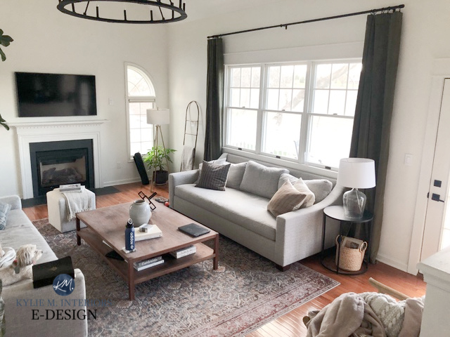
2. SHERWIN WILLIAMS CREAMY SW 7012
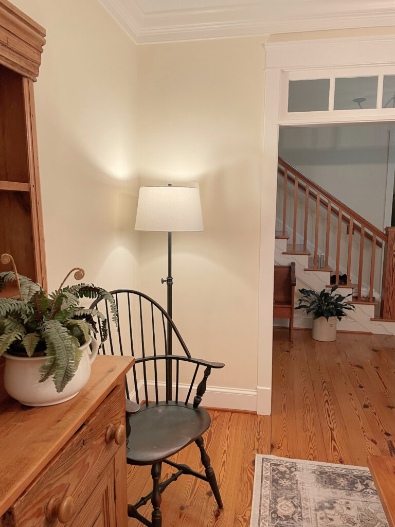
Sherwin Williams Creamy is the lightest of the bunch, coming in with an LRV of 81, meaning it’s tucked tight between the squishy bosom of off-white and white.
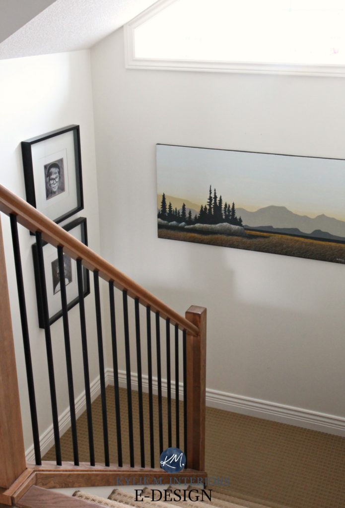
How to Update Your 1990s Staircase
Notice how the color washes out on the well-lit upper walls in the photo above (nature of the beast). However, you can see the proper contrast of it down by the baseboard (Benjamin Moore Cloud White). This wall gets northern light, so you’ll see how the yellow base of Creamy looks more muted.
In this kitchen (below), Creamy is a soft, subtle partner to the granite countertop and off-white subway tile backsplash…
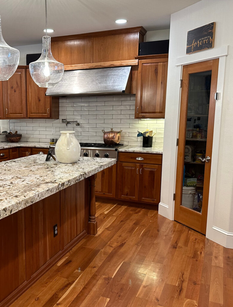
How to Update Wood Cabinets WITHOUT Paint
99.5% of the photos in my blog are of REAL HOMES from my Online Color Consulting clients, readers, and friends. While not always magazine-perfect (dirty socks & all), they’re packed with ideas and proven color choices to help you create a home you’ll love.
WHY CREAMY IS A GOOD WHOLE HOME COLOR
- Creamy has a bit more depth and body than white paint colors, while still offering a reasonably bright look (since not every home can pull off white).
- While it has a yellow undertone, it’s way more muted than normal cream paint colors.
- If Creamy’s soft, subtle approach is what you love, compare it to other gorgeous shades in my CURATED Cream Peel & Stick Bundle.
FULL PAINT COLOR REVIEW of Sherwin Williams Creamy
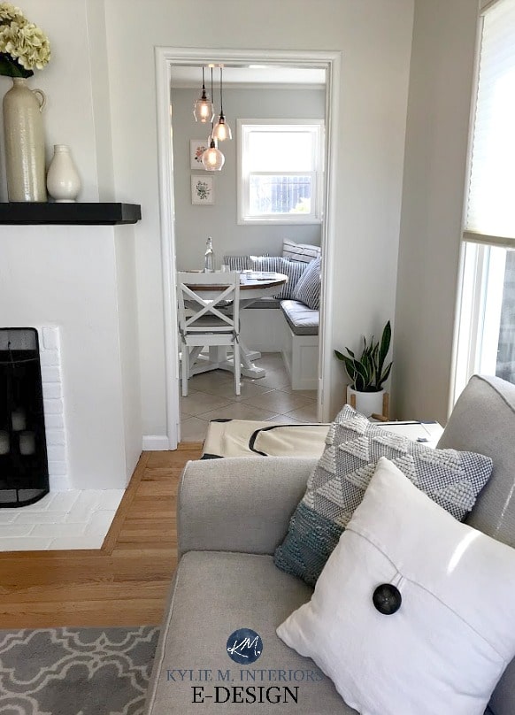
3. SHERWIN WILLIAMS SHOJI WHITE 7042
In the last 12 months, Shoji White has been a hot trend and is one of the most popular paint colors – not just for one room, but for entire homes, cabinets, exteriors, and more.
Sherwin Williams Shoji White is a warm, off-white neutral paint color. It’s blend winks at cream and taupe with no real commitment to one particular ‘type’ of neutral.

As for undertones, its subtle pink hue scares the pants off some people. However, the emphasis is on SUBTLE, so sample and compare it to similar shades to see which best suits your finishes.
As shown in this next image, compared to other popular neutrals that really DO commit to a taupe-pink undertone, Shoji White seems more cream-inclined…

REVIEWS: SW Aesthetic White | SW Heron Plume | SW Pure White | SW Pearly White | SW White Heron | SW Origami White
WHY IS SHOJI WHITE A POPULAR NEUTRAL?
- Shoji White’s depth (LRV 74) tends to settle well in the average home and room. It’s soft and airy without being white and bright.
- Its pink undertone suits a ton of interior finishes – more than you’d think!
Here’s your Peel & Stick sample of Shoji White…
Sherwin Williams Shoji White: IMAGES, Info, & More
4. BENJAMIN MOORE NAVAJO WHITE OC-95
Navajo White has been kickin’ some serious butt in the color world for a loooong time – for a good reason!
Navajo White is a beautiful, warm cream paint color. It has just enough depth to contrast with white trim without weighing down darker hallways or basement rooms.
Get the best color advice…
Navajo White will wash out on well-lit walls, as shown in this next photo, but this will happen with any light color. To avoid this, you need more depth; even a shift to the slightly darker Gentle Cream could help a bit.
If you like cream and are cool with a BIT of yellow, this could be your color.

The Best Paint Colors with Golden Oak & Similar Woods
WHY IS NAVAJO WHITE A POPULAR CREAM PAINT COLOR?
- Navajo White has an LRV of ALMOST 78.26, so it’s on the higher end of the off-white range.
- Navajo White has a soft yellow backdrop with a touch of orange to balance it, but isn’t remotely pinkish or green.
- If you love cream colors like this, check out this popular blog post: The Best Cream Paint Colors
Benjamin Moore Navajo White: IMAGES, Info, & More
Take a look at the taupes in this next image…

If your tastes lean more towards greige and taupe (not quite as warm as most of these options, but warmer than gray), check out this blog post: The Best Taupe & Greige Paint Colors for Your WHOLE Home!
5. SHERWIN WILLIAMS AESTHETIC WHITE 7035
Aesthetic White is one of my new favorite warm neutral paint colors – so much so that I used it in our new lake home!
While it’s an off-white beige, Aesthetic White is far more muted than many of today’s typical light shades of beige.
Aesthetic White’s muted approach stems from a solid gray base, which calms it down.
If you use this color in your whole home, you’ll see quite a shift between rooms with different exposures and interior lighting conditions!

WHY IS AESTHETIC WHITE A POPULAR PAINT COLOR?
- Aesthetic White offers a super subtle approach to warmth. Some would say it’s a stretch to call it beige, and in some lighting, I agree!
- Aesthetic White can be a great choice for walls, cabinets, and exteriors – not every color can satisfy all three!
FULL COLOR REVIEW of Sherwin Williams Aesthetic White
The Best Warm Neutrals With NO YELLOW UNDERTONES
6. SHERWIN WILLIAMS WHITE DUCK 7010
Right up there with Sherwin Williams Shoji White (#5) and Benjamin Moore Ballet White
(#2), White Duck is a super popular, off-white, warm paint color.

White Duck is an off-white that’s a blend of cream, tan, and gray. If you compare it to Ballet White (as you should), you’ll see that White Duck is lighter and more muted with its approach.
Here’s your Peel & Stick sample of White Duck…
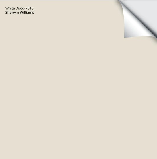
On the other hand, compare it to Shoji White and notice a wee shift in undertones. Whereas Shoji White can pick up a subtle pink undertone, White Duck is (barely) inclined towards green.

Notice how White Duck is on the walls, built-in cabinets, and painted brick fireplace!
WHY IS WHITE DUCK A POPULAR WARM, NEUTRAL PAINT COLOR?
- Like all the colors on this page, White Duck is great for 1 room or many.
- If you opt for a slightly darker color in your main living areas, but need a flexible off-white for transition areas like hallways, White Duck is a good option.
- Many people are looking for colors with minimal commitment. They want WARMTH, but no definitive undertone. This is where White Duck comes in handy.
Sherwin Williams White Duck: IMAGES, Info, & More
7. BENJAMIN MOORE WINDS BREATH OC 24
I couldn’t end this article without talking about Wind’s Breath, a real HYBRID, touching on beige and cream while having a soft gray base to calm it down.
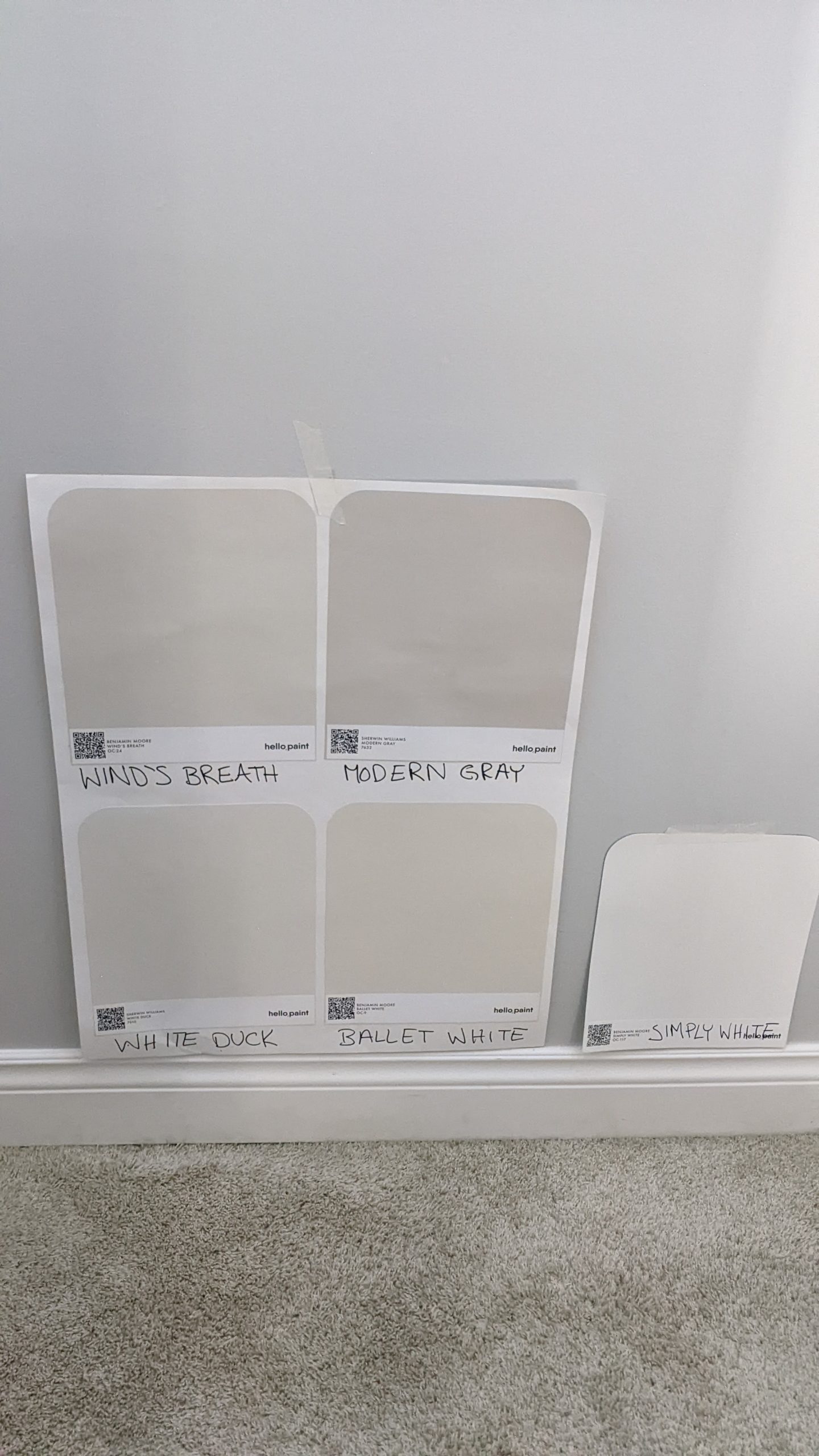
Winds Breath is a subtle, warm neutral with flexibility that suits various interior finishes, including some trickier tiles and carpets.
FULL COLOR REVIEW of Benjamin Moore Winds Breath
8. BENJAMIN MOORE MARITIME WHITE
Maritime White is a classic, warm off-white paint color. Being beige, it centers on an orange undertone. This undertone is slightly more inclined to appear orange-pink, but doesn’t go so far as to alienate anything that has a touch of orange-yellow.
In this next kitchen, notice how Maritime humours the orange-peach undertone of the wood cabinets as well as the subtle warmth in the tile flooring…

As for depth, Maritime White has an LRV of 71.6; it’s ACTUALLY in the light range, but it’s near the very top of the range and tends to read more like an off-white with its soft, airy approach.
In this next photo, notice how Maritime White’s undertone shifts on the different sections of wall…

Benjamin Moore Maritime White: IMAGES, Info, & More
Well, that’s it! If you didn’t find your dream color here, you know I’ve got more! Use my SEARCH function to type in a keyword and see what pops up!
READ MORE
The 5 Best Creamy White & Off-White Paint Colors
The Best Warm Neutrals With NO YELLOW UNDERTONES
The 12 Best LIGHT Taupe & Greige Paint Colors
Get the best color advice…
Check out my Online Color Consulting packages.

ORIGINALLY WRITTEN IN 2020, AWESOMELY UPDATED IN 2025


Great post! I’m glad to see that warmer colors are coming back around, especially for those of us who can’t use grays because of the lighting in our home or that they simply don’t appeal to us. As you know I recently used Manchester Tan when Canvas Tan went too gray in our north facing room, and I have been thrilled with it! Just wanted to mention that in case any of your readers are struggling with the same problem.☺️
How would you compare Neutral Ground to the above colors….especially Canvas Tan?
Hi Kylie, great post!! Could you tell the difference in undertones of SW Kilim Beige and Sand Beach? They seem so close, I can’t decide which I should use. Thank you!
Oooo, Kilim Beige can be a tough one, as it does have a wink of pink in it. Of the 2, I would lean more into Sand Beach, but of course it can depend on the interior finishes in your home and which paint colour connects with them the best!
Kylie, I have a question for you. We are fixing to repaint our entire living room, dining room and foyer. We currently have Sherwin Williams Creamy Paint Color on my kitchen cabinets and I love it.
I am looking for a beautiful beige (not dark) to coordinate with it. Will Sherwin Williams Kilim Beige be a great color to paint the entire house including the kitchen walls? I really love the Accessible Beige but I did watch one of your videos and you said it would not coordinate with Sherwin Williams Creamy. I am just concerned that Kilim Beige may be a shade darker than I originally wanted.
Thank you!
Hi Lisa! Because Creamy has more yellow in it, you often need a beige-tan that also has a bit more yellow – I worry that Kilim Beige has too much orange to really flow. Compare it to Softer Tan and see the subtle shift. OR…shift into a tan like SW Sandbeach and see how that jibes with Creamy and your other finishes. Along the lines of Accessible Beige, but adjusted, you miiiiight be able to sneak Sandbar in there :).
Please save our marriage Kylie! I HAVE to pick a paint color once and for all! I currently have SW Restrained Gold and I am so over it!
My favorite sample on white board has been BM Windsbreath but it is a sad grayish whitish color in my home. My other was SW neutral ground but looking neonish white in my LR.
Just wanting one color for all rooms….med wood trim, offwhite kitchen cabinets, brown/black/creme quartz.
I have read all of your wonderful reviews..just too overwhelmed! Thanks!!!!
What about paper white in this category?
Ooo, Paper White just isn’t that warm and can easily grab green-blue undertones :).
Hi Kylie! Thank you so much for sharing all of your great expertise! Do you think SW Aesthetic White would also be considered a good warm whole home color? Thanks 🙂
YES YES YES! I love Aesthetic, as long as you know it’s not a TRADITIONAL warm colour as it’s more muted and toned-down 🙂
Suggestions for a warm paint color to go with medium color oak cabinets & lots of yellow/orange undertones in the kitchen?!
YES!! This is what I’m looking for too. I love accessible beige and natural tan- trying to decide.
I just love reading your articles on paint colors and they’re undertones. I was wondering if you could tell us what the paint color of the walls is in the counseling waiting room at the beginning of the article. Also, when you talk about North facing windows and the light, is that the same for Arizona as well as say Canada or the northern United states? Does the light change as you go further south? Thanks a bunch! And keep the articles coming 👍
Ahhh, that’s Sherwin Williams Alabaster!
And for the light changing, that’s a GREAT question. As far as I know, and I’m not even remotely scientific, is that we tend to have more GRAY days in the northern areas, whereas down in the southern states, there are more SUNNY days, this alone will change the general perceived warmth of any area. I’m going to look at this more though, my brain is churning…
Hi Kylie,
I’ve been trying to buy your consultation, but keep missing it before it sells out! You are My color specialist as I’ve been reading all of your advice and learning about LRV, exposure, and finishes. Do you like SW Natural Linen or SW creamy for an open concept kitchen/den with East facing kitchen and west facing Den? Kitchen cabinets/trim will be either SW Super White or SW Pure white- black granite countertop with very vague silvery/white translucent pieces (barely noticeable)- warm brown walnut floors throughout. Sofa in den is a linen color, also we have a red brick fireplace in den… currently painted SW Popular grey it’s brrrrrr too cold for me- Im so over it! I’m going for a comfy Transitional casual style and WARM WARM WARM look. We live in PA, Cape Colonial
Hi Kylie Thank you so much for your expertise. I really enjoy reading your posts! I was wondering if you have any advice for choosing a colour for a new build condo that has north east exposure. Loads of natural light coming from the East face. North face has an overhang and some trees. I do tend towards colours like balanced beige. One of the colour choices from the builder is gray owl, I think it will be far too blue and cold though. Any advice you have would be appreciated.
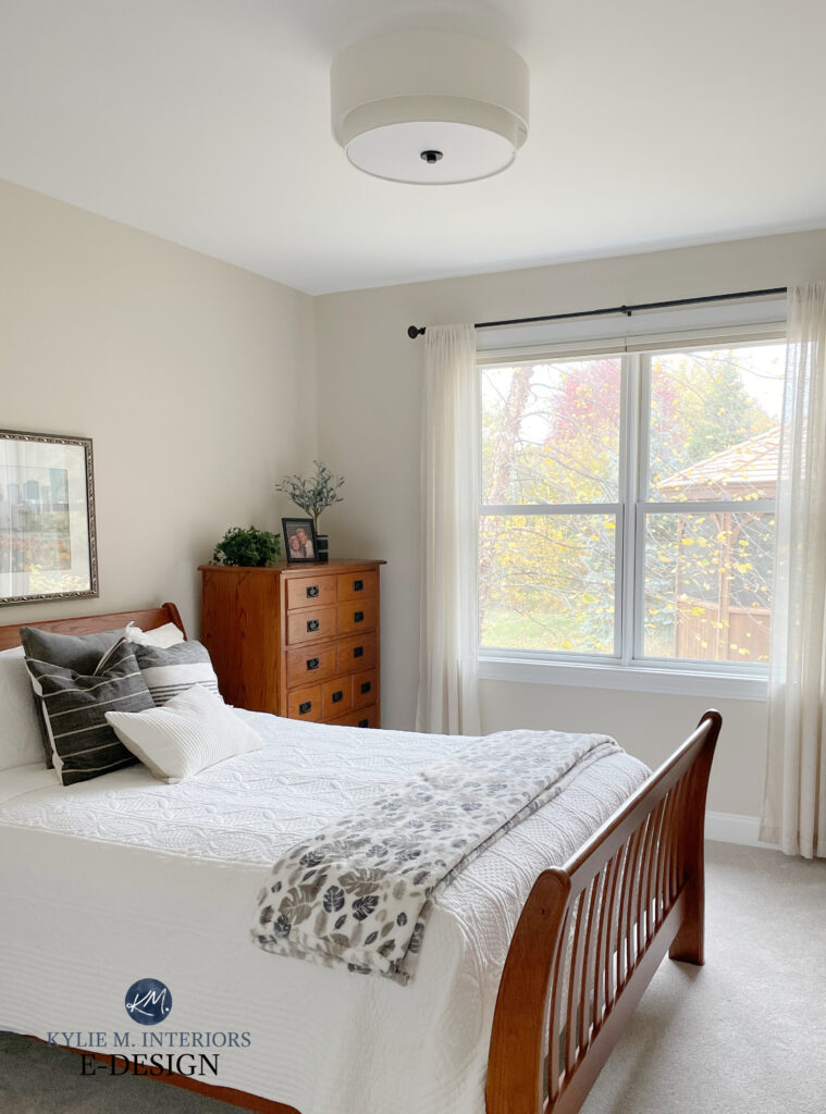
Please! What is the color in the bedroom picture with the bed, corner dresser chest and curtains. One picture under the one of the samples I believe.
Hey Erica, if it’s one of the first photos, with the orange-wood dresser and the leafy throw on the end of the bed, that’s the BEAUTIFUL Sherwin Williams Natural Linen!
Hi Erica! l love the look of the Natural Linen color you painted in the bedroom mentioned above. What trim color did you use? There are soooooo many choices of white. It makes my head spin! Thank you:-)
Help! I have looked at sooo many paint colors and cannot figure out which to go with. I have a open floorplan living area that I am trying to brighten. We have dark wood cabinets and floors. My husband REALLY does not want to paint the trim (sw creamy) because it is everywhere and we would also have to paint the doors. Right now we have sw anew grey on the walls but our natural light is north, west facing so it looks purple a lot of the time. what neutral paint color would work with creamy trim and northwest natural light?