
Benjamin Moore Wind’s Breath OC-24: Undertones & Real Home Use
I love Wind’s Breath and recommend it often to my clients. With a livable depth and muted undertones, it’s a great choice for walls, cabinets, or even exterior surfaces.
However, there are SO many options: warm grays, taupes, beiges, and creams – what makes it the best color for your walls, cabinets, or exterior? Let’s find out.
WHAT TYPE OF COLOR IS WIND’S BREATH?
While it’s not traditionally warm like a cream paint color, Winds Breath is definitely a warm neutral, hovering between cream, tan, and greige, making it quite the hybrid!
With the flexibility of Winds Breath, it’s a great option when you need a paint color that doesn’t commit hard to one shade of neutral or another. This can be handy when you have tricky finishes to accommodate. However, if you have finishes that demand a particular undertone, make sure Wind’s Breath hits the spot, as its lack of commitment can make it clash (e.g. if you have a finish that wants a taupe or orange undertone).
In this next photo, see how Winds Breath isn’t quite as beige as Sherwin Williams Accessible Beige (top) nor as warm and creamy as Benjamin Moore Ballet White…
Wind’s Breath can be great in a north-facing room (as long as you get ENOUGH northern light), as its warmth can slightly balance cooler northern light. However, if your room is dark, it can look drab and dingy; the same goes for lower light eastern afternoons and western morning light.
On the other hand, if you have south-facing light or warm afternoon sunshine, Winds Breath will lean into its warmth without looking overly golden or creamy.
North, East, South, West – Which Paint Color is the Best?
WIND’S BREATH’S LRV
Winds Breath has an LRV of 69.59, putting it on the high end of the light range. With this higher LRV, if your room has average or brighter light, it could act more like an off-white. Also, at this depth, it will wash out if your room is super bright, as will any paint color in this range.

But as mentioned earlier, Winds Breath could look a bit drab in a darker room because of its earthy base. Make sure you improve your interior lighting and partner it with a relatively clean white trim color.
Not sure what LRV is? It could save your paint-lovin’ life – read all about it HERE.
How to Make a Dark Room Look Brighter – and it ain’t with paint!
The Best LIGHT Paint Colors for a DARK room
WHAT ARE WIND’S BREATH’S UNDERTONES?
(Undertones are the way a color leans, or its bias towards a ‘color’). Winds Breath is a slightly complicated neutral paint color, as its tone shifts with its surroundings. Sure, every paint color does this, but some lighter neutrals really move around. While its undertones are subtle, it can pick up a very gentle wink of green (vague at best – most people don’t notice it) but can also lean into cream and, more rarely, pink (but it can happen).
However, complicated colors often fit well in tricky spaces and lighting conditions.
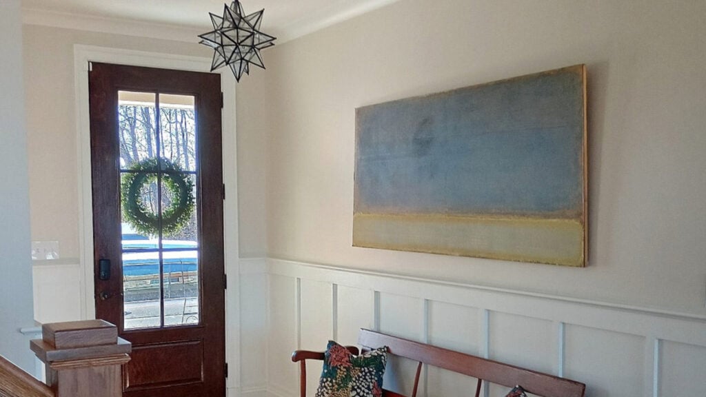
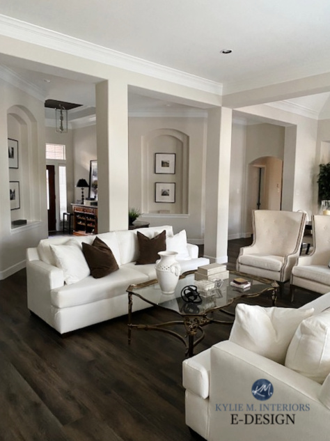
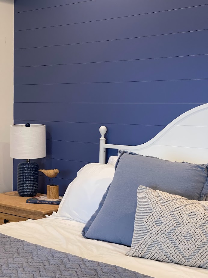
Take your time looking at this next photo…
Compare the top of the left-side wall to the top of the right-side wall. The left leans slightly yellow-green, and the right picks up a vague pink. It’s being overly influenced by exposure.
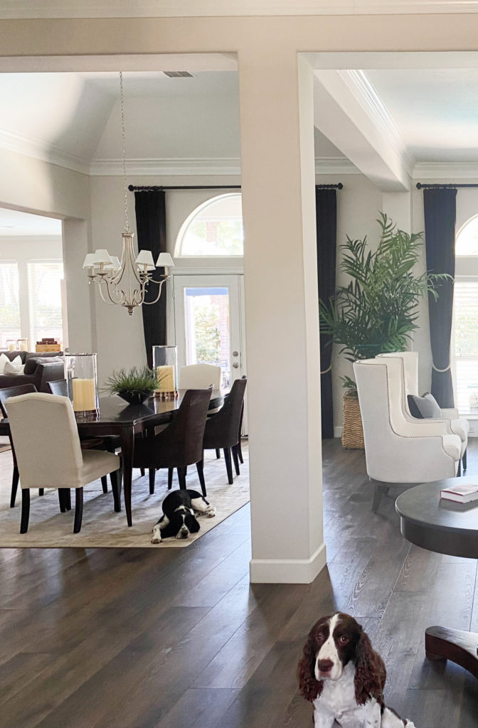
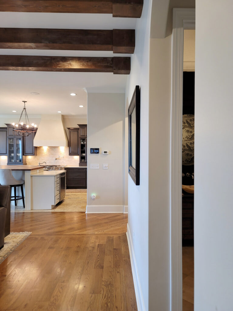
In this next photo, notice the shift between the horizontal beam on the left compared to the beam/walls on the very far right – again, yellow-green to a subtle pink…
Here’s your Peel & Stick samples of Wind’s Breath…

WHAT’S THE BEST TRIM COLOR WITH WIND’S BREATH?
If you’re refreshing your trims or kitchen cabinets and need a compatible white, take a look at…
- Benjamin Moore Chantilly Lace for a brighter, cleaner contrast
- Sherwin Williams Pure White for a slightly softer contrast
3 Steps to Picking the Best White Paint Color
IS WIND’S BREATH A GOOD EXTERIOR PAINT COLOR?
Off the top of my head, without seeing your home, probably not. While it can work on the odd home, its sneaky green undertone can clash with many exterior finishes, including stonework and roofing.
If you choose Winds Breath, expect it to lean warmer. And whereas that wink of cream isn’t always as noticeable on walls, you can expect it to appear more on an exterior.
5 Tips for Choosing an Exterior Paint Color
IS IT A POPULAR COLOR FOR CABINETS?
If you’re looking for the best off-white for your kitchen cabinets, I recommend reading this FIRST. If you’re already sold on off-white cabinets, then yes, Wind’s Breath CAN work, as long as none of your finishes cater to pink, taupe, or beige. Sure, it can be friendly sometimes, but the green undertone often pops up compared to these other undertones.
How to Choose the Best White Paint Color for Your Kitchen Cabinets
DOES WIND’S BREATH GO WITH CREAM TRIM OR CABINETS?
Generally speaking, no. While it can depend on your exact shade of cream, Wind’s Breath is often too similar in depth (without exactly matching undertones) to make the proper connection. It’s worth sampling, but look carefully.
Look at how gorgeous it is with this soft white trim (possibly Pure White)…

The Best Paint Colors to Go With Cream Cabinets & Trim
IS IT A GOOD COLOR WITH WOOD TRIM OR CABINETS?
Whether you have wood cabinets, trims, or flooring, it depends on the undertone of your wood stain and its intensity. A little pink stain might be doable, but a lot of pink or red is a hard no.
The Best Paint Colors with Golden Oak
Wind’s Breath is a bit more inclined to yellow woods and can handle some orange, but not a ton of orange-red…

Benjamin Moore Ballet White | Sea Pearl (China White) | Sherwin Williams Aesthetic White
WHAT PAINT COLORS ARE SIMILAR?
There aren’t any colors JUST like Wind’s Breath; there will always be a change in undertones, temperatures, and depths. However, several with similar intentions are great for sampling and comparison. You might end up finding an even better choice!
WIND’S BREATH VS. SHERWIN WILLIAMS WHITE DUCK
This is a great comparison. Regarding undertones, White Duck is far more likely to pick up a creamy hue. In fact, Wind’s Breath SEEMS a touch taupe (taupe) compared to White Duck’s type of warmth.

As for depth, White Duck’s LRV is 74, making it off-white and about 25% lighter than Wind’s Breath.
Sherwin Williams White Duck Paint Color Review
WIND’S BREATH VS. SHERWIN WILLIAMS AESTHETIC WHITE
Aesthetic White is one of my favorite warm neutrals. Whereas Wind’s Breath picks up a whole whack of neutrals in its travels, Aesthetic White is a bit more inclined to beige, although a lovely gray base grounds it. Because of this, Aesthetic White is more popular and often better suited to the average home.
Regarding depth, Aesthetic White has an LRV of 73, which is more in line with White Duck’s off-white depth. This makes it a small jog lighter than Wind’s Breath.
Sherwin Williams Aesthetic White Paint Color Review
WIND’S BREATH VS. BENJAMIN MOORE EDGECOMB GRAY
I love this comparison. If you are considering Wind’s Breath but worry about it washing out or want more contrast with your trim, a) you could consider getting it darkened by 25% (could enhance undertones), or check out Edgecomb Gray.

Sherwin Williams Egret White | White Heron | Modern Gray
As for depth, Edgecomb Gray sits at 63.09, making it a moderate, light-depth paint color and a GOOD chunk lighter than Wind’s Breath’s LRV of almost 70.
While their depth sets them apart, their undertone profiles are somewhat similar: both are sneaky about their undertones and can lean warmer than expected, especially on cabinets and exteriors! This said, with its depth, Edgecomb Gray holds its grayish base a bit more.
Benjamin Moore Edgecomb Gray Paint Color Review
WHAT COLORS GO WITH IT IN A COLOR PALETTE?
While not all of these colors work in the same room, they can make for a great overall home palette…
- cool grays with blue or blue-green undertones that are darker than Wind’s Breath
- warm grays with a green undertone that are darker than Wind’s Breath by approximately 15 LRV points or more
- smokey, medium-depth, or darker gray-blues
- slight greiges that are slightly or more darker than it
- darker shades of greige can be badass with Wind’s Breath as accents
READ MORE
The Best Warm Off-White Paint Colors That AREN’T YELLOW
The 10 Best Warm Off-White Paint Colors
Paint Color Review Benjamin Moore Pale Oak
Need help?
Check out my Online Paint Color Consulting – I’d love to help!

ORIGINALLY WRITTEN IN 2020, UPDATED IN 2025


Thanks for reviewing this color. Would you use it on walls with Edgecomb Gray cabinets in a bright space? Other suggestions?
Love, love, love your blog!! Please share your thoughts on Edgecomb Gray and Winds Breath with honey oak trim.
BEAUTIFUL! I see no problem with this – of course, I say that without seeing your space :).
Thank you for this! This article was validation for my decisions and feelings about Winds Breath. It is my favorite paint color in my house. I used it with SW pure white trim and have it in the majority of my—smaller sized—townhouse. It brightens things up, but still feels welcoming. It is adjacent to a room with magnolia home’s Emmie’s Room (blue/green) and I think it works well. After all of my painting mistakes it was nice to find WB, it just is calming and doesn’t yell at you when you walk in the room. I’m about to have my bedroom repainted with WB after making the mistake of FB peignoir (way more purple than the test pot..I needed to sample a larger size…ahhh!!!).
Love your color expertise and humor! Thinking of using winds breath or edgecomb grey on our walls(southeast light) and doing the cabinets in requisite grey. do you think either wall color would look ok w the cabinet color and compliment each other ok???
Just painted kitchen in Winds Breath…it looks green in natural light. Any suggestions?
Hi Terri, that’s likely coming from the outside and one way to balance that is with colours that have a bit more taupe (violet-pink or pink) in them :).
Hi, I had my Kitchen cabinets painted in Windsbreath. I am looking for a white for my walls. I’m having a hard time choosing. Our trim has been painted in Pure White. Do you have any suggestions? I was looking at Chantilly Lace.
If you have Pure White trim already I HIGHLY SUGGEST using Pure White on the walls too. Chantilly Lace could make your trim look dingy/darker in comparison!
Great post!! Very informative!
I am looking to repaint my bedroom and am torn between Winds Breath and Edgecomb grey. It is a north facing room with a little bit of western light. We have one window which is about 3×3, maybe 3.5. Thank you!!
Oooo, from the sounds of it, PERSONALLY, I’d lean into Winds Breath 🙂
Hello. Love all of your assistance that you give us. I am thinking of painting Winds Breath on a wall next to Edgecomb Gray in the hopes of toning down the green that comes out at the north end of the living room and from reading would Winds Breath tone the green down a bit and also match with Edgecomb. Thank you.
Hi! I see people mentioning/comparing Wind’s Breath with Edgecomb Gray but how do they coordinate side by side? Thinking of WB as an entryway, hallway, stairwell color with EG in connecting main spaces… Family Room, Kitchen, Dining…
Ahhh yes, it would be hard to ‘compare’ them, as they’re in different depths. You’re right in what you’re doing as they are GORGEOUS partners in a palette :).
Thanks! Would Gray Owl work well with WB in a palette as well? They look pretty soft and calm together to me.
I have winds breath kitchen cabinets in a south-facing open room. I love simply white for the walls. Trim is cloud white but I could re-paint it simply white too? Is winds breath too pink for simply white?
Hi Kate! It’s doable, but it’s not my FAVE combo. I would rather see something like BM White Dove or Chantilly Lace 🙂
I just painted all my trim White Dove (my fav. White). Would Winds breath look good with white dove?
Sure would!
I am thinking about painting my south facing kitchen cabinets Winds Breath or Edgecomb Gray , and I am aiming for a neutral light greige that won’t wash out, but give my kitchen warmth and depth. I’m trying to move away from a stark white kitchen.
How did this turn out?? I’m planning to do the same.
I am repainting everything ! Thinking of winds breath as the neutral throughput the house and Texas sage and passion vine as accent wall(s). Any suggestions? Also should trim be the same? I have chair rail molding I the hallway
Hi Karen, Did you paint? I would love to see the results…I’m considering these colors as well. 🙂
In regards to your statement “Wind’s Breath is a bit more inclined to yellow woods and can handle some orange, but not a ton of orange-red…”. I have wide cherry stained trim in my bedroom and 2 cherry stained dressers. I have muted eastern light, 2 small windows of southern light and 1 small window of western light. I don’t get a lot of light. But there is some from 3 directions. I have cathedral ceilings that I would also paint the color. Would this color work?
Have you ever tried Winds Breath darkened by 50%? What are your thoughts about that? Would you suggest the same trim colors as in this article? Considering WB at 50% for south facing two story foyer. Thank you!