
How to Choose the Best Exterior Paint Colors: 5 Steps to Success
Choosing an exterior paint color palette isn’t easy when there are so many surfaces to consider: siding, trim, gutters, front door, garage doors, and more. While I’ve covered many of these in other blog posts, this one is about choosing your main house color.
Why is it so hard? Between varying exposures, window colors, roofs, stone and brickwork, and landscaping, there are so many considerations. Thank goodness you have me (wink wink).
This 5-step guide will be handy. It will allow you to step back and view your home from a different angle (literally and figuratively), not just the one based on your personal preferences.

That’s right. Sometimes, what you want and what your home wants are two different things.
You have to listen to your home first. From there, see if you can accommodate your personal tastes (which is where fun front doors come in handy).


STEP 1: LOOK AT YOUR STONE OR BRICK FOR INSPIRATION & GUIDANCE
If you don’t have any stone or brick, read this anyway – you never know what little tips you’ll pick up!
On most homes, because stone/brick and siding are on the same vertical plane, your eyes usually visually connect them first, THEN the roof (but that doesn’t mean you can forget the roof entirely!). This means it’s UBER important to get the color connection bang-on.
UNDERSTAND THE MAIN COLOR/UNDERTONES IN YOUR STONE/BRICK
You can get a lot of inspiration from the stone or brick on your home, but that can be hard if you don’t like the stone or brick you have. However, if you ignore the needs of your home’s finishes, NOTHING will look good—you gotta work with what you have!

The exception to this is if you have a particular layout where the stone or brick plays second fiddle to your roof, which is the more dominant feature. This is rarely the case, as the brick/stone needs to be pretty invisible to not matter.
If you don’t know the undertones of your stone or brick, don’t worry. The GOAL is just to find colors that lean into them. Sure, some opt for a contrasting palette, but you might need to hire someone (ahem) to create that.
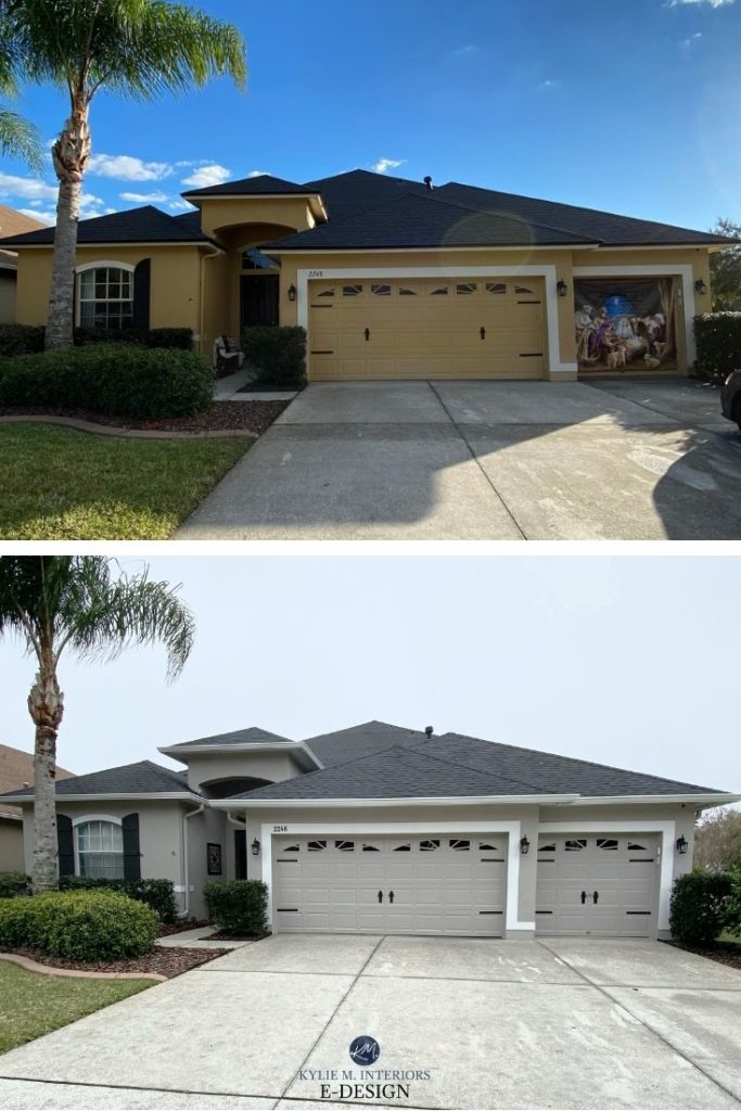
The beige on this next exterior clashed hard with the stone facade, as well as the roof and trim…

After (below), while the front door and its trim still need some TLC (or KLC would be more the point), the siding and trim colors are 100% improved!

Why?
Because the taupe-greige siding color leans into the stone’s colors.
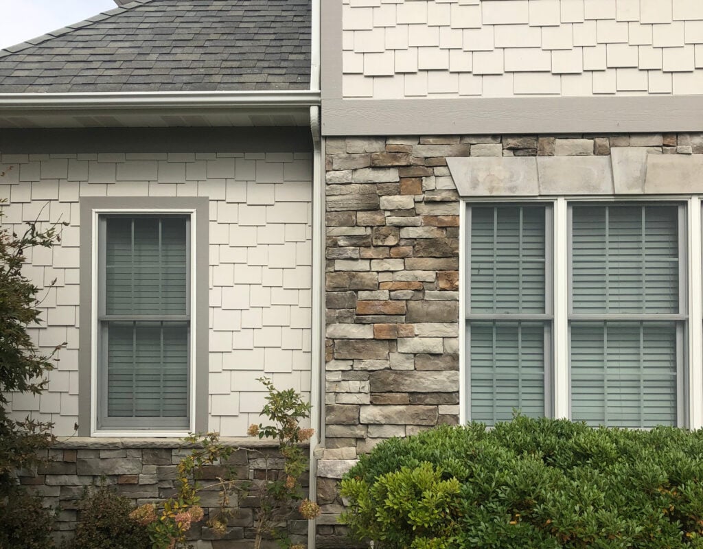
Don’t just focus on the stone or brick itself; pay VERY close attention to any MORTAR around it, as this is often the first place I look when choosing exterior paint colors.
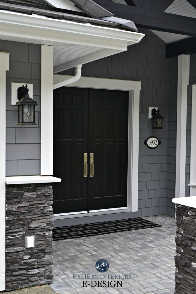
Check out the stone on this next home and notice its darker parts. These, along with the roof’s needs, are the inspiration for the main house color…

Sherwin Williams Gauntlet Gray Paint Color Review
If the gutters and windows weren’t black, this stone could call for a lighter siding color. However, considering the black elements, a dark color makes the most sense.
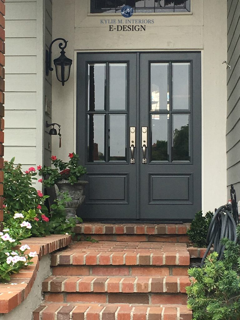
In this next photo, see how the paint samples relate to the colors in the stonework and their undertones.
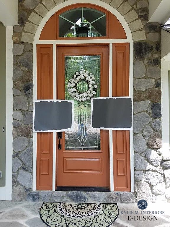
The above stones have a variety of neutrals, but we focused on the gray stones with violet-blue undertones, which reflect that on the front door—just darker! We didn’t make any colors up just because we liked them – we FOUND them in the stone.
Not sure what undertones are? Check out this helpful blog post.
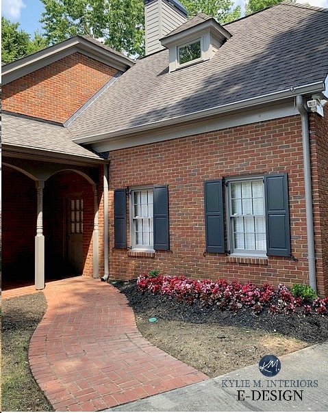
This next photo shows trim and shutters that match one of the brick colors PERFECTLY and suit the front steps…
YOU CAN ALSO CONTRAST THE COLORS IN YOUR STONE OR BRICK
As mentioned earlier, you don’t always have to match (the carpet doesn’t always match the drapes – wink wink); instead, you can try contrasting or complementing your stone brick with an opposite or complementary color. However, it can be tricky, and you may need to hire a professional to get the right look.
In this next photo, notice how the house’s colors, trim, and shutters contrast with the brick without clashing…

Photo via my awesome client, House of Blue Hues
The siding color is Benjamin Moore Revere Pewter, with Graystone on the shutters. These grays with warm gray undertones contrast and complement the red brick.
Here’s another gorgeous example of a brick exterior with a contrasting siding color and front door…

The front door is painted Benjamin Moore Wrought Iron
Many brick exteriors do well with a green-inspired contrast (either as a color or undertone).
Remember, your stonework (or brick) plays a huge part – your personal tastes should be at the bottom of the list. For a flowing palette, REPEAT what you see.
As an example, check out the next home, which features a 3-color palette (shakes, trim, and black shutters). The homeowner probably chose the trim/shake colors because they liked them, not because they suited the house…
However, because the colors don’t coordinate with the stone, they read as another set of colors, making this palette WAY too busy. The colors are totally disconnected from the stone.
Again, if you want to contrast with your finishes, you miiiiight need professional help (physical, mental, and emotional).
Instead, we picked up what the stone was throwing down, and brought the roof more into play at the same time…
If you’re unsure about stepping outside the colors in your stone or brick, it’s sometimes safer to CONTRAST or COMPLEMENT the colors via the shutters or front door (or plant pots). This way, your ‘color experiment’ is more of an accent, rather than a full-home commitment.
If you don’t like what your stone or brick has to say, your mortar might give you a bit more flexibility.
The Best Off-White Paint Colors
STEP 2: CONSIDER YOUR NON-WHITE WINDOWS
Windows can mess up your color palette and are an expensive update if you want a clean slate.
In fact, only black-or-white windows rank lower. If your windows are taupe, greige, tan, off-white, etc., they’re up in the running for 1st place, as they can be darn bossy!
BROWN WINDOWS & EXTERIOR PAINT COLORS
Many of my clients have brown windows and hope to update their homes with a classic gray, but the two don’t always match, and sometimes, they have to consider warmer options to accommodate these windows.
Benjamin Moore Ballet White painted brick | The Best Brown Paint Colors
WHITE WINDOWS & EXTERIOR PAINT COLORS
White windows are the most flexible of the bunch…
Sherwin Williams Alabaster & Aloof Gray
The most common approach with white windows is white trim. From there, your stone, brick, or roof should call the shots regarding your actual house color.
The only combo I’m not a big fan of is white windows with black trim. This high-contrast look makes the windows pop, even though they’re usually not the focal point of the home. But it’s not ALL ABOUT ME (well, let’s be honest, it is—most of the time).
TAN, TAUPE, OR BEIGE WINDOWS WITH EXTERIOR PAINT COLORS
If you’re dreaming of a white home, you’ll be out of luck with beige windows. And while you might be able to squeeze in a gray, it’ll need some good depth and undertones, while still making sense with the other fixed elements on your home.
When choosing paint colors for tan or beige (almond) windows, I recommend leaning into their warmth rather than trying to ignore or distract from it.
This home is a perfect example of leaning in (as far as trim and front door color are concerned), since it’s a mostly brick home…
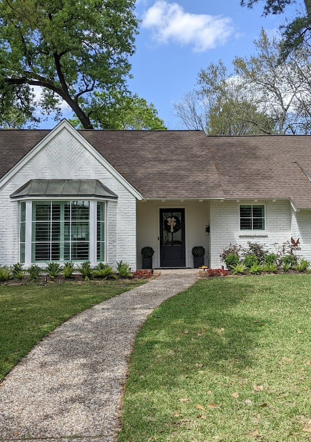
Here’s another exterior where we painted the siding a darker, warmer shade of gray-taupe that complements the windows rather than competing with them.

We also matched the trim color and gutters/soffits to the windows for repetition and flow – this way, the windows BELONG.
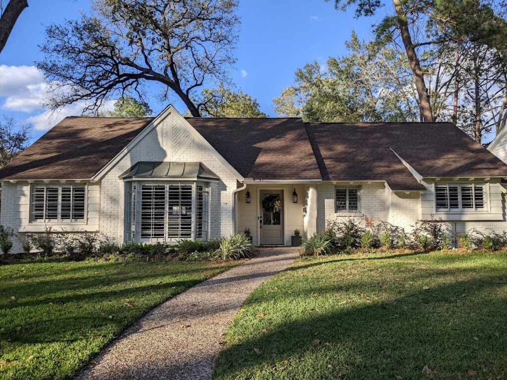
However, it can be hard when your home’s different features/surfaces aren’t well-coordinated. This was the case with our home when we bought it (below)…
Look at my one-legged child! She must’ve had some serious momentum going…
Notice that the beige windows look yellow-green compared to the beige-pink undertone of the siding (wooooof).
Beige windows were the wrong choice for the charcoal gray roof – white windows are more appropriate (and you guys know I’m ALL about being appropriate – wink wink).
Ultimately, I couldn’t work with the windows’ color (and I didn’t want to paint them). Ultimately, we replaced the windows with white for a fresh, clean look! We might be living on Kraft Dinner and weiners for the next five years to pay for them, but that’s my specialty, anyway.
Get your Peel & Stick sample of Sherwin Williams Roycroft Pewter…

BLACK WINDOWS & EXTERIOR PAINT COLORS
Black windows are definitely the second easiest to accommodate when choosing exterior colors. Like with white windows, you’ll find fewer limitations, leaving you to focus more on the roof, stone, brick, and exposure needs.
This said, your home needs to SUIT black windows, and not all do (a blog post unto itself).

If you’re choosing a house paint color to go with your black windows, they should be the least of your concerns (for most homes). Look at your stone, brick, and/or roof FIRST. Like a pair of black pants, they go with a ton of colors.
A lot of it comes down to the contrast you want on your home…
- BLACK WINDOWS with white, off-white, or light-depth trim and siding = high contrast
- BLACK WINDOWS with a moderate house color – medium contrast
- BLACK WINDOWS with a darker house color – lower contrast
While the black windows and off-white trim/siding are high-contrast, the look is softer because the trims aren’t dark. If the trims were also dark, they’d cut a much clearer, darker line with the siding color.
STEP 3: CONSIDER YOUR ROOF (Metal, Asphalt, Red Tile, or Cedar)
(This is STEP 1 if you don’t have any stone or brick on your home and have black or white windows)
The roof? That’s right. So many people forget that the roof plays a big role in their home’s color palette – especially when there’s no stone or brick to consider.
By the way, almost every photo on my blog has been sent in by my Online Color Consulting clients—you guys make my colorful little world go round!
Some roofs are very flexible regarding the colors they can partner with. You have to be careful with roofs with dedicated ‘colors’ or undertones. The two most common fiberglass/asphalt roofs are…
DARK GRAY-BLACK. Timberline, GAF, IKO, and Certainteed – four brands that carry a similar version of a dark gray/black roof (often called Charcoal or Black). These aren’t as neutral as you might think and most often cater to violet undertones (although the odd green pops up here and there).
BEIGE-BROWN ROOFS. Roofs like Weathered Wood (a popular one), Beachwood, and Hickory often cater to beiges (more orange-pink than orange-yellow) and some shades of taupe. A slightly darker green or green can also fit in, depending on the actual roof brand/color.
Here’s the same home at a different time of day, with a new front door paint color…
There are many more roof colors and brands out there. The point is to look at your roof to identify its main neutral, then see if you can find its undertones or at least its overall ‘look’.
This next roof’s cedar shakes have faded to a mix of taupe and warm gray (both favoring a purple-pink undertone)…

Red clay/terra cotta tile roofs can be tricky. Some people lean toward creamy colors, and the yellow hue clashes with the roof (and often the driveway, too). Listening to your home and giving a polite nod to its needs is a great way to create the perfect palette.
Online Color Consulting is how I support my family and continue to blog for you for free! I freely mention many colors in these photos, but others are in the vault. I also have clients who don’t want their color info shared!
The Best Off-White Paint Colors
Check out this next home and notice how the off-white warmth of the painted brick satisfies the roof’s needs…

What Color Should Your Gutters, Downspouts, & Soffits Be?
While I can’t tell you the EXACT COLORS that will suit your home, you have to do the groundwork yourself. Order a range of large samples and see which ones CONNECT to your roof – usually like a lighter or darker version.
STEP 4: NOTICE THE COLORS IN THESE ‘OTHER’ EXTERIOR SURFACES
While the above finishes are the bosses, you might have a few other surfaces to consider.
This said, if you don’t have any other bossy finishes – no brick or stone, and your roof is easy to please, a feature like your driveway could call all the color shots!
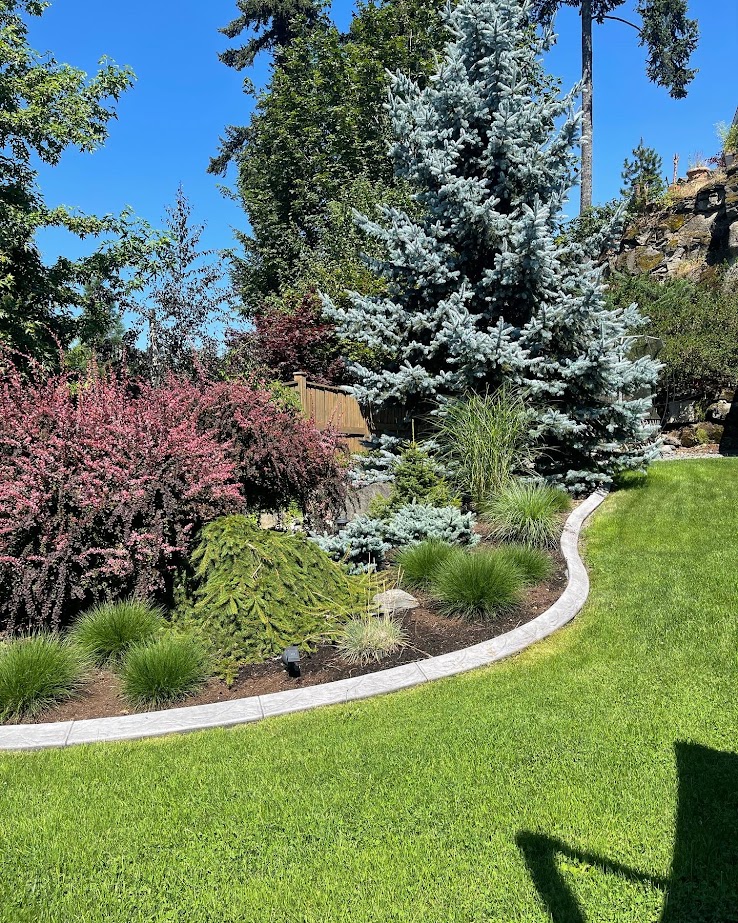
THE COLOR OF YOUR DRIVEWAY & PATIO/FRONT PORCH
The color of your driveway or walkway (either concrete, stone, or brick) can play a big part in color selection. Size matters, too (that’s what she said). In fact, if you have a large pathway or driveway and no other features on your home (the roof has minimal exposure from the front), it might call all the shots.
This next home is the perfect example of a home with a notable pathway, but not one big enough to dictate much…
Benjamin Moore Half Moon Crest / The Best Teal & Blue Front Door Paint Colors
While we don’t want the house to clash with the pathway, this type of home is best for expressing a homeowner’s tastes as it has no overly bossy features.
Previously, the yellow hue of this next home clashed with the driveway’s undertones, but after, it’s like a brand new home.
The Best Darker Greige & Taupe Paint Colors
In the big picture, the front porch/patio (stone/brick) usually plays a very minor part compared to the all-important stone/brick and roof (it’s like matching your shirt to your underwear). Still, it doesn’t hurt to consider it, especially if it has particular colors or undertones. However, in terms of priorities, I put it lower on the list.
In fact, front pathways and porches often play a bigger part in choosing front door paint colors…
THE COLOR OF YOUR GUTTERS & SOFFITS
The wrong gutter color can throw a huge wrench into your paint palette if it doesn’t fall in the right family. Keep in mind that when painting the exterior, many people paint the gutters and soffits at the same time (I did this on my own home), often matching them to the trim.
If you’re painting your siding and your trim, don’t let a bad gutter and soffit color hold you back from your home’s BEST color – paint those bad boys.
What Color Should Your Gutters & Soffits Be?
STEP 5: CONSIDER YOUR HOME’S EXPOSURE
North, east, south, west – which paint color is the best? Well, it depends not just on your stonework, brick, and roof, but also on your home’s exposure. And while I could get down n’ dirty, instead, I’ve dedicated an ENTIRE blog post to this topic.

Paint Color Review of Benjamin Moore Amherst Gray
Remember that exposure plays a smaller role if trees surround your home or your neighbor is right next door, blocking most of your natural light.

Your paint sampling life just got a whole lot easier…
Samplize Peel & Stick paint samples!
FREQUENTLY ASKED QUESTIONS
In case you’re looking for a few more tips and ideas…
WHAT’S THE BEST EXTERIOR HOUSE PAINT COLOR?
That’s such a funny question, as there is no universally ‘best exterior paint color’. The best color is the one that suits your home’s finishes, as you learned above.
So, rather than choosing a generic, mass-appealing color, choose one that suits your home’s unique needs.
If I were to generalize a range, I’d aim for paint colors that are warm (either warm gray, greige, taupe, or an actual tan or beige) with LRVs between 30-70.
WHAT EXTERIOR COLORS WON’T GO OUT OF STYLE?
When a home commits to a particular trend, it doesn’t matter what color it is; at some point, it will go out of style. For example…
WHITE EXTERIOR COLORS: On a Colonial or traditional home, white can be the most classic, timeless paint color. However, a white exterior combined with black windows and wood details looks like the ‘White Modern Farmhouse’ trend. And unless it actually IS a modern farmhouse, it will become dated at some point (#now).

GRAY EXTERIOR COLORS: Gray exteriors can be incredibly timeless and classic, especially with white trims and windows. However, pair a gray exterior with black trim and black windows, and you know your home was updated in the last decade or so (a trend that has since passed).
This next exterior is super timeless. From there, it just comes down to whether you LIKE these types of colors or not…
Often it’s not a single color that becomes outdated, it’s a combination of colors and finishes, including stone, brick, and windows.
Choose a color that makes the most sense with your home’s permanent exterior finishes – that’s YOUR home’s best, most timeless option.
HOW MANY COLORS CAN AN EXTERIOR PALETTE HAVE?
It depends on the home, its layout, and its different exterior features. For the most part, the average home suits a 3-color palette. The odd home can pull off 4 colors (but two can be a bit boring, unless it’s a more modern/contemporary home).
Remember the K.I.S.S principle – Keep It Simple…Sweetheart.
QUICK SUMMARY (TL;DR)
- When choosing your exterior paint color (siding or stucco), any dominant, vertical brick or stone matters the most.
- Next, consider the color of your roof and windows, if they aren’t white or black.
- Your home’s exposures shouldn’t call the shots, but they’re worth considering when choosing a paint color.
- While your front pathway can play a part, it matters even more when choosing a front door paint color.
READ MORE
What Color Should Your Gutters, Downspouts, & Soffits Be?
The Best White Exterior Paint Color
North, East, South, West: Which Paint Colours Are Best for Your Exterior?
Get the best paint color & home update advice with Kylie M’s Online Paint Colour Consulting packages!

Updated with new, fresh content and images for 2026!


OMG Kylie, so many great considerations and gorgeous inspiration shots as always! One other tip I would have for exteriors is that while painted flat samples are great for interiors, it’s worth the small pain to actually test color on all exterior surfaces to be painted and also take sheen into consideration. The color will look different on stucco and brick vs. siding vs. trim as the materials are different textures and read differently on different planes. Most homeowners and painters opt for a satin on siding, semi-gloss on trim and the elastomeric products for stucco and stone are usually flat. As you know, the higher the sheen and flatter the surface the lighter the color will appear. This can actually be used to great effect to create some interest in a one color scheme, but I’ve found some homeowners think the painter made a mistake when their trim looks brighter/lighter than the house body:)
THANK YOU Lori! I’ve written some blog posts on those topics, yet didn’t link very well to them in that blog post, so I actually added a 6th BONUS STEP – which involves more reading, of course ;). And thank you for mentioning that
‘surface will look lighter with sheen’ bit. So many people don’t realize this, but it’s a very important aspect of painting!
~Kylie
Great advice! My neighbors installed a green roof and painted their house a green color that does not look good. It’s really an eyesore and I am tempted to walk over with new exterior paint options and offer a redo on me.😂 They tried but I have only seen white exteriors with green roofs.
Hello, Kylie!
Your posts are always very informative and fun! Thank you.
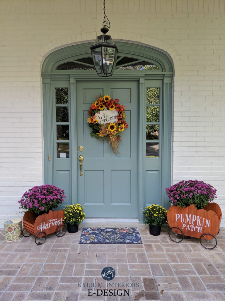
The colour pairings you chose to highlight your blog are fabulous and I learned a lot. I would appreciate your identifying the paint colour of the front door with the pumpkin,s as after reading your blog, I think it would be a perfect match for our stone and siding.
Many thanks,
Victoria in Canada
Hi Victoria, I believe that’s the door with Benjamin Moore Sioux FAlls on it!
Hi!
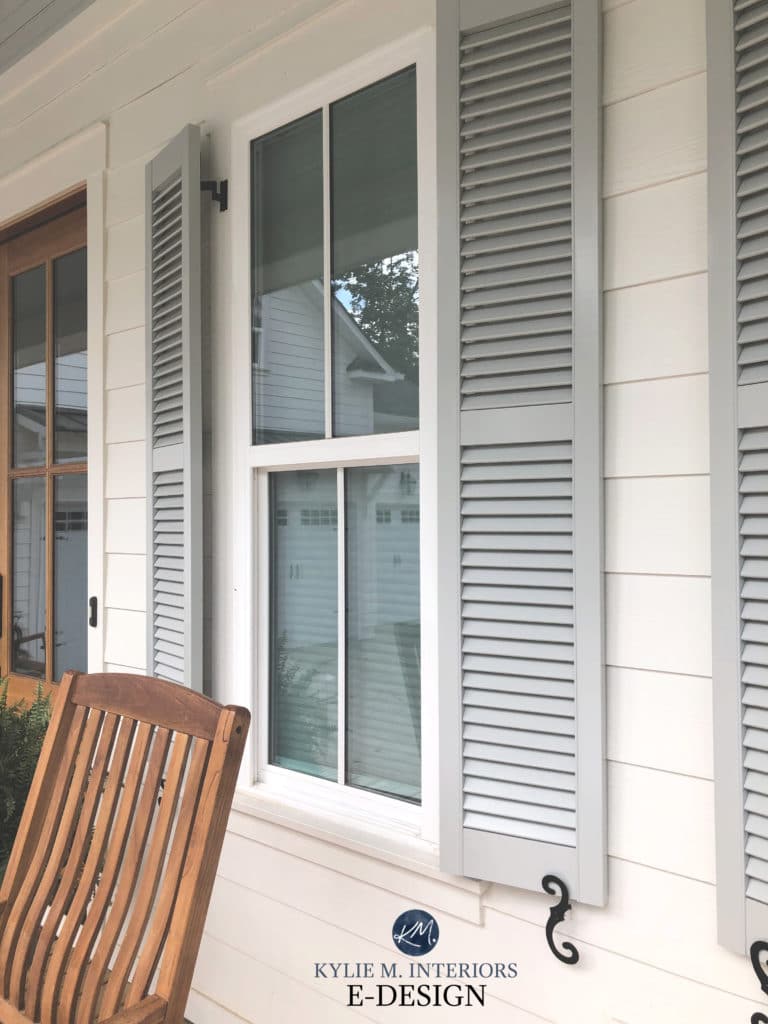
Can you please share what color the shutters are in the photo with the white windows (and brown rocking chair).
Thank you!
Well, boo. I needed this dose of reality. Our house in SW coastal US faces east (back of the house faces west). It has a clay tile roof (orange/red undertones) and is currently painted a color called Washed Khaki (has warm undertones) and the windows are white. I have been dreaming of using Urbane Bronze or Black Fox for the trim, but after ordering samples and reading your post I think my dark paint dream may die here, haha. Back to the drawing board for how to bring this exterior up to date!
Kylie,
Thank you for always guiding me in the right direction when I paint. I have painted several things in my current home with your advice and have loved all of them.
I am fortunate that I will be getting a different home. It faces East, is a one story, and has a brown roof. The stone veneer with a strong purple presence…going with what the home wants, not me. If all goes well, I would be happy to send before and after pictures to give credit to your for your amazing advice. Just let me know.
Your articles are my go to! We have a midtone gray roof with slight blue undertones. We have brown windows and live in sunny south west Florida What color white? We’re hoping for a warmer white but not sure. Thank you!
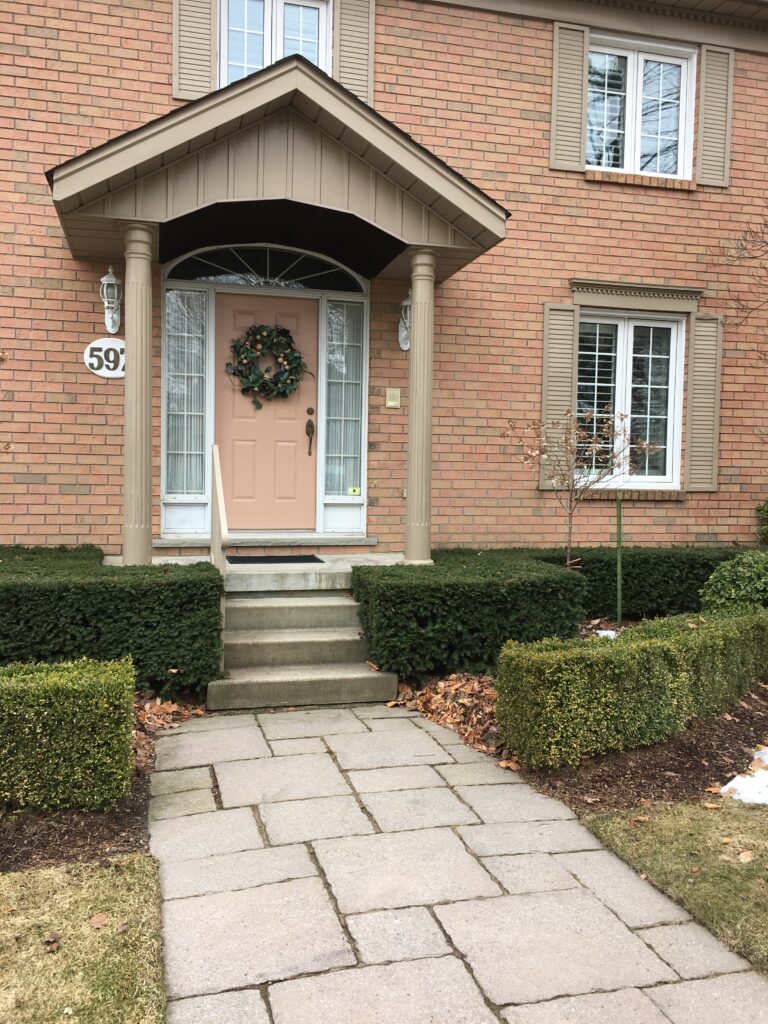
I can’t thank you enough! My sister and I have come to you with every single paint project inside and outside our homes! And we then try to help our mom. 🤣 My parents moved closer to us into a home with an orange, Mediterranean style house which is her LEAST favorite. Anyway you could pretty PLEASE share the light gray paint color in step #2 that’s on the house with the orange roof? Much gratitude!
Jenn! Can you let me know if I replied to this via email? I FEEEEL like I did, but I can’t remember????
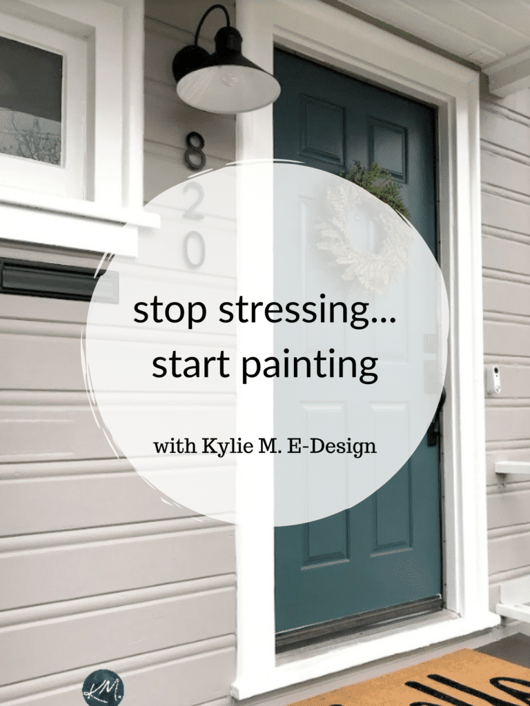
Hi Kylie,
So many great tips and things to consider! I’m in the middle of painting my house exterior and I absolutely love the green colour in the photo of the end of this article with the “820” address. Can you please tell me what this is?
Thank you!
Bec
Hey Bec, that’s SW Riverway!
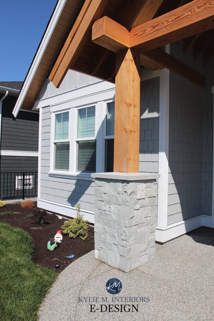
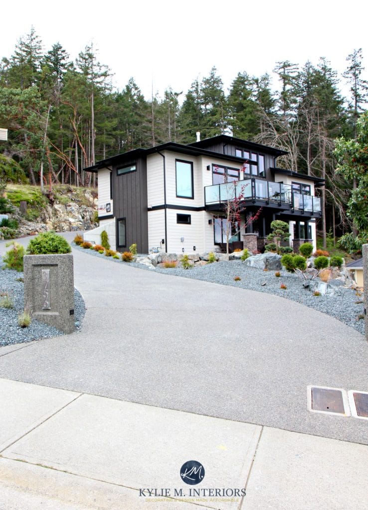
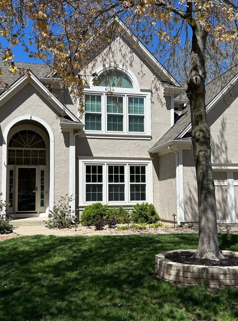
I love your tips. I was wondering what light gray you show in your first picture?
Thanks, Natalie! That’s actually Hardi Light Mist, which is similar to colors like BM Stonington Gray and Coventry Gray. It’s VERY LIGHT in that photo as the sun is on it :).