
Benjamin Moore’s 10 Best DARK Gray (Charcoal) Paint Colors
WHAT ARE THE MOST POPULAR DARK GRAY PAINT COLORS?
When it comes to the best dark shades of gray, it’s all in the undertones. And not just that, it’s about matching these undertones to your interior finishes – regardless of your personal tastes. If your home loves a purple, blue, or green undertone, and you don’t, you might need to take a deep cleansing breath (and a glass OR TEN of wine helps) and focus on what your home is asking for.
EVERY GRAY HAS UNDERTONES
For those of you hoping for the EVER-ELUSIVE perfectly neutral gray, I hate to tinkle on your toenails, but grays have undertones. And not just gray paint colors, but gray SURFACES, too. That gray tile that looks pretty darn neutral? Yup. Your sectional sofa that’s the perfect dark charcoal? You bet your booty it does. Even your brand-new white quartz countertop with gray veining has undertones.

Once you figure out the undertones of your interior finishes, it will be easier to pick the best paint color to go with them (if your room is a blank slate, then focus more on the exposure of your room).
As for the hues you can expect to see, warm gray paint colors will have either purple or green undertones, whereas cool gray paint colors lean into blue, purple, or green (often a blend).
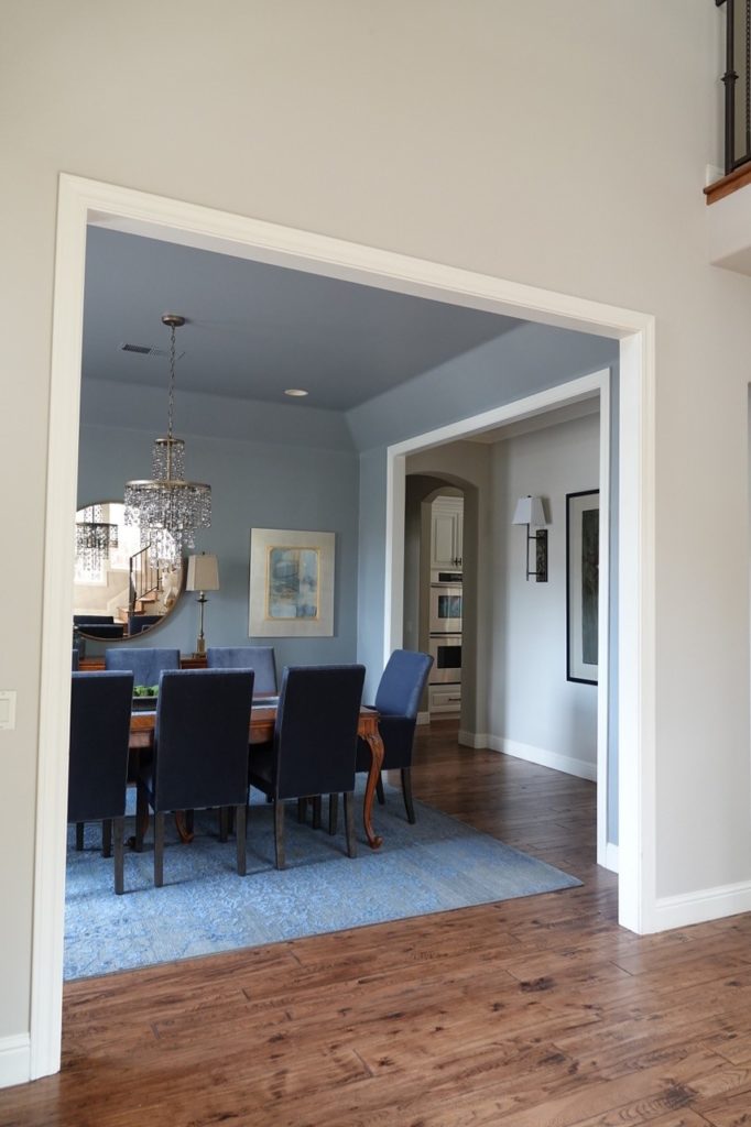
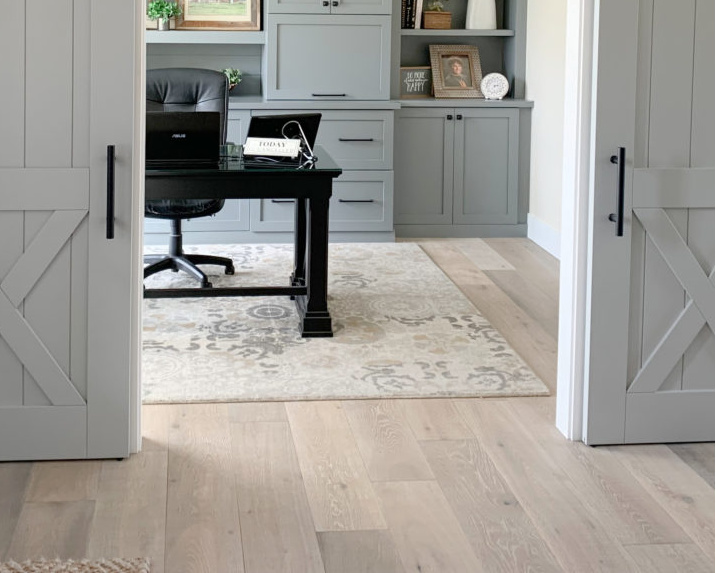
Benjamin Moore Stormy Sky
But regardless of the undertone, compared to Sherwin William’s selection (more limited), Benjamin Moore kicks some serious badonkadonk, so let’s get started.

By the way, these grey colors have LRVs lower than 30. Not sure what LRV is? It could save your PAINT-LOVIN’ LIFE – read about it HERE.
1. BENJAMIN MOORE CHELSEA GRAY HC-168
Chelsea Gray has an LRV of 22, making it a popular choice for cabinets, exteriors, and even all the walls in a room! With that moderate LRV, it’s the right depth to add drama and style to a space without weighing it down too much.

In the above dining room, look at how sharp Chelsea Gray looks with the white trim work. You’ll get a similar look using Benjamin Moore Chantilly Lace with Chelsea Gray.
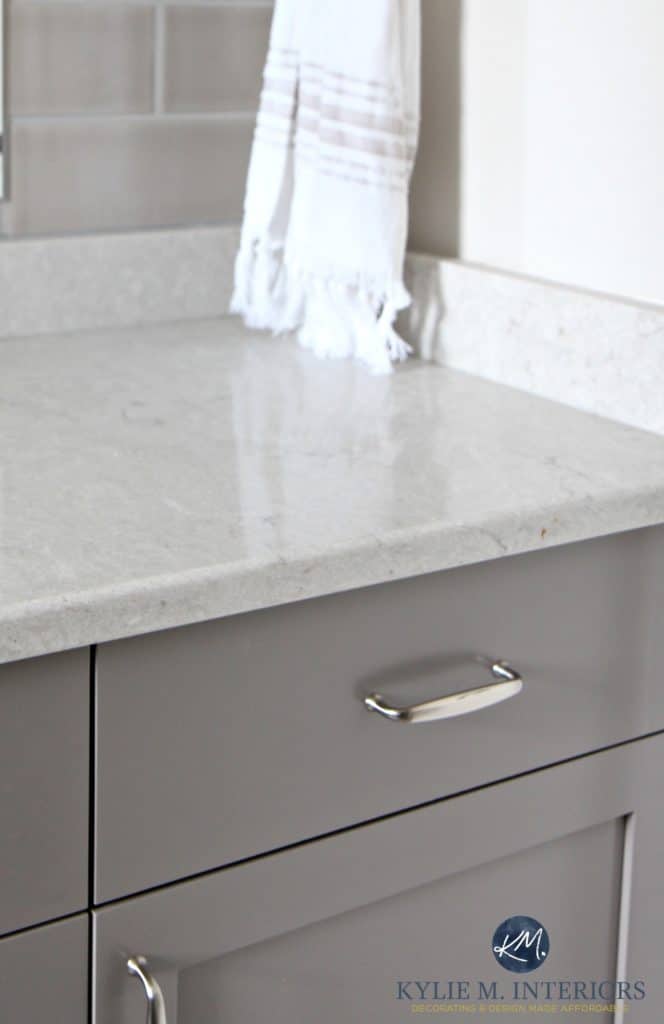
And while sometimes you don’t see it at all, Chelsea Gray has a green undertone. It’s also classified as a warm gray, but you won’t see it looking traditionally warm like Metropolis (coming shortly).
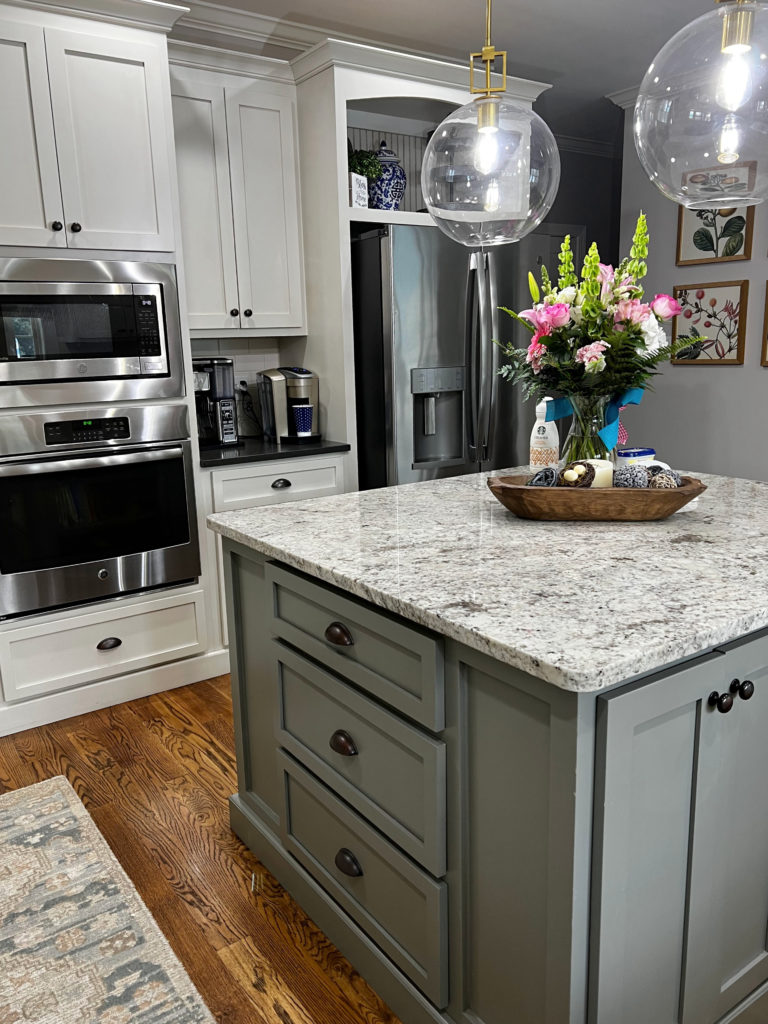
The green undertone is more obvious on this kitchen island with its 2000s granite countertop.
In this kitchen (below), Chelsea Gray looks simple and low in contrast with the black laminate countertops, letting the white subway tile and cabinets do the contrasting…

FULL PAINT COLOR REVIEW: Benjamin Moore Chelsea Gray
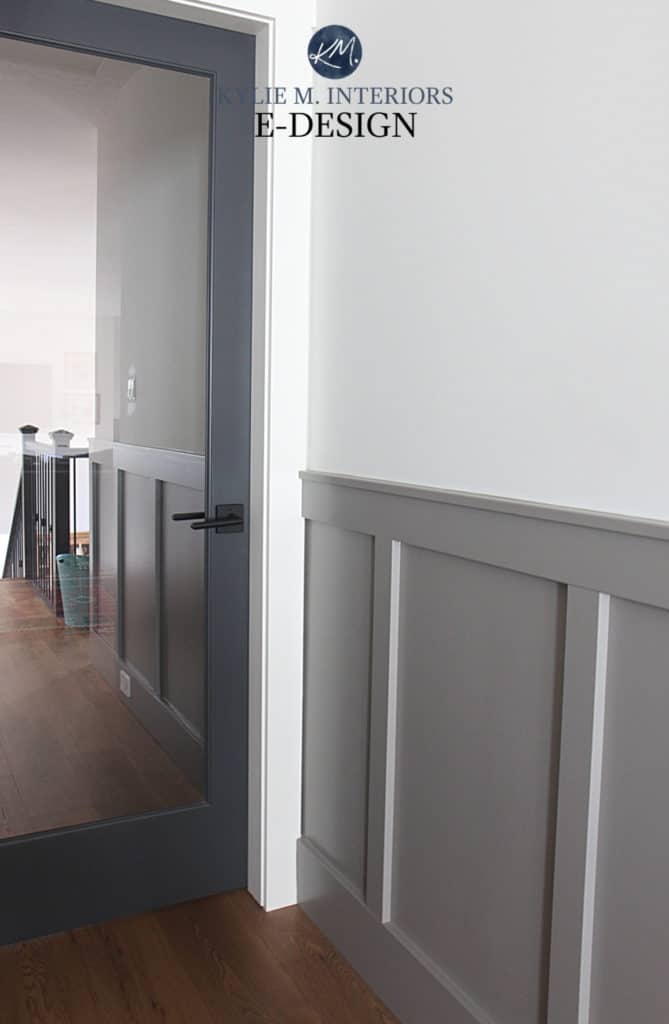
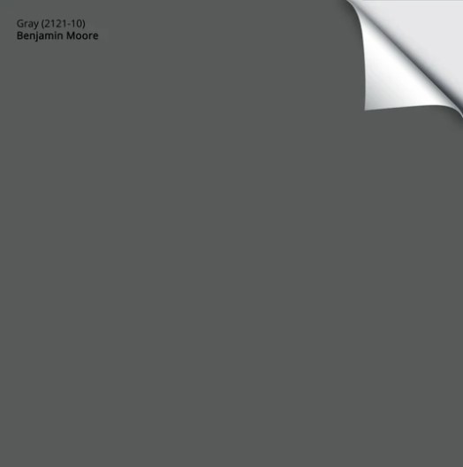
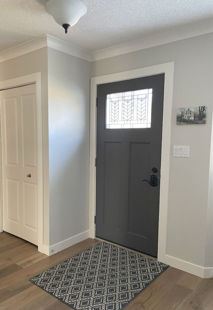
2. BENJAMIN MOORE STEEL WOOL 2121-10
Steel Wool goes opposite to Chelsea Gray (as it relates to undertones). Whereas Chelsea Gray has a green undertone and a tiny wink o’ warmth, Steel Wool is a cool, dark gray paint color with a purple-blue undertone.

The great thing about Steel Wool is how it sharpens scissors and its flexibility as a wall color; it nods at the blue and purple end of things without 100% commitment. And it does all of this while still looking more or less ‘gray,’ as shown in this next entryway photo…
The trim color in the above photo is Benjamin Moore Cloud White, a white with a wink of warmth to offset the cool approach of Steel Wool.
FULL Paint Color Review of Benjamin Moore Steel Wool
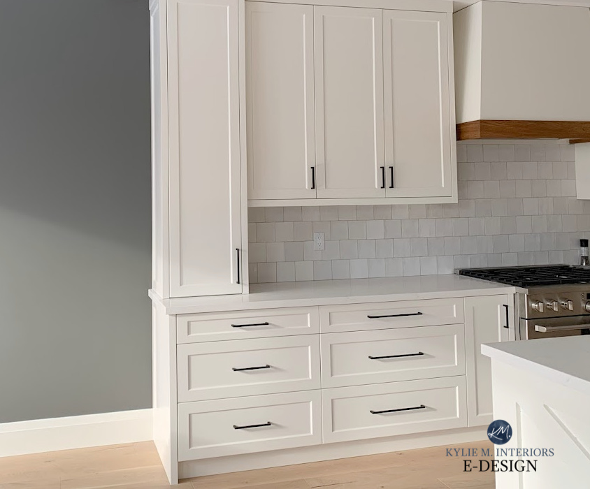
3. BENJAMIN MOORE GRAYSTONE 1475
Benjamin Moore Graystone has an LRV of almost 30, making it one of the lighter options on this page. When it comes to this particular type of warm gray, I would love to show you something a bit darker, but if we bump down just ONE NOTCH to Squirrel Tail, we pick up a green that’s more distracting than a streaker at a football game (it wasn’t me, I swear).
Shown with Benjamin Moore White Dove & Cheating Heart
But compared to the slightly warmer greige end of things, Graystone holds itself amazingly well as it relates to undertones. While it nods at green, it’s more of a polite nod than a ‘come hither’ one. In the above photo, you’ll see Graystone with White Dove trim and a Cheating Heart door.
Look at how much more green shows up to the party in this next foyer with warm white trim and a gorgeous wood interior doors. Remember, your room’s EXPOSURE, interior lighting, and surrounding finishes play a huge part in how a color is perceived.
The Best Paint Colors for the INSIDE of Your Front Door
4. BENJAMIN MOORE GRAY 2121-10
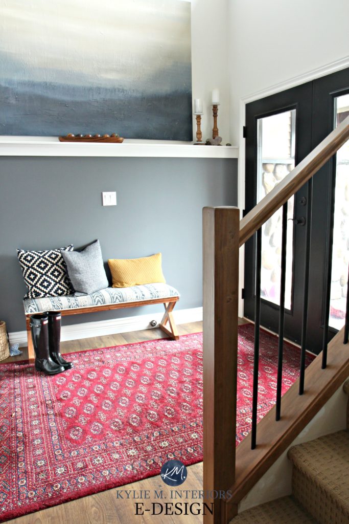
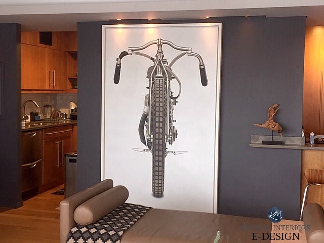
Seriously, I could go on and on about Gray…so I will. Gray is not just GRAY; it’s a very dark charcoal with a reasonably strong violet-blue undertone. I can’t even tell you how often I refer this color to my Online Color Consulting clients.
With an LRV of ALMOST 10, it’s one of the darkest options out there – at least before things start looking blackish, at which point it’s all in the sheen (not the Charlie Sheen, the other sheen). In the above photo, notice how the semi-gloss sheen of the paint bounces the light, making Gray look lighter than you might expect.
Gray was the perfect choice as a backdrop to my client’s art (below). While the art is big for the wall space, it’s still pretty badass…
Gray is also one of my top choices for front doors as they can add huge curb appeal to homes with brick and stone…
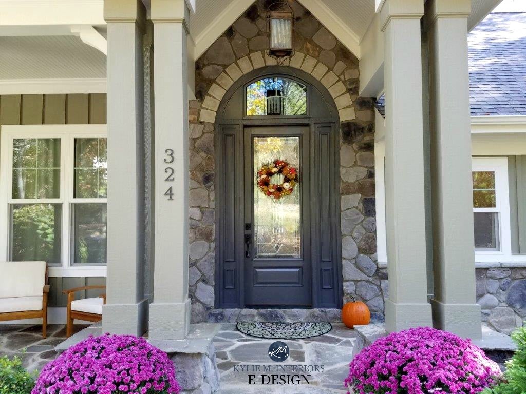
The Best Front Door Paint Colors
By the way, if you go to the paint store, you must ask for Gray 2121-10, including its number. Why? Because if you ask for GRAY, the employee will say, ‘which GRAY do you want?‘ and you’ll be on an endless Ferris wheel of misery trying to figure out WHICH gray you’re referring to.
FULL Paint Color Review of Benjamin Moore Gray 2121-10
SAMPLIZE peel-and-stick paint samples are more AFFORDABLE, EASIER, and more ENVIRONMENTALLY FRIENDLY than traditional paint pots.
Plus, samples arrive on your doorstep in 1 day!
Visit the SAMPLIZE website HERE
5. BENJAMIN MOORE METROPOLIS CC-546
Metropolis is one of the BEST warm gray paint colors on the market. Some warm grays lean so far that they’re mistaken for taupe, and others are so subtle they don’t always have enough warmth. Metropolis sits right in the middle and is a great choice, especially for some granite countertops from the early 2000s.
Metropolis has a purple undertone, and while it’s not shy about it, it’s also not overwhelming by any stretch of the imagination.
The 13 Best Gray Paint Colors With Purple Undertones
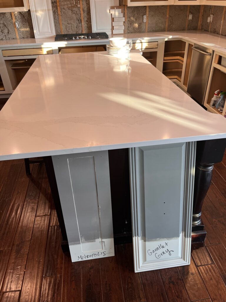
While the difference isn’t as noticeable, Metropolis is WARMER than Sherwin Williams Gauntlet Gray.
FULL Paint Color Review of Benjamin Moore Metropolis
6. BENJAMIN MOORE AMHERST GRAY HC-167
Amherst Gray is a hugely popular dark gray paint color, coming in a hot second place to Chelsea Gray. With an LRV of 17, Amherst Gray has more meat on its bones without going as dark as Kendall Charcoal (also lovely).
But remember, there are always sneaky undertones, and Amherst Gray comes in HOT with a green undertone that can come up considerably depending on its surroundings…
Really, when it comes to Chelsea Gray, Amherst Gray, and Kendall Charcoal, ASSUME you’ll see green.
FULL Paint Color Review of Benjamin Moore Amherst Gray
It’s easy to see the green undertone in Amherst Gray on this accent wall. Benjamin Moore White Dove cabinets.
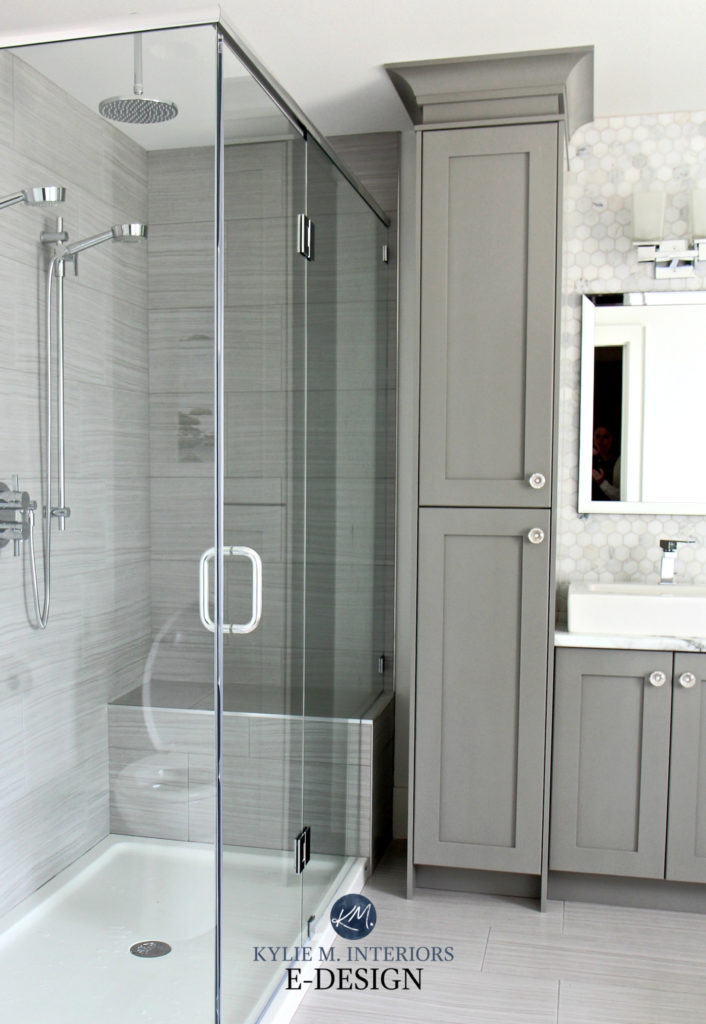
7. BENJAMIN MOORE TROUT GRAY 2124-20
I have mad love for Trout Gray – like, stick a fork in me, I’m done. This gray is colorful enough to be interesting without being overwhelming in its approach. As for undertones, Trout Gray leans nicely into blue, a blue that leans hard into violet, as shown in this powder room with personality.
Blue Paint Colors: The 2 Types & Where They Work Best
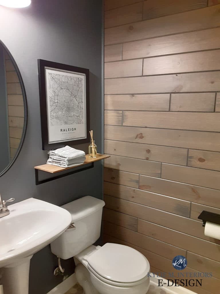
Trout Gray has an LRV of almost 15, making it a WICKED gorgeous option for feature walls, built-ins, cabinets, or ENTIRE ROOMS!
FULL Paint Color Review of Benjamin Moore Trout Gray
Want a bit more color? Check out Benjamin Moore Wolf Gray; she’s a beauty!
Want to see Sherwin Williams’s best dark gray paint colors? Check this out.
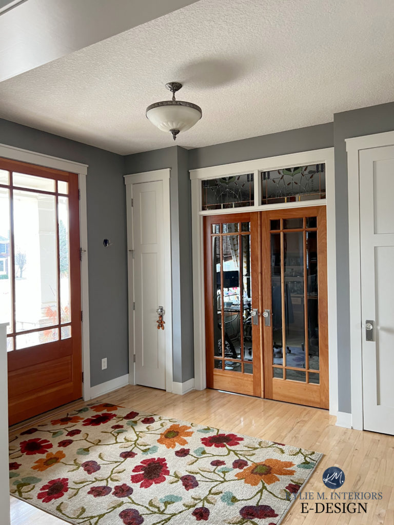
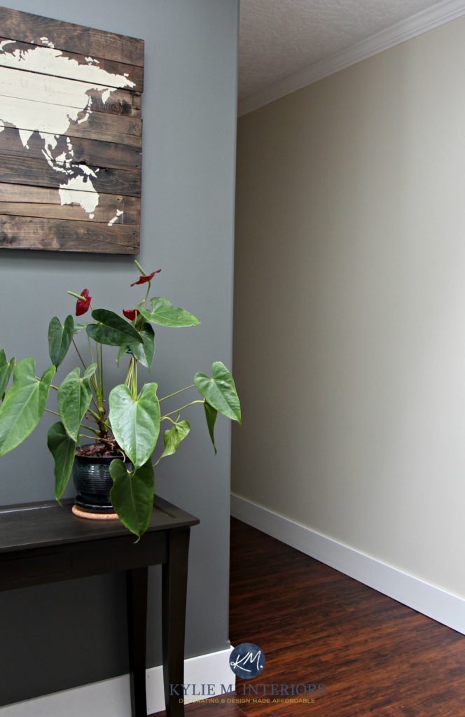
8. BENJAMIN MOORE STORM AF-700
Storm is lighter than the others with its LRV of 35.6, but for some people, that’s darn dark! Whereas some of the previous shades have muted undertones, Storm comes in hot with a glorious purple hue.
Check it out in this dining room. Its almost cove-style, vaulted ceiling looks more intimate with Storm wrapped around the entire room…
The other walls are Sherwin Williams Accessible Beige
The MOST NEUTRAL Dark Gray Paint Colors
While the above options are the most popular dark gray paint colors, this next section concerns the most NEUTRAL dark grays.
Why aren’t they included above?
Well, they’re rarely used, and this is because the majority of interior finishes demand gray paint colors with noticeable undertones! This doesn’t mean these options aren’t pretty; they’re just not POPULAR.
I also don’t have full reviews of these colors or photos to show you simply because I don’t refer to them as often, meaning these are super brief summaries…
9. BENJAMIN MOORE ASPHALT CC-548
Asphalt is a solid, concrete-inspired dark shade of gray. It has an LRV 19.71 and a VERY slight violet undertone. This makes it an interesting option for exteriors with roofing, stonework, or brickwork that need a more passive approach. It’s also an interesting cabinet color when a little undertone is needed.
10. BENJAMIN MOORE OVERCOAT CC-544
With an LRV 13.47, Overcoat is a classic, dark shade of gray and has a similar approach to Asphalt with a slightly stronger violet undertone and a bit more MEAT on its bones. Overcoat would be a beautiful exterior option, as well as for front doors and dramatic feature walls.
11. BENJAMIN MOORE IRON MOUNTAIN 2134-30
Iron Mountain is a popular choice for exteriors, both on siding and trim. However, it’s not like the other grays, as it has some interesting things going on – read all about it in Benjamin Moore Iron Mountain: Paint Color Review.
The Best Paint Colors for the Inside of Your Front Door
PEOPLE ALSO ASK…
WHAT’S BENJAMIN MOORE’S MOST POPULAR DARK GRAY PAINT COLOR?
Hands down, the most popular dark gray from Benjamin Moore is the rich, dark, and moody Kendall Charcoal, followed by Chelsea Gray. Whether on cabinets, feature walls, doors, or exteriors, these two stormy (not cold) shades of gray satisfy various styles and tastes.
But do you want my HONEST OPINION? I know you do. If I choose a gray paint color like this for one of my Online Paint Color Consulting clients, I’m probably gunning for Sherwin Williams Classic French Gray instead. Why? It’s not as warm, AND it has less undertone.
IS DARK GRAY A GOOD COLOR FOR A HOME?
If you’re talking about the exterior, yes, dark grays are often well-suited to brick, stone, and various asphalt roofs. As for interiors, they’re more generally popular on accent walls, islands, or single rooms.

5 Steps for Choosing Your Perfect Exterior Paint Color
Personally, I love the right room painted in a dark gray!

The Best Darker Gray-Blue Paint Colors
WHAT IS THE DARKEST SHADE OF GRAY PAINT?
If we’re looking at Sherwin Williams, Benjamin Moore, and BEHR, BEHR comes first with Cracked Pepper, a hybrid between dark gray and soft black.
As for Benjamin Moore, Iron Mountain is the darkest, but its warmth and undertones can have it flexing out of the gray range. For this reason, Kendall Charcoal is a more typical gray with a wicked depth. Some would say that Deep Space is the darkest gray, but with its strong blue hue, it’s too colorful to be a good gray (in my books).
WHAT COLOR IS REPLACING GRAY IN 2025?
LIGHT gray is definitely not in style, and beiges are coming in hot. We’re also still seeing a lot of greige, taupe, and warm off-whites. However, dark gray, on the right surface, will always have a place on the exterior of a home. As for the interior, it depends on the home and surface, but less so.
READ MORE
Sherwin Williams 8 Best Dark Gray Paint Colors
Are Gray Paint Colors Still Trendy on Walls, Cabinets & Exteriors?
BEHR’S 2024 Color of the Year: CRACKED PEPPER
Sherwin Williams Peppercorn: Paint Color Review
The Best DARK Greige & Taupe Paint Colors – Benjamin Moore
The 12 Best Whole Home Gray & Greige Paint Colors
The Best Front Door Paint Colors (Exterior)
The Best Darker Paint Colors for Cabinets & Vanities
Need help?
Check out my Online Paint Color Consultations!

ORIGINALLY WRITTEN IN 2021, UPDATED IN 2024


Kylie! Your reviews & color breakdowns are truly the best of the best. Would you ever consider doing a review of your favorite black & soft black paint colors.. pretty please?
YES, Amy, that’s a great idea, thank you!!! I’ll dedicate it to you 😉
Random question – why did you stop mentioning Hello Paint? It’s cheaper for Canadians than Samplize, especially when you count the shipping. I used Hello Paint in the spring and thought it was great. Did you find they no good?
Hi Cassie (also my daughter’s name ;))! I LOOOOVE HELLO PAINT, they’re AWESOME! But funny enough, the majority of my readers (like 95%) are in the US which is where Samplize is. I include Hello Paint & Samplize in my e-design consults, but in my blog posts I try to keep it simple with just Samplize.
Happy holidays! Kylie
As another Canadian, I always appreciate it when bloggers point out Canadian alternatives!
But this was a great blog post, thanks!
-Sara
Hi Kylie! I’m really enjoying your blog, and wondered if you could help me. I know you’ve talked about paint in the context of whether a room faces east, west, etc. I have a home office that has south and east facing windows; the south window has a neighboring house not too far away, and the east window has nothing really blocking it. The tone of the room is pretty warm. I’m wondering what sort of colors I should aim for? If I pick a cool color, is that okay because it’ll still look a little warmer? Or should I stick with warm? I do really want a BRIGHT, cheerful room that looks that way as much of the time as possible, even at night. I’m thinking some off-the-wall color combos. But then again, maybe I’ll do a warm white and super colorful trim? What do you think? Any input is appreciated. Thanks!
Hi April, YES, a cool colour can be a great way to balance out a room that has a good visual warmth to it – definitely! BUT, once the sun goes down, it still needs to be the type of paint colour you love to live in. Have you checked out my blog posts that are specific to exposures, ie. the south-facing exposure post?
Yes, I did, thanks! However, the information was a tiny bit confusing because one of your pages said to focus on the eastern exposure, and the other southern–but I think the difference being specified was that if one window was slightly blocked by anything, focus on the other as the primary exposure? Is that right?
I deal with a lot of fatigue, and am also a night owl (ironically), so I’d like a nice bright color scheme to keep me feeling stimulated, since this is for my home office. I wanted to think it over and get a more concrete idea on what exactly I want, hence the delay in responding to you again, apologies! But, now I’m thinking to do two walls in Benjamin Moore’s Just Peachy (a peach that’s pink enough so that when it warms up hopefully it won’t look too yellow?), and the other two walls in either BM’s Rose Parade or Hot Lips. What do you think? I do wonder if the Rose Parade might turn out looking too orangey?
Thanks for putting up with my rambling! haha!
Also, I should specify: I know this color scheme idea is sort of *a lot*, (lol!)but I want to go all-out and embrace a boho look. My decor would continue in that vein. I did think about doing a soft white for the walls and just stick to super colorful moldings, but I have floaters in my vision; when I look at a white wall, they’re all I can see and it’s horribly distracting.
I want to paint a powder room Coventry grey with a darker board and batten feature wall but I’m confused. I want this feature wall to be darker. This room has no windows and doesn’t even get indirect light from the hallway. Help!
Hmmmm, Coventry Gray is already a slight statement colour in a dark room. Have you considered doing white walls with Coventry Gray on the board and batten or a different DARKER colour on the board and batten with the white walls??
Kylie
Love this very much.
Great data.
I have at least 50 more Gray colors in front of me, so hard to pick a color.
I’m having a professional painter coming in to do my foyer and stairs leading up and hallway.
And master bedroom.
What is your opinion about the B/M Wolf Gray on the walls and white wainscoting and molding?
What is your opinion about the B/M Oxford Gray on the walls and white wainscoting and molding?
Thank your Stephen Beyer
Hi Stephen, I had Wolf Gray in the lower family room area of our last home and LOVED it. It does have a reasonably strong violet-blue to it though, so make sure you’re okay with this. Oxford Gray is equally as striking, but more much more colourful, leaning that bit further away from gray, so as long as that’s the LOOK you want, you should be good! Look up BM Steel Wool on my website though, see how that seems to you…
Kylie,
Thanks for your professional knowledge and incite.
This is so hard.
The Steel wool is nice as well.
My entry foyer lower wall is done with wainscoting in white and follows up the stairs to second floor and is also painted white.
I thought a darker side gray paint would make a statement but Im not sure what gray to use to make it pop to give it a rich, deep, luxurious look and feel.
I have oxford gray, wolf gray, black pepper and kendall charcoal paint samples to apply to the walls but I have not done so just yet. What’s the best way to put these samples on the wall and how big should I make each test site. I’m leary putting these paint sample colors on the wall since they are all dark.
My dinning room is just off of the foyer and that is done in the historical BM Whipple blue with white wainscoting and that look awesome.
I like using the BM historical colors. Do I have to transition the flow from the D/R to the Foyer area?
I also saw a color BM Luxe on the internet with white wainscoting and it looked great.
I really dont want to use a light gray on the upper walls since I think with the white wainscoting it would look washed out.
Why is this so hard?
Any ideas from your wonderful mind.
Help Stephen
I can’t believe I’m just now finding your website, you are so helpful! Im painting my white shaker cabinets – uppers SW white duck, I do not have backsplash yet but keeping my new Venetian light granite countertops. I’m going back and forth on a dark gray for the island to pull from the granite but was wondering if SW Cyberspace would clash with the granite?
Love the list of dark gray paint colors! I’ve been searching for the perfect shade to update my living room and these options are definitely worth considering. Thanks for sharing!
You’re most welcome!