
How Light Bulb Temperatures (Kelvins) Affect Paint Colors
Remember when you went shopping for light bulbs, and all you had to think about was wattage? Not anymore. Now, it’s all about KELVINS.
Of course, wattage still matters, as do lumens and CRI. But these days, when choosing a light bulb that ENHANCES colors, Kelvins are the main consideration.
Interior lighting is used to compensate for the light coming from the outside, either in amount, quality, or temperature. KELVINS covers part of this. Once you get on more intimate terms with him, you’ll realize he’s not such a bad guy—you might even become besties.

LIGHT BULBS (TEMPERATURES) & PAINT COLORS
KELVIN (shown as K on the light bulb package) is the measurement of the temperature of light.
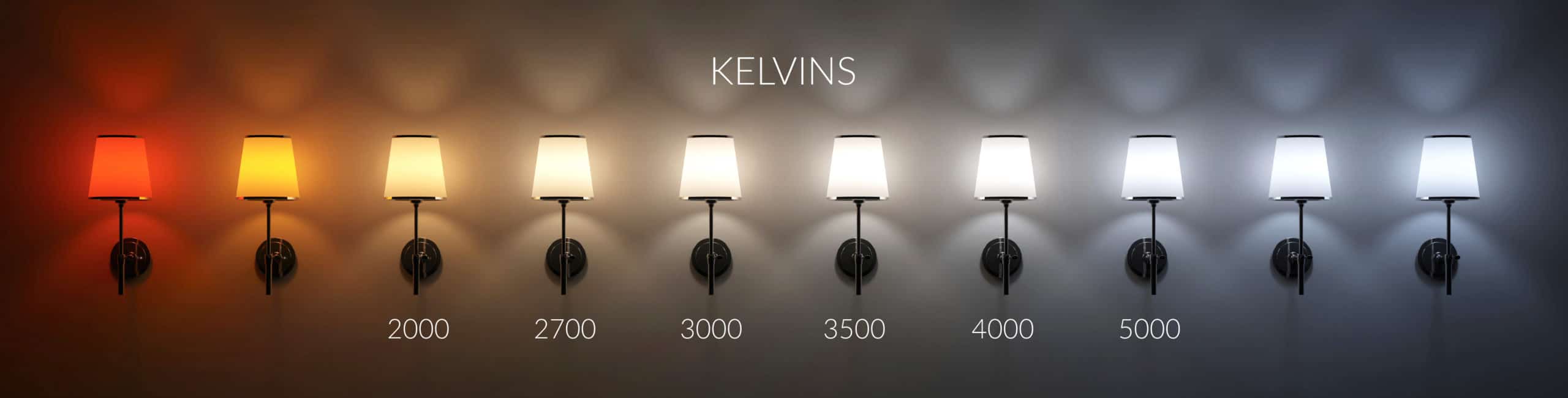
The above representations are approximate.
While there’s an even more extensive range of Kelvins than shown above, today, we’re focusing on the most popular ones – not those used in igloos and saunas. Yes, I’m talking to the men who LOVE their light bulbs as cold as their beer – these cold bulbs have got to go!
But a few notes before we start…
- There are many ways of grouping Kelvins – this is how I’ve chosen to group them for learning purposes.
- I can’t discuss every type of bulb and temperature/wattage/etc.… I can only advise on the most popular bulbs and Kelvins; otherwise, we’ll both lose our minds.
- I’m not a lighting expert; I’m a paint color expert who happens to put two & two together.
- When you’re done, you’ll find a link at the bottom of this page called ‘How the CRI of Light Bulbs Affects Paint Colors’ – it’s a MUST READ!
Also, thank you to all my Online Paint Color Consulting clients who sent in their photos – I couldn’t do this without you!
2500-3200K LIGHT BULBS
TEMPERATURE: WARM-YELLOW
This is a range we’re pretty familiar with, as it’s the range of most incandescent bulbs. The light in this range is warm—yellow. While some bulbs dip down to 2200K (i.e., Edison bulbs), 2700K is pretty average.

Sherwin Williams Pearly White / The Best Non-White Paint Colors for Cabinets
The lower the number, the warmer the light. Warmer in this range = YELLOW (the lower you go, the more orange you’ll get, then red). For most people, 2500K is the starting point.
WARM PAINT COLORS & 2500-3200K BULBS
- These warm bulbs will enhance WARM PAINT COLORS as they lean into each other.
- The lower the Kelvin number, the warmer your paint color will look. If you go too low in Kelvins, you’ll start picking up pink-red. I recommend no lower than 2500K.
- Warm paint colors often look their best between 2700K and 3200K.
COOL PAINT COLORS & 2500-3200K BULBS
- COOL PAINT COLORS will be toned down and muted by this warm light.
- Cool colors that look crisp and fresh in white or cool light will lose this edge in warm light. This isn’t a bad thing, as what was once a cool, clean color in the day can look soft and subtle in the evening. Just note that you can expect tweaked undertones as the color will be distorted.
- Some paint colors with a bit more blue in them can even look a bit greenish under the warmth of lower Kelvin bulbs.
In this home office below, Sherwin Williams Sea Salt looks even more beautiful with warm light shining on it!
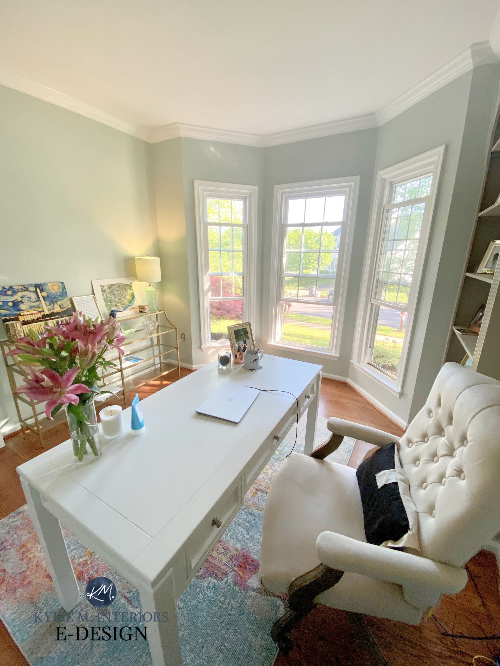
Did you notice the shift in how the paint color looks from left to right? Cool, eh?
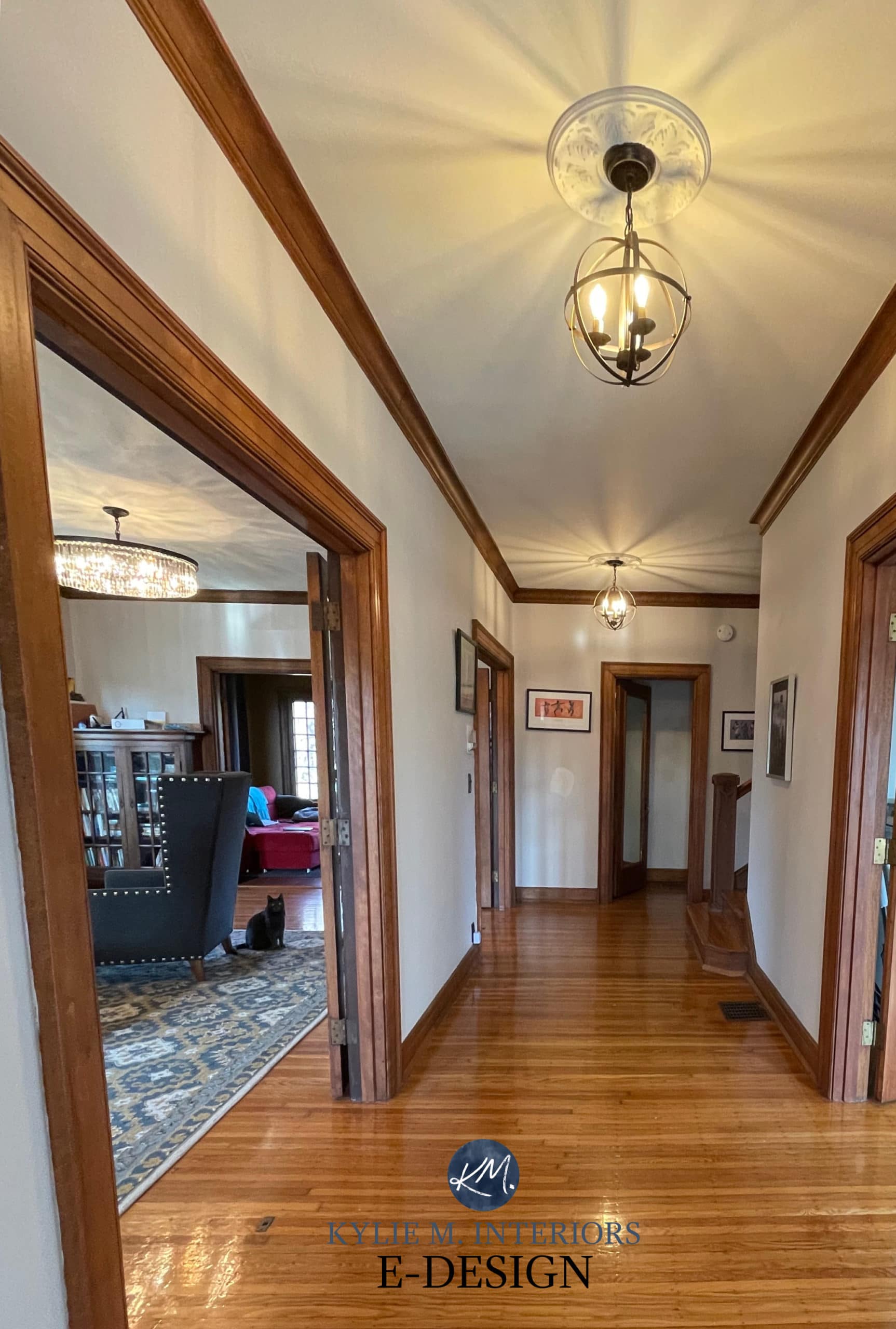
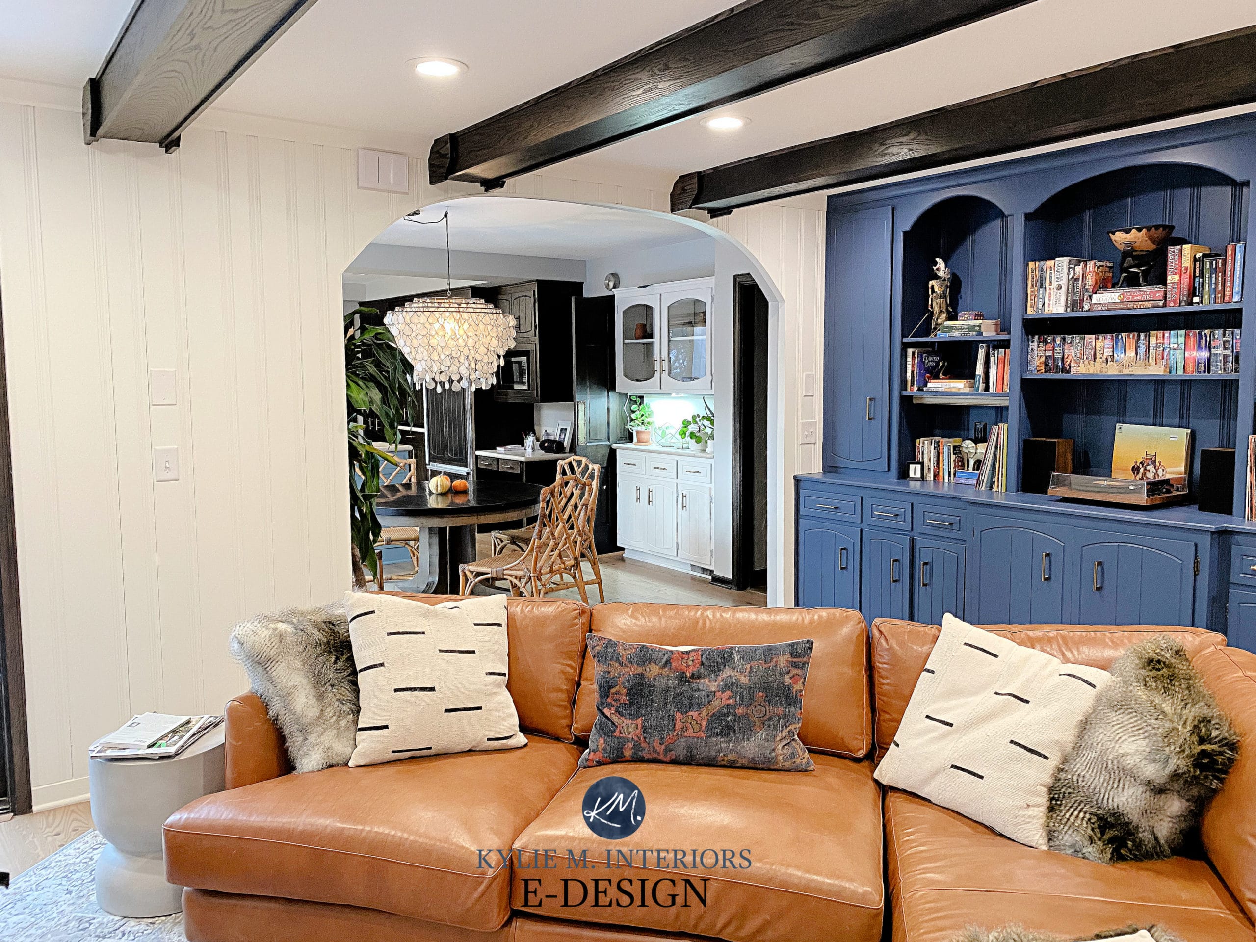
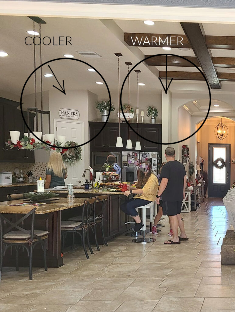
In this living room (below), look at the paint color on the right side of the photo and then at the color above the fireplace. Based on the visible shift of the paint color (Benjamin Moore Stonington Gray), I bet these are 2700-3200K bulbs!
If you want a room with a cool color to always look clean and crisp, you may want to choose a bulb with higher Kelvins. But it’s not all about your paint color; make sure it’s a light you’re comfortable living in.
My favorite light bulb with ADJUSTABLE KELVINS & a CRI of 95!!

3300-4200K LIGHT BULBS
TEMPERATURE: BRIGHTER WARMTH TO NEUTRAL WHITE
Light bulbs around 3300K will still have a subtle warmth, but their light will be less warm/yellow than the lower Kelvins. These Kelvins can come across as a bit brighter and whiter looking. However, this slightly brighter white doesn’t mean you have higher lumens (even though it might look like it).
Benjamin Moore Van Deusen Blue and Simply White
As the Kelvins get higher, the warmth starts disappearing to the point where at 4000K you have a relatively ‘neutral bright white’. This light isn’t necessarily warm or cool; it’s more ‘neutral’ (although compared to warm bulbs, it can look pretty darn cool).
While this is a popular range for many households, personally, I use 2700-3000K in almost ALL of my fixtures – I err on the side of warmth.
BTW, I will NEVER put a bulb higher than 3500 in my own home…just sayin.
WARM PAINT COLORS & 3300-4200K BULBS
- Warm paint colors will look soft and warm around 3300 K, as they should. However, they’ll be a bit brighter than the 2700K range (and less warm than they would be in the lower range). If your paint color isn’t as warm as you hoped, drop those Kelvins back down to 2700K.
- 3300-3500K won’t enhance warm colors the way the lower range can, and it can still be quite pretty if the 2700K range is too warm/yellow for you.
- As you get closer to 4000K, you’ll gradually lose warmth. A whiter light replaces this warmth. Warm colors start getting a bit nervous in this range as the light isn’t catering to them as much.
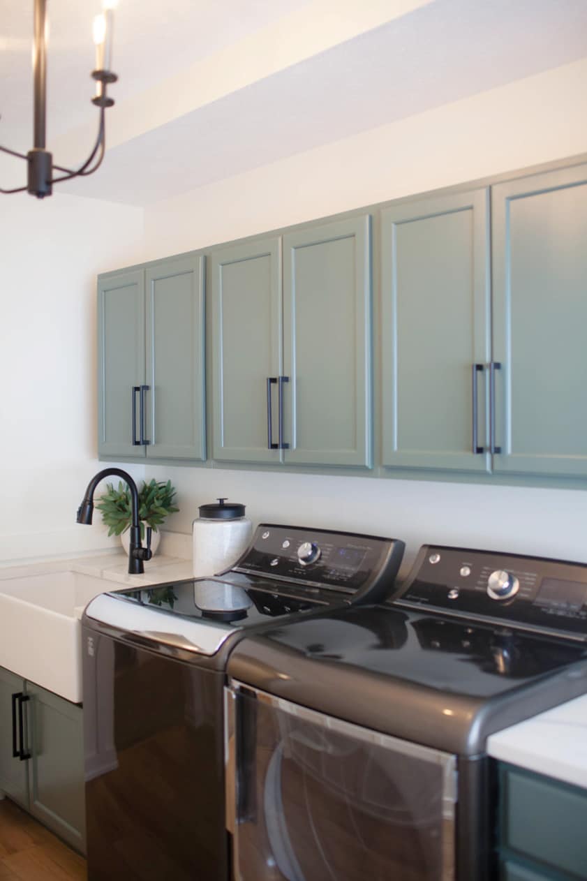
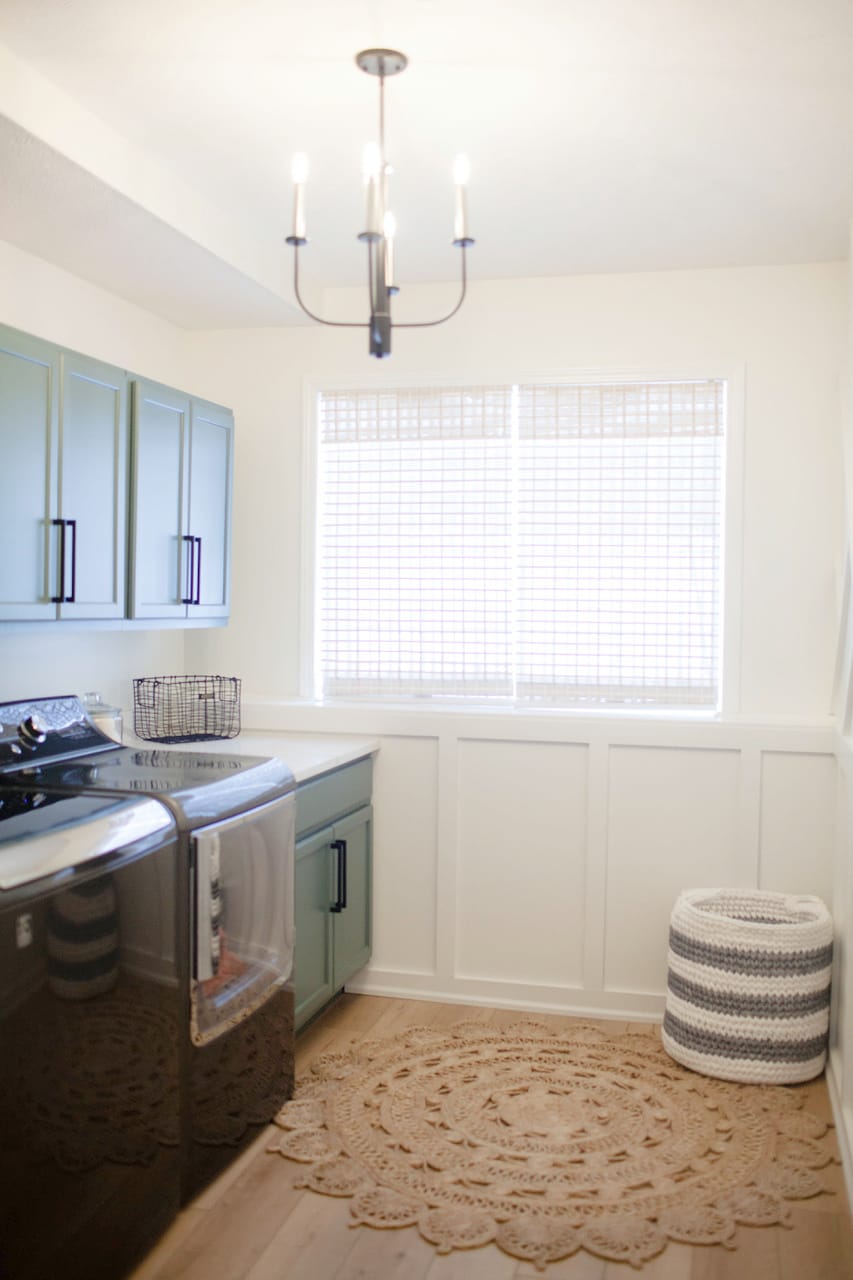
See this GORGEOUS laundry room makeover HERE
In the higher end of this range (I’d say 3800-4200K), warm paint colors can sometimes look off, as this whiter light almost seems a bit cool, like it’s going slightly against the intentions of warm paint colors. It’s one thing to add contrast with paint colors, but it’s a different thing to try with light bulb temperatures. Even though 4000K isn’t cold or blue, its lack of warmth can make it seem cold.
Another reason is that, for many years, we were used to the warmth of 2700K incandescent bulbs.
Because of this, even a bulb that’s not cold but also not overly warm can make colors seem off. This could be because the light’s temperature isn’t as familiar.
Sherwin Williams Big Chill
COOL PAINT COLORS & 3300K-4200K BULBS
- In the 3300-4200K range, cool paint colors start to perk up a bit, but they will still be toned down or slightly distorted in the lower end of this range. This isn’t necessarily bad, as toned-down cool colors can look very pretty, just differently than they would in a cooler light.
- Cool paint colors enjoy the 3500K+ range, as it plays off the crisper, clean look of cool colors, especially as the Kelvins get higher. But remember, like north-facing light, this will compound the cool look of an already cool-looking room, as you won’t add any warmth for balance.
I appreciate how nice a cool color LOOKS in the 4000K+ range, but I don’t appreciate how the room FEELS (but you do you).
Sherwin Williams Pure White
Funny enough, they (you know, ‘they’) say that the best light for paint colors to look their most true is 5000-6000K with a CRI of 100. Okay, I get the 100 CRI bit (it’s slightly excessive, but so is my wine consumption, so who am I to judge)…
…but 5000-6000K? Do you have ANY IDEA HOW FREAKIN’ COLD THAT IS?
If you’re more concerned with how your paint color looks (and less with the visual temperature of the room) and enjoy a mix of warm and cool tones, you might choose bulbs approximately 3500-4000K. This range could offer a more balanced light (erring on the slightly warm side at 3500).

A darker hallway/staircase and warm paint color like this does well with approximately 3000K.
Now, do you want to know what happens as we continue down this path into higher Kelvins? I run out of photos, and there are a few reasons for this.
1. Interior photos are usually best taken with lights OFF (as long as there’s adequate exterior light).
2. I ONLY use photos from my E-Design clients – REAL HOMES for reality-based advice.
2. Not as many people use cool bulbs compared to warm bulbs. And if they do take a picture, it doesn’t always translate well.

How the CRI of a Light Bulb Affects Paint Colors
4300-5000K LIGHT BULBS
TEMPERATURE: A RELATIVELY NEUTRAL WHITE TO BLUE
Hubbies worldwide (and about three women) rejoiced when they introduced cool white-blue LEDs! For some reason, many men love these cool-tinted bulbs. On the other hand, most women find them too harsh and unfriendly or clinical (like, ‘just lie down, cover your lower body with this sheet and place your heels right here’ kind of clinical). Personally, I would only use this temperature range in my garage… Nah, I still wouldn’t (but that’s me – YOU DO YOU!).
By the way, that’s a generalization based on experience, just like most men don’t like to paint wood, whereas many women already have their paint roller wet!
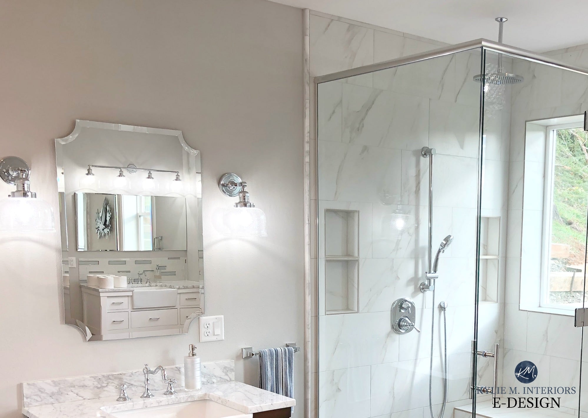
For a room like this bathroom (below), a cool light/slightly higher Kelvin will help the blue paint color look crisp and fresh. However, this same bulb could make the warm white trim look a bit off. It’s a balancing act!

Personally, I think 4300-5000K is damn cold (particularly 5000K). If you choose bulbs in this range, you’re looking at a cold blue-white light that’s most similar to a clear, bright, north-facing day, (wearing blue-tinted glasses). The closer you are to 4000K the more neutral/less blue the light will be, the closer you are to 5000K, the cooler or bluer the light will be.
WARM PAINT COLORS & 4300K-5000K BULBS
- Whereas some cool paint colors can look pretty in warm light, warm paint colors will look flat and distorted in this cool white-blue light.
- You may find that using higher Kelvins in the bathroom* can cast a GREEN glow onto your skin – which is great if you’re Shrek.
*I understand that a brighter, cooler bulb can be helpful for those who need to see better. But if you wonder why your cream-colored walls look a little peaked, and your face looks a tinge green, well, now you know why.
Kylie M Answers Your Top Paint Color Questions!
COOL PAINT COLORS & 4300K-5000K BULBS
- Cool paint colors will respond well to cool white-blue light, just as warm colors respond well to the 2700K range. If you love everything crisp, cold, and clean, this could be the Kelvin for you. Just don’t tell your partner about this amazing ‘Kelvin’ fellow you’ve been introduced to.

While a color like this might look pretty in a high Kelvin light, the combo can be a bit cool for everyday living.
5100K+
TEMPERATURE: BLUE
I can’t tell you from personal experience how paint colors will react to cool-toned bulbs because I would never…ever…do this to my home. I know this is a personal preference, and I don’t mean to sway you…wait, yes, I do. You subscribe to my blog to learn about what looks good, and this ain’t it. Unless that is, you live in a commercial space, workshop, or institution.
So, where is a 5100K+ bulb most popular?
- offices
- commercial applications
- garages
Some people also use them in their bathrooms (great for tweezing those nose hairs), but they can cast a greenish light on the skin—energizing yet not ideal.
I’m sure there are men WORLDWIDE pinning a photo of my face to a dartboard, but I’m just keepin’ it real. For the average homeowner, 5100K+ isn’t a comfortable light to live in.
WARM PAINT COLORS & 5100K+ BULBS
- Warm paint colors will look greatly distorted in 5100K light as it doesn’t have yellow/orange/red in it to PLAY with warm colors (blue light actually will absorb red).
COOL PAINT COLORS & 5100K+ BULBS
- Cool paint colors will be in their glory when using bulbs with this high number – AS WILL ELSA! (a la Frozen)
A blue paint color like Sherwin Williams Niebla Azul (below) will be in its glory in the higher Kelvins, but you better watch that warm white trim!

LIGHT BULBS, KELVINS & WHITE PAINT COLORS
Because white paint colors reflect the most light (having the highest LRVs), they’re super responsive to the Kelvins you choose.
If you give a paint color with a high LRV a light that is tinted with yellow, blue, or another color, your walls will do one of the following:
- reflect some of that color back at you
- the undertone in your white can be muted or distorted
WARM WHITE PAINT COLORS & KELVINS
Warm white paint colors will have undertones of yellow, orange or red. As mentioned above, if you give white paint colors a light that casts a particular hue, this will affect your paint color.
- If you choose lower Kelvins for your warm white, your white will be enhanced and look a bit warmer.
- Choose moderate Kelvins for your warm white, and it could look well-balanced based on its intentions/undertones.
- However, start dabbling in the higher Kelvins with warm whites and you could get murky-looking walls with disturbing undertones.
In this next space, I assume these bulbs are approx 3200K…
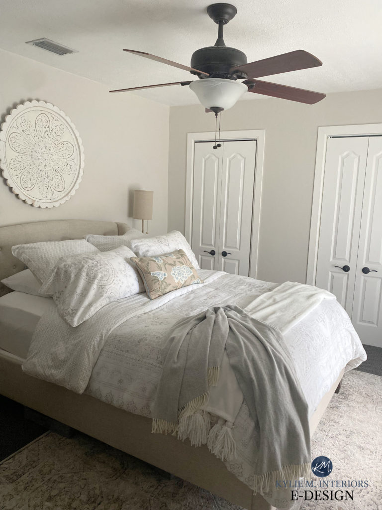
TRUE WHITE PAINT COLORS & KELVINS
Because true white paint colors don’t lean warm or cool, they’re very susceptible to tossing back what you throw at them. Give them a warm light, they’ll give it back. Give them a cool light, they’ll give it back.
In this bedroom below, Sherwin Williams High Reflective White looks gorgeous in natural light. If the bulbs have a lower Kelvin, you can expect the walls to look warm. If the bulbs have a higher Kelvin, you can expect the walls to pick up a blue hue.
COOL WHITE PAINT COLORS & KELVINS
Cool white paint colors will have undertones of blue, violet, or green. Again, the Kelvins you use can greatly affect how your paint colors look!
- Give your cool white paint color a bulb with higher Kelvins, and the undertones of your paint color can be ENHANCED.
- Choose a more moderate Kelvin for your bulbs and your cool white could settle in just as expected (not glorified OR distorted).
- However, give cool white paint colors a bulb with a yellow hue (lower Kelvins); the cool undertone of your white could be distorted. But unlike WARM colors and HIGHER Kelvins, this isn’t necessarily a bad thing. This combo can add a bit of balance, as cool colors that are dulled can still look very pretty (just a bit different from their original intention).
In this gorgeous powder room, Benjamin Moore Super White (a cool white), looks a touch warmer with these bulbs. Again, while warm colors can look considerably off in cooler light, cool colors can look pretty in a warmer light!

WHEN OPPOSITES DON’T ATTRACT
Now, I’m sure you can figure out which Kelvin you and your paint colors love to live in, but what happens when you and your partner like opposite ends of the scale? Well, you could flip for it, or you can check out these tips…
- If you have a partner who LOOOOVES the cool white-blue light of the 4500K+ range and you’re more of a warm white lover (2700K range), 3500k can be a reasonable place to settle. Reasonable means it caters slightly more to the warm end of things than the cool end. 4000K is more reasonable. #imslightlypassiveaggressive
- If you have mostly warm colors in your home, they could decide it for you, as warm colors do best in warmer, lower Kelvins. Remember, warm colors can actually look bad in cooler, higher Kelvins.
- If you have mostly cool colors in your home, they could decide for you. Cool colors look their best in moderate Kelvins (let’s say, 3500K) or higher ones. However, unlike warm colors, which can look terrible in cool light, cool colors can look quite pretty in warmer, lower Kelvins as well—just a bit different.
It all comes down to the type/temperature of light you’re comfortable LIVING in.
- If you prefer ONLY cool colors and cooler light, you might prefer bulbs with 4000K+. However, you may want to add balance with texture and warm accents, otherwise, your room could look a bit stark and icy.
How to Make a Cold Gray Room Look Warmer
- In my experience, many of us enjoy a softer, warmer-looking environment—it’s more inviting. Sure, we can add a bit of freshness to that, going up to the 3500K range, but beyond that is unfamiliar territory. Again, this goes back to the fact that many of us were raised with incandescents.
- In my home, I don’t have a variation of more than 500K between fixtures IN a room and BETWEEN rooms. This way, I can add a bit more function where needed (3000K in my task lights) while keeping softness in other fixtures (2700K). This helps a room feel balanced and flowing when all of the lights are on without having a warm light battling a cool light. Sadly, the cool light will always win because they tend to look darn bright!
LRV and Paint Colors: The ULTIMATE Guide you Need to Read
There you have it! Do you feel any BRIGHTER? Are you positively GLOWING with new knowledge and feeling like a real chLAMPion? You should, you learned a lot today!
NEED HELP?
Check out my Online Paint Color Consulting…
As well as the excellent SEARCH FUNCTION you’ll find on the right side of the home page. Type in any word and have access to 500+ articles at your fingertips!
PARTNER POSTS…
The Ultimate Guide to Choosing Paint Colors Using LRV
How to Get the Perfect Color: LIGHTEN & DARKEN
What Matters the Most When Choosing Paint Colors
Kylie M’s Ultimate Guide to Paint Colors & Their Undertones
How to Choose Your Perfect Paint Color: 5 IMPORTANT BLOG POSTS
OTHER BLOG POSTS…
The CRI of Light Bulbs and How it Affects Paint Colors
5 Ideas to Update Your 1990s Home
4 Budget-Friendly Kitchen Update Ideas


ORIGINALLY PUBLISHED IN 2021, UPDATED FOR YOU IN 2024!


Wow, this cleared up a lot of confusion with lighting. Thanks so much!
You’re so welcome, Pat, thank you for commenting!
This post is perfect timing! It’s so much to take in, now adding lighting to the exposure and undertone considerations! My last place had a different bulb in every fixture and I hated it, but couldn’t figure out how to fix it. I had cool grey walls and warm lights shining on them which was so uncomfortable, like little pools of yellow on the wall. I just want that continuity of light throughout the whole house. But then there’s all “you have to have warm in the living room and cool in the kitchen and warm in the bedrooms and natural light in the bathrooms.”🤦🏻♀️ can I just tell the electrician to put 3500 in everything?
YES! That’s what this blog post was about, helping you figure out the light you like to live in as well as what suits your paint colours. I think 3500K could be a GREAT happy medium between things! I don’t have a variation of more than 500K between the fixtures in my own home!
I painted my bedroom whi h has east and south windows ballet white. it has a green tint. but in master bath with o ly an eastbwi dow looks exactly like swatch. we have cream tile floor in. ath and hard wood in bedroom and trees that are green outside both windows. but even at night my bedroom not cream. it’s a bkuenor green ish. is it the light bulbs? the hard wood floor? any help?
I would definitely check your bulbs! I might aim for a CRI of 90+ and a warm light, around 2700-3000K 🙂 https://www.kylieminteriors.ca/light-bulbs-how-a-bulbs-cri-affects-paint-colours/
I have a question Kylie! I have a eye disease and I luckily come across your Pinterest page today. Sometimes it seems like the led lights affect my eyes. Do you recommend led or regular bulbs. For a room with warm tones?
Hi Tina! Well, if the LED bulbs affect your eyes and I’m not a doctor, but it seems to me that the old-fashioned incandescents could be better while giving you that lovely warm glow!
Hello! What kind of bulb would you suggest for sw drift of mist ?
Hi Jessica, it all depends on what you want it to DO. If you want it to stay soft and warm (as it is a warm colour at heart) then something in the 2700K range would work, although it could tweak the green undertone a bit. If you want it to go GRAYER, you may want to inch up a bit, try something closer to 3500, maybe 4000K, just make sure you enjoy LIVING in those lights too!
Hi! Thanks for this article. Can you recommend a bulb to use with
SW Agreeable Gray? I have this color on my first floor and love it in natural daylight but not a fan of it in artificial lighting. It looks more beige/tan/pinkish to me in the artificial lighting and I want it to lean more gray (how it does during the day). Any suggestions?
Hi Angela, I might try a bulb around 3500K-4000K and see how that feels. This could cut back on the warmth of it without having your room look cold! Bring a few bulbs home to try and return what doesn’t work!
Thank you for this post!! Ever since they stopped selling the old style bulbs I have HATED the lighting in my house. The places I’ve been shopping for lightbulbs only ever have Soft White or Daylight and I can’t stand either one. Yellow or blue , what to choose… Just checked the kelvins and one is 2700k and the other 5000k. 🤦🏻♀️ I’m going to head to a lighting store with my newfound knowledge and find something a bit more middle of the road.
Thank you so much for these 2 articles, that makes so much sense and explains why my previous rented house felt so cold, the light was nearly blue in some rooms ! Do you have any specific stores you would recommend that have a good variety of bulbs ? I am in Eastern Canada and went to home depot and Kent but the selection was small and it was hard to find bulbs where both CRI and Kelvins were indicated on the box.
Hi Emilia, I’d LOVE to send you to a great local store, but we’re on opposite ends of the country! LOCALLY, I go to McLarens and Illuminations. I do believe Illuminations has some locations on the east coast! Hope you’re keeping well my fellow Canadian!
Wow! This is going to either end or exacerbate some arguments at my house. In my mind – we’re done! Thanks so much for a truly (oh, no! don’t do it) enlightening (I did it) and very useful post.
I refuse to wear sunglasses in my own home now that I have guidance written in stark, cold, blue-white, 5100 Kelvin English.
I JUST painted 2 walls in my bathroom Palladian blue. Could not figure out why they looked so different, in fact I repainted one white, as I didn’t like the 2 tones. Then I received your email and fabulous lighting blog. Turns out I had 2 different bulbs in 2 different lights. Changed a bulb, and already see a difference. Talk about excellent timing and help for me. THANKS. You should do a TV, JUST DECORATING tips show!
This all makes so much sense now especially combined with your CRI post! I just redid my entryway and put in 3000K LED w/ CRI 90 and it is my favorite room in the house and the paint looks amazing (agreeable gray). I finally found my happy place with 3000K but am learning it isn’t commonly stocked. Can you recommend any go to brands that carry 3000K in all styles?
YES YES YES, this is what I love to hear! It’s that magical combination that pulls a great paint colour together with the vice you want in your home! And no, I’m not particularly married to one particular brand at all, and kind of grab bulbs on a one-by-one basis :).
Kylie, I thought my phone was listening into our household conversations this week when this came across my feed! My husband and I were talking about this very topic for our basement lights being put in. I want 3000, he wants 4000, colour chosen was SW Zircon (so cold!). I compromised with the 4000 but changed the colour to BM Revere Pewter to bring a bit of warmth back in. I truly can’t believe the difference Kelvin makes, that sneaky fella! Thank you for solidifying what I tried to tell hubby this week…he doesn’t always take my word for it so I told him to ask his buddy Kylie (no joke, you’re the paint marriage counsellor here haha), and you delivered!
IT’S FATE or Kismet, or something like that ;). Seeeeeriously, evne if you could bump it down to 3500K that could help. Personally, 4000 is not warm enough for me, but going from Zircon (damn cold) to Revere Pewter would ABSOLUTELY help the 4000K feel better!
I’ll put another notch in my headboard for another marriage saved ;).
Oh My! There is so much to know and thank you so much for sharing. By the way, I love your new home! It is so classy with a relaxed west coast feel. I wish I had found your website before making some costly mistakes in our new home.
Do you think that where I live, Vanderhoof~ (the Geographical Centre of BC, ) I would need different KELVINS?
Corinne
Do you do road trips? I have a wine cellar!
Hi Corinne – you had me at wine cellar ;).
And thank you, we love our home too! Now, with where you live, I would THINK you’d want a bit more warmth, to counteract the grayer colder days, but you’d also want brightness, so som LUMENS in there. I’d think somewhere around 2700-3000K could be your sweet spot!
And YES, once this darned Covid is done, we’re definitely going to be on the road – can’t wait to meet you!
This is really interesting. We have daylight bulbs (5000K) which I would have never thought of but our decorator suggested since our house felt soooo dark when we moved in. Some people have commented that it is very bright but it works for us. We do have lower kelvins in our table/floor lamps and ceiling fans. Our last house had tons of natural light everywhere and I really missed it. When we moved in I felt like the paint color was blah, but with the daylight bulbs – I can actually see the color. The builders used SW Creamy on the trim (which is everywhere and we don’t have the $$ or time to repaint) so I wanted something to combat the yellow. Thanks for the great info – when it comes time to replace these lights I may look for lower kelvin daylight bulbs.
Hi Kylie just dropping in to say EXCELLENT post!!! Very informative I thought I knew about lighting but after reading this I knew nothing until know. 😉
Well, thank you, Leslie! I love to hear that 🙂
Very interesting and informative article! Thank you!
Could you please recommend Kelvin range for a north facing living room?
It has moderate natural light. I’m considering SW Repose gray color.
Hi Nik, well if it were ME, I would look around 3000k 🙂
Hi Kylie,
I just painted the walls in my kitchen Stonington Gray with Chantilly Lace on the ceiling. I have honey oak cabinets and I noticed in the evening when the overhead light with a single incandescent bulb 100 watts is on the cabinets look even more orange, Any suggestions on how to tone down the orange with lighting?
Hi Kylie! You are hilarious and so helpful—I look forward to your new posts! What kelvin do you recommend for houses with antique white/cream trim and cabinets (most walls are SW Anew Gray)? Currently, using 2700K and not loving it.
Thank you in advance!
Hi, just had my house painted all the same color and it looks different on every wall.. any you can look straight down through a couple of rooms and see as many as 5 different colors. This cant be fixed with light bulbs I assume this is due to outside lighting coming through the windows.. is there any fix for this because it looks terrible. I know how to fix the lighting with light bulbs now for nighttime but have to fix this daytime light reflection issue ita driving me crazy. thanks for any advice you might have.
Yeaaaah, that’s definitely the nature of natural light! For example, south-facing light is a warmer, slightly yellow light. North facing light is gray and can have a touch of blue. Then, you can get some green reflecting off trees, landscaping, etc…
The ONLY solution is to change the color in each room and perhaps choose a color with a lower LRV. The lower the LRV is, the less light it reflects, hwoever, this ALSO means you can end up with a prety dark room. Even dark colors can shift, just not as MUCH as light colors.
Hello Kylie,
We painted our north facing Living room Sherwin-Williams creamy. We also do not get a lot of natural light. It is looking like a light green. Do you have any suggestions for lighting?
Thank you,
Rebecca
Ooo, I wonder if some of that is reflecting from the outside – grass, shrubs, trees? I wouldn’t say Creamy LOVES to flash green. Have you checked the CRI of your bulbs? https://www.kylieminteriors.ca/light-bulbs-how-a-bulbs-cri-affects-paint-colours/
Hi, Kylie,
We just painted our bedroom BM Edgecomb Grey and while the first coat looked great, the second is looking so pink!
Any suggestions on how to neutralize with lighting? Outside is very green, west facing but I find it looks worse in the artificial light.
Oooo, that’s tough. Lower CRI bulbs can cast a subtle green light. Although it can be tricky to find the CRI of some bulbs. I mean, USUALLY, it’s about getting higher quality bulbs, but maybe this is the tweak you need?? https://www.kylieminteriors.ca/light-bulbs-how-a-bulbs-cri-affects-paint-colours/
Love this article. I need some advice though… My entire house is dim and warm however my workshop needs 5000k + bulbs. I know it’s horrific but it needs to be bright as day. I’m painting the floor and the walls preferably 2 slightly different colours. What would YOU paint them?
Hi Kylie, long time East coast USA follower here! I have apparition BM with a drop of red to enhance the taupe for a wallpaper. Lots of beadboard and trim involved. The recessed lights @3000k is flashing the paint yellow casts. Not liking yellow and taupe together. Blah! Any suggestions?
Best, Joan
Hi, Kylie! We’re building and using BM White Dove as a whole-house color (thanks to your articles, I think White Dove is the perfect white for us and it’s looking amazing in our new build!). After reading this article, I’m leaning towards 3000K for all of our overhead lights. We like to use 2700K for all table lamps and sconces. Does 3000K sound right for us then, with this wall color and our lamps? Or should we go a little whiter, to perhaps 3500K?
Hey, i personally love 3000K for my general lighting 🙂