
The 18 Best Blue-Gray Paint Colors (Light to Medium)
Blue-gray is popular, and I’m here for it. While more colorful blue-green blends have had a good run, especially in modern farmhouse style, I’ve been getting many more requests for moody, modern blue-grays in my Online Color Consulting. And not just for bedroom and bathroom walls, homeowners are hitting on the cabinets, islands, exteriors, and doors, too.
But with so much variation in undertone and depth between the varying shades, how do you know which one is right for you and your home?
You do your research, which means you’re in the right place. So, let’s have a little chat about getting you the best blue-gray for you and your home.

WHAT’S THE DIFFERENCE BETWEEN BLUE-GRAY & GRAY-BLUE?
The first word is the dominant color, so a BLUE-gray shows up as blue on the walls, with a degree of gray to calm it down. Gray-blue is a GRAY paint color with a blue undertone to add interest!
- BLUE-GRAY is more color-forward and blue-centric
- GRAY-BLUE is more gray-centric with a blue undertone
But whether a color is BLUE-gray or GRAY with a blue undertone, why is it suddenly so popular?
I think that many of us are seeking calm. We’re pining for colors that bring our heart rates down and help us relax in our homes. Blue-gray seems to be a magical blend that hits a certain happy place (not THAT one, you dirty bird). Personally, my happy blend is a mixture of white wine, red wine, and Boom Chicka Pop Popcorn, but each to their own.
And remember, when it comes to choosing a blue-gray, don’t just pick the one YOU like; consider the ones that best suit the products, the exposure of your room, and its finishes, even if they fall a bit outside your comfort zone.
Now, let’s talk a bit more about undertones.
BLUE-GRAY WITH A GREEN UNDERTONE
Blue-gray with a green undertone is cold, as blue and green are traditional cool colors; however, green can soften the look of blue. This influx of green won’t make your blue-gray any WARMER, but it can look a bit more inviting than a colder blue blend (though that IS open to perception).

- Add a reasonable amount of green to your blue, and you’ll get colors like aqua, robin’s egg, and teal
- Add even MORE green, and you’ll get a sage green paint color
- Gray-blues with green are often used in homes that have a beachy, coastal, or spa-inspired look
- Along with beachy and traditional homes, blue-greens are commonly used on porch ceilings, as they’re also referred to as ‘haint blues.’
- Many of the blue-grays we’ll look at are heavy on the green, as they tend to be the most popular
BLUE-GRAY WITH A PURPLE/VIOLET UNDERTONE
A blue-gray with a purple undertone can look a bit cold, which makes sense, as purple is often seen as a cool color. When you add purple to blue (technically, you’re adding red, but I’m pretty meat n’ potatoes around here), you’ll shift your blue, making it look a bit cooler.
Shown here, Sherwin Williams Jubilee
- Add enough purple, and you’ll get periwinkle
- Add even MORE purple, and you’ll get a purple with a blue undertone (or a cool-toned purple)
- Blue-gray with purple is often seen as more romantic and slightly more traditional than the coastal vibe found in gray-blue-greens
And while these are ALL COLD COLORS, you can adjust the type of blue you see by choosing which way it leans!
In my 25+ years of experience doing in-home and Online Paint Color Consulting, the requests for a blue-gray with a green undertone greatly outweigh the blue-purple end of things.
LASTLY (because I talk this much in real life, too…
THE LRVS OF THE BLUE-GRAYS IN THIS BLOG POST…
Because I have a blog post dedicated to darker shades of gray-blue and blue-gray, this blog post focuses on paint colors with LRVs between approximately 30 and 65.
- Lighter shades (approx 55-65), which are more common for general living areas, bedrooms, and bathrooms.
- Slightly darker to medium-depth blue-grays (approx 30-54) are more popular in secondary rooms or as accent walls

99.5% of the photos in my blog are of REAL HOMES from my Online Color Consulting clients, readers, and friends. While not always magazine-perfect (dirty dishes & all), they’re packed with ideas and proven color choices to help you create a home you’ll love.
Now that we have that out of the way, let’s check out some of these bad boys!
THE BEST BLUE-GRAY PAINT COLORS
In the selection below, you’ll find a range of BLUE colors with a good dose of gray. Of course, some colors are open to perception – what I find to be more blue-centric, you might find to be WAY too gray! Compare a range to see which one suits your home best!
1. SHERWIN WILLIAMS LULLABY 9136
While I don’t have photos of this one yet, Lullaby is a gorgeous light blue paint color that leans more on blue and a bit less on gray than some others. Most popular in bedrooms, Lullaby offers a relaxing, spa-like vibe.

Get your Peel & Stick sample of Lullaby HERE!
Lullaby has an LRV of 65, placing it nicely in the light range and offering a calmness that almost puts you to sleep.
This is a great shade of blue if you want something soft and subtle but not traditional ‘baby-boy blue.’
COLORS THAT ARE SIMILAR TO LULLABY
To learn more about Lullaby, read its FULL COLOR REVIEW!
2. SHERWIN WILLIAMS NIEBLA AZUL 9137
Niebla Azul is a light-medium depth blue paint color with an LRV of 53. While it has a bit more blue than most of the colors on this page, I couldn’t NOT include it for all you blue-lovers!

With an LRV of 53 and a slightly higher chroma (degree of visible color), this is a great color for a secondary room like a bedroom, but it would be too blue as a whole home paint color (or even a main living area).
As for undertones, Niebla Azul commits to its blue and doesn’t heavily favor blue-purple or blue-green (only a minor amount of blue-green).
COLORS THAT ARE SIMILAR TO NIEBLA AZUL
- Sherwin Williams Jubilee (SW site) – leans slightly more blue-violet.
- Sherwin Williams Lullaby – similar idea, but lighter.
3. SHERWIN WILLIAMS NORTH STAR SW 6246
North Star is one of the calmer shades on this page, offering a more subtle approach to blue-gray…

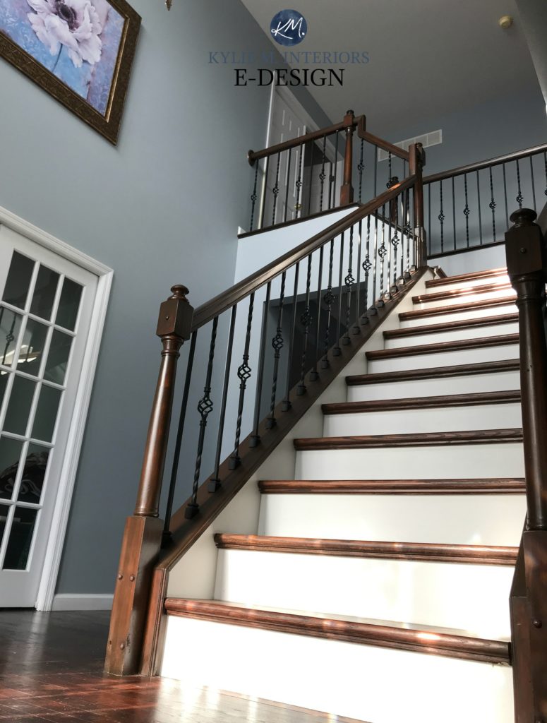
Ideas to Update Your Staircase
North Star is a blue-gray blend – some call it blue, others call it gray. I call it friggin’ gorgeous.
With an LRV of 62, North Star sits right in my happy place, being a moderately light paint color. As for intentions, while its main ‘color’ is blue, there’s a whisper of violet that keeps it from looking blue-green.

Sherwin Williams Pearly White entryway. I’d just update the light fixture; otherwise, it’s so darn pretty and homey!
SIMILAR COLORS TO COMPARE
- Sherwin Williams Krypton (#12, below) offers a slightly darker take on the look of North Star.
- I would also compare it to Benjamin Moore’s Blue Lace, which has a similar look.
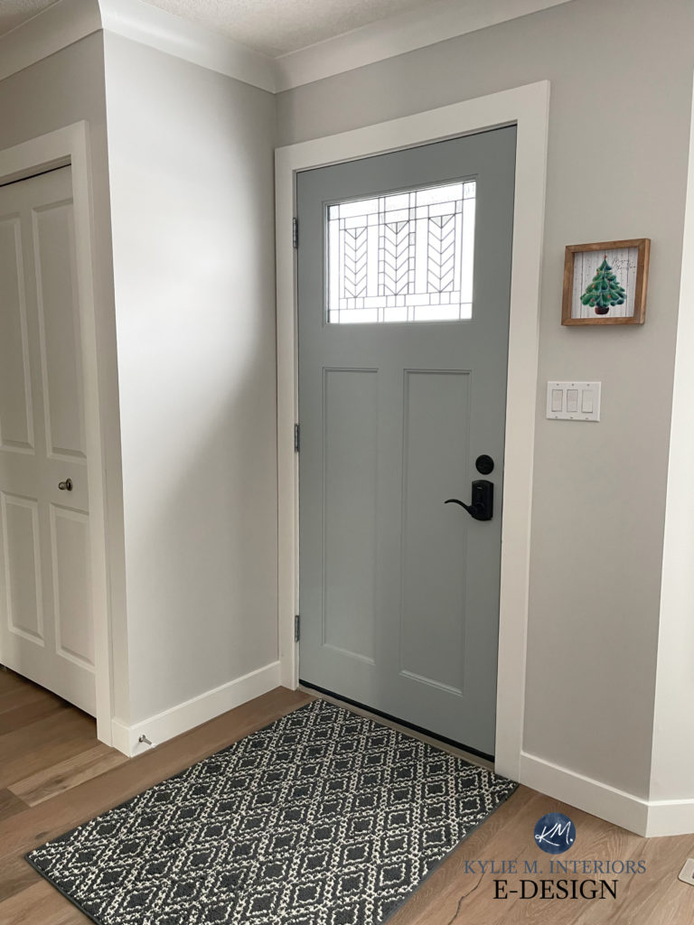
4. SHERWIN WILLIAMS CADET
Cadet is a gorgeous blue hue. With a healthy dose of gray and a hint of green, Cadet is a great way to add depth and interest to your walls without overcommitting to either.
Here’s Cadet’s blue-gray hue (left) compared to Sherwin Williams Tin Lizzie (right), which picks up more green-gray.

As for depth, Cadet rolls in with an LRV of 31, putting it in the middle of the medium depths. This depth is great for accent walls, kitchen islands and cabinets, and front doors. Mind you, if you love a color with meat on its bones, you could use it in an entire room!
Here’s Cadet in a super small bathroom with only moderate natural lighting…

On this exterior, look at how much lighter and slightly blue-purple Cadet looks! Don’t be fooled, Cadet doesn’t cater to purple; it’s just the lighting.

All the same, this is why you sample and compare similar colors to see how they settle in YOUR space.
COLORS THAT ARE SIMILAR TO CADET
- If you sample Cadet and find it’s too dark, bump up to Sherwin Williams Uncertain Gray
- For a more committed blue hue, I highly recommend Sherwin Williams Stardew (#14, below)
- You know what, if Cadet intrigues you, take a look at Benjamin Moore Adagio. It’s a bit different, but HOT DAMN, is it pretty.
5. BENJAMIN MOORE SILVER GRAY 2131-60
Silver Gray is a gorgeous, stormy blue-gray. While it’s definitely heavier on the blue, it’s not remotely overwhelming.
Here’s your 9×12 Peel & Stick sample of Silver Gray…

As for depth, Silver Gray clocks in at 60.27, which makes it a light shade of blue-gray.
COLORS THAT ARE SIMILAR TO SILVER GRAY
Often, a small tweak in depth, undertone, or temperature makes one color look better than another…
- For more commitment to color and less gray, check out Benjamin Moore Brittany Blue
- If you want a blue-gray with a bit more depth, pop back to Sherwin Williams Niebla Azul (#2)
- If you love Silver Gray but wish it were LEGIT darker, you have to check out Benjamin Moore Nimbus Gray – and yes, I am a bossy lil’ thang.
6. BENJAMIN MOORE FEATHER GRAY 2127-60
As mentioned earlier, there are two main types of blue. If Silver Gray ISN’T your type of blue, then chances are, Feather Gray is. This is because Silver Gray takes on a hint of green, whereas Feather Gray is a blue-purple.
Here’s your 9×12 Peel & Stick sample of Feather Gray…

By the way, on the screen, the image of this on the Samplize site looks less purple. That’s just a computer glitch. In the real-life sample, it does what it should.
With an LRV of 58.3, Feather Gray is a light-depth blue-gray, but on the lower/darker end of this range. Feather Gray looks gorgeous with certain marble tiles and finishes, thanks to its blue-purple-gray blend.
COLORS TO COMPARE WITH FEATHER GRAY
How do I even CHOOSE? Eenie, meenie, minie…
- If you want more color, Benjamin Moore Iced Slate will do the trick
- Benjamin Moore Metallic Silver is just a touch grayer.
If you’re exploring these colors and finding them a touch too blue, you might want to read this: The Best Lighter GRAY-Blue Paint Colors
7. BENJAMIN MOORE MOUNT SAINT ANNE 1565
Mount Saint Anne is one of the good ole boys girls. Anne is a soft, medium-toned blue with a good shot of gray in her, and a buttload of green. She’s super popular with the boys, as well as in bedrooms and home offices.
The Best Paint Colors With Wood Finishes
This popular blue-green-gray paint color has an LRV of 42.28, making it a medium-depth color with a smoky, moody vibe. That said, Mount Saint Anne is also great for a beachy or coastal look, too.
COLORS THAT ARE SIMILAR…
- Benjamin Moore Beach Glass (#9) is the lighter, softer, and slightly greener version.
- Benjamin Moore Adagio has a softer look with a bit more gray and a little green.
- Brewster Gray, by Benjamin Moore, is another beautiful gray-blue-green hue.
In this next photo, look at how much green Mount Saint Anne picks up compared to how it looks in the previous photo…
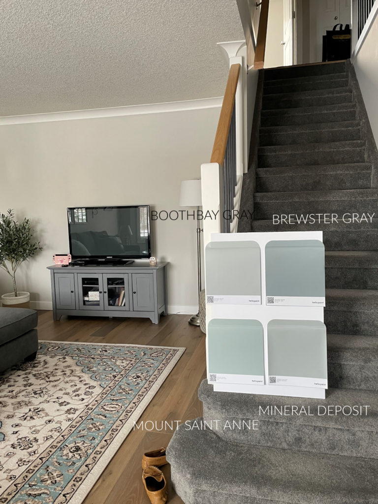
BM Boothbay Gray | BM Brewster Gray | SW Mineral Deposit
Also, notice that the above samples are hit with a good amount of natural light, which makes them look lighter!
Get the best color advice with Kylie M’s Online Paint Color Consulting
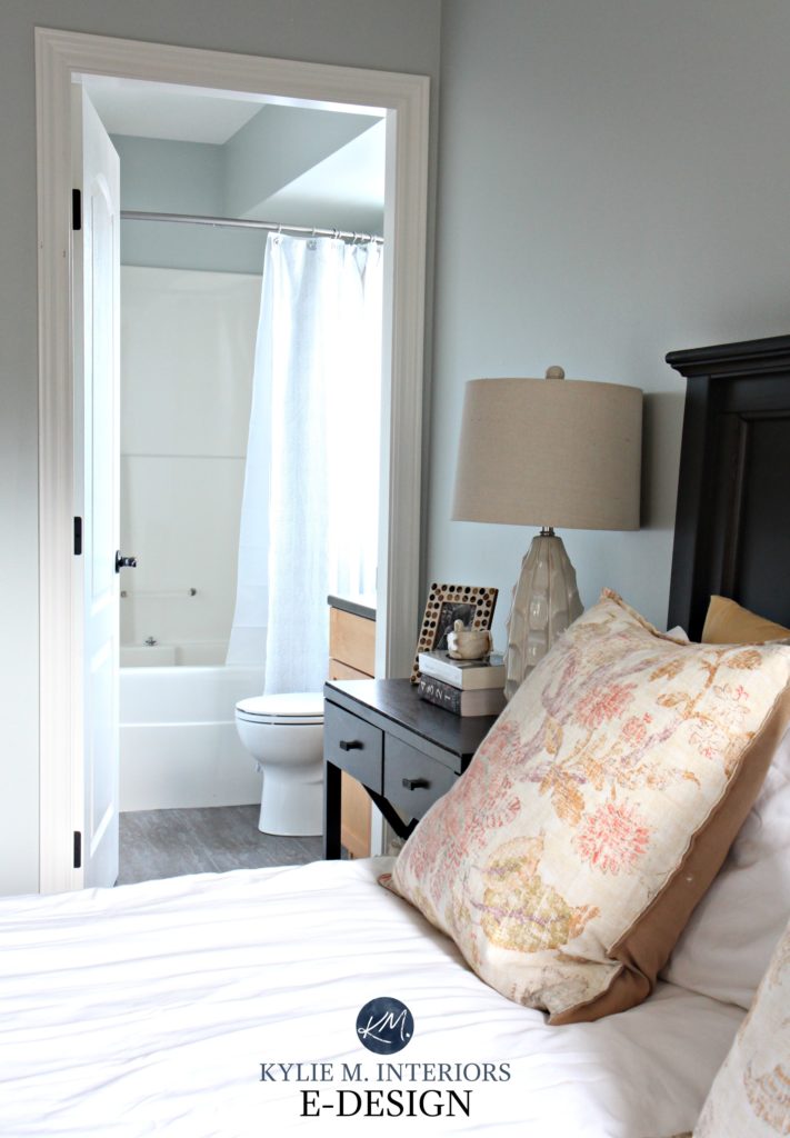
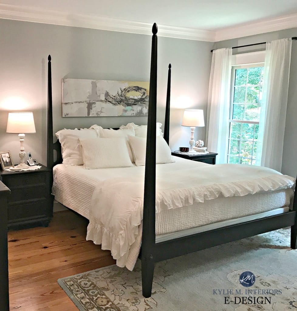
8. BENJAMIN MORE QUIET MOMENTS 1563
Can we have a quiet moment for…Quiet Moments? This beautiful, soothing shade of blue-gray has just the right blend of blue, green, and gray, offering a calming, stress-free approach to color.
Whether it leans more blue or more green can depend a lot on your room’s exposure and your interior lighting choice.
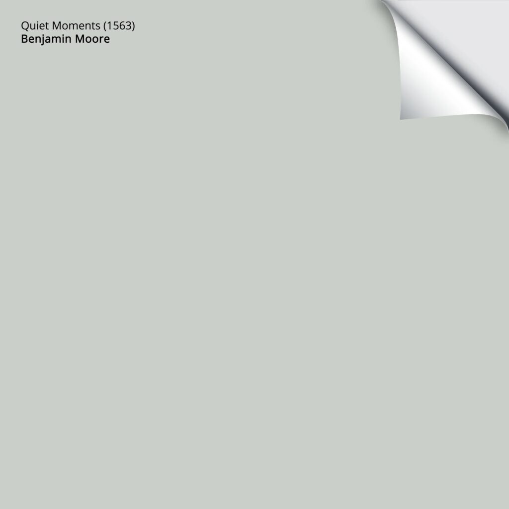
With an LRV of 60.73, Quiet Moments (also known as Smoky Green CC-700) is a smoky, subtle take on color, but still has some good personality.
COLORS THAT ARE SIMILAR TO QUIET MOMENTS
- If you want less color and more gray, take a peek at Benjamin Moore Arctic Gray (#11)
- Sherwin Williams Silver Strand (#10) is a gorgeous alternative with a bit more gray/less color.
9. BENJAMIN MOORE BEACH GLASS 1564
Beach Glass is as beach-inspired as it sounds. With its soft gray backdrop and green undercurrent, Beach Glass offers a coastal vibe that’s especially popular in bedrooms, though it appears in all spaces, including this living room…

As for depth, Beach Glass sits at 49.7, which means it has a bit more meat on its bones, sitting in the light-medium depths. So, rather than being airy and light, it offers more contrast with white trims.
Benjamin Moore Beach Glass: Color Review
COLORS THAT ARE SIMILAR…
If you’re looking for a few alternatives, take a look at…
- Benjamin Moore Wales Gray (#13), which happens to be one of MY FAVORITE blue-gray paint colors!
- Flip the script to a color with a bit more gray than blue and check out Sherwin Williams Magnetic Gray.
10. SHERWIN WILLIAMS SILVER STRAND 7057
Seriously, while I love so many colors on this page, if you’re looking for the PERFECT blend of blue, green, and gray, Silver Strand is one of my favorites.
Popular on interior walls, including bedrooms, bathrooms, living rooms, and calming home offices, Silver Strand offers a balanced approach to color.
While it can cater a bit more to blue, give it the right lighting and that green will rise up, or even a bit more gray! This gives this color a lot of flexibility.
Silver Strand’s LRV is 59, which puts it in the light range but on the slightly heavier end.
Sherwin Williams Silver Strand: Color Review
ALTERNATIVES TO SILVER STRAND
Here are some colors to sample and compare…
- Mute the HECK of this look by switching to Sherwin Williams Silverpointe
- For a color that’s a bit grayer and lighter, check out Benjamin Moore Arctic Gray (#11)
11. BENJAMIN MOORE ARCTIC GRAY 1577
Arctic Gray is great for those who can’t decide what they love more – blue, green, or gray. Sure, the blue and green are a bit more powerful in this color, but a smoky gray base greatly subdues them.

Arctic Gray has an LRV of 61.03, making it a light-depth shade of blue-green-gray.
12. SHERWIN WILLIAMS KRYPTON 6247
Krypton is one of the few blue-gray-purples on this page.
Why?
Well, this blog post is about the most popular blue-gray paint colors, the BEST ones. Having done over 10,000 online consultations, I can easily say that few people ask for blue-purples (they do in the darker end, but not so much in the light range).

Now, this doesn’t mean that YOU aren’t craving one. And because I’m a people-pleaser, I want to show you one of the prettiest shades out there – Krypton.
Krypton is heavier on the gray, for sure. However, I don’t mind this, as the purple is also a bit more subtle than in some other, similar shades. Its LRV of 52, combined with its degree of gray, makes for a super stormy blend.
COLORS TO COMPARE WITH KRYPTON
Here are a few similar alternatives to sample and compare…
- I love Sherwin Williams Samovar Silver – seriously, check it out. Less purple, a bit more gray, but equally as gorg.
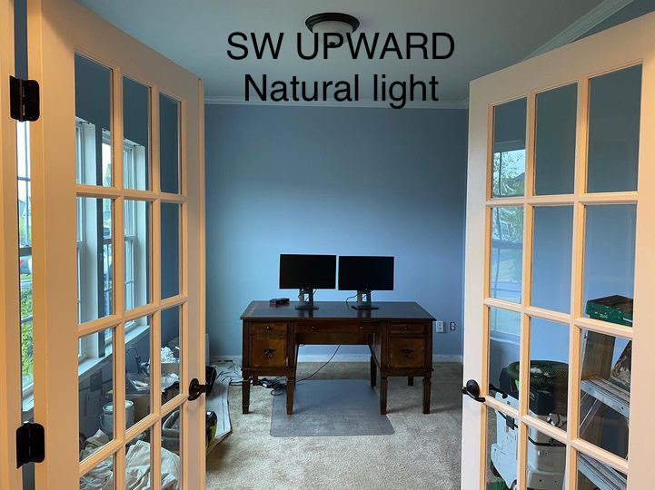
- Oh, you want MORE color? Check out Sherwin Williams Upward.
13. BENJAMIN MOORE WALES GRAY 1585
I love Wales Gray. I don’t even know why. Maybe it’s its watery approach to blue and gray with no REAL commitment.

Or maybe it’s because it’s so darn versatile, great for entire rooms, accent walls, cabinets, and exteriors. Whatever it is, this color has got it goin’ ON!

The other colors might not appeal to you, as they aren’t blue-green. If they do, type their name in my SEARCH, as I have a review on each!
Wales Gray has an LRV of 53.54, making it a light-medium depth color, but on the higher end of the range. Its depth and approach to blue-gray make it popular for bedrooms, but it shows up in other spaces, too, like exteriors, dining rooms, and kitchens.
COLORS THAT ARE SIMILAR TO WALES GRAY
Sampling and comparing alternatives is the best way to find the perfect color for you and your home.
- Benjamin Moore Beach Glass (#9) offers a bit more depth and has more green mixed in.
- Benjamin Moore Silver Mink is another personal favorite (for no exact reason). So, if you want a bit more depth than Wales Gray offers, check it out for sure.
- Flip things around for more gray and less blue with Benjamin Moore Blue Springs, which is wickedly gorgeous.
Seriously, ain’t she purdy (below)…?

If you like blues that lean hard on gray, read this next…The Best Lighter GRAY-Blue Paint Colors
14. SHERWIN WILLIAMS STARDEW 9138
Stardew is flat-out gorgeous. It’s more blue than gray, and while it’s pretty flexible, it could nod just a wee wink into green (a serious stretch of the imagination).
This powder room has no natural light, making Stardew read a bit darker. In a room with decent natural light, you can expect a lighter approach than shown here…

Get your Peel & Stick sample of Stardew HERE!
Stardew has an LRV of 43, placing it between the light-medium and medium depths. And while it’s certainly colorful, Starew has just enough gray to calm it down and a touch of green for balance, preventing it from flashing blue-violet. This makes it popular for bedrooms, as well as some bathrooms, and the add main living area.
COLORS THAT ARE SIMILAR TO STARDEW
- If you want a similar look, check out Sherwin Williams Tradewind.
- Sherwin Williams Uncertain Gray (which you’ll see more of shortly) is goooorgeous and great if you want a bit less blue and more gray.
- For a bit more depth and blue, check out Sherwin Williams Debonair (which looks quite similar to how Stardew does in the above photo).
15. BENJAMIN MOORE SMOKE 2122-40
While the word smoke has me thinking along the lines of gray-purple, this Smoke is anything but.
Smoke is a blue-gray that leans into green. With an LRV of 56.39, it sits between the light and light-medium range.

Not all blue-grays are great for multiple uses, but Smoke is popular in rooms (especially bedrooms), on exteriors, and even on front doors!
Here’s Smoke looking badass and beautiful on this front door…

The Best Front Door Paint Colors
COLORS TO COMPARE WITH SMOKE
These colors are similar, but sometimes the small tweaks in undertones, depth, and temperature make one color perfect over another!
- I would definitely compare it with Sherwin Williams Niebla Azul (#2)
- If you want less blue, jump back to the balanced look of Benjamin Moore Wales Gray (#13)
16. SHERWIN WILLIAMS UPWARD SW 6239
I added this one near the end because it’s a very…very sneaky one. It’s also the Color of the Year for 2024, so I figured I should hit it.
Upward is a blue-gray, but it’s more like a PURPLE-blue-gray, since purple is often stronger than blue. This doesn’t mean it’s not the perfect shade for you, but sample it carefully!
17. SHERWIN WILLIAMS RAIN 6219
Of all the blue-grays on this page, Rain is one of the stronger ones with its commitment to color. In fact, it fits easily into the “The Best Light Blue Paint Colors” blog post.
Rain has an LRV of 49, making it a well-balanced, light-medium depth blue-gray paint color, great for bedrooms and even more muted kids’ rooms.

Rain is a color-forward shade of blue. While it definitely has gray in it, it’s blue hue let’s you know it’s there in a bigger way than many other blue-grays. It also has a decent, but not remotely overwhelming dollop of green in its backdrop.

Compare this image to the previous one to see how Rain can go from a little blue to a lot!
COLORS THAT ARE SIMILAR TO RAIN
If you like the looks of Rain, you might love these…
- Sherwin Williams Languid Blue offers more blue (hardly any green) while still being tempered by gray
- Sherwin Williams Niebla Azul (#2) brings more gray to the scene, while still being color-forward
- Check out Sherwin Williams Tradewind (next) for a bit more depth!
18. SHERWIN WILLIAMS TRADEWIND 6218
Tradewind is actually like the ‘light version’ of Rain – same idea with its commitment to blue, but its LRV of 61 puts it in the light range.

COLORS THAT ARE SIMILAR TO TRADEWIND
- Sherwin Williams Sleepy Blue shifts gears into more blue/less green compared to Tradewind
- Benjamin Moore Harbor Haze is definitely worth comparing for a wink more color and personality
- If you’re in the mood for more green shining through, you HAVE to check out Sherwin Williams Rainwashed…

Seriously, there are SO many more, but I had to draw the line somewhere. This is why I also give ‘alternatives’ for each color – so you have a range of colors to play with!
Want more GRAY in your green-blue blend? Check out…
Sherwin Williams Gris & Mineral Deposit
THE BEST WHITE TRIM COLORS WITH BLUE-GRAY WALLS
When it comes to blue-gray paint colors, they can be reasonably versatile.
Some people prefer cool whites with their blue-gray walls. However, on a whole-home scale, cool whites can be harder to coordinate and live with.

The Best Light Blue Paint Colors
While the actual BEST white can change depending on the color you choose, here are some colors to get you sampling…
- Sherwin Williams Extra White
- Sherwin Williams Pure White
- Benjamin Moore Chantilly Lace
- Benjamin Moore Simply White
- Sherwin Williams White Snow
HOW DOES LIGHTING AFFECT BLUE-GRAY PAINT COLORS?
While we could go down a huge rabbit hole, instead, we’ll go down a modest hare hole…
- The more blue there is in your gray, the less it will shift in different lighting conditions.
- North-facing exposure can enhance cool hues, such as blue. The same can happen in east-facing afternoon light or in west-facing morning light.
- South-facing light adds a really nice balance to blue-grays – not enhancing the blue, but still looking gorgeous.
- To add softness to your cool blue-gray, try warmer light bulbs (e.g., 2700 Kelvins) and watch how your blue changes!
- If you paint your exterior blue-gray, expect the blue to show up a bit more than expected.
Or, sample a range with my CURATED FAVORITE WHITE BUNDLE.
READ MORE
The 8 Best Blue-Green Blend Paint Colors
The Best Light Blue Paint Colors
Blue Paint Colors: How to Choose the Blue that’s Best for You!
Get the best color advice with Kylie M’s Online Paint Color Consulting


Hi Kylie
I too am looking for a grey blue to complete my kitchen/family room makeover. I have looked at SW Tinsmith and BM Stonington Grey but also really like SW Zircon and wonder how this colour compares to those.
Love your posts. I’ve gotten so much great advice from them.
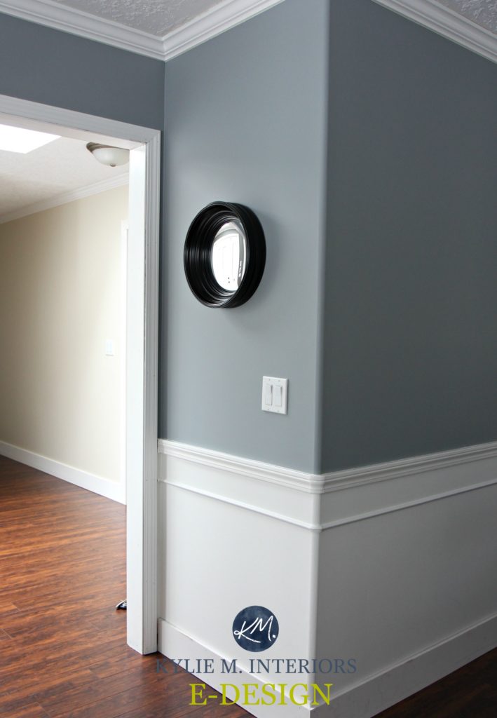
This was an incredibly helpful article. What paint color is in the first photo, the corner of the wall with the circular black mirror and white wainscoting underneath?
Thank you!
Hi Lauren, that’s Sherwin Williams Online :).
I have a question?? What color blue-gray-green is in the picture with the rocking horse, pic # 3?
Good question! That’s Benjamin Moore Sea Star, a blue-green blend – she’s a BEAUTY!
Hi, Kylie – Great article. By the way, I painted the wall behind my bed with Trout Gray and I LOVE it. I also used Trout Gray on a wall with a fireplace, in order to make the fireplace less conspicuous (similar to how you used a dark SW shade – was it Cyberspace? – on the wall with your tv in your prior house, I think).
Seriously, I love Trout Gray SO MUCH! Which is my passive-aggressive way of saying…SEND PHOTOS! ;). If you want to snap some, you can send them to kylie@kylieminteriors.ca If that’s not your jam, that’s cool too!
Kylie, your site is amazing! Quick question, the Gray 2121-10 (totally agree with your rant!) fireplace pic…what is the coordinating wall color?? And if you were to do it in a dining room as a top/bottom division with a chair rail, do you think the dark would be best on the top or bottom?? My trim is Chatilly Lace 🙂 Thank you so much!!
Under what circumstances would Gray Timberwolf scream purple? If I missed that in your article I apologize! BTW, I’m using Newburyport Blue in my kitchen with oak cabinets, brushed nickel hardware, white subway tile, light countertops and white appliances. Trying to do the best with what we have therefore not replacing or painting the cabinets…but we will be investing in better lighting! I love that blue! So colorful! And we used Icy Moon Drops in our girls’ room and it’s so fun and fresh (like my baby girls)! Thank you for helping us folks that are clueless when it comes to color!
How do you feel about Stardew as an exterior color?
Well, I find that my clients usually lean into colours with a BIT more gray to them OR a bit more depth. I’m not saying no, but I haven’t come across it before ;).
What is the color in the very first pic of this post with the round black mirror?
Hiya! I believe that was Sherwin Williams Network Gray 🙂
Hey Kylie,
Thanks so much for this article! I’m also looking for the paint color in the very first picture but two of my Sherwin Williams paint specialists said it was not Network Gray. 🙁 Any recommendations as to what this color is or is it just distorted blueish in the photo? Network Gray seems to be way more on the “gray” side and not blue side. ?? 🥴 Sorry for the confusion!
Hi Joanna, well, that was a hands-on project and I can tell you with ALLLL certainty that it was indeed Network Gray! The thing is, every gray has undertones and Network Gray has MORE than usual, so it’s not a great ‘neutral gray’ look and you can definitely see more blue at times. This can also shift depending on your exposure/interior finishes. Grab a paper chip sample of Dorian Gray, which is a more neutral gray (a warm one with its own undertones). This might show you HOW BLUE Network Gray can look!
I hope that helps :). Let me know!
We used SW misty in our upstairs loft. It is beautiful for that area. It is kind of like the color of faded blue jeans and a bit moody. I tried it downstairs but it looked muddy on every wall I tried.
Hi Kylie,
I’m reading all your articles for help with choosing my front door color and they have been extremely helpful. I want a blue green door but don’t think the greens work with my pavers which are more icy and I think have more purple. My paint is willow creek, also a purple undertone, and I have red/pink brick for my doorsteps. Should I lean into (see I’m using your phrases!) more of a purple blue? Also I have no direct sunlight (recessed front door faces north-north east) so everything I try in the blue green greys look, well, grey. Any suggestions are very appreciated! Thank you.
Hi Kiley! I haven’t seen your home, but from the SOUNDS of it, you might check out Benjamin Moore Gray 2121-10 (you need the number to find it). Or it might at least get you on a better track ;).
Hi Kylie, Can you please recommend a gray blue that will compliment smokey taupe painted furniture?
Thank you!
Hi Kylie! Can you tell me what color blue-gray is in the first picture posted of this blog? It’s a hallway picture with chair rail and a round black mirror hanging on the wall? Thanks so much!!
Ahhh, that’s Sherwin Williams Online 🙂
Hi Kylie !
Which white colour for trim would you recommend for Colorado Gray in a south facing room ?
Thanks so much !
Hello,
Mineral Deposit looks great on the Door in the photo. Do you happen to know the name of the color on the walls next to it? Thank you!
You bet I do – it’s Benjamin Moore Light Pewter – thank you for asking!
Thank you!
Hi Kylie, what is the gray color of the living room with TV wall or similar color of the pic where the 4 blue (Boothbay, Brewstar, MSA, MD) colors are compared? Thanks.
Could you tell me what the blue wall color is in the picture with the yellow labrador dog on the floor?Thank you
We did Sherwin Williams Rain in our daughter’s room when she was in junior high and wanted blue. It is gorgeous and a great color if you want light-medium blue but don’t want blueeee!! 🙂 I’ve heard it stated as gray blue or blue gray, but it just looked blue in her room on the Eastern side of the house (maybe a little muted). I never saw green. We did it with a white dresser and desk, and the bed is a lighter teal upholstered color. I highly recommend and would consider it if I wanted blue again (so I don’t get blueeee!). Just for context, it looked just like the last picture you posted of this color.
Hi Kylie! Do you have thoughts on what colors pair nicely with SW Stardew? And what’s the best white pairing? Thank you!