The Most Popular Light GRAY-Blue Paint Colors
While gray paint colors aren’t necessarily trendy anymore, gray-blues still hold their own on some walls (bedrooms), cabinets, and exteriors.
However, gray-blues aren’t easy; in fact, they’re darn tricky. Along with a range of undertones, gray-blues can shift easily with a room’s exposure or interior lighting – even more so than many other colors.
This is why we’re not just looking at some gorgeous gray-blues, we’re looking at the what, where, and WHY THE HECK DOES IT DO THAT?

WHAT’S THE DIFFERENCE BETWEEN GRAY-BLUE & BLUE-GRAY
While you might think they’re the same thing, they’re not. They’re so different that I have a different blog post about the best BLUE-gray paint colors.
GRAY-blue paint colors are gray-centric, meaning most people see the gray BEFORE the blue. If a room is painted a gray-blue, most people would say it’s a ‘gray’ room.
BLUE-gray paint colors are color-forward, meaning most people see the BLUE before they see the gray. If they look at a room painted in a popular blue-gray, they’ll see a blue room.

GRAY-BLUE’S DIRTY LITTLE SECRET
Humor me for a minute here – this might explain why you’re having a hard time finding a gray-blue you love at all times of the day.
When it comes to BLUE-grays, the blue is dominant and holds its own. However, with GRAY-blues, once a bit of blue is added to gray, it’s bossy – blue is a dominant color, and it takes over gray fast. So, to get a more subtle gray-blue, paint companies add yellow, red, or both to soften blue’s bossiness.
So, with the idea that gray-blues are usually mixed with other colors…
- Blue + yellow =green
- Blue + red = purple
And while we could get into the science and lighting of it, neither of us is here for that. What you need to know is that in the evening, BLUE-grays easily lean into their blend, either green or purple.
End of story.
Here’s Benjamin Moore Stonington Gray, a gray with a SUPER PASSIVE blue (blue-green) undertone.
Now, while there are blue-grays and gray-blues, just like Malcolm, there are colors in the middle…

This color’s name, Uncertain Gray, basically says it all (you’ll learn more about it shortly)
However, there are a few things that can skew what’s what, including…
- THE AMOUNT OF BLUE: A minor blue undertone can be unnoticeable. A gray with more blue can be noticeable to those with an eye for color. But some grays have so much blue that it ALMOST takes over, at which point, it comes down to…
- PERCEPTION: I could show 100 people the same gray-blue, and I guarantee we’ll get at least three variations of what it is (gray, gray-blue, or blue-gray).
- EXPOSURE & INTERIOR LIGHTING: Depending on your room’s exposure and the Kelvins of its light bulbs, a gray-blue undertone can rise, disappear, or look a bit tweaked (most often at night, as mentioned earlier).
REMEMBER, EVEN BLUE UNDERTONES HAVE UNDERTONES…
As you learned above, while there are the odd true blues (more so in the actual ‘color’, not in undertones), when blended into gray, blue can lean either blue-green or blue-purple…
The tricky thing about grays with blue undertones is that the blue undertone is about as committed as Hugh Jackman. You’ll find that most gray-blues tiptoe quietly away into purple or green quite easily.
This is why SAMPLING & COMPARING similar paint colors is so friggin’ important. It’s also why I’ve included extra colors with each suggestion below, to help you find your best gray-blue.

Last thing before we get started. Well, 2 things, actually…
- Most of the best, most popular gray-blues are grays with blue-green undertones, not blue-purple.
- I use images from my Online Color Consulting clients, readers, and friends, so I don’t always have the EXACT image I need. In this case, I refer to BM/SWs’ onsite images or Samplize.
OH MY GOD, DO I EVER STOP TALKING!!! Schlong story short – no.
Let’s begin.
1. BENJAMIN MOORE WICKHAM GRAY HC-171
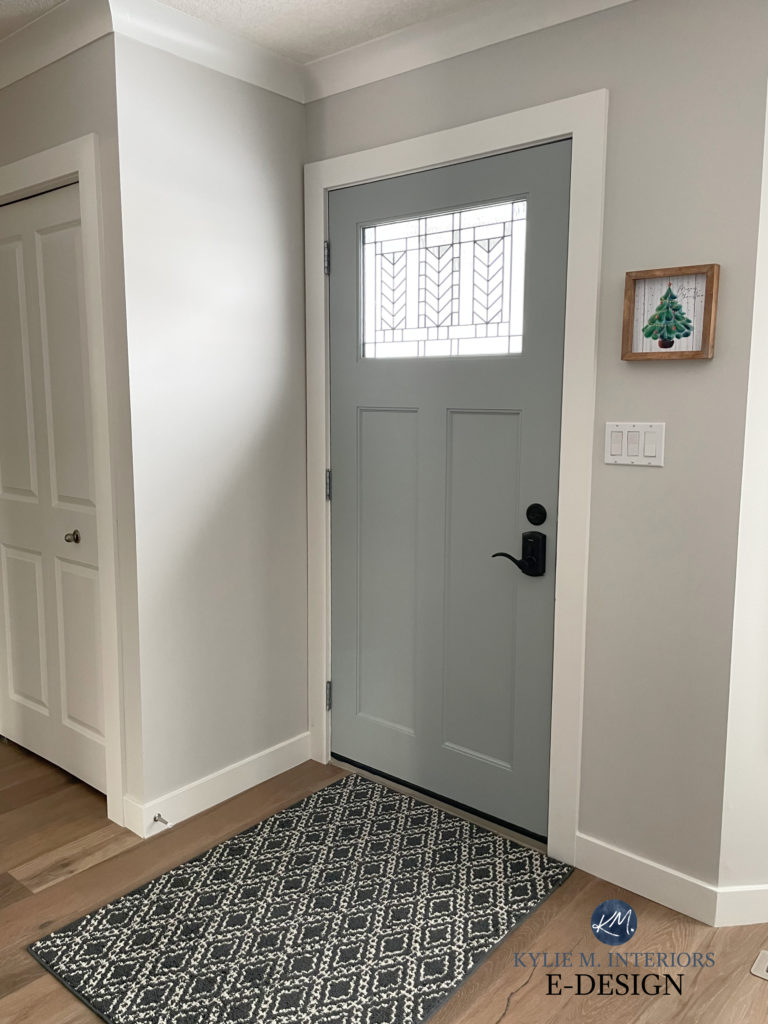
Wickham Gray is one of the lightest, most subtle paint colors on this page. With muted undertones and a stormy gray base, Wickham Gray is a popular choice, particularly for interior walls, but it even pops up on front doors, as shown in this foyer…

I lightened this photo so you could see the door a bit more
The Best Colors for the Inside of Your Front Door
Wickham Gray is a melange of blue, green, and gray that changes its tune depending on the space it’s in. With an LRV of 67.87, this subtle neutral is on the lighter end without winking at the wild world of off-white.

COLORS THAT ARE SIMILAR…
- If you want a slightly darker look with a bit less undertone, check out Benjamin Moore Stonington Gray.
- For a wee touch more green/color, Benjamin Moore Iced Cap is pretty and quite tasty – don’t drink the wrong one.
Never trust a gray-blue; always compare it to similar shades and sample it on your space to see how it REALLY looks!
2. SHERWIN WILLIAMS SAMOVAR SILVER 6233
Samovar Silver is one of Sherwin Williams most beautiful gray-blue blends that winks super hard at the blue world.
In fact, it has so much blue that Sherwin-Williams calls it a BLUE, not a gray. Good thing you can sample it and decide for yourself!
Here’s your 9×12 Peel & Stick sample of Samovar Silver…

This said, my perception is that it’s a gray with a decent blue undertone. This blue undertone leans into green just by a touch. As for depth, its LRV is 51, which puts it in the light-medium range.
COLORS THAT ARE SIMILAR TO SAMOVAR SILVER
Because you should never choose a paint color without comparing it to a few alternatives…
- Compare it to Sherwin Williams Misty to see what a slightly lighter color offers
- Sherwin Williams Monorail Silver offers a stormier, grayer look.
3. BENJAMIN MOORE PEBBLE BEACH 1597
Pebble Beach is a wonderfully stormy shade of gray-blue. With a bit more undertone than some, Pebble Beach’s blue hue isn’t overly committed to purple or green, and you can watch as it shifts its allegiance depending on your lighting.
Here’s your 9×12 Peel & Stick sample of Pebble Beach…

As for depth, Pebble Beach has a great, moderate depth of 60.09, making it a light-depth paint color.
COLORS THAT ARE SIMILAR TO PEBBLE BEACH
Seriously, NEVER choose a paint color without comparing it to other similar shades, you just might find something better!
- Compare Pebble Beach to Silver Lake if you want a bit more depth (LRV 54.82) while still winking at the light range.
- Sherwin Williams Gray Screen is the BEST comparison to Pebble Beach if you want a slightly lower chance of any purple popping up.
4. SHERWIN WILLIAMS TINSMITH 7657
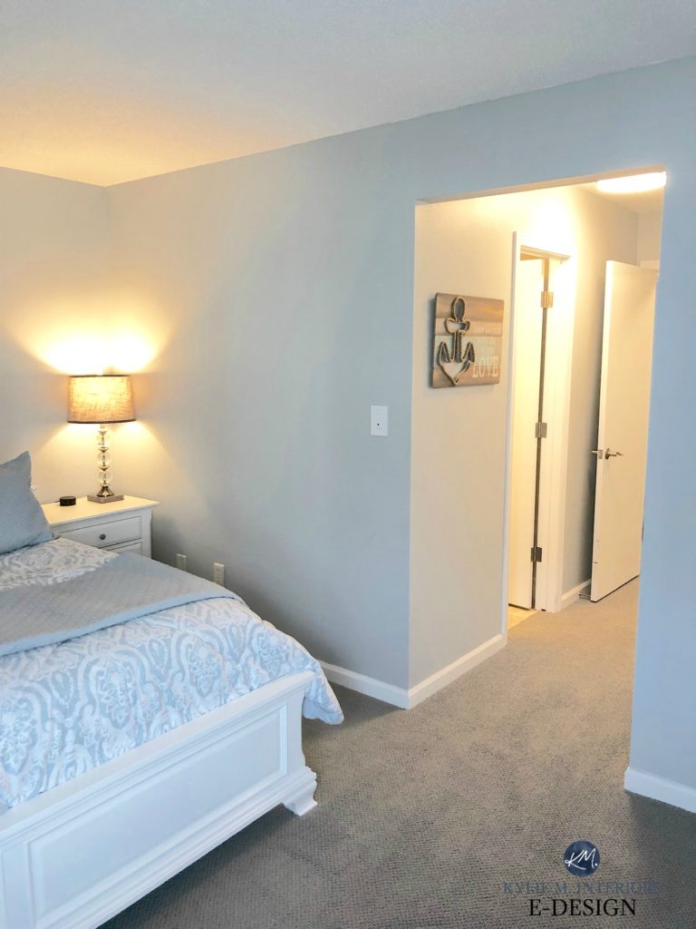
Tinsmith is a light-medium super STORMY gray with a soft blue undertone, giving it a bit of a coastal vibe, as shown in this bedroom…
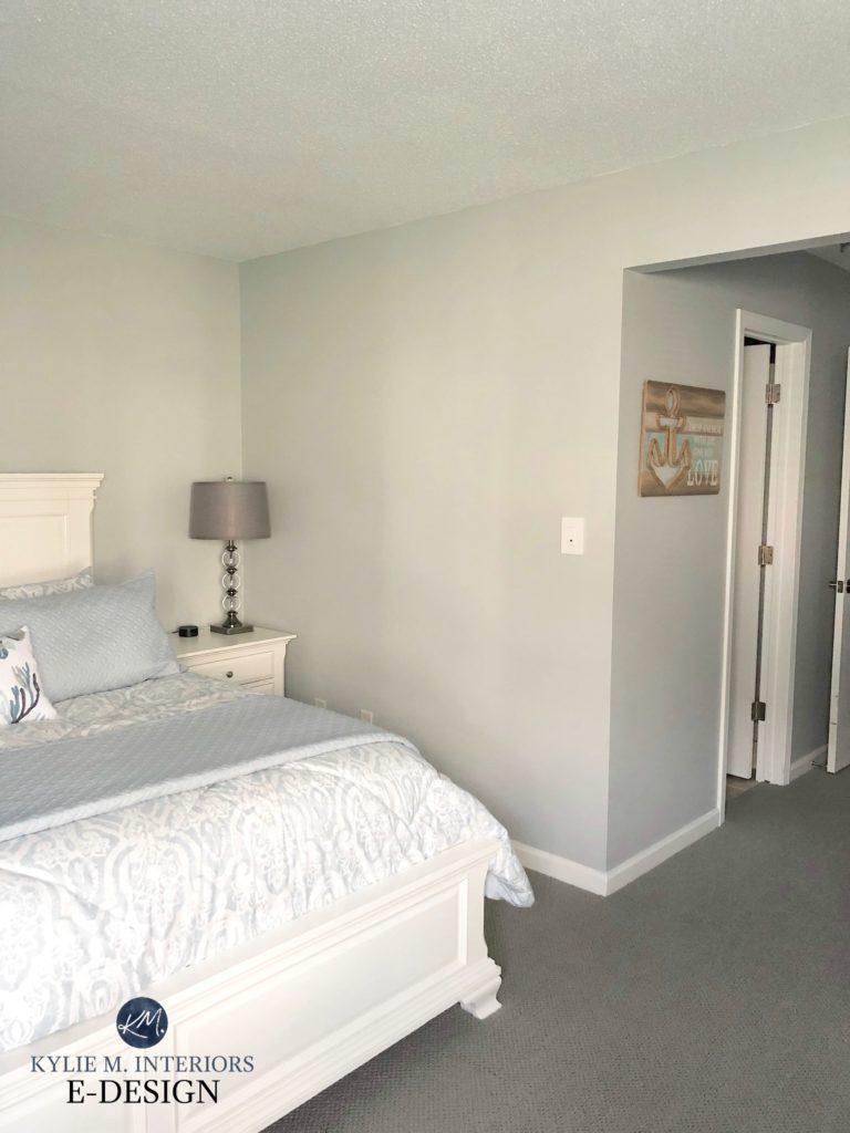
Look how much it changes with the lights on. I prefer to change with the light on, too…
Sherwin Williams Tinsmith has an LRV of 57, so it’s a light-depth paint color, but it’s a HEAVY light, not a fresh, bright one. As for undertones, while it caters to blue, it can tip its hat slightly to green.
Paint Color Review of Sherwin Williams Tinsmith
COLORS THAT ARE SIMILAR TO TINSMITH
- Sherwin Williams Silverplate
- Benjamin Moore Stonington Gray
Gray Paint Colors – The 3 Undertones You NEED to Know!
5. SHERWIN WILLIAMS OLYMPUS WHITE 6253
If you’re looking for a lighter, airier shade of gray-blue, Olympus White could be the color for you.
And because we NEVER judge a wine by its label or a color by its name, we know that Olympus White isn’t white…at all. We know this because its LRV is 68, which parks its little gray toosh in the light range. So, not only is it not white, it’s not even an off-white.
Here’s your Peel & Stick sample of Olympus White…

While Olympus White has a touch of purple, it doesn’t overly influence this blue undertone (for once). Mind you, compare it to other shades, as you might find it too strong one way or another!
COLORS THAT ARE SIMILAR TO OLYMPUS WHITE
- If you love the COLOR of Olympus White but want a bit more depth, check out Sherwin Williams Lazy Gray
- Compare it to Sherwin Williams North Star to see what a bit more blue does for you and your room
If you’re exploring these colors and finding them too neutral/gray, you might want to read The Best BLUE-Gray Paint Colors for more color!
6. BENJAMIN MOORE PAPER WHITE OC-55
While I don’t usually go this light with this type of color, I do get the odd request for super- light, subtle shades of gray-blue.

Howevaaaaah, while Paper White most definitely can look gray-blue, it easily grabs green or purple (it’s definitely a sneak gray-blue), so sample it in your space to see how it settles.

As for depth, Paper White has an LRV of 74.41, making it an off-white shade of gray. As shown below, its depth and muted color can make it hard to read without white trim to contrast with…

COLORS THAT ARE SIMILAR TO PAPER WHITE
- Shift gears to a bit more blue undertone with Benjamin Moore Horizon
- For a bit more depth while still keeping things reasonably light, I recommend Benjamin Moore Moonshine, which has similar tendencies to Paper White
Here’s Moonshine in action. While this Moonshine won’t make you blackout or run naked through the forest, it did make this mirror a touch too black for this room…but it’s all still pretty!
7. SHERWIN WILLIAMS GRAY SCREEN 7071
Gray Screen is one of Sherwin Williams more popular grays with blue undertones (in this depth).

Now, just like some of the darker, popular shades on the same color strip (Network Gray, Web Gray), Gray Screen has some flexibility. So, while it can look gray-blue, it doesn’t lean hard into gray-purple or gray-green.
As for depth, Gray Screen’s LRV of 59 makes it a light paint color.
COLORS THAT ARE SIMILAR…
- If Gray Screen’s flexibility makes you a bit nervous and you’d rather a chance of purple than green (as the secondary undertone to blue), take a look at Sherwin Williams Evening Shadow. You can also check out Benjamin Moore’s Pebble Beach (#3).
- Check out Sherwin Williams Online to see what a gray-blue with a bit more depth offers.
Get the best color advice…
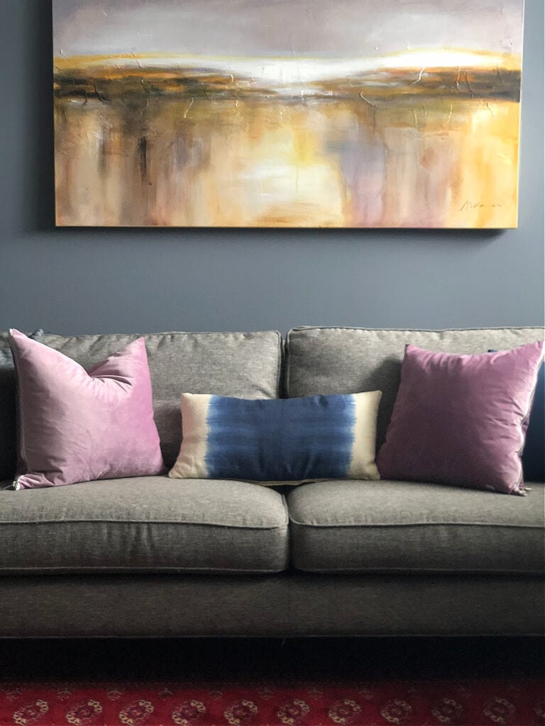
8. BENJAMIN MOORE STONINGTON GRAY HC-170
If you’re looking for the most classic, timeless shade of gray-blue, Stonington Gray is it. However, it’s not REALLY gray-blue. It’s more like a gray-green that loves to lean into blue. That said, there was zero chance I’d write this blog post without including its badass self.
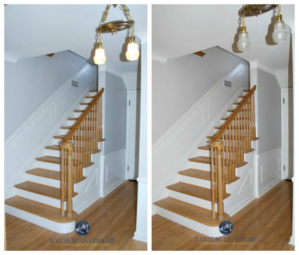
Seriously, look at Stonington Gray on either side of this glorious K2 stone fireplace…
The left side looks a touch warmer and slightly gray-green. The left is most definitely gray-blue.
Stonington Gray has been holding its own (not in public, that would be rude) for decades. With its blue-green undertone, it’s a popular choice for rooms and even entire homes.
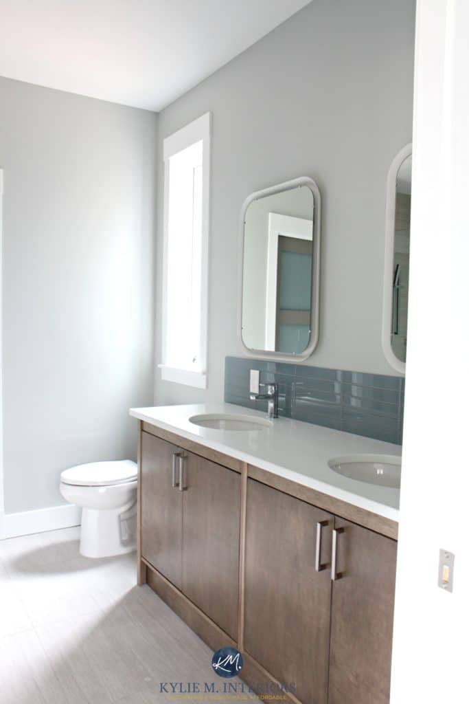
Stonington Gray has an LRV of 59.36, making it a light-depth shade of gray, but on the slightly lower side, for sure.
Benjamin Moore Stonington Gray: COLOR REVIEW
COLORS THAT ARE SIMILAR TO STONINGTON GRAY
- Oh, you have to compare it to Sherwin Williams Tinsmith (#4), no doubt about it.
- You know, I might even toss in Sherwin Williams Big Chill; it’s a beauty.
- Compare it to Sherwin Williams Front Porch if a) you want a bit more noticeable green in your blend, and b) to show you how blue Stonington Gray can seem!
THE MOST NEUTRAL GRAY PAINT COLOR
There is no perfectly neutral gray paint color. There’s also perception: some see grays with a slightly blue undertone as ‘neutral’, whereas others consider gray with a purple undertone to be the most ‘gray/neutral’ looking.
If you ask me (which you kind of are), Sherwin Williams Big Chill is one of the more neutral-looking gray paint colors with minimal undertones.
Sure, it can lean into any undertone given encouragement. However, it tends to settle pretty evenly, winking at blue sometimes, then not at all.
I also love Big Chill’s LRV of 62, which makes it a moderate light paint color suitable for a wide range of rooms.
The Best Grays With No Undertones?
Check out how this bad boy changes its look with lighting…
SLIGHTLY DARKER, LIGHT-MEDIUM TO MEDIUM-DEPTH GRAY-BLUES
Because I can’t even HELP myself and ain’t done talkin’ yet, I want to share a few slightly darker shades with you – see if we can grease those colorful little wheels of yours…
1. SHERWIN WILLIAMS NETWORK GRAY 7073
Network Gray is a popular gray with a blue undertone. One reason I love it is that its undertone doesn’t cater hard to purple or green, making it a reasonably balanced gray-blue paint color (of which there aren’t nearly enough).
Here’s Network Gray in my newly updated laundry room with a non-white interior door (mad love)…

Network Gray with Benjamin Moore Revere Pewter interior door
Network Gray has an LRV of 37, making it a medium-depth paint color. However, it isn’t on the heavier end of this range—it has a bit of levity. As for the degree of color, while a few in this blog post pick up a wink more blue…
Network Gray is a gray with reasonably strong blue undertones; however, the color isn’t obvious enough to take over unless you’re sensitive to color.
Network Gray shiplap with Benjamin Moore White Dove walls and trims
COLORS THAT ARE SIMILAR TO NETWORK GRAY
- Sherwin Williams Uncertain Gray is a touch lighter, grayer, and bluer.
- Benjamin Moore Marina Gray, just a bit softer (I had this in my home office for a while and loved it hard).
2. BENJAMIN MOORE BOOTHBAY GRAY HC-165
Boothbay Gray is one of my FAVORITE gray blends (this month, anyway). With Boothbay Gray, you’ll find a super stormy gray paint color with a decent blue-green undertone. Sometimes the blue shows up more to the party, whereas other times, it’s a wink o’ green that rises up…but both are reasonably subtle.

Boothbay Gray with Sherwin Williams Snowbound walls
If you like this depth, read this: The Best Darker Gray-Blue Paint Colors – you might find something even more gorgeous!
As for depth, Boothbay Gray has an LRV of 43.26, making it a more or less soft, medium-depth paint color.

Boothbay Gray is super popular on kitchen islands, cabinets, front doors, and exteriors. However, it’s also found on accent walls and even in entire rooms!
3. SHERWIN WILLIAMS UNCERTAIN GRAY SW 6234
Uncertain Gray is a gorgeous, gentle, medium-depth gray-blue. Whether it’s gray or blue is open to your perception, and one of the many reasons I love this versatile shade!

Uncertain Gray has an LRV of 43, making it a very light, medium-depth color. Some medium-depths have LRVs closer to 20, and this color is far from that. With its overall vibe, Uncertain Gray is great for walls, cabinets, and exteriors.
If you love the degree of color in Uncertain Gray, you might want to read this blog post: The Best BLUE-Gray Paint Colors
4. SHERWIN WILLIAMS MINERAL DEPOSIT 7652
If you love grays with good blue-green undertones, Mineral Deposit should hit the spot.
Mineral Spot is a stormy, moody shade of gray with blue-green undertones. With its LRV of 43, it winks at the medium depths with a come-hither glance. This might make it sound like the previously mentioned Boothbay Gray, and it is similar; however, you’ll find a bit more gray in this color.
5 Steps for Choosing Your Best Exterior Paint Color
WHAT ABOUT DARKER GRAY-BLUE PAINT COLORS?
For those who want to nerd out a bit with me, a dark gray-blue color is ‘technically’ called Perse or Gunmetal. For the rest of you who want to SEE some dark gray-blues…
The Best DARK Blue-Gray Paint Colors
WHAT’S THE BEST WHITE TO GO WITH GRAY-BLUE WALLS?
Gray-blue paint colors can be a bit fussy when paired with white trim or cabinet colors. This is more about the DEPTH of gray-blue you choose, not the actual color blend.
- If you choose a considerably light, crisp, cool gray-blue, it’s more likely to suit a bright, true shade of white.
- Gray-blue paint colors with a stormy nature and a bit more depth can also handle bright, true whites, but many suit slightly warmer, brighter whites and softer shades of white, too.
To get you going, here are a few of my favorites…
- Sherwin Williams Pure White
- Benjamin Moore Chantilly Lace
- Benjamin Moore White Dove
- Sherwin Williams Extra White
Or, sample a range with my CURATED FAVORITE WHITE BUNDLE.
QUICK SUMMARY (TL;DR)
- Gray-blues often don’t look gray-blue, as in the evening, they can slide into gray-green or gray-purple.
- For a more committed blue, you need more blue undertone. In this case, you might need a BLUE with gray.
- Gray-blues are popular in bedrooms, bathrooms, and the occasional living area. They’re also hot on exterior surfaces (main house color).
READ MORE
Popular BLUE-Gray Paint Colors for Your Home
The Best Blue-Green Blend Paint Colors
The Best Light Blue Paint Colors
Blue Paint Colors: How to Choose the Blue that’s Best for You!
Get the best color advice with Kylie M’s Online Paint Color Consulting