
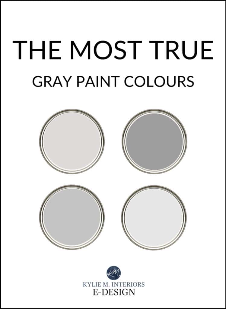
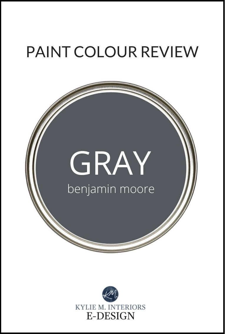
The Best Gray Paint Colors With NO UNDERTONES
THE MOST POPULAR TRUE GRAYS (Benjamin & Sherwin)
If you’ve been looking for the most neutral gray paint color with NO UNDERTONES, you’ll be looking for a looooong time.
Why?
Every gray paint color has undertones. That’s not to say there aren’t grays that are MORE NEUTRAL than others; it’s just about adjusting your expectations. This is why we’re looking closely at some of the more popular, ‘as neutral as possible’ gray paint colors from Benjamin Moore and Sherwin Williams.
But first, we need to chat with our big girl undies (or big boy boxers) on and two boxes – one full of wine and one full of Kleenex for all those tears you’re gonna cry.
As mentioned above, every gray will have undertones; I have an entire blog post dedicated to this topic. But two other issues are at play when finding the best gray paint color for your home.
ALL PAINT COLORS ARE SUBJECT TO PERSONAL OPINION
If a gray paint color has a blue undertone it DOES, if it has a green or purple undertone it DOES, but that doesn’t mean you SEE IT THAT WAY or that it will look that way in your room to YOU.
A lot depends on how you actually see color, which can be skewed by any number of things, including…
- Degrees of color blindness (of which there are many and is more common in men than women).
- PERSONAL biases toward one undertone or another. I’ve had clients tell me they see green in EVERYTHING as they are sensitive to it, even when there isn’t any green to be found!
- Your idea of what a ‘neutral gray with no undertones’ looks like. Again, some people see gray purples as neutral, and others see gray blues as the most neutral (fewer people see gray greens as true grays, though).
- What you choose to partner your gray paint color with. A gray that COULD’ve looked neutral to you might look blue if you put it with a warmer tone. A gray that could’ve been your best, true gray, could look green if you partner it with a gray with a purple undertone.
Schlong story short, there are many scenarios where your PERCEPTION of a color can be altered.
How do I know this?
Well, in my Online Color Consulting, clients send me inspiration photos or written info showing me the ‘true gray look’ they want on their walls. Some will send me photos of Benjamin Moore’s Stonington Gray (blue-green undertone) or Collingwood (purple). Others will send photos of Sherwin Williams Repose Gray (hot mess) or Light French Gray (violet) as to THEM, they look like true grays.
But they aren’t.
Do we need a drink break? Silly question, OF COURSE WE DO.
GRAY PAINT COLORS CAN SHIFT DRASTICALLY DEPENDING ON THEIR ENVIRONMENT
Even the most neutral, subtle gray paint color WILL change on a room-to-room basis depending on each room’s exposure, the amount and QUALITY of light coming in, the light bulbs, the surrounding hard surfaces, and even the soft furnishings. Again, the COLOR ITSELF WON’T CHANGE (it is what it is), but how it looks on your wall and your perception of it will.
For example, if you have…
- North-facing light. Grays can lean harder into their cool base, picking up more undertone. And because the north-facing light is a cool light, many gray paint colors can flex into that intentionally.
- South-facing or warm afternoon western light. Some grays can look softer, muddier, and warmer and not so ‘legit gray’ or cool as they might in another room.
- A countertop that has, say, purple undertones, and you partner it with a gray that DOESN’T HAVE purple undertones but a very vague green instead (but looks gray to you). The green undertone could be ENHANCED because opposites can bounce off each other and strengthen each other. So, what looked like a neutral gray could have an undertone you didn’t expect simply because it was given the wrong partner (Tim feels this way all the time – definitely unexpected).
- Beige-toned carpet, tiles, or furniture. If you have these warmer tones and partner them with what LOOKS like a darned neutral gray, the warm undertones of your beige could glorify the cool undertone in the gray paint color, making it look stronger and LESS neutral. This said, some people love the play of warm and cool, beige and gray (myself included).
Look at how the UNDERTONE of this gray paint color changes from left to right, going from slightly blue to warmer and slightly green.
One of my more important points (even though ALL of my points are important #jokingnotjoking) involves a question I get all the time in my Virtual Paint Color Consulting: ‘Why does every color look GREEN on my walls?’
4 GOOD REASONS YOUR PAINT COLOR LOOKS GREEN
1. Your windows have a tint, glaze, or reflective barrier, which has a subtle green cast.
2. There’s a lot of grass, trees, or landscaping outside the window, which are OFTEN combined with northern sunshine.
3. You might not know it, but you chose a gray paint color with a particular blue or blue-green undertone that’s reacting with your warm-toned/low-Kelvin light bulbs or that golden south-facing western light shining through your windows, turning the walls a slight shade of green (blue and yellow = green).
North, East, South, West – Which Paint Color is the Best?
4. You actually chose a color with a green undertone; you just THOUGHT it looked neutral.
5. Kermit the Frog is outside the window, mooning you. I did say four GOOD reasons…
Here’s Benjamin Moore Gray Owl looking a touch green…
And now, it’s picking a range of undertones depending on which wall you look at…
When your walls look green because of reflection (grass/trees), you end up in a tricky spot. To balance that green reflection on your walls, you’ll want to focus on the warmer end of things, using colors with orange, red (pink), and sometimes even purple undertones (which works great if you want colors in the warm range). However, for those wanting a cooler approach, once the sun goes down (not Elton John style), you’re left with a color far from your perfect neutral gray.
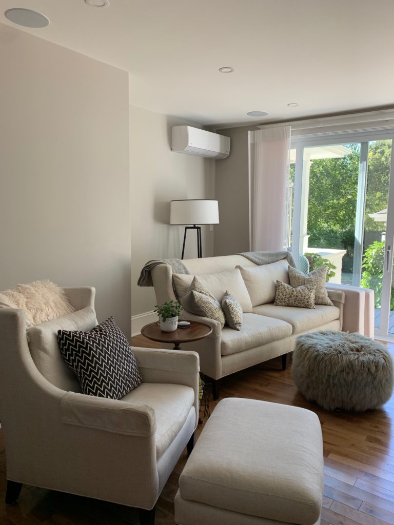
In this next photo, you’re looking at Benjamin Moore Collingwood, a warm gray paint color that usually commits to a purple undertone (whereas some are more flexible), yet it looks greenish in this space, especially on the wall with the AC unit on it…
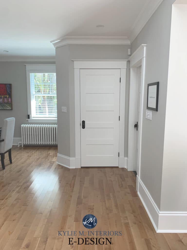
Let’s look at Collingwood in another room, which shows its natural tendencies a bit better…
In this next photo, Benjamin Moore Classic Gray looks like it has a wee touch of the Irish…
And in this next photo, it looks more like its usual self…
Sometimes, we just can’t get what we want and must find a happy medium (or accept what is – insert meditation and deep breathing exercises here). Short of that, board up the windows and call it a day (you can also try daylight bulbs with slightly higher kelvins, although I find them a bit bright and harsh for many homes).
So, let’s dive in and see what I’ve got. These are colors I know are relatively neutral, but have also resonated with my Online Color Consulting clients who are looking for that ever-elusive, perfectly true gray.
These grays have undertones that will shift based on your perception & their environment – but they’re your best shot at getting a true gray paint color.
In order of lightest to darkest…
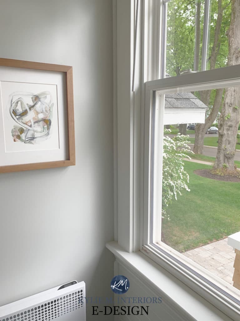
1. BENJAMIN MOORE GRAY OWL OC-52
- LRV 64.51
- UNDERTONES: Gray Owl has a green-blue undertone
Benjamin Moore Gray Owl is one of the more popular gray paint colors. And while you wouldn’t know it to look at it, in some circles, it’s considered a slightly warm gray. However, it does favor cool undertones, specifically blue and green, and can swing WILDLY between them (although they are passive, I’m just being anal).

FULL Paint Color Review of Benjamin Moore Gray Owl
Kylie M YOUTUBE Paint Color Review of Benjamin Moore Gray Owl (new updated version coming soon)
2. SHERWIN WILLIAMS BIG CHILL SW 6848
- LRV 62
- UNDERTONES: Big Chill has a blue undertone
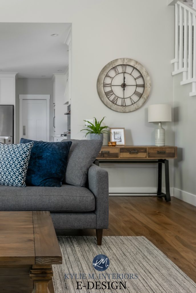
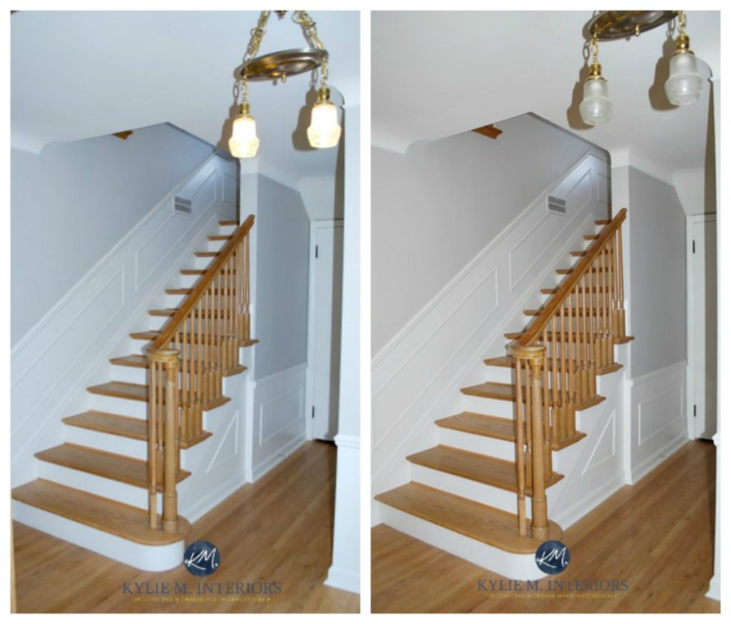
Sherwin Williams Big Chill is my favorite color as far as ‘neutral grays’ go. Its blue undertone is passive, and while in certain lights/situations, it can lean that wink blue-green or blue-purple (it’s not fussy), it’s generally a pretty fab-looking neutral gray.
Just look at how it changes with the lights on/off…lights on, lights off. Lights on…lights off. Wasn’t that a Muppets sketch? Anyway.
FULL Paint Color Review of Sherwin Williams Big Chill
Kylie M YOUTUBE Paint Color Review of Sherwin Williams Big Chill
3. SHERWIN WILLIAMS ON THE ROCKS SW 7671
- LRV 62
- UNDERTONES: On the Rocks has a purple undertone
Ooooo, On the Rocks gives Big Chill a good run for its money! As for undertones, it favors a subtle purple that doesn’t swing wildly into purple-pink or purple-blue.
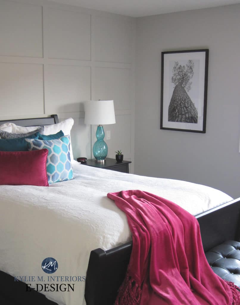
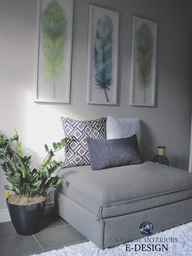
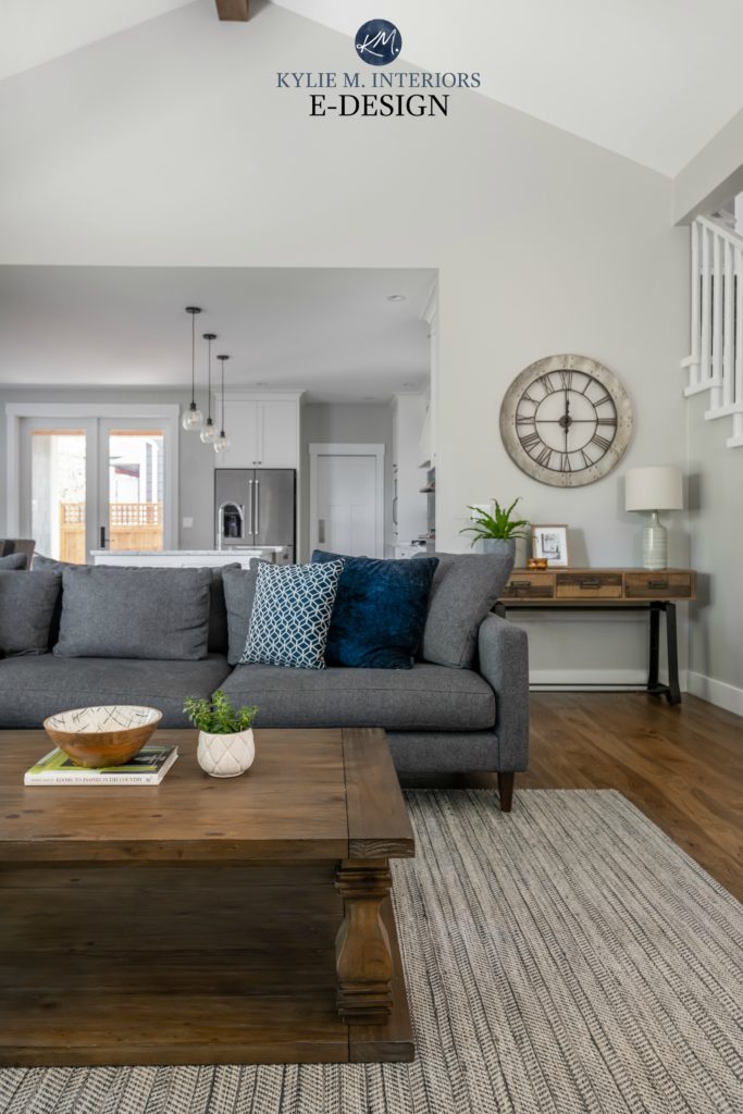
In this next photo, On the Rocks was a great choice as it connects with the undertones in the toss cushions, ottoman, and flooring. Had we gone with a GREEN or blue undertone, it would’ve been hell on toast.
FULL Paint Color Review of Sherwin Williams On the Rocks
Kylie M YOUTUBE Paint Color Review of Sherwin Williams On the Rocks
Sampling paint just got a WHOLE lot easier!
Get your Samplize Peel & Stick sample of On the Rocks HERE
4. BENJAMIN MOORE STONINGTON GRAY HC-170
- LRV: 59.36
- UNDERTONES: Stonington Gray has a blue undertone (slightly blue-green at times)
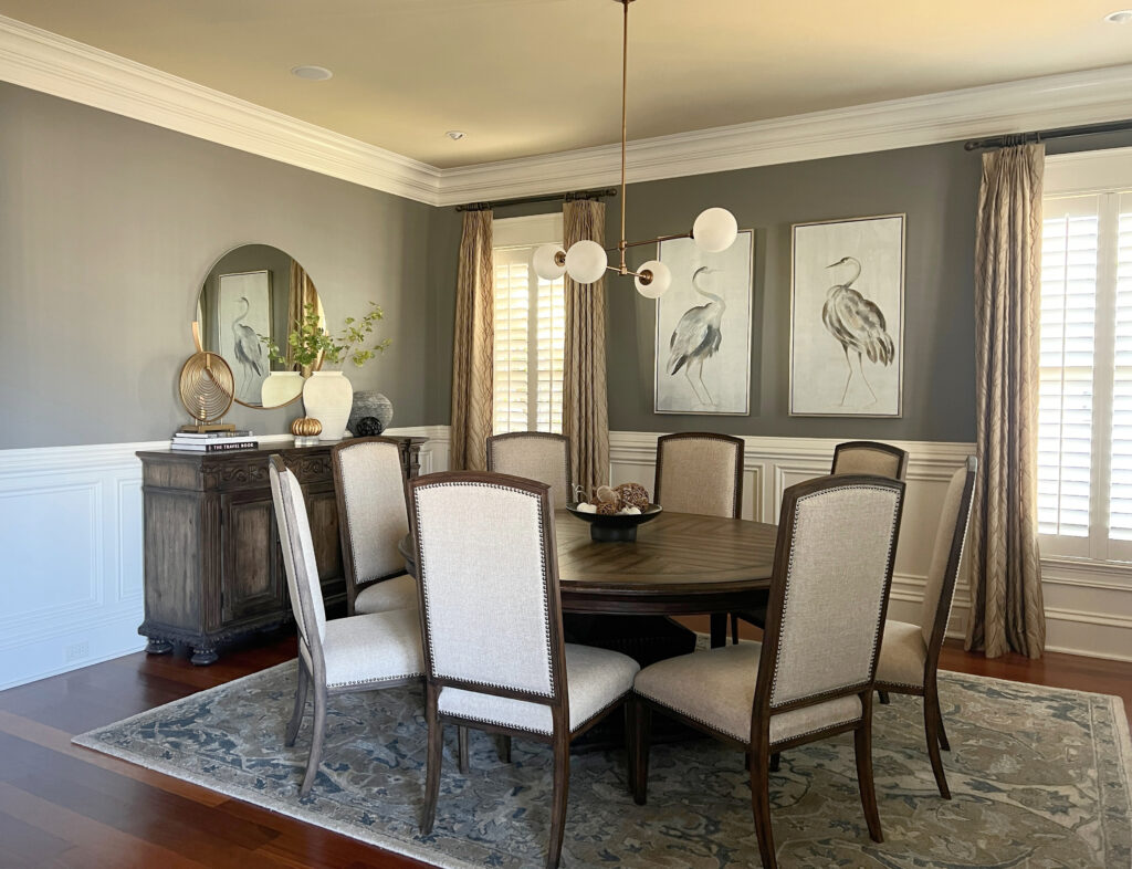
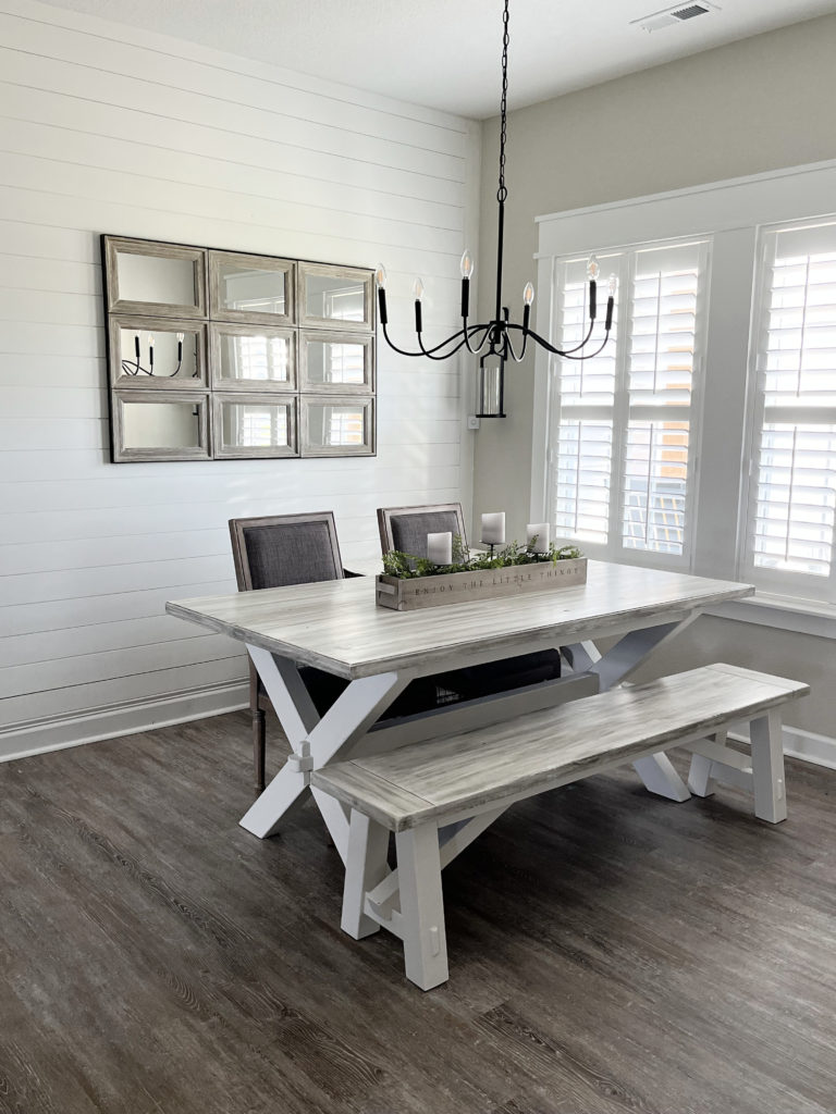
Stonington Gray is wickedly beautiful and seems to be the gray that most people find pretty darned neutral—but as we know, it’s not. Stonington Gray is known for leaning into a vague blue, although in the odd rare light, it looks a bit more muddy green, as shown in this next dining room…
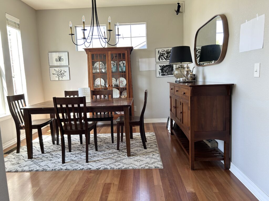
This room is the exception, not the rule.
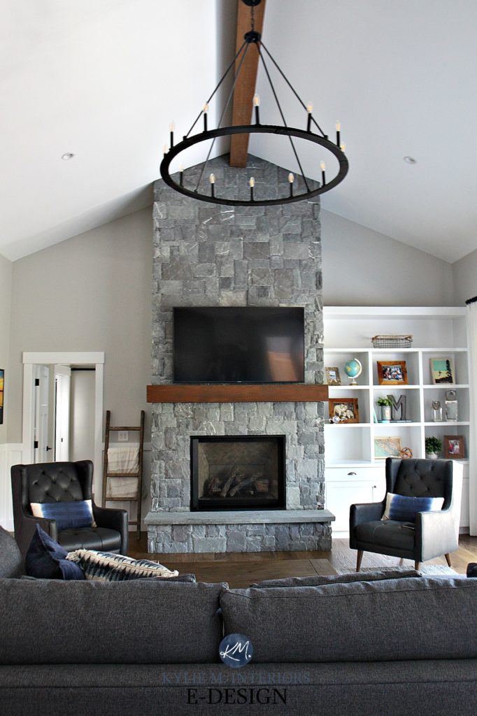
This next living room, with its gorgeous K2 stone fireplace, shows Stonington Gray at its very best…
FULL Paint Color Review of Benjamin Moore Stonington Gray

5. SHERWIN WILLIAMS LIGHT FRENCH GRAY SW 0055
- LRV: 53
- UNDERTONES: Light French Gray has a slight purple undertone
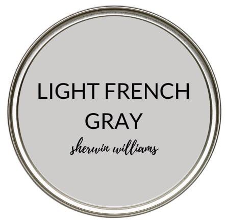
I had mad love for Light French Gray. While the lighter grays are definitely more popular, Light French Gray can be a stunner for those wanting more depth and body on their walls. It does favor a vague purple undertone with a kind of stormy (not overly warm/not overly cold) undercurrent. If you have a north-facing light, you may see it swing a weeee bit into a purple-blue undertone, whereas in south-facing or western light, it softens up quite nicely.
FULL Paint Color Review of Sherwin Williams Light French Gray
Kylie M YOUTUBE Paint Color Review of Sherwin Williams Light French Gray
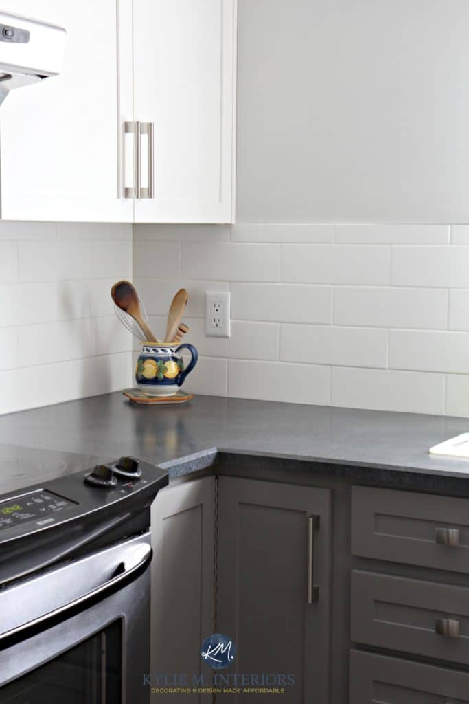
6. BENJAMIN MOORE CHELSEA GRAY HC-168
- LRV: 23.33
- UNDERTONES: Chelsea Gray has flexible undertones
Chelsea Gray is one of the most familiar names in the darker gray paint world. It’s been kickin’ it for quite some time simply because it’s so versatile! Whether it’s for kitchen cabinets and islands, bathroom vanities, accent walls, WHOLE ROOMS, exteriors, or doors, Chelsea Gray has it covered!
It’s also reasonably neutral. Sometimes, it picks up a flash of green, but put it in the right conditions, and you might think it’s a tad violet. Overall, this color has some serious flexibility.
FULL Paint Color Review of Benjamin Moore Chelsea Gray
Kylie M YOUTUBE Paint Color Review of Benjamin Moore Chelsea Gray
7. SHERWIN WILLIAMS CLASSIC FRENCH GRAY SW 0077
- LRV: 24
- UNDERTONES: Classic French Gray has a SUPER minor green undertone
Classic French Gray is an awesome option for exteriors, feature walls, kitchen cabinets and more, it’s all about making sure you like how it settles on your home re: its undertones and how they relate to the environment they’re in.
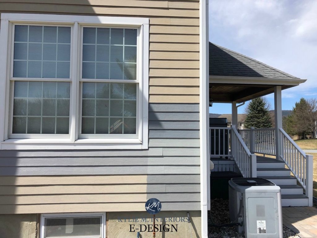
In this next example, Classic French Gray is the sample on the bottom right. Now, you could look at ANY OF THESE GRAYS independently on a white background, and they could all look pretty darn gray. However, through comparison, we see their true colors (pun intended).
FULL Paint Color Review of Sherwin Williams Classic French Gray
8. BENJAMIN MOORE KENDALL CHARCOAL HC-166
- LRV: 14.61
- UNDERTONES: Kendall Charcoal has a tiny wink of green undertone hiding inside it. Think of the wee dude in Lucky Charms, like THAT tiny (not that green, though)
Kendall Charcoal is a gorgeously dark gray paint color. Benjamin Moore Amherst Gray is close on its heels, although I find Amherst is just slightly more likely to flash green, especially on exteriors.
Paint Color Review of Benjamin Moore Kendall Charcoal
Paint Color Review of Benjamin Moore Amherst Gray
Popular grays that didn’t make the cut
- Benjamin Moore Revere Pewter – warm gray with green undertones
- Benjamin Moore Classic Gray – warm gray with purple undertones
- Benjamin Moore Collingwood – warm gray with purple undertones
- Sherwin Williams Passive – a whole WHACK of cool undertones in this bad boy
- Sherwin Williams Repose Gray – its undertones swing WAY too much for me, although at times it can LOOK gray
- Sherwin Williams Dovetail – it has a lovely warmth, and while its undertones are passive, it’s the warmth that throws it for me
READ MORE…
The 12 Best Light Gray & Greige Paint Colors
How to Change from Beige to Greige, Taupe, or Gray
How to Update a Millenial Gray Home
BEHR’S 6 BEST GRAY PAINT COLORS
NEED HELP?
Check out my Online Paint Color Consulting packages


ORIGINALLY WRITTEN IN 2020, UPDATED FOR YOU IN 2024


Hi Kylie!
You are a color genius for sure.
My walls are Edgecomb Gray, such a pretty color but my brick house makes me see purple! I want to lighten up my north west facing room, but I’m afraid that Ballet White mighty actually turn pink!
Hi Katie! Well, Ballet White has much more cream in it, and I don’t THINK it will do that, but sample sample sample!
Hi Kylie,
Regarding the Sherwin Williams color GRAYISH #6001, I can’t see what the undertone is. Can you help?
Hi Joanne, it’s DEFINITELY purple and a considerable one at that 🙂
Hi Kylie,
Do you have any good recommendation for sleeper sofa that is comfortable and good looking.
Thanks, Connie
Grey is so – yesterday…. That trend has been on the way out for a few years now..
Grey goes well with so much. Has always been in decorating schemes. Just no big hoop-la until these past few years. And it will forever be an anchor in interior design. Trends are ongoing and cyclical—whether we like it or not. That being said, once you learn your undertones (which may be very difficult for some as perception is half the battle as you said lol) and you paint up a big ole poster board or buy from Samplize—you’ll know which paint color makes the cut. Move that bad boy all around the room. Paint up or buy multiples. Watch it morning, noon and night. You’ll be able to tell the winner. Process of elimination. I love all the backstory to color you gave. It’s such sound advice. Thank you.
Color or absence of color is a very curious art form and I’m grateful to you for your clarity and humor. Oh how you make me laugh!!!!
Greys are tough as you said. I’ve learned so much about undertones from you and others. And I still have so much more to learn. Understanding undertones- It is the basis of walking into your newly redone room(s) and audibly going “Ahhhhhh……”. Nailed it lol. Thanks so much for this post Kylie.
My family room is Pale Oak. I am painting the dining room which is open to the living room. Choosing between Collingwood or Stonington Grey. What do you think.
Hi Valerie! Without knowing your home or exposures, I would LEAN into Stonington GRay, just to see a more noticeable shift in colours 🙂
Hi Kylie,
Which Benjamin Moore grey do you recommend for the exterior that won’t look purple. We want to do white trim and stained wood garage doors and front door.
Hi Jenny! If you check out my website at: https://www.kylieminteriors.ca/ I have written a number of blogs about grays and their sneaky undertones! I hope this helps!
Kylie – love your style ind insight. I am a graphic designer and love color.
I am painting my family room Agreeable Gray with all trim and crown molding in Pure White. It’s a south facing room with a vaulted ceiling. Should I use the Pure White on ceiling, or might there be a better way to go?
Thanks in advance for your time and response.
Hi Geoff! I think that combo sounds great! I lean towards Pure White on the ceiling. We have a vaulted ceiling in our home too and I like the consistency of it. Also, if I ever change the walls, I don’t need to worry about painting the ceiling again. With it being so high up, I lean towards what’s good for the long haul :).
Fabulous. Thanks. I’ll keep exploring and enjoying your site.
Your blog is so helpful! We made the MAJOR mistake of painting the entire interior of our new home SW Grayish and it was PURPLE! Except the west facing rooms which were PINK! UGH. That was an expensive mistake to correct. Wish I had found your blog before that giant mistake! But I will tell you – every dime (and there were many, many, many dimes) paid to correct that was worth it! We went with SW Silver Strand and breathed a huge sigh of relief when we walked in!
My question is, what is the gray color just above the SW Classic French Gray in the photo above of the exterior of the shingled home? That is the color I want for our garage door (which faces west). We painted the front doors (there are two) SW Copen Blue on our modern white brick farmhouse and absolutely love it!
Thanks for all you do!
Hi Erica! Yes, Grayish is a DOOZY! So, I think the colour you’re talking about is Sherwin Williams Stamped Concrete, which is a soft, medium-toned gray with a green-blue undertone 🙂
Thank you so much for all of the comprehensive research you share so graciously. The visual comparisons are wonderful. I love white because the decorating options are wide open. My family loves color so I’m making baby steps here and there. I really have a hard time looking at a color card and visualizing it in my spaces. You have better reference pics as to what the colors look like in real rooms than the paint sites themselves have. So thank you for helping people like me. I’m a fan.
Rita, that’s about the nicest comment I’ve ever received. THANK you so much…
Would you please make it more clear to me, if my windows face southwest, does it mean that the light I get through them is nortseast. Need to understand what undertones to choose not to get green undertone. My wood look tile is white grayish. Thanks
Hi Maria! If your windows face Southwest, then the light you’re getting in the windows is southwestern light :).
Hi-I have a painter coming in the morning and NO CLUE which paint color!!! I am stressing out! So it’s the family room which gets pretty good natural light. I have mindful gray all throughout the house in different areas and I like it, just don’t want it in that room too. Currently there is a beige (close to agreeable gray) in there now so I don’t want AG just because I want something different. I am down to REPOSE GRAY, ON THE ROCKS, PASSIVE, BIG CHILL, ESSENTIAL and LFGray but you might have me talked out of that. HELPPPPPP! I don’t want any purple showing at any time…an undertone of LIGHT blue I’m ok with and LIGHT green, I’m ok with too. Hopefully you see this in the next few hours 🙂
Everyone thinks I’m crazy cause every color I choose I see green! (We also have floor to ceiling west facing windows-think mid century vibes)
We have painted 4 times.
I just want anything that won’t pull bile green from outside. Any suggestions? I’m this close to
painting it all black lol
Oooo, that’s a tough one to avoid. Generally, the more committed a paint color is to ‘neutral’ the more likely it is to pick up from its environment. The more COMMITTED it is to a particular undertone, the better chance you have of standing up to the green, but sometimes even that can’t beat it! I’d say, check out Sherwin Williams Alpaca and Popular Gray which cater to VIOLET and can help counteract the green. So can orange-beiges like Sherwin Williams Rivers Edge, but not everyone is this inclined (and if they DO grab green, it can be creepy).
Other than that, you’d need to go dark so that your walls reflect less of the green light they’re given!
I have the same issue. I painted Alabaster because it seemed to be the “safest” option. I was so wrong! I had 12 different whites on the walls and this one was bad, bad, bad. It looks like highlighter green/bile green (as you described) in the summer on sunny days 🙁 What did you decide to do?
Ooo ya, some whites are definitely tougher than others – Alabaster is one I’m usually careful with, especially with the sun. Even though it doesn’t LIKE to show green, the odd time it can! The tough thing is, with sunny summer days, depending on your landscape and whether the natural light is grabbing some green reflection off that and throwing it on your walls, most whites will shift. Sure, some people will offset by painting a violet, pink or orange hue, but then you have to live with that color in the night and and when it’s not so sunny!
Hi!! I’m hoping for some advice with a wall color that will help my carpet that is supposed to be a darker gray not look blue. 😵 I tried painting an accent wall, dark gray (iron ore) to help, but it hasn’t. I’m still struggling and so disappointed. The other walls are currently a light creamish color. We live in the PNW and our living room fave north. I would be forever grateful if you have time to offer any suggestions and help!💕
Hi Kylie,
You insights are helpful and reassuring that I’m not crazy in having such a difficult time trying to find the right gray for my livingroom/dining room which are open to each other. My kitchen is all white – very white – super white so I want some contrast and I love gray. But I don’t want a gray that looks blue… I have lots of Western light in my apartment. I just painted sidewalk gray (25% lighter than the original color) and it just has too much of a blue tint for my liking. Any suggestions?
Thank you!!
Linda
Your webpage title is The Best Gray Paint Colors With NO UNDERTONES. All of the colors on the page have undertones and not a single true gray with NO UNDERTONES. Your title is misleading, guess you really just want people to click on the site to be over whelmed with ads, making you money.
Hey Robert, thanks for your note. The truth is, there aren’t gray with no undertones, and yes, the title catches you – that’s the point and that’s the way we write for Google. I write for free, the only way I support my family is through ads. If you don’t like ads, you might find that purchasing magazines or design books are more your style. These colors are the most neutral grays you’ll find, making the content super valuable. Good luck with your search!