Repose Gray: is it warm, is it cool, is it POPULAR? Let’s find out!
Are you looking for the perfect gray paint color? Feeling nervous about those sneaky green, blue and violet undertones? Don’t be (insert Superman song here), as I’m on a mission to demystify my fave shades of gray, and today, we’re chatting about Repose Gray.
WHAT KIND OF GRAY IS REPOSE GRAY? WARM OR COOL?
Repose Gray is a gray paint color (I’m not just good-looking, you know). However, it’s not a TRUE neutral gray as it has a weeee wink of a brown in it, making it a WARM gray.
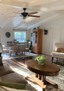
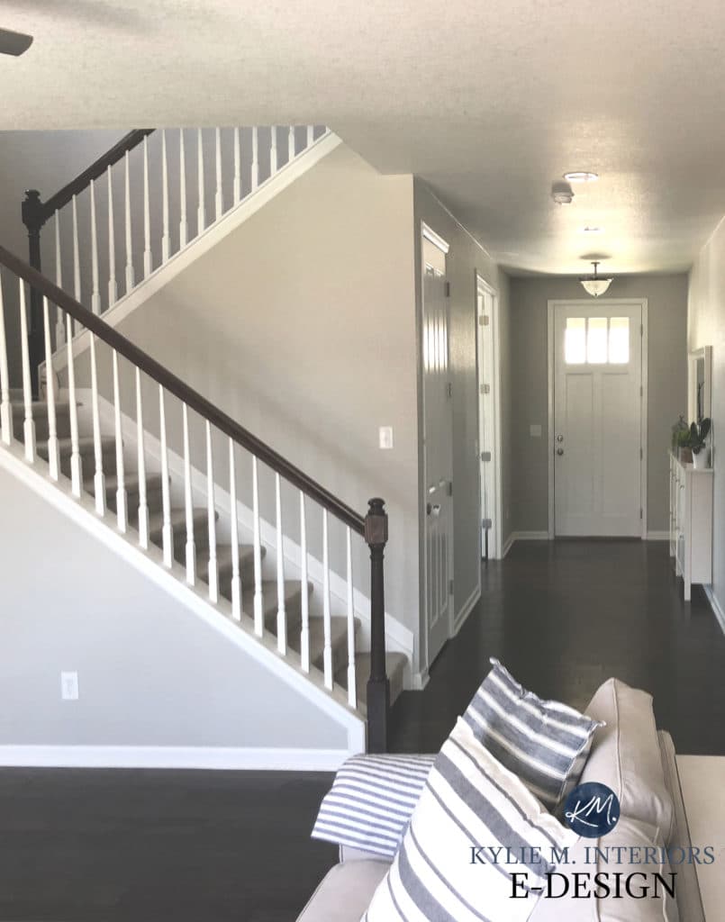
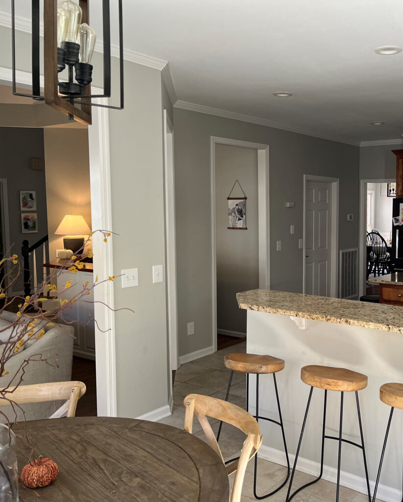
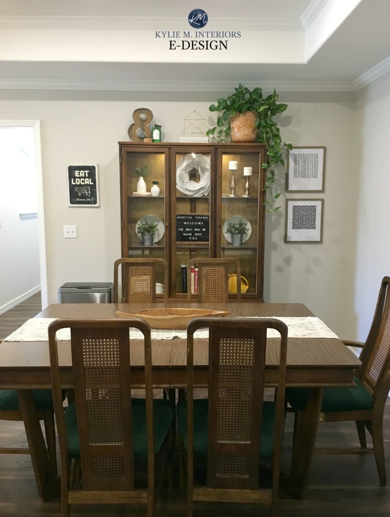
This next photo is AS WARM as I’ve ever seen Repose Gray look. Usually, it caters harder to gray…
IS REPOSE GRAY MORE GRAY, GREIGE OR BEIGE?
Without a doubt, Repose Gray is gray, although, in some lights, it can look a touch greige-taupe. And while it has some passive warmth, it looks nothing like beige – don’t worry.
WHAT ARE REPOSE GRAY’S UNDERTONES?
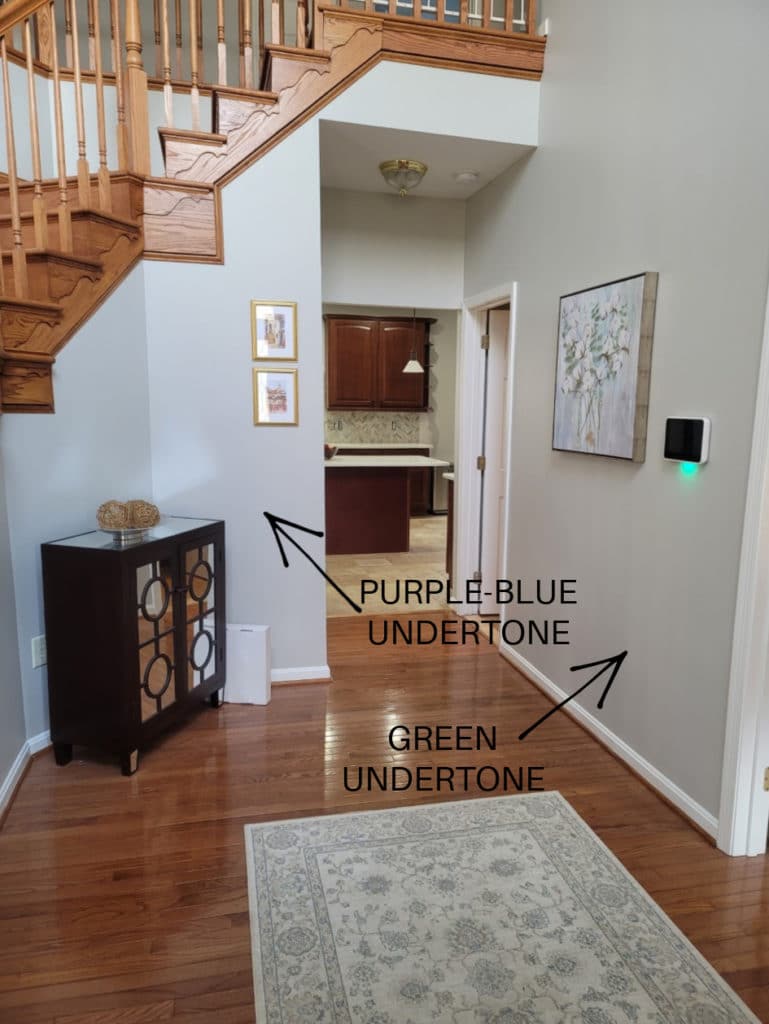
While Repose Gray can favor a soft violet undertone, there’s also a bit of green undertone. And believe it or not, once in a while (given the right exposure/interior finishes), I’ve seen Repose Gray flash a touch blue. While every gray has undertones, some grays flex a bit more, and Repose Gray is DEFINITELY one of these grays. Because Repose Gray can be unpredictable, I highly recommend ordering the Samplize version to see how it settles in YOUR room.
When I mention violet undertones, my Online Color Consulting clients often get nervous with visions of Barney dancing through their heads. However, hints of an undertone like this can soften a color, stopping it from looking flat and boring – particularly in dark and gloomy or north-facing rooms.
BTW, my blog runs 100% on wine, Doritos and my Online Color Consulting client’s PHOTOS – thank you SO much for sending them in!
- Repose Gray is not a typical ‘fresh’ gray; it’s soft and warm, even though it can look cooler in some situations.
- If you don’t like violet undertones, you’ll want to tread carefully with this color. That being said, I have DOZENS of E-design clients who don’t like violet undertones who LOVE Repose Gray.
- If you were hoping for a COOLER approach, you may want to check out Sherwin Williams Light French Gray or On the Rocks instead.
Now to sum up the above info for those with more SPECIFIC questions…
WILL REPOSE GRAY LOOK BLUE?
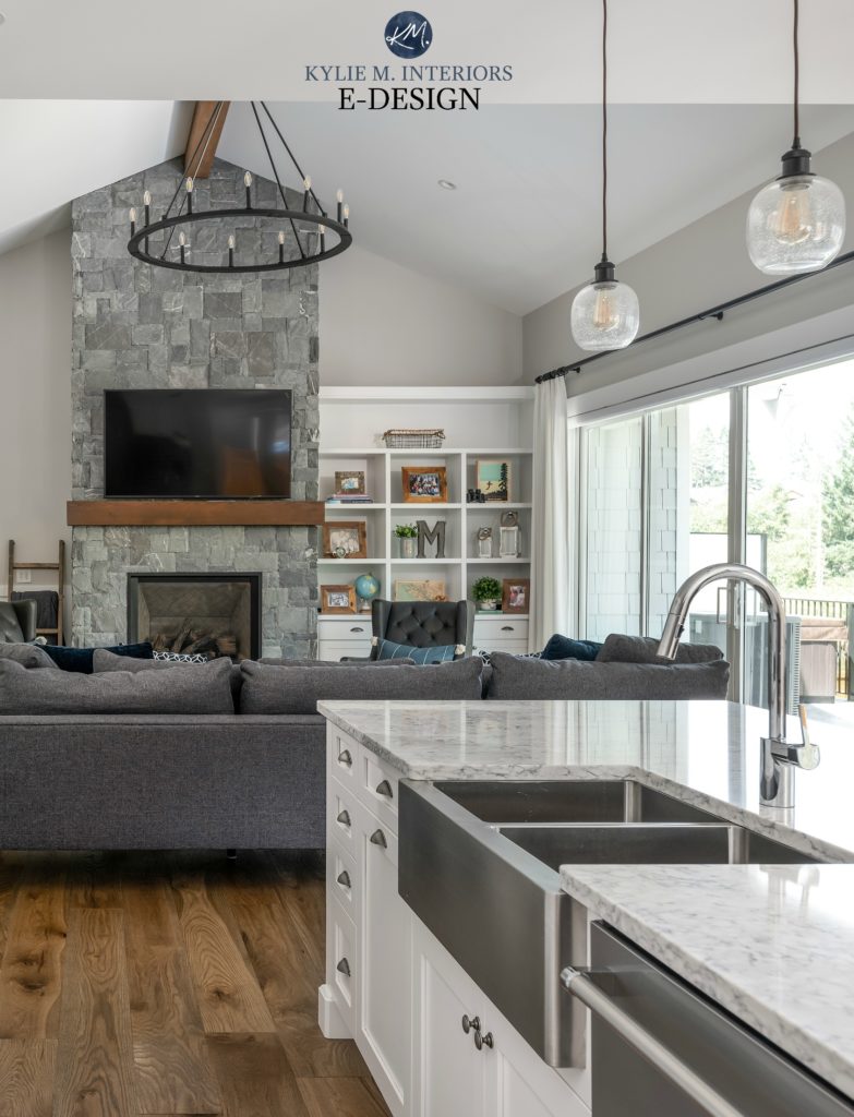
While Repose Gray doesn’t WANT to look blue in the right environment (i.e. exposure based or with trim that’s overly warm), it CAN pick up a blue hue. HOWEVER, of the three gray undertones, blue is the one that’s LEAST likely to show up, as shown in this next photo (hardly a wink of blue to be seen).
WILL REPOSE GRAY LOOK GREEN?
Repose Gray can nod politely at green but rarely commits on a LARGE scale.
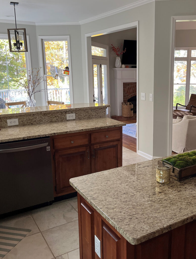
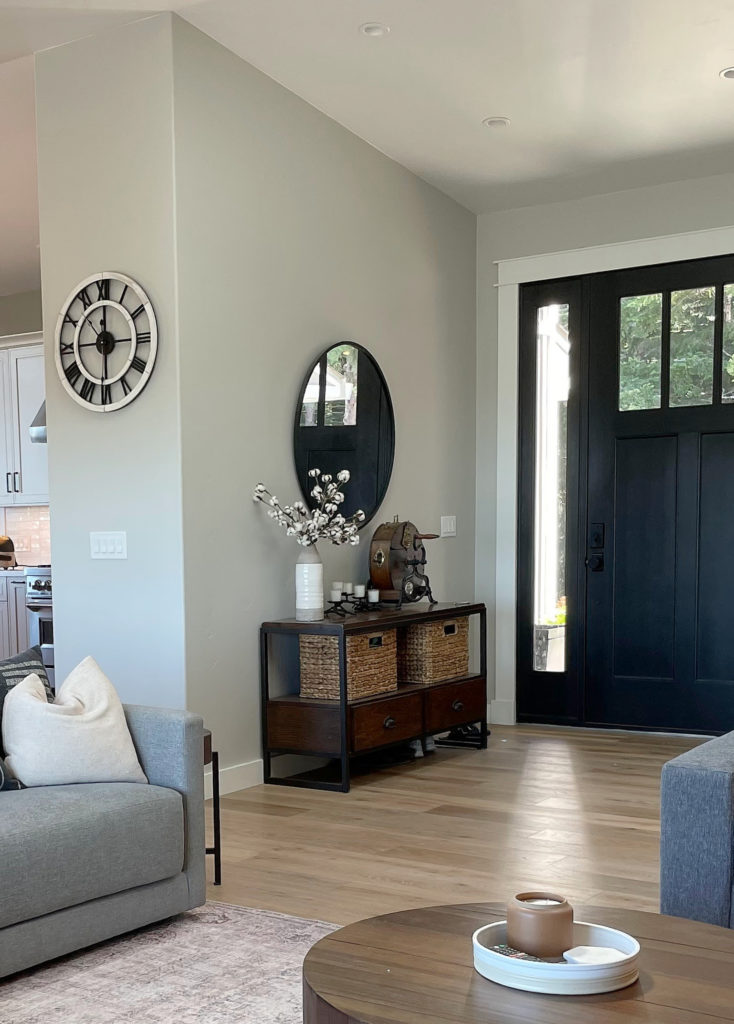
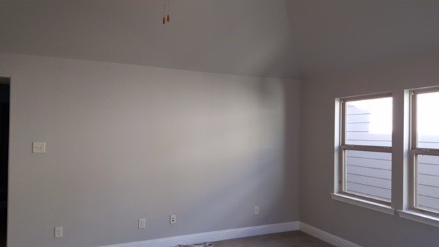
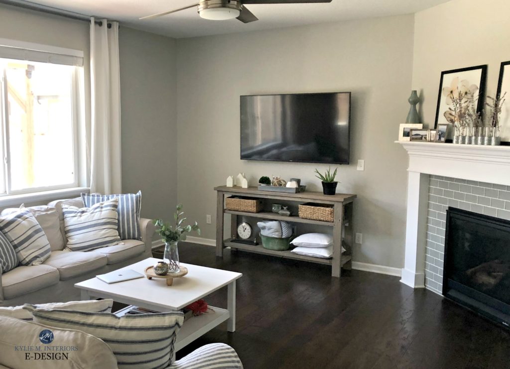
This next photo shows Repose Gray picking up a subtle green hue…
However, as shown earlier, notice how it shifts depending on which part of the room you’re looking at, the time of day, and the light bulb temperature…
If ANY degree of green makes you nervous, you may want to read this…
The Best Gray Paint Colors With VIOLET/Purple Undertones
WILL REPOSE GRAY LOOK VIOLET/PURPLE?
Just as with the green undertone, Repose Gray can pick up a touch of violet without hardcore commitment. If you don’t want ANY chance of violet – you’re looking at the wrong color. Instead, explore shades of gray that are more inclined towards green.
Remember, EVERY gray has undertones – find the one that best suits the finishes in your home!
WHAT’S REPOSE GRAY’S LRV?
Repose Gray has an LRV of 60. With an LRV of 60, Repose Gray won’t look like a heavy color in a room with an adequate amount of light, but it also won’t bring a TON of reflective value to the table (or the wall, in this case) if you have a darker room.
The Ultimate Guide to Choosing Paint Color with LRV
If you want to learn more about LRV, check out this article: LRV – What Do The Numbers Mean?
REPOSE GRAY IN A LOW-LIGHT/DARK ROOM (OR COOL EXPOSURE)
A room might have low or cool-toned natural light for a few reasons:
- it’s north-facing
- it has east-facing afternoon light or west-facing morning light
- there are a lot of trees outside blocking the sky
- it doesn’t have many windows (or any windows)
- there’s a large overhang outside the window (like a deck or large soffits)
And as you can see in this next photo, having another house close by can really affect the quality of light coming in the window!
Any of the above reasons will contribute toward Repose Gray changing its overall appearance, flexing through the cool undertones and going from being a warm gray to a slightly cooler-looking one. SAMPLE SAMPLE SAMPLE – make sure Repose Gray looks like you want it to in your space!
If you have a darker room, Repose Gray can look heavy and drab due to the color itself…
1. Repose Gray doesn’t have a lot of chroma or ‘color’ to it. Color is often used to add interest and personality to a room with muted light.
2. Repose Gray has a slightly lower-than-average LRV (as discussed earlier). That low LRV combined with the low chroma can leave it pretty flat looking. You need to improve your interior lighting and choose the right light bulbs to bring it to life!
In the end, if Repose Gray goes a wink too cool for you, check out Sherwin Williams Agreeable Gray, a gorgeously warmer alternative…
Color Review Sherwin Williams Agreeable Gray
Agreeable Gray vs Repose Gray, Revere Pewter & More
On the other hand, if Repose Gray seems too warm, you might like Benjamin Moore Stonington Gray…
Paint Color Review of Benjamin Moore Stonington Gray
REPOSE GRAY IN A ROOM WITH AVERAGE NATURAL LIGHT
In a room with average natural light, Repose Gray holds itself well, sitting in the light zone without being washed out. Repose Gray is undoubtedly at its personal best in spaces like these.
REPOSE GRAY IN A BRIGHT ROOM
Because Repose Gray has an LRV of 60, it will still wash out a bit in an ULTRA-bright room, but will hold itself better than many of the lighter gray paint colors.
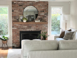
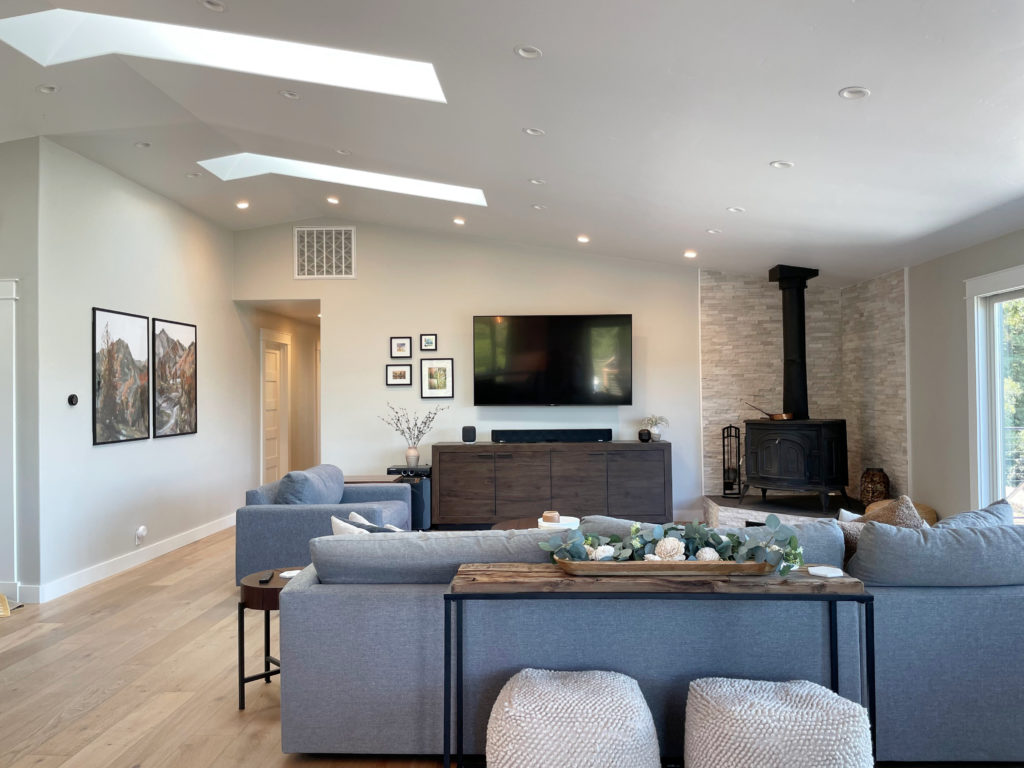
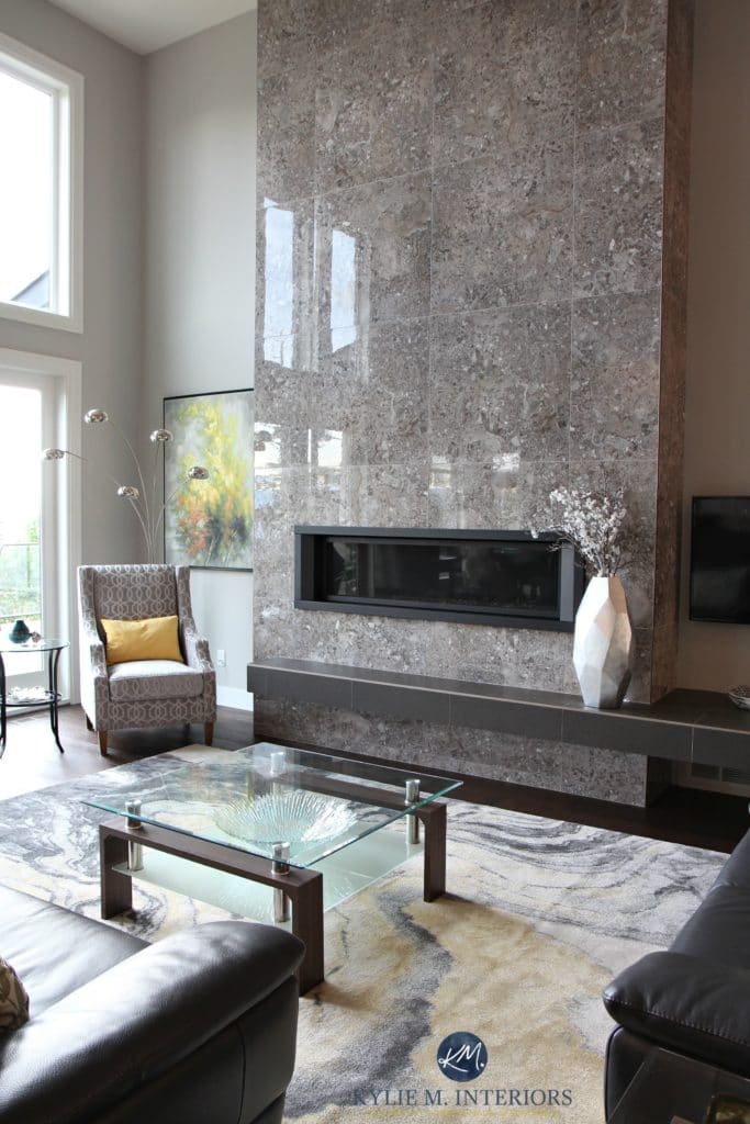
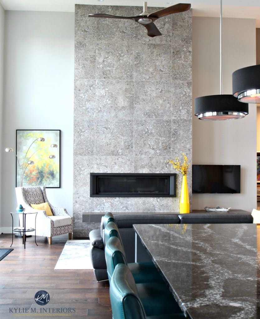
In this next photo, you can see a DRASTIC shift from the left side of the fireplace to the right. Notice how the depth and undertones change with the shift in natural light (the left side is bright northern light).
Let’s take a quick break to talk about paint samples…
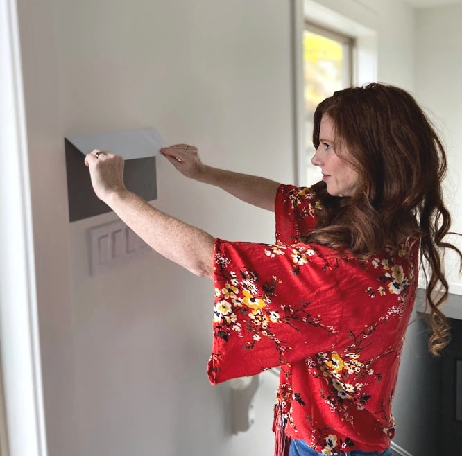
Undoubtedly, you’ll be heading out shortly to grab paint samples – stop right there! Please check out SAMPLIZE Peel & Stick. Here are just a few reasons why I recommend Samplize to my clients…
- samples arrive ON YOUR DOORSTEP in 1-3 business days, depending on the location
- they’re more affordable than the samples pots/rollers/foam boards that are needed for traditional paint sampling
- if you keep the samples on their white paper, you can move them around the room
Visit the SAMPLIZE website HERE
WHAT WHITE TRIM COLOR GOES WITH REPOSE GRAY?
When looking for a white paint color for trim, cabinets, ceilings or doors, lean into those that aren’t OVERLY warm, for example…
- Sherwin Williams Pure White with its wink of softness
- Sherwin Williams High Reflective White for a cleaner approach
- Repose Gray does NOT want to be partnered up with an overly warm white!
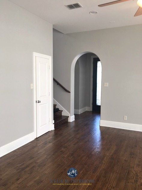
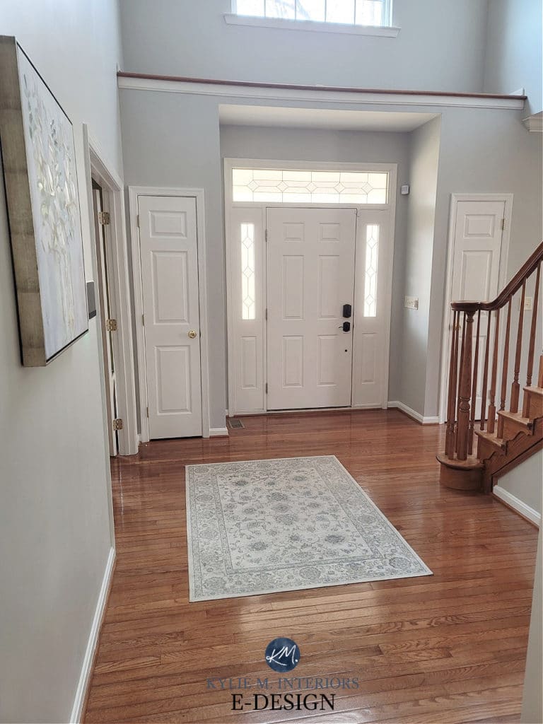
BTW, look at how much blue it grabs in this foyer! This isn’t common, but you still have to be careful!
Sherwin Williams 4 Best White Paint Colors
WHICH PAINT COLOR IS SIMILAR TO OR MATCHES REPOSE GRAY?
There will be NO perfect match when it comes to different brands – each color will have its nuances, undertones and intentions. This is even MORE the case with Repose Gray, as Benjamin Moore doesn’t have anything even CLOSE. However, these colors have similar intentions…
- Benjamin Moore Nimbus
- Benjamin Moore Cumulus Cloud (much warmer)
- also, check out Sherwin Williams On the Rocks and Knitting Needles for a slightly different look
And if you’re thinking of color matching between brands, you might want to read THIS first.
Sherwin Williams Agreeable Gray vs Repose Gray, Revere Pewter & More
WHAT PAINT COLORS GO WITH REPOSE GRAY?
If you’re looking for colors that compliment Repose Gray, check out…
- whites that are bright or only slightly warmer (i.e. Sherwin Williams Pure White)
- shades of gray with similar undertone profiles but more DEPTH, like Dorian Gray or Dovetail
- GRAY-blue-green blends, especially those in the light-medium or medium range (i.e. Sherwin Williams Argos is awesome)
- BLUE-GREEN-gray blends (meaning the gray takes a step back).
- DARKER green-grays like Sherwin Williams Grizzle Gray
- Repose Gray doesn’t always like paint colors that are cooler and lighter than itself OR darker and warmer
Finally, let’s cover a few common questions with…
PEOPLE ALSO ASK THIS ABOUT REPOSE GRAY…
IS REPOSE GRAY STILL A POPULAR PAINT COLOR – IS IT OUTDATED?
While Repose Gray has its following, with trends leaning warmer, it’s not popping up nearly as much. And while it’s not quite outdated, it’s also not the most UPdated approach. Also, there are other warm neutrals with more predictability and flexibility.
IS REPOSE GRAY BETTER THAN AGREEABLE GRAY?
A question like this is ALWAYS open to perception. However, in my Color Consulting, Agreeable Gray is FAR more popular than Repose Gray and is often the better choice for the average room.
DOES REPOSE GRAY GO WITH EVERYTHING?
Heck…no. While Repose Gray can be reasonably flexible, it’s often a bit too cool for interior finishes and rooms with ‘less than ideal’ lighting.
Not sure if Repose Gray is the right color for you? I’ve got more!
READ MORE
Paint Color Review of Sherwin Williams Colonnade Gray
Sherwin Williams Agreeable Gray Paint Color Review
Paint Color Review of Sherwin Williams Light French Gray
The 12 Best WHOLE HOME Gray & Greige Paint Colors
Not sure which gray is best for YOUR home?
Check out my Online Consulting / E-Design Services!
Chat soon,
Written in August 2015, updated in 2022
Yaay…a SW color that I will have to look into to!!!
Hi. I left a comment re revere pewter but it never made it..awaiting moderation? Anywho just wanted to share that I totally enjoyed your gray post. Thank you! I am totally in love with Revere Pewter. (See? I even paid it homage by capitalizing it’s name lol). I just love love love that paint color. Soothes my soul it does. I’m a neutral/gray-greige kinda girl so this paint makes my heart sing. Also really like anew gray by SW. Pretty greige. Well…not sure if this comment will make it either but if so, much thanks for your fun, funny and wicked informative posts Kylie. From another paint junkie :))
Hi Robin, HOLY DELAYED REPLY – sorry about that – I got a bit backed up! Thanks for loving the grays I talked about – I know, I easily get obsessed on a colour too (Gray Cashmere is a current obsession even though I don’t have it in my home). Thank you for commenting and keeping grayin’ on my friend!
~Kylie
Kylie,
Loved your post! would you recommend Repose Grey for an English basement with only 2 windows. Want to keep the space warm and as light as possible
Author
Nope! I think it would be too heavy and dark. If you’d like me to take a look and come up with some good solutions, I do have an affordable E-design service that is fun too! This way I can take a look at your flooring, interior lighting and furnishings and give you some great options to choose from… https://www.kylieminteriors.ca/online-decorating-design-services/
~Kylie
Hi Kylie,
I have an accent wall that is Fairview Taupe by BM in a large great room with a lot of natural light. Do you think Repose Gray would work for the other walls?
Author
Ooo, I think the undertones in REpose Gray are too unpredictable for Fairview Taupe…
Hi, I have a simple question that I would love some advice on. I’ve been in search for the perfect gray for my master bedroom for days. Every time I think I found one, I change my mind . Our room is large and has three giant window which provide a lot of natural light. We have dark brown bedroom furniture with a little red in it and dark black leather on our headboard with the dark brown wood on the outside . We are looking for a “darker gray” we hate blue undertones. We’d like to avoid anything to green/pink/purple. If we have to have a undertone I think a slight green would be acceptable. I think we’d prefer a slight brown undertone if anything. We want it warm. We have lighter colored neutral carpet. I was thinking of Rockport gray, Chelsea gray, Plymouth Rock? I don’t know. Can you recommend a couple grays please? Thank you! I would love and appreciate a email if you have time .
Hi Brian! Now I refer most questions to my Online Consulting as it is my livelihood, but I will give you a heads-up that Chelsea Gray is a LOVELY medium toned gray with very little undertone, as is Amherst Gray, the slightly darker version of Chelsea Gray – hope that helps!
~Kylie
After much debate and color sampling to decide which shade of grey to go with for my main open living space, I’ve decided to go with Repose Gray!! This was only after having my choices narrowed down to its 3 contenders, Agreeable gray, Collonade gray and BM Revere pewter. While I liked all 3 of them in my space, neither of these choices seemed to jump out as the “ONE”. Then I came across your wonderful article about Repose gray, and I just had to run out and buy a sample to try it… BINGO!! It’s perfect for all the reasons stated above! Now I’m trying to pick from a large selection of white trim colors to go with it. Do you happen to have any favorites that you can suggest?
Hi Christine, I’m SO glad you found my blog post enlightening – that’s what I’m here for! I want you to take a look at White Dove which is a soft subdued off-white. And if all else fails, there is always white. People seem to forget about plain old white! It’s not as easy to get plain white at BM, but if you go to SW you can just say ‘I would just like plain white’! Then, the key is to ask them to add 4 drops of white to the can. White itself doesn’t cover very well, so adding some more tint to the can will help with your coverage 🙂
Hope that helps! If you loved reading my blog, please consider subscribing for weekly updates (right hand side of page) – it’s free!
~Kylie
Hi Kylie,
I’m thinking of making the switch to Sherwin-Williams, and am curious which of the Sherwin-Williams lines of paint you prefer. We are thinking of Repose Gray in a flat finish for a family room. Thank-you for your great gray articles!
Hi Karen! I love SW paints. If you are in Canada it’s the Opulence line, if you’re in the States its called Cashmere. Its the middle of the road and I love the quality/price point. Now keep in mind that flat finishes can be ‘wipeable’ (barely) but not washable. I’ve yet to find a good washable ulti-matte paint!
Thanks for asking!
~Kylie
Dear Kylie,
I am in a bind. I have never had the chance to get my house professionally painted, and it’s coming up soon. I am between BM’s Owl Gray and SW’s Repose Gray. I have them both up as samples, and they are both beautiful. They both change so much as the light changes throughout the day. I am just worried that their undertones may eventually clash with our furniture. Orange couch, turquoise buffet, fuchsia, indigo, and mustard/gold accents. I think neutral color walls with help balance the flair, but would just hate to see the clash. Any help on making the final pick? Your articles are great by the way. Seriously.
Karin
Hi Karin! Usually I refer these questions to my Online Consulting, but I DON’T want you making the wrong choice and your 99% there!
So yes, these 2 colours will change a lot throughout the day – particularly Repose Gray. In some lights Repose will be a bit more gray, another a bit more greige and yet another, a touch of purple. It’s the touch of purple that is going to BAD for your lovely accent colours! Funny enough I was just at a clients house yesterday and she has some of those EXACT accent colours – various shades of turquoise, orange, gray and white (none of the other colours though). Now she has Revere Pewter on her walls, which is very pretty, but I think I might have chosen BM Gray Owl had she asked. Why? Well Gray Owl also changes throughout the day – sometimes gray, sometimes blueish, sometimes greenish – but it wouldn’t matter WHAT it did, it would still look good with turquoise, orange, mustard, indigo to a degree and fuchsia somewhat.
What I’m saying is sometimes you can’t make EVERYTHING happy, especially when you’re dealing with so many accent colours, however I think you are 10x safer with Gray Owl than with Repose Gray as I don’t think Repose Gray will look healthy with turquoise/orange/etc…
Hope that helps!
~Kylie
Kylie-
I’m going to do you online consulting for my house, but wondering about my daighter’s Would Classic Gray work with these accent colors? Turquoise, mustard, indigo, orange, pink…
Author
Hi Sheila, it can depend on the room as Classic Gray can go quite warm or quite gray. If it goes warm I don’t know if it feels QUITE as nice with those accents, but not bad.
Hi Kylie,
I just am getting ready to buy this color for my open concept kitchen/dining/family room, south facing light (mostly- it’s a space that has east and north windows, too). I was surprised to find out that they recently reformulated it and it now has an LRV of 58. I hope this won’t matter too much- it’s the best color out of Revere Pewter, Gray Owl and Worldly Gray. I’ll post a pic when I get it on- I just know you said no lower than 60 LRV for spaces that you want the light to dance (which I certainly do!).
Thanks for your blog- it rocks. I never would have know about LRV without it!
Cheers,
Lara Henderson
Hi,
I love your column. And I too love Repose Gray. I just painted my entire basement this color. It’s my husbands man cave. There is only 1 little tiny window so it’s very dark down stairs. We initially wanted a blue but everything blue looked overwhelmingly blue in the dark space. Repose gray (which I had a sample on hand for my upstairs and didn’t like) was perfect for our basement. It looks almost slate blue in some lights and then back to gray. We both love it and wanted to share our experience as I just finished painting last week.
Hi Kylie,
Which white do you think looks best with Repose Grey? I am thinking for our kitchen cabinets. I am wanting a warm white look, not stark. I am doing the walls Repose Grey and had originally thought Simply White for cabinets and am now second guessing myself and wondering about Chantilly Lace. But I worry it may be too cool looking.
Thank you!
Danielle
Hi Danielle, sorry for the delayed reply! I actually like BM White Dove with Repose Gray. Chantilly Lace ‘can’ look a touch pinky and Simply White is beautiful and you COULD do it, I just prefer White Dove!
~Kylie
Great article. Thanks for helping us with this color dilemma. The different photos helped also.
Hi Kylie,
Quick question, we have decided to paint the house in SW Repose Gray and bedroom and bathroom in SW Sea Salt, but trying to decide which paint finish to go with is the hard part for us. Our walls have a texture and there a certain rooms that get a lot of natural light. Please advice.
Thank you
Angelica
Hi Angelica, I think you will find this blog post helpful re: paint finishes 😉 https://www.kylieminteriors.ca/the-best-paint-finish-for-walls-ceilings-trims-doors-and-more/
Hope that helps!
~Kylie
Do you think Repose grey would pair well with Alabaster on the cabinets and trim? Thanks!!
Hi Kay, yes Alabaster and Repose Gray are a beautiful combo together!
I absolutely loved my swatch of Repose, so I ran out and bought a 5 gallon bucket and went to town. My trim is Decorator’s White and now that everything is done I don’t have as much contrast as I thought I would when comparing the 2 color swatches on my wall. When I look at pictures online (I do know I can’t trust colors on monitors), it seems every other room I see it in, there is blatant contrast. I have tons of natural light, do you think that is the reason or was my white color choice not bright enough? I strike out on every paint job I do it seems! I’m debating changing my white color or going Mindful or maybe 50% of Mindful added. Paint colors are so hard!
Hi Jacquelyn! I know, Pinterest can be SO deceiving as to how things will ‘really’ look. A lot of the images online have been edited, particularly the more professional ones on Pinterest/Houzz. In a really well-lit room, REpose Gray will still show up to the party, but you wouldn’t see as much contrast as you might see in a more average/moderately lit room. If you have great light, I might just bump right on down to Mindful – and since they are in the same colour range you might just need to do 1 coat if you do a good job!
~Kylie
HI Kylie! So I came across your post a few days ago when my husband and I were deciding paint colors and we decided we wanted a warm gray to compliment our brown wall cabinets and vintage White kitchen Island with cherry hardwood floors. But the painters just finished painting the repose gray all through our living room and kitchen and it almost looks blue! Kind of like SW passive. Have you ever heard of anyone seeing a blue undertone in repose gray? Or do you notice it in your house? I thought it may have been because the painters didn’t use a primer and the original walls were yellow and hunter green. But they did do two coats. I’m so bummed and confused :/ I thought repose would look a little beige if anything! Curious if you’ve seen or heard anyone else say that it looked like it had a blue undertone in certain lights.
Oh Emma, YES, this has happened before! In fact, I was just my Repose Gray post today to chat a bit about that. I would say it’s ‘rare’ but you are the third person I’ve heard of this happening with. Exposure can affect things for sure but keep in mind, with yellow and hunter green underneath, even 2 coats (if it’s not high quality paint) might not be enough and you ‘could’ have some of that original colour flashing through, distorting things…
What color gray would be better with cherry floors?
I painted my daughter’s room in mindful gray. Looked great! Used Agreeable gray in the bathroom and it looked beige, so I switched to mindful on the cabinet and repose on the wall. Repose is totally light blue. And you would never know the mindful on the cabinet is the same as the wall. I then painted my kitchen repose gray and it too looks blue. Only this time I wanted the blue undertone because my kids did not want me to change the bluish gray cashmere that was already there but I wanted a change. Oh, and just about all soft grays look lavender in my hallway! Even after I changed the lightbulbs too. These colors are so dependent on the lighting….
Author
I know Karen, isn’t it just mind boggling! I’ve found that Repose Gray, IN PARTICULAR, is one of the BIGGEST chameleons in the gray world too!
Do you prefer collingwood or repose gray and why?
Well, I like them both in different situations, but ‘overall’ I do like the softness of Collingwood Gray. It has a bit more beige in it, so it has a bit more warmth to it. However, if you are more of a ‘gray’ fan than a ‘greige’ fan, Repose Gray would be a much better choice!
~Kylie
So we just painted our whole dining living AND kitchen in Repose because I figured how could I go wrong with all this love…BUT it really looks BLUE! Like light blue! Im shocked!! Im freaking out a bit! Do you know what it is or why?! Maybe I just need to get everything back in the room???? Help!!
Hi Cassie (great name by the way, that’s what we named our daughter!). You know, I’ve had a few clients have Repose Gray pick up a blue on them. Once it was a mistint from the paint company and the other times were in shadowed or north facing rooms. Could this be the case with your home perhaps?????
Hi, we have dark brown trim throughout our house. Will the repose gray go with that??
Hi Nichole, yes, Repose Gray usually looks quite nice with dark brown trim!
~Kylie
Hi – Have you heard of mixing 50 % mindful gray with 50% repose gray – and what the results might be like?
Hi Mary, nope I haven’t heard of that! Usually i just suggest either lightening one or the other – I’ve found that 40% is the magic number that does the trick to get me ‘in-between’ 2 colours.
Hope that helps!
~Kylie
Hi Kylie – I can’t tell you how helpful your blog has been to me!!
We recently bought an old 1930’s fixer upper on 40 acres. The house is a big L shape – lots of big different facing windows hallways, high ceilings, dark staircase, etc…outside trees – but still good light. Because of multiple window directions…the light changes by the minute! I wanted to brighten it up with grays, but about $500 later in various BM gray paint choices…everything, and I mean everything, kept turning blue – pink blue, purple sweet tart blue, periwinkle blue…ugh! I would use a sample, and it would look great, but then show up completely different on 2 walls in the same room!
I found your blog, switched gears, and grabbed samples of all the paints on the SW Repose, Mindful, Dorian strip and…voila! I had to change shades from room to room according to the light – but it all flows and looks really pretty. There are still some slight blue undertones, but mostly just a nice fresh, gray feel. To note – the Mindful is a welcoming bluish/gray in the bright foyer but looks the exact same color as the Repose in another hall/office/breezeway…the front room and DR which are immediately off the foyer, are in Dorian – but only a little darker looking than the Mindful! A half bath (small but decent window) in Mindful has not even a smidgen of blue…but more taupe, and looks darker than the Dorian in the DR.
I decided I am doing the kitchen walls in white, mostly just to break up the blue/gray feel from everywhere else…so I must ask…do I go with Eider White since these tones seem to work? Or will that come off feeling like an extension of the other rooms, just lighter? I’ve noticed you like BM’s White Dove? Any other thoughts for whites? (with plain white trim)
*Also, an interesting side note…salvaged from my troubling BM relationship – I painted our dark stairwell in BM’s Winter Solstice with plain white trim (with dark wood banister & risers)….and by all accounts it looks gorgeous! Oddly, the stairs open to the Dorian in our front room and I am not sure you would even notice. Under closer inspection WS is cooler – but kind of a rich, warm coastal feel (…Cape Cod in winter by a fire??)
Thanks so much for all the great info – hopefully, this may help another poor soul stuck in the gray blues!!!
-Laurie
Hi Laurie, sorry for the delayed reply and I’m SO glad you’ve find my blog helpful! And you are RIGHT, I LOOOOVE me some White Dove! Eider White is pretty but can have a vague purple undertone. Bad? No, but I like the subtle neutral warmth of White Dove, particularly if a lot of your colours are flexing to the cooler side rather than the warmer side. Also check out BM Calm https://www.pinterest.com/search/pins/?q=benjamin%20moore%20calm&rs=typed&term_meta%5B%5D=benjamin%7Ctyped&term_meta%5B%5D=moore%7Ctyped&term_meta%5B%5D=calm%7Ctyped which is like Eider White but with a weee wink of softness/greige to it.
Hope that helps!
~Kylie
We have to choose our interior pint color on our house being built without seeing samples on the wall.s. It will be the same color throughout the entire house. Our trim and cabinets will be pure white. I have it narrowed to repose gray, light French gray, and knitting needles. I am so scared of undertones. Any suggestions??
Hi Brenda! If you’re nervous about undertones I would think that the MOST safe would be Repose Gray. It can flex around a bit, but it’s always pretty. Knitting Needles can come up a bit too purple. Light French Gray is beautiful, but I think Repose is a bit more safe 🙂
~Kylie
Hello I love your Blog, you give excellent advice. I am going with BM Gray Owl bcs of your advise, my furniture is gray and accents are coral, yellow and aqua. My problem is that my Living Room, Dining room and kitchen are right next to one another with very little wall space in between the LR and DR. The Dining and Kitchen are connected (one room). My kitchen cabinets are all white, dining table grayish silver. I have 6 windows in the Living Room, and 1 window in the dining room/ kitchen area. Yes, very dark area. Should I paint the dining/kitchen another color? only 2.5 walls in dining room (1 of those has the lonely window) and little wall space in kitchen mostly cabinets and appliances with an Island. I was thinking about yellow, but what shade of yellow should I use with BM Gray Owl? Or paint all the rooms with Gray Owl, since they are in close proximity of one another? I will be forever grateful for your advice.
~Regina
Hi Regina, thank you for your note! Now with personal questions with a bit more detail I usually refer to my Online Consulting as I do have a ‘feature wall’ package that’s affordable! Based on what i can read, I’m thinking that they could all be the same, but unfortunately it’s hard to tell without photos 🙂
~Kylie
Hi Kylie!
Your blog has been enormously helpful to me. I can’t thank you enough for all that I’ve learned! The painters are coming in 2 days and I’m still on the fence about my kitchen wall color with my cabinets to be painted Dorian Gray. I’m using Repose Gray in the den, foyer, up the stairs, and in my husband’s office. For some reason, I just can’t commit to Repose on the kitchen walls….so much gray. I saw your thoughts on Eider White (purplish-ick) . My painter likes Pearly White with it. I’d like a decent contrast with the white trim. My table and chairs are orangey wood and the floor a light , neutral tile. My fingers are crossed with the hope that you can advise and celebrate with me the passing of my old oak cabinets!
Kris
Hi Kris! it’s really hard to consult without seeing photos (which is why I usually refer to my e-design) but have you looked at Agreeable Gray for a subtle shift into something a wink more greige?
Hi Kylie!
I’ve painted my kitchen and entire first floor Repose Grey. I want to paint my cabinets and I’ve been sitting on this decision for months! I am trying to decide between Dovetail, Pavestone, Acier or Gauntlet Grey for the cabinets.
Any thoughts on a good cabinet color to go with Repose Grey walls?
Thanks so much for all of your great posts!
Author
Hi Sara! Well the best advice I can give is that cabinets seem to look lighter than you THINK they will once all is said and done – so with that being said, I would lean toward Dovetail as the ‘just right’ choice – not too dark, not too light.
~Kylie
Hi Kylie! I’m in a major dilemma. Currently I have revere pewter in my large family room downstairs, with high ceilings, lots of windows (I’m on an end unit) which gets TONS of sun in the morning, into afternoon. I’m repaintjng, due to a small candle fire, and just can’t find the right color. My plan was repose gray, but was afraid it was too beige-y as I have a couch that can sometimes pull green. At SW yesterday, I saw how similar repose is to revere, and decided to try more grays. The rep turned me to knitting needles and zircon, true grays. At first I loved zircon, but woke up this am and it’s far too light, against my furniture. So I painted more of the knitting needles around. This room goes into my dining room and to my kitchen, so there’s no breaking point to change colors. (My kitchen cabinets are painted in Chelsea gray. )
Can you give me any thoughts? I’ll lose my mind if I have to keep running back to SW, as it’s not very convenient and need to get this decided on by the weekend. Any help you can give would be amazing! Thank you 🙂
Author
Hi Ashlee! I have to say that the one problem people don’t have with Repose Gray is beige and in fact it sounds like it could work really well for you! The amount of beige it has in it is SOOOOO fractional – it barely qualifies as a warm gray and doesn’t even TIPTOE close to greige. I’ve also had it pick up a variety of cool undertones that you’d find in those more traditional cool toned grays such as blue/green/purple. I don’t know, it sounds like it could be just fine to me!
~Kylie
I had no idea it would be so difficult to pick the perfect shade of gray. We currently have samples of repose. Passive, knitting needles, lazy gray, front porch and Argos on the walls of our living room, entry and stairwell. None of these areas receive a great deal of light but the colors look different in each spot. All will be against white trim but the living room is adjacent to the dining room which is painted a light sage/mint green. Although we were in search of a true gray, we are leaning toward repose as most of the others look too dark and passive a bit blue. Any suggestions would be greatly appreciated.
Author
Hi Vicky, thank you for the note! I try to give as much complimentary info as I can on my blog and if that doesn’t work, it might be time for a closer look via my e-design! It’s fun and affordable and this way I can look at photos/questionnaires and come up with some options that make sense, rather than just guessing! If that interests you, the link is here… https://www.kylieminteriors.ca/product-category/interior-paint-colors/
Chat soon!
~Kylie
Hi there! We are expecting a baby girl and just painted the nursery BM Stonington Gray. The swatches we painted looked beautiful (which is why we chose it), but now that the room is painted it is reading WAY too blue. I am a fan of warm grays – my favorite is Mindful Gray, which I have used in a number of other rooms in our home. I am considering repainting using that, but really wanted a lighter gray so I was thinking of using Repose Gray since they are in the same family. Do you think Repose Gray will read blue since Stonington Gray did? Would I be better off lightening Mindful Gray? This room has one east facing window and our trim is cream (not a true white). Thank you!
Author
Hi Jessica! Well, Stonington Gray DOES read blue because it has that undertone. Now REpose Gray is a very slightly warm gray but it does have some cool undertones and is well known for flexing into them – particularly purple. A handful of times it’s picked up a subtle blue, but certainly not often. I would also lighten it by 25% as because it’s a touch more muddy, it could be a bit heavy for a baby room…
I hope that helps!
Hi Kylie!
We are painting our basement repose gray, thank you for a helpful review! We are trying to find a nice coordinating color for the full bathroom that is in the basement. Though it’s a full bath it’s very small and has no window since its in the basement. I like Cucumber and white mint through Sherman Williams, but do they clash with Repose Gray? Any other suggestions? Thanks!!
Author
Hi Amy, thank you for your note! Those colours are lovely, but a touch too ‘lively and colourful’ for the likes of Repose Gray. You may want to explore colours with more gray in them. When it comes to actual colours, I’d only be guessing as I don’t know what your tile/countertop/etc… looks like. When it comes to personal questions I do refer to my E-design. It’s affordable and fun and this way I can take a look at your room… https://www.kylieminteriors.ca/online-decorating-design-services/
~Kylie
Hello Kylie!
Thank you for your helpful videos!
We’re designing a house with a warm midtone wood look tile, beige carpets and white kitchen/white quartz (no warm tones in the kitchen). Most of the house has nice natural light.
Would Repose Gray sound like it could work for the whole house, to break up the “beige”? Or would a warmer floor clash w/ the purple/pink undertones?
Author
Hmmmm, it does depend on the TYPE of beige, but in general I would say that it might be a smidge too gray/purple…
Hello! What an AWESOME space to stumble upon! Extremely helpful!! We are building – open ranch. I’m stuck between agreeable gray and repose gray. Cabinets and trim will be SW pure white. Our kitchen island, beams, and stair railing will be stained. We will have LOTS of natural light. Which colors would you go with?
THANK YOU!!!!!! -Mandy
Author
Wellll, if it were me, while EVERYONE ELSE seems to grab Repose, I’d go for Agreeable. I like its flexibility. It can look like a greige, but it can just as easily lean considerably more gray and pick up a vague cool blue (given the right exposure). I just think it’s fab. Repose is great too, but I find it a touch heavy (in which case you could lighten it by 25%) but I DO miss the very subtle warmth/balanced that Agreeable offers…hope that helps! Normally I send questions along to my E-design, but you caught me at a good time!
~Kylie
I am doing a kitchen remodel. My den that my dining room opens up into is new (recent ad on). My walls in the den are repose grey and my trim is white. I will be repainting the dining and kitchen to match. So, my question is, if I want grey kitchen cabinets what color grey do I go with (in your opinion)? Suggestions please.
Author
Hi Sally! I do try to give as much complimentary advice as I can on my blog and if that doesn’t help, it might be time for a closer look! This way I can look at your countertops, flooring, exposure, etc.., otherwise I’m totally guessing and that won’t do you any good! If that interests you, the link is here… https://www.kylieminteriors.ca/product-category/interior-paint-palettes/
Thank you for your wonderful blog! I’ve been reading a lot of your blog lately while trying to paint our entire main floor ceilings over naptime and between having several sick kids (Gong on 4 weeks now). All of your detailed reviews have my indecisive self leaving towards agreeable grey for our split foyer main living\entry. Hoping it doesn’t become washed out as I’m used to the sw latte that have been on the walls since before purchasing (oak floor and orange maple\oak cabinets. Who remodels with the same tone wood cabinets as the floors these days? Ick! I’m so sick of the brown everywhere!)
You have given me so much knowledge on LRV and lighting! I would love to use you for am online consult someday when it’s in our budget for our remaining rooms. Until then, I just wanted to say thank you!!!! <3
Hi Kylie,
Great blog by the way! I just painted Repose Gray in my dining room, and plan to carry it through the open concept kitchen and living room but the dining room is looking blue. Ive already bought a 5 gallon bucket so I feel like I’m stuck with color. My question to you is, Is there anything they can add to the tint to offset the blueish it has in our home?
I oringally painted a ton of cardboard cuts out with all different grays you’ve suggested and my husband and I both liked this color the best but now getting it on the walls we are a bit nervous to do all of it. ????
Thank you so much!
Hi, my wife and I are looking for a grey paint to use in the kitchen with our cream cabinets. We have dark wood floors and caramel fantasy counters. Which have a bit of grey in them as well. Any recommendations? We have been trying to find a color for four years now….ugggh
Author
Hi Demetri, I have my E-design services which is built for questions just like yours – and its affordable too! This way I can actually spend some time with your home via photos/questionnaire, rather than just rattling off an answer from the top of my head. If you’re interested, the link is here… https://www.kylieminteriors.ca/online-decorating-design-services/
Scared I chose poorly! New construction. White shaker cabinets, med stain wood floors, very bright kitchen, lots of windows.
Used Repose gray for the island cabinets as well as the range hood that goes to the ceiling.
Walls are set to be done in Owl Gray (BM 2137-60). Will this look awful?! Cant change the cabinets but could try to change the wall color – HELP!
Author
Hi Margaret! I’m not sure that I would put those 2 together. Don’t worry as it won’t be BAD, I just think it could be a bit better. My concern being that Gray Owl is a bit unpredictable and can be a soft gray, but can also EASILY look a bit green or blue. I might look at something a bit softer, along the lines of BM Balboa Mist perhaps. It’s hard to say without seeing your lighting/flooring/etc…
If you’d like me to look into this, I do have an e-design service that is affordable and fun! https://www.kylieminteriors.ca/online-decorating-design-services/
~Kylie
I am wanting to paint an accent wall in my formal living room. The entire house is Repose Gray, and I have accents of blue throughout. What blue would you put on one accent wall? Love the navy trend right now?
Author
Hi Cheree, thank you for your note! I actually have an Edesign business that I’ve created for questions like yours! I try to give as much complimentary info as I can on my blog posts and if that doesn’t work, it might be time for a closer look, this way I can see your furnishings, flooring, etc…otherwise I’m totally guessing!
https://www.kylieminteriors.ca/online-decorating-design-services/
~Kylie
Hi Kylie,
I’m getting ready to paint my open concept main areas and am considering BM Nimbus. Am looking for a warm grey with no yellow or green undertones. Going to compliment it with a wall in BM Smoke or Sea Star. Any thoughts on Nimbus? I have. Looked at so many SW colors, and almost went with a lighter Requisite grey but think it’s too dark. Thanks!!!
Author
Hi Donna, sounds like you’re on the right track, Nimbus is gorgeous! However it is only a slightly warm gray, fractional at best. You can also look at BM Collingwood which is quite beautiful!
Hello Kylie !
I”m looking for a greige color for the exterior of my home. I’m looking at Agreeable Gray and Repose Gray. I seen you said both have a touch of purple in them. I am afraid in the sun, the purple will show. which would you say has the least amount of purple and would better suit the exterior of the home?
Thank you for your time,
Erica J
Author
Hi Erica, of the 2, Agreeable Gray might be a safer bet!
Wow your posts have been so valuable in my renovation, thank you. So I would love your thoughts on Repose Gray throughout an entire main floor, open concept family room/kitchen with white cabinets, large windows which also extends into hallways and smaller rooms with less light. I want one color throughout and think I have looked at everything! I am saving Grey Owl for my bedroom :-), love Passive but it seems too icy/blue on wall sample. I need a Neutral, not too beige, not too gray. Thank you, Ashley
Author
Hi Ashley, I want you to check out Agreeable Gray – it is the epitome of not too beige, not too gray!~
Hi Kylie,
I painted my family room Repose Gray and it turned green. I researched a ton to try to find the right gray for this room that has low natural light. I don’t understand how this happened? We also painted our upstairs hallway and it looks blue up there? Go figure. Can you give any insight? I would love to post a picture so you can see it but I don’t know how.
Author
Ooooo you have experienced the chameleon-like nature of Repose Gray! So, in my time using it and referring to it, I find that MOST of the time it does what it SHOULD do, which is act like a soft warm gray that favours a very vague purple undertone. However the rest of the time it slides either blue or green, more often green. The slightly darker version of it, Mindful Gray can do this as well, but I’ve found that as the colours on this strip get darker, that risk fades away. Some grays are just that way, it’s about the different colours that are used to create them, meaning that under the right circumstances, they can flash a bit green. I can’t say it’s the low natural light in particular, as I’ve used it in rooms with low-natural light with no green. Sometimes it’s the colour of the trim that makes it shift this way or the light bulbs or the exterior exposure/greenery outside. I know, it can be a bugger…I’m sorry it didn’t turn out the way you hoped! I mean, even the fact that it turned into a blue undertone in your upstairs is a bit more unique for this colour!
~Kylie
Hi Kylie, I watched your video on repose gray which I plan to use. Can you suggest a warm white trim color?
Author
Hi Jan! Take a look at SW Alabaster which is a soft, warm white!
We used Repose Gray on interior rooms (no windows) with fluorescent overhead lighting. It is lovely, but definitely shows the green undertone.
Author
That is good to know, it’s things like this that help others make their decision, thank you!
Hello! We are getting our whole house professionally repainted…right now the walls are a light tan color. We’ve painted large swatches of both repose gray and agreeable gray on different walls throughout our living room. Repose looks blue on all of the swatches on the walls. Could that be due to the existing tan color that is underneath? I love how repose looks in all the pictures online but I’m so scared my whole house will look light blue. Agreeable gray looks really nice but I’m just worried it might turn out too beige and not give us a big enough difference overall. Any advice?
Author
Hi Lan! Yes, things could easily be influenced by the colour underneath. The best way to sample is to paint 2 coats on a white poster board and leave a white border around it, so you can visually separate it from the old colour. However, Repose Gray is unpredictable and I have seen it go a bit blue (but if you have different exposures in each room, it shouldn’t do it EVERYwhere. If I were to choose between the 2, I would lean toward Agreeable Gray myself as while it can lean into a slight gray-blue in certain lights, it is more of a cool greige tone.
~Kylie
Thank you!
We made a white border around our paint samples and it totally changes the way we see the color! The repose no longer looks blue…it almost has that slight green undertone to it and is beautiful! And the agreeable looks more Greige/beige now! Both are such great colors and now I’m torn! In your experience…which gives a fresher feel to it?
Does agreeable gray blends well with dovetail?
Author
Hi Kati, yes, they can complement each other nicely!
Hi! I’m wondering your opinion on repose gray if all out trim and kitchen cabinets are Decoratirs White by BM? I’m also wondering what your opinion would be in ceiling color throughout house since our trim and crown moulding is decorators white. I’m just worried it may be too white for a ceiling. Thanks!
Author
Hi Amber, I see no problem with Repose Gray and Decorators White! DW is a cool white that does favour cool colours, and although Repose is a warm gray, it loves picking up cool undertones! And remember, ceilings generally shade themselves a bit, so white isn’t always as white is it seems 🙂
Would you recommend repose for a basement color?I am looking for a nice fresh color that reflects a touch of warmth /green , what is the LRV of this color? If not what would you recommend?I also like floritine plaster BM , until I came across your very helpful information on this color. Thanks , Carole ????
Your reviews of paint samples are so helpful. I recently painted the middle of our home SW Repose Gray. I am now repainting all of the bedrooms. I want to take the Repose Gray into each of the boys bedrooms (girls get their own color) with an accent wall in each. For the first one, I chose SW Denim which was perfect with the Repose Gray. I need a gray or greige accent wall that will pair nicely with Repose Gray for the other bedroom. Any suggestions? I really wanted to love Gauntlet, but the one single window in this north-facing bedroom made it feel way too dark.
Thank you,
Jen
Hi Kylie,
What is a good alternate in a north east exposure room. Looking for that coastal Hamptons look.
Repose looks too cold in this room.
Thanks Sophia
Just discovered your playful yet sage painterly advice. My guest bedroom I am going with Revere Pewter, but if I tweek by 25% white, what will be the revised lrv? I don’t want the eastern exposure to be too dark with our oak trees in the one large window.
Author
Hi Nancy! It’s not about adding white, it’s about having them lighten Revere Pewter by 25%, they’re really just cutting back the ingredients that are going in the can, if that helps ;). Now re: the LRV, it can depend on the colour and how much black it has. Some colours adjust a bit more than others. I’ve found that 25% results in an approx 3-5 point raise, so Revere Pewter could have an LRV a bit closer to 60 :).
hi
i painted my basement walls repose gray with pure white trim and love it….will a dark brown couch go ok with it?
Author
Hi Billy, without seeing the exact brown it’s hard to say, but off the top of my head, yes 🙂
Hi Kylie,
You have such an informative blog and youtube channel. Help! I have PURE WHITE on trims and doors. I have an option to choose 1 color out of Natural choice and Repose Gray for the whole home and ceilings. Natural choice looks like a safe option but Repose gray leans on a modern look. Please advice which one will give a nice tone yet a distinguished look.
P.S- I want to have a clean bright look with the combination. DO NOT wan’t the home to look darker.
Thanks