
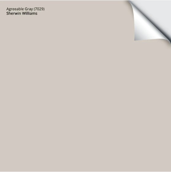
Sherwin Williams Agreeable Gray vs Repose Gray, Revere Pewter & More
COMPARING AGREEABLE GRAY TO SIMILAR, POPULAR SHADES
When choosing the best paint color for your room, it all comes down to one word – COMPARISON. Comparing similar shades shows the difference between colors regarding undertones, depths, and intentions.
COMPARISON IS THE MOST IMPORTANT PAINT PICKIN’ TOOL
And because Sherwin Williams Agreeable Gray is a super popular warm gray/greige paint color, it’s time we made some straight-up comparisons.
How do I know that Agreeable Gray is the BEST? It’s in 5th place on SAMPLIZE Peel & Stick’s 200 most popular colors of 2024; the only colors beating it are white. This said, it was in 4th place in 2022…just sayin’.
So, without further ado, let’s get this color party started…

1. AGREEABLE GRAY vs REPOSE GRAY
There’s no doubt that Repose Gray is one of the most popular gray paint colors (8th place in 2022, 18th place in 2024—which ain’t shabby, given the thousands of paint colors available). However, which one is the better color is open to opinion.
If you ask this crazy lil Ginger, it’s a no-brainer – Agreeable Gray is the superior choice to Repose Gray (shown above). However, many would disagree. So, let’s see how they compare.
THE DIFFERENCES BETWEEN AGREEABLE GRAY & REPOSE GRAY
- Agreeable Gray is warmer than Repose, although both are warm neutrals.
- Agreeable Gray is a touch lighter than Repose Gray. Repose has an LRV of 58, while Agreeable’s is 60, so there’s a relatively subtle shift in depth.
- Agreeable Gray’s undertones are more subtle than Repose Gray’s. Both can grab a violet or green hue, but Agreeable Gray is far more vague in its approach.
- When coordinating with interior finishes, Agreeable Gray suits more interior finishes than Repose Gray.
- Trends are leaning warmer and away from gray. Agreeable Gray is warmer than Repose Gray, making it a ‘trendier’ color (but neither is timeless).
But just because I refer to Agreeable Gray WAY more in my day-to-day Color Consulting doesn’t mean Repose Gray doesn’t have its place…
It’s just that Agreeable Gray is a BIT more flexible for the average home and its finishes…
Now, don’t get your knickers in a knot. If you already have Repose Gray in your home, good on ya. However, if you’re choosing between the two, I almost ALWAYS cater to Agreeable Gray over Repose Gray for the above reasons.
Sampling paint just got a whole lot easier…
Get your Samplize PEEL & STICK sample of Agreeable Gray
DOES REPOSE GRAY GO WITH AGREEABLE GRAY?
Yes, Repose Gray and Agreeable Gray can look good in a color palette. Would I put them in the same room? HELLLLS NO, but I would consider them for rooms beside each other or in the same home.
WHICH ONE DOES KYLIE M LOVE THE BEST?
Yes, I do like to refer to myself in the third person. As mentioned earlier, I’ll take Agreeable Gray any day over Repose Gray. Again, if you have Repose, you do you—it’s a beautiful color for many homes. However, of the popular gray and greige paint colors, Repose Gray is usually the least likely to suit my clients’ homes.
Color Review: Sherwin Williams Repose Gray
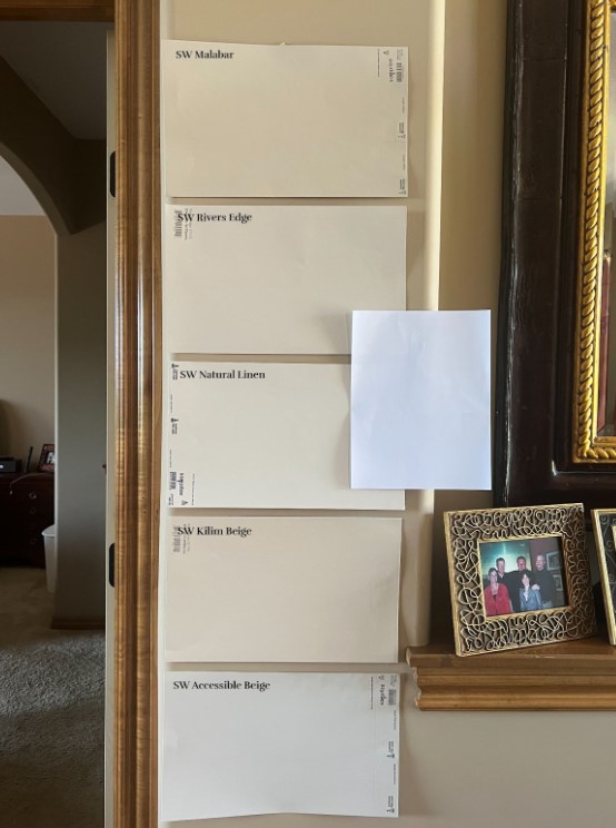
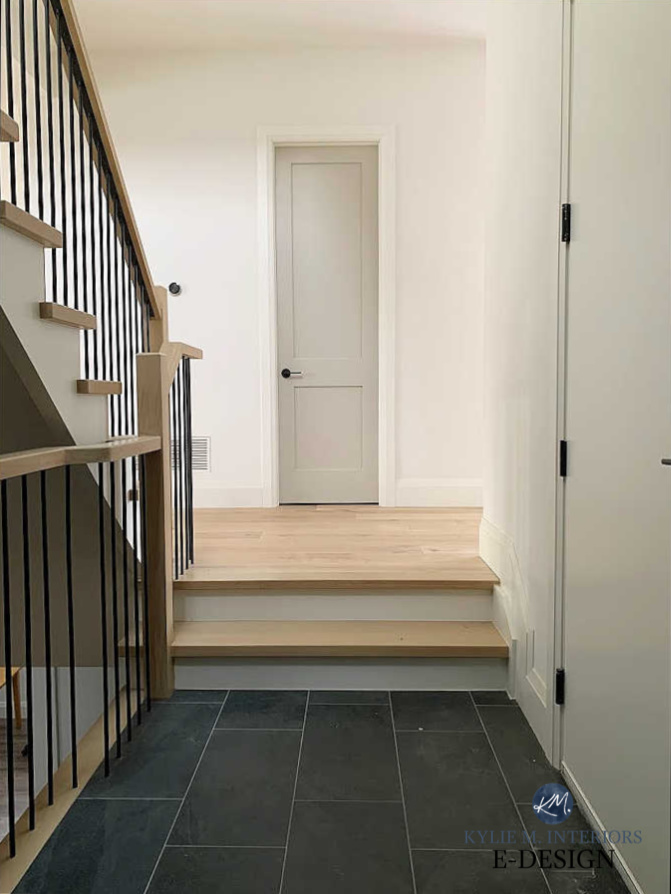
2. AGREEABLE GRAY vs. ACCESSIBLE BEIGE
On the other side, sliding in with a bit more warmth, is Sherwin Williams Accessible Beige. Whereas Agreeable Gray leans into gray but is a greige/warm gray at heart, Accessible Beige is a beige that leans a wink into gray.
And where Agreeable leads the greige-taupe (and gray) realm, Accessible Beige leads the beige world – but still sits at 17th place overall.
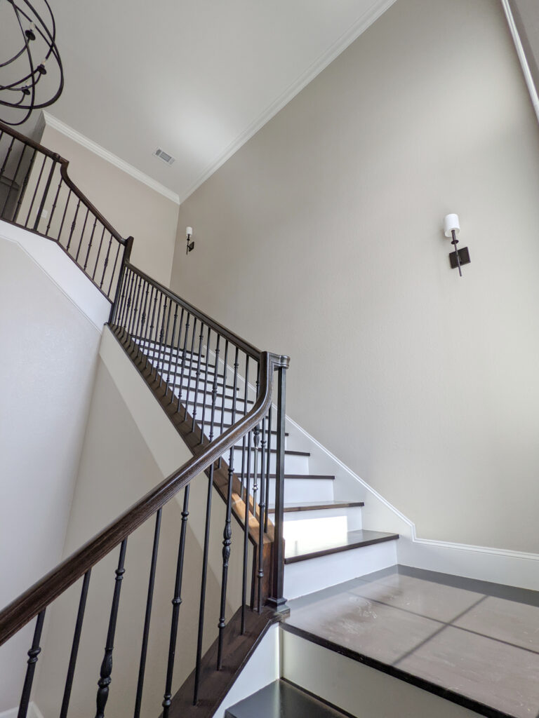
Accessible Beige is STUNNING in this staircase.
But what are the OTHER differences between Agreeable Gray and Accessible Beige? While the shift isn’t DRASTIC, it’s noticeable. And with trends shifting warmer and warmer, you should expect to see more of Accessible Beige in the coming years.
THE DIFFERENCES BETWEEN AGREEABLE GRAY & ACCESSIBLE BEIGE
- Accessible Beige is a beige, making it warmer than Agreeable Gray, which is a greige-taupe (so it has more gray in it)
- Accessible Beige has an LRV of 58, to Agreeable Gray’s 60. This means Accessible is a touch darker.
- Both shades have subtle undertones. Accessible Beige’s undertones are as nuanced as Agreeable’s, but AG can grab violet and green (occasionally, blue). As for Accessible, the odd time a flash of green or pink comes up, but not often.
- When it comes to coordinating with today’s (and yesterday’s) interior and exterior finishes, it’s a toss-up. However, for TODAY’s trends, I’m giving the title to Agreeable Gray as being the most flexible.
- Agreeable Gray is more popular than Accessible Beige, but they have different intentions because one is a greige-taupe, and the other is a beige. If your home suits either, I’d go for Agreeable Gray (ask me in one year, and I bet it will be Accessible Beige).
- Accessible Beige can look awesome in north-facing rooms to balance the cool light. Agreeable Gray can look a bit flat/cool in some northern spaces, especially with low light.
North, East, South, West: Which Paint Color is The Best?
Given the right lighting conditions, these two neutrals can look similar (compare the photos above and below). But there is no mistaking it: Accessible Beige is warmer.
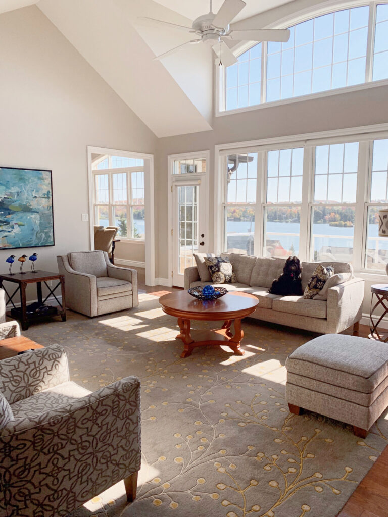
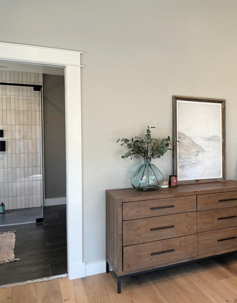
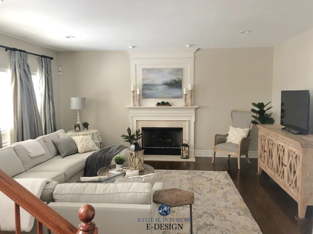
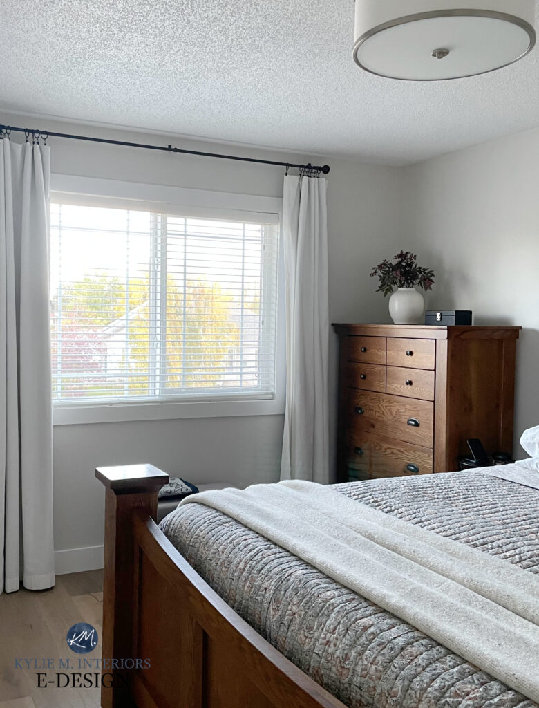
Agreeable Gray is a great choice for this living room.
Sherwin Williams Accessible Beige
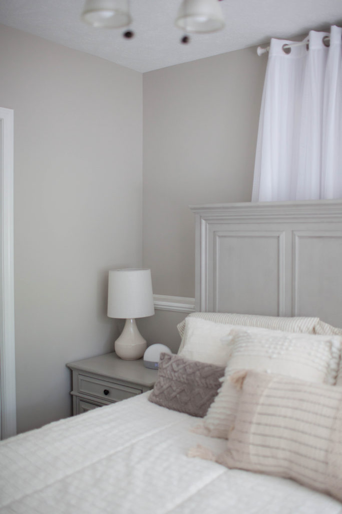
Agreeable Gray is soft and subtle in this guest bedroom.
DOES ACCESSIBLE BEIGE GO WITH AGREEABLE GRAY?
I wouldn’t put these two neutral shades in the same room; I might put them in neighboring rooms for a layered but subtle neutral palette.
Why the hesitation?
Warm colors are FUSSY about being partnered with colors that are cooler and lighter than them. While Agreeable Gray is only fractionally lighter, Accessible is slightly uneasy—not enough to stop me from partnering them up, but they’re on edge (Accessible Beige prefers the darker version of Agreeable Gray—Anew Gray).
Get your SAMPLIZE PEEL & STICK (shown above) of Accessible Beige!
Compared to ‘traditional beige paint colors,’ look at how MUTED Accessible Beige looks in the above photo—it hardly looks beige at all.
WHICH ONE DOES KYLIE M LOVE THE BEST?
With trends leaning warmer – and my personal preferences leaning this way, my vote goes to Accessible Beige.
By the way, my site is 99.9% powered by my E-Design client’s photos—thank you, everyone! This helps me show you REAL homes, keeping things relatable and real.
Paint Color Review: Sherwin Williams Accessible Beige SW 7036
Sherwin Williams Agreeable Gray FULL Paint Color Review
3. AGREEABLE GRAY vs REVERE PEWTER
AHHHH, the titans of the neutral world! Benjamin Moore Revere Pewter is one POPULAR shade of gray (subtle greige). However, when I look at SAMPLIZE Peel & Stick’s 200 most popular colors, Revere Pewter is in 9th place to Agreeable’s 5th.
Yes, that is a very narrow door – but it looks GREAT in Revere Pewter!
But is there a noticeable difference between Agreeable Gray and Revere Pewter? You bet your BOOTY there is (coming from a booty that’s been bet on MANY a’ time).
Both Agreeable Gray (above) and Revere Pewter are AWESOME cabinet colors.
Subscribe to my YOUTUBE channel for more great Kylie M. content!
THE DIFFERENCES BETWEEN AGREEABLE GRAY & REVERE PEWTER
- Revere Pewter can look a bit WARMER than Agreeable Gray, but it depends on the surroundings, exposures, and interior finishes.
- Agreeable Gray (LRV 60) is lighter than Revere Pewter (55) by approximately one shade. This bit more depth contributes to Revere Pewter looking a bit warmer at times.
- Revere Pewter favors a green undertone that can be MORE noticeable than Agreeable’s ‘barely there’ hues (remember, every gray has undertones!).
- Agreeable Gray is hands down a more flexible shade that suits a wider range of finishes. This is because of its more muted undertones.
- Agreeable Gray is more popular than Revere Pewter, likely because of its lighter approach (Revere Pewter can seem a touch heavy in some spaces).
- Agreeable is better suited to darker spaces and hallways, although both can look heavy without adequate light. Both spaces suit a room with south-facing light for balance without going super gray.
The EVER-lovely, Revere Pewter
DO AGREEABLE GRAY & REVERE PEWTER GO TOGETHER?
Do these two shades look good together? Ermmmm. No. They’re competing for the same position, and if you ask me (which you kind of are, btw), one is doing a better job (AG).
WHICH ONE DOES KYLIE M LOVE THE BEST?
Oh, MAN, I was afraid you’d ask this. Okay…by a slim margin, I have to say Revere Pewter, as I love its muddiness and subtle green hue. I even have Revere Pewter on my kitchen cabinets…
The Best NON-WHITE Paint Colors for Kitchen Cabinets (Off-White/Light Depths)
Benjamin Moore Revere Pewter’s Paint Color Review
4. AGREEABLE GRAY vs EDGECOMB GRAY
I’m always excited to compare Agreeable Gray and Benjamin Moore Edgecomb Gray (this said, I’m easily excitable).
Why?
These two are often at the TOP of the list when my clients mention the ‘colors they’re considering.’ And really, they’re doing the SAME THING, just hitting different ends of the greige-taupe scale.
I looooove me some Edgecomb Gray – ANY DAY OF THE WEEK!
What about the SAMPLIZE Peel & Stick scale? Again, Agreeable Gray is in a hot 5th place, whereas Edgecomb Gray comes SURPRISINGLY in 15th place.
Why is this surprising? Benjamin Moore Edgecomb Gray has been a HOT color in my previous six months of work, and I’m sure we’ll see more of it as trends lean warmer.
How to Create a TIMELESS Home: 4-PART SERIES
THE DIFFERENCES BETWEEN AGREEABLE GRAY & EDGECOMB GRAY
- Edgecomb Gray is much warmer than Agreeable Gray, making AG look GRAY in comparison—this is the scale I was referring to. Edgecomb is a greige-taupe that leans WARMER; Agreeable is a greige-taupe that leans HARD into gray (Greige vs. Taupe: What’s the Big Difference?).
- Edgecomb Gray’s LRV (depth) is 63, which is a little shot lighter than Agreeable Gray’s LRV of 60.
- Both colors are NOT COMMITTED to any undertone and can flex depending on their surroundings. However, whereas Agreeable Gray most often flashes violet or green, Edgecomb is likelier to wink at green or pink.
- Which one is easier to coordinate with? I have to give that to Edgecomb Gray.
- As for which one is more popular when given a choice (when their room can handle EITHER), more people seem to choose Edgecomb, contrary to what the SAMPLIZE stats show.
- With trends leaning warmer, you should expect to see more of Edgecomb Gray—but will it come in ahead of Agreeable Gray? We’ll see!
Edgecomb Gray in a transitional style living room

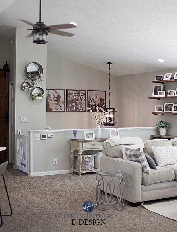
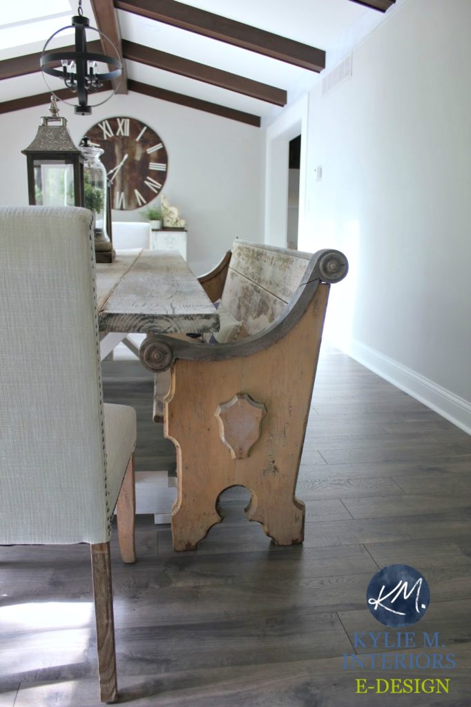
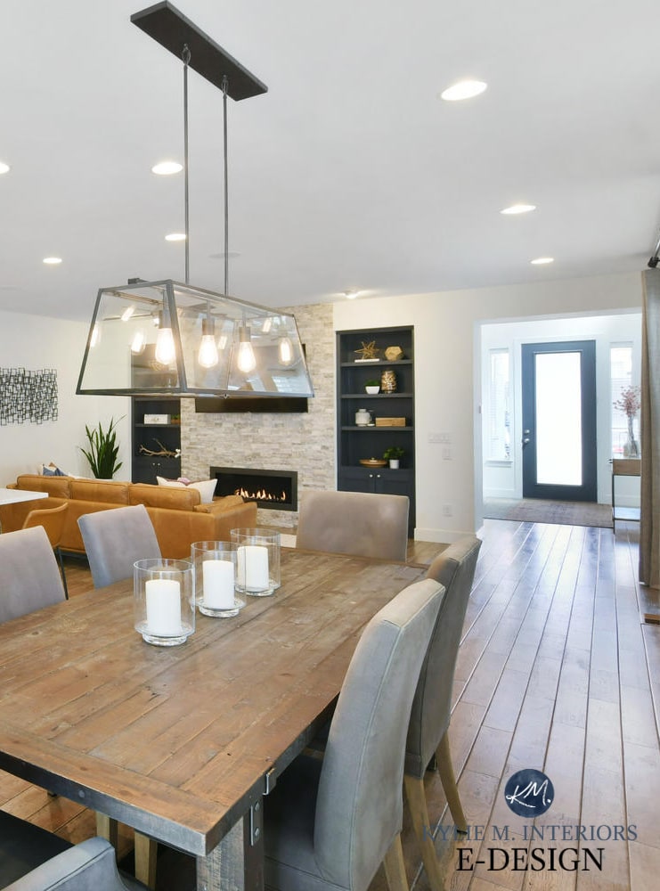
Agreeable Gray in a rustic farmhouse dining room
WHICH ONE DOES KYLIE M LOVE THE BEST?
Awwww, thanks for asking! Benjamin Moore Edgecomb Gray has my heart – no doubt about it.
Benjamin Moore Edgecomb Gray’s Paint Color Review
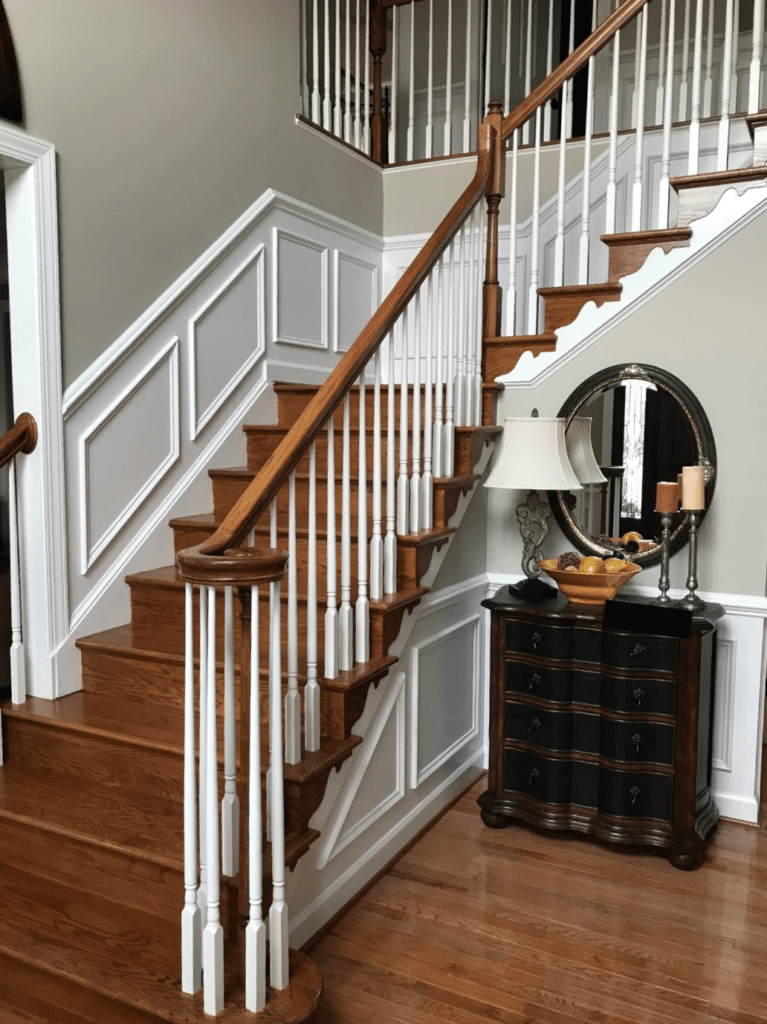
5. AGREEABLE GRAY vs CLASSIC GRAY
My clients often mention Agreeable Gray and Benjamin Moore Classic Gray in the same sentence, for good reason. These two popular neutral shades have one BIG difference and quite a few similarities!
Which one is in the lead for the top spot? Classic Gray is in 16th place, which is pretty smokin’ compared to the 5000+ colors behind it.
THE DIFFERENCES BETWEEN AGREEABLE GRAY & CLASSIC GRAY
- I wouldn’t say that one is overly warmer than the other – they both have the potential to shift HARD into gray in certain exposures and lean surprisingly warm in others!
- Classic Gray has an LRV of almost 74, putting it a SOLID shade or two above AG at 60. In fact, Agreeable is in the light range, and Classic Gray is an OFF-WHITE (learn about LRV).
- Classic Gray’s undertones are slightly violet (violet-pink) and not inclined to grab green. Of the two, Agreeable Gray is more likely to grab green.
- As for flexibility – both are FAR more flexible than me. One of the main differences is how they partner with white trim. Classic Gray is MUCH fussier about its white trim partners, whereas Agreeable Gray can handle a few more soft whites (as well as brighter ones).
Benjamin Moore Classic Gray: Paint Color Review
Sherwin Williams Agreeable Gray FULL Paint Color Review
DO AGREEABLE GRAY & CLASSIC GRAY GO TOGETHER?
You bet they do. While they can be a BIT touchy in the same room, they’re quite happy in adjoining rooms.
Agreeable Gray is on the door and trim, and Classic Gray is on the walls.
Benjamin Moore’s Classic Gray Paint Color Review
WHICH ONE DOES KYLIE M LOVE THE BEST?
I love Classic Gray…a lot. Nuff said.
6. AGREEABLE GRAY vs COLLINGWOOD
Benjamin Moore Collingwood is the MOST SIMILAR to Agreeable Gray – no doubt about it. But there is no PERFECT match between brands, so let’s see what these two popular shades have up their sleeves…
Benjamin Moore Collingwood with Simply White trim
THE DIFFERENCES BETWEEN AGREEABLE GRAY & COLLINGWOOD
- Collingwood is at a surprising 52st place compared to Agreeable’s 4th. This surprises me, as Collingwood is equally awesome and one of the most similar shades.
- Collingwood can come off a TOUCH warmer than Agreeable, but both are darn similar.
- Both can be open to interpretation as to whether they’re warm gray or taupe-greige.
- With an LRV of 62 (right on my happy place), Collingwood is a TOUCH lighter (learn about LRV!).
- The BIG difference is that Collingwood favors a violet undertone. Agreeable Gray has a bit less undertone and can go green or violet – its reduced undertone is probably why it’s more popular.
- As for versatility, they’re both VERY versatile, suiting a wide range of finishes.
WHICH ONE DOES KYLIE M LOVE THE BEST?
I don’t have a favorite between these two; they both hold a solid place in the cockles of my heart (wherever they are). It’s just a matter of whether that tiny touch of violet is needed (if it is, Collingwood’s the winner-winner chicken dinner. If not, Agreeable is the one).
Benjamin Moore Collingwood – Paint Color Review
7. AGREEABLE GRAY vs WORLDLY GRAY
Okay, now we’re just splittin’ hairs. Seriously though, there IS an important difference between these two shades.
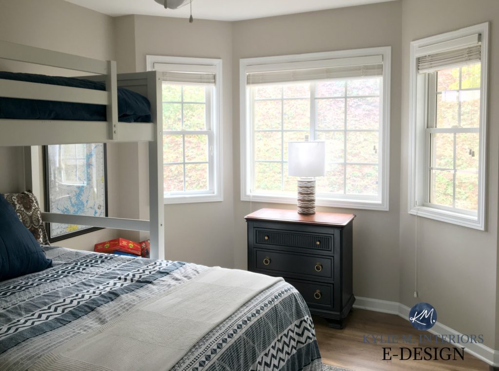
Sherwin Williams Worldly Gray in a guest bunk room
First, Agreeable Gray is HUGELY popular compared to Sherwin Williams Worldly Gray. Compared to Agreeable’s 5th place, Worldly Gray’s 64th place is a little lackluster. But considering this is out of 5000+ paint colors – 45th ain’t so shabby.
Sherwin Williams Agreeable Gray with dark wood beams
THE DIFFERENCES BETWEEN AGREEABLE GRAY & WORLDLY GRAY
- Worldly Gray is WARMER than Agreeable Gray. So, whereas Agreeable Gray can pass as a warm gray, Worldly Gray isn’t as inclined.
- Worldly Gray has more meat on its bones with an LRV of 57, to Agreeable’s 60. This makes Worldly Gray about a half shade or so darker.
- Agreeable Gray has flexible undertones, whereas Wordly Gray isn’t HARDCORE; it does have weeee bit more preference for a green hue.
- No question, Agreeable is FAR more flexible than Worldly Gray when coordinating with popular interior finishes (due to its minimal undertone).
Sherwin Williams Worldly Gray Paint Color Review
PEOPLE ALSO ASK THIS ABOUT AGREEABLE GRAY…
With its popularity, there are a LOT of questions surrounding Agreeable Gray. Here are some answers!
WHAT PAINT COLOR IS SIMILAR TO BUT LIGHTER THAN AGREEABLE GRAY?
Benjamin Moore Classic Gray has a very similar look to Agreeable Gray but is far less likely to grab green (keeping in mind that AG doesn’t grab it often either).
Paint Color Review of Benjamin Moore Classic Gray
WHAT PAINT COLOR IS SIMILAR TO AGREEABLE GRAY BUT DARKER?
Sherwin Williams Anew Gray is a bit darker than Agreeable Gray, with an LRV of 47. With its increased depth, it’s also a touch warmer.
Sherwin Williams Anew Gray Paint Color Review
WHAT IS THE BENJAMIN MOORE EQUIVALENT TO AGREEABLE GRAY – WHICH COLOR IS MOST SIMILAR?
Benjamin Moore Collingwood is the closest match to Agreeable Gray, but as explained above, shifts in undertone and LRV are the main differences.
Benjamin Moore Collingwood Paint Color Review
WILL AGREEABLE GRAY BE TOO BEIGE OR TOO GRAY?
This question is open to perception. Agreeable Gray is hardly EVER too beige for my clients but is occasionally too gray. If your room is north-facing, you might need a bit more warmth. However, it can be a great moderator for an overly warm south-facing space!
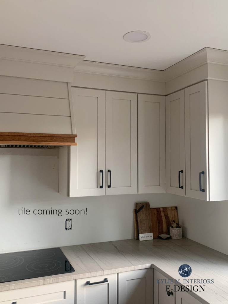
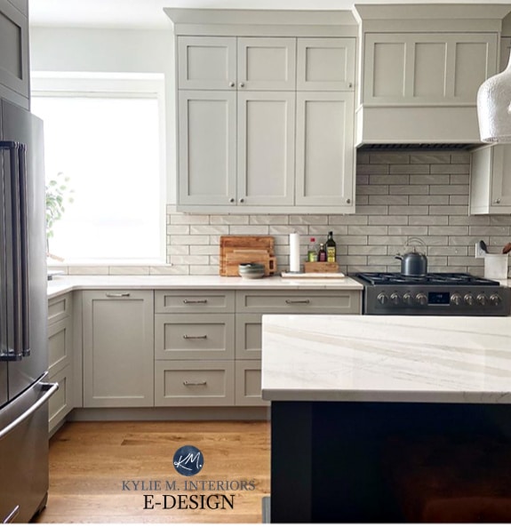
IS AGREEABLE GRAY A GOOD COLOR FOR KITCHEN CABINETS?
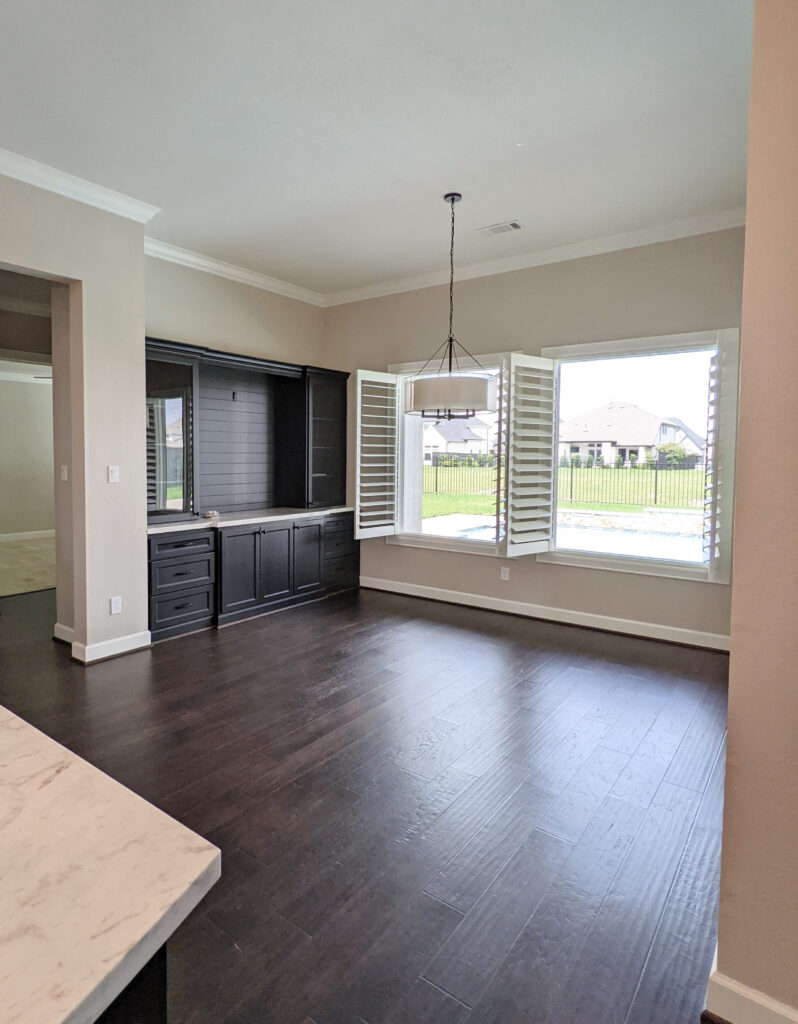
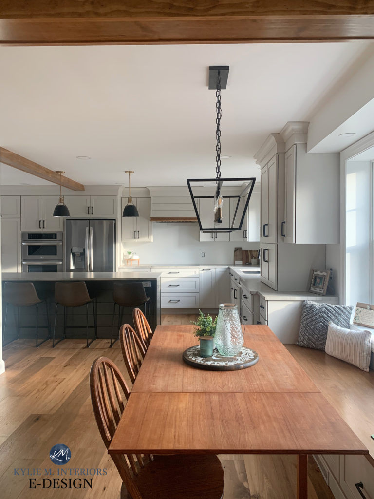
Heck, yes, Agreeable Gray is a GORGEOUS cabinet color, as long as it suits the surrounding finishes (countertop, flooring, wall color, etc.), as shown in this kitchen below.
To learn MORE about Agreeable Gray, check out its ONE-ON-ONE interview HERE.
READ MORE
The 12 Best Whole Home Gray & Greige Paint Colors
Do You Love Agreeable Gray? Check out These HOT SHADES!
The Best Off-White & Light Depth Paint Colors for Cabinets
The Best Warm Neutrals That AREN’T BEIGE!
The Ultimate Guide to Choosing White Paint Colors
NEED HELP?
CHECK OUT MY ONLINE PAINT COLOR CONSULTING!

ORIGINALLY WRITTEN IN 2022, UPDATED IN 2024


I definitely have quite a bit of experience with Agreeable Gray, Anew Gray, and Repose Gray. I am choosing Agreeable Gray for my husband’s office that faces north. I have a rug that is a modern mixed pattern (kind of blotchy) that has a gray/green tint that is moving into that room and that is why. Repose Gray is in our guest bedroom (formerly our son’s bedroom.) It works well there and leans a definite blue because it gets good strong sunlight for half of the day.
You’ve inspired me to finally get down to painting that office space! Thanks for another fantastic, comprehensive review of these varying shades of gray/greige!
WAHOO, sometimes you just need that little push to get some paint on those walls – even I need it sometimes! I’m so glad you found it helpful :).
This is hands down one of your all time BEST posts. I hope you get hired by HGTV one day! You are truly fantastic at what you do. LOVE, LOVE L O V E yoir content!
GAHHHHH, what a fabulous comment – THANK YOU! And one can dream ;).
Great post, as always, thanks Kylie! Question — can you direct me to information you have about lightening a color, in particular, when does lightening change the undertones? Is it after lighter by 25%, 50%, always, etc. I saw a blog post from last year where the person was saying that a new trend for builders is painting a whole house a “barely there” color (rather than using white or off white) and she suggested lightening several colors in the pictures by 25% to get the effect of the rooms she showed. So would lightening Revere Pewter by 25% or 50% give you something closer to Agreeable Gray depth? Or should you switch to another color if you want to go beyond a certain percentage? Hope that makes sense!
Ohhh…I was hoping she had replied! I have the exact same question. I know in one of KM’s posts, I believe she said 25% lightened/darkened is about 4 points on the LRV scale; however, I have the same question “at what point is it better to just look for another color”. I want to darken Edgecomb, bit is 25% enough to make a difference and is 50% at the “you should just go with Revere Pewter”😵💫
Hiya Pam and Tanya! So, even though they’re above/below each other, Edgecomb Gray isn’t the lighter version of Revere Pewter :). When I love a color, but not the depth, I’ll try 25%, maybe 50%, but if that isn’t hitting the spot, it’s time to look for a NEW color!
Hi Kylie! Love your blog.
We’re in the midst of revamping some of the rooms in our 1875 four square and I’m lost with neutrals. The room I’m mostly lost on is the bathroom. Some things to note:
-I’m 100% painting the vanity BM Galapagos Green
-bath/shower is white
-floors are white with taupe/neutral marbling-
-countertop is TBD but likely white or a white “stone” laminate with neutral flecks
-This room is north facing and gets good light as it has a large window
-I tried BM Edgecomb grey thinking I’d love it and it looks way too light and “cream” on the walls
Any ideas on an awesome light/medium depth neutral to go with the white-whites and green?
Thank you!
Hey Carli, it’s SUPER hard to say without seeing the room, but maybe you’d like SW Anew Gray/Requisite Gray/Versatile Gray? They definitely have some more depth to them!
I referred to your blog quite a bit prior to repainting our interior walls. It was very informative, thank you for sharing! We definitely wanted a warmer gray to replace the 2000s beige / antique white Tuscan extravaganza. Ultimately I went with sw skyline steel, a color that I found few writeups on line for. For us, hit the right level of warmth without going too greige or muddy looking. Undertones have been minimal. Paired with sw pure white trim. Anyway, might be a color you’d find interesting.
I haven’t had much experience with this one, but it has caught my eye several times – I’m glad you love it!
Have a 1926 tudor. Painting my 3 floor hall in Collingwood, The master bedroom which has a full wall of white built in closet/drawers I’m liking bone black, I’m looking to do an accent wall, what would you recommend that would compliment bone black. The master bathroom I was thinking of san antonio.
Thank You, Maria
Hi Kylie,
I have read so many of your articles. You have a great way of making paint interesting and fun. I am ready to paint kitchen cabinets and bar cabinets (a lot of cabinets here … 48 doors and drawers). They all have the same granite countertops and backsplash. Tile is swirled shades of light grays and a little beige. I have the dreaded arched oak cabinets. They also have the dreaded sapphire granite countertops. I actually like the countertops though. There are lots of east facing windows and modern LED ceiling lights. Thank goodness I got rid of the long tube fluorescent lights. I am not changing anything just painting.
I had pretty much decided on white but your article about white being a hard no made me rethink. I do love grays and this might be too many cabinets for white anyway. The paint will be SW so I am considering agreeable gray, on the rocks and big chill. Would these work? Should I stick with warmer or cooler grays?
Sorry for the long post.
So I had decided on Edgecomb to paint my living room…and what do you know…there isn’t a place that sells BM paint within miles of us!!! Do you have a Sherwin Williams dupe for it?
Oh Amy, I wish. Your best bet is to order a peel and stick sample from Samplize, so that you have it on hand to give to the paint store employee. Then, ask them to color match it. Make sure you check it before you leave the store with your paint – they should dry a small sample of it, 2 coats, to see if it blends with the real EG. Sure, it’s not 100%, but it’s closer than any of Sherwin’s existing colors. I mean, there’s Modern Gray, Egret White, Mortar, but none hold a candle to what Edgecomb Gray does!
This is so helpful!! We’re painting a colonial wood house White Duck! Any suggestions for which of these grays to put on the shutters? We want moderate contrast- like a house Becky Owens did with gray mist and revere pewter.
Need a sherwin color though!! I’m worried about choosing a gray that clashes with the creaminess of white duck 🥰 🤔
We also hope to do a light greenish gray front door.
Hi Kylie. Thanks for your help on our kitchen. I haven’t seen anything on your site mention basement colors. Leaning towards a grey with green/blue undertones for a feeling of color…you chose Edgecomb that we have throughout our whole upstairs so I want a little something. I’m reading that basements should be warm colors. Thoughts on Silverpointe? or Repose Grey. Since we don’t have natural light I won’t have to worry about lilac. Pale grey carpet with little grey/beige tweed. Really want a freshen up from the dark gold on the walls.
Hey Kiflyn, I actually have a GREAT blog post for this https://www.kylieminteriors.ca/the-best-light-paint-colors-for-a-dark-room-basement/ Also, I would probably avoid REpose Gray/Silverpointe as they could be a bit drab. If you want a gray-blue-green, Gray Owl is more popular or even lean in a bit more with BM Quiet Moments perhaps?
Hi, your articles are so great and informative! I’m renovating a ranch lake house. White kitchen cabinets and light gray island. Not decided on countertops yet but probably white quartz with some veining. Kitchen is open to living area and I was thinking of painting all the walls agreeable gray, pure white trim. Floors are light wood. Would that work? Also, planning on painting brick fireplace but not sure if to go all white or charcoal? What do you suggest? Please recommend color too. Thanks
My cabinets are aesthetic white and so is my trim. I was thinking of painting the walls agreeable gray. Will those colors look fine together? If not, is there a similar Sherwin Williams color that would be better?
Thank you!
If my walls have a slight yellow hue to them (they just say off-white match on the can the previous owner’s left), which gray would be the best for a contrast door in an upstairs, dimly lit hallway? Thank you!
OH boy, it’s impossible to say without seeing the walls, but off the top, maybe BM Revere Pewter, but try darkening it by 50% (not as drastic as it sounds).