
White Paint Colors: A Color Expert’s Quick Guide
All white all white all white…
When choosing the best shade of white for your walls, cabinets, trims, and ceilings, it doesn’t really matter which white you like. In fact, your preferences come at the bottom of the pile.
What comes first?
Oh, there’s a list (which we’ll get to shortly), but at the heart of it all is your home – it calls the big shots.

This is why we’re looking at some of today’s most popular white paint colors and what goes into picking the best one for your home. The topics we’ll be covering include…
- The HIERARCHY of choosing your best white.
- The FIVE TYPES of white paint colors.
- The main UNDERTONES in white paint colors.
- HOW TO CHOOSE a white paint color that suits your interior finishes and style
- How to choose a white paint color that suits your room’s EXPOSURE (north, south, etc)
You get all of that, plus…
- Tips and ideas to MIX & MATCH white paint colors in a room (and whether you even should).
- Links to the best white paint colors and their FULL COLOR REVIEWS.

Let the games…BEGIN!
1. THE HIERARCHY: WHAT MATTERS THE MOST
When choosing your best white paint color, there’s a hierarchy of considerations.
While there are exceptions (there are ALWAYS exceptions), these categories will get you started and are in order of importance.
a) YOUR INTERIOR FINISHES ARE THE BOSS
Your interior finishes call the BIG shots. If your paint colors don’t coordinate with your interior finishes, you’re up shit’s a very muddy creek.
Of course, you can put your home’s needs aside and choose the white you love – fill yer lil white boots. Just don’t assume it will work with your finishes.
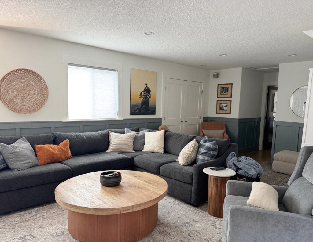
For example, the owner of this next kitchen must have envisioned warm, soft white for their cabinets and thought this color would achieve that…
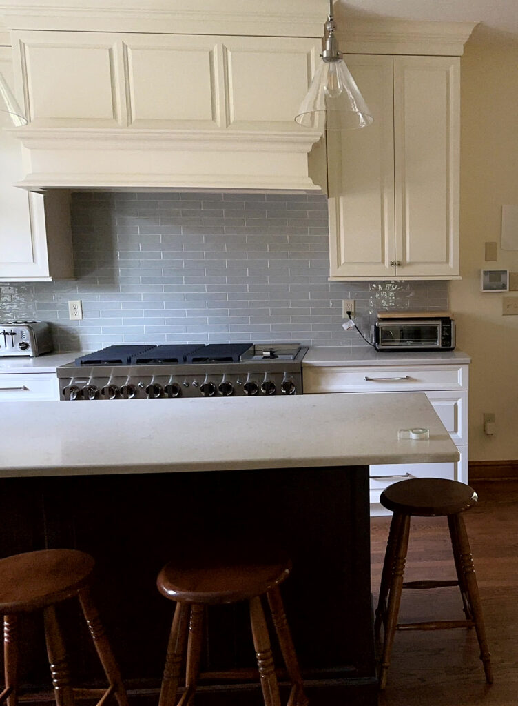
Oh, it gave it to them, alright – right up the rear. They didn’t listen to their home (or didn’t sample and compare enough), as the creamy yellow cabinet color is too strong for the countertop and backsplash.
Now, look at the lower cabinets in the above photo. Even this small sample area looks a million times better.

b) YOUR HOME’S EXISTING PALETTE
Your current paint color palette might already feature the right shade of white, particularly on trims or cabinets. In that case, you likely need to repeat this white to avoid a hot mess of white madness (read more about this).
If you already have a white finish and want to keep it, you fall into one of the following three situations…
- THE RIGHT WHITE: The white that’s already on your walls, cabinets, or trim is the best white for your room (and you know it, not just hoping). In this case, use the same white for your newly painted surface.
- THE WRONG WHITE: The existing white isn’t the right white for your room in the first place and should be changed to a more suitable shade. Just because it’s THERE doesn’t mean it’s the right color. Trying to integrate it could make things worse. Using it on ANOTHER surface, well, stick a fork in your room – it’s done.
- OPPOSING FINISHES: You have finishes that suit different types of white. This means that the white you currently have might suit one finish, but not another. This is common in an open-concept home, e.g., you have a fireplace tile that suits a true white, but the kitchen backsplash suits a soft, warm white. This means your home wasn’t coordinated carefully enough, and you might need two different whites – one in each area. Ideal? No.

But when working with existing finishes, sometimes the ideal world doesn’t exist and we have to find the next best thing!
But let’s think on a smaller scale, like a closed-in kitchen. Let’s say you already have white trim and want to paint your cabinets white. But (Kardashian-sized, so it’s a big one), the white on your trim is too bright, dark, or creamy for your cabinets.

This means your existing trim color isn’t the right white for your room in the first place. Not only can it not go on the cabinets, but it shouldn’t be on the trims, either.
What does this mean?
If it’s the right white for your SPACE, it should suit your trims and cabinets. Suiting one but not the other means that something isn’t working. Of course, if your finishes have different white needs, you might need to mix things up, but let’s think positively.
If you need help finding the next best thing, you know where to find me.
Moving along…
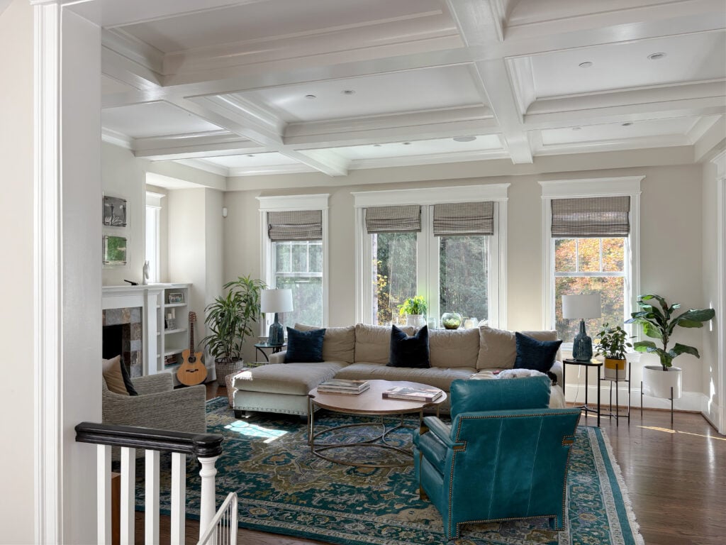
c) YOUR ROOM’S EXPOSURE
The exposure of your room will DIRECTLY affect how warm or cool a white paint color looks.
In this next kitchen, Benjamin Moore Chantilly Lace is on the walls and cabinets…
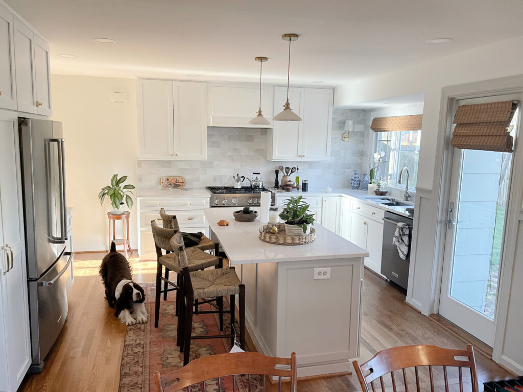
- Notice how warm Chantilly Lace looks on the far left walls, which are being hit by the afternoon western sun.
- Compare the left wall to the cabinets on the far right, which appear almost blue-violet.
- Ignore the wall color entirely and focus on the subtle shift in cabinet color from left to right, from warm to cool.
ISN’T COLOR FUN?! Said nobody but me.
d) PERSONAL TASTES
Guess who comes in last place – you! Don’t take it personally; putting your tastes aside is your best chance of finding the perfect white paint color for your home.
Remember, if you love a color but it doesn’t suit your interior finishes, you shouldn’t use it.
WHY DOES ANY OF THIS MATTER?
Because if you focus on the white YOU love without considering these other topics, there’s a good chance you’ll end up with the WRONG white. If this happens, you’ll be tossin’ back the white (wine) as you sob in a corner, hyperventilating and twitching uncontrollably (it’s quite therapeutic, but won’t fix your fugly white problem).
And as promised, here’s the full blog post on the above topic…
How to Choose Paint Colors: Who’s The Boss
2. THE FIVE ‘TYPES’ OF WHITE PAINT COLORS
Don’t be scared; once you figure out which type of white your home leans into, you can focus on the very few whites that will actually work in your space. And guess what, buttercup…
There are probably only two to three white paint colors that actually SUIT your home – let’s find ’em.

That’s right. Out of the DOZENS of whites you might have explored, only a small handful will look good. Learning which white paint color best suits your interior finishes is your FIRST step in choosing the best color for your room.
And because this topic is so near and dear to my heart (right up there with Ryan Gosling and Cornuts), I wrote an entire blog post about it (I’ll also include a link at the end of this post). For now, here are the basics…
#1: WARM WHITE PAINT COLORS
While white paint colors can have other undertones, the most POPULAR shades lean toward a yellow hue, giving a creamy white look in many situations or a bright, warm white look in others…
Benjamin Moore Cloud White is a popular warm white paint colour.
Many people get nervous at the idea of yellow undertones. However, this particular color is found in the most popular shades of white, so don’t let the ‘y’ word scare you off.

Benjamin Moore Simply White (tall strip on the right) is a BRIGHT, WARM white.
If your main surface (i.e., countertop or tile) features a warm white tone, it makes sense that a warm white paint color would be the best choice.
Warm whites are the most common, as they’re found in more interior finishes than true or cool white paint colors.
In this next kitchen, the backdrop of this countertop (Brittanica Warm) is a soft, slightly warm off-white…
How would I KNOW the above countertop is a soft, warm off-white? I’d compare it to a *TRUE white paint color and note the differences (which I did, as it’s the countertop in my kitchen).
*We’ll learn about the best true white paint colors shortly. When choosing paint colors, always have a few onhand for comparison’s sake.
THE 5 BEST WARM WHITE PAINT COLORS
These are in ‘most popular’ order based on my Online Color Consulting…
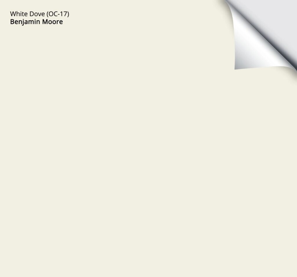
- Benjamin Moore White Dove (here’s its review )
- Sherwin Williams Pure White (review)
- Sherwin Williams Alabaster (review)
- Sherwin Williams Greek Villa (review) – not my fave
- Benjamin Moore Swiss Coffee (review) – not my fave
If it were based on Kylie’s favorites, I’d take out Greek Villa and Swiss Coffee. Instead, I’d include Benjamin Moore Cloud White and Sherwin Williams White Snow. But hey, it’s not all about me – not all the time, sadly.
Are White Walls, Cabinets & Exteriors STILL TRENDY?
Sample and compare some of Kylie M’s favorite white paint colors in this CURATED COLOR BUNDLE.
#2: COOL WHITE PAINT COLORS
Cool white paint colors favor a blue or violet undertone, although, like my nostrils, a weeee willy wink o’ green pops up here and there. Sometimes, the overall impression is of a slightly ‘gray’ shade of white.
Benjamin Moore Decorator’s White is a cool white paint color – LRV 85
Cool white paint colors aren’t as popular, as they suit fewer interior finishes.
However, cool whites often pair well with some marble finishes or south-facing rooms. The challenge is that not many finishes coordinate with a cool shade of white, aside from white appliances and GE Cafe White.
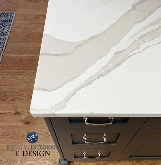
As shown in the following example, the marble tile leans more cool than warm. If you put a warm white with this tile and countertop, it would look yellow or dingy in comparison. Cool or even true white paint colors are the best choice…
THE 3 BEST COOL WHITE PAINT COLORS
- Benjamin Moore White OC-151
- Benjamin Moore Decorator’s White (review)
- Benjamin Moore Super White (here’s its review)
Sherwin Williams doesn’t have any great, popular cool whites.
Here’s a Peel & Stick sample of White…

#3: BRIGHT WHITE PAINT COLORS (warm or cool)
Bright white paint colors have higher LRVs, but undertones vary depending, as two types of bright whites combine a higher LRV and our previous warm/cool categories…
- WARM BRIGHT whites
- COOL BRIGHT whites

Benjamin Moore Simply White is one of the best warm, bright whites – LRV 92
BRIGHT WARM whites are more common than BRIGHT COOL whites – I don’t even have a good cool one to share with you.
Not sure what LRV is? READ ABOUT IT HERE – it’s a game-changer!
THE BEST BRIGHT WHITE PAINT COLORS
- Benjamin Moore Simply White (review)
- Sherwin Wiliams White Snow (review)
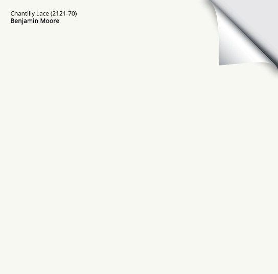
- Actually, we can toss Benjamin Moore Chantilly Lace (review) in here too; it satisfies two categories.
#4: SOFT WHITES (warm or cool)
Soft white paint colors have LRVs in the low to mid-80s, and like bright whites, there are two types…
- SOFT WARM whites
- SOFT COOL WHITES
Benjamin Moore’s White Dove is my favorite warm soft white – LRV 83.16
SOFT WARM whites are, by far, the most common, popular white paint colors for walls, cabinets, and trims.
Here’s a Peel & Stick sample of White Dove…
THE BEST SOFT WHITE PAINT COLORS (warm & cool)
- Benjamin Moore White Dove (review) & Swiss Coffee (review)
- Benjamin Moore Cloud White (review)
- Sherwin Williams Alabaster (review)
- Sherwin Williams Pure White (review)
- Sherwin Williams Extra White (review)
- Benjamin Moore Decorator’s White (review)
- Benjamin Moore Super White (review)
White Dove vs. The Top 10 Popular Shades of White
#5: TRUE WHITE PAINT COLORS
Like a fresh pair of tighty-whites vs the ones already in your drawer, true whites are the whitest of the bunch, clocking in with LRVs in the mid-90s.
True whites come in a hot second place to soft, warm whites in popularity, as their lack of undertone gives them a bit more flexibility. That being said, not everyone wants a super-white look (it’s popular among contractors and builders who don’t want to put much thought into their color palettes – shame shame).
THE BEST TRUE WHITE PAINT COLORS
- Sherwin Williams High Reflective White, but good luck getting it.
- Benjamin Moore Chantilly Lace (it’s not a TRUE white, but it’s BM’s whitest, brightest shade). Here’s its FULL REVIEW.
- BEHR Ultra Pure White, although I like their trim/cabinet paints somewhat, I’m not a huge fan of their wall paint.
Here’s a Peel & Stick sample of my favorite TRUE WHITE…
As promised, here’s a full-scale blog post on the 5 types of whites…
The 5 Types of White Paint Colors (in more detail)
Let’s do a quick checklist…
- We’ve covered the basic hierarchy. You should know where your first priorities lie.
- And because we’ve talked about the 5 TYPES of white paint colors, you should have an idea of the type of white your home might need (most likely a SOFT WARM white or BRIGHT WARM white). If this isn’t the case, you’ll figure that out soon enough.
3. THE UNDERTONES OF WHITE PAINT COLORS
When choosing a white paint color, many people focus on the undertones…or lack thereof.
White paint colors can have a range of undertones, with the most common being…
- Yellow (warm)
- Gray (with undertones of blue, purple, or green)
- Blue or purple (cool)
- Green (cool, unless it’s a green-yellow)
- Pink (considered a cool color, but can look soft and warm)
The best, most popular, warm white paint colors have a yellow undertone – it’s the nature of the beast.
Benjamin Moore Edgecomb Gray with White Dove
WHAT’S THE BEST WARM WHITE COLOR WITHOUT YELLOW UNDERTONES?
If a white doesn’t have a yellow undertone, where do you think the warmth comes from? There are no beige-whites or tan-whites, soooooo…
When it comes to warm white paint colors (and undertones), you’ll find yellow and pink. So, if you want warmth with no yellow, you get pink. Needless to say, not many people want a pink-white.
A better way to ask the question is…
What’s the best warm white paint color with the least yellow undertone?
Ahhhh, now we’re cookin’ with grease! If you want a warm white with minimal commitment to yellow, your best shade is Sherwin Williams Pure White (review). While it has fractional warmth, it’s well-grounded by a gray backdrop.
In the next image, see the horizontal white molding separating the shiplap ceiling and bulkhead? Consider the difference between the shiplap/molding and the drywall underneath it…

Pure White is the shiplap color, and is butted-up against Sherwin Williams Alabaster, a warmer, creamier shade of white.
Sure, if you put Pure White next to a true white, like some white subway tiles, it could look warmer – because it is. If it’s too warm, your next best bet is a brighter, true shade of white or a cool one.
You can’t get a good warm white paint color with some degree of yellow. End of story.
4. HOW TO CHOOSE A WHITE THAT GOES WITH YOUR HOME
As we chatted about earlier, no matter what else is happening in your space – not its exposure or your tastes – it’s essential that your white paint color coordinates with your interior finishes.
In the words of the great Britney, let’s hit that baby one more time…
Your white paint color must coordinate with your interior finishes.
This can be hard when your interior finishes have different needs. And while there’s a whole different hierarchy for THAT, if we take the example of a kitchen and choosing a cabinet color, most often it’s the backsplash that calls the color shots.
Of course, if you use a slab backsplash like this, you have one less finish to worry about!
It’s about choosing the best white paint color for the home you HAVE, not the home you wish you had.
Your interior finishes will tell you which type of white paint color they like the best – you just need to listen.
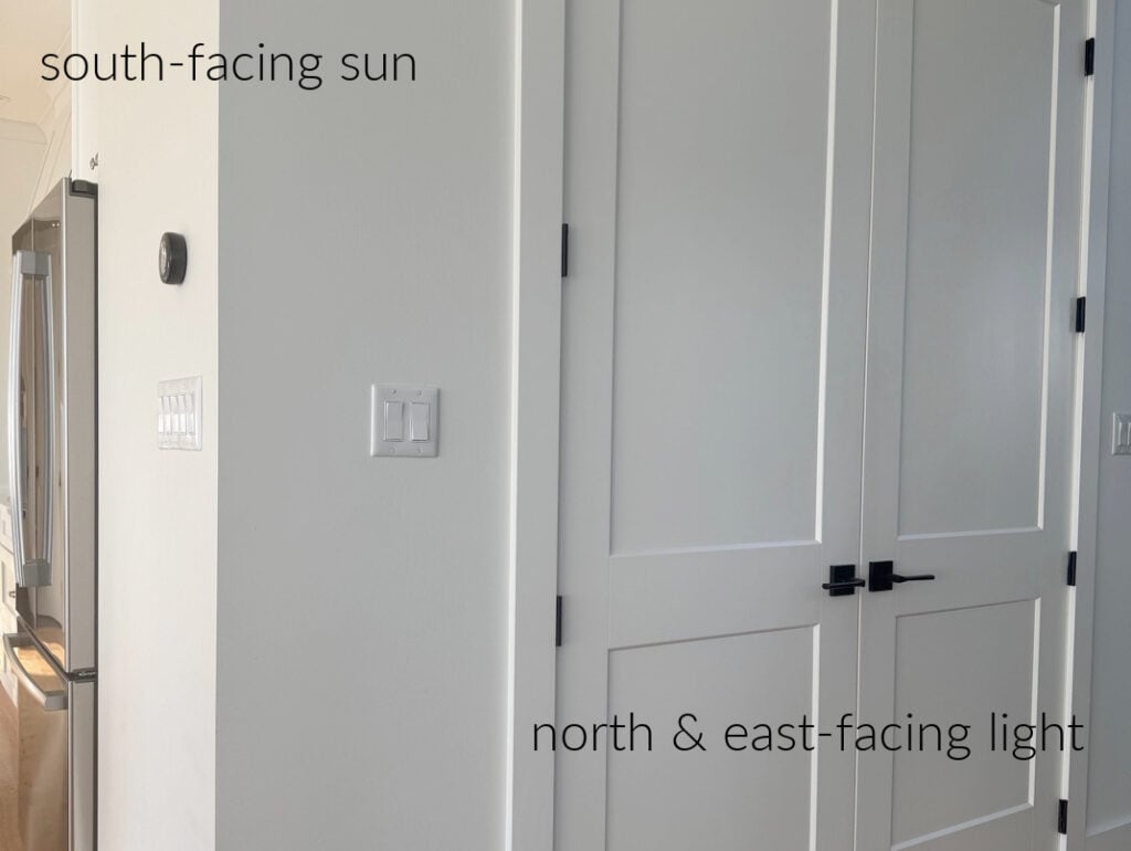
In this next home, with its white quartz countertops and southern exposure, Sherwin Williams Pure White was the best white paint color (on all surfaces) as it blends with the white subway tile backsplash…

Sherwin Williams Cyberspace is on the island
Generally speaking, when choosing new paint colors, vertical surfaces are more important to coordinate with than horizontal ones. For example…
- Your backsplash matters more than your countertop. It’s all fine and dandy if they suit the same color, but if not, you usually prioritize the backsplash.
- A fireplace surround matters more than a wood floor, especially a dominant one (e.g., not a small brick surround).
However, if you don’t have any bossy vertical surfaces, you might listen to your…
- Carpet, tile flooring, countertop, etc.
At first glance, this laundry room/mudroom below is pretty flexible, right? HARD NO! In designing this room, the white paint colour needed to be the same TYPE of white as the white subway tile…
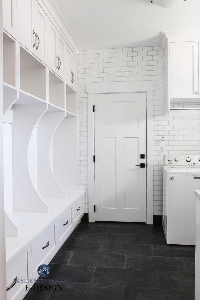
Why?
Compared to the true white subway tile, the wrong white paint color would make all the painted surfaces look dingy, yellow, violet, or blue (depending on which white we chose). They work well together because Sherwin Williams High Reflective White is the SAME TYPE of white as the tile.
Your room knows which type of white paint color it wants – you just need to find it!
White Paint Colors: Your Questions – Answered!
COORDINATING WHITES WITH COUNTERTOPS, TILES, & MORE
- The majority of interior finishes are WARM white, not cool or true white.
- Of these warm whites, more interior finishes lean into a soft, warm white over a BRIGHT one.
- If you have a finish that suits a COOL white (not as common, but it happens), it’s most likely to humor a blue-violet undertone.

If you don’t know where to start, grab WARM & SOFT white paint colors, as they’re the most likely to suit the average interior finish.
If these warm whites aren’t connecting, branch out to bright warm whites, true whites, and then cool whites.
As promised, here’s a large-scale blog post on this topic…
How to Choose Your Room’s Best White
Remember, this is the ULTIMATE GUIDE TO WHITE PAINT COLORS, which means we’re still going!
5. NORTH, EAST, SOUTH, WEST: WHICH WHITE IS THE BEST?
Whether your room has northern, southern, or INDECENT exposure (a constant in our bedroom), it’s important to consider your room’s exposure when choosing paint colors. And while the needs of your interior finishes come first, exposure can play a big part in how a paint color is perceived.
Is this why white paint colors are so DAMN HARD to choose?

You bet your cute little booty it is (one of the many reasons).
Because white paint colors have the highest LRVs (light REFLECTANCE value), they reflect the most light around a room.
So, if the light you give your white walls is tinted green by exterior landscaping or yellow by southern exposure, guess what color your bright white walls are going to reflect? Green or yellow.
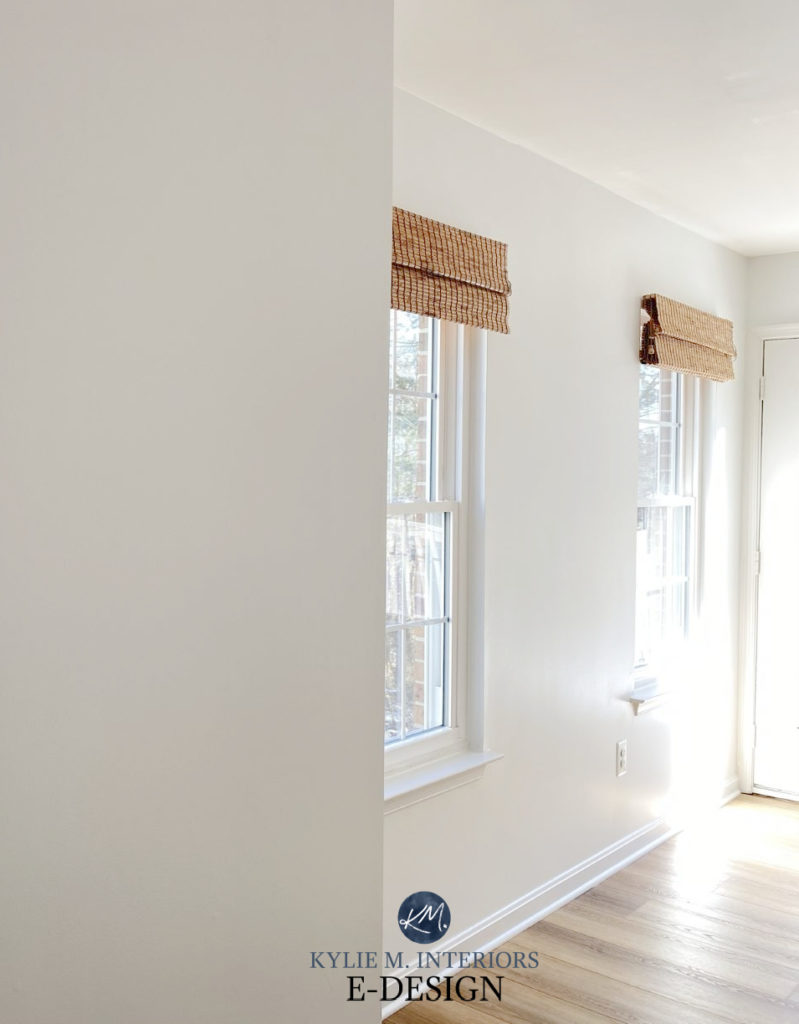
In the above photo, look at how Sherwin Williams Pure White warms up with a hit of western sunshine – and Pure White isn’t even one of the warmest whites!
Now check out the same color, Pure White, in this north-facing foyer…
How to Pick Paint Colors When You’re An OVERTHINKER (OR HAVE ANXIETY)
And guess what, buttercup? There’s avoiding this, short of boarding up your windows, cutting down your trees, or closing your eyes; tis’ the nature of the beast.
Generally speaking…
THE BEST WHITE PAINT COLORS FOR EXPOSURES
NORTH-FACING LIGHT: Warm whites. If it’s a darker space, choose a warm BRIGHT white.
SOUTH-FACING LIGHT: Warm whites can still work, but don’t go too hard on the creaminess. Some prefer bright whites. Few people choose cool whites as they aren’t as easy to live with on a cloudy day/when the sun goes down. Truer whites can be pretty.
EAST-FACING LIGHT: Warm whites tend to settle the best. Bright warm whites can be nice in eastern exposure that is low-light.
WEST-FACING LIGHT: With the extreme warmth of afternoon western sunshine, some lean into more moderate warm whites or bright warm whites. True whites can also be pretty.
And as previously promised…
The Best White Paint Colors for North or East-Facing Rooms
North, East, South, West: Which Paint Color is The Best
READ MORE
Are White Walls, Cabinets & Exteriors STILL TRENDY?
White Dove vs. Cloud White, White Dove, & 10 Popular Shades of White
The Best White Exterior Paint Color
Get the best paint color advice with Kylie M’s Online Consulting


I have BM’s Pure White trim all over my house and it looks nice. We’re getting ready to paint our orange-oak kitchen cabinets white but the Pure White will be too bright for our cream/tan backsplash and dark granite countertops. What are your thoughts on painting the cabinets and trim in the kitchen a soft/warm white and still keep the pure white trim in the rest of the house? The rooms are completely separate but I can see into the kitchen from our family room. Thanks!
Hi Terri, I would be VERY careful. One white can really exploit the undertones in another, undertones that might have been previously hiding! When it comes to whites it’s usually best to stick with the white you’re using or step RIGHT out of the white range and into something in the light family or darker. Remember, even though the name says Pure White, it’s actually quite far away from it as it has some cool violet hues that would DEFINITELY pop up against a creamier warmer white :).
Hi Kylie, Happy New Year! Thank you for writing this blog post. It comes on the heels of me trying to figure out what white works best for my home. The front of my home (workout room, guest room, and 1 hallway) is south-facing while the back of my home (foyer, 2 small hallways, living room, and kitchen) are north facing. For the past 6 months, I’ve been living with swatches of BM White Dove on the north-facing parts of my home and loved it. I recently tested Chantilly Lace in my south-facing hallway and while it was very bright, it had a bit of softness and warmth to it. I decided to do another test and paint this same hallway White Dove and feel like I made a bad mistake as it appears a bit too creamy. Should I paint the hallways a different color and leave the core of my house (foyer, living room, kitchen) White Dove. Or is there by chance a happy medium color outside of White Dove that has a tiny bit of warm without being color and is still white?
Oooo that’s tough. IDEALLY, you’d use the same white throughout for consistency and flow. My concern is that the whites might do what you want in the daytime, but at night, they’d give different vibes.
Hi Kylie – can you recommend a “faux” laminate marble look-alike that would pair well with BM white dove cabinets? I was thinking maybe Formica 6696-46 Carrara Bianco, Arborite P1015 UL, Versailles Marble or Arborite P1000VL Arabescato Marble – or should I just ditch the marble look-a-likes altogether? Your expert opinion would be greatly appreciated.
Hi Kylie,Happy New Year! Just to let you know I enjoy reading your blog posts and watching your video’s.Even when I don’t have a particular project in mind for the all the useful information you give out. I love your sense of humor sarcasm and innuendos.Keep it up!
Martin, THANK you for this comment, I love to hear this and Happy New Year to you too!
Hi Kylie! Thank you so much for all the helpful lessons. Following your blog’s advice last year, I was able to pick the correct white for my kitchen cabinets/walls/trim (BM White Dove…so pretty and versatile). We’ve just bought a new house that we move into next month and this post has already been so helpful! I can’t wait to get in there and use your tips!!
I love to hear this, Desiree, thank you for commenting!
I’m trying to soak up as much as I can from social media as we are in the middle of our first home build and I’m trying really hard to avoid hiring a designer.
After hours on social media I think I am making progress on my selections so far, but I am STUCK on this to the point of losing sleep…
I love and want a white kitchen! I have always had tan everything (walls & carpet), so never again. But I REALLY don’t feel confident in my “white” selections for quartz countertops, paint, subway tile backsplash and farmhouse sink (being delivered tomorrow)!
I’ve heard I don’t have to be all matchy, matchy, which I’m trying to break, but I know “clashing” whites will haunt me for life!
Do you have suggestions? I’ve been leaning toward Sherwin Williams pure white, extra white or snowbound for all paint (interior and exterior) but this feels like such a HUGE decision. I get totally lost trying to figure out the north, south, east, west angles (sheetrock going in today) and I have no existing interior finishes to consider yet. We have tons of large windows, so I’m guessing we will have a lot of natural light. We are also narrowing down LVP flooring options, likely in a light wood tone.
Is there a magic combination that I haven’t discovered yet???
Once I get past this hurdle, I think the rest will come together 🤞
Thanks in advance!
Hi Kylie, I love reading your blogs and I am also a subscriber for your YouTube channel. I love how you speak and even my husband is a fan of your blue eyes 😍Anytime I am watching your videos, he would say I love her eyes! I really appreciate how you take time to write these blogs and post videos, you don’t know how much you are helpful to people like us who cannot afford very expensive interior designers🙏 you are my most favorite paint advise persons on YT. I have been watching all your videos to help me decide paint for my house for past several weeks.
I tried to short list my paint colors to Dove white, Swiss coffee and Pale Oak. The way my layout is, I have to go with the same color for my entry way, living room (facing north west) and kitchen ( very dark since only one window facing south) since there is no division in between (80’s typical colonial house with stairs in the middle with no big foyer so dark hallway)I like how Pale oak goes with my warm fixed elements such as glazed maple cabinets and my dark brown couch, cream/beige coffee table and beige carpet/tiles, but what I don’t like is how it looks especially on stairways showing blue/ green undertones and also in my family room especially in evening hours when the warm light is turned on. I don’t like it in my family room so I started looking for off whites since I’ve 2 sky lights and one patio door in family room so I get plenty of lights there from south east direction. I tried so many color sample from samplize( thanks to your advise 😊) such as Chantilly lace, pale oak, Swiss coffee, super white, revere pewter, Collingwood, etc
1st question I’ve is 1. Should I go with dove white in family room and pale oak in living room or should I keep white dove through out my first floor. 2. If I go with dove white everywhere then do I keep the same trim and doors ( laundry room/ mud room/powder room etc) or should I change it up? 3. I’m doing an accent wall in family room with board and batten which is facing the main wall that can be seen as soon as you enter the room as well as from kitchen and living room. I was thinking of choosing Dove white with Pale oak/ agreeable gray as an accent wall ( I tried revere pewter but found too dark) which one do you think would go more? 4. If it was your place with lots of warm elements would you go with off white such as dove white or neutral white would you go with greige color or any other color? If so which one? What color would you choose for accent wall?
Sorry for the long question but I wanted to provide as much info as possible. Appreciate it! 😊
Hi Preity, this is just the nicest comment to get 🙂
So, re: Pale Oak going blue-green on the stairs, that will be more about your natural light or light bulbs than Pale Oak, as pale oak has a PINK-VIOLET undertone, which is opposite those colours! In my own home, I have a VARIETY of exposures and went with White Dove on my walls/trim/ceilings/doors as I wanted a soft warm, but not ‘colourful’ look and it gives me SO MUCH FLEXIBILITY and shifts nicely with the light. Of course, it shifts DIFFERENTLY in each room, but that’s the nature of paint colours and lighting. So long story short, yes, I would lean into White Dove everywhere for a simple consistency. I would ALSO look a SW Agreeable Gray or Collingwood for the feature wall. It will be subtle, but I totally get not wanting anything too strong.
I hope this helps!!
Hello, this is GREAT information! I do have a question. My kitchen is more ‘Tuscan’ so to brighten it I thought of using Alabaster or Pure white. It’s a bright white now and doesn’t vibe. My living room has grey sectional darker with whites and woods (modernist) accents, would the Alabaster work in there also or should I got with a different white to brighten that room? I worry about mixing and not great matching colors. :). My trim and doors are all the bright white but my plan is to make it all the same white maybe? Thank you so much
Very informative blog post, though now I’m more confused than ever. Trying to repaint a fresh coat of white over the existing white in our new home’s main areas, and I have no idea what the current paint colour is to match it. I was leaning towards Chantilly Lace because it seemed the most “white” white. But I’m afraid to depart too much from what’s there already, for fear it will look off.
Hey Sarah! When you say ‘for fear it will look off’, do you mean off as a ‘new color everywhere’ or off when it meets up with the OLD white in areas?
Knowing this is an older article I’m hoping that you can help… and using this statement you made : “In an open-concept space like this next one, mixing and matching whites doesn’t make sense. Because the cabinets are already Sherwin Williams Alabaster, it makes sense to use this on the walls, trims, and ceiling, too!”
Should I follow the same concept in My Home? I have an open floor plan and I’m trying to repaint my whole downstairs, partial upstairs by the landing in a white that doesn’t yellow. Currently I just had my kitchen cabinets painted in Sherwin-Williams Extra White (south facing) In reference to your statement, should I use an Extra White as the white for the rest of my home? I was looking for some thing on the soft side. Any advice you can offer would definitely help I am going through white paint hell. Lol
Hey Eleni! Generally, yes, I lean into using the SAME whites. Now, Extra White, in particular, is a bugger, as how it looks in CABINET/TRIM paint is different (warmer) than how it looks in wall paint. This makes it hard to get the same look/consistency. This is just because the base/foundation of the paint between cabinet/walls is different. It’s not noticeable in some lights, but is in others. I DO know that Extra White can look pretty with Alabaster, if you’re open to a warmer white on your walls and it is lovely and soft!
Dang, this part kills me:
“In this next photo, you’ll see Sherwin Williams Pure White, the SAME white from the above photo. Look at how much more yellow it looks IN COMPARISON to the whiter, brighter trim in the bottom photo. Did this person WANT yellow-hued walls? Not bloody likely. Had they used the same white on the trim and ceilings, Pure White would’ve looked whiter overall, as it wouldn’t be directly compared to a more true white.”
I got an incredible amount of pushback from all the painters who came for quotes over my desire to paint my walls and trim the same color. “The trim is in such good shape, the contrast is so beautiful,” they said. And of course, because I have a modernish I wanted to do the same but yielded to the professional feedback. Now I have this problem and I hate it.
Ughhh, I’m so sorry to hear this! Some painters know what they’re doing when it comes to colors, others either want to save themselves some time on the project or have different tastes from you!