
How to Choose Paint Colors When You’re An Overthinker (or have anxiety)
Whether you have anxiety, don’t trust your own opinion, or love to overthink things, choosing paint colors is enough to send you around the bend…or on a bender.
Light, dark, colorful, neutral, warm, cool – SO MANY CHOICES, so few walls. Luckily, you have me tucked in your back pocket (I pinch upon request).
I’m obsessed with paint colors. However, as many of you who subscribe to my blog or follow me on Instagram know, I have anxiety (and ADHD…and OCD – it’s like the trifecta of magical thinking and creativity).

You might find it funny/weird that I agonize over choosing paint colors for my own home. Seriously, though, my anxiety doesn’t just take a front seat; it hijacks the car and starts running over curbs. On the way, we hit innocent pedestrians while hitting the liquor store for a six-pack and box o’ wine.
This being said, I’m doing a pretty bang-up job of managing it and want to share some paint tips with you; tips that UNFORTUNATELY don’t include two bottles of wine and a tranquilizer dart (we’ll save those for another day).
HOW TO CHOOSE PAINT COLORS WHEN YOU HAVE ANXIETY
While I can help YOU choose paint colors with a wink and a smile (because I don’t get emotional about it and am confident in my knowledge), I know first-hand how darn hard it is to choose paint colors for your own home.
Why is it so hard?
Well, if you’re like me, you might have…
- a tendency to overthink, which causes you to doubt yourself
- a habit of asking OTHERS for their opinion, which only adds to the muddle
- ALL the feels (emotions that we have in abundance)
- a tendency to do too much research, overwhelming yourself with options
- difficulty making a big decision as it relates to your home

Luckily, I’ve learned a few key tricks to make your paint-picking journey less painful…
1. DON’T ASK FRIENDS FOR THEIR OPINIONS
We know what they say about opinions; they’re just like…well, let’s say that ‘everybody has one.’ The more opinions you get, the harder it can be to decide. And most opinions are swayed by personal tastes and perceptions—not actual knowledge.
Just like the great Britney Spears says, let’s hit that baby one more time…
Most opinions are swayed by personal tastes and perceptions – not actual knowledge.
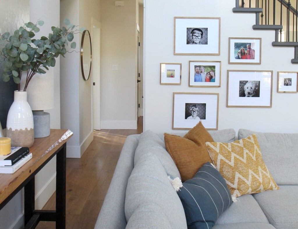
If your friend doesn’t love pink undertones, they might tell you that Benjamin Moore’s Pale Oak is a bad color – even if it’s the best one for your space (as shown above)
Choose one or two key people to pitch your ideas to, but choose the people who you feel will have your and your home’s best interests at heart.
2. TAKE YOURSELF OUT OF THE EQUATION
Sometimes, we get so caught up in what WE want to see that we forget to listen to our home. And when choosing paint colors, the needs of your home are pretty darn important. If you like brighter whites and your home prefers off-whites, things could get a little fugly if you only cater to yourself.
And let me tell you, NOTHING will cause you more anxiety than realizing you didn’t listen to your home and you painted it the wrong color.
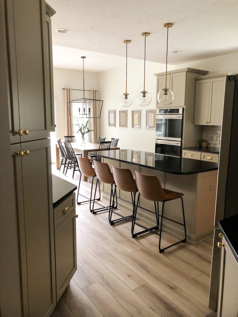
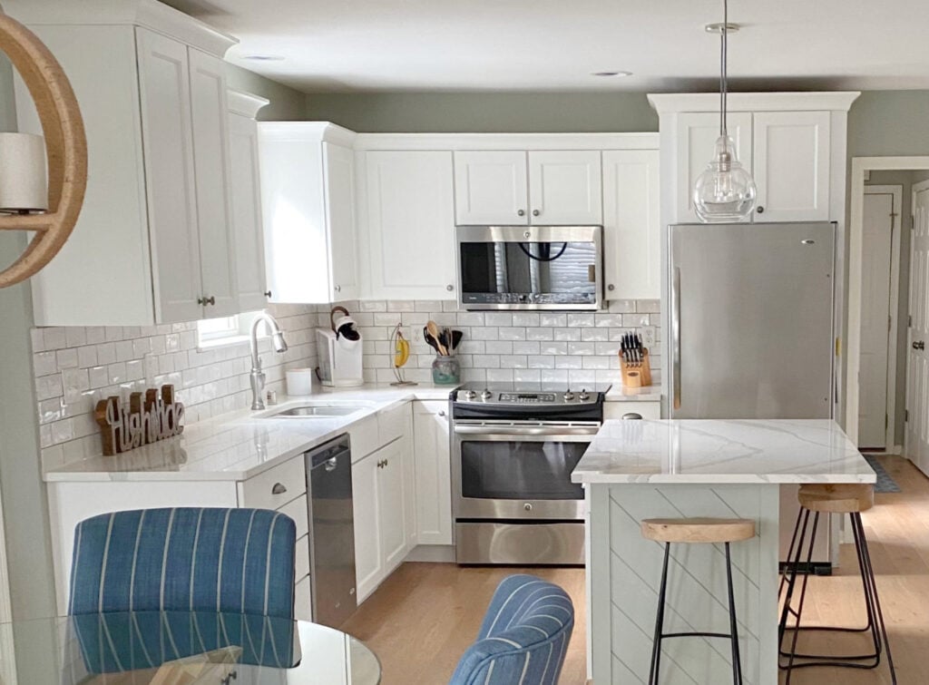
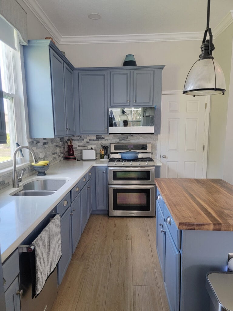
Damn, do my clients ever have good taste – I love this kitchen!
By the way, choosing the wrong color happens; that’s life. However, there are some ways to reduce the chance of this happening (other than hiring me, wink wink).
3. PAY ATTENTION TO THE HIERARCHY
I’m not talking about Prince Harry (although he’s not hard to pay attention to, and Megan’s a total babe); I’m talking about the hierarchy when choosing paint colors (in very particular order)…
- The needs of your home’s interior finishes (e.g., does your countertop better suit beige or gray?).
- An existing color palette in nearby rooms.
- Your room’s exposure.
- You.
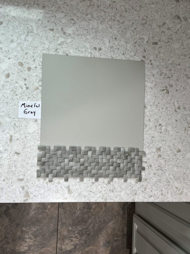
No matter how much a homeowner might love blue or violet hues, this backsplash and countertop TOTALLY DISAGREE!
While this hierarchy can shift depending on the situation (especially #3 and #4), considering your home’s needs first is a great way to remove some of the emotion and add some logic. My brain spins TEN TIMES SLOWER when I take my heart out of it and put my head back in.
Choosing Paint Colors: Who’s The Boss?
This is one reason I’m so good at helping you (and I’m modest, too) – the emotions aren’t there (I mean, I love y’all, but you know what I mean).
- I can look at your space objectively.
- Draw on my vast knowledge and experience in 11,000+ homes (which you can also find in my 600+ blog posts).
- Apply it all to what best suits your home.
At the end of the day, I never want to ignore my client’s tastes, but often, there’s a great happy medium between what they want and what their home NEEDS.
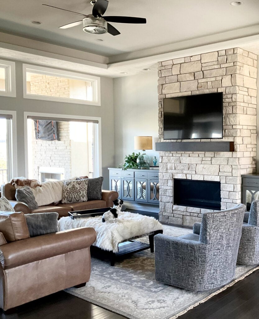
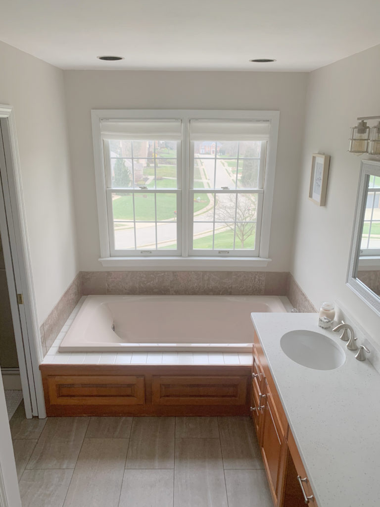
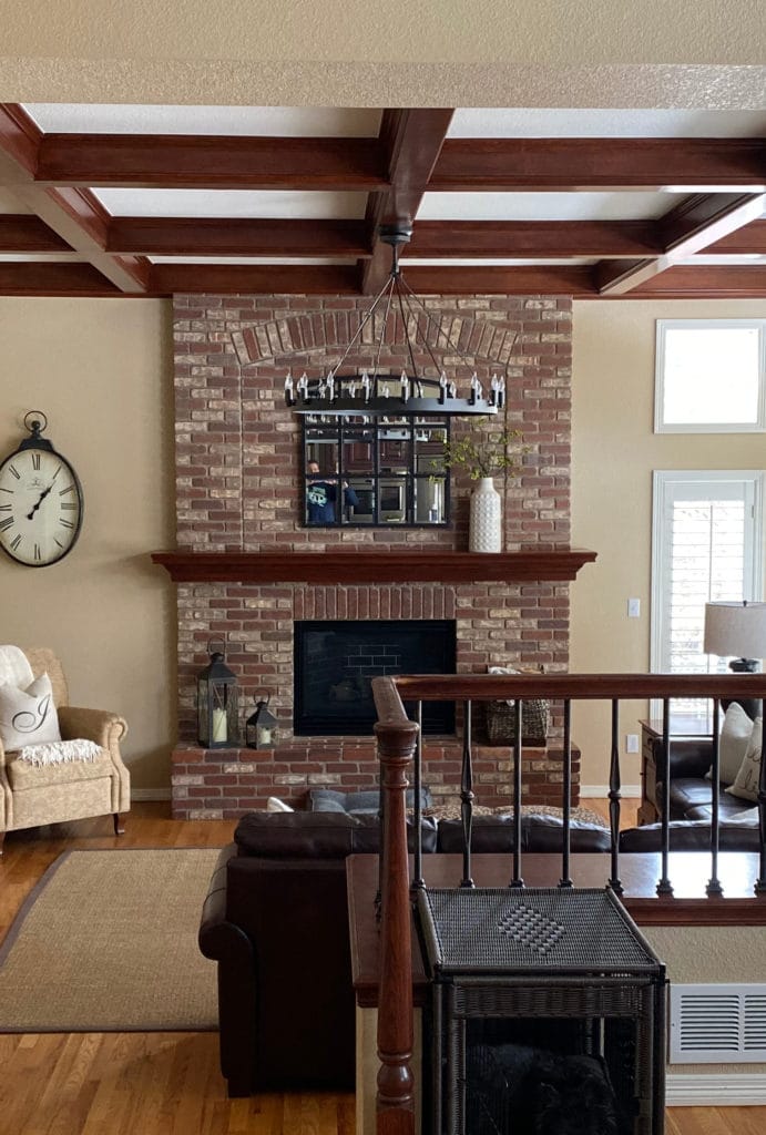
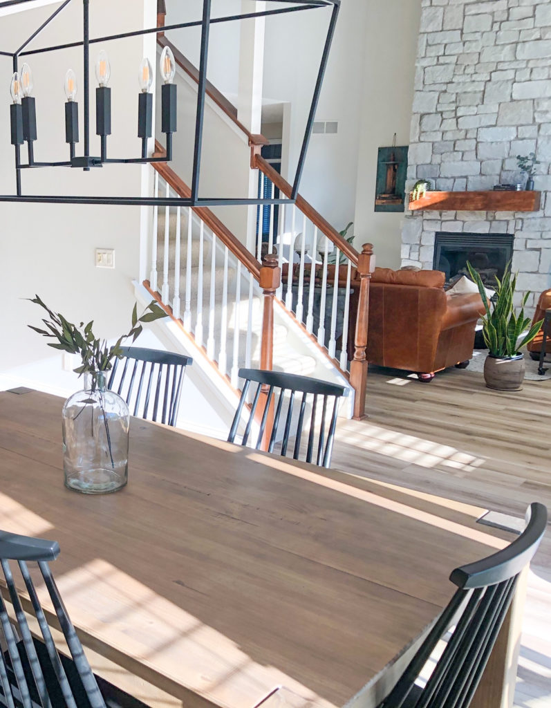
While they’re not glaringly bad, the walls aren’t the right color for the gorgeous stone fireplace.
5 Reasons You Keep Picking the Wrong Paint Colours
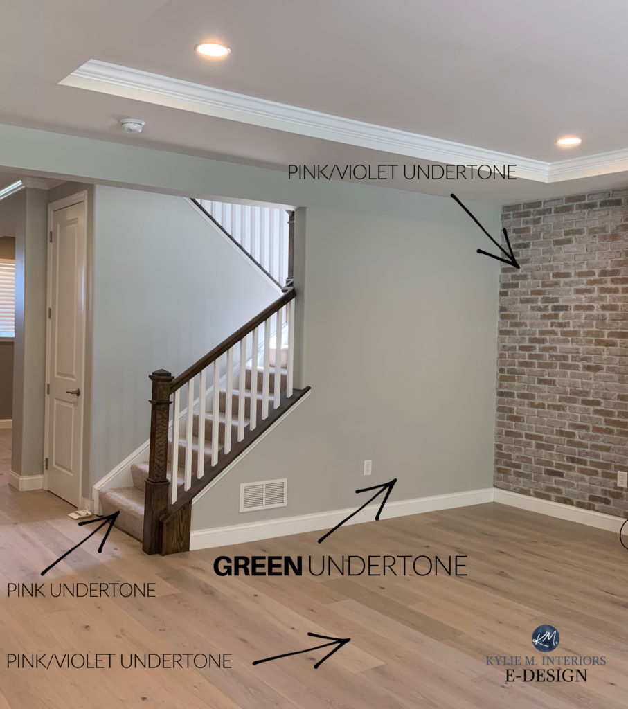
In this next photo, even if the homeowner doesn’t love violet-pink hues, their home desperately loves them. This makes Sherwin Williams Agreeable Gray the wrong choice, as it can skew green (as shown)…
Of course, some would rather choose a color they love, even if it looks disconnected from the finishes in their home – you do you, boo (insert Kylie crying and twitching in a corner HERE). Really, though, the end goal is to be happy in your space, whatever ‘happy’ looks like to you. However, for the sake of this blog post, my advice is to…
Stop fighting your home and start LISTENING to it.
4. DO YOUR RESEARCH BEFORE LOOKING AT PAINT COLORS
Now that you’ve removed some of the emotion, you’ll pay less attention to yourself and more to your home. Trust ye ole Ginger, doing it this way makes it much easier to step back and view your space with more curiosity.
Once you’re CURIOUS, you’ll try to figure out what your home’s interior finishes are REALLY asking for.
Then, once you know what to look for, it’s easier to do your research, using my Kylie M YouTube and blog as references (my SEARCH function is awesome. Seriously, type in any word and see where it takes you…except the word ‘nudes,’ that’s a whooooole different blog).
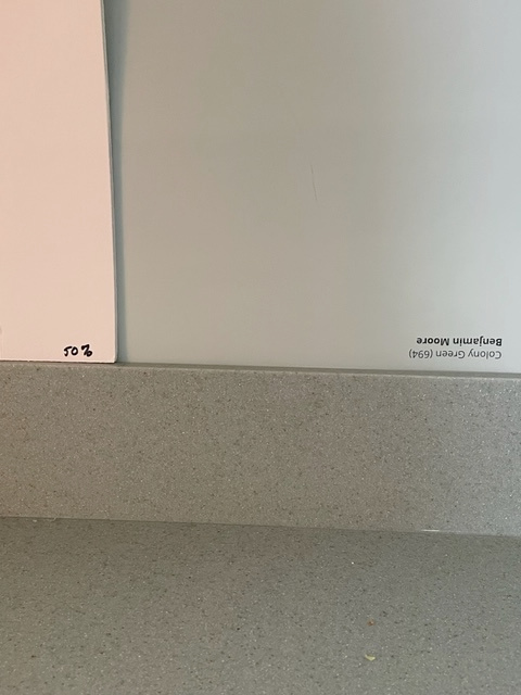
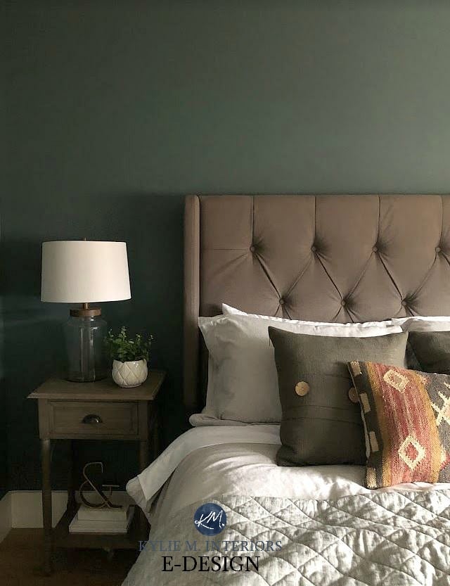
This homeowner did a GREAT job of listening to their countertop…and me (Benjamin Moore Colony Green)
Also, as shown in the above image, DON’T mess around with small paper chip samples. Check out Samplize Peel & Stick for 9×12 sheets that make it way easier to choose.
5. REALIZE THAT YOUR PERFECT PAINT COLOR MIGHT NOT EXIST
Ummmm, pardon? That’s right, the color you’re looking for – the PERFECT COLOR, might not exist.
Why?
We’re all at different places in our decorating and design journeys. Here are a few reasons why there might not be a ‘best paint color.’
99.5% of the photos in my blog are of REAL HOMES from my Online Color Consulting clients, readers, and friends. While not always magazine-perfect, they’re packed with ideas and proven color choices to help you create a home you’ll love.
1. Your home might have finishes that aren’t well-coordinated, meaning they have different color needs.
This is a HUGE challenge. In my Online Color Consulting, approximately 75% of the homes I work with have finishes that aren’t 100% compatible with one another. In this case, it’s about finding a ‘happy medium,‘ or an ‘It’s not perfect, but it’s the next best thing.‘
2. Your tastes might not align with the colors that suit your home.
This is a tough one. I’d love to tell you to fill your little anxiety-ridden boots with a color you love, but if it looks fugly in your room, you won’t be happy (or maybe you will, who knows).
The Best Blue Paint Colors for Cabinets
But trust me, it can be a lot easier to settle on a color that suits your home, as it’s easier to take the emotion out of it. It can also be fun to lean into your home and learn about it, giving you a stronger sense of control over the process rather than just choosing a color on a wing and a prayer.
3. You and your spouse don’t agree on what looks good.
Whether it’s painting wood cabinets and wood trim, whitewashing a brick fireplace, or updating something even if it isn’t broken, not everyone has the same tastes (or common sense). Again, lean on your home – take yourself out of the equation and LEARN about what suits your home and where the value is. Coming in armed with knowledge versus tastes is a great way to swing the pendulum.
The Best Light to Medium Greige Paint Colors
4. Your room’s exposure doesn’t align with the types of colors that best suit it.
You might love warm, creamy whites but think your south-facing room looks too roasty-toasty in them. Or maybe you have northern exposure and a mad love for gray blues, but they make your room look so DARN COLD. Exposure can be a real bugger when choosing paint colors. Again, lean into your home and think about workarounds.

For example…
- For love of warm creamy whites, how about painting your walls a modern, moderate, warm neutral or warm shade of gray or greige? Then, accent with creamy whites in your furnishings and decor.
- For that cool, north-facing room, consider a warm neutral for your walls and accent with mid-toned or darker shades of blue-gray.
Even one of these can make it hard to choose a paint color, let alone several.
What I’ve found is that sometimes, once you accept that the perfect color isn’t out there waiting for you to find it, it’s easy to settle on the next best thing.
The above list makes it easier to forgive yourself for the stress you’re under – you’re up against a lot of factors. Take a deep breath and lean into your home.
6. TAKE IT EASY ON YOURSELF – YOU’RE NOT A COLOR EXPERT
If you were a paint color expert (and good at it), choosing paint colors would be easier (unless you’re a dork like me, who still agonizes over your own home).
What I’m trying to say is, don’t beat yourself up for not being great at picking paint colors (you’re only lucky or skilled if it does). While I might be able to fill my car’s tire with air (maybe), I sure as heck can’t change the tire – I’m not a mechanic. I can cook a mean Kraft Dinner, but don’t ask me for chicken and potatoes – I AIN’T NO CHEF (if you want to learn more: ‘Mom, What’s That Smell? Cooking with Kylie‘).
Take a deep breath, and if all else fails, hire someone to help and let yourself off the hook.
Remember, you’re not saving lives; you’re just picking a paint color – let’s make it fun.
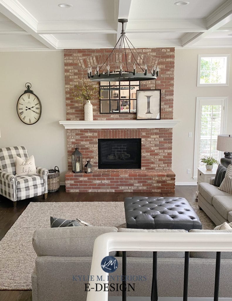
Benjamin Moore Edgecomb Gray
7. HELPFUL SAMPLING TIPS
Of course, it will finally come down to picking the paint color that, hopefully, both you and your home (and your spouse) can agree on…
- ALWAYS surround your sample with white paper. Your existing paint color will skew your perception of your samples. The only side that shouldn’t have white paper next to it is the side that buts up to your cabinet/trim.


- Once you know you don’t like a sample, remove it from the equation. I don’t care if you recycle it, throw it in a pile for later, or light it on fire, singing ‘I Hate Everything About You’ by Three Days Grace – PURGE THE DEMONS and move along.
- Come heck or high water, narrow it down to your fave 2 -3.
- If things seem off, shift your undertones. If the colors look too gray or cool, try some warmer ones. If they look too warm, try something in the middle. Remember, this isn’t ‘Do you find it too cool/warm/etc?‘ It’s ‘Do your interior finishes find it too cool/warm/etc?’
- Look at your samples throughout the day. While I prefer SAMPLIZE Peel & Stick, especially for interior projects, you can always buy a quart of paint and paint an important wall section. Two coats are best; feather out the edges and get some white paper around for some separation from the old color.
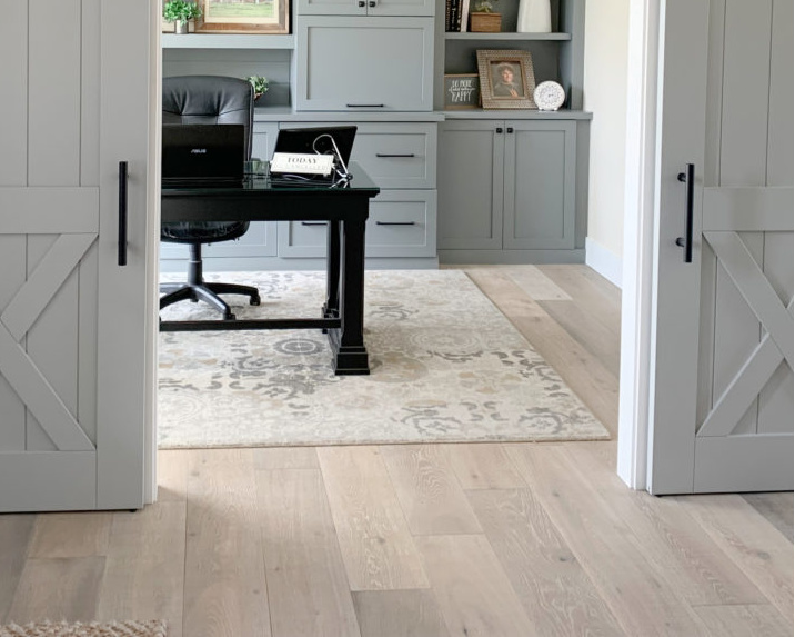
The Best Blues & Greens For a Calming, Focused Home Office
A great way to get the decision-ball rolling (once you’ve narrowed things down) is to commit to painting one wall or section that butts up directly with the finishes you’re trying to coordinate with.
Worst-case scenario: You hate it, buy another quart of paint, and go at it again. Best case: You made a great choice.
So there you have it. While you might not implement ALL of the above tips, hopefully, you picked up a few tidbits to help you along the way. And remember…BREATHE (meditation and Mojitos help as well).
QUICK SUMMARY (TL;DR)
- Take your personal tastes out of the equation and focus on what suits your home’s finishes.
- Don’t listen too hard to friends’ or neighbors’ advice, no matter how well-intentioned.
- Use large, peel and stick paint samples
- Remember, you aren’t a color expert. If all else fails, hire one.
READ MORE
The 10 Best LIGHT & Calming Paint Colors for Stress & Anxiety
The MOST TIMELESS Paint Colours
The 8 Best WHOLE HOME Warm Neutral Paint Colours


Oh my word did I ever need to read this! We are picking paint colors for our forever home before we move in and it’s so hard! It was built in 2009 and is a well done Tuscan inspired home with an open floor plan. It has gorgeous high end oak woodwork, and I am on the struggle bus! Our current home is mostly White Dove and Sea Salt and totally my jam! I can use both calm and coastal colors and pull in fresh color too. My designer is not recommending the all white look in the new home, however, even though we are redoing the warmest surfaces (and taking down gorgeous wood plantation shutters). She is recommending a neutral like City Loft or Gray Mist so there is contrast with the painted white trim. The prob is I have a hard time with all neutrals and the the idea of the putty look over the whole space is making me twitch (and lose sleep). I have been reading your posts frantically searching for an answer to my paint color conundrum! I’ll admit I have seen some gorgeous photos of Gray Mist with Dove Wing though! I was conjuring up a muted, French palette vibe when my husband said, what about the SW Sea Serpant color for the island 😊!? I’m a boy mom and we all love blues! We’ll see what the space says it needs! Thank you for being so generous with your knowledge! Cheers!
Sooooo, I haven’t seen your home, BUT being a white lover myself, if there were one white I would consider with the Tuscan style for EVERYWHERE, it would be Cloud White. YES, it’s likely a touch more yellow than your main finishes, but being so light, you’re given some good forgiveness.
Short of this, Moderate White (WAY prettier in real-life than Pinterest, it’s pretty fugly on Pinterest) is often a GREAT CHOICE. I wouldn’t do Gray Mist – no how no way, it will clash with travertine. City Loft is lovely – compare it to Egret White and see if you prefer one over the other.
I know what it’s like to HAVE a personal style and crave it. If I thought Cloud White were a hard-no, I’d tell you, but I think it’s worth exploring :).
Is it possible that you meant Prince Harry, not prince Andrew? 🤔
Ahhhh, probably! I’m going to fix that!! Thank you 🙂
Great post, thanks for putting color choices in perspective….Noone will die if it’s not right….Anxiety can be paralyzing for overthinkers.
It really can be! I’ve made myself hyperventilate (proud moment ;). Sometimes it’s just taking that step back and a VERY deep breath.
Hello Kylie, I’ve spent hours rolling through your blog posts, thanks for sharing so much info!
I’m planning to paint our combined kitchen/living/dining in a few weeks time…
A self-confessed over-thinker, I’m going back and forth with my painted sample boards and am very worried about getting it wrong!
I can’t afford the time it will take to do this twice so I am determined to get it right…
My question is about changing the strength of the paint colour… full strength is too dark for what I’m after but if i take it down to 1/4, what happens with the known undertones?
Thanks in advance from an anxious overthinker 🤦🏻♀️
Hey Kath! It’s always fun to play with paint colours, so yes, try 25% lighter. The undertones CAN shift, but most times the shift is so small you can’t even notice it :). I do this ALL THE TIME when I want to get just the look I’m going for. And while 25% can be quite subtle, it’s often just the thing I need.
Hello
The following is some information regarding my dilemma.
Room Type – Basement Bar Sports Room 12×12, Toronto Maple Leafs Hockey Theme with Memorabilia
Window – 93 Width x 18 Length with Light Grey Shade
Wall/Trim Colour – Soft Light Grey with White Trim
Lighting – Ceiling Light with Dimmer, Colour LED Strip Lighting under Bar Top and under Floating Shelves
Furniture – 74-inch Parota Wood Bar, Matching Bar Chairs with Black Iron
Wall to Paint – Back Bar Wall Facing Door Entryway. I would like this to be the accent wall in a different colour.
Items on Wall – 40-inch TV with 2 Acacia Wood Floating Shelves on either side of the TV
My thoughts – I was thinking Blue or Grey for this Accent Wall but unsure of shade. I am open to other colour suggestions also.
I am looking forward to your suggestions
Elaine
I’m going through this right now. We’ve been in our house 22 years, have painted the interior many times, and now are going from a super-dramatic gray to something lighter. I’ve always suffered from analysis paralysis but this time is hitting differently, prob because we’re doing several rooms and it will be very expensive. I want to get this right. After getting stuck repeatedly in the Repose Agreeable Light French Gray loop I hired a pro to help and am even more frustrated now. She criticized our current color choice (who does that?), ignored everything in my questionnaire and recommended colors a good two shades lighter than we wanted to go. Told her that and now she’s arguing with me about how what we want isn’t “the trend”. I feel like I’ve wasted money and now I’m even more anxious! lol
Hey Stacy, my apologies on the HUGE DELY, I have a hard time keeping up with my comment section. But I was flipping through and yours caught me. I’m sorry you had this experience. If you’d like, I’m happy to do a consult for you – no charge. I know how it is to feel unsettled and I’d like to help if I can! I also feel like I know who you might have hired, as I’ve heard this before.
I’ll be away a few days this week, but if you’d like to send me an email, reminding me that you’re Stacy from my comment section, then when I’m back we can get the ball rolling. kylie@kylieminteriors.ca
Cool beans?
I needed this post. I definitely feel better about the rest of the house but still my biggest struggle is the kitchen. Northern exposure. Bright white cabinet. Creamy white quartz with cool dark gray/purplish veins. I want to go blue or green but from reading your page with the northern exposure its going to look cold. The color they have now is a gray but it doesn’t match at all. Its definitely mindboggling. Your pages have helped me so much with the rest of my house and learn more about paint in general. Thank you!
Hey Sabrina! What’s interesting about blue and green, is that mixed together, they can look quite pretty in a north-facing room. OR, lean into the warm side of green, like Sherwin Williams Techno Gray, Grassland, Benjamin Moore Mountain Air. Blue-green mixes like Rainwashed or Benjamin Moore Gray Mist can also be pretty! It’s not that they add warmth, but when they have color, they have PERSONALITY!
I would so love some help. I just am moving into a rental that desperately needed some fresh paint. The kitchen, dining room, living room, and even the bathroom all flow into each other. I don’t want boring but I want clean and nice and versatile. It’s so overwhelming to try and pick colors from tiny squares from Home Depot lol. It’s an old farmhouse with uneven walls and even a shiny ceiling in the living room. Help!
ooo, it’s just so tough without seeing photos! Personally, I love BM Classic Gray and SW Egret White as they’re a passive warmth and pretty versatile!
Ahhh the over thinkers! 🙂 I can relate. I’m getting my house ready to sell and I hired a designer to help because I was stuck!!!! And I continue to be in analysis paralysis. I thought – I’ll just do what she says and it’ll be great. The counter has been installed – awaken by Hanstone. The cabinets are decorators white, the paint color she picked is useful grey but sherwin Williams but it is reading so green to me. Looks fresh but like a light green almost. Bleh. I did the kitchen and it was my intention to paint the main floor and up the stairs the same color. It’s so much work to paint this area, I really want to get it right. I have red cherry floors (don’t love them but they’re what was there) in the living room and a pretty neutral grey tile throughout the kitchen/main floor – probably leans more warm than cool. Anyhow – your post was great. I am quite anxious and I get stuck with this stuff a lot so the encouragement is always reassuring!
Oooooo boy, so there’s a really good reason why Useful Gray is looking green…because it is. I mean, it’s not a green color, but it has a MOST DEFINITIVE warm, earthy green undertone. Also, unfortunately, her partnering it with Decorator’s White is a hard no as DW has a gray-VIOLET undertone, so things are really bouncing off each other. You aren’t overthinking girl, what you’re seeing is REAL! I mean, you might be overthinking anyway, but you’re not going crazy and seeing things ;).
Check out…
SW On the Rocks / BM Nimbus / BM Collingwood. I bet these will feel SO much better :). LET ME KNOW HOW IT GOES!
You are me. You described me (us) perfectly. I went with repose grey based on the color consultant telling me to and I’ve hate it every single day. I’ve read basically article you’ve written, bought 16 paint samples, and unfortunately I’m still paralyzed 😅 I love sea salt but not in my home – it is in the woods and had very little sunlight but somehow seasalt is reading pale baby blue. Repose grey with dark wood floors feels like a gloomy prison to me- or is so grey, like duct tape almost. My husband refuses white. We have alabaster trim but it doesn’t look great on the walls. I just want a neutral color that brightens and warms up the space but isn’t too blue green but still is blue green leaning… or is whatever my house wants which I apparently don’t know still. Anyway thank you so much for your articles and feel free to tell me 1 perfect color and I’ll just go with it 😉
Oh Virginia, I feel you, and I’m sorry you were misled with Repose Gray! Now, you want neutral grayish with some blue-green – not too much blue-green, but a wink is good – correct? Off the TOP, I worry it could feel heavy for the home you’re explaining, but all the same, you KNOW your home and you know what type of coolor your’e craving! Sea Salt is a little bugger and shifts its shape all the time. HOWEVER…I’ve had a ton of luck with the slightly darker, light-medium Comfort Gray. I mean, i’d still check it carefully, but it always settles SO nicely for me. I feel like it still has enough color for a home in the woods with little light without being TOO colorful. You might also check out BM Gray Wisp, which is a little tweak on things and a touch darker – see how that feels.
If you prefer the DEPTH of Sea Salt, just not it’s blue hue, BM Night Mist is different and interesting. I hope these help!!! Let me know :).
Hi Kylie,
I signed up for your wonderful emails. I live in California but vacationing in Montreal for several weeks while my house is being painted. I am allergic to house paint! Can you imagine? Anyway, I watched your videos and it took me 2 months ( yes I overthink it) to settle on SW Dover White for the general areas of my house which is pretty well an open plan. My most used rooms kitchen and family room are north facing a little bit east. No sun after 10:30am. I have warm wood maple with darker glaze cabinets and warm wood floors rosewood. I’m pretty confident it all goes well together thanks to your very helpful how to choose an off white color for your house. I am interested in buying your color classes. What an enlightened experience it was to learn about color, exposure and yes even kelvins when I replace my recessed lights with LED. But I want to learn more. Because I am not home, do I have to buy any supplies while in Montreal to do these classes? I dont’ have the luxury of space. and have no access to a SW paint fan. For some reason it is not so easy to access SW, although they have lots of Benjamin Moore and Farrow and Ball retail paint stores… Will not have access to “making a paint mess” where I am staying.. thanks for any guidance you can give me about your classes..
Hi Rosalie! You know what? As we speak, I’m taking my courses and tweaking them into E-BOOKS, making it way easier to digest for the average person. I HOPE to have these out by the end of the week, if you’re able to wait! Otherwise, YES, it’s best if you have all of the fan decks for the course :).
Thank you! I have been reading so many of your posts to find the right colors for my enclosed garage-become-den with 10 foot ceilings that has large east and smaller north facing windows with an exposed rear fireplace. I have learned so much about undertones and leaning warmer in lower light rooms! The fireplace has some darker purplish bricks, so through all the help on your website I am leaning toward SW Polished Concrete (which I never would have previously considered!) with SW Pure White for the trim. Is Pure White too warm to go with PC? I’m having so much fun building this room from scratch!
I think this sounds GREAT! And Polished Concrete is so pretty :).
All of your classes are sold out. I was looking at Dover white for my home exterior, which you said you do not like. I have a weird roof and need a suggestion on color.
Hey! Do you mean my courses or consults? I do have courses available! They do come up Mon/Wed/Fri approx 8am PST. How many are available depends on current demand and how fast they sell – sometimes they sell out in seconds!
From one anxiety ridden person to another… thank you.
Oh Stephanie, you’re most welcome (If I could do a heart emoji, I would) :).
Kylie,
This is more of a question than a comment. We have a lot of wood trim and doors that are stained in a medium-oak color with beige carpeted floors. Unfortunately, most pictures feature painted wood trim and doors. I am looking for a paint palette that will complement our wood.
Hi Beth! If you find my SEARCH and type in WOOD, a bunch of blog posts will come up – several on the best paint colors with wood!
Hi Kylie. I recently found your blog and I’ve really learned a lot from it. I love the new wall color in the photo with the red brick fireplace shown in this post. Can you please share the name of the color?
Hey Michele, I’m glad you found me! If it’s the second photo of the fireplace under #6, that’s BM Edgecomb Gray, which is an awesome color 🙂
Hi Kylie, thank you , so much, for this post. I have been stressed, overthinking paint colors, and paralyzed, for a couple of years. My west-facing kitchen (open to family room) has fugly builder grade oak cabinets, St Cecilia granite, carbonized bamboo floors, and SW Sand Beach walls. I (per husband) cannot change the granite or flooring, so I want to paint the cabinets and walls. Even with reading your post on how to modernize older granite and ordering paint samples using your guidelines, I struggle with paint color decisions. After reading this post today, I pulled out the color samples and put them on white paper. Immediately, I eliminated 2 colors. I feel more confident about making color choices that work with the room, and that I can live with. I don’t want yellow and thought I would be stuck with Alabaster cabinets; it definitely leans yellow in my kitchen. Whew, I’m so glad I happened across this post today. Thank you, thank you!
WAHOOO, Robin, I just love reading this – I’m so glad the tips came in handy! From a fellow overthinker, ESPECIALLY with my own paint colors, I feel you :). You can do it!!!
Hi Kylie,
Choosing my kitchen/hallway paint colour is giving me insomnia!!
For the last 25 years I have loved BM Sundial CC400, matched my travertine floors, mahogany furniture,persian rugs , jewel tones, you get the drift.
Just replaced tiles with creamy porcelain tiles (look little like a soft copy cat marble) and new Cloud White kitchen cabinets.
After sampling White Down, Dove Wing, Seapearl, Pale Oak, Greek Villa, Etiquette, Plaster of Paris, and more, I chose Dune White..was aiming for a softer cream. But it is picking up gray in my west facing kitchen and too light and not what I expected or can live with.
Going to BM store asap to get more sample pots and read all your posts on Gentle Cream, Feather Down, Ballet White, Antique White and so anxious now on which ones to try.
Any advice you can give me would be greatly appreciated as I have to finish before the holiday guests arrive! Thank you so much.
Kylie, thank you for sharing such a thoughtful and relatable guide on choosing paint colors for overthinkers. I especially loved your point about taking yourself out of the equation and listening to what the home “wants” first—it really helps reduce decision anxiety. Another tip that can complement this approach is to test the chosen color under different lighting throughout the day; natural and artificial light can dramatically change how a shade reads on walls. Your tips make the process feel much more manageable and fun!
Nouman Khalid
CEO: https://normpainting.com/
I needed to read this so badly! I also have the anxiety/ADHD/OCD trifecta and am losing my mind having narrowed down to the final two colors and am PARALYZED at the home stretch. My bedroom is east/south facing but the eastern windows are huge and the south facing window small and mostly blocked by my neighbor’s house. I also live in a valley and have weirdo light that no paint advice I’ve read has helped me negate. Pale colors look drab and anything with too much grey looks dark and blah. Midtones with decent pigment are the best samples I’ve tried. Did I mention I’m trying to pick an earthy blush pink? It’s enough to make anyone drink. Down between BM Rosetone and SW Pink Shadow. My furniture has deep red-orange undertones, forest green curtains, a lot of burgundy in decor, rugs, etc… a really autumnal palette with rich colors. Terrified of the pink I choose being too pure or sweet for the rest of my decor – I want calm and muted, but not so muted it becomes depressing. I’m so glad to read this and see that even an expert feels the same way when picking color for her own home.
Oh girl, I SO empathise with you! I’ve hyperventilated – I’ll admit it. It’s much easier in other’s homes, as I don’t have emotion attached, but my own home? LORD HAVE MERCY! I just had to choose a color for my office cabinets and it just about slayed me.
At this point, what about getting a quart made of each and putting them both on the walls in big swatches (feather out the edges of your roller lines so they’re smooth). This way you can get a larger scale idea before you bite the bullet? That would help me!
Also, if you’re ever painting your home office, I wrote a fun blog post about home office’s and ADHD, too :).
LET ME KNOW HOW IT GOES!
Omg I totally will let you know how it goes! I bought multiple Samplize samples of each and put them together on big white poster sheets, and I got the little sample pot of BM Rosetone and painted it on foam core (since it’s a test pint it looks like a totally different shade than the Samplize of course), moving them all around and staring at them like I’m finally going to see something new… but I should probably just bite the bullet and paint big swatches of the real paint on the real walls. We’re painting in the spring, so once the primer is up I’m going to do just that!
Thanks so much for your reply 🙂