
19 Paint Colors to Make a Small Room Look Bigger
The Best, Liveable Colors for Your Small Room
While small rooms can pack a ton of personality, not everyone wants to embrace their small space and crave something a bit bigger. However, in the words of the great Mick Jagger…
You can’t always get what you waaaaant.
But did you know you can create the illusion of size with a well-chosen paint color (not to be used on any body parts—wink, wink)? You bet your cute little booty you can. Will this make your room bigger? Of course not. I’m good, but I’m not THAT good.
Now, before we dive into colors, let’s touch on the science of it (you guys know what a science nerd I am #notreally).
This isn’t just a “tell you what to do design blog;” it’s a “teach you how to do it” one!

LIGHT COLORS REFLECT MORE LIGHT
The lighter a color is, the higher its LRV (Light Reflectance Value). A paint color’s LRV number tells you how light or dark it is on a scale of 0-100 (black to white). The higher the number, the brighter a color is and the more light it reflects! Of course, if your room is dark, it won’t give your paint color a lot of light to reflect.
- BRIGHT ROOMS: While there’s no clear-cut starting point, if you have a reasonably bright room, I’d focus on LRVs of 65+. Of course, everything is relative. For example, if you currently have a lighter color on your walls, a color with an LRV of 65 could be darker than it. In this case, your goal is to get a color with a higher LRV than you currently have.
- DARK ROOMS: If your room is darker, you need to improve your interior lighting, as colors can’t reflect light they aren’t given. If you can’t install more lighting, consider floor and table lamps with white shades (no clear glass and no tinted, off-white shades) and aim for Kelvins of 3000+.
- If your room is dark and you can’t improve that, you might want to stick with shades of white or embrace your small space and make it moody and fun!
Without enough light, no light paint color will save you.
COOL COLORS VS. WARM COLORS
While many colors are in the gray area (literally and figuratively), there’s often a clear difference between warm and cool paint colors.
TRADITIONALLY COOL PAINT COLORS: gray, cool or clean white, blue, green, violet
Of course, I could go down a huge rabbit hole and say there are WARM greens and violets, but let’s keep it meat n’ potatoes for this blog post (you gotta pay for gravy). Traditionally, cool colors look fresh and clean, making the walls look like they recede or get pushed back further. However, not all cold colors are liveable in the average home, and we often need to hit the ‘gray area’ to make a room look bigger without making it look like an ice cube.

TRADITIONALLY WARM PAINT COLORS: beige, tan, cream, warm white, brown, orange, yellow, red, pink
Warm colors can make a room look and feel more cozy, inviting, and smaller as the walls appear to advance and come closer. Of course, this can be open to perception, but it is backed by science.
The tall ceilings in this next room could look uninviting, but the paint color helps add some balance. Sherwin Williams Accessible Beige is a warm color but not an overly golden one. With its LRV of 58, it’s a great way to make this room look cozier without visually shrinking.

There are also greiges and taupes. The closer these are to gray, the cooler they look. The closer they are to beige, the warmer they look. Colors don’t need to be ICY COLD to recede all the way, and an expansive but slightly softer, inviting look can be achieved with warm grays, greiges, and taupes, as long as they’re LIGHT and your room has good natural light.
Long story short, to make a small room look bigger, paint it a LIGHT & COOL(ish) paint color!
That makes it sound so easy, but it’s not. Light and coolish colors are best for making your room look bigger. However, did you notice the word ‘liveable’ at the very top of this blog post? While cold, light colors are best for making a room look bigger, these colors aren’t always liveable or flexible with the average interior finish. This is where cool-ish comes in: colors that lean into gray without dropping an ice cube down your pants.
And besides, sometimes you need a happy medium to humor, not just your room’s size but also the following…
1. Your room’s interior finishes and which colors and undertones suit them—this matters more than making the room look bigger.
2. Your room’s exposure and which temperature it suits best. For example, if you have a north-facing room that’s already cool and gray-looking, a light cool color could compound this. The room might look bigger, but it could also look uninviting and cold.
As shown in this primary bedroom below, there’s something to be said about a happy medium for rooms that don’t necessarily suit cool paint colors…
Not every room suits a cool paint color, and not every person loves them!
Lastly…
CONSIDER YOUR CONTRAST LEVELS
Contrast can play a massive part in how big or small your room looks.
HIGH CONTRAST
If you have a range of light and dark finishes and furnishings, this can make a space look smaller. For example, if you have wood trim and paint your walls a cool light color, your room might not look bigger as there will be decent contrast between the trims and walls.
As shown in this next photo, Sea Salt can be a gorgeous, expansive color. However, it’s in high contrast with the darker, warm wood trim, which brings the walls back in.

This next room feels cozy and intimate thanks to the soft black accent wall. While the black is low-contrast with the TV, it’s high-contrast with the fireplace…

If you want a cozier and more inviting room, varying your contrast levels is a great idea.
However, if you want your room to look bigger, you might want to cool it on the contrast.
LOW CONTRAST
The lower the contrast between your finishes, especially from three feet and up, the bigger your space will look, as your eye won’t stop and start as much between the varying depths.
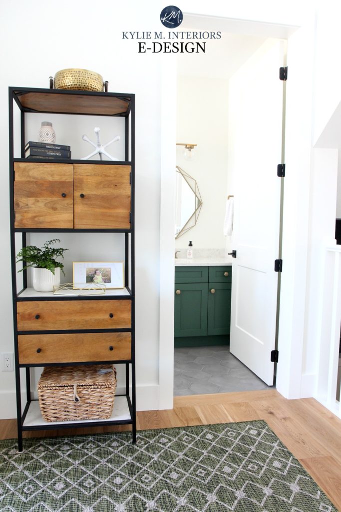
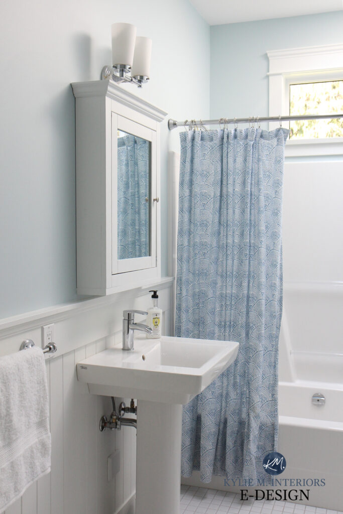
In this next bathroom, you’d think the white shiplap walls, vanity, and countertop would make this room look bigger…

That’s a big fat nope! Sure, the white-on-white look is low contrast, but the black finishes are high contrast with the white and cancel out the wall color’s effect.
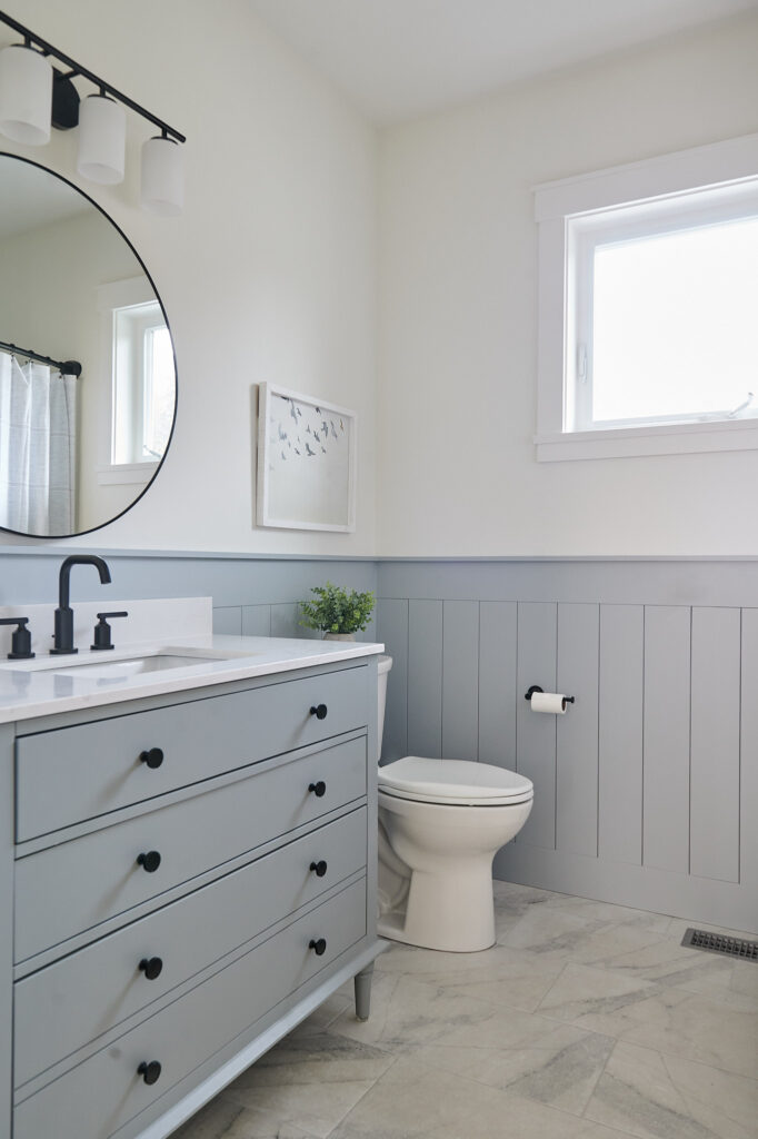
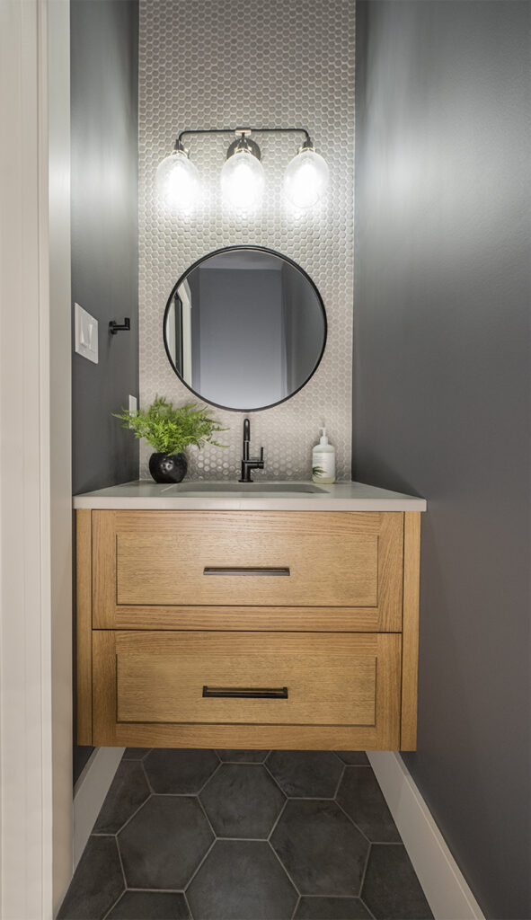
This doesn’t mean everything needs to be bland and boring, but from approximately three feet and up, consider how much contrast your room has. This next bathroom has a nice balance…
The countertop is actually affordable laminate!
- The greige-painted vanity grounds the space without making it look smaller. It’s also beneath the three-foot mark, so it registers less on our radar.
- The art has a bit of black detail, but it’s no biggie. Overall, the palette is low-contrast, which makes this bathroom look bigger.
You don’t need to be afraid of contrast; just use it wisely.
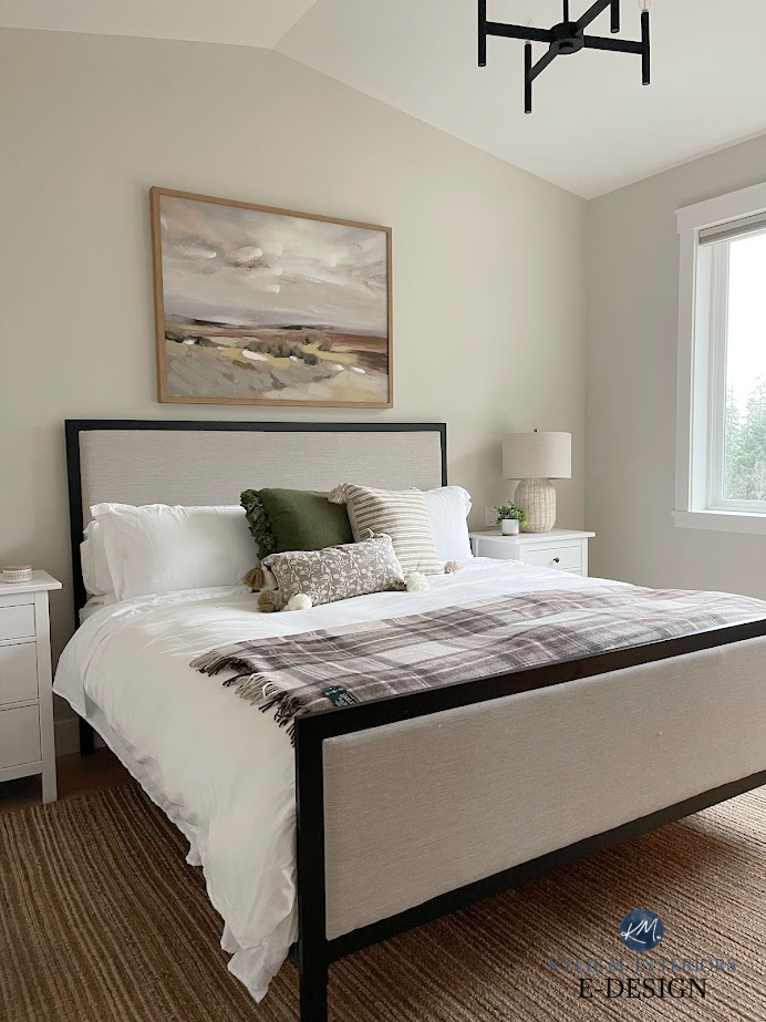
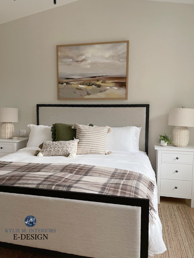
The headboard and wall color in this next room are reasonably low-contrast. While this can make a space look bigger because they’re darker, it’s a more intimate look…
Remember that small rooms can pack a lot of personality, and looking bigger isn’t always better.
For example, this next bathroom is 30″ wide x 78″ long—it’s pretty darn small. Sure, it could be painted white with low-contrast finishes, but it would be boring and still small. Instead, a striking darker color makes it a talking point and way more fun to spend time in (I spend a lot of my quality time in the loo).
PAINT YOUR TRIMS & WALLS THE SAME COLOR
On the topic of low contrast, a great way to get a seamless look is to paint your walls and trims (and doors and probably the ceilings, too) the same color. Generally speaking, it’s best if your chosen color has an LRV of 75+ for this to look its best. Again, if your room is dark, stick with white.
Now, without further ado, let’s hit some colors…
1. SHERWIN WILLIAMS FLEUR DE SEL
Fleur de Sel is gray at heart, but it has some beautiful blue-green undertones, giving it a soft, cool look that can help lighten and brighten a space.

Would white walls reflect more light? Absolutely, but not everyone wants white walls, and you can find a great happy medium with a slightly lower LRV.
With its LRV of 72, Fleur De Sel sits at the top of the light range and winks provocatively at the off-white world.
SIMILAR SHADES TO EXPLORE
If your room needs a color with slightly different undertones or LRV, here are some comparable shades…
- Sherwin Williams Reserved White (green hue)
- Sherwin Williams Spare White
- Benjamin Moore Paper White
- Check out the colors listed with Gray Owl (coming up next)
2. BENJAMIN MOORE GRAY OWL 2137-60
Gray Owl is always a fan favorite; I hear people hooting and hollering about it all the time (get it?). With its LRV of 64.51, Gray Owl is best for a small but bright room, as its color and depth aren’t well-suited to small, dark rooms.
Gray Owl is a stormy gray, so it’s not overly cold but not traditionally warm. It also harbors a green undertone that LOVES to lean more into blue than green!

Gray Owl looks great, but if your room is darker than this, it could be too dark to make your room look bigger.
My FULL Paint Color Review of Benjamin Moore Gray Owl
SIMILAR SHADES TO EXPLORE
If Gray Owl is a touch too dark for your space or its undertones aren’t 100%, here are a few other colors to check out…
- Benjamin Moore Horizon
- Benjamin Moore Moonshine
- Sherwin Williams Crushed Ice
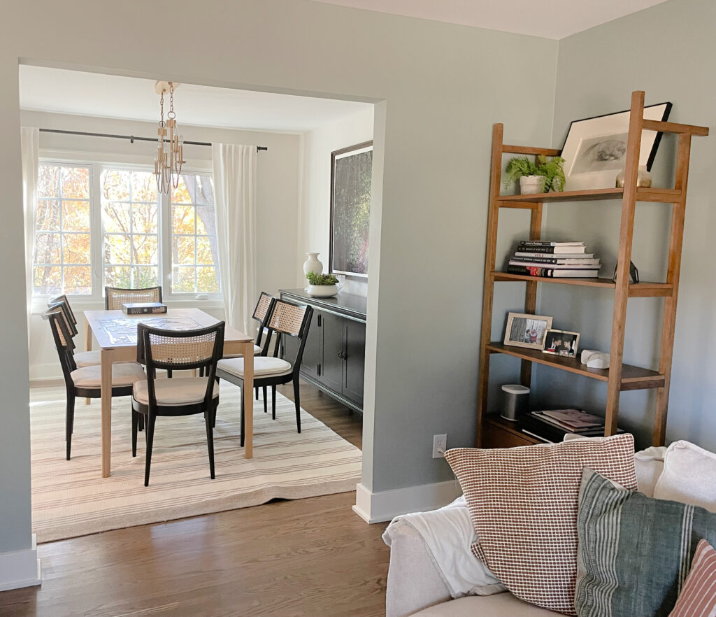
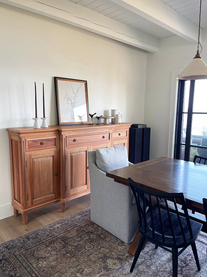
3. BENJAMIN MOORE SILVER SATIN 856
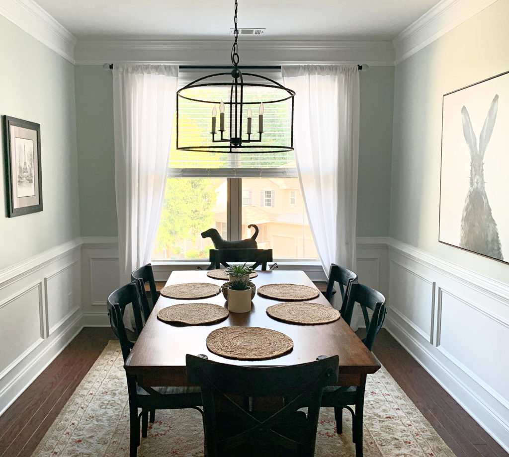
Silver Satin is a slight shade of warm gray with a feather-light violet undertone. Believe it or not, many interior finishes (like countertops, tiles, etc.) cater to violet over blue and green (as grays will have these undertones). As for depth, Silver Satin sits at 74.9, making it an off-white shade of gray.
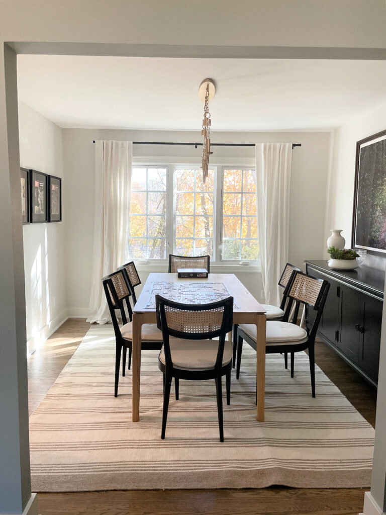
In the above dining room, notice how the walls and trims are low-contrast. The furnishings/art/drapery rod add some contrast, which helps the room look inviting and interesting. Aside from the artwork and rod, notice how most of the contrast is three feet and lower! This said, I like the three black frames on the right, but I might put lighter art or black-and-white photos in them to add some balance to that wall.
My FULL Paint Color Review of Benjamin Moore Silver Satin
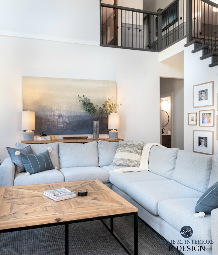
And look at how beautiful Silver Satin looks as a backdrop to this blue-green-gray living room attached to it…
SIMILAR SHADES TO EXPLORE
Sometimes a color needs to be tweaked for undertone, temperature, or LRV to hit the perfect spot. Sample and compare these shades with Silver Satin…
- Benjamin Moore Calm
- Sherwin Williams Eider White
- Sherwin Williams Incredible White
Remember, sometimes it’s about finding a happy medium. A touch of warmth in a higher LRV can still make your room look bigger while having a liveable, flexible color.
4. SHERWIN WILLIAMS ICE CUBE 6252
You don’t need to be a hardcore rap fan to fall in love with Ice Cube (Yes, I’m a 90s dork and previous gangsta). Seriously, if you’re looking for the perfect, icy, crisp shade of gray that winks at the wild world of white, Ice Cube (the color) could be your perfect shade!
While these next rooms sure as heck ain’t small, they’re the only shots I have of Ice Cube in a home, so it’s as good as you get for now!

My client wanted a contemporary look for his home but not a traditional shade of white or gray.
He landed on Ice Cube, and, like Frank’s Hot Sauce, we put that $#%! on everything—walls, trims, cabinets, and ceilings!

Generally speaking, icy cold colors like this aren’t as liveable in the average home with the average finish/lighting/etc. However, not every home is average!
If you end up using Ice Cube in your small room, I’d love to see photos!
SIMILAR SHADES TO EXPLORE
Ice Cube isn’t the perfect fit for every cool-lovin’ client. Sample and compare these similar shades…
- Sherwin Williams Rhinestone
- Sherwin Williams Ceiling Bright White
- Benjamin Moore Pure White
Also note that being SO crisp and clean, if you want to partner Ice Cube with trim or cabinets that are whiter than it, I recommend using a super bright white. A brighter shade of white will showcase Ice Cube’s undertones nicely.
5. SHERWIN WILLIAMS SNOWBOUND 7004
As far as liveable colors go that aren’t too icy cold, Snowbound is amazeballs. While it has a gray-based warmth, it’s flexible and can pick up a subtle taupe (violet-pink) and only winks occasionally at the cream world. This makes it a great option as its high LRV (83) will massively lighten most spaces, making them look brighter without being as intense as many traditional shades of white.
FULL Paint Color Review of Sherwin Williams Snowbound
SIMILAR COLORS TO EXPLORE
Snowbound isn’t everyone’s cup of tea – if you’re like me, you prefer coffee (with Baileys). Here are a few shades to sample and compare…
- Benjamin Moore Cloud Cover (for a more noticeable warmth without going too far)
And that’s it – even that’s not super comparable – there aren’t many colors similar to Snowbound!
This next color is a stretch, as it leans warmer than the above by a good whack. However, not everyone can handle the above colors, and as mentioned, there can be happy mediums between worlds when you play around with depth and temperature!
6. SHERWIN WILLIAMS AESTHETIC WHITE 7035
If your room has a lot of natural light, and you don’t love cold paint colors, even if they’ll make your room look bigger, Aesthetic White can be a great choice.
Aesthetic White is an off-white shade of beige with an LRV of 73. While it has warmth, it’s super passive compared to the usual beige bunch, making it an interesting option for a room with a lot of natural light and an owner with a hankerin’ for a bigger-sized look.
SIMILAR COLORS TO EXPLORE
If you don’t want THAT much warmth or beige, here are some shades with a similar warmth/LRV to compare with Aesthetic White…
- Benjamin Moore Sea Pearl
- Sherwin Williams Origami White
- Benjamin Moore Maritime White (has more warmth and is a stunner)
7. SHERWIN WILLIAMS ROCK CANDY
Along with Ice Cube, Rock Candy is the coolest color on this page. In comparing the two, you might notice a flash more violet undertone pop up in this bad boy, along with a cool blue undercurrent. This is all wrapped up in a gray base.
Ice Cube looks almost white in the home where it was previously shown. However, because this next room has white trim to contrast with and a lower degree of natural light, the gray base of Rock Candy is easier to see.

I rely 99% on photos from my Online Paint Color Consulting clients and don’t always have the EXACT photo I need!
I mention this as a) a gratuitous plug for the services that I offer and b) because this room has a slightly lower degree of natural light that makes Rock Candy look a bit darker/grayer. If your room has great natural light, it can make a room look bigger – picking up a bit of what Ice Cube threw down in previous photos. At least these photos show the general idea of it (and dissuade those of you who think a lower LRV can work to make their low-light room look bigger, as even this moderate light has Rock Candy looking grayer vs brighter).
With an LRV of 75, Rock Candy is an off-white paint color. My clients didn’t choose Rock Candy to make their baby’s nursery look bigger. Had they wanted to, a shade of white (coming up shortly) would have been better because of the lower light.

Sampling paint just got a whole lot easier (and more fun, too!)

Get your PEEL & STICK NEUTRAL COLOR BUNDLE HERE!
Now, the above colors are all ‘reasonably’ light and bright – some more than others.
However, some of you want a color with a bit more meat on its bones.
Obviously, the darker a color is, the closer your walls can look and the smaller your room might seem. If you’re willing to give a BIT of the enhancing effect for the perfect cool paint color that shows up at the party, I’ve got some beauties. Besides, we’re not going THAT dark…
8. SHERWIN WILLIAMS NORTH STAR 6246
North Star is a beautiful, cool blue-gray, so it already has its temperature going for it. As for its depth, it has an LRV of 62, which ain’t shabby, given my ideal LRV range for the average room. And, of course, if your room has a ton of natural light, this color will be even better.

To look BIGGER, a few tweaks could be made to the above room…
- The black-and-white art is pretty, but white frames would lower the contrast and make the wall look more expansive.
- They could switch to a light fixture with polished nickel and frosted white shades (I’m not a clear shade fan). Or, at least, a black fixture with a small frame and candle-style bulbs.
- Because the chairs are warmer than the walls, it’s best if they’re LIGHTER than the walls (read more about that HERE). This would also soften the contrast between walls/chairs.
9. BENJAMIN MOORE GRAY CASHMERE 2138-60
Gray Cashmere has been kickin’ a long time in the Benjamin Moore world. This blue-green-gray blend is a great hybrid between worlds and offers interest without too much commitment to color.
What’s interesting (to this color nerd) is that Gray Cashmere is like the reverse of the previously mentioned Gray Owl. Gray Owl is a GRAY with a dose of blue-green; Gray Cashmere is more like a blue-green with a good dose of gray!
Gray Cashmere’s undertones are a bit stepped-back in this room.
As for depth, Gray Cashmere has an LRV of 64.53, which is almost EXACTLY THE SAME as Gray friggin’ Owl! It would be cool to compare these shades to see what you like more – a bit more gray or a bit more color!
Of course, there are colors that are WAY colder and lighter that will make your room look bigger, but these colors are rarely as liveable. They work in the ODD room, which is not the usual room.
10. BENJAMIN MOORE OCEAN AIR 2123-50
As far as cool colors go, Ocean Air is a stunner. This gorgeous shade of blue has a bit of gray to calm it down, along with some green for balance (otherwise, blue loves to go blue-purple). As for depth, Ocean Air has an LRV of 71.84, putting it at the top of the light range and winking at the off-white world.
This next small bathroom looks wicked pretty in Ocean Air. Note how the chrome metal finishes are low-contrast with the walls and trims, compared to black, which would be contrasting and make the room look smaller.
The Best Blue & Green Paint Colors
11. SHERWIN WILLIAMS SEA SALT 6204
Sea Salt is a super popular green-gray that also moonlights as a blue-gray in some rooms! Again, if your room is dark, a color like this won’t save it – you need to improve your interior lighting or at least explore shades of white (coming up shortly). This is because, as requested, Sea Salt has more meat on its bones with its LRV of 63.
However, with good natural light, Sea Salt’s briny vibe can be a great way to make a room look bigger – assuming your current color isn’t lighter than it!
FULL Paint Color Review of Sherwin Williams Sea Salt
12. BENJAMIN MOORE ICEBERG 2122-50
Ooooo, she’s a nipply one! Iceberg is a beautiful, cool hue focused on blue but with a touch of gray and green mixed in. This might sound similar to the previously mentioned Ocean Air; however, there’s more gray this time.

Iceberg’s LRV is 71.1, which is DARN CLOSE to Ocean Air’s, making them great to compare.

Get your PEEL & STICK SMALL ROOM COLOR BUNDLE HERE
Now that we’ve hit the more colorful end of things, THE TIME IS RIGHT FOR WHITE!
This section matters a lot as many of you have small DARK rooms. Without light, there is no life; your best shot at this is with a well-chosen white paint color.
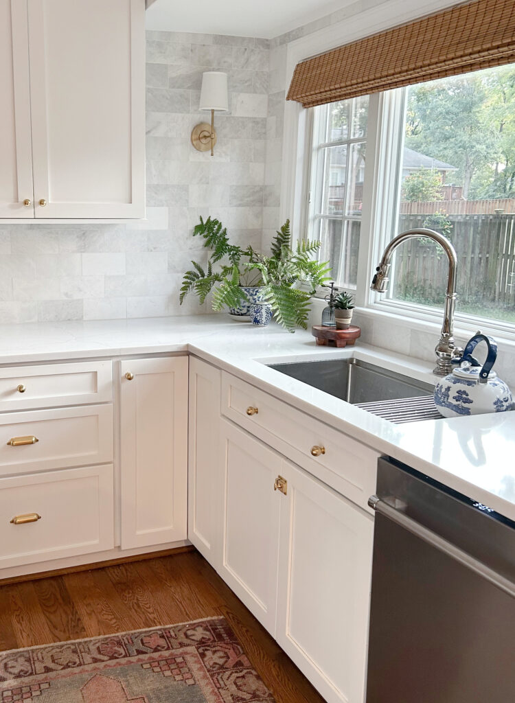
Another interesting note is that many of the above colors aren’t great for walls, trims, and cabinets (all painted the same color). With their high LRVs, these whites can be used on all surfaces for a super low-contrast, seamless look, helping your room look even bigger!
13. BENJAMIN MOORE CHANTILLY LACE OC-65
If you think Chantilly Lace has a pretty face, you’re right. This glorious shade of white is one of Benjamin Moore’s most popular paint colors for many good reasons; ONE of them is that it can make a room look much bigger.
Chantilly Lace has a reasonably high LRV of 90.04, so it’s right up there in the white world. While it has a wee wink of softness, this can help prevent it from looking cold and stark (especially if your room happens to be small AND north-facing).
FULL Paint Color Review of Benjamin Moore Chantilly Lace
14. SHERWIN WILLIAMS WHITE SNOW
This white doesn’t get the credit it deserves, as it’s amazeballs. However, as it’s only available in the Sherwin Williams Designer Collection, it’s not easy to get a sample at your SW store (you have to order it through Samplize, which I suggest doing anyway).
Get your Peel & Stick sample of White Snow HERE!
White Snow is similar to Chantilly Lace, but it’s just a tiny bit warmer. Again, with north-facing light, a bit of passive warmth can go a long way to stop your room from looking like an igloo.
FULL Paint Color Review of Sherwin Williams White Snow
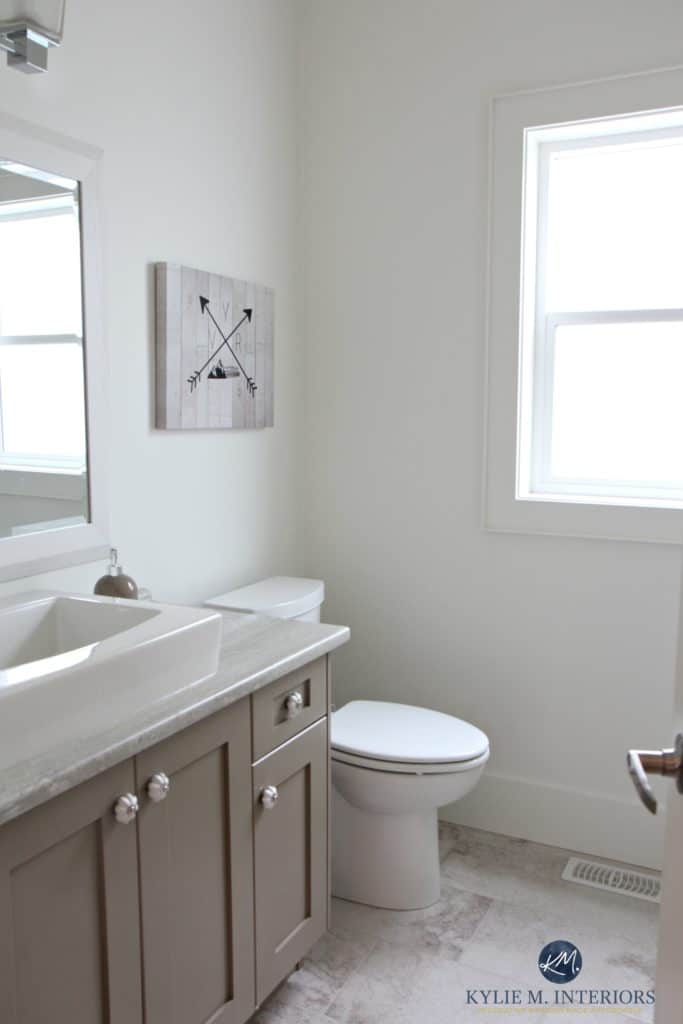
15. BENJAMIN MOORE SUPER WHITE OC-152/PM 1
Super White is exactly what its name says. With an LRV of 87.36, it’s a reasonably bright white—not as bright as the previous two shades, but offering a slightly cooler approach.
As mentioned WAY earlier (yes, I’m stilllllll talking), this next bathroom has a higher degree of contrast because of the black fixtures. However, if not for these, the Super White shiplap walls would be in low contrast with the vanity, countertop, and toilet, making this bathroom look much bigger than it is…
FULL Paint Color Review of Benjamin Moore Super White
Just remember, the colder a white is, the more you risk it looking sterile, especially if your space is north-facing.
It’s important to SAMPLE and COMPARE various shades of white to see how they settle in your space.
I’d hesitate to go any cooler than the whites listed here and would also dabble a bit warmer with colors like…
16. SHERWIN WILLIAMS EXTRA WHITE 7006
While there are shades of white cooler than ALL of the whites mentioned in this blog post, those whites aren’t always liveable in the average home (in fact, most homes don’t suit them). In this case, a wink of warmth goes a long way!
In this next image, Extra White is the weeeee sample on the far right. However, even with this, you can see how much whiter it is compared to the very popular shade of white, Benjamin Moore White Dove…

Extra White is an interesting shade. While it could read a bit cool in some spaces/on some finishes, it has a bit of softness to it, thanks to its LRV of 86.
FULL Paint Color Review of Sherwin Williams Extra White
17. SHERWIN WILLIAMS PURE WHITE 7005
Pure White is the softest white of the bunch. Sure, the previous whites will reflect more light, but Pure White is STILL white with a reasonably high LRV of 84.
Pure White is a warm white but has the least noticeable warmth of the most popular warm shades of white. Is it enough to warm up a north-facing room? Not really, but it won’t be as cold-looking as some whites while still making your room look bigger.
FULL Paint Color Review of Sherwin Williams Pure White
18. BENJAMIN MOORE SIMPLY WHITE OC-117
With its LRV of 89.52, Simply White is a reasonably bright shade of white. However, whereas Chantilly Lace and White Snow are slightly more neutral, Simply White has a more noticeable warmth (yellow undertone). If you find the previous whites lacking, this could be that subtle shift you need!
FULL Paint Color Review of Benjamin Moore Simply White
19. BENJAMIN MOORE WHITE DOVE OC-17
I love White Dove (it and Pure White are my two favorites). However, it’s not for EVERY small room if the goal is to make it look bigger and brighter. Of course, if you don’t have white now, it will look bigger painted in White Dove. Of the whites mentioned, it’s the most muted (LRV of 83.16) and can be best for a slightly brighter room.

FULL Paint Color Review of Benjamin Moore White Dove

Get your PEEL & STICK WHITE COLOR BUNDLE HERE!
Of course, there are MANY more gorgeous shades out there to explore. If you aren’t sure what to do and need advice, you know who to talk to (and it ain’t your sister-in-law or well-intentioned neighbor)…
READ MORE
How to Make a Small Room Look Bigger With SHEEN!
How to Make a Room Look BIGGER or SMALLER With Paint Colors
How to Decorate & Design Small Spaces & Rooms
6 Ideas to Make a Dark Room Look Bigger & Brighter
NEED HELP?
Check out my Online Paint Color Consulting!


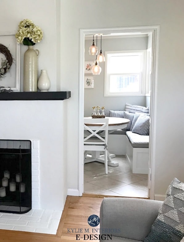

You provide details on the painting of a Prairie/skyscape under the head, cool colors versus warm colors shown above?
Hi! I can’t quite make sense of this note, do you mind clarifying? 🙂
I believe Joanne is referring to the painting in the picture under that heading. It caught my eye too, very pretty! The painting is in the photo to the left of the stone fireplace.
Thank you! That one is SW Austere Gray and it’s JUST as gorgeous in person (this is my friend’s home :))
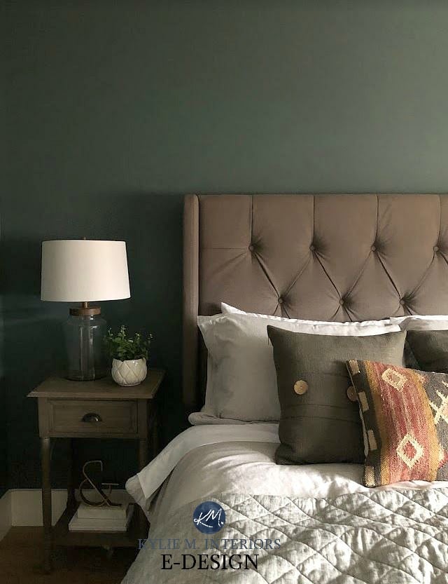
Hi Kylie, you have been such an amazing help to so many of us. Thank you for your hard work. Would you happen to know what color the green wall is in the fourth picture with the stone fireplace. I’m looking for a color just like this. Thank you so much. Blessings, Debbie Mohr
What a lovely note, thank you Debbie! That’s the lovely SW Austere Gray :).
I’ve done gray (SW Reflection) and I’ve done off white (SW White Duck). Loved both, but I’m seriously thinking of painting my living room, hallway, dining area and kitchen SW Glimmer. My ceilings are low and we don’t have many windows to bring in natural light. Can a color be too light?
Under Silver Satin, what is the color of the living room walls that you refer to? Thanks
And look at how beautiful Silver Satin looks as a backdrop to this blue-green-gray living room attached to it…
Ahhh, that’s the lovely BM Imperial Gray!