
How to Mix Gray & Beige In the Same Room
THE SECRET TO MIXING WARM & COOL COLORS
Do you have gray walls and want to warm things up a little? Or maybe you have a beige-on-beige home and want to add some cool balance with gray, greige, or taupe. Either way, pairing warm and cool neutrals together is tricky business.
Why?
There’s ONE BIG REASON. And once you understand the ‘WHY’ of it all…
- You’ll save yourself a LOT of pain, suffering, and marriage counseling bills
- It will be SO much easier to coordinate beige and gray in your room/home
- You’ll be able to find shades of gray and beige that actually go together
The above doesn’t mean you’ll LOVE what I have to say, but just because it hurts doesn’t mean it isn’t true (just like when Tim says wine isn’t a breakfast beverage). So here it is…

HOW TO MIX BEIGE WITH GRAY, TAUPE, OR GREIGE
First, when I say BEIGE, you can also assume I’m talking about cream paint colors. It’s easier to say this than to say ‘beige and cream‘ every single time—although I do love to hear myself talk.
Second, when I say ‘cool colors,’ I’m not just talking about gray; I’m talking about any color that’s COOLER THAN beige (or cream) – and that’s a lot of colors when it comes to the wild world of neutrals. And trust me when I tell you this next part…
When partnering cool colors with warm colors (or finishes), the cool color should be DARKER than the warm one (or at LEAST the same depth).
Why?
Let’s flip things around (which is also Tim’s favorite Friday night saying)…
When pairing warm colors with cooler colors (or finishes), the warm color should be lighter than the cool one (or at least the same depth).
I want you to reread the above and sit with it for a bit – think about how it relates to what you’ve been trying to do. Does this explain a WHOLE LOT?
While some same-depth, cool-warm partnerships can work, you need to tread carefully, which many of us aren’t inclined to do when we have a vision of what we WANT.
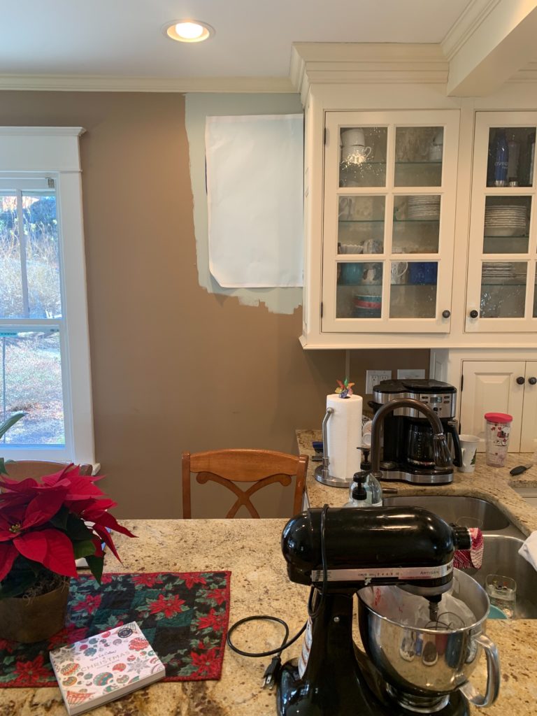
Look at this granite countertop in this early 2000s kitchen…

Ignore the sample on the left and focus on the sample on the right. There are two reasons it works…
- This color is found in the flecks/veins of this countertop
- It’s darker than the warm beige-cream base of this countertop
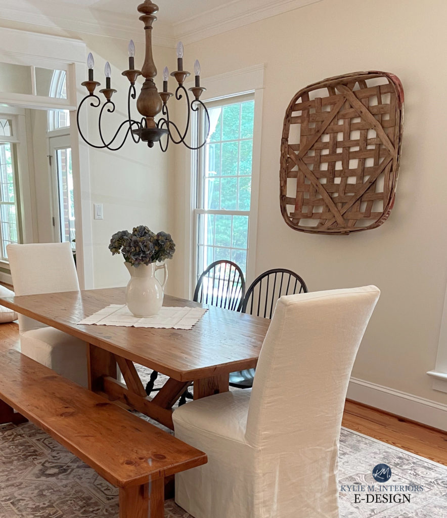
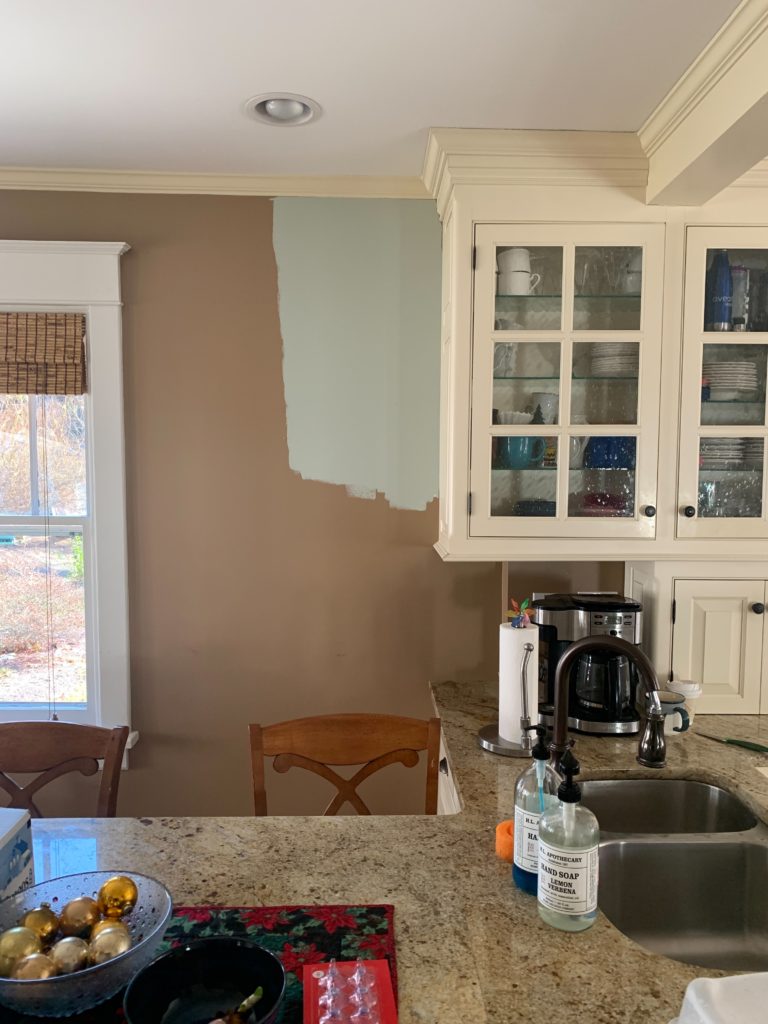
Check out the combo in this next photo. Why does this palette BARELY make the cut?
PRO: The gray shiplap wall is darker than the creamy-beige wall (as it should be), which means the cooler color is darker than the lighter, warmer color.
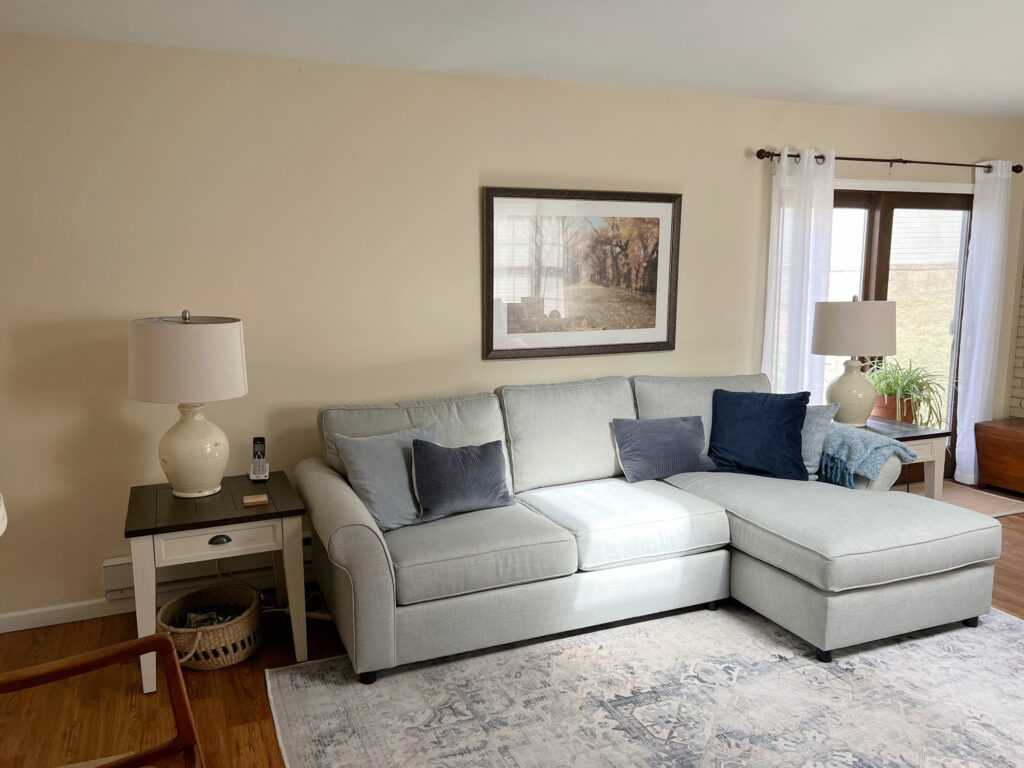
BORDERLINE: The gray shiplap wall is the same depth as the beige sofa. However, if the gray shiplap were any lighter, the palette would look off-balance as the WARM color would be the strongest of the two.
The above demonstrates the secret tip we’re learning that…
Warm neutrals are fussy with neutrals that are cooler AND lighter than them.
Cool neutrals are fussy with neutrals that are warmer AND darker than them.
You’ll find that the above is less of a concern when you’re dealing with pairing actual ‘colors’, rather than neutrals.
Why does the palette in this next home work so well?
The cool color (Benjamin Moore Stratton Blue) is DARKER THAN the warm color (Benjamin Moore Edgecomb Gray) and the beige tile.
Remember, even though Edgecomb Gray isn’t a beige or cream, it’s WARMER THAN the blue-green it’s being partnered with, so the blue-green needs to be darker than it.
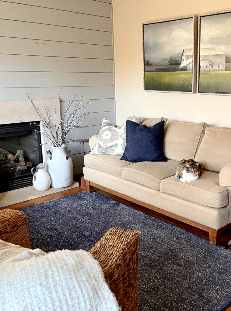
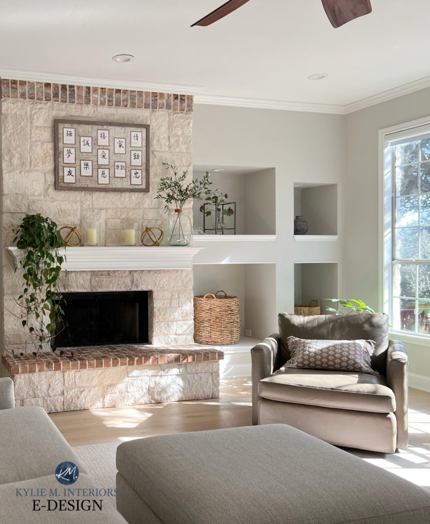
In this next photo, the cooler color (walls) is a wink darker than the warm color (the carpet)…
Are you ready to go a little deeper (that’s what she said)?
Here’s where it gets a BIT tricky. While I nodded toward the following general guideline earlier, I want to hammer it home a bit more. And seriously, once you understand this general guideline, it will make your paint-pickin’ life a WHOLE LOT EASIER!
The above information doesn’t necessarily mean literal WARM and COOL colors (e.g., beige or gray)—it also applies to colors that are ‘COOLER OR WARMER THAN‘ the color you’re trying to coordinate with.
What does this mean?
Let’s look at a few examples where the above guideline applies…
- Taupe is a warm paint color, but it’s COOLER THAN beige
- Cool gray is COOLER THAN warm gray, even though they’re both gray
- Beige is WARMER THAN taupe or greige (although all are WARM colors)

Why is this room a bit uncomfortable? The blue wall color is too light for the beige carpet and sofa!
That’s right; the above doesn’t apply to traditionally ‘warm or cool paint colors’; it also applies to ANY neutral, including gray, beige, greige, taupe, cream, tan, or white. The idea is that…
ANY color or finish (no matter which neutral it is) can be sensitive to a color that’s cooler & lighter OR warmer & darker than it*.
*Remember, there are ALWAYS exceptions, so don’t get your knickers in a knot if your home is one of them.
This next photo shows an exception with Sherwin Williams Crushed Ice and a warm-toned stone fireplace…
Crushed Ice barely makes the cut in the above room. In fact, it’s lucky that it’s the same depth as the beige stone; if it were any lighter, the combo would be off. Sure, this room might love a warmer off-white beige, but sometimes, there’s a happy medium between what suits a home and what a homeowner wants!
NEED HELP? Get the best color advice with my ONLINE PAINT COLOR PACKAGES!
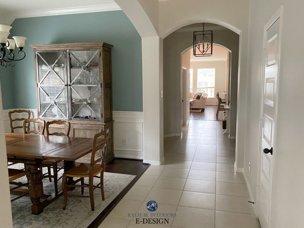
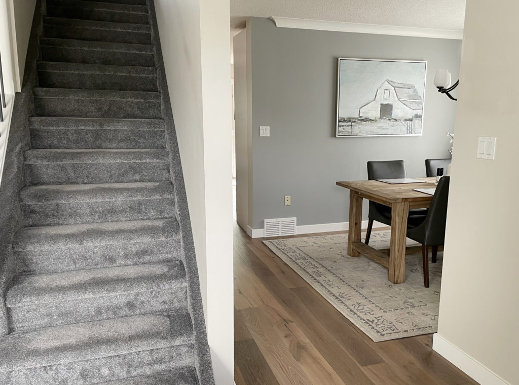
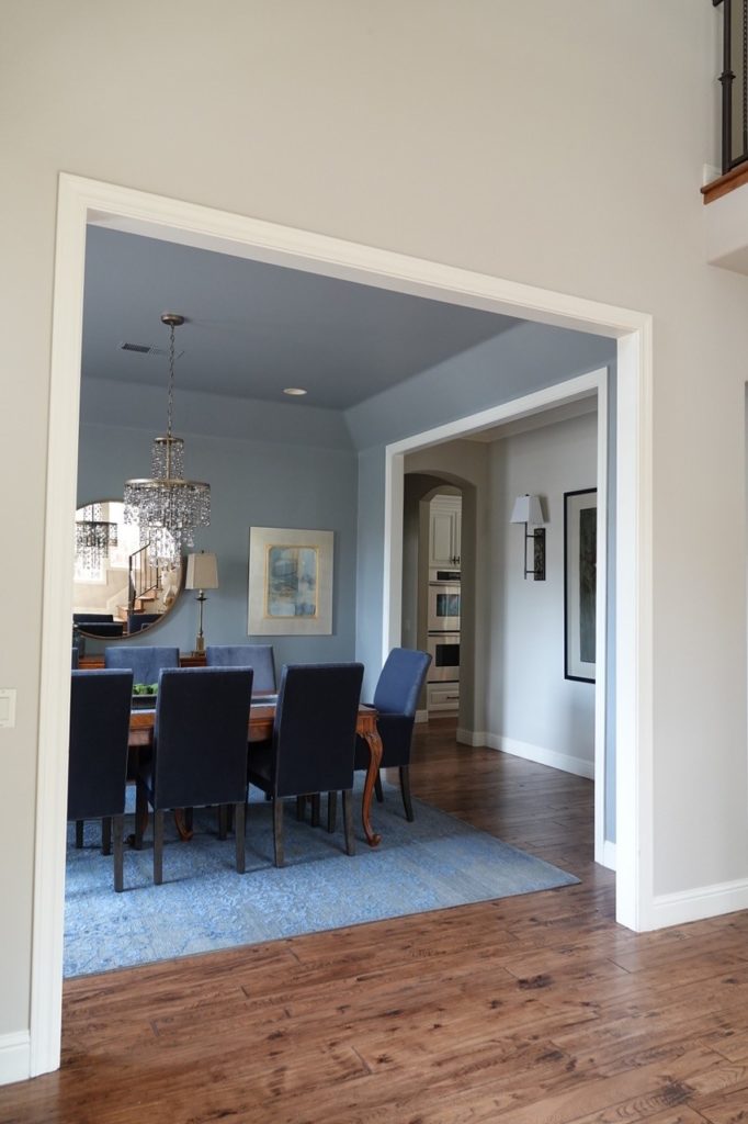
Check out this next space. Is the palette between the dining room and the foyer well-balanced?
This palette gets 1 out of 5 woofs.
HELLLLS NO. The beige in the entryway is darker than the blue-gray in the dining room. The palette feels off. Truth be told, even the dining chairs are a bit uneasy with the wall color.
There are occasions where a ‘same depth warm-cool combo’ works. There are far fewer situations where a color that’s ‘lighter AND cooler than its warmer partner‘ works. If I had photos of them, I’d show them to you.
As for actual ‘COLORS,’ you have much more flexibility when partnering neutrals with colors like blue, green, and purple. Even then, the reason this next room sings is that the blue-green paint color is DARKER THAN the beige chairs—the cooler color is darker than the warmer neutral.
I know it’s a lot to process, but the dots should come together once you consider how this advice relates to your space.
Think about the colors you’ve been trying to put together. Are they not working? Does something seem ‘off’? There could be a few reasons for this…
1. You might not have chosen the right undertone for your room’s finishes (a blog post unto itself).
2. You don’t have the decor and furnishings to support the color direction you’re going in (another blog post, yet to be written).
3. While YOU might be ready for a color change, the finishes in your home might disagree. Some homes can’t handle a warmer/cooler shift, or at least not one that YOU’RE also happy with.
OR, if your room can handle a change and you have the right undertones and furnishings for visual support…
Maybe you need to adjust the DEPTH of color you’re looking at – it could be that easy.
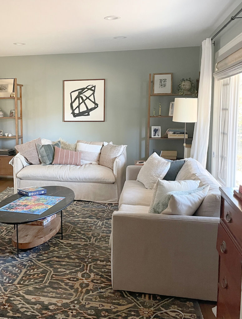
Note the darker gray carpet and accent wall with lighter, warmer main color
That’s right. The gray, greige, or taupe you’re trying to partner with your beige or cream might work if it’s a bit darker! This applies whether you’re creating a paint palette or pairing paint colors with fabrics or other finishes.
In this next family room, if the sofa were one tone darker, it would be much happier with the Benjamin Moore Gentle Cream walls. As it is, they’re fighting each other as they’re too similar in depth. Alternatively, the walls could be a lighter tone, more like Benjamin Moore’s Navajo White or White Dove.
Are you still with me?
HOW TO CHOOSE WARM & COOL COLORS THAT GO TOGETHER
I get it if the above info didn’t quite seal the deal – it’s a tricky topic. Let’s do things step-by-step.
While you can’t put a number (as it relates to depth) on beige carpet, countertop, tile, or furniture (whereas you can with paint), it’s about exploring the finish you’re coordinating with and figuring out its general depth. Is it light, medium, dark, or somewhere in the middle?
The cool gray-blue-green walls are DARKER THAN the off-white warm sofas – PERFECT!
Let’s say you have a beige carpet, tile, or countertop (or all three)…
1. TRY GOING LIGHTER
If you have a beige (or cream) that you’re trying to coordinate with, look at grays, greiges, and taupes that are LIGHTER than your surface.
- Do your paint samples seem a bit disconnected from the surfaces around them?
- Do the colors seem a bit uncomfortable with each other?
GRAY FINISHES: If the finishes you’re trying to coordinate with are gray, try warmer shades that are DARKER than your gray surface.
2. TRY THE SAME DEPTH
If you’re trying to coordinate with beige, look at grays, greiges, and taupes that are the SAME DEPTH as your warm finish.
- Does it seem like your room breathes a sigh of relief compared to the lighter versions?
- But have you REALLY hit your home’s happy place? You won’t know until you do STEP 3.
You might have started your journey by looking at LIGHTER colors. But having seen that they don’t always work, shifting a bit darker could be your best move – even if darker isn’t what you have in mind.
The gray in the dining room is darker than the beige in the foyer.
It’s not always about what YOU want; it’s more often about your home and what it NEEDS.
3. GO A BIT DARKER…
If you have warm finishes that you want to partner with a cooler color, look at cool colors that are a shade or two darker than your warm finish.
- Do the finishes in your room seem to respond better to this increase in depth?
- This doesn’t mean the ‘same depth’ colors don’t work – they might, but going that step darker could get you closer to your perfect palette.
GRAY FINISHES: If your finishes are gray, look at warm colors that are a bit lighter than your gray surface.
If things STILL aren’t working…
a) You might be looking at the wrong undertones for your finishes. For example, SOME beiges don’t look great with some blue hues, whereas others do. Some beiges don’t suit green undertones, whereas some do! There are MANY factors at play.
b) Your room might not look good with any paint color that’s cooler than its current finishes; the original design of it wasn’t meant to accommodate cooler hues.
Sometimes going WITH your finish rather than against it is the best choice.
Cream cabinets and trim are the PERFECT examples of finishes that don’t love colors that are cooler and lighter than them. I’ve had dozens of Online Colour Consulting clients wanting to update their cream-cabinet homes with cooler hues, and we bump up against the same challenge every time – they want something lighter and cooler than their home can handle.
And sometimes, they must undergo the process of SEEING what doesn’t work to believe it, as shown in this next photo…
Not only is this particular shade of blue LIGHTER THAN the cream cabinets, but it’s also too clean-looking.
Shifting a bit darker certainly helps…
The above combo is better than the previous one. However, if you ask me, the cool color contrasts too much with the warmth of the cabinets, making them look even warmer/creamier (which isn’t usually the goal). However, I’m often happy to humor clients if they want to explore a specific color, even if I don’t advise it – sometimes, they have to see it to believe it!
The 16 Best Paint Colours to Update Cream Cabinets & Trim
Remember, this is all general guidance – there are exceptions and anomalies. HOWEVER, if the colors you’re looking at aren’t working, the above reasons could be why.
QUICK QUESTIONS & ANSWERS
CAN GRAY & BEIGE GO TOGETHER?
Yes, you can mix warm and cool colors in a home, as long as the gray (cooler color) is darker than the beige (warmer color) it’s partnered with.
The Best Beige & Tan Paint Colors
The Best Gray Paint Colors for EVERY Room
WHAT COLOR OF BEIGE GOES WITH GRAY, GREIGE, OR TAUPE?
The beige paint color should be LIGHTER than the gray, greige, or taupe it’s partnered with. I cover this a bit in this blog post about updating gray flooring and finishes.
The Best Light to Medium Taupe Paint Colors
The Best Light to Medium Greige Paint Colors
CAN GRAY & BEIGE BE IN THE SAME ROOM IN DECOR OR PAINT?
Yes, they can, but be sure both are repeated MORE than once (three times is ideal).
CAN YOU MIX GRAY & CREAM?
Yes, as long as the gray is darker than the cream and the undertones of the gray suit the space and the type of cream you have (yellow-orange, yellow-pink, or yellow-green).
Of course, I could keep on typing. I have a lot more to say about some more closely related topics. But for brevity and sanity (both in short supply around here), they get their OWN BLOG POSTS!
READ MORE
The Best Off-White Paint Colors
5 Ideas: How To De-Beige Your Home
Sherwin Williams Accessible Beige Paint Color Review
The Best Warm Neutrals that AREN’T BEIGE!
Get the best color & update advice…
Check out my Online Paint Color Consulting


This article is awesome! I never knew about this design secret. One question though. As I’m decorating my living room I’ve started thinking about every item: couch, rug, walls, ottoman, etc. Where does this rule end? Is it mostly geared toward larger items (ie. walls, flooring, rugs, couches)? Or is it a rule to follow even down to throw pillows and flower pots? I started to feel a bit overwhelmed!
OMG Kylie!!! I get it. AND just walked my husband through our house and pointed out EVERYTHING that is wrong with it. I think I made this mistake in almost every room. I kept repeating cool color darker than warm. LOL…. But honestly I can now see how the beige couch is darker than the Edgecomb Grey walls and looks hideous and why the dining room chairs that are a warm mid depth fight with the beautiful teal blue wall color also mid depth. New couch and chairs pronto! 🙂
Kylie this was so helpful! I always wondered why my porch walls painted Smoke Embers looked good with golden wicker furniture and light berber carpet. It made no sense until now! You are amazing!!! Thanks so much!!!
Heather
I’m wondering if you would consider wood trim to be frequently exempt from the rule? I think warm wood (like pine or fir) looks great with lighter gray walls, but I’m second guessing myself after reading your wonderful article!
This actually still follows the guideline as the warm white trim is LIGHTER THAN the light gray/cooler walls!
I second that question. I think Janet is referring to natural wood tones. I have older natural wood trim and floors in my home which would be considered warm tones, but I do think they pair well with light, cooler, paint colours. Thoughts?
This is exactly what my bran has been trying to figure out. We are looking to paint our kitchen/living room (with skylights & fireplace) with two paint colours: edgecomb gray (one wall) and Windham cream (opposite wall and wrap around fireplace)
At a certain point both paint colors with be next to each other. And so the edgecomb gray would go from simply being neutral to a neutral “warm” tone while the Windham cream would remain warm…is warm or warm ok? Should I be bringing in a cooler tone?
My kitchen is upper whites /lower dark gray cabinets…we liked edgecomb gray for the walls because it feels like a color that can go with anything…so many things to consider when it comes to cool and warm.
Hi Nina! It’s hard to say without seeing your home, but Edgecomb Gray and Windham Cream don’t belong together. It’s not just about the minor shift in LRV (it’s good to see more) but they’re competing neutrals and Windham could make Edgecomb Gray look quite dirty in comparison!
When will you have consulting packages available again?
Hi Barbara! They do ebb and flow based on my workload! We try to get some out every week. Keep in mind that the $99 Quick Consult can get you well on your way too!
How can we print your posts?
Thaaaat’s a good question! I would say maybe transfer them to Word? As long as they’re just for personal use!
Would sherwin williams topsail in an East and south facing room go well with sherwin williams vanillan for closet doors or is that too warm? Looking to paint over our wood closet doors something to go with the light blue on the walls…. Also considered evergreen fog but that seems too dark! Thanks for all your wonderful helpful articles
Defffffinitely too warm. Vanillan is a considerably strong, heavy cream and will be very fussy with its partners. You might find this helpful https://www.kylieminteriors.ca/the-16-best-wall-colours-for-cream-cabinets-trim/
I have Bianco Superiore Quartzite with Snowbound cabinets and looking for a paint to “warm” up the space. Thinking about taupe or beige, thoughts on any colors? I like BM Cedar Key. Kitchen window is NE facing and slider is SW facing. Any ideas are appreciated.
Oooo Snowbound is a tough one as it can flash some pink. I would stick with more taupe colors, so LESS beige than Cedar Key but with a nice violet-pink base 🙂
This is sooooo soooo helpful, thank you! What paint color is on the walls in the “ The Best
PAINT COLOURS
for your walls…” picture above?
Hey Holly, can you describe the picture for me as I don’t see which one you’re referring to 🙂
Does this rule apply to floor tile as well? If you have warm, brown, Tuscan style, tile are you limited to only darker cool colors? I am considering using escape gray for our mud room but I’m having trouble telling if it’s darker or lighter than the floor tile.
Oooo, knowing beige tile like I do, I feel like Escape Gray should should be a great depth!
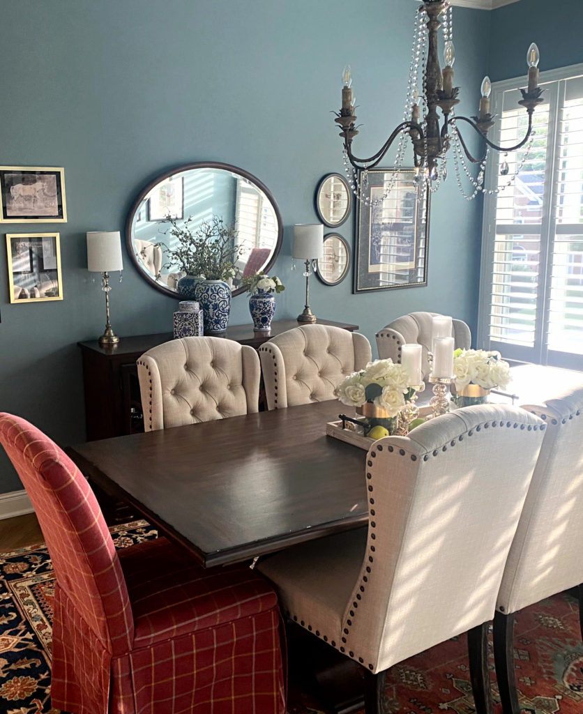
Hello! Can you tellme the name of the paint colour on the dining room with the circle mirror in the background. It says it’s a grey but look like blue. Either way, it lovely. Thank you in advance!
Ahhh, that’s BM Courtland Blue. The lines above talk about how adding a bit more COLOR can work too 🙂
Hi kylie I’m trying to find paint color for my kitchen that will match my living room which is painted grey owl in adjoining room. The finishes are maple cabinets and baltic brown granite looking for a warm grey,greige,or off white color, should I go darker then grey owl or lighter ?
I have light gray floor off white sofa & light blue rug & navy blue chair can I warm the room with beige walls?
Does your rule of partnering only lighter cool colors with warmer dark colors apply to wood as well? For example would dark (warm) walnut not look good with pale grey walls?
Now THAT is a great question! You know, I’d have to say it would be situational, but for the MOST part, no. I say this because most wood tones are warm and can look good with cool light color and cool dark colors. HOWEVER, the odd wood finish has a bit of a gray wash and has a cooler violet undertone. THESE woods won’t be happy with many darker, warmer colors :). Thanks for making me think!!
Hello Kylie! Thank you for all the information you share!
How do the Calcutta and Carrera Marbles (cool?) work with beige/tan (warm) kitchen cabinets, because I’ve been seeing a lot of them in design inspiration photos. Yet the marbles are “lighter” than the warm beiges/tans! Can you help me understand, because I have a 90s faux marble tub and I’d like to put Calcutta umber on the floor! Thank you!
Hey Lisa! Yup, I’ve been seeing alot of it too – sometimes it looks good, othertimes…not so much. I find when it looks best, it’s when the cabinet color is similar depth (or lighter) to the main, darker gray in the marble (if that makes sense). I struggle when the cabinet color is darker than the darkest gray in the marble, for sure.
This perfectly describes the issue I’m having with our 90s house. Open concept kitchen/ family room with cream cabinets and tan/beige backsplash (screams 90s) but I just bought a gray sectional so the paint color has to work with all! The current color accessible beige is not working with either side of the room. I was going to try pale oak but now I’m wondering if ballet white might be a better bet… or something else…
Hi, thankyou for this, it’s very helpful. I’m wondering if this applies to ceilings, ie I want to paint my walls BM natural wicker does that mean a very pale blue gray like BM Horizon would be too light? should I go darker blue and would it feel oppressive? Thanks.
Yeaaaah, I’d be careful as it could be a rough combo…And yes, you could go that bit darker – maybe just 5-10 LRV points lower than Natural Wicker???
Your site provides so much excellent information. Having made a significant investment and not liking the paint color outcome, I wish I had discovered your site sooner. I am a little frustrated when I attempt to purchase one of your paint packages that say in stock or 1 left and then won’t add to my cart due to out of stock. I will continue to watch for available packages as due to water damage I am in a position to repaint and change the color I dislike. Thank you.
Hi Kay! Yeah, I’m taking a little time off this summer but should be back at it soon! Often, the Quick Consults come instock quicker, and they can be darn handy. If they come up, be sure to grab one!
Hey Kylie,
Would you happen to know the colors of the shiplap grey with the neutral accent wall? we have autumn fog from valspar amd looking to paint an adjacent wall off white or beige. Thanks!
You betcha, that’s actually SW Chelsea Gray, not to be confused with BM Chelsea Gray (which easily happens 🙂