
5 IDEAS: HOW TO DE-BEIGE YOUR HOME
HOW TO GO GRAY (OR GREIGE-TAUPE) WHEN YOUR ROOM IS BEIGE
If I had an extra twoonie (being Canadian) for every one of my clients who wanted to ‘de-beige’ their Tuscan-vibe home, I’d still be doing what I love – I’d just have some serious coin jingle-janglin’ in my pockets.
And while beige is starting to trend again, there are MANY of you still trying to DE-BEIGE your beige-on-beige home – and it isn’t always an easy transition.
So how do you update a beige home? How do you add gray, greige, or taupe when your home is top-to-bottom beige?
You keep reading…
First of all, DID YOU KNOW that beige is coming back? That’s right; beige is said to be the ‘gray of 2023’. In fact, I have blog posts talking about these new, modern beiges…but they’re not what you’re here for.
Second, because beige is coming back doesn’t mean you must love it. And as I alluded to above, I consult DAILY with clients desperate to add some balance to their beige-on-beige homes.
And like them, you might’ve lived with beige SO long that it’s actually coming back in style.
So, if you’re ready for a fresh start with a cooler approach, I hear you and am here to help.
1. THE BEST GRAY, GREIGE, & TAUPE PAINT COLORS TO GO WITH BEIGE
If your home is beiged-out, there’s a moderate chance you can paint your walls a cooler color. However, it might not be the cool color of your dreams.
Why?
Beige finishes are fussy about their color partners. Often, my clients try to integrate the WRONG cool colors when the right ones are just a few tweaks away (that would be tweaks, not twerks, you crazy animal).
And while I’ve written a detailed blog post about this exact topic (read it, it’s awesome – and yes, I am a bossy lil thang), the gist is that…
Warm finishes don’t love being partnered with colors that are cooler and lighter than them.
Suppose you’ve been looking at colors like Benjamin Moore Collingwood, Gray Owl, Sherwin Williams Repose Gray, and Agreeable Gray. You like these colors, but the finishes in your home don’t agree with you. In this case, they probably aren’t working because they’re not dark enough for your finishes.
This might not be what you want to hear, my dear, but if your current beige finishes are staying-put, AND you want things to look good, you may want to adjust your expectations (said with love, kindness, and a splash of wine for liquid reinforcement).
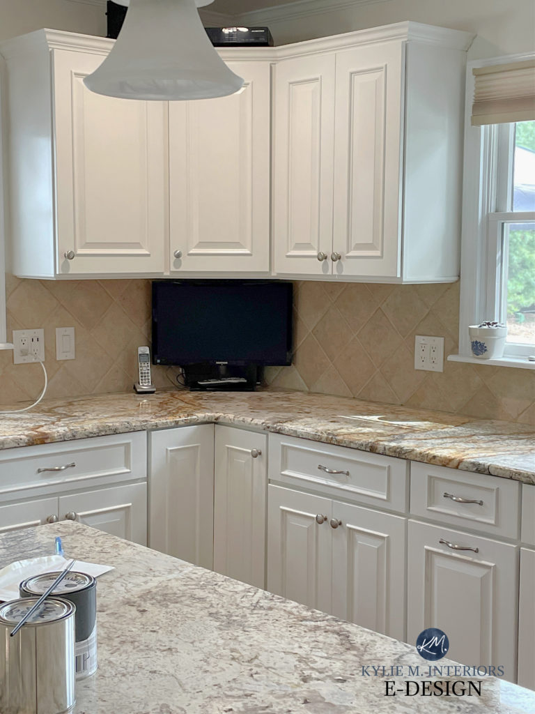
This backsplash is orange-pink beige.
FUN FACT: Many of my clients refer to their ‘warm-toned finishes’ as being cream or tan. MOST of the time (i.e., 9o+%), these ‘warm-toned finishes’ are actually beige with orange-pink undertones.
When choosing your new paint color, the best place to start is with LRV. While it depends on your home and its particular finishes, a great LRV to start with is 55. If you don’t know what LRV is, it will ROCK your world more than Dwayne Johnson.
The Ultimate Guide to Choosing Paint Colors Using LRV
And without getting into which UNDERTONES best suit your particular blend of finishes (as most people have more than one beige finish to accommodate), check out the following:
- Sherwin Williams Argos
- Sherwin Williams Requisite Gray
- Sherwin Williams Versatile Gray
- Benjamin Moore Silver Song (review coming soon)
- Benjamin Moore Stonington Gray
- Benjamin Moore Revere Pewter (definitely hit and miss)
- Sherwin Williams Perfect Greige
- Sherwin Williams Amazing Gray
Again, I can’t for sure tell you the above will work without seeing your room, but they’re a place to start. When comparing your samples, see how they relate to each beige finish in your home, your exposure, trim, and any other hard or soft finishes that need to be considered.
SAMPLIZE peel-and-stick are the best tool for sampling paint. They’re more affordable than sample pots and are made with each brand’s REAL PAINT!
And they show up on your doorstep in 1 DAY!
Visit the SAMPLIZE website HERE
2. CONSIDER GRAY, GREIGE, OR TAUPE FURNITURE & ACCENT PIECES
If the above colors aren’t jibing with your space, listen reaaallly closely, and you might hear your home whispering that it wants a modern beige paint color. However, even without cool-toned walls, there are still some great ways to add balance to your space.
FURNITURE PIECES
Depending on which best suits your space, consider furniture pieces that are DARKER THAN your beige finishes; they act as ‘accents’ rather than direct competition.
The warm gray chairs in this eating area below ground the space while letting the off-white cabinets and beige walls speak to the finishes in the room…
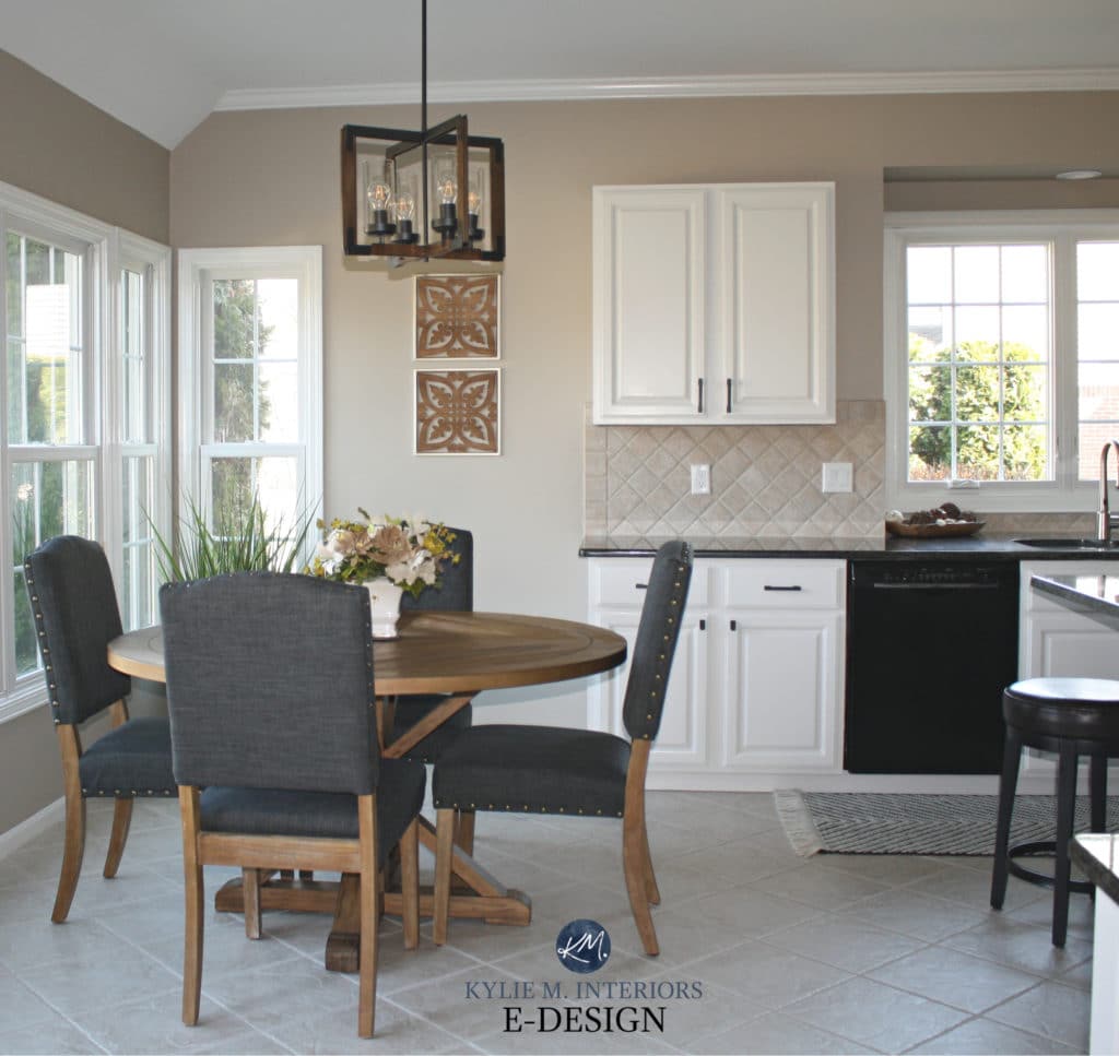
Sherwin Williams Balanced Beige
ACCENT PIECES
Rather than painting your walls the wrong color, get great visual value out of accent pieces in cool hues of gray, greige, taupe, blue, violet, and green.
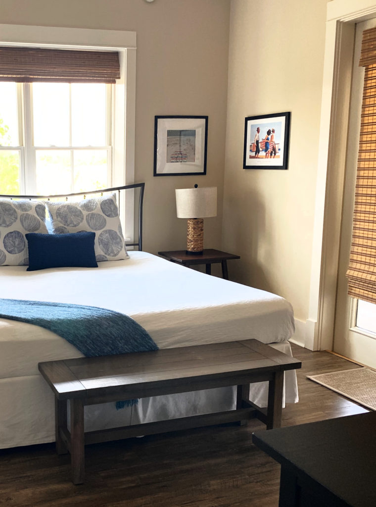
As shown in this next room, you can also balance a beige room with other NEUTRALS, including warm white and black…
3. ADD SOME COOL CONTRAST WITH A COOL-TONED KITCHEN ISLAND
Painting your island (or bathroom vanity) is a GREAT way to add some cool balance to your space. In fact, you can make more of an impact with a well-chosen accent color than you will with a ‘half-decently’ chosen cool wall color.
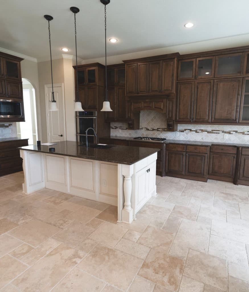
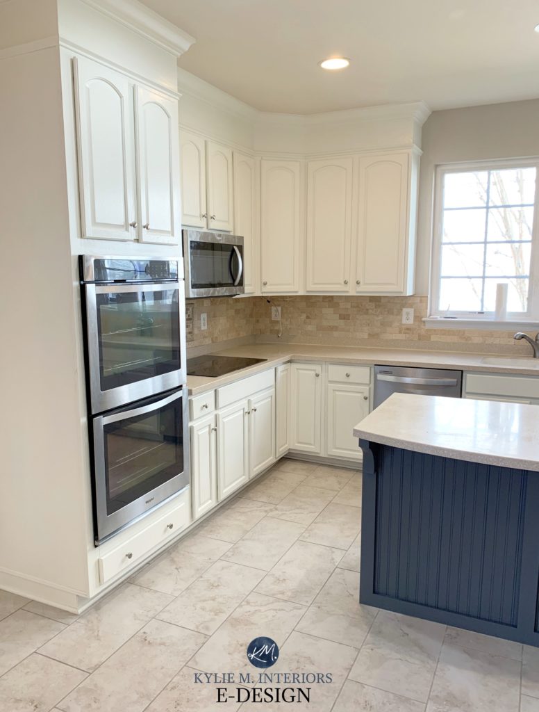
This next kitchen was ‘next-level beige’ with its saturated golden tones…
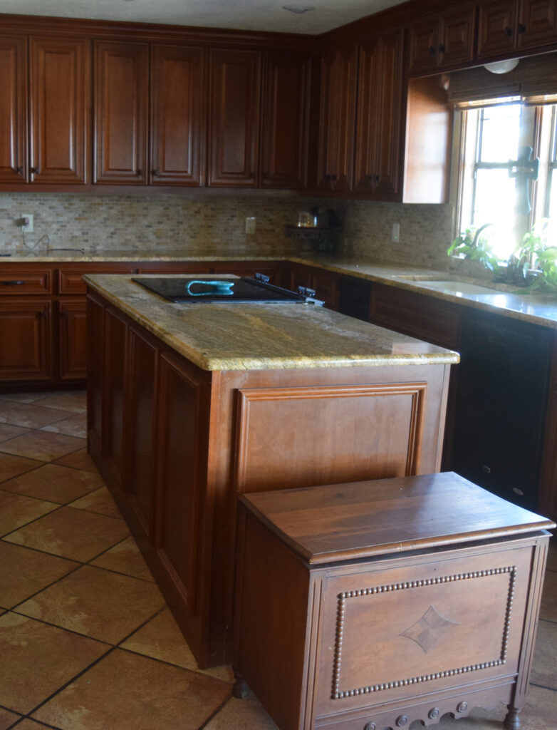
Sure, in the ideal world, you’d replace one or more of the hard surfaces. But in the REAL world, money talks, and paint listens…
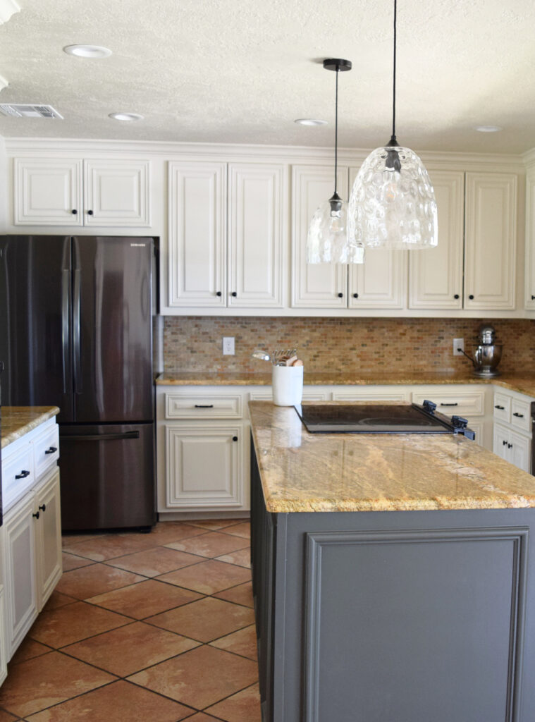
We went beige on the cabinets to coordinate with the room and its needs (Benjamin Moore Maritime White). This is what the kitchen wanted. HOWEVER, we did a beautiful dark green-gray on the island to add a cooler element. While a lighter version of this would fight with the warm finishes, this darker shade ‘accents’ the space.
With its beige/gold-inspired granite countertop, this next space looks much more modern with the painted island and new hardware (which I bet they catch their pockets on ALL THE TIME!)…
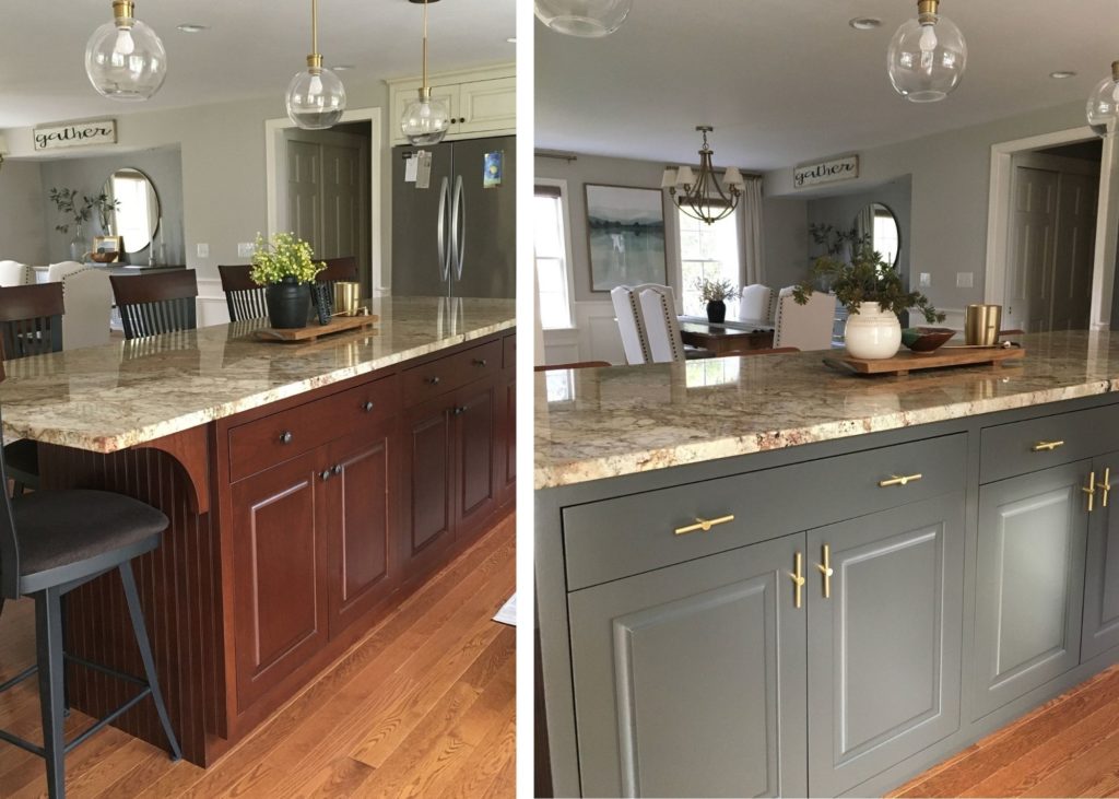
Sherwin Williams Urbane Bronze is a beautiful contrast to this warm granite countertop
The Best Paint Colors for Kitchen Islands & Bathroom Vanities
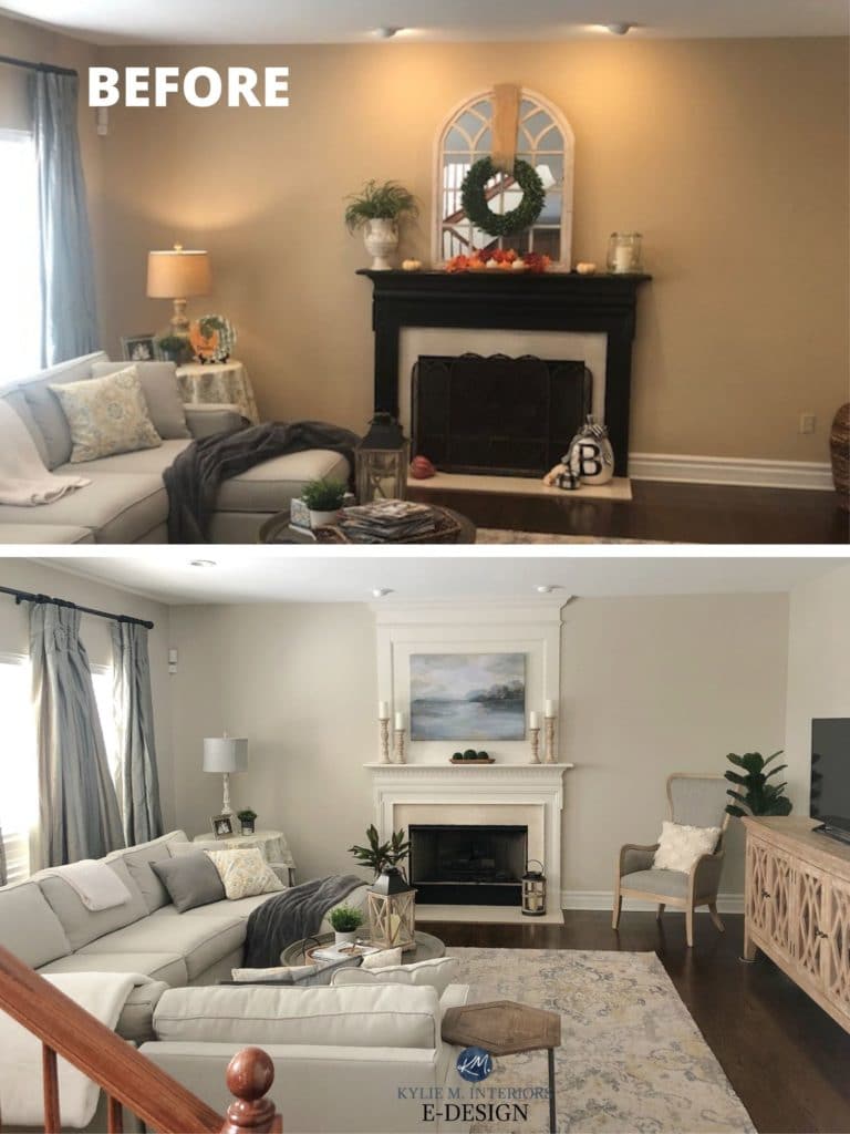
4. EMBRACE THE WARMTH OF YOUR ROOM WITH UPDATED DECOR & FURNISHINGS
Don’t be afraid to lean into your home. Almost any beige-on-beige space can look updated with the right furnishings, decor, and texture!
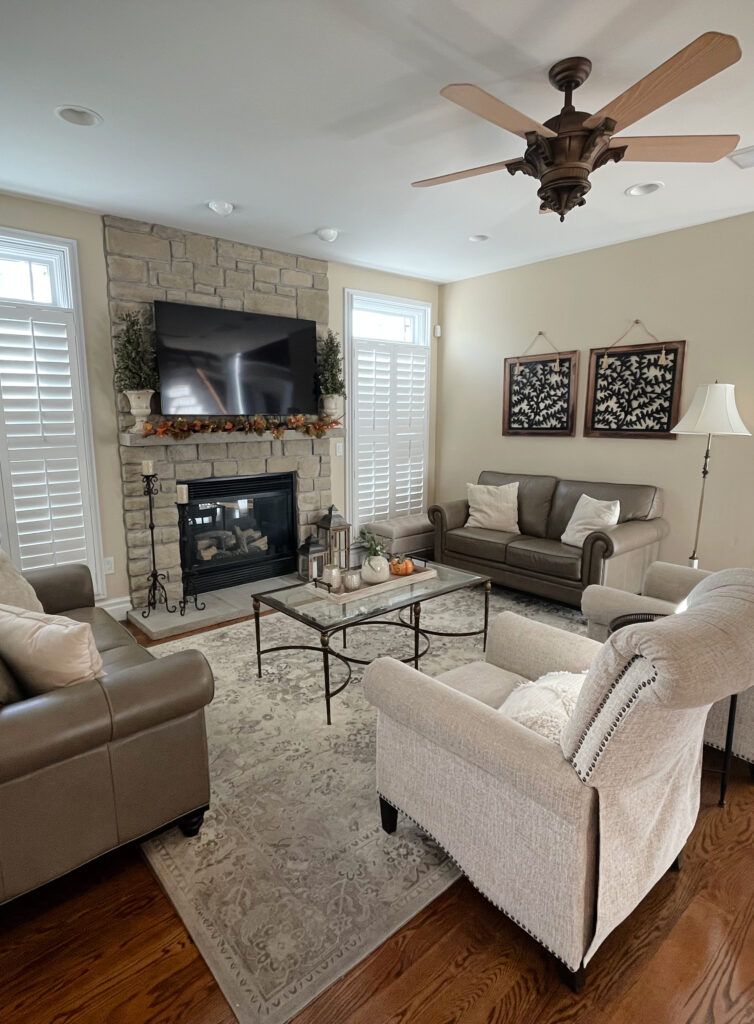
In the above room, I would change the art above the sofa to something a bit lighter/fresher. As for furnishings, what’s there looks beautiful. Find pieces with fewer curves and slightly cleaner lines if you want a more modern look. Dark greige accents would also add a nice balance/dynamic to this space.
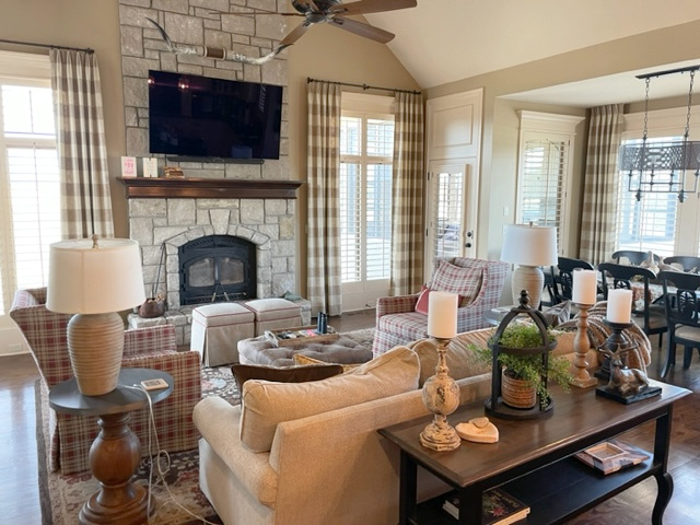
This next space has ALLLL the potential to be beautiful. In a space like this, it can be about shifting to a lighter, more modern beige. A lighter shade would shift the energy in this space while still suiting it and keeping things homey and inviting…
5. FIND A TRANSITIONAL COLOUR BETWEEN GRAY & BEIGE
Some rooms can humor a ‘happy medium’ colour that bridges the beige and gray worlds without committing 100% to either.
Benjamin Moore Edgecomb Gray (below) is a great transitional colour. As you can see, it works with the beige/polished travertine of the fireplace surround…
The 11 BEST Warm Neutral Paint Colours – THAT AREN’T BEIGE!
Realistically, the fireplace surround wants a WARMER color. However, in considering the sectional and area rug as well, Edgecomb Gray is the perfect happy medium.
The stone fireplace in this next living room has slightly cooler hues but a few warmer stones that gladly accommodate Edgecomb Gray…
FULL Paint Colour Review of Benjamin Moore Edgecomb Gray
6. PAINT AN ACCENT WALL OR INTERIOR DOOR A COOL COLOR
Painting a smaller area with a cool paint colour is one of my FAVOURITE WAYS to add balance to a beige-inspired room.
These small-scale ideas work because on your main walls, you can listen to your home and its specific (and probably warmer) needs. You can then have some FUN and explore cooler hues for an accent wall or the inside of a main door. For example…
- INSIDE OF THE FRONT DOOR (often suits navy blue-hues)
- ACCENT WALL (a wide range of options, depending on the surrounding finishes)
- Again, the KITCHEN ISLAND is a great place for an accent (dark green-gray often suits beige finishes)
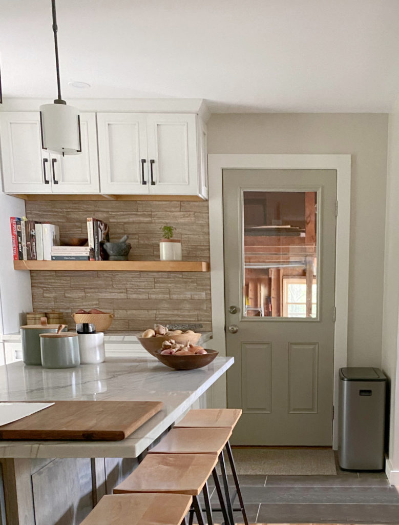
While this next kitchen isn’t remotely overwhelmed by beige, the soft shade of green-gray on the back door is a gorgeous accent to this ‘mostly warm’ palette…
And check out how this blue kitchen island adds to the palette of this 1990s kitchen…
And don’t you worry about whether accent walls are trendy or not. A well-placed, well-chosen accent color can be great for almost ANY home…
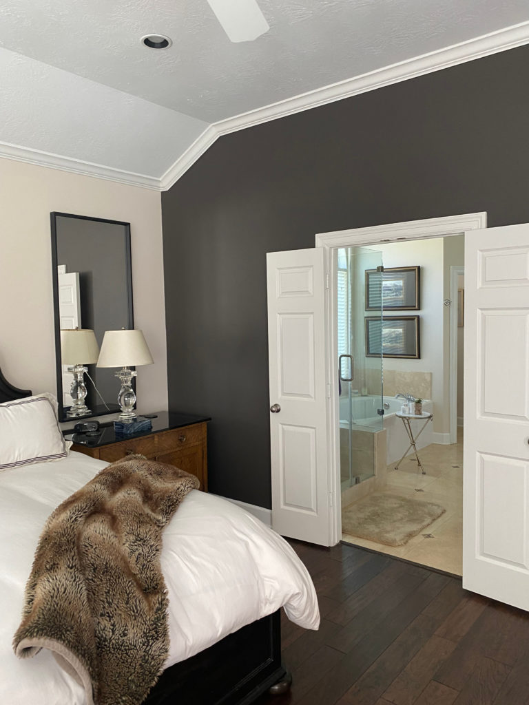
The above bathroom is SUPER beige, as is the wall behind the headboard, making Sherwin Williams Urbane Bronze a beautiful accent!
Where to Paint an Accent Wall & What Color Should It Be?
At the end of the day, the above colour tips are great for nodding toward your personal preferences without sacrificing the needs of your home.
READ MORE
The #1 SECRET to Coordinating Warm & Cool Colors
The Best MODERN Beige & Tan Paint Colors
6 Budget-Friendly Home Update Ideas
The Best Warm Neutral Paint Colors THAT AREN’T BEIGE!
NEED HELP?
CHECK OUT MY ONLINE PAINT COLOR CONSULTING!
Chat soon,


Thank you for this!! We have whitewashed woodwork, which we love. Reading this article it hit me – for all intents and purposes it is a beige with a pink-orange undertone. That’s why it has been so tricky to find paint colors that are friends with it, especially because we kept choosing too high of an LVR! Versatile Gray or Diverse Beige are on the list to test for our living room, while Softened Green for our kitchen and dining area seems absolutely perfect. Can’t wait to update our place!
Great post! I’m in this exact situation. Our new home is definitely beige and I took your advice and added darker gray accent chairs to the den. It works so well and now I’m not nearly as stressed about combining beige and gray as I was. Our other home had SW Agreeable Gray that I still love but I had to get away from it here. I’m now seeing how beige/greige/taupe can get along! Thanks to you!
Hi Kylie,
I’m confused. Aren’t we trying to get away from gray, and into warmer colors? I always LOVE your posts but frankly this one leaves me scratching my head. Please help!
Nan
Oh, I know! Even though trends are shifting into warmer colors, I have many clients still trying to get OUT of their beige homes, or at least have LESS beige :).
I am glad you mentioned my favorite paint color to update beige -Edgecomb Gray is almost a universal color. The other problem with so many of these “all beige” houses is a lack of contrast, so adding a darker color makes it look better!
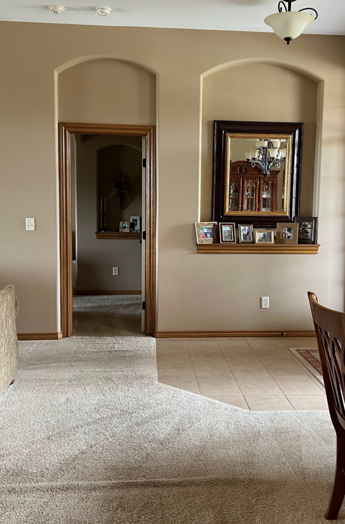
Awesome article – thank you so much! My home is exactly your first photo, and I’m so tired of beige and tan and brown! Why did I ever let a color consultant (albeit in 2004) convince me to paint the whole house tan when I HATE brown?? Luckily, it’s taken me so long to decide to repaint that the tile, floor, and cabinets need refreshed now too. No more compromising with the beige tile for me – it is out of here! And all the sneaky little niches and alcoves with their beige tile – you’re all being painted, my dears!
Love your posts! Does this advice extend to wood? I have nice wood cabinets, doors, etc , that have orange tones. I want gray paint to balance them, but would I really need paint darker than the wood for it to work? I would like light walls, though not white. (I’ve liked colors high 70s to low 80s, but the tone is so hard to pick!)
Good question, and NO! While there are a ‘few’ exceptions, wood is a creature unto itself, and you can definitely go lighter with your gray!